Architecture Workshop’s 400-Square-Foot Studio Has a Secret Bedroom and Sleeps Six
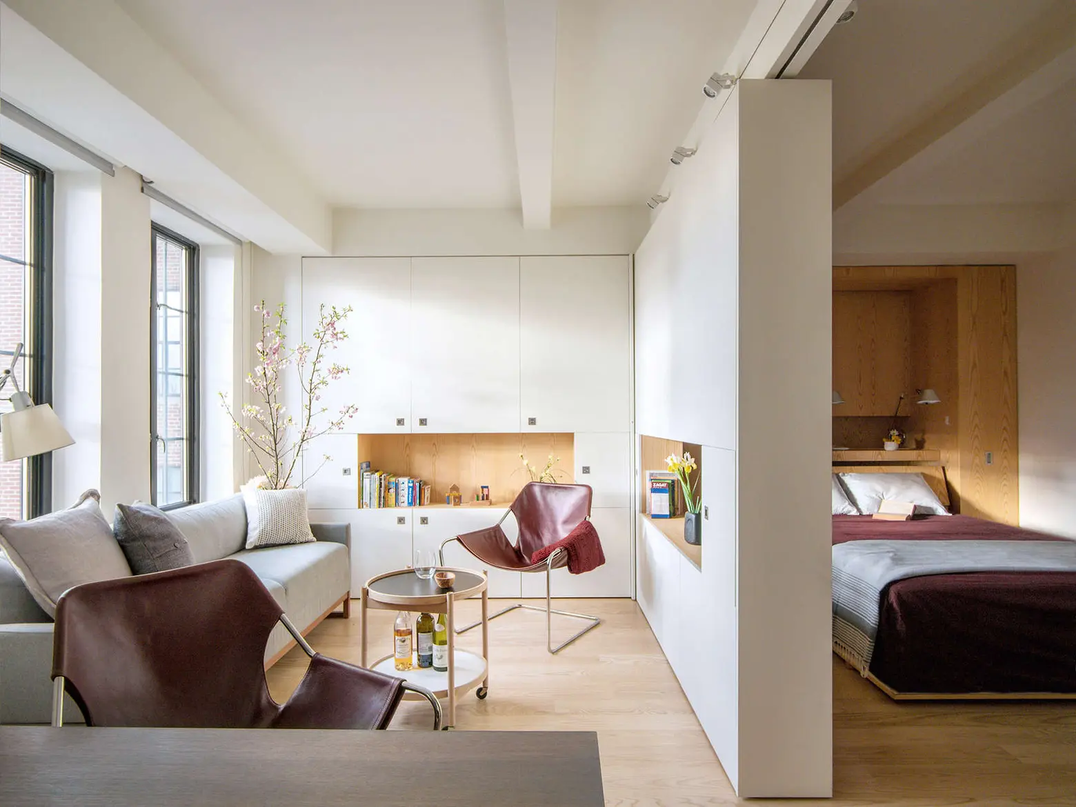
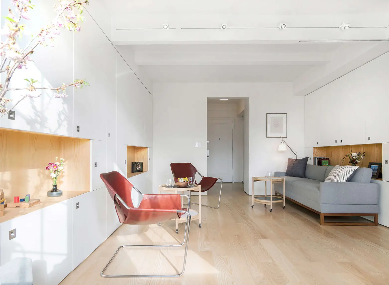
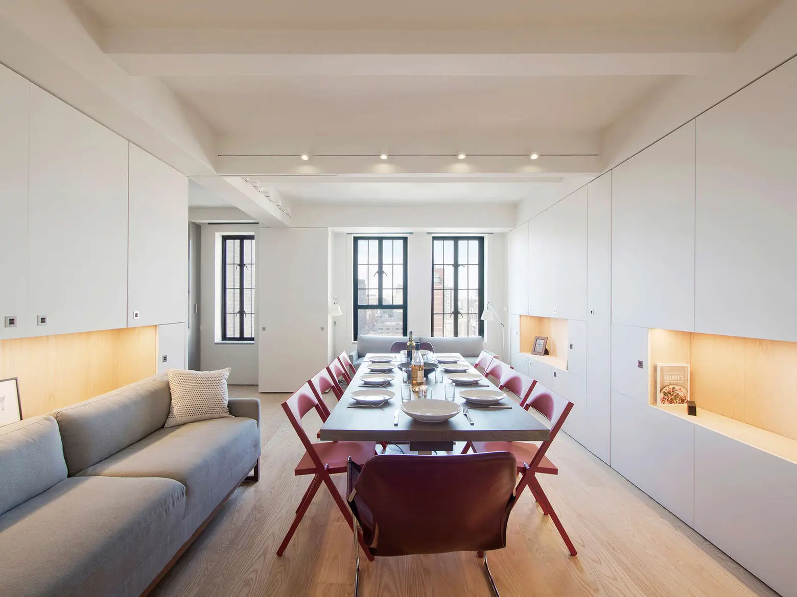
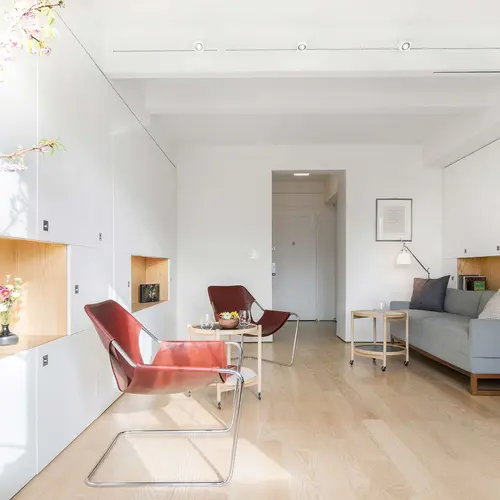
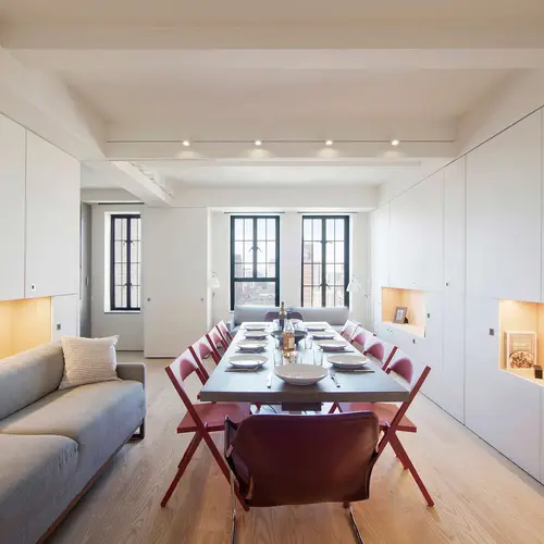
Almost every New Yorker has been tasked with the challenge of smartly utilizing a tiny apartment. But Architecture Workshop takes the prize for the unbelievable challenge of transforming a 400-square-foot prewar studio into a modern space that hosts 10 for dinner, sleeps six, and includes a home office to boot. The firm created a multi-functional space with tons of cabinetry that blurs the line between furniture and architecture. The result, as the firm puts it, is “an airy modern apartment where everything has its place.”
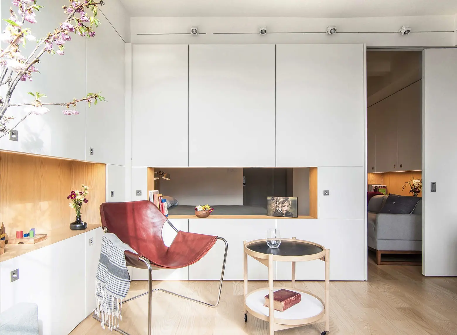
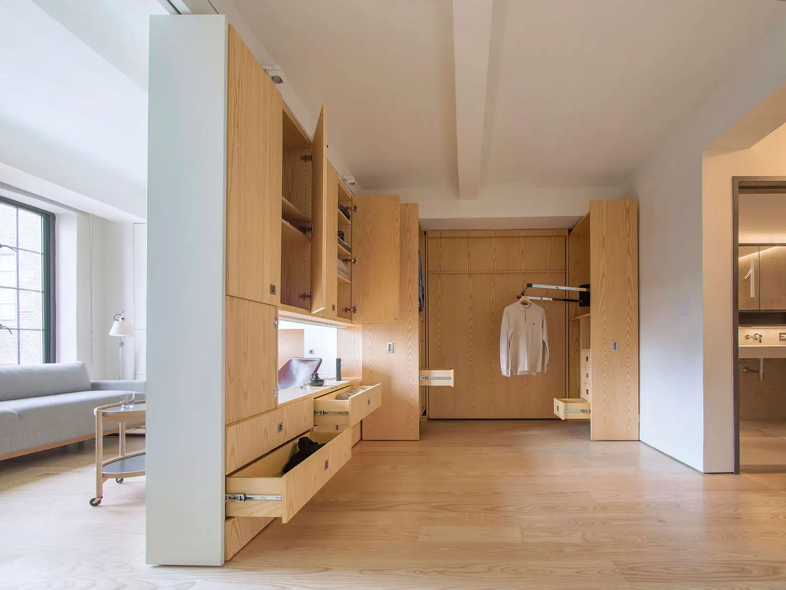
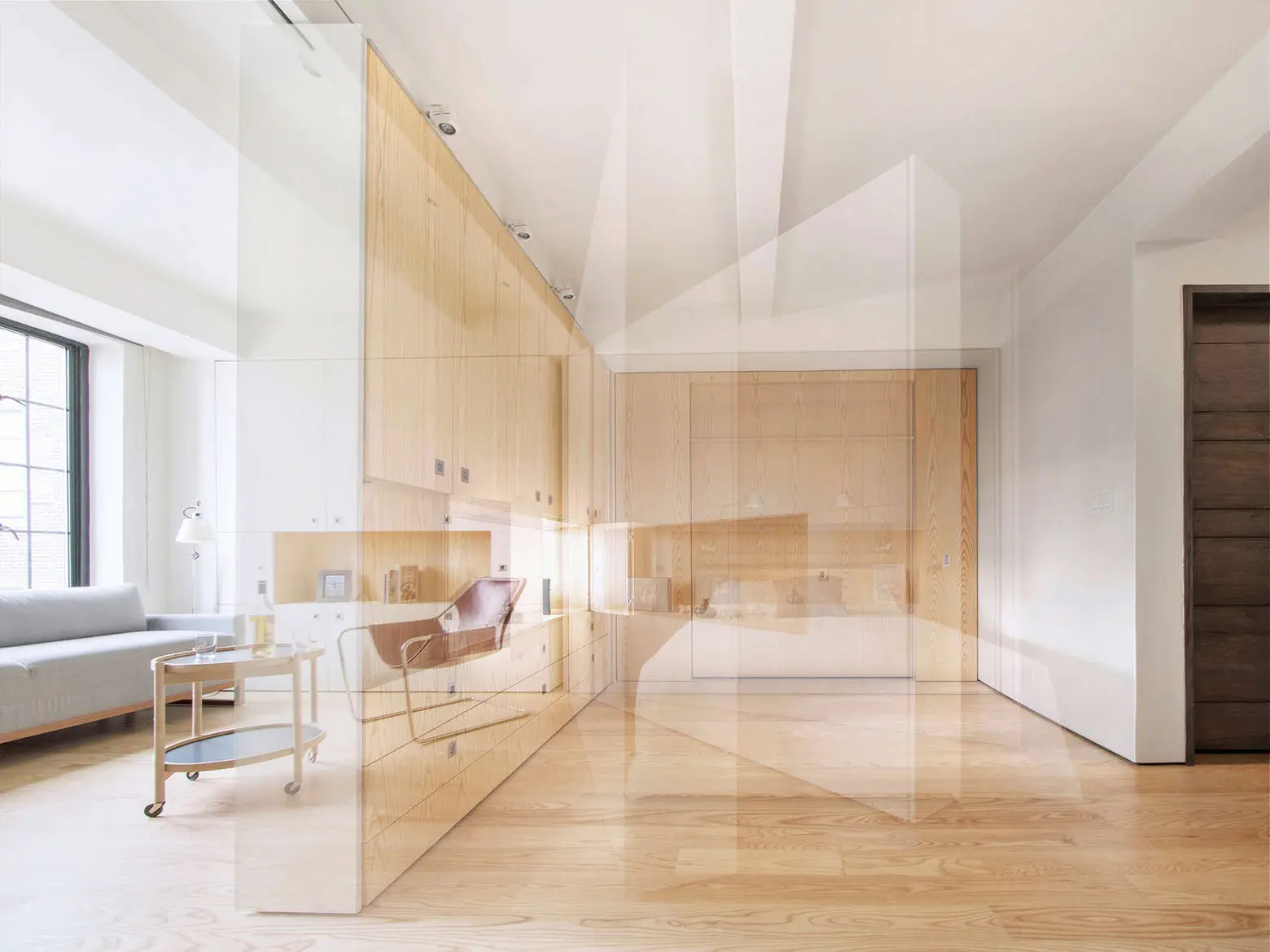
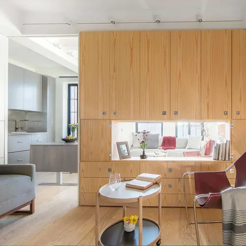
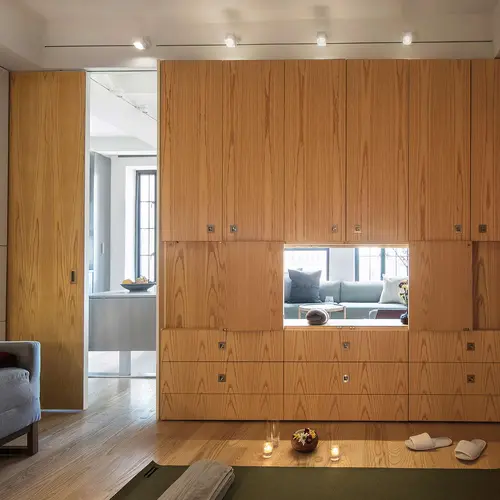
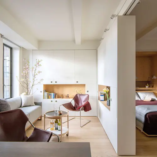
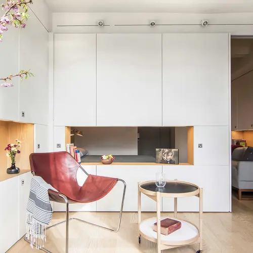
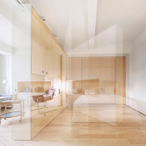
Upon entering the apartment it looks like a pretty typical studio space. But the architects created a customized wall, filled with storage, that creates two separate spaces that can be used independently when needed. The wall actually pivots to create each distance space. This unique storage wall, according to Architecture Workshop, “creates various spatial experiences depending on use, ranging from serene white walls to lush wood interiors.”
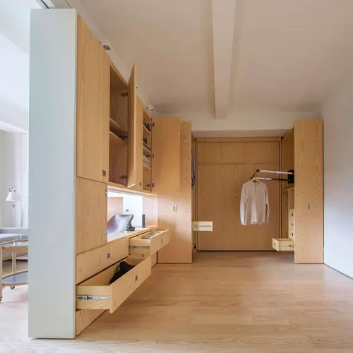
The design is also notable for hidden storage throughout the studio, like built-in shelving inside the entrance closet with an illuminated hanging rod.
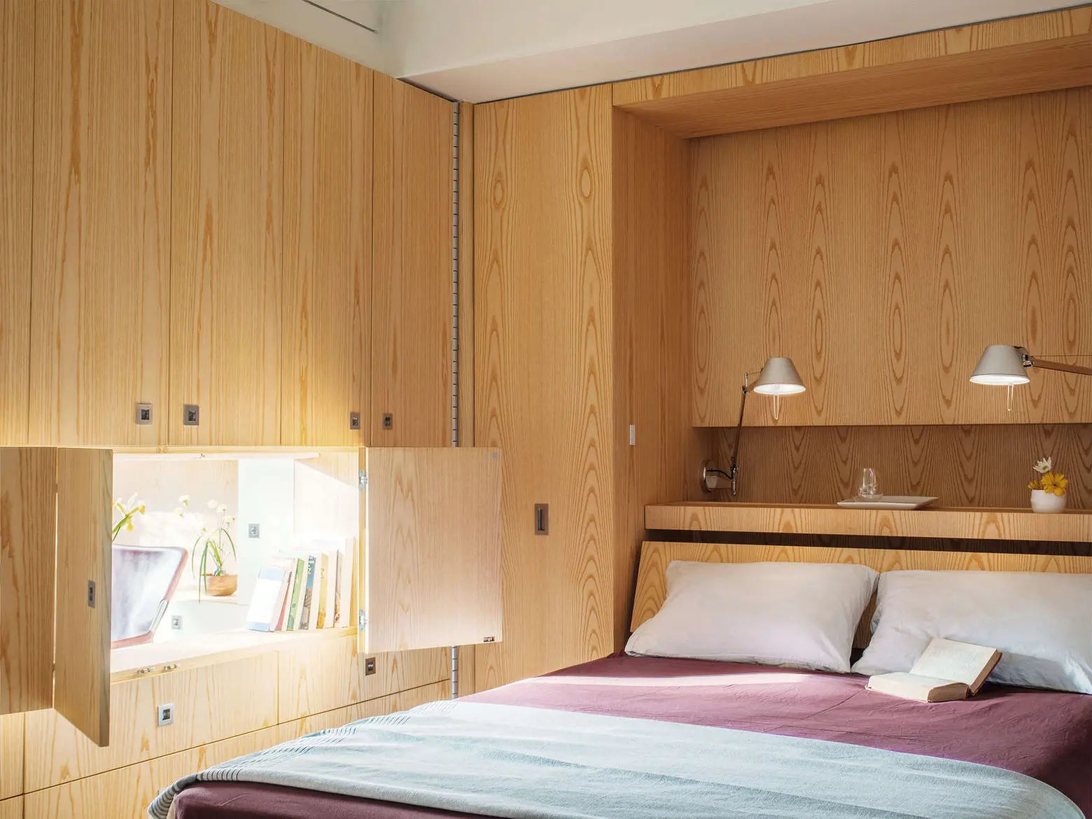
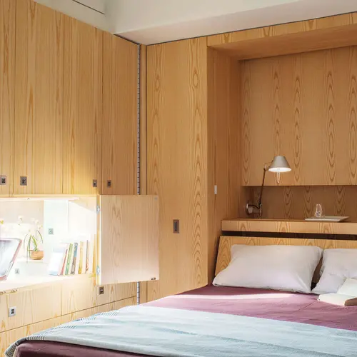
The new, smart layout capitalized on a pre-existing wall and bed nook in the studio — the architects used this space to build an “unfolding bedroom” that could be concealed behind the pivoting wall.
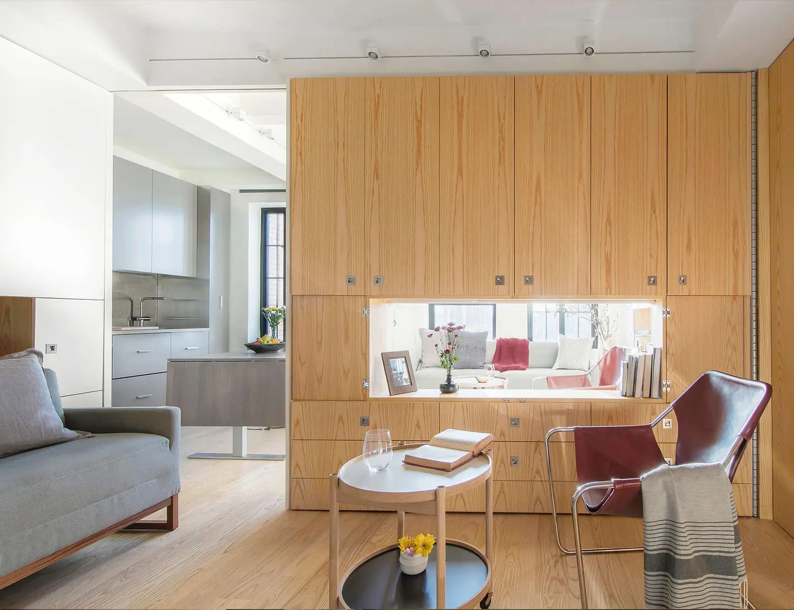
Here’s a look at the bedroom once the bed has been pulled down. When the bed is up, it’s a large dressing area boasting closets on either side, which extend out with pull-down rods and drawers. The wall even has an open-able window to provide daylight to the “secret” bedroom.
Once you shut the wall window and slide the wall closed, you have a private dining area. That’s a height-adjustable, expanding table and yes, it fits ten. The couch also pulls out to create a guest bed if needed.
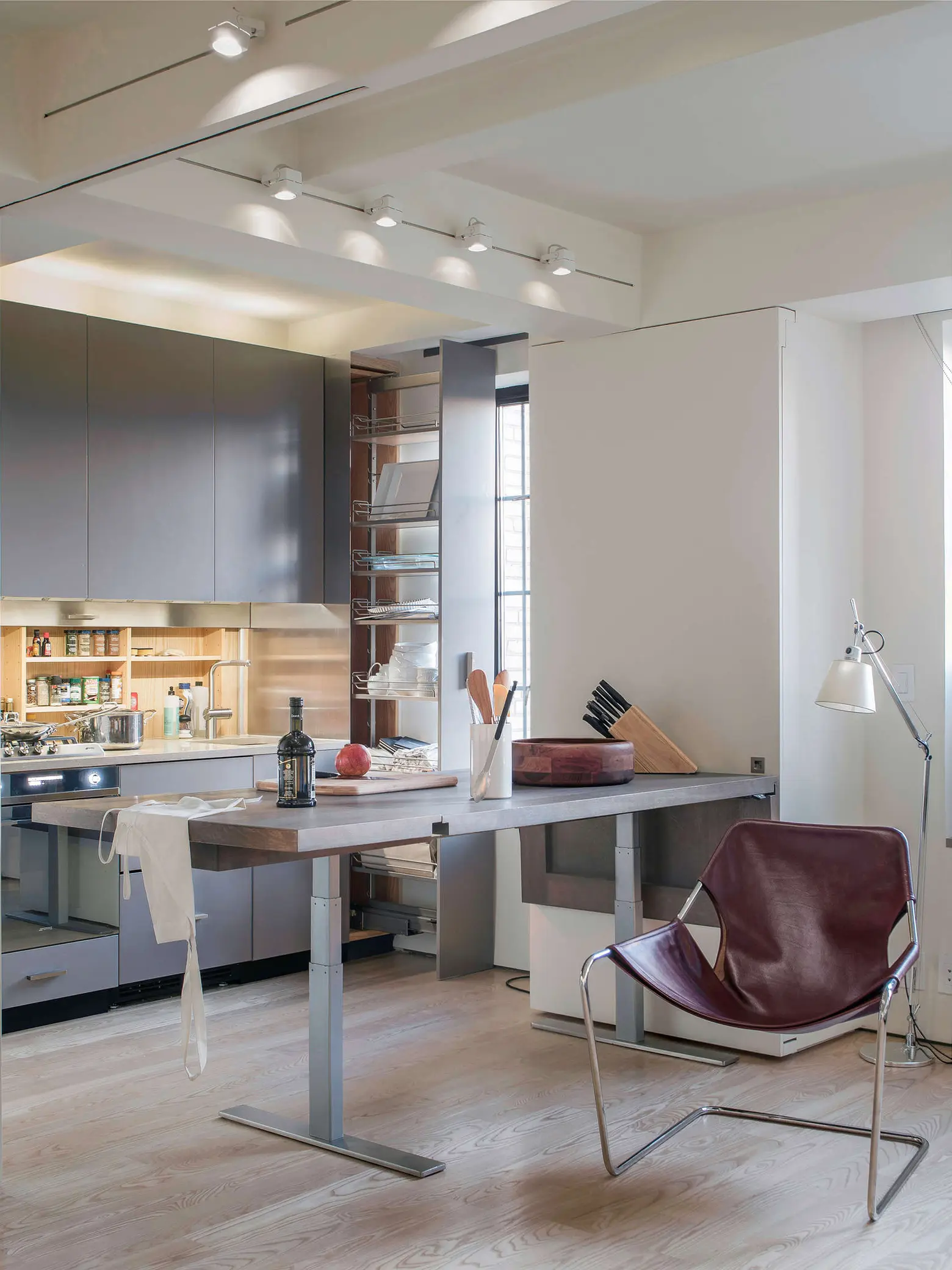
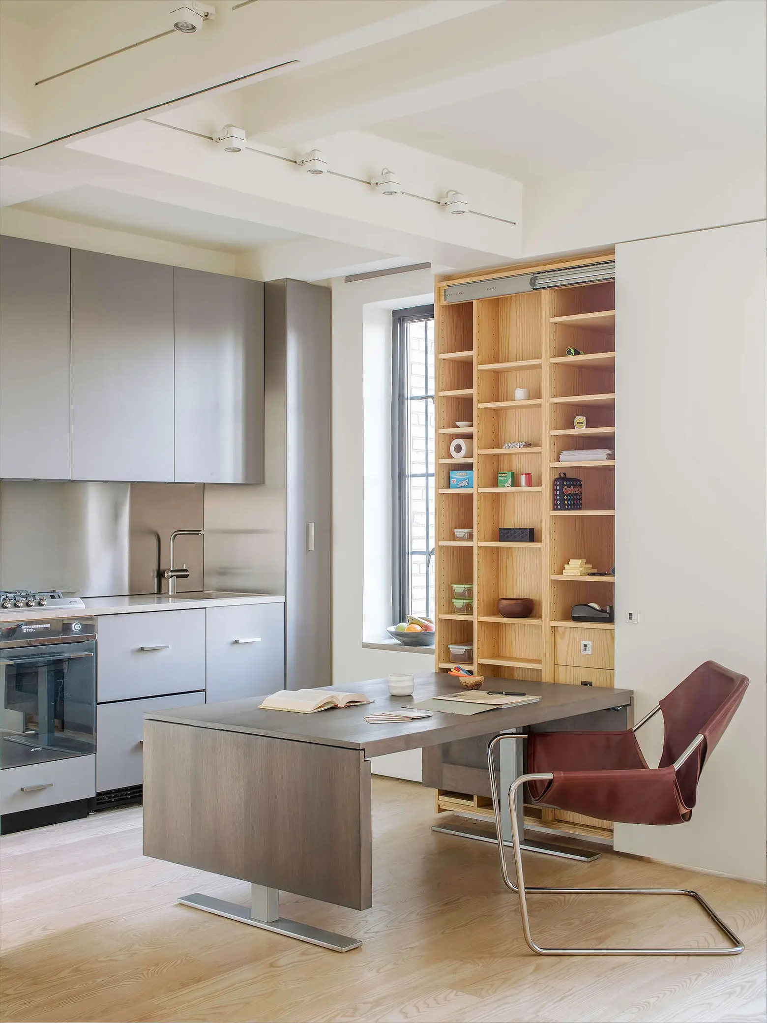
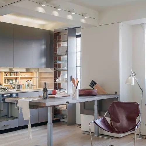
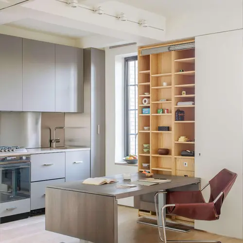
The kitchen features a backsplash that lifts to reveal more storage behind. The table (the same one that can be expanded to seat ten) can be used as a home office or additional counter space off the kitchen.
This gives you an idea of how flexible the space actually is. The firm’s goal was to use cabinetry to blur the distinction between architecture and furniture, and to make this multi-purpose space feel interactive for the owner. They wanted to re-imagine the typical studio into a responsive, flexible space–and they’ve definitely succeeded here.
[Pivot by Architecture Workshop]
RELATED:
- A Family of Four Squeezes into This Tiny 640-Square-Foot East Village Apartment
- 325-Square-Foot Greenwich Village Apartment Is Smartly Designed to Pack All the Comforts of Home
- Specht Harpman Transforms an Awkward 425-Square-Foot Apartment Into an Open Space Oasis
Photos courtesy of Architecture Workshop
