Coney Island Design: “Defending the Honor of American Pop Culture”
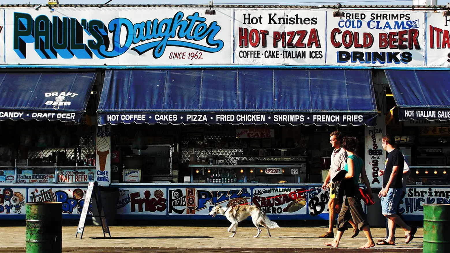
Image © Javier Ignacio Acuña Ditzel
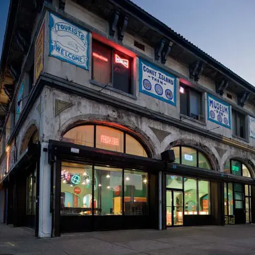
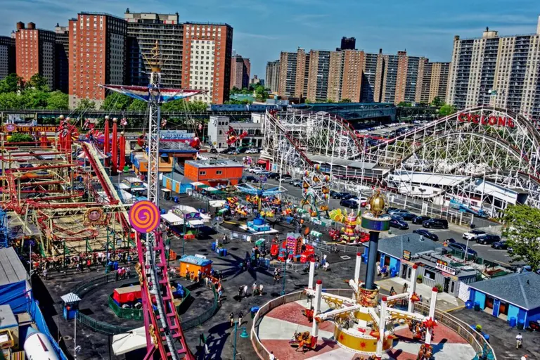
Coney Island is an entertainment destination in New York, with its beach and amusement park rides, but it is also a city center for weirdo culture and kitsch. The neighborhood’s aesthetic has developed into something like an early 20th century carnival surrounded by ’60s and ’70s storefronts which may or may not be conscious of their dated designs. So the question is, how do you design a new building in a neighborhood which is so identified with an attractively shabby, authentically dated look? Buildings like the Coney Island Museum face that difficulty with each passing year.
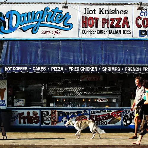
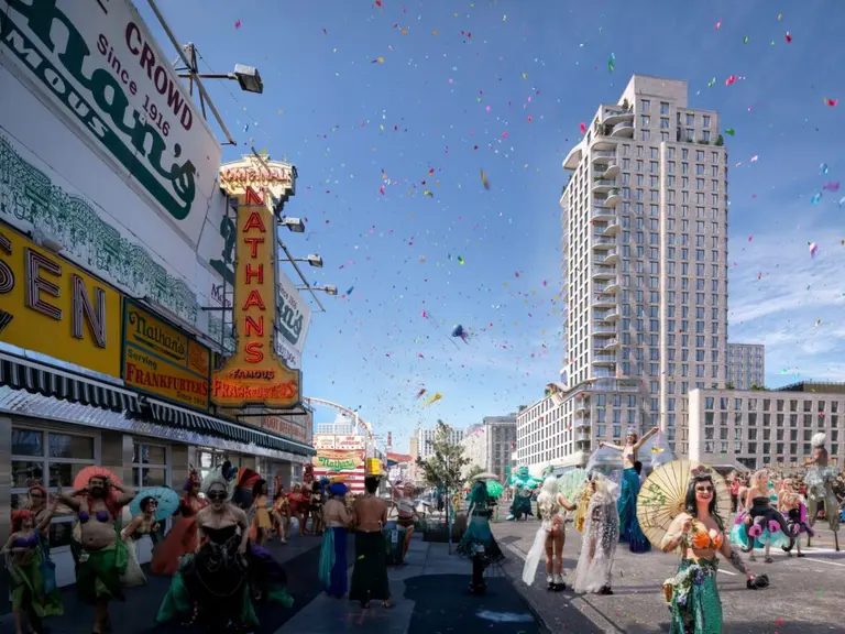
Coney Island’s style amalgamates the low-brow attention-grabbing attractions of the entire 20th century in America, from carnivals and fun fairs to freak shows and beach culture. The loopy hand-painted 1960s signs above are just one of several styles that sit right at home in Coney Island and nowhere else in New York. If you were tasked with renovating and redesigning a building in Coney Island, how would you try to fit in with all these kitschy styles fighting for attention at once?
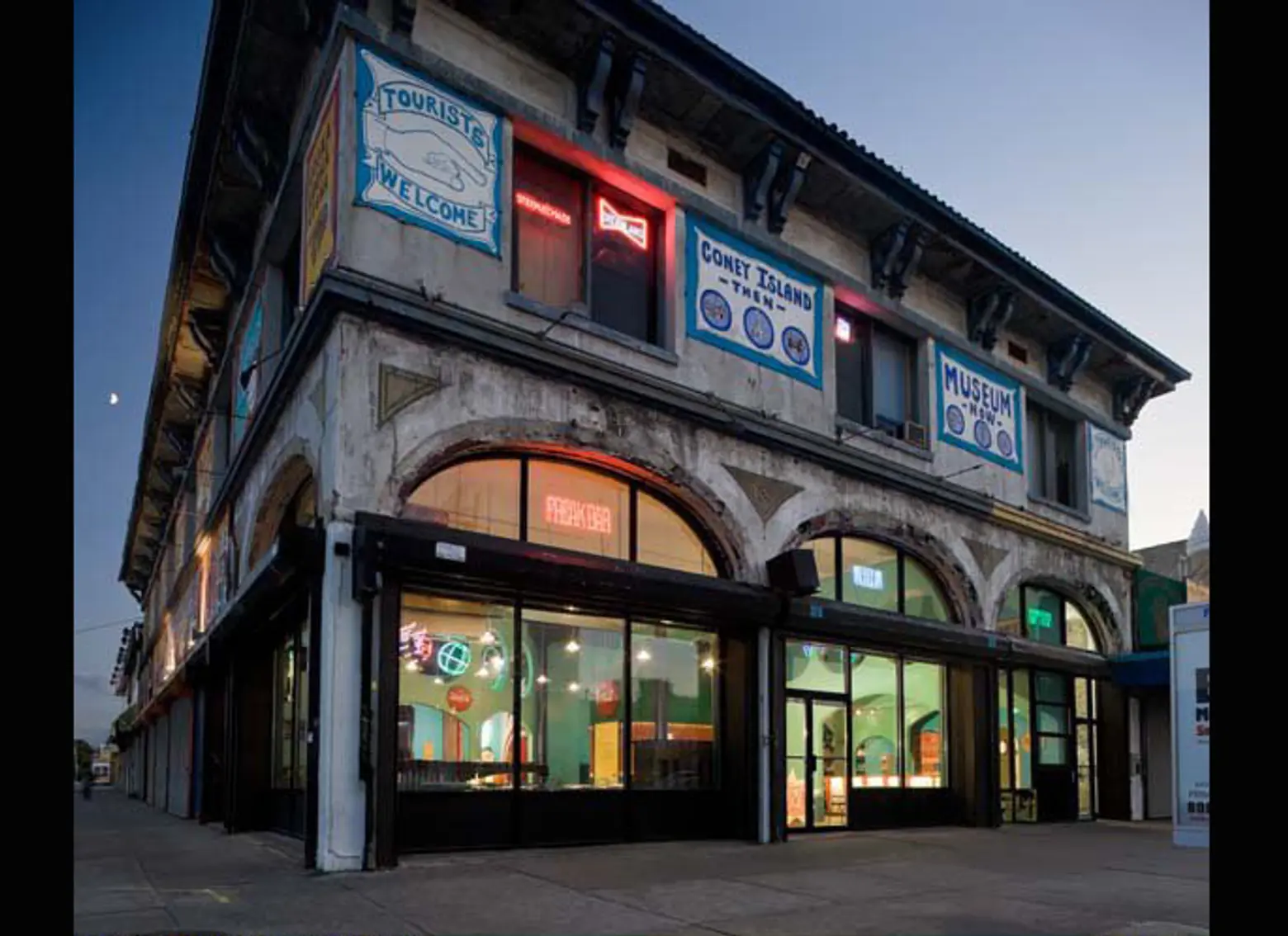 Image courtesy of Architect Philip Tusa © Paul Warchol
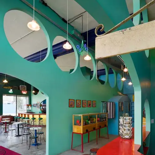
The Coney Island Museum sits in a true landmark of a building on Surf Avenue with a (intentionally?) unwashed exterior and classic architecture. When the interior needed renovation, designer Philip Tusa was brought in to give it a fresh interior design and add a “Freak Bar” for new customers. But the culture of Coney Island asks for “weird” kitsch more than authentic historical style, so the interior would not be designed to match its relatively regal walls and roof.
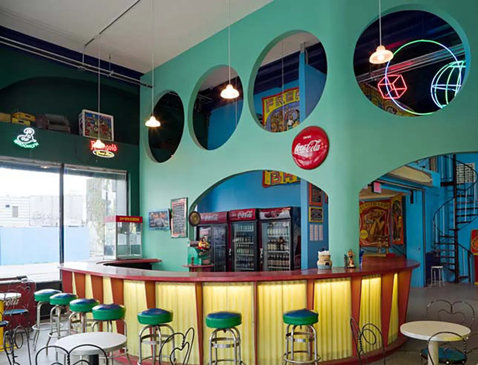 Image courtesy of Architect Philip Tusa © Paul Warchol
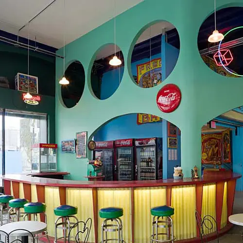
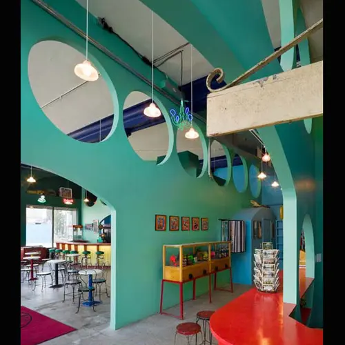
The Coney Island Museum’s creed is “Defending the honor of American popular culture.” This “Freak Bar” suggests part of their strategy for fitting in with the culture around them. Among so many varieties of truly dated designs, it is difficult to make something both retro and new, and the correct level of low-brow for its setting.
 Image courtesy of Architect Philip Tusa © Paul Warchol
The bar’s neon and metal conjure up the image of a ’50s-style diner, with a beach-y color scheme that matches the Wonder Wheel.
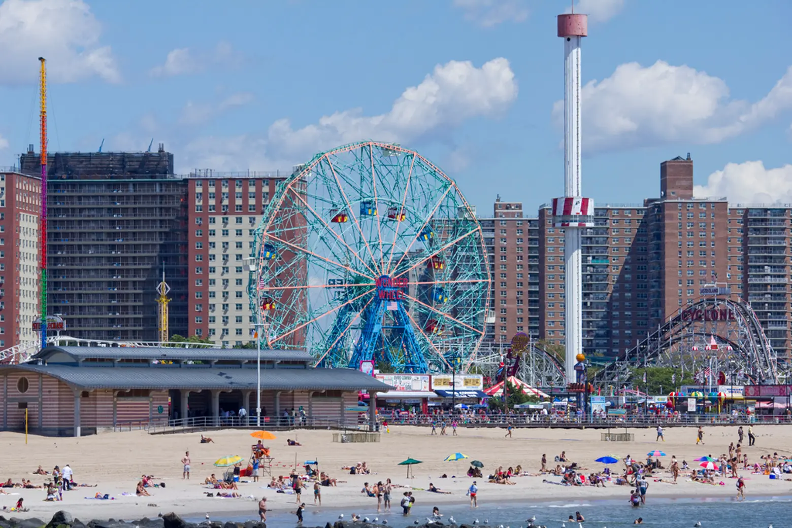 Image © Daniel Fleming
As a recreation center, Coney Island will continue to have a role in New York, but hopefully it will continue to develop its offbeat, retro style to contribute to its culture as well. New York City is more than big enough for a few extra styles, and even a center for kitsch. With renovations and new developments like the Freak Bar at the Coney Island Museum, that look can continue to build and flourish.
Bonus: Coney Island: A Documentary with Al Lewis:
