Renovation Diary: A Clinton Hill townhouse makes room for layers of history and modernist design
Our Renovation Diary has been following 6sqft writer Michelle Cohen as she takes on the challenge of transforming a Brooklyn townhouse in the historic Clinton Hill neighborhood into a site-sensitive modern home. She previously shared plans for the 150-year-old building and the first big steps she and her husband, a public health lawyer and antique lighting dealer, have taken to make their dream home a reality, including two years of hunting, planning the renovation, and assembling the professionals needed to make it happen (and how the homeowners made the best of all the waiting time). With Landmarks’ signoff and permits in hand, a year-long renovation began. Below, the results, with plenty of hindsight, advice, resources and construction photos on the way.
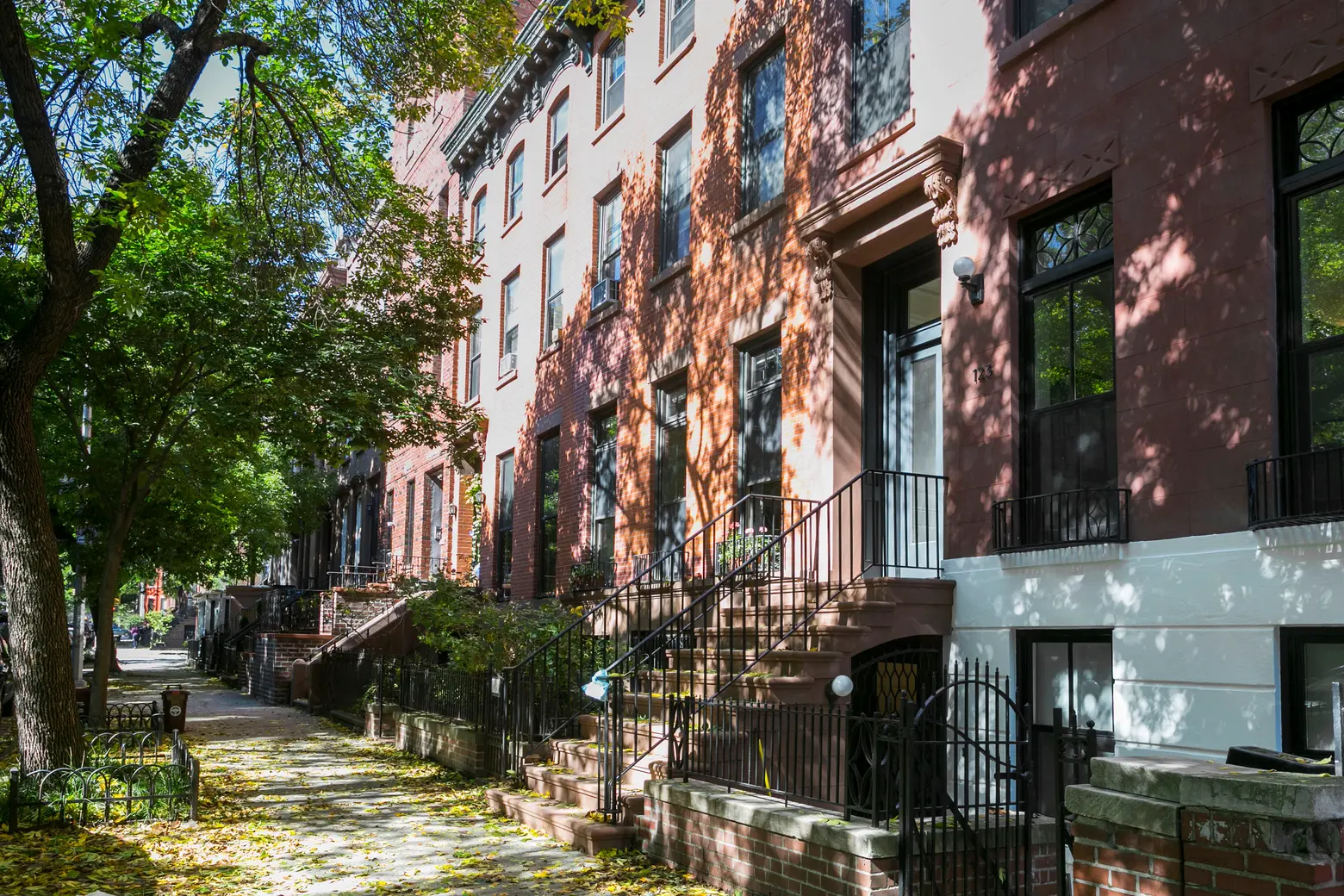
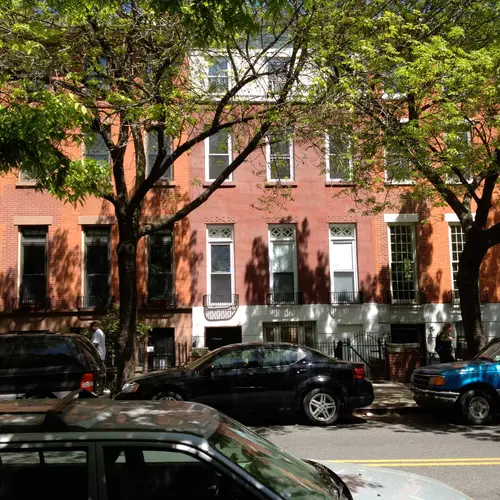
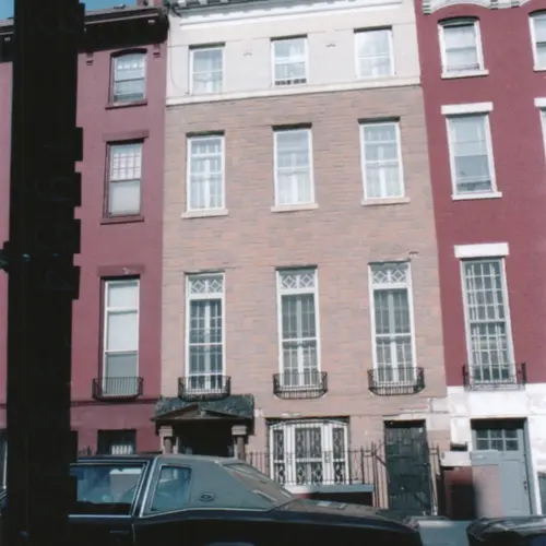
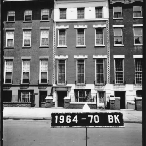
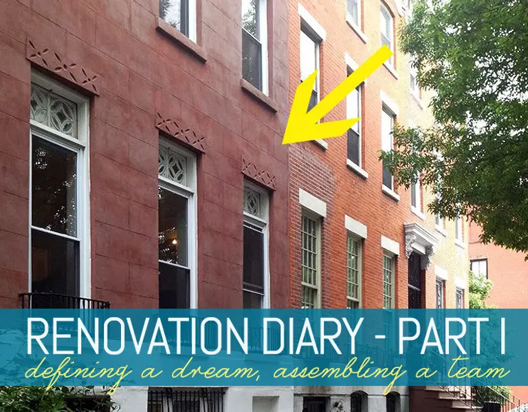
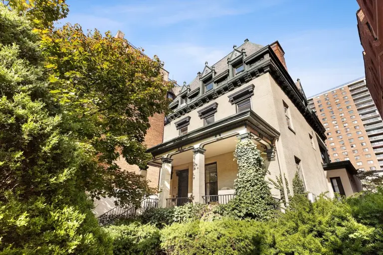
Our two-family Italianate row house in the Clinton Hill Historic District was built in the mid-1860s; a major renovation was done sometime around the 1920s-’30s which resulted in the original interior staircase being replaced by a grand central stair and hall. Somewhere along the way, the stoop was removed. The house also received various upgrades in the ensuing years, making it possible for us to spend time living in the house while pondering the daunting task of renovation. Designing three kitchens and four bathrooms was both an exciting and terrifying task to look forward to. With the help of Urban Pioneering Architecture and Alex Scott Porter for kitchen design, we got down to serious business.
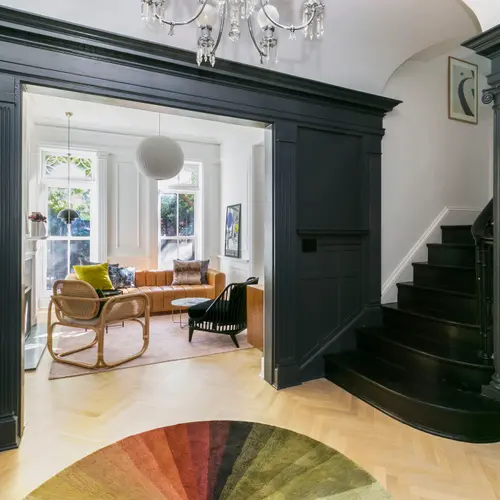
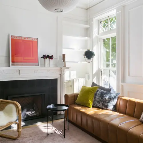
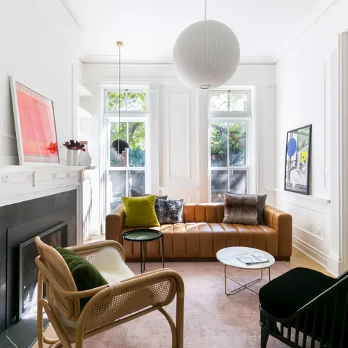
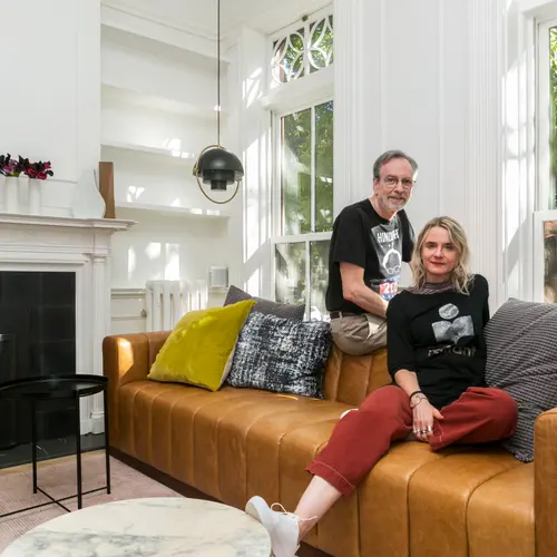
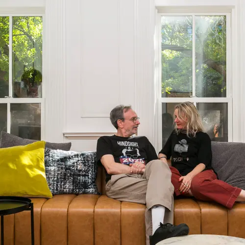
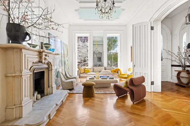
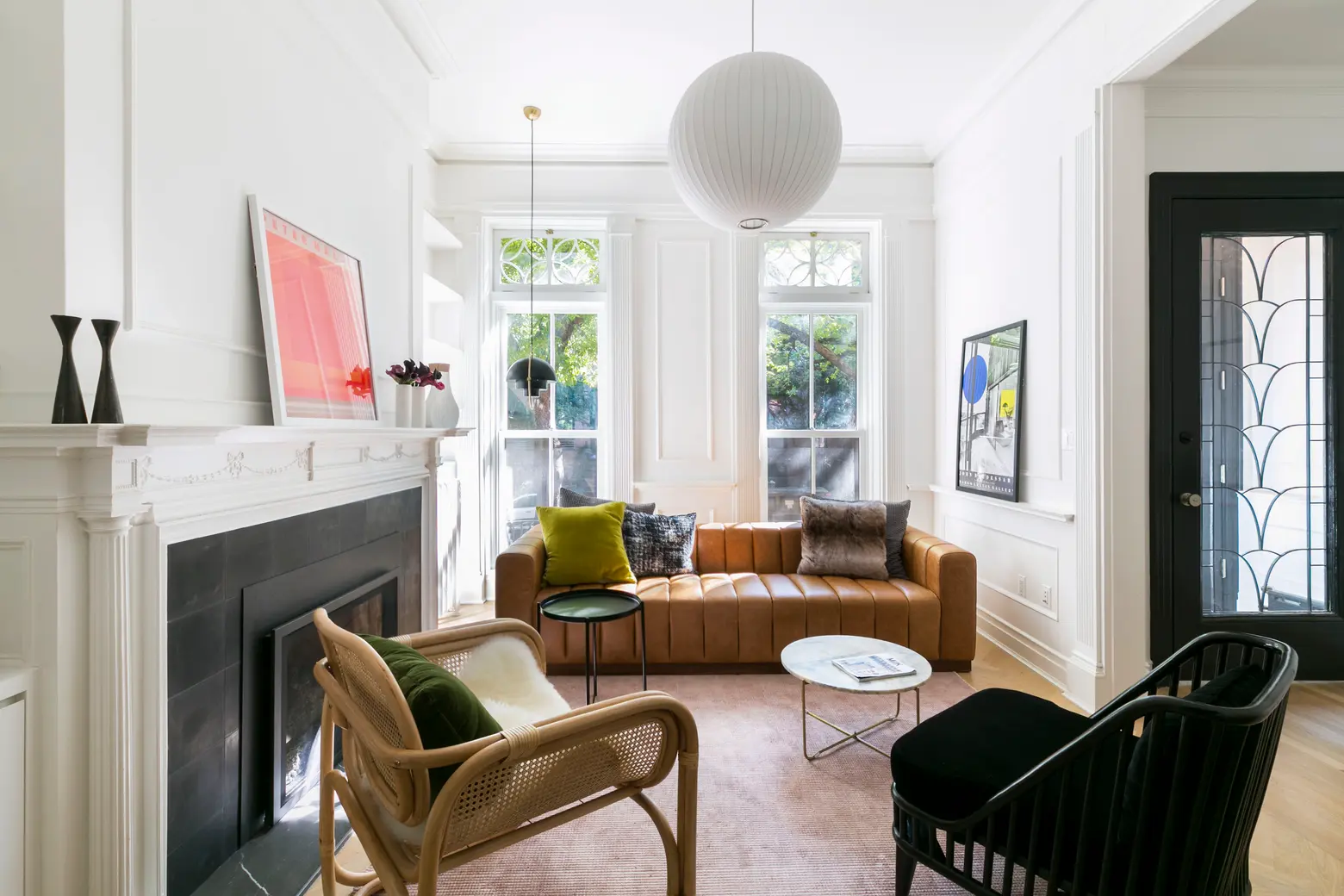
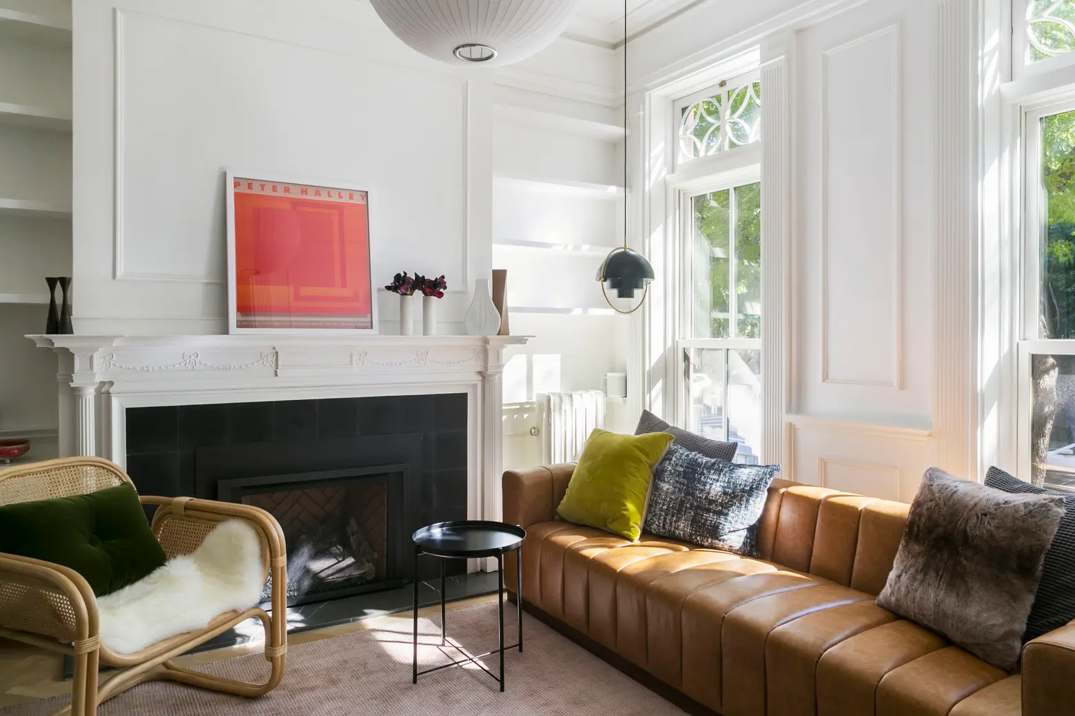
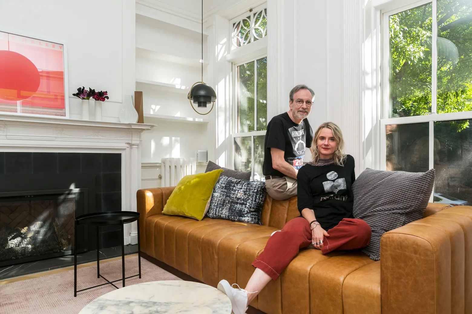 The sofa is from CB2. The corner pendant light is the Gubi Multi-Lite Pendant designed by Louis Weisdorf.
As described in the first installments of this multi-year saga, we totally fell in love with the house and we wanted to make it into the kind of home we felt it deserved to be. But also, speaking as a longtime design junkie and, for both of us, as people who like new projects, we really saw it as a design project. I think that made the actual process easier. We have both been project managers in our professional lives, and I can put on my producer hat so it doesn’t get too personal. But I also allowed myself to be the “crazy client,” which you can’t do when you’re the manager.
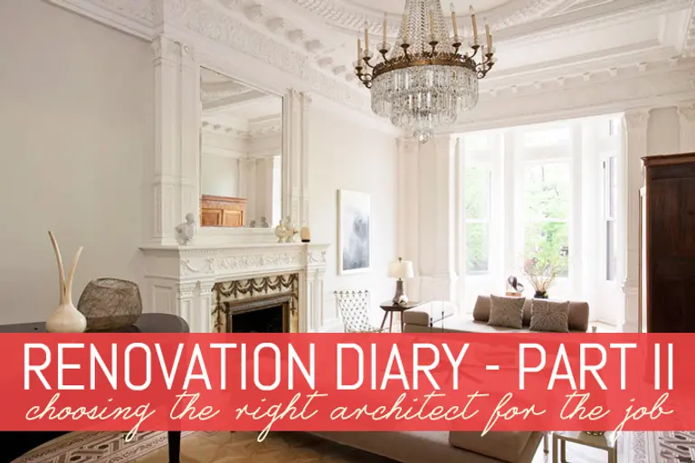
The house has retained many lovely details like molding and wainscoting, columns and arches, 11-foot ceilings, and plaster walls. We weren’t planning a gut renovation, but there was an awful lot of work to be done on practically every inch. And it was important that everything didn’t just look good but that it be conducive to daily use and enjoyment for a wide range of individuals of all ages. Within our major construction goals was a seemingly endless list of design items such as new flooring, paint, and lighting throughout, replication and placement of the home’s moldings and other original details, built-ins, and more.
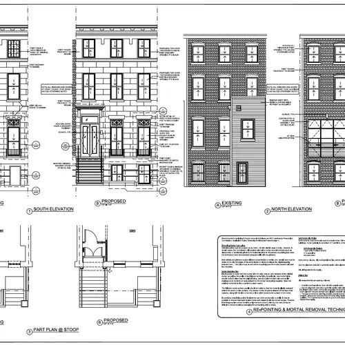
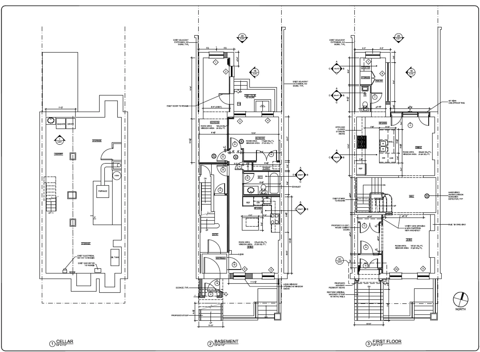
Structural updates included plumbing and electric; adding a ducted zoned split central air conditioning/backup heating system to our steam heat system; replacing all windows and doors; replacing the original stoop and adding a new front entry.
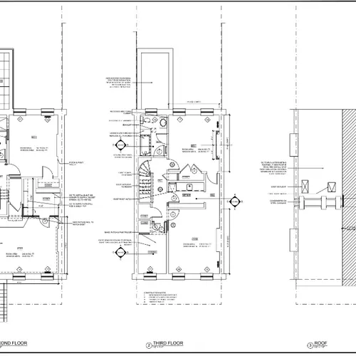
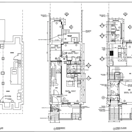
We created a separate rental apartment on the ground floor. This was by far the biggest task from an architectural standpoint–mostly a gut job. The home’s center stair, while grand, adds challenges beyond the average Victorian home layout. The apartment also has access to the backyard and the cellar (we share storage and laundry).
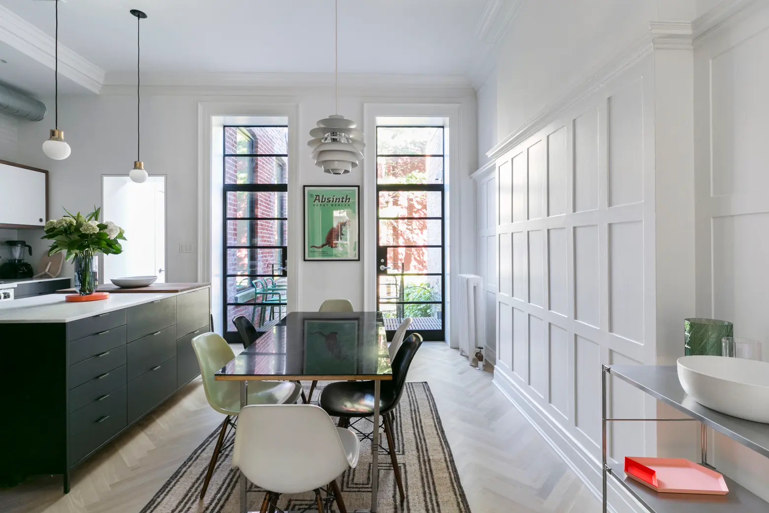
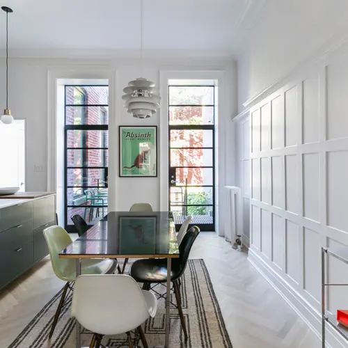
On the parlor floor, we installed a new kitchen in the rear with a pair of massive steel doors to give the north-facing space lots of light, and a deck with stairs to the yard off the adjacent dining area. Custom steel doors are by A & S. The rug is from CB2 and the corner shelving is from Muji. Tray and vases from Hay.
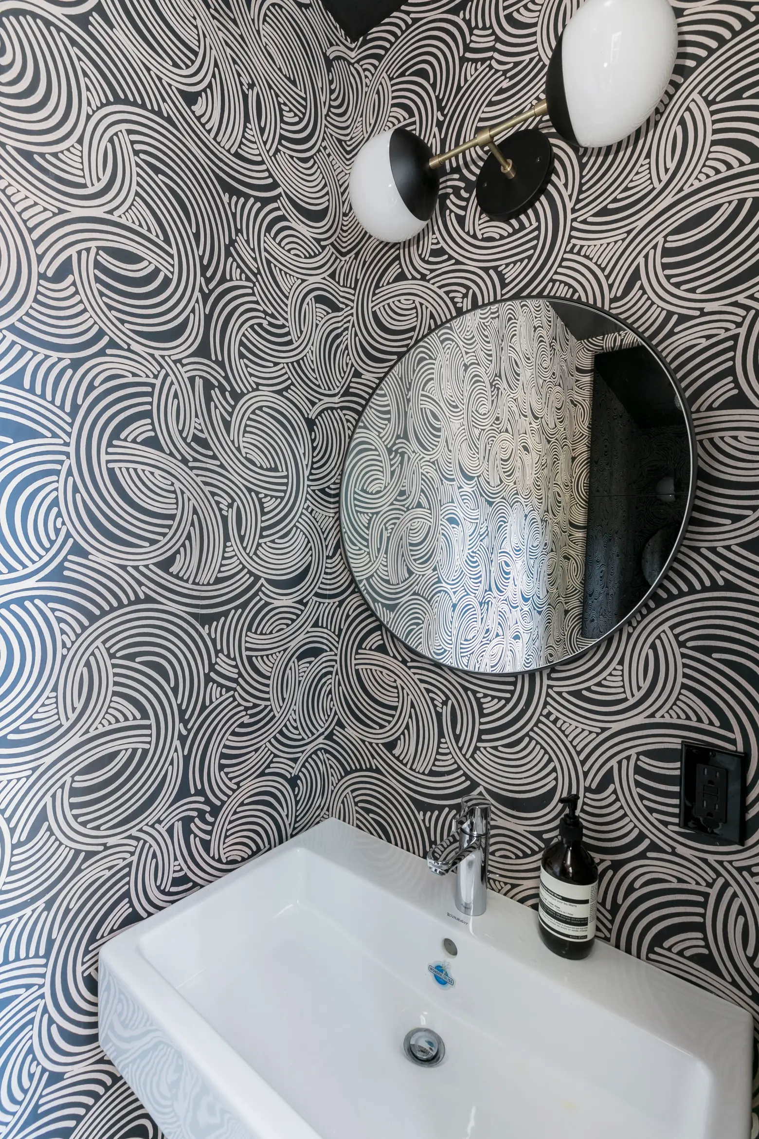
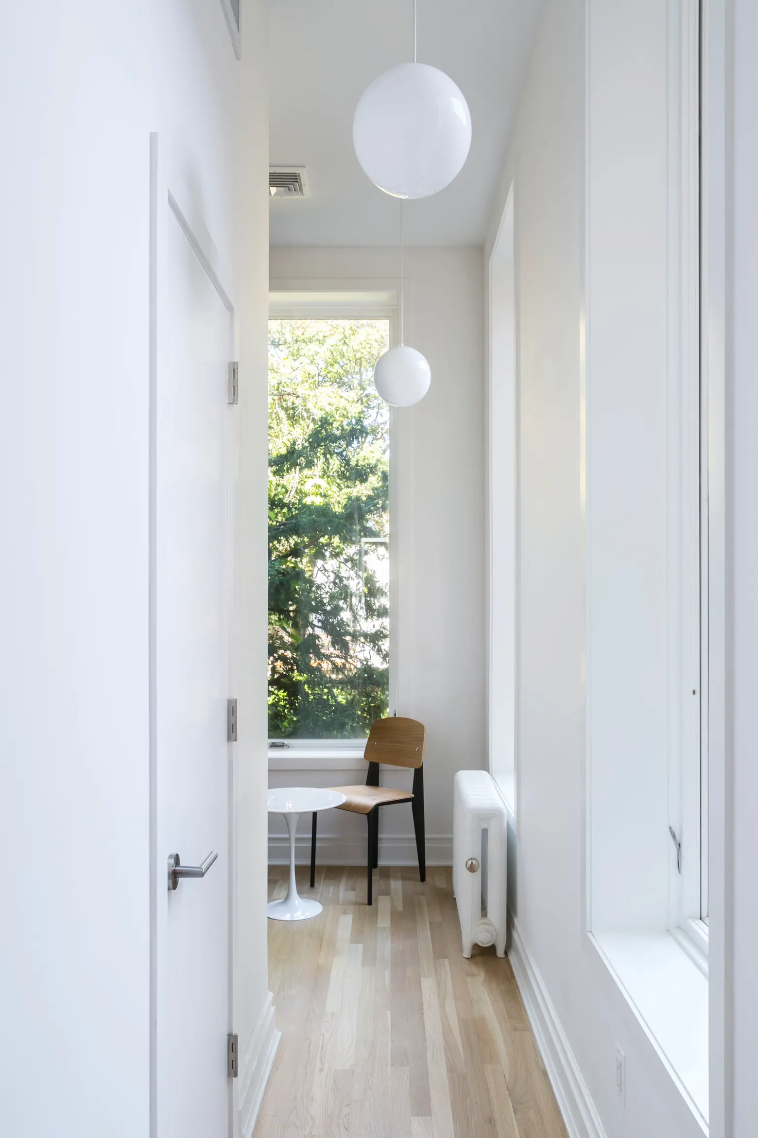
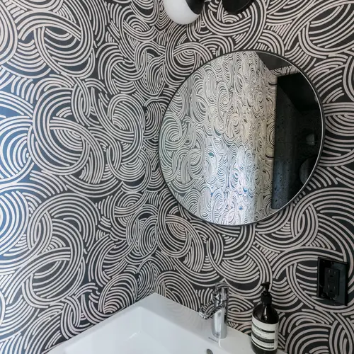
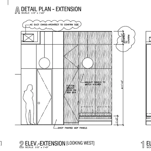
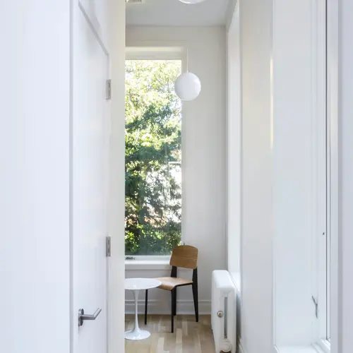
Off the kitchen, a powder room, a closet, and a breakfast nook-slash-“modernist igloo” were created in the long, narrow rear extension, lined with floor-to-ceiling single-pane casement windows. The wallpaper is the Tourbillon pattern by Farrow & Ball. The mirror is from CB2. The basin is Duravit with a tap by Grohe. The sconce is by Cedar & Moss. The pendant lights are by Schoolhouse Electric.
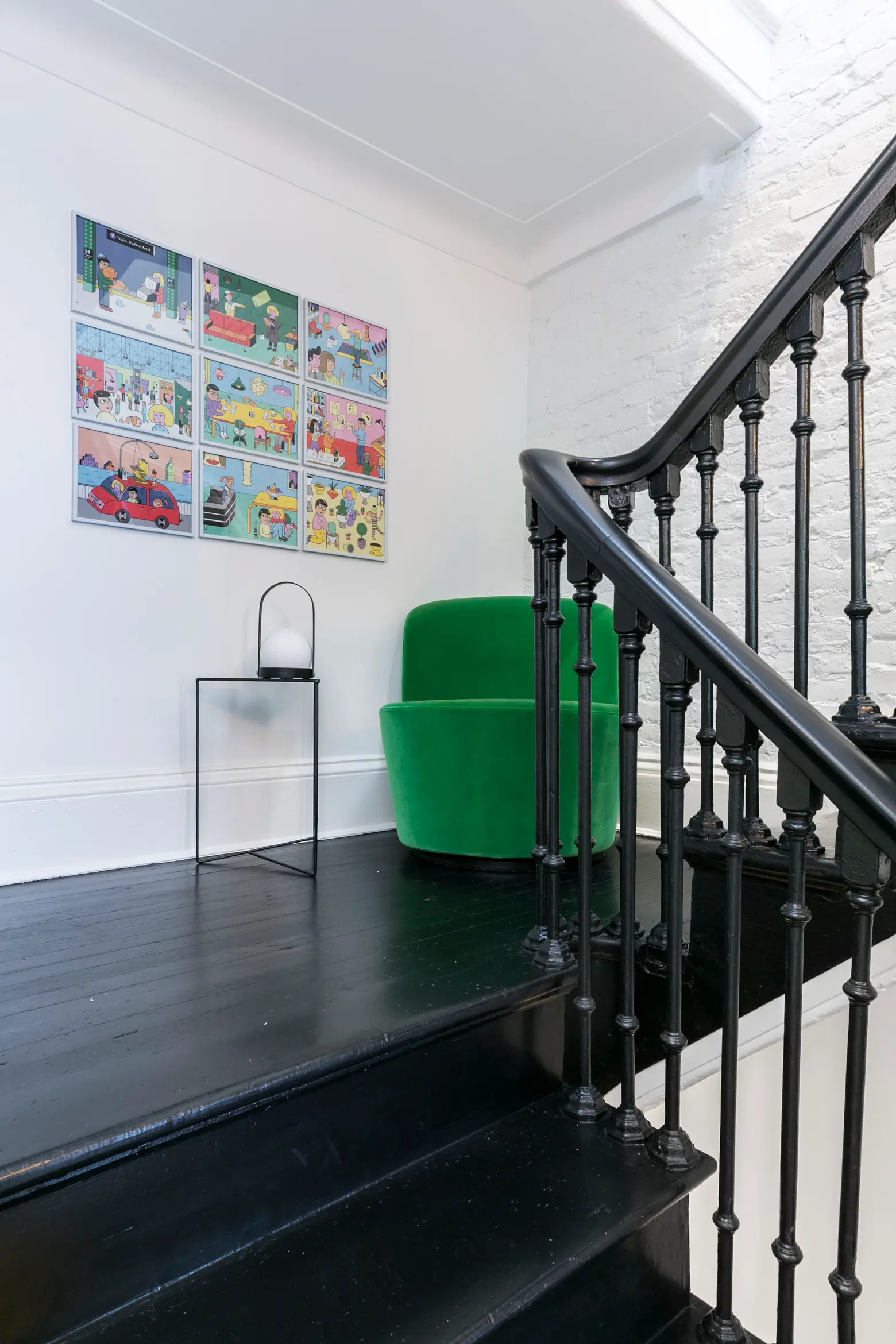
The table light is the Carrie LED light by Menu.
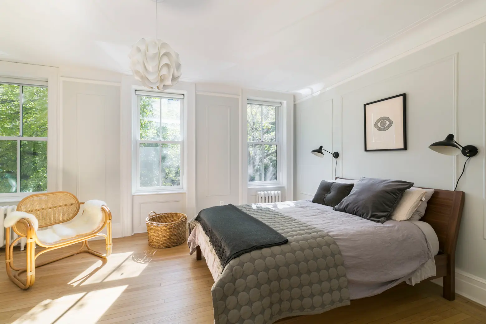
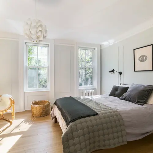
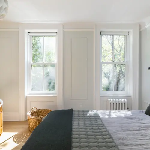
Walls are painted in Benjamin Moore’s Alaskan Husky custom mixed at 40%; finding the right color took many, many tries–most paint companies will custom mix anything for you. In the bedroom, the wall sconces are DCW Mantis; the print is by Jennifer Ament; the chair is from Urban Outfitters; and the quilt and pillow from Hay.
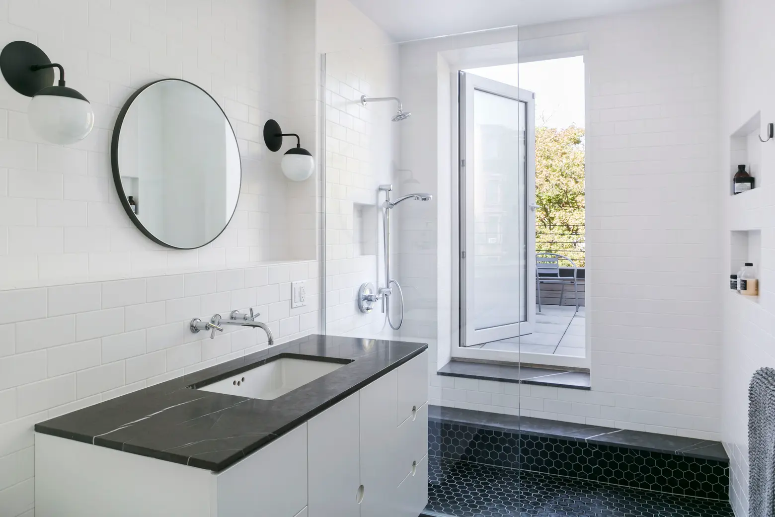
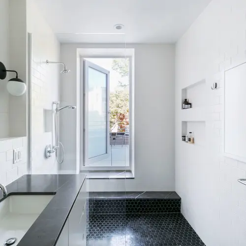
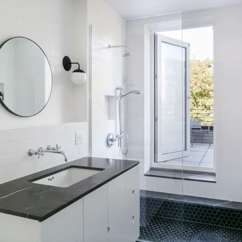
The bathroom vanity was made by our contractor; vanity top and steps are Antique Grey marble from ABC Stone. Basin and tap are Kohler; sconces are Cedar & Moss.
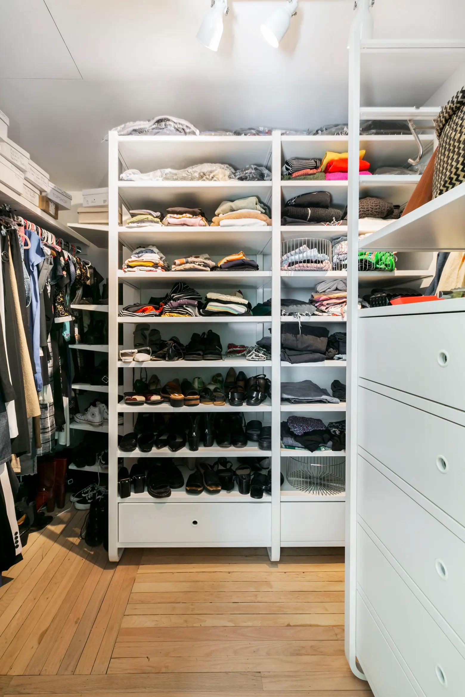
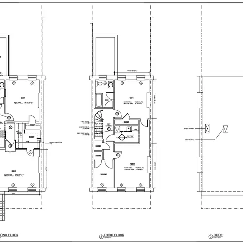
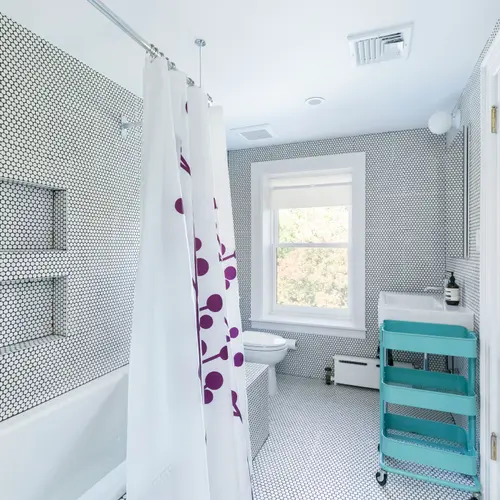
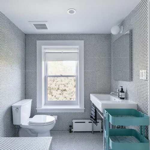
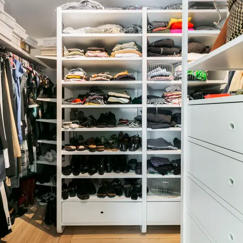
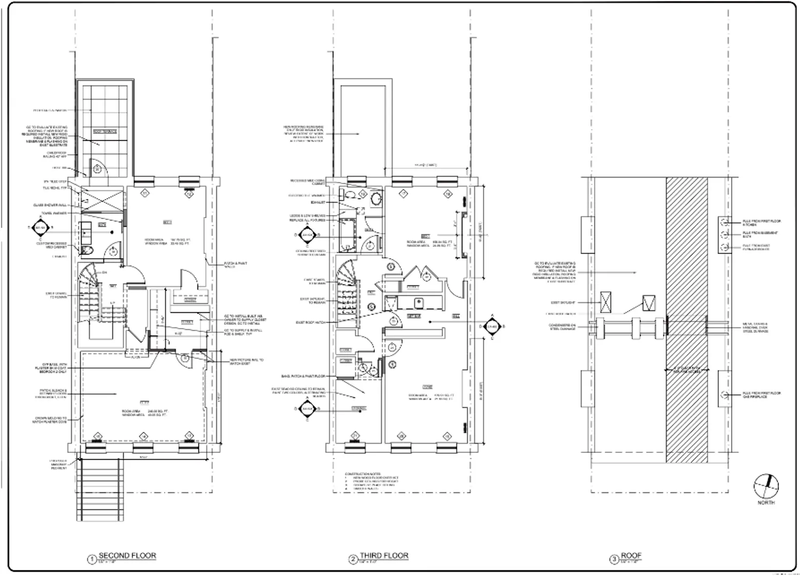
One flight up, the major structural change was expanding the closet in the master bedroom. The master bath got a complete overhaul and a private little upper deck atop the aforementioned two-story rear extension.
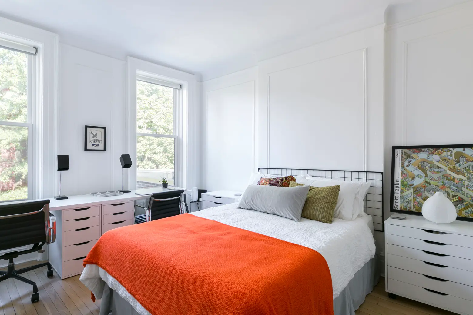
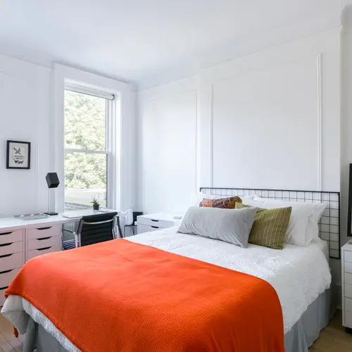
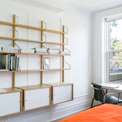
The Eames Aluminum Group chairs are vintage from eBay. The desk lights are also vintage. The drawers are IKEA’s ALEX series, and the drawing at right is by Scott Teplin.
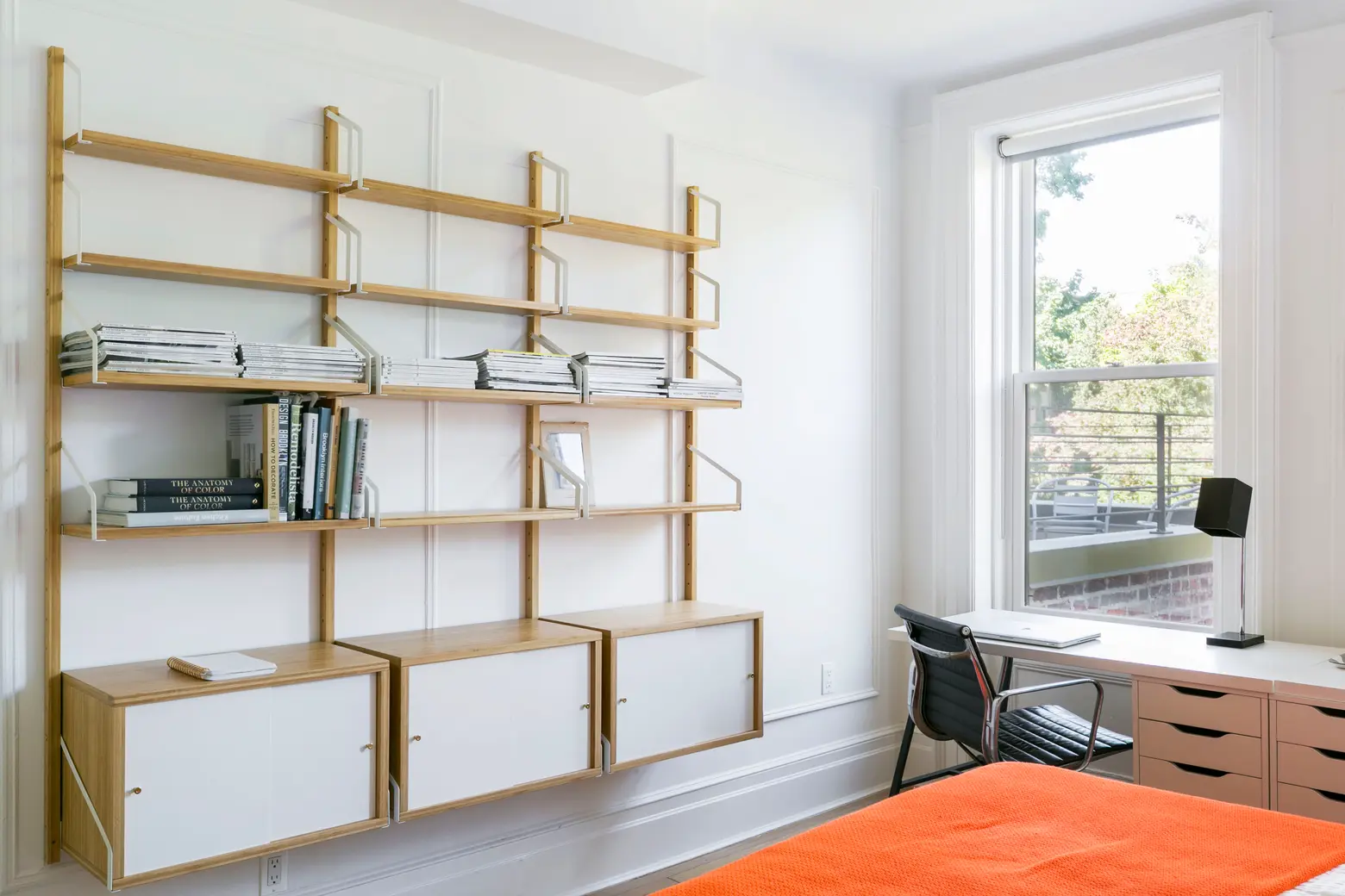
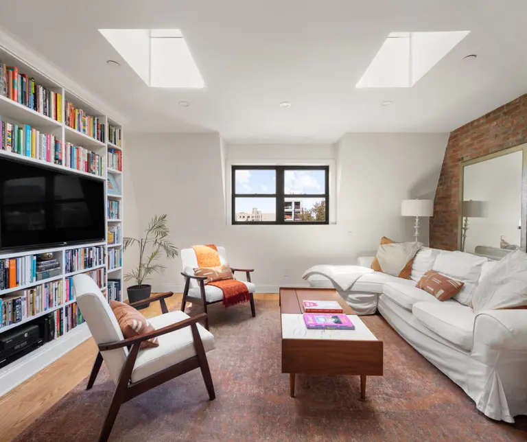
The second bedroom is also our office/library (many books have arrived since this photo was taken). I work mostly from home so the fact that the room is spacious, quiet, and sunny make it perfect. It’s also our main guest room, and we wanted an actual decent bed rather than a convertible day bed, which can be dangerous for an office but so far it works. The office shelving is the amazing IKEA SVALNAS series.
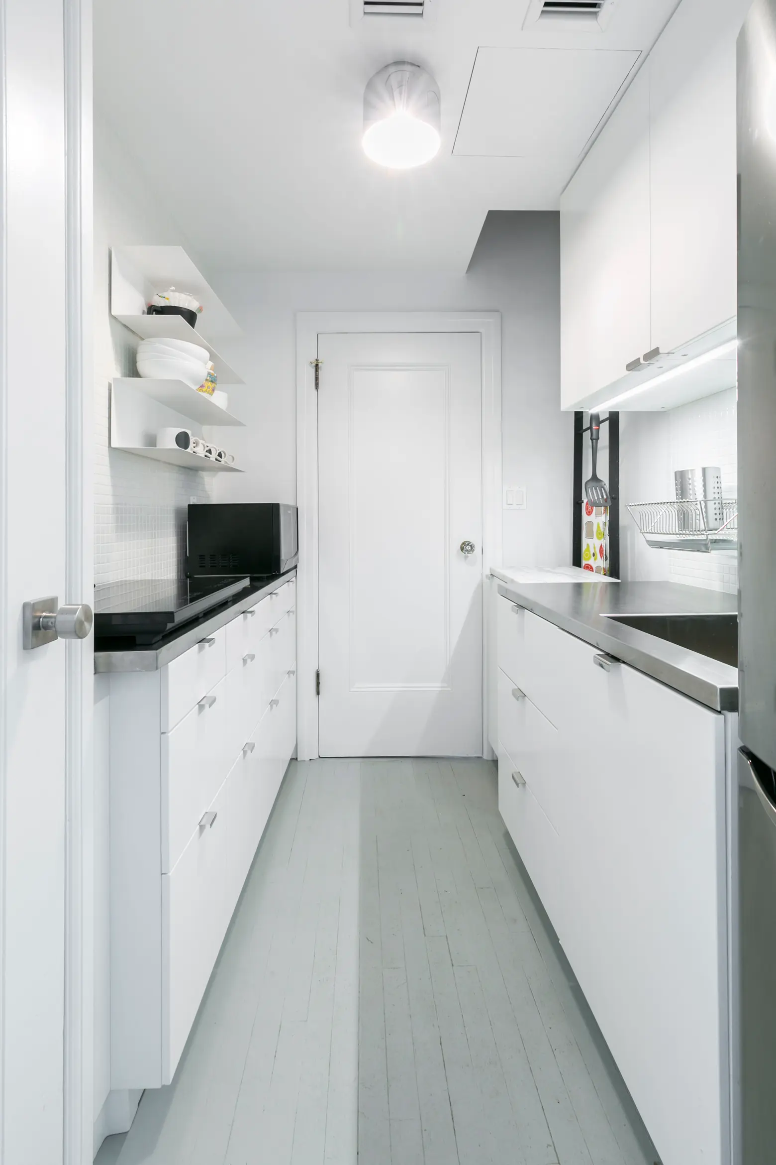
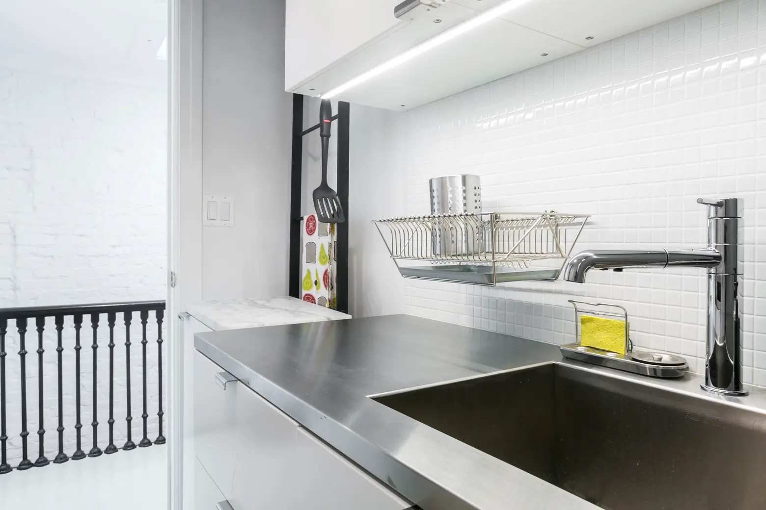
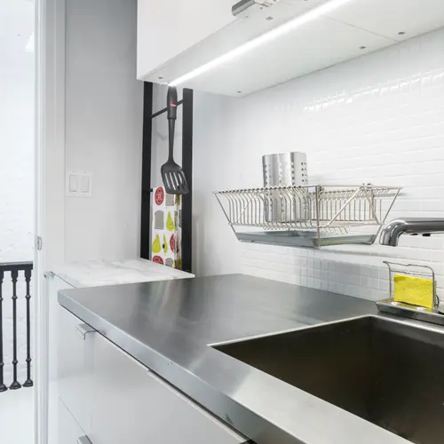
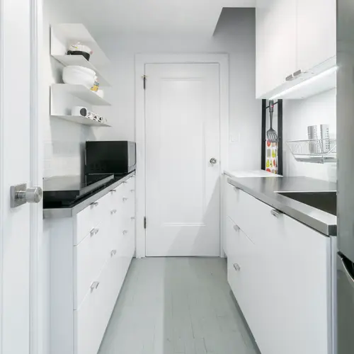
We had a custom stainless steel countertop and integrated sink made by our contractor in the kitchenette. I wanted a chance to use a stainless countertop, and I’m loving how indestructible and actually warm-feeling it is.
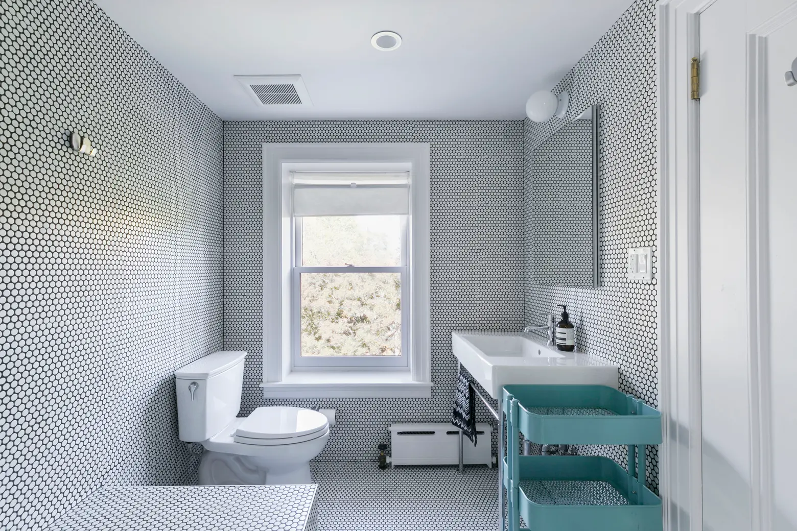
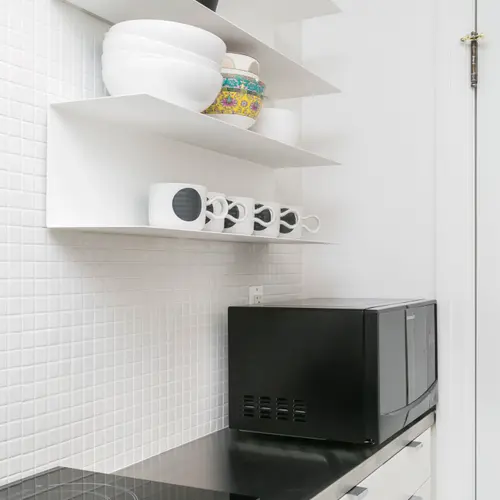
On the top floor, we created a suite within the triplex with a little kitchenette as a “nanny suite,” or guest suite for friends and family who might be staying a while (no, we’re not planning to Airbnb it). The space had originally been a second kitchen, so the plumbing was already in place. There’s also a stacked washer/dryer up here tucked into the kitchenette. I liked the challenge of making a tiny, multi-use room in such a small space. And a full bath, of course.
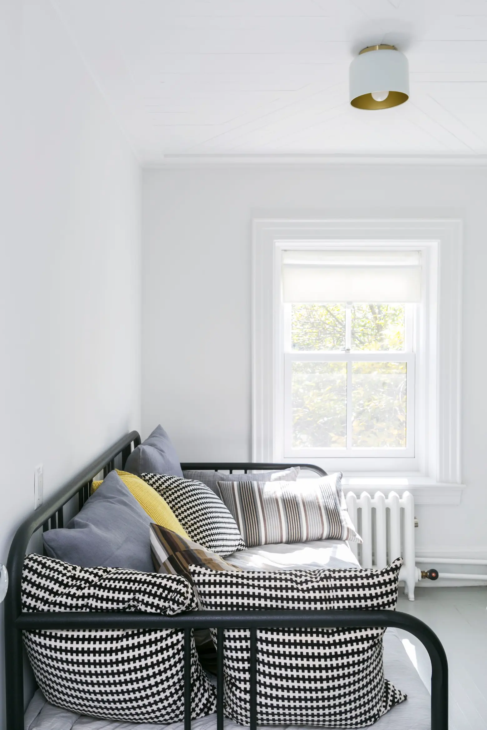
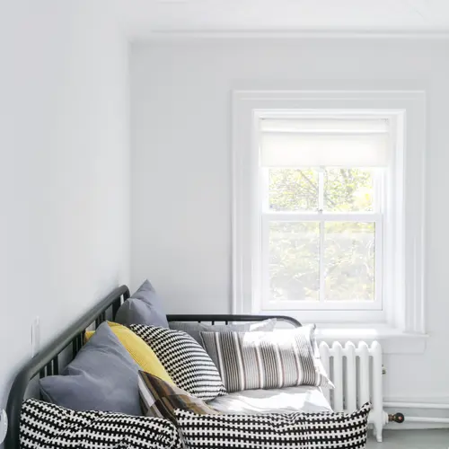
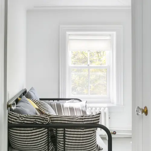
Also up here is the “Swiss Army knife” room: An extra office and cozy guest room for kids of guests. The bell light is by CB2 and the day bed is from IKEA.
Below, I share some larger thoughts on the renovation in an interview with 6sqft…
Renovation has a rep for being really stressful; what can you say about stress and keeping your sanity?
You have to be insane to do something like this. Ok, not really! But it definitely earns its reputation for being stressful if you let it. A project like this is actually great for people who tend toward ADD: Every day is a deus ex machina in a way. What kept us sane is the ability to keep it in perspective. The project was something that we were lucky to have the opportunity to experience; it’s not that issues that arose weren’t real, but they were renovation issues.
When stuff goes nuts or setbacks happen, it’s important to remember they’re things that involve a particular self-contained project and are relative to the rest of life. We actually didn’t even fight too much about house things. We’re a pretty good team. I’d step back and say, “this cannot be you vs. me, that’s completely counterproductive. We have to be united on this.”
You always hear about renovations taking years from when they’re first started; what’s the reason?
The time it took us to renovate this house is, I’m guessing, right in the middle for a project of this size. It took nearly a year and a half to finish up the regulatory phase of our project and get a team in place for demo and construction. Then from the beginning of construction, all told, the project took about one year.
The house is a landmarked building in the Clinton Hill Historic District, so plans and drawings for all of the above had to be submitted to the Landmarks Preservation Commission. Altering anything on the exterior was subject to their approval. The DOB is yet another regulatory body that requires the serious focus of an architect and often an engineer/expediter to tick off the boxes as far as building regulations are concerned. Even the Department of Transportation weighed in. Fortunately, we were able to live in and rent out lots of rooms during that time, an adventure in itself.
How would you describe the design vision you had for the house?
There was a massive renovation in the 1920s or ’30s, so actually, it’s hard to tell what’s “original” to the 1870s building. That’s part of what we love about it. As far as my own design and architectural style, I’m a complete modernist in theory. I think the idea of modern, clean, comfortable/casual interiors in an old house is really just beginning to catch on in most of America. In much of Europe, for example, where there are lots of much older homes, it’s common to create a space with a lot of modern design influence within homes much older than this one–with thick plaster walls, high ceilings, casement windows, parquet floors, and other beautiful details. The incredibly solid bones really do lend themselves to modern design. That’s definitely where my vision was. I’d been taking notes and collecting ideas as an interest and hobby for what seems like forever.
You really do have to have a vision in place for what you want. It’s great if you can find an architect or designer who is totally on your wavelength who can feed you good ideas, and who really takes the wheel as far as the execution of the project, but those “rock stars” tend to be very expensive and the process will still be time-consuming with lots of smaller decisions to be made by the homeowner. Bottom line: You really have to do your research, learn what you like, spend an enormous amount of time and effort sourcing the work and items you are looking for, ask tons of questions of strangers and do it over and over and over again.
Then there’s the whole question of getting the actual construction to fit the design and quality you have in mind and in the plans that have been drawn up. Again, research is key.
How do you feel about the many design trends out there?
I don’t have strong feelings about trends; I actually love them in general as someone who can recognize them for what they are and trace their elements and influences. I neither avoid trends on principle nor embrace them blindly. The current love affair with Scandinavian and French style often nails it as far as the look I love, with a little bit of opulent European vintage modern thrown in. And as trendy as some of my favorite pieces are right now, they’re ones I grew up with and have loved–and in some cases collected–for a lifetime. Stanley is an antique lighting dealer/collector and has always known antiques, but he’s learning a whole new language he wasn’t so familiar with before. And I think there is a lot of overlap with our design ideas.
What were the biggest tasks?
The garden (it’s referred to as the “basement” in official building lingo, though there’s a cellar) apartment was a total gut job, and there was a lot of work done on the rest of the house but most of the original structure was kept, except for adding the main kitchen, doors, deck, and stairs at the rear of the parlor floor. Formerly, the house had one main kitchen that was on the ground floor at the back. There was no way to get to the back yard from the parlor floor.
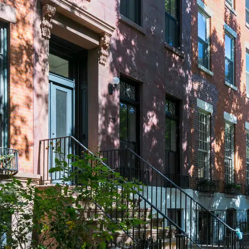
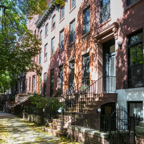
We re-created a stoop (it had been removed by a previous owner), which required a huge amount of work on the front entry with a lot of original details to be replicated, including lintels that were painstakingly sculpted by hand, and some very big townhouse doors which had to be fabricated and installed.
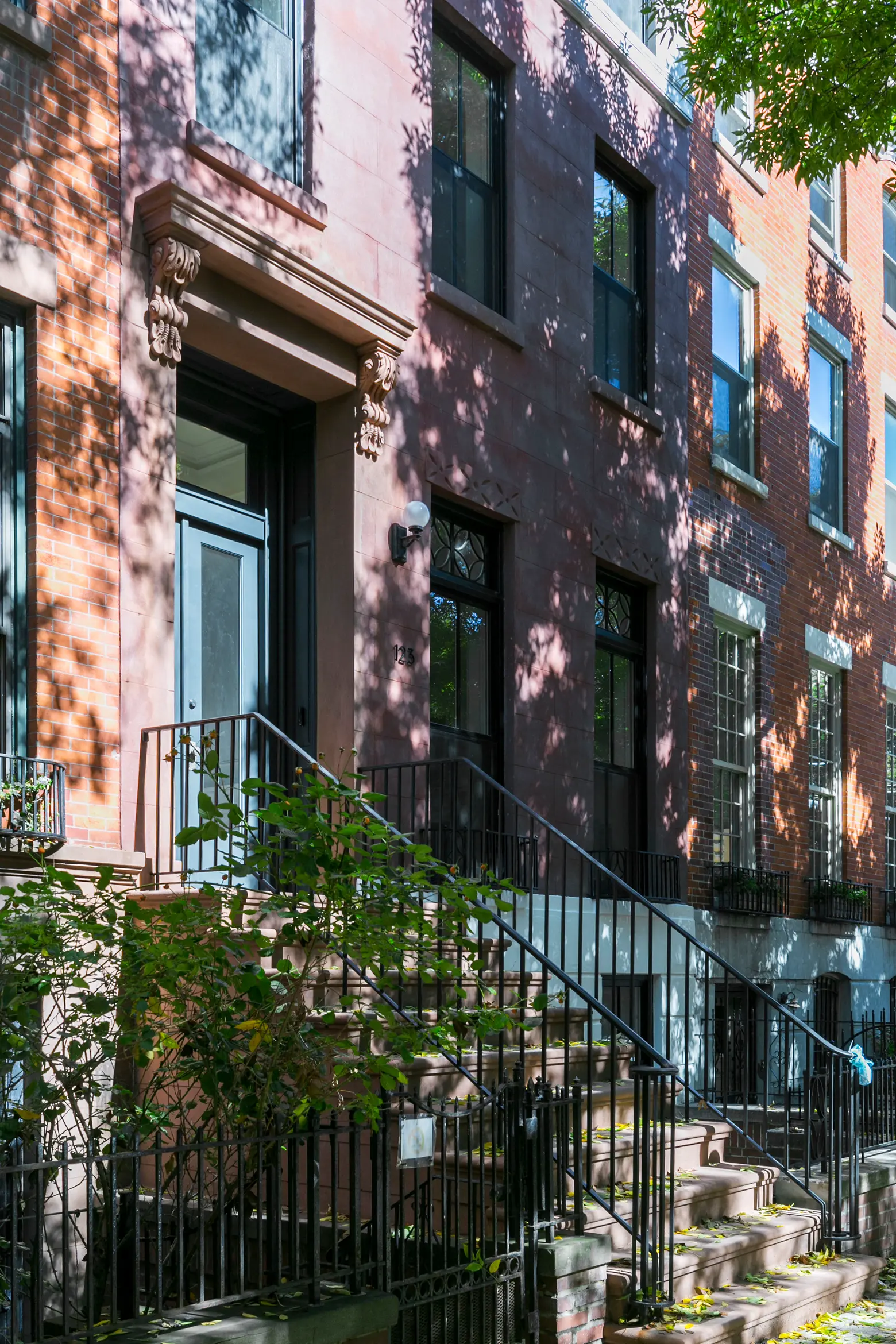
The outdoor lights are vintage from Old Lights On. All windows are Marvin. The door was custom fabricated in Pennsylvania by an acquaintance of Stanley’s after a search turned up some astounding prices on custom townhouse doors in NYC.
What stayed from your original wish list?
The deck, the stoop, the master closet/dressing room, breakfast nook in the extension, massive steel-framed back doors that open out to the deck.
What didn’t?
A huge expanse of glass with two doors at the rear of the house, a brick weave wall on the extension; we added the aforementioned steel-framed doors where the rear windows had been, and floor-to-ceiling casement windows in the extension–which turned out to be a pretty good compromise.
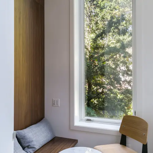
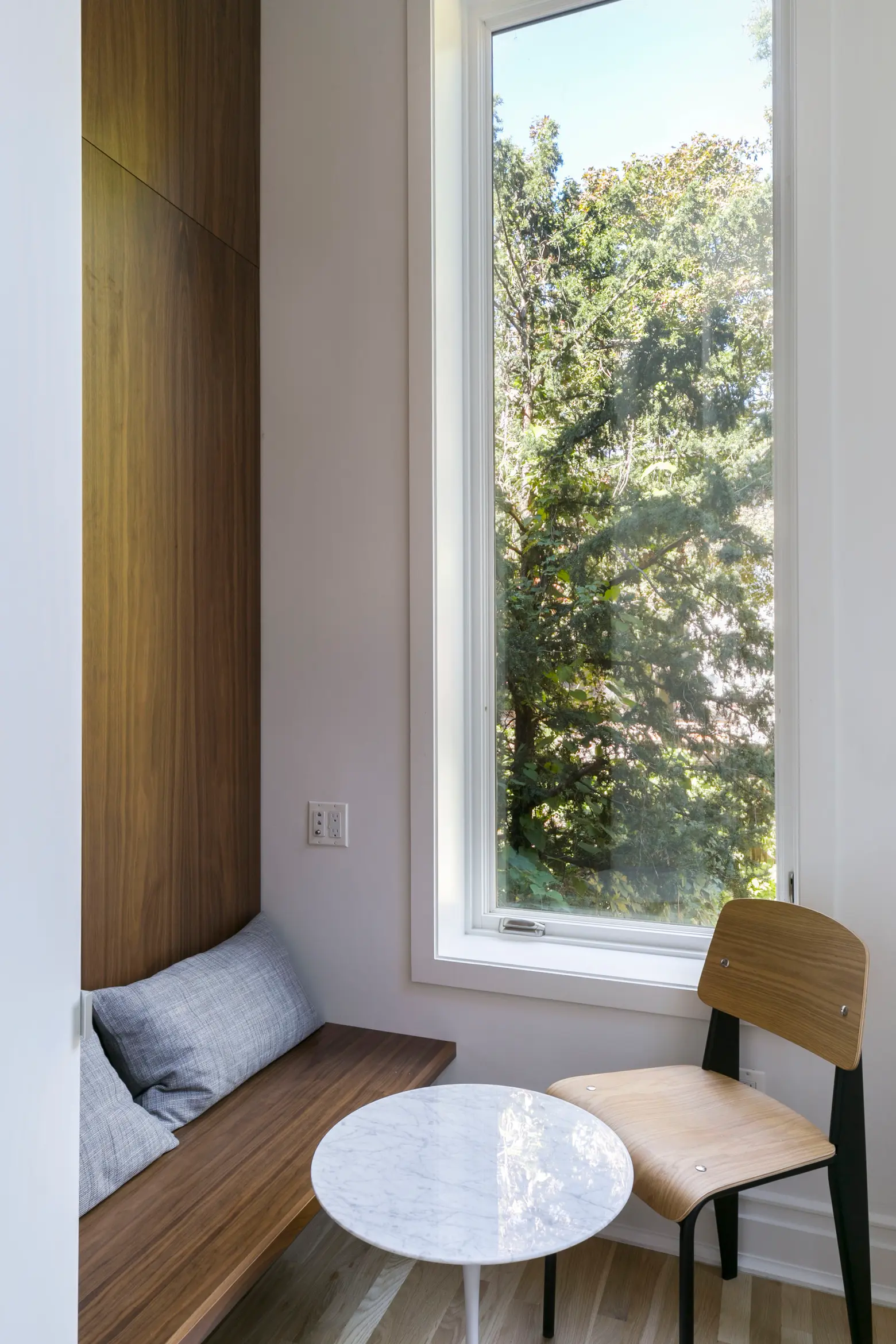 The walnut bench and paneling are custom by Maciek Winiarczyk/MW Construction.
What would you say makes this home different from the standard brownstone?
I think if anything, in addition to our already history-layered “frankenhouse” with its center hall and columns, it’s a nearly obsessive focus on using every inch of space to its highest and best use. In addition to storage niches, nooks, and closets, creating the upstairs nanny suite using the existing kitchenette and layout, for one.
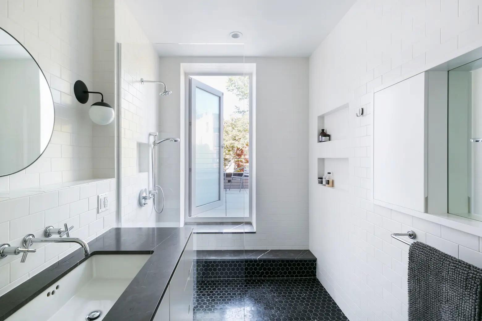
Then there’s the “secret” patio deck off the master bath; it’s the rooftop of the extension below, so the deck part was already there. We just added some concrete decking, railings, and outdoor lighting and gave ourselves a little outdoor space for a morning weather check or a nightcap. It took forever to find a “windoor” that would work in this space, it’s custom by Starr in Brooklyn; it replaces an already-existing window of the same size. The recessed medicine cabinet was made by our contractor.
And my favorite space in the house might be the sunny breakfast nook, a great use of previously rarely-used space (it had held a back stairway going to the ground floor, and a dumbwaiter, which is how the original townhouses like this one were set up, so the servants could send food from the kitchen downstairs up to the formal dining room on the parlor floor.)
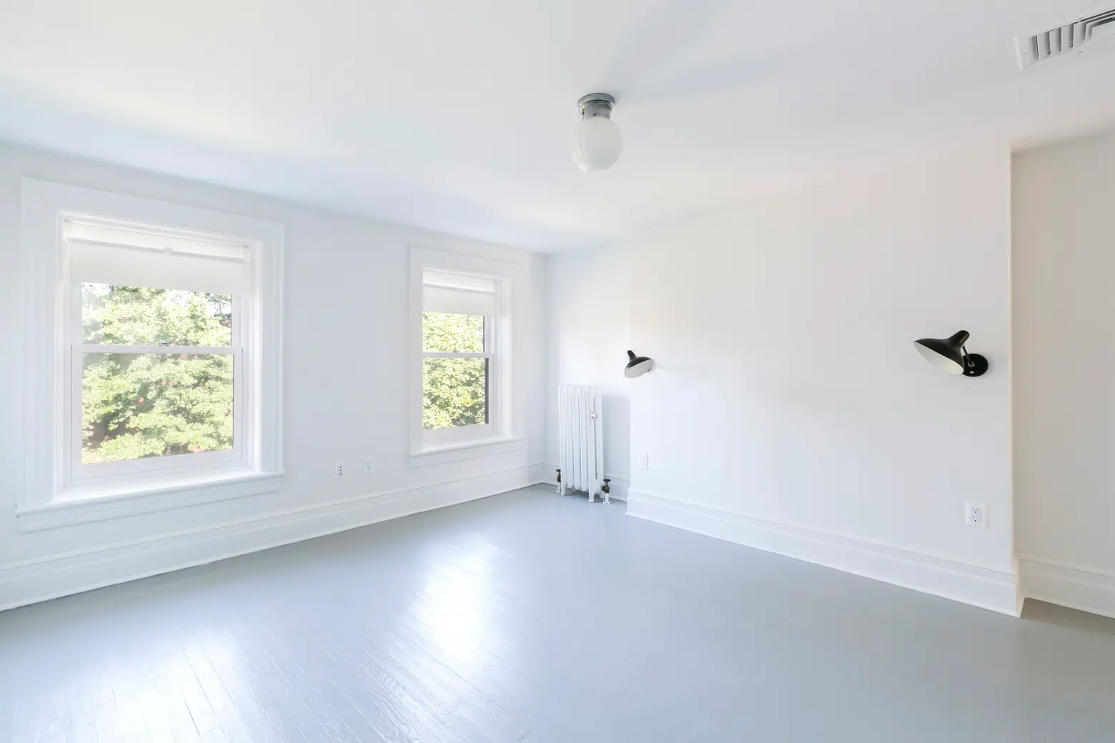 DCW Mantis wall sconces; ceiling fixture is vintage from Old Lights On.
Let’s get into some of the big-impact design decisions.
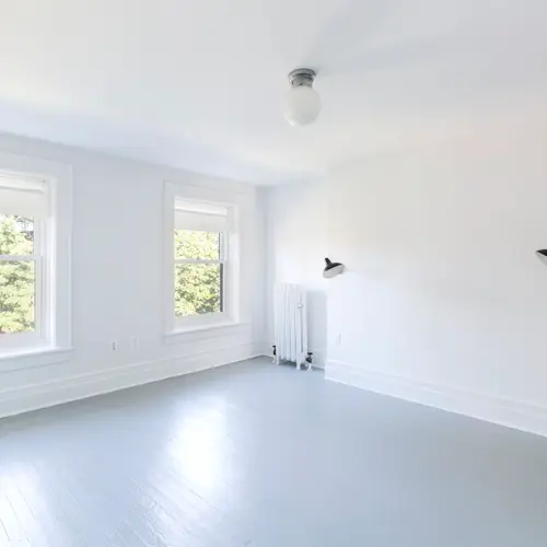
We arrived at a cost-effective flooring strategy after some suggestions by designer Sarah Hill at Urban Pioneering and a ton of research on my part. The apartment and the first (parlor) floor are new white oak, site-finished with a clear matte finish using Bona Traffic HD water based poly, finished in place with a herringbone pattern on the parlor floor. The second floor original boards were treated to give them a bleached look using Bona Nordic Tone and Nordic Seal; the top floor was painted pale grey with Benjamin Moore floor paint in Pewter. Finding the right products and shades for each was really a learning curve and a challenge.
Regarding flooring, Debbie Gartner from The Flooring Girl blog is an amazing resource, her website is an endless trove of accurate information on all things flooring, and she is great at replying to questions and providing advice. I’m also endlessly grateful for the help of NYC-based architect Brent Buck, whose brownstone reno was a huge inspiration. After seeing his renovation diary I reached out to him with some questions about random things like floorboard size and finish, and though he’s super busy doing awesome high-end work, he immediately got back to me with some of the best and most thorough advice I’ve gotten.
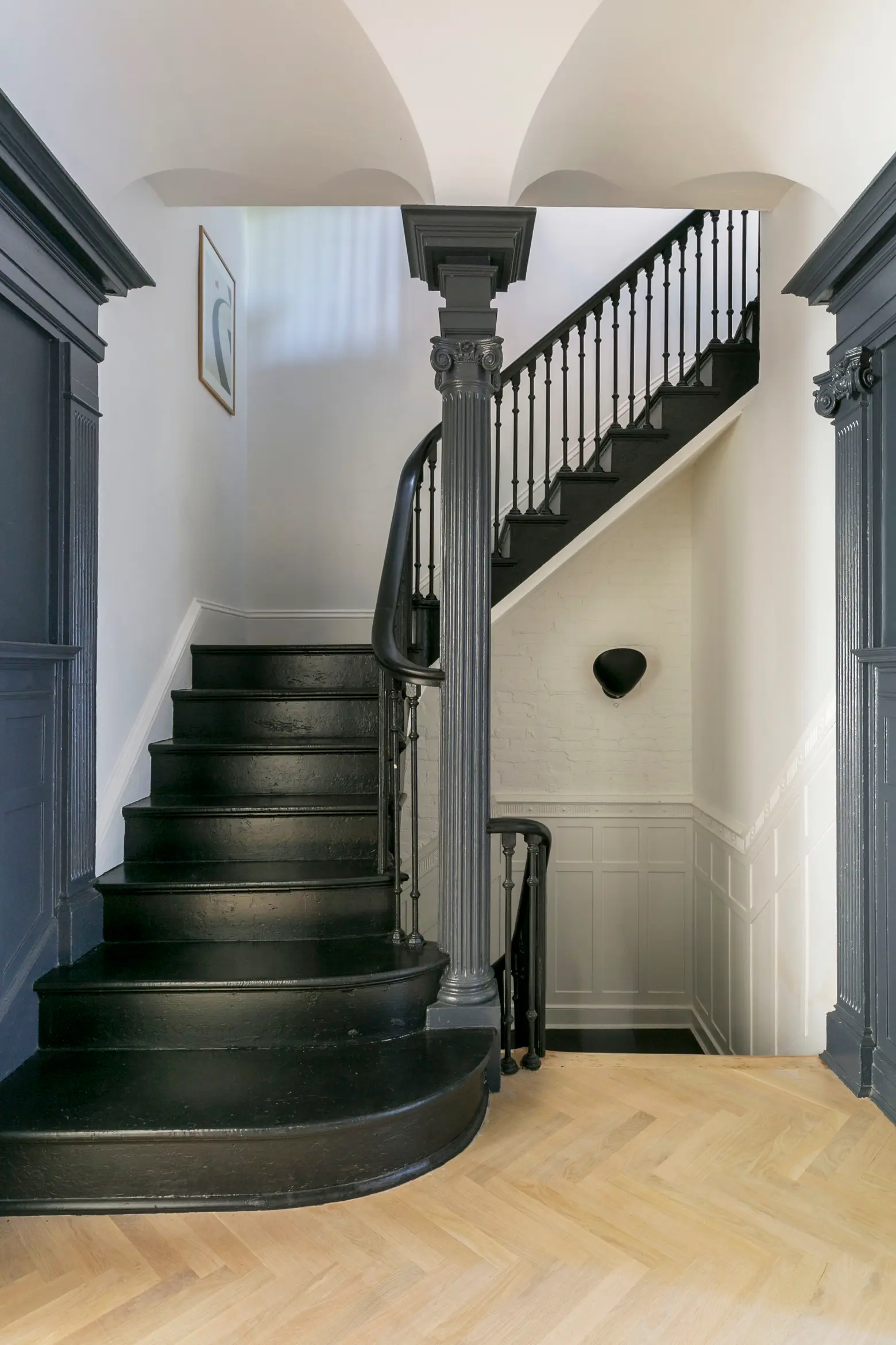
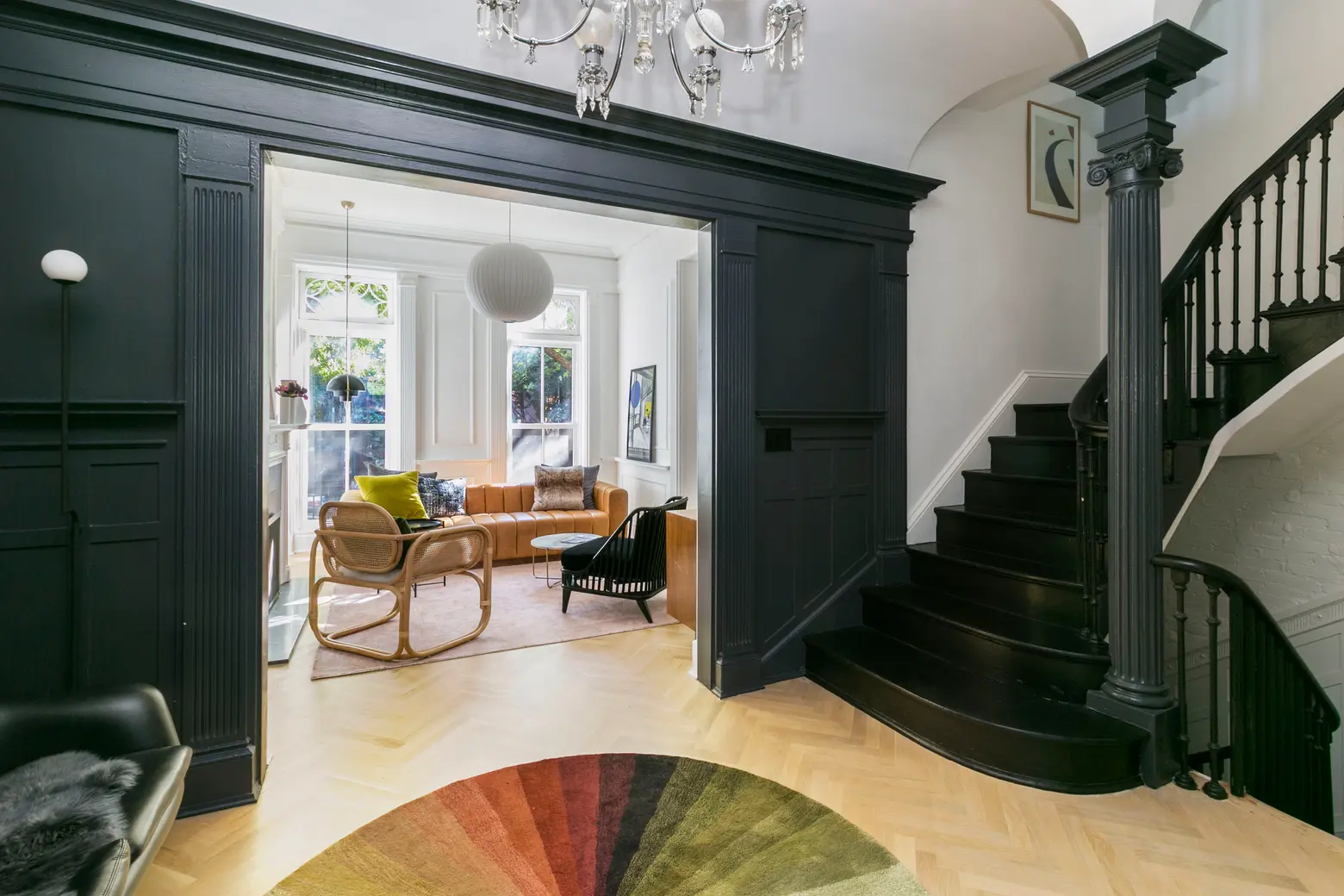
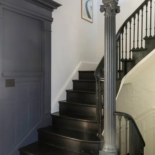
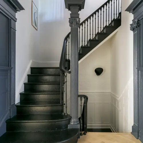
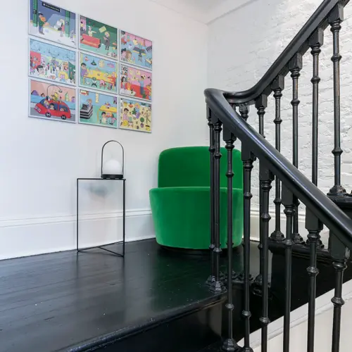
The black loveseat at left is a vintage Overman. The chandelier is an antique from the early 1900s from Stanley’s collection; he had an identical one which sold so quickly we had to hide this one. The stair and railing paint is Pitch Black by Farrow & Ball. The print over the stairs is by Aure Studio; the wall sconce is by Pholc.
Our center hall and center stair are probably the most dramatic thing about the house. The pillars and arches and grand, curving stair landing are from the late ’20s renovation. Overall, I was somewhat restrained with the use of color–most of the rooms are Benjamin Moore’s Chantilly Lace, a white that lots of architects and designers recommend. I love dark walls though, and this room was the perfect place for them. We used Benjamin Moore’s Witching Hour, an amazing blue-black-grey on the whole center hall. The dark walls make the adjoining rooms look huge and really define the room itself as well as adding both drama and a welcoming vibe.
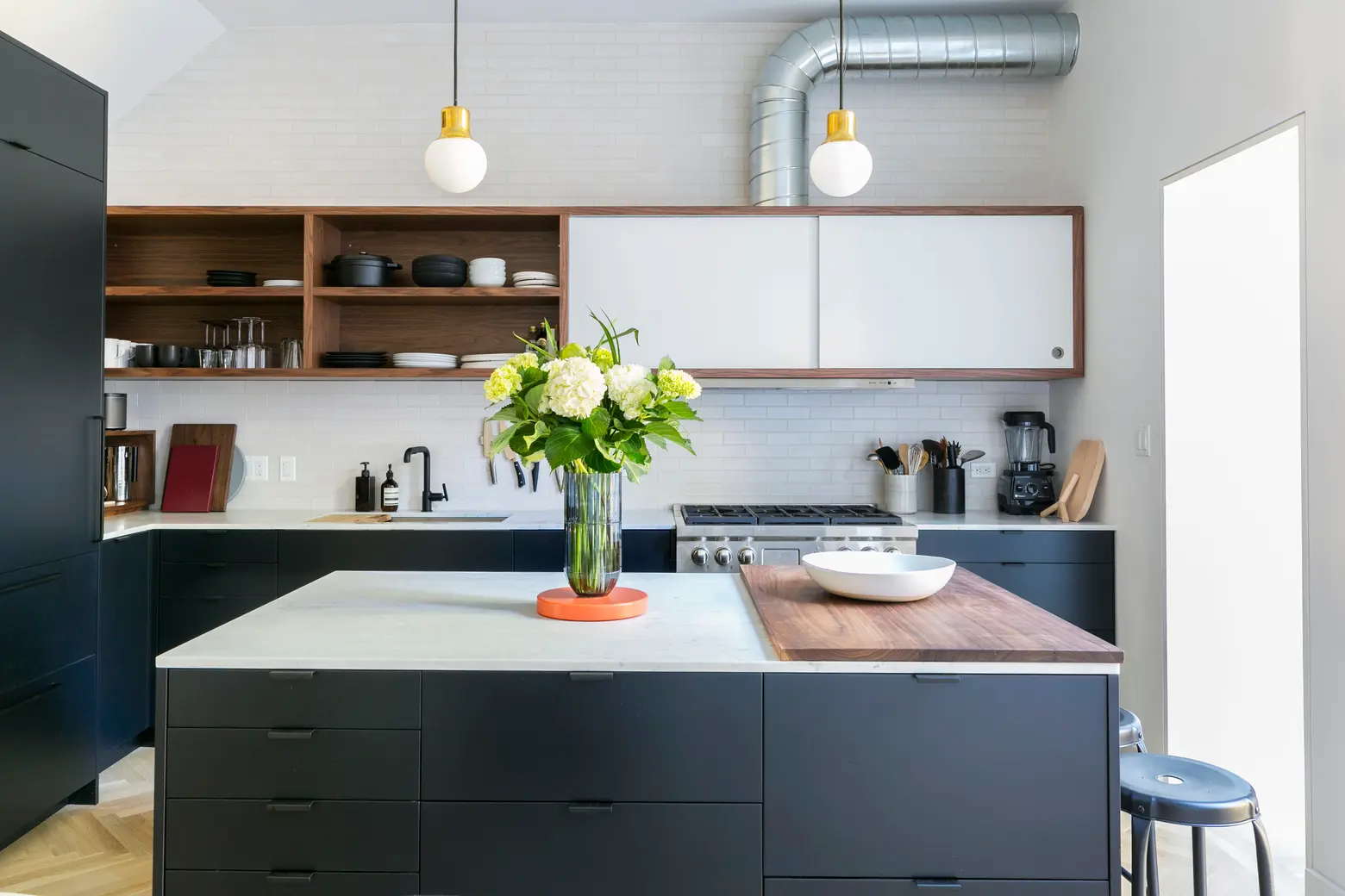
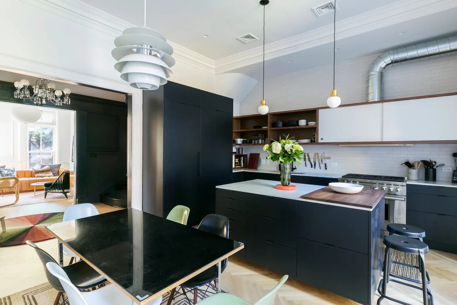
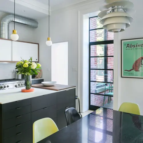
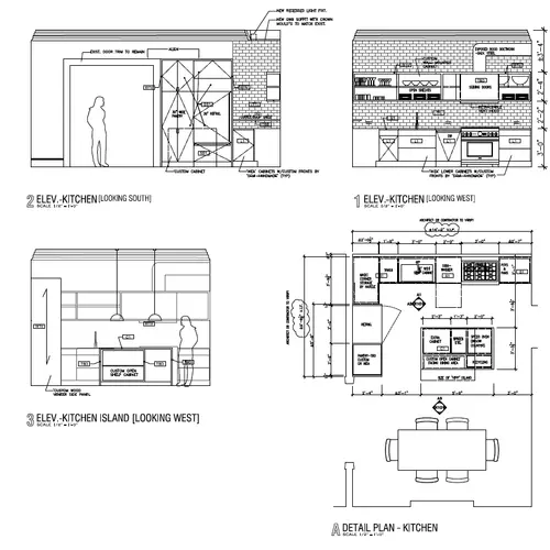
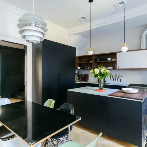
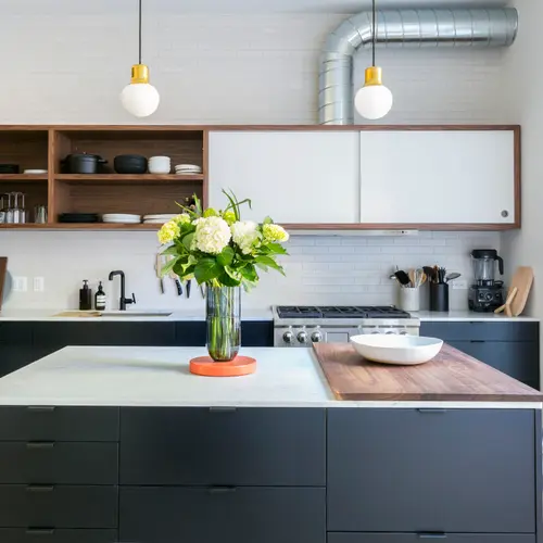
Countertops are Carrara marble from ABC Stone. Tap is the Purist by Kohler. Pendant lights over the island are the Mass Light NA5 by Norm Architects for &Tradition. The upper, walnut and white, shelving is custom. Alex designed the pull-out Best vent configuration to fit neatly inside the cabinetry. The range is Wolf.
The backsplash was a bit of a wild card until the last minute. We ended up choosing Boneyard Brick glazed thin brick tiles from Trikeenan, sourced from Chelsea Arts Tile & Stone, which were a bit of a splurge but we love them for their warmth and visual interest.
I had pretty much decided on the basic design for the kitchen, but because there were so many moving parts, we hired super-architect Alex Scott Porter as a design consultant. The millworker who did the custom carpentry for the kitchen also served as our kitchen contractor.
The lower cabinet interiors are all Ikea with custom fronts and panels made by Maciej Winiarczyk of MW Construction, our kitchen contractor. That strategy is the not-so-secret weapon in many a design arsenal. In the apartment we used the Danish company Reform–their Navy Yard showroom is amazing–to create the cabinet fronts. Reform designs are gorgeous, some are by design superstars like Bjarke Ingels and Cecilie Manz. And you can get them color-matched to any paint color you want.
My main inspirations were Henrybuilt and Vipp, and I love the Frama Studio kitchens. I wanted black cabinets and ended up choosing Benjamin Moore’s Midnight Dream, a dark velvety blue-black. My original plan was to have marble on the back run and concrete on the island but the concrete turned out to be not only expensive but complicated, though I’d still like to try it. I like the warmth of stone and concrete–they’re both authentic materials that patina nicely and I think they bring a kind of solid warmth to a kitchen.
What’s your favorite thing about the kitchen?
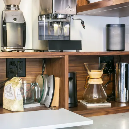
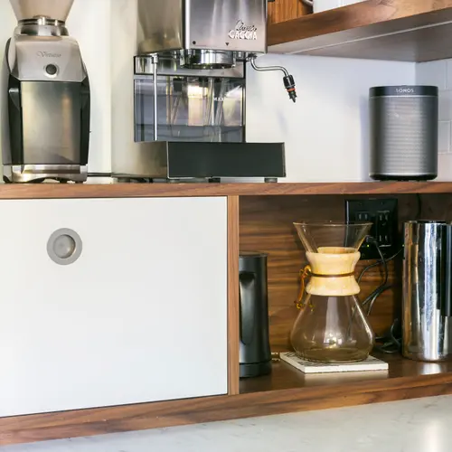
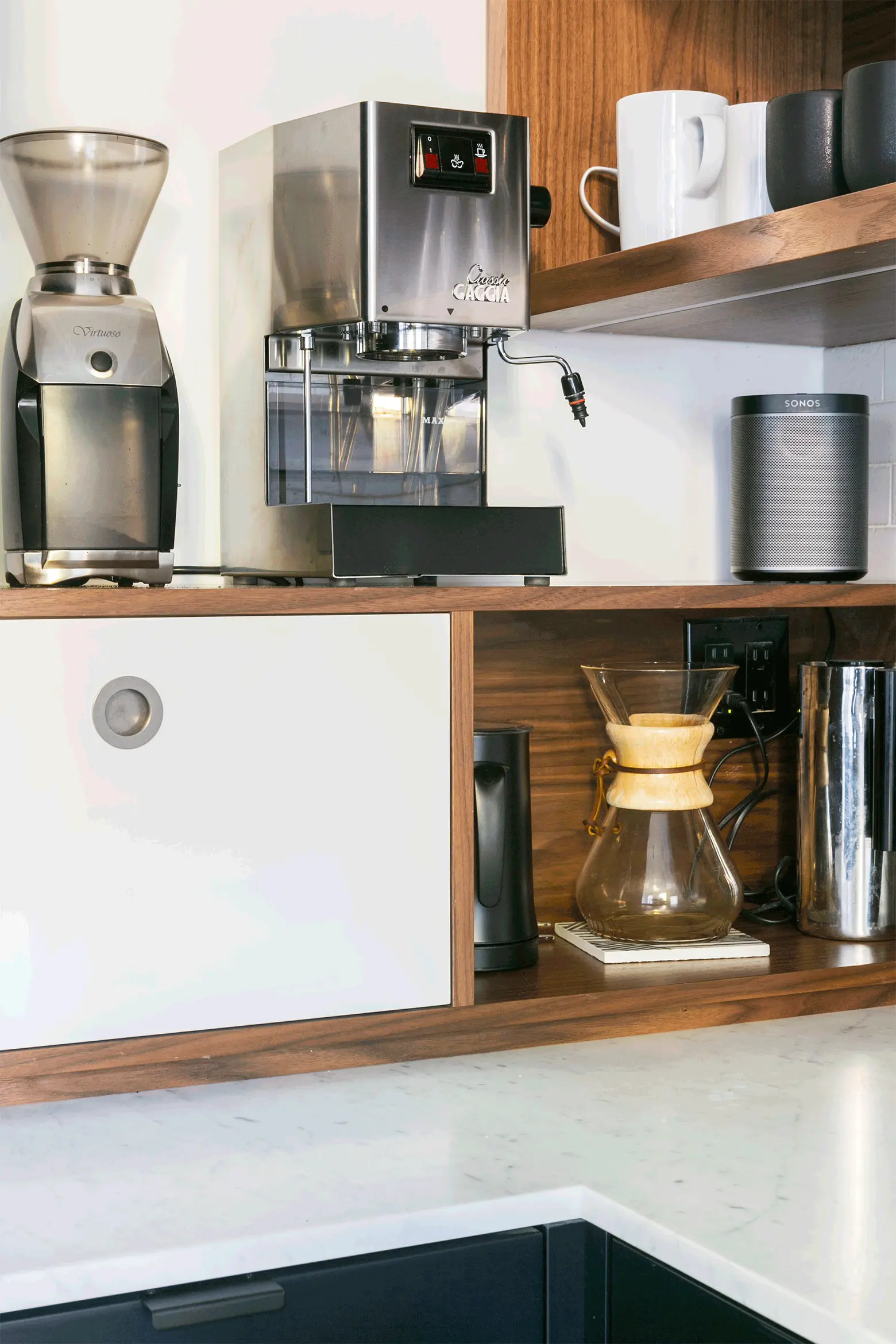
The coffee station! In general, between Alex and myself we were absolutely obsessive about everything having a function and a place. The idea of a kitchen that looks cool but doesn’t work horrifies me. This kitchen excels at everything it needs to do, from prep and cooking, entertaining and hanging out, to not being cluttered.
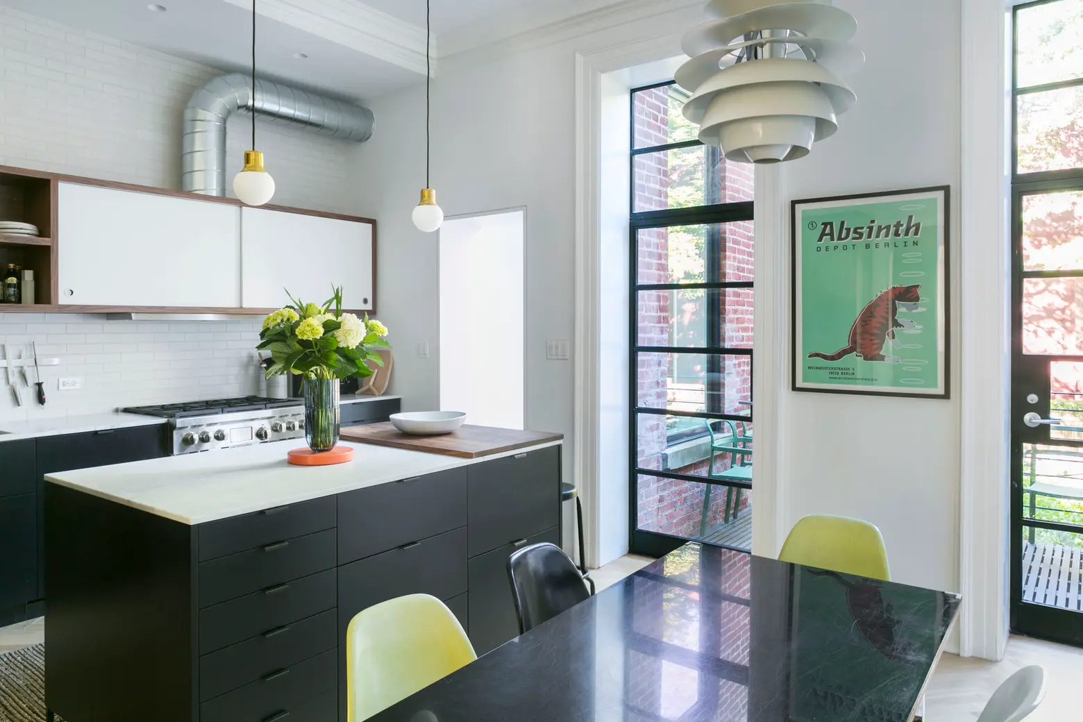
The dining room table was one of the first things I owned after moving to the city decades ago. We made it from a 1940s vintage chrome desk frame and an IKEA wood top, with a custom slab of acrylic from the amazing Canal Plastics bolted at the corners. It’s indestructible. It started out as temporary but it’s really working. The pendant light over the table is the Louis Poulsen PH Snowball by Poul Henningsen, an online vintage find via First Dibs.
The steel-framed doors were another splurge, but they’re a great visual anchor and bring in a lot of light for a north-facing room that tends to get cool, flat afternoon light. I love having the deck right off the kitchen. The yard… that’s happening in the next phase.
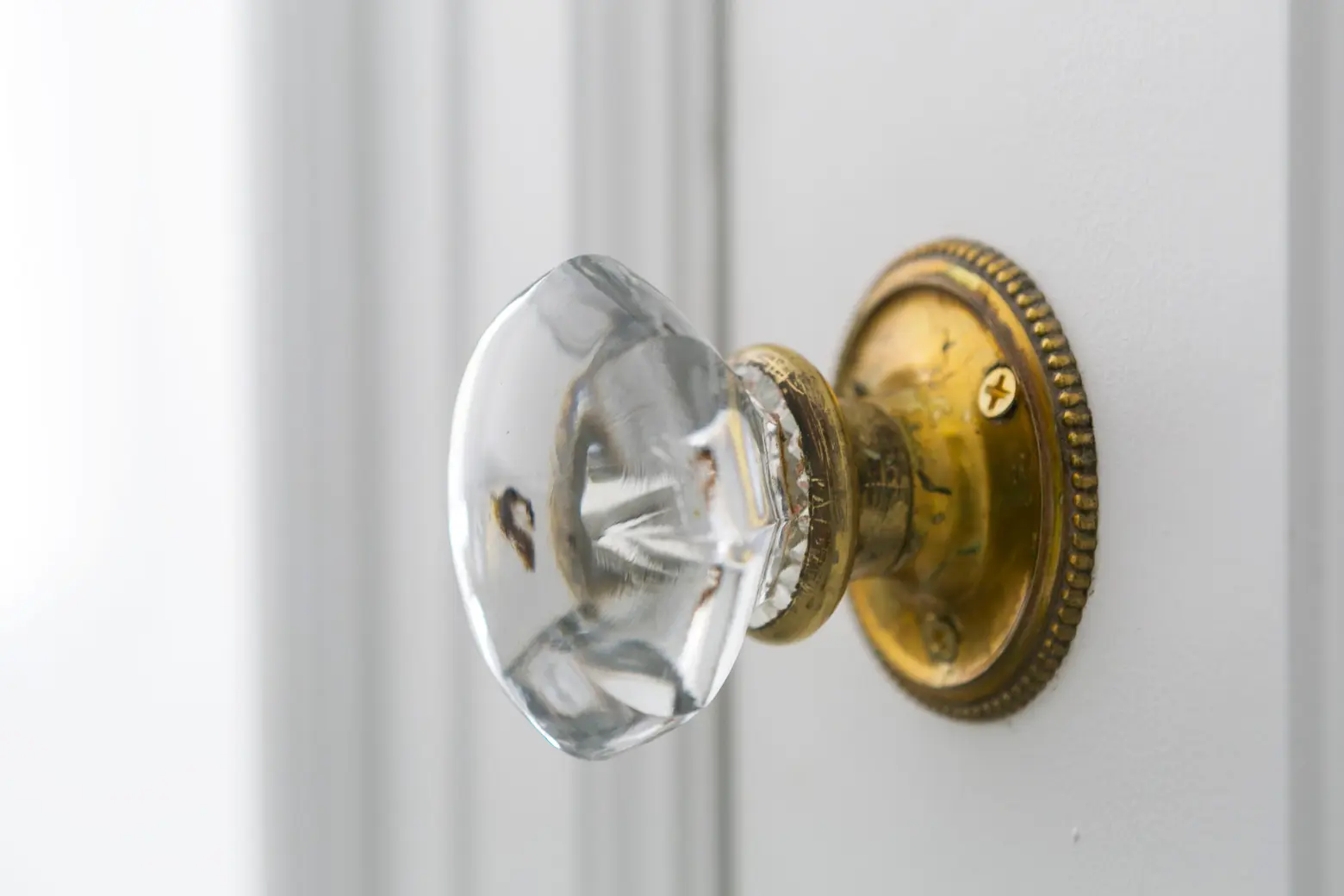
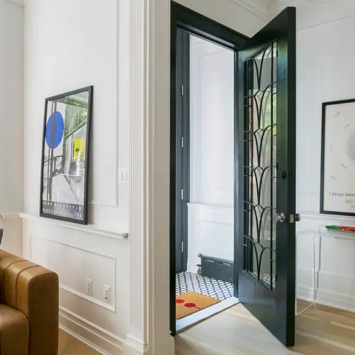
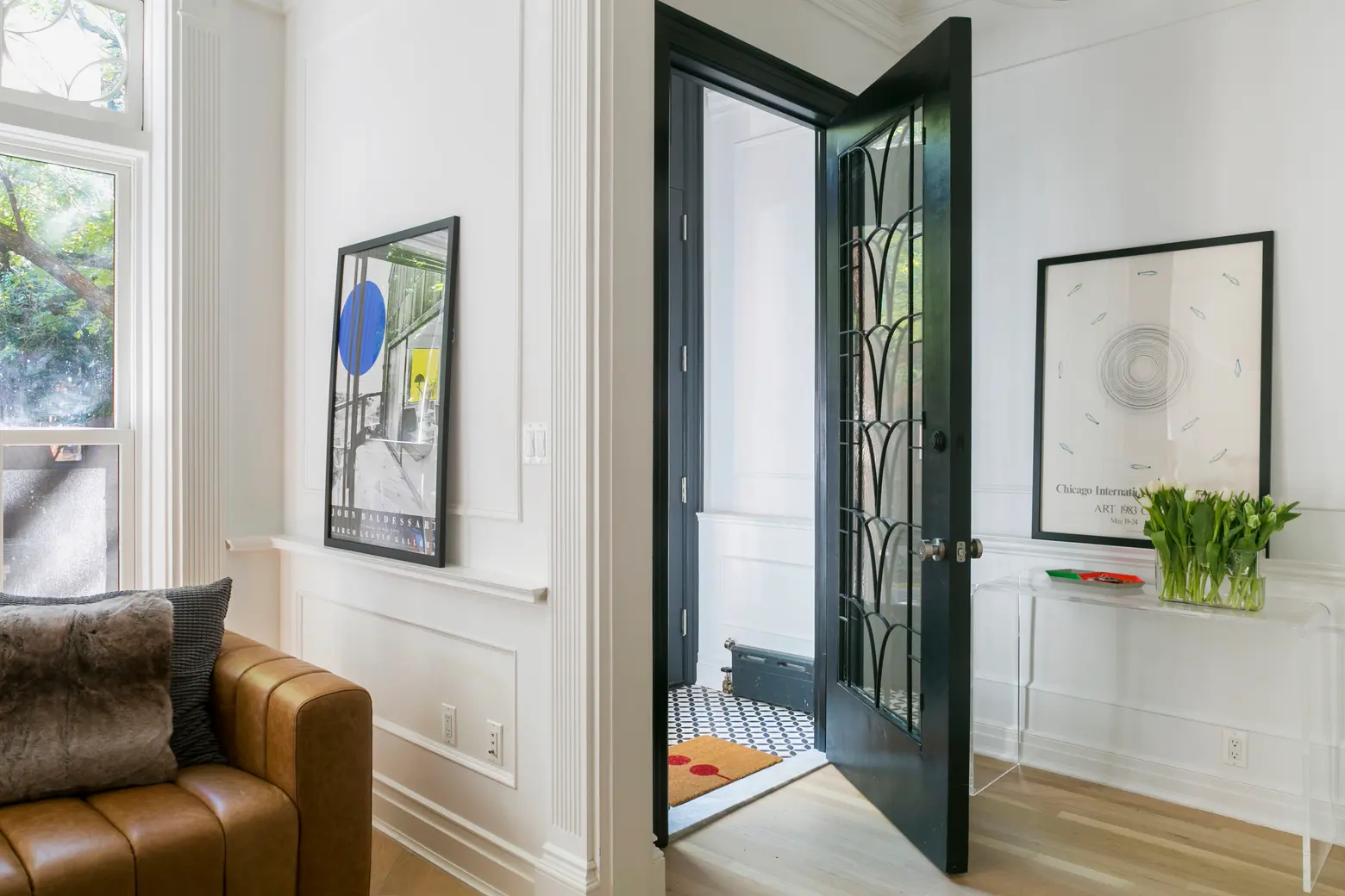 The door is from Irreplaceable Artifacts. The vestibule floor tiles are circulos encaustic cement tiles from Cement Tile Shop.
Talk about repurposing materials.
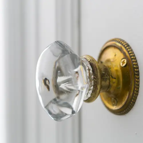
We reused the original interior doors and even the old doorknobs on the top floor. We’d thought we’d find an old set of brownstone doors in a salvage shop, but, as anyone who has tried this will tell you, it’s easier said than done. As one shop owner told us, there are many more people who need this item than there are people who are getting rid of them. We ended up having those custom made, but we did find a great door with a Deco-esque inset at Irreplaceable Artifacts in Harlem that was refurbished by our contractor that we are using for the second entry door. We’re using the old radiators–cleaned and painted–for steam heat. We also converted the long-defunct fireplace in the living room to a working gas fireplace.
Some key pieces of advice?
- Maintain a sense of context. There’s a lot of life outside of the project.
- Live in the house before you renovate.
- Do not live in the house while you renovate.
- When hiring contractors and architects, do your homework. Make sure you see work they have done and talk to past clients. Ask about their project management strategies (scheduling, etc). Those are almost as important as the construction. They should answer all of your questions in a way that you’re satisfied with. Trust your gut if it’s telling you yes or no on someone. You’ll be spending a lot of time with these people.
- Ask any and all knowledgeable people, including complete strangers, for advice and sources and don’t hesitate for fear of bugging people too much. Thank them heartily.
- Look at tons and tons and tons of pictures. Follow all of your favorite inspirations on Instagram. Make a ton of folders/mood boards/pinterest boards, narrow them down to a reasonable amount for each room. Get really granular with your boards (appliances, hardware, paint, etc) as well as having overall inspiration collections. You’ll need these to share with your architect and/or designer.
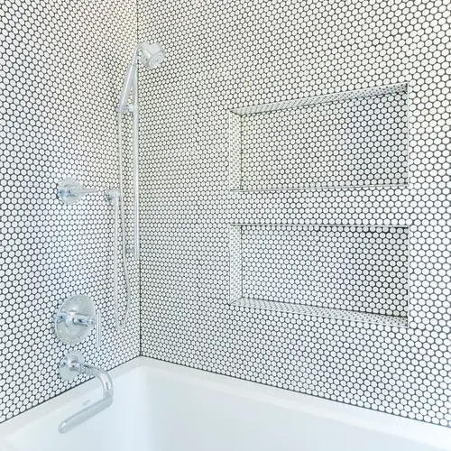
- Splurge on things you really dream of (as long as they aren’t really impractical), you can save and substitute elsewhere. That said, find creative ways to find the more expensive things you want, for less. Do NOT just buy from showrooms or go with your architect or designer’s usual source. Search Google, eBay, craigslist, etc. Just as one example, we found the same two-inch Nero Marquina marble hexagonal tiles for our master bath online from Builder Depot for about half the price of the tile place our architects regularly use.
- It’s hard to be super-creative in every aspect of a large renovation, so don’t feel you have to. If you have a vision definitely go for it; that’s the easy part, but otherwise stick with classics you know you’ll like. When in doubt use classic, simple timeless materials, and colors (subway tile, etc) that wear well.
- Optimize rental spaces as much as possible, don’t write them off as “just a rental” or plan to upgrade later. If you want to create an income-producing space, get it done first. Your bank account will thank you for years to come. And you probably won’t do it later.
- Do not rule out IKEA no matter how “cheap” you may think it is. They know their stuff. (closets, cabinets, kitchens), especially if you think out of the box and get creative when looking at what they offer. Ikea “hack” kitchen cabinet fronts are some of the best and most creative out there.
- Insist on excellence from contractors, architects, vendors and any other people who you are working with. Be kind and respectful of course, but don’t be shy or worry about being too demanding.
- Let your contractor know if you are uncomfortable or unhappy with the work any subcontractor is doing (within reason). This is a tough one, but if you really think there’s a weak link for an important job (electrician, or flooring contractor for example) it’s better worked out before the work is done–poorly.
- It’s ok to change your mind up to a point and/or if you’re really sure about the change.
- Include lighting (especially), art and furniture in your plans and budget. They really make the space; in the end, any space is absolutely better off designed as a whole.
What do you like best about the house now that you’re (for now) done?
It really is hard to choose one thing, of course. I love the way the space looks overall and fits together; the few places we used color turned out great; I love the floors, especially the herringbone pattern on the parlor floor. I’m thrilled that it’s so functional and comfortable in the ways we’d hoped. I love that there are little hidden spaces, nooks and etc that set it apart from the average “brownstone” layout.
Credits
Architect: Urban Pioneering Architecture
Kitchen design: Alex Scott Porter
General contractor & millwork: CNS Construction; Kitchen millwork and contractor: Maciej Winiarczyk/MW Construction
Lighting design: Old Lights On
RELATED:
- Renovation Diary: Defining a Dream, Assembling a Team
- Renovation Diary Part II: Choosing the Right Architect for the Job
- My 3,900sqft: Four Ladies Turn a Clinton Hill Townhouse into a ‘Pop-Up Mansion’
All photos taken by Kate Glicksberg exclusively for 6sqft. Photos are not to be reproduced without written permission from 6sqft.

