INTERVIEW: Architect Nancy Ruddy on 30 years in NYC, adding to the skyline, and restaurant design

Photo courtesy of CetraRuddy
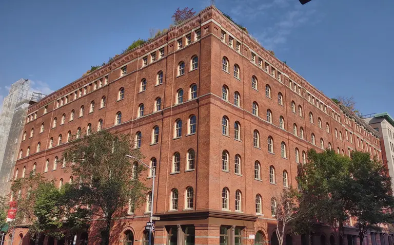
When Nancy Ruddy and her husband John Cetra formed architecture firm CetraRuddy in 1987, they wanted to “create inspirational spaces and buildings based upon the ideas of craft and the human touch.” Thirty-one years later, and the 100-person firm has achieved this goal and then some, marking the skyline with their soaring One Madison tower, transforming Tribeca’s 443 Greenwich Street into the hottest celebrity residence, and adapting historic buildings by prolific architects such as Ralph Walker and Rosario Candela. They’ve also distinguished themselves by combing architecture and design practices, which was most recently showcased at their designs for the new Time Warner Center restaurant Bluebird London.
Ahead, 6sqft talks with Nancy Ruddy about how all of these successes came to be, where she sees the architectural landscape of NYC heading, and what it was like creating a destination dining space overlooking Central Park.
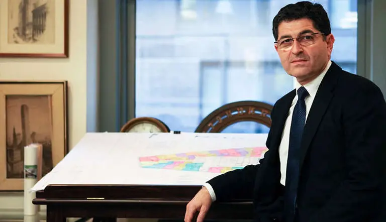
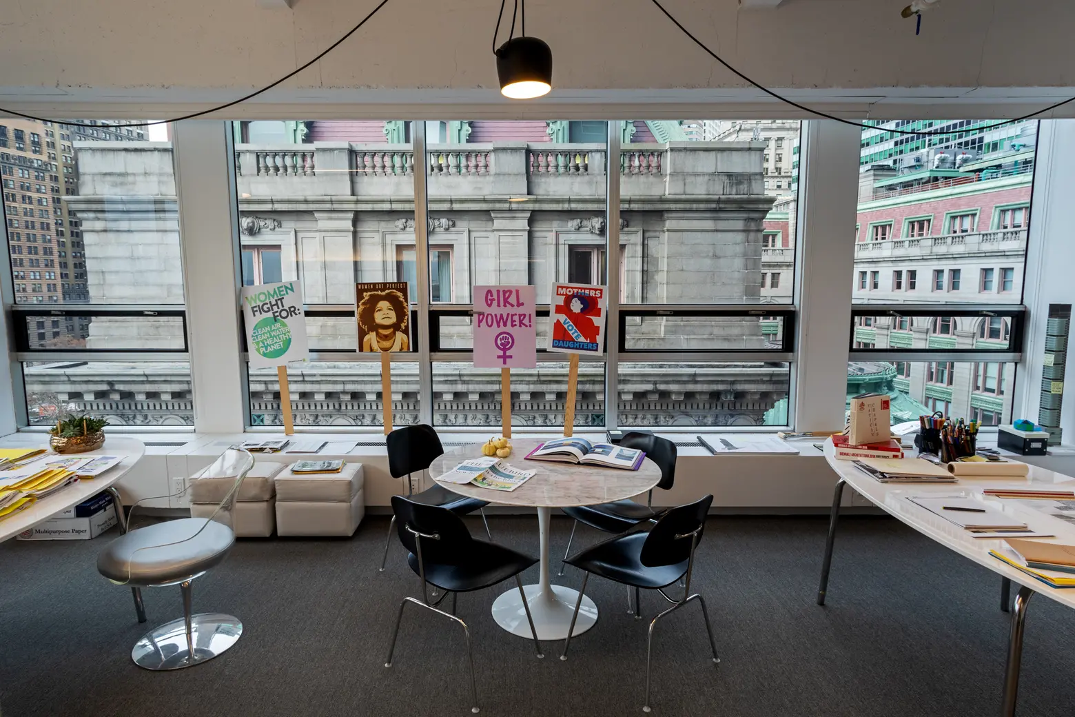 Nancy’s office in her firm’s home at One Battery Park Plaza, © James and Karla Murray for 6sqft
What were your early design goals when you founded the firm? Has this shifted over the years?
Beginning our own studio came from our desire to create inspirational spaces and buildings based upon the ideas of craft and the human touch. We also believed that a practice founded on the integration of architecture and interior design would lead to more authentic and purposeful design. So we began over 30 years ago with the premise that architecture is about creating home, and that the foundation of inspiration comes from a design that nurtures and inspires at the same time.
Another key factor in creating our own firm was to form a new kind of community within the studio. We had both experienced practice in both large and small firms, none of which revolved around the people who collaboratively create great design. We consistently work to express a sense of community and to treasure the talents of our staff.
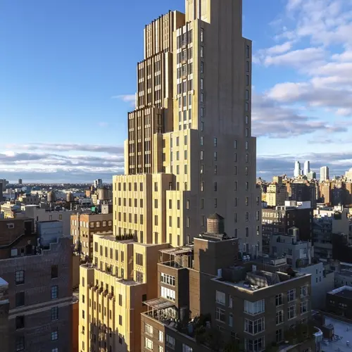
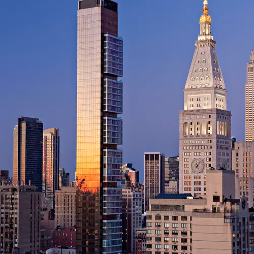
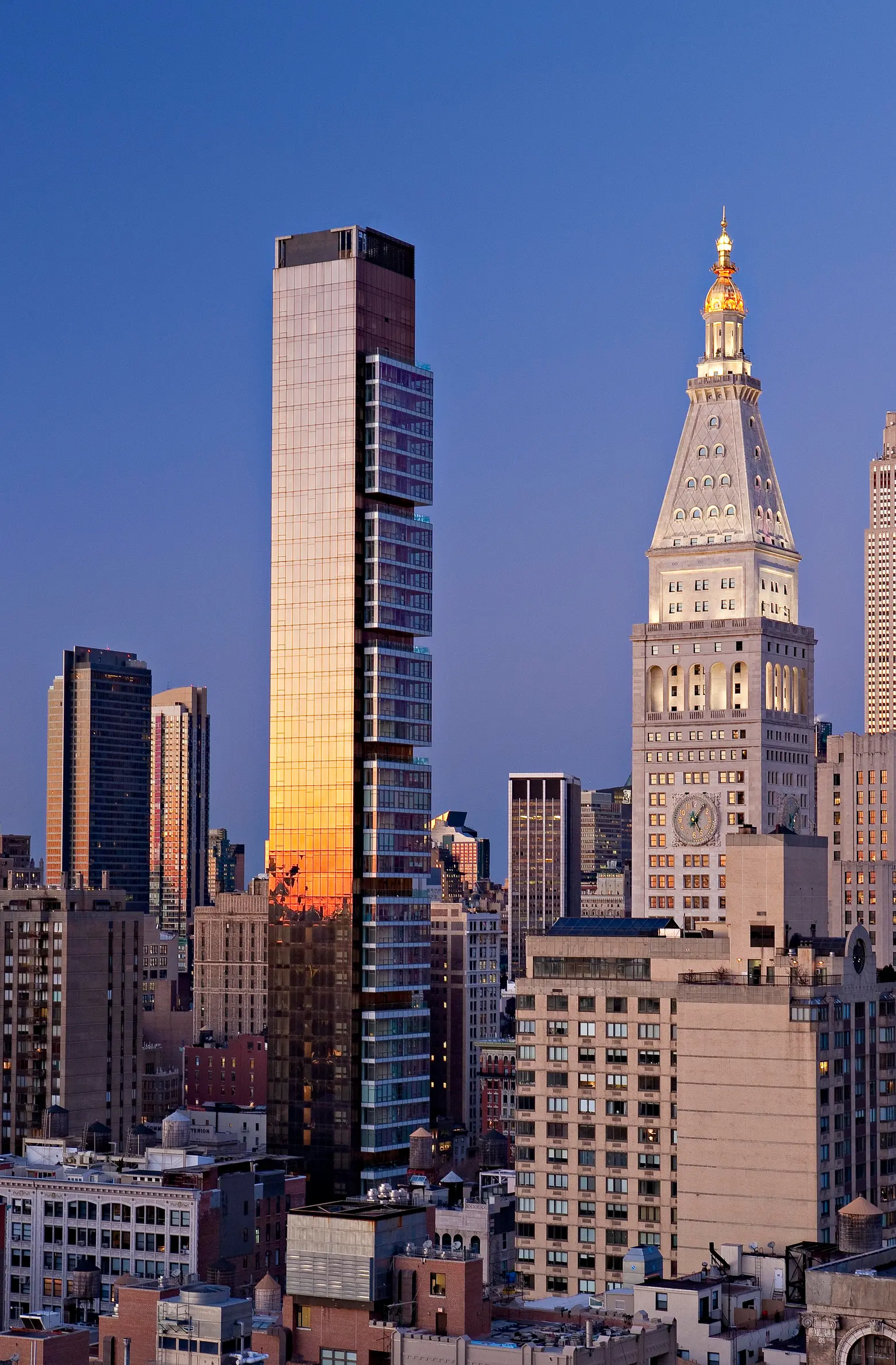 One Madison by Alan Schindler
Was there one project that you feel really put you on the map?
When we look at our history over the past 31 years, there has been a consistent growth in project size, complexity, and notoriety. We have honed our skills and our knowledge, and are constantly expanding our worldview. That is the wonder of architecture: every project brings new knowledge; every client brings new points of view; and every typology requires us to expand our horizon. One Madison was a seminal project that perhaps brought our work to be known by a greater population. For us, it was an important milestone on a continued journey.
One Madison is such an iconic marker on the skyline. Tell us a bit about the approach to that project?
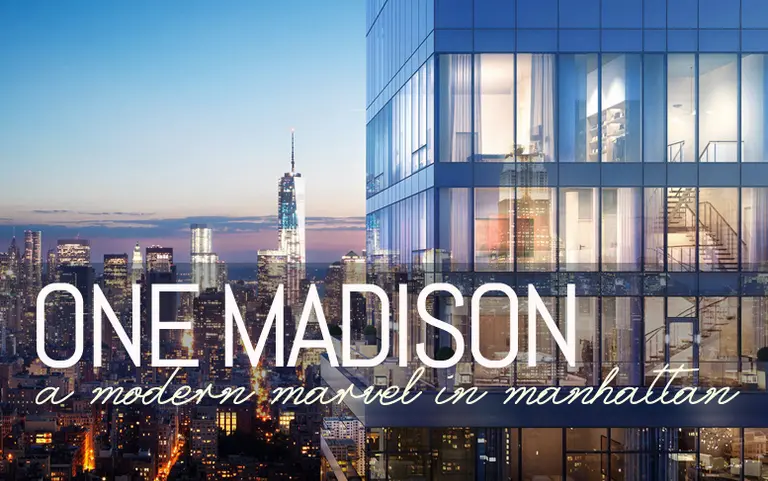
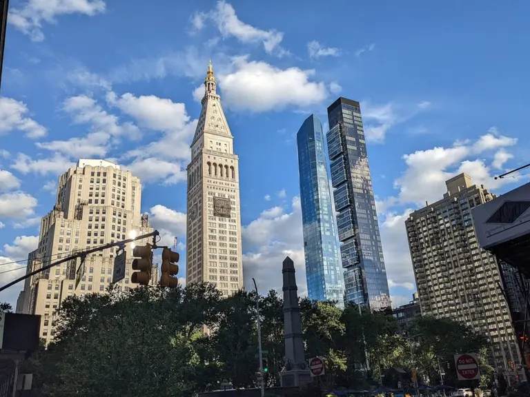
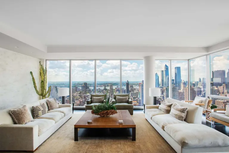
The One Madison site had a number of complex zoning and contextual constraints; these became the foundation for developing an important building. Creating a modern 60-story tower on the edge of a park within a mixed yet historically rich context formed the basis of our concept: we wanted to respect and respond to our architectural neighbors, the Flatiron Building and the Met Life Tower, both considered forward-looking skyscrapers in their time. As architects and urbanists, we determined that an elegantly proportioned tower articulated by pods could embrace the sky, a modern version of the same approach taken by One Madison’s iconic predecessors. Through air rights from adjacent sites and a required cantilever over a hold-out tenant, we were able to express that idea with a 12:1 slenderness ratio that creates the most minimal possible shadow as it crosses Madison Square Park.
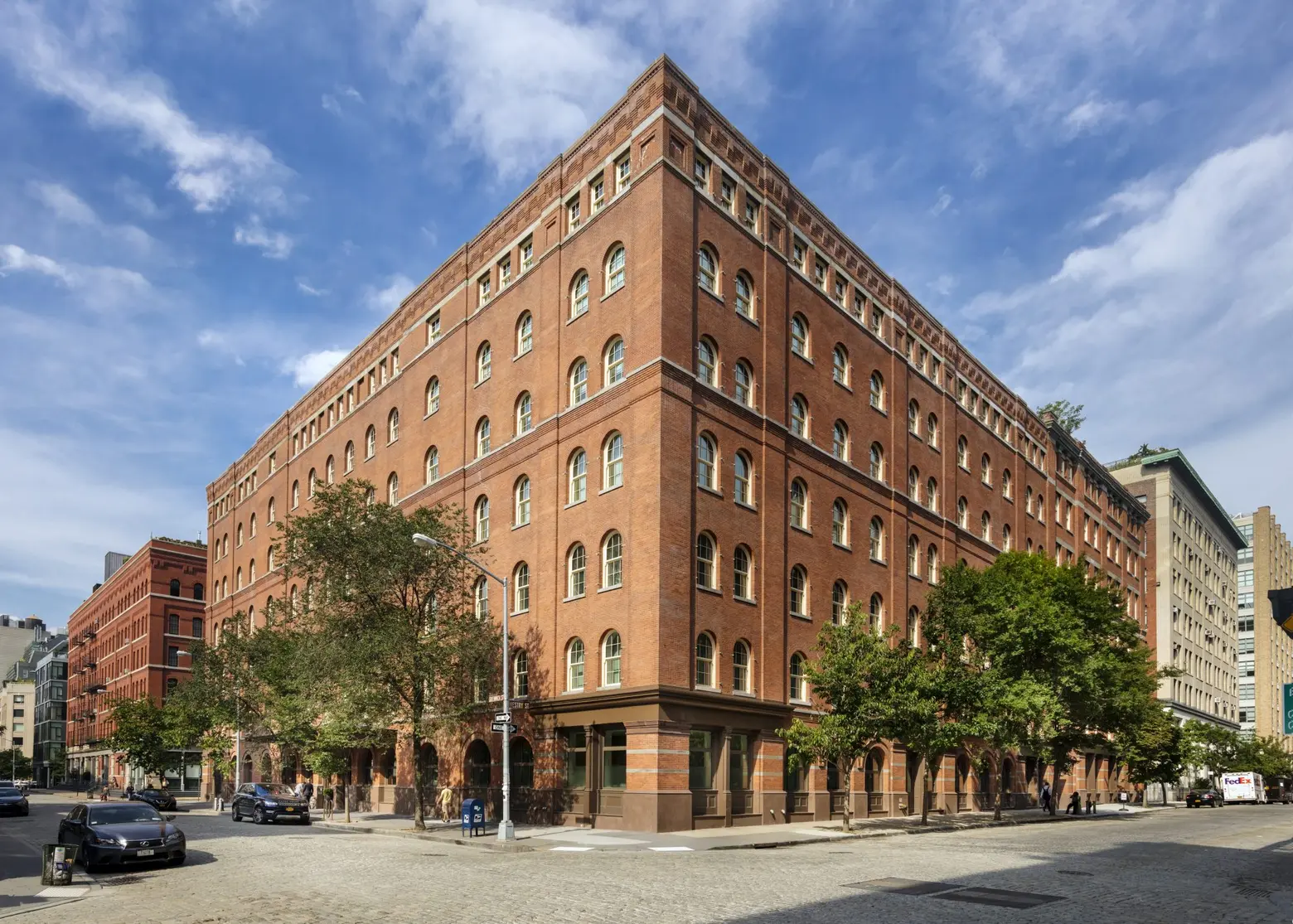
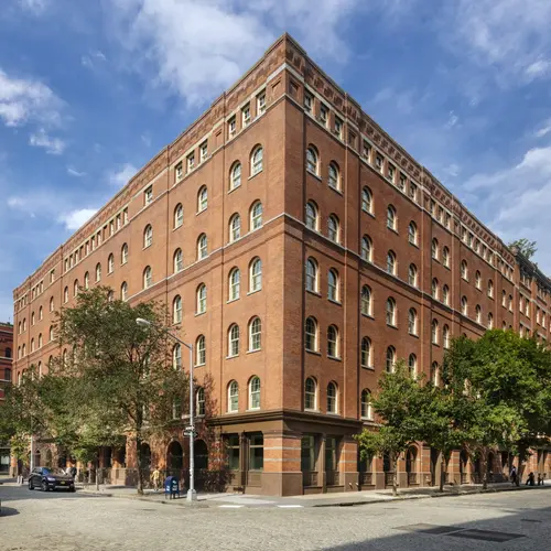
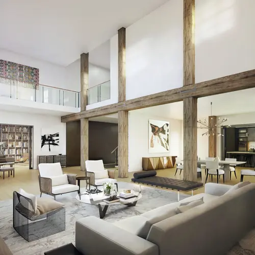
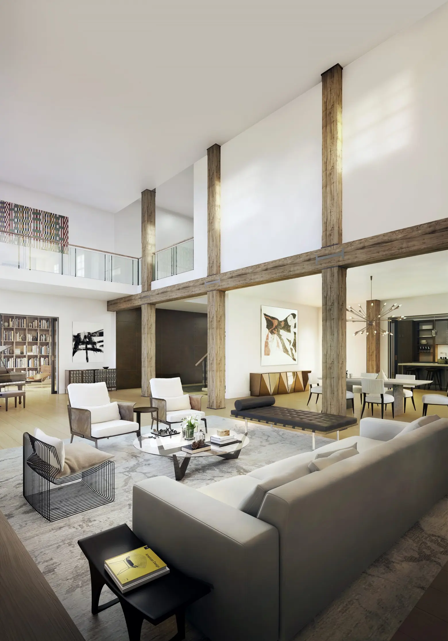 443 exterior by David Sundberg/ESTO for CetraRuddy; interior courtesy CetraRuddy
You worked on the conversion of 443 Greenwich Street, which has gotten a reputation as a celebrity hotspot. Did you anticipate this?
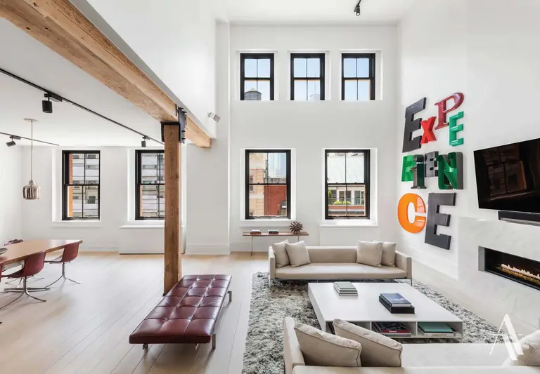
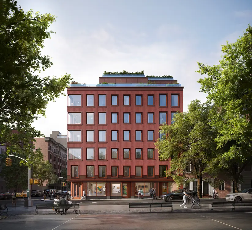
When we first walked the site, we were so inspired by the monumental quality of the building and the raw beauty of the interior spaces. In adapting this New York City landmark to urban residences, we really celebrated turn-of-the-century architecture and the structure’s grand proportions. We approached this project with respect for the integrity of the building, seeing the modernity and simplicity of its elemental spaces while adding modern craft. Key to our planning effort was to expose the extraordinary timber post-and-beam structure and to provide each residential unit with an allée of a free-standing structure; a warmth and tactile reminder of the building’s history, surrounded by a downtown polish.
There is constant discussion of the definition of luxury within our real estate world. In this building, we created a most coveted luxury: privacy. An underground drive-through private driveway and parking — linked to private lobbies — provide access directly to your apartment. I believe this combination of a design approach highlighting history and integrity, in addition to the luxury of privacy, has made the building so attractive to bold-face names.
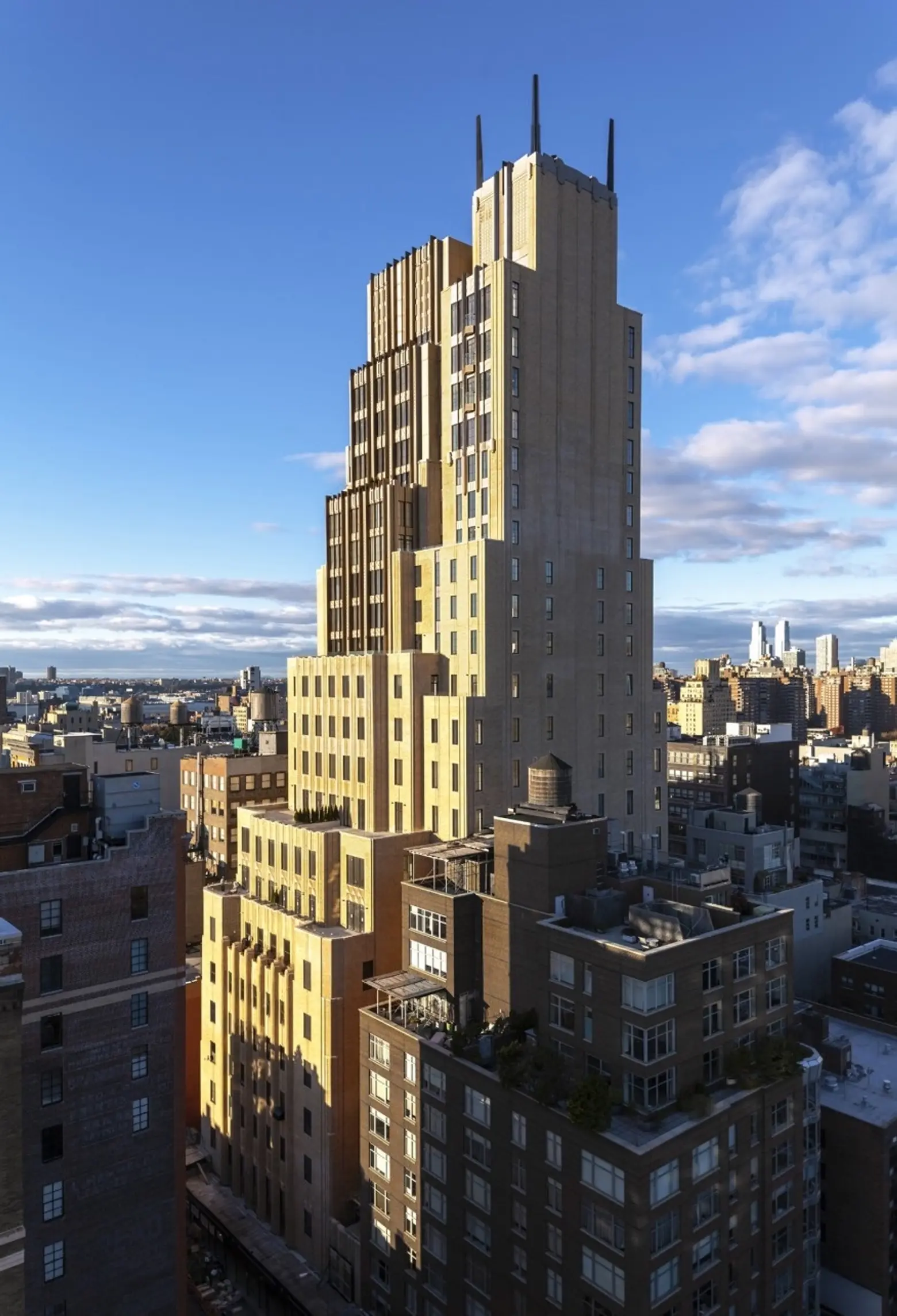 Walker Tower by David Sundberg/ESTO for CetraRuddy
When you do a project such as the Walker Tower or 360 Central Park West where you’re working with a historic building from great architects past, how does your methodology shift?
We are always inspired by a building’s history and context. Prior to any design work, we research the building’s original use, the era it was built, and the original architect and their goals for the building. When we adapt a building to a new use, it is a journey to respect its bones and build on its essential spirit. In repurposing an historic structure, we many times look to find new architectural potential to what exists while respecting the structure’s history. Our process is never to replicate details or massing of the original era but to bring the building forward into a new and inspirational chapter.
Where do you see the architectural landscape of New York heading in the next 10 years?
New York has such a vibrancy and a diversity — every neighborhood has the capacity for building on its essence while reinventing itself. Over the past 10 years, we’ve seen a renewed commitment to the quality of architecture, moving past that old adage of New York development that all that mattered was “Location Location Location.” One part of the urban landscape that makes New York unique is context. It is a walking city where the fabric that invigorates the pedestrian experience is unique.
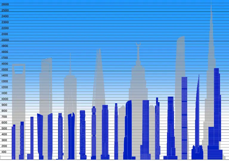
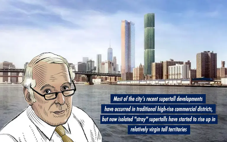
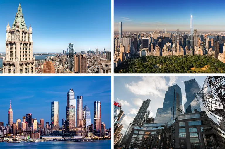
In this new age of supertalls and large-scale developments, I am concerned that urban design is being left behind and tall disjointed towers fight for control of the sky. We as architects are taught to respond to our context. At One Madison, we were very conscious that we were occupying the skyline with the Flatiron And MetLife Buildings, landmark skyscrapers of another era. The form of our building was designed to have a respectful dialogue with those structures.
We do see a meaningful change in buildings that are truly being built for people and for our emerging live-work-play lifestyle. We are adding amenities to office buildings that typically were only seen in residential buildings. New office buildings we have designed in the Meatpacking District and Staten Island incorporate shared food and beverage elements, co-work opportunities, urban farms to supply the restaurants, and social spaces. The creation of community has become very important.
Another positive direction in New York architecture and development is the engagement of buildings and outdoor spaces. Indoor-outdoor dynamics are enlivening the pedestrian experience and providing usable outdoor spaces that provide spirit and relief in the city. The activation of our waterfronts has made New York a much more livable city.
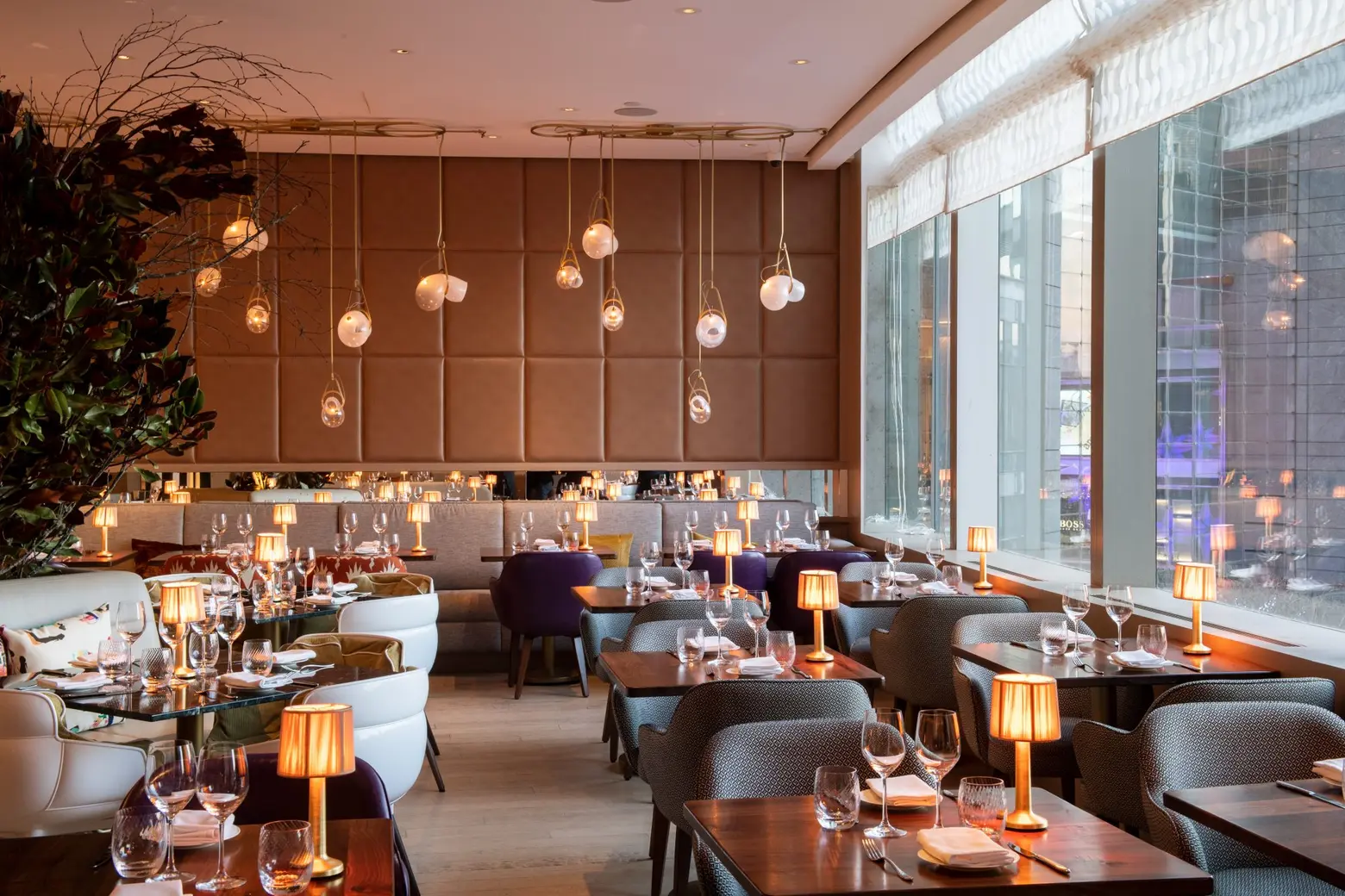
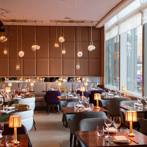
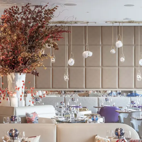
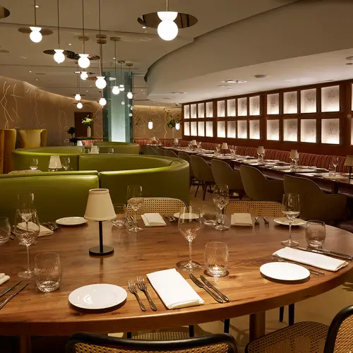
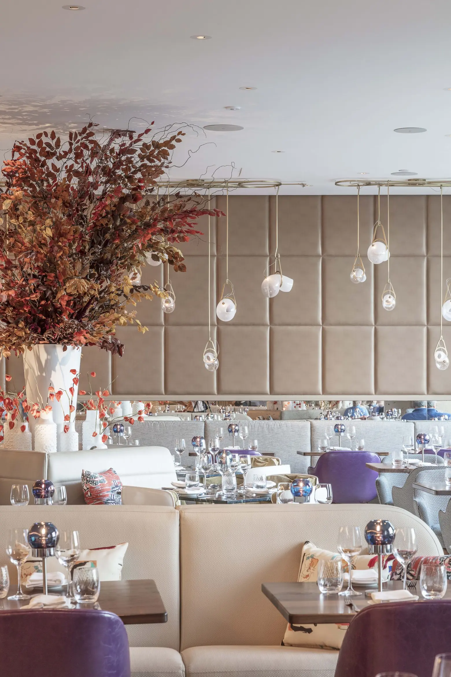 The main dining room of Bluebird London. Top by Evan Sung; bottom by Montse Zamarono.
You’ve done quite a bit of hospitality work. What are some of the things you must consider in these projects that people may be surprised to learn about?
In the hospitality world, the key to success is to create a memorable experience. Hotels and restaurants have become entertainment. People are looking for great food and great places to sleep, but the key is having all elements powered by design and the senses. Great hospitality design also involves crafting an atmosphere that makes you feel comfortable and that is spirited yet welcoming. Every owner/operator strives to create a venue that people think of as “their place” and where they’ll come in multiple times per week.
The hospitality business is a service business where operations are a premium driver of the design. It’s a fast-paced world where operational components must enable staff to perform their roles at high peak. Every detail is critical to the operational success of a restaurant, and every component of the design needs to look great and be highly functional at the same time.
Speaking of, your latest hospitality project, Bluebird London in the Time Warner Center, just opened. How did you take restaurant group D&D London’s style and translate it to NYC?
Bluebird London is an established, successful brand in London. We took the essence of their spirit and adapted it to New York, a center for arts and culture. The design is inspired by Britain’s most creative mid-century era when the celebrated Bluebird race car broke speed records around the world in the 1930s and ’40s, and as the irreverent spirit that led to the Mod era was taking hold in the UK. It was a period where modern art hit the streets, saturated colors and patterns were mixed to create vibrant palettes, and women’s fashion became more liberated, including the wearing of ponytails, which we echoed in the back bar of the restaurant.
There is a lot of interesting art incorporated into the space, which we feel is very New York, too. The backdrop of Columbus Circle and Central Park also frame the overall design of the main dining and private dining areas. We’ve found New Yorkers are intrigued by the British-ness of the brand and its take on British creativity that doesn’t rely on the usual clichés.
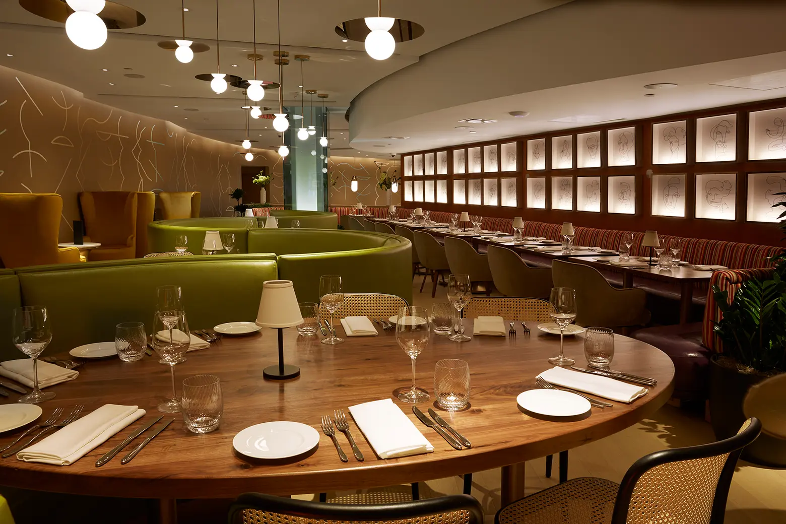 The gallery/lounge area; photo by Will Stanley
There are several “areas” in the restaurant. Why was it important to lay the space out this way?
The layout is a bit odd and is very deep. We decided to create a series of spaces that spark interest as you meander through the restaurant. The distinctive dining spaces also offer great variety for repeat diners, so people can come back and have a new experience. There is a front café and wine bar for casual dining followed by a gallery lounge area, a very lively central bar, and main dining area. Another major layout choice was to open the front of the restaurant to the mall and really activate the entrance with an all-day café/wine bar.
Bluebird LONDON occupies a long space previously occupied by two other restaurants. In both cases, patrons entered through a long passage, and while sitting at the bar their backs would be to the spectacular Central Park view, with the kitchen occupying the primary view. We opened up the entire restaurant to become one contiguous space, with two-thirds of the seats having the wonderful light from Columbus Circle. We even pushed the kitchen back so that guests had the best views and the bar becomes the hub of activity on an elevated platform. In a restaurant of this scale, we look to design unique areas with their own character, which means that depending upon the time of day and where you sit, it’s possible to have an appealingly diverse set of experiences — which is one of the main draws for return customers.
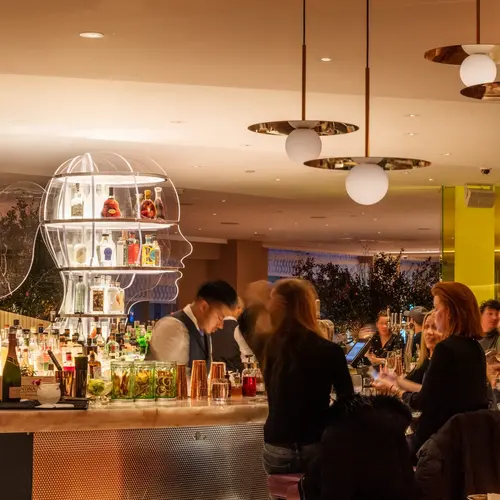
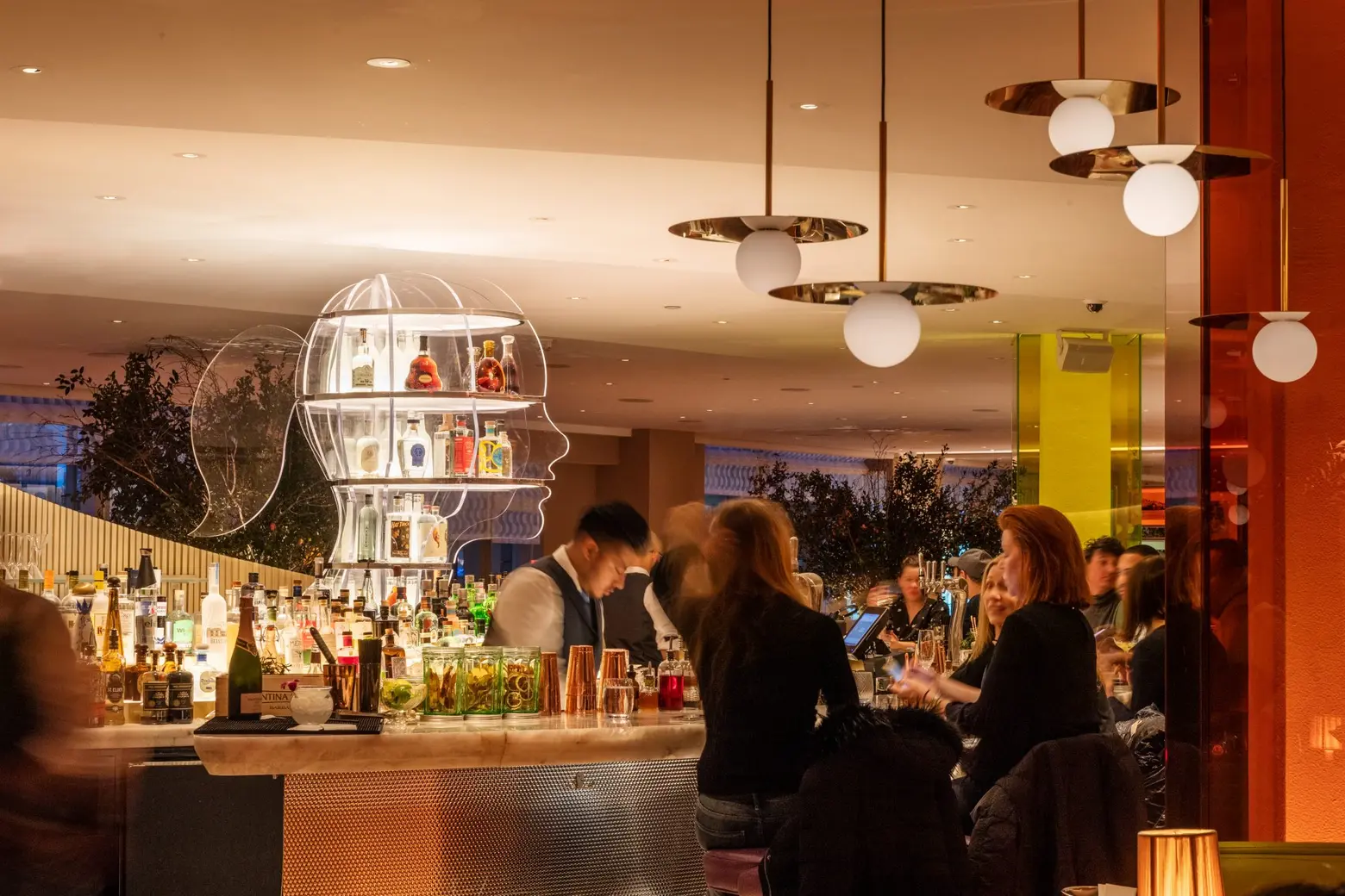 The bar; photo by Evan Sung
The decor is very playful while still reading very sophisticated. Tell us more about the design.
The design celebrates the irreverent spirit that defined the mid-century era in Britain, and by using a vibrant mix of colors and patterns, we sought to reflect that atmosphere and mood. There are numerous references to that era in art and fashion: An intimate dining area known as The Gallery has artworks commissioned by American and British artists that include wire caricatures executed in the continuous line method (which was first explored in the 1930s), sculptures reminiscent of early modern British forms, and irreverent pieces by England’s pre-eminent mid-century illustrator. A memorable moment includes Miss Bluebird, an illuminated sculpture serving as the back bar and reflecting British fashion’s wink to the ponytail as a liberating new style for women and a nod to pop culture. A snaking green leather banquette visually gives the sense of the speed of the Bluebird race car while reflecting the leather stitching and straps used in the race car.
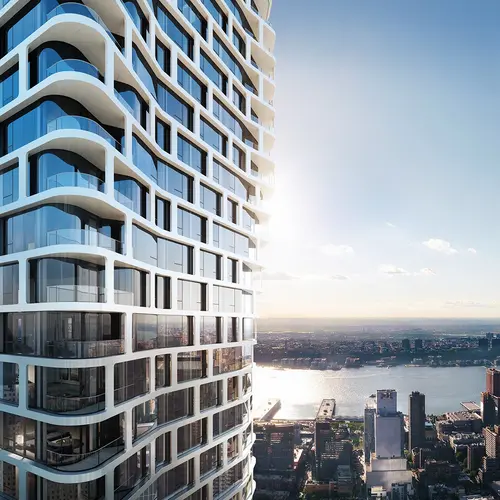
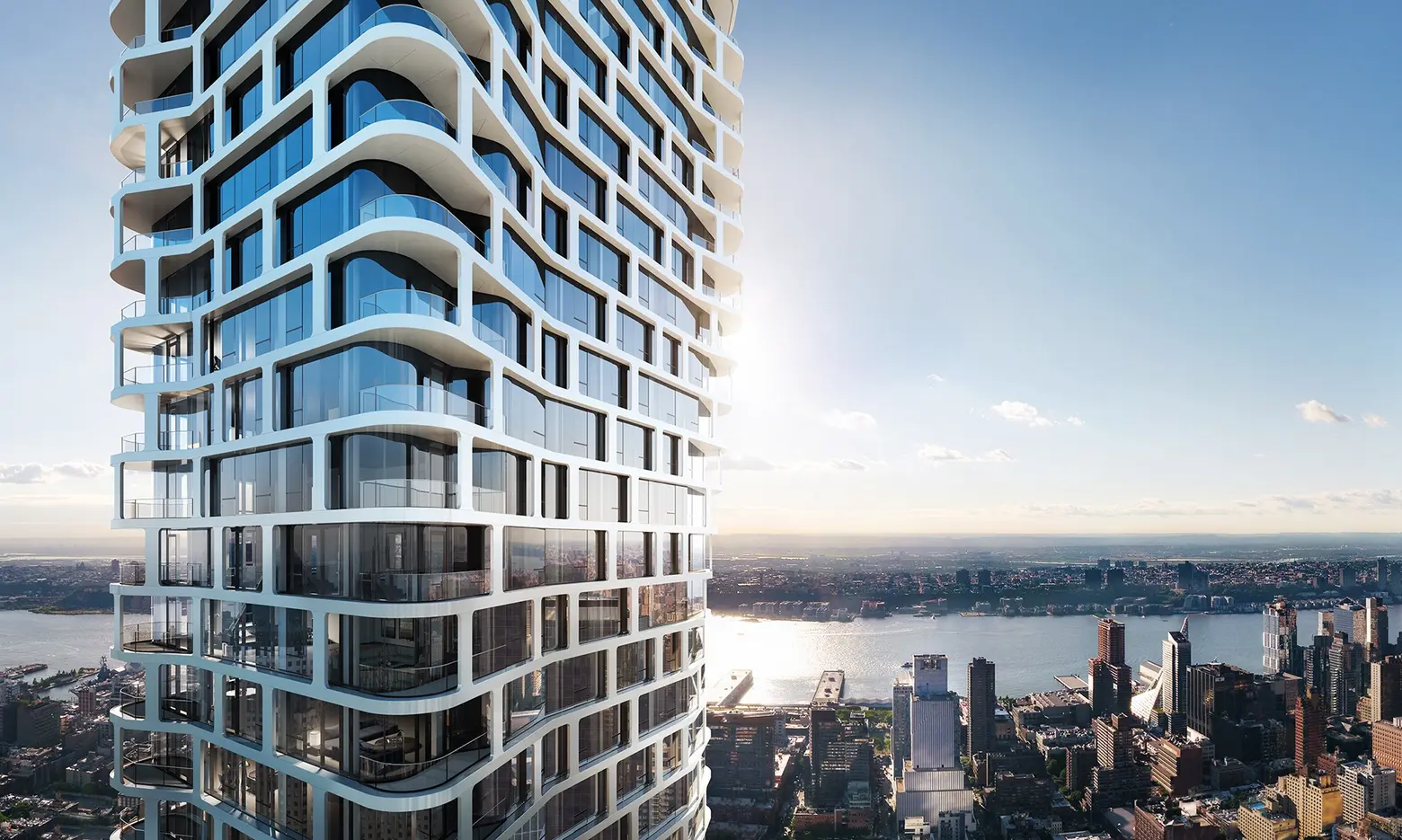 ARO by Binyan/IF Studio for CetraRuddy
Any exciting projects coming up you can tell us about?
We are working on a number of exciting and diverse projects, many of which are under construction. We are working on a contemporary photography museum from Stockholm called Fotografiska within a landmarked building in the Flatiron neighborhood; our sculptural residential tower, ARO, on West 52nd Street is nearing completion; and we are master planning a new 24/7 mixed-use town center in New Jersey consisting of retail, hospitality, entertainment, and residential elements. Another new restaurant in Hudson Yards with D&D will be opening this year, and we also have an exciting new 300,000-square-foot office building in Staten Island, with a rooftop farm supporting an on-site restaurant.
RELATED:
