VIDEO: A Visit to the ‘Creepy’ Depths of the ‘90s Subway Finds Some Things Haven’t Changed
Find out what's changed, what hasn't and what's still creepy
Have you ever noticed those signs on a train or bus that say “video and audio systems in use?” If not, you might want to start paying closer attention, because the notifications are actually warning you, the rider. NPR took a closer look at the use of video and audio surveillance on public transportation, the latter of […]
The ye-olde MetroCard swipe has made national headlines in recent weeks, thanks to Hilary Clinton’s inability to get through the turnstile and Bernie Sanders’ belief that we’re still in the dark ages using subway tokens. The fact that these snafus are so attention-grabbing goes to show how intrinsic the simple act of swiping a MetroCard is […]
Image: Xymox/Flickr
New Yorkers are notoriously hard to impress, so it’s not surprising that some are finding fault with the MTA’s proposed open gangway subway trains, which are pretty much the norm everywhere else in the world. Despite the fact that they’ll reduce congestion and platform pileups, as well as reportedly increase safety, jaded city dwellers fear […]
Image via Allen1628famm/YouTube
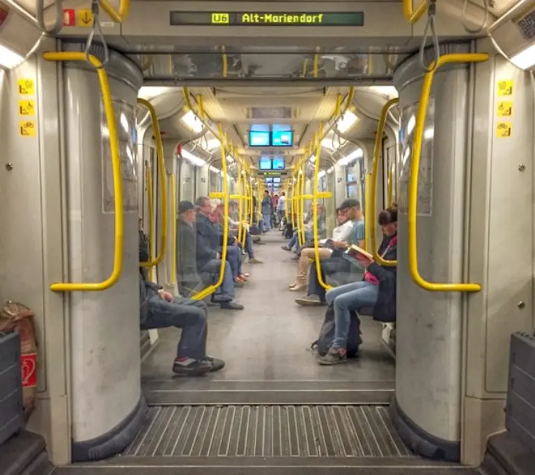
An open gangway subway in Berlin, photo via Second Avenue Sagas
Image via MTA/Flickr
Image via FEMA

Image via Gothamist