August 15, 2017
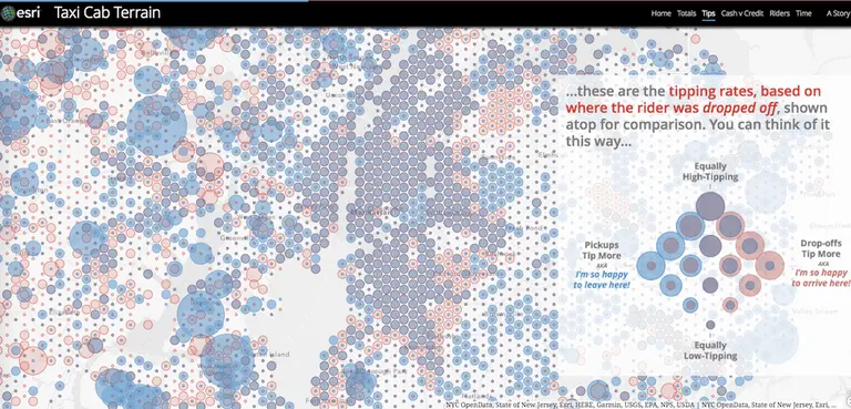
Looked at from any distance, New York City may appear to be a honking sea of cars and taxis, with the latter making the biggest visual impact (and probably doing the most honking). Thanks to GIS gurus Esri via Maps Mania, we have a snapshot–an aggregate vision, if you will–of a year of life in the Big Apple made up of the city's taxi journeys. The Taxi Cab Terrain map allows you to zoom in and find out about the many millions of rides that start and end in the New York City and New Jersey metro areas based on data from the NYC Taxi & Limousine Commission. Mapping yellow cab travel data covering July 2015 to June 2016, the map shows how different NYC boroughs use taxis and how they pay for their rides. Esri's John Nelson then takes a look at socioeconomic data to look for influences that might impact how different neighborhoods use and pay for cab rides.
More from the map, this way

