August 9, 2019

New study finds reasons for storefront vacancy are as varied as NYC neighborhoods themselves

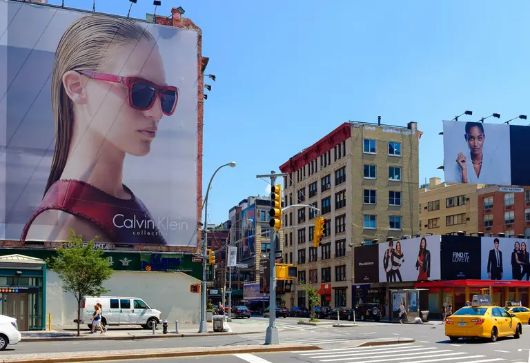
Amid discussions of gentrification and astronomical rents, it's impossible not to notice the alarming appearance of vacant storefronts in what seems like every neighborhood in New York City. A new report from the Department of City Planning (DCP) has attempted to get a closer look at the data behind this phenomenon to get a better understanding of how the city's retail and storefront uses may be changing. The report, titled "Assessing Storefront Vacancy in NYC," looks at 24 neighborhoods as case studies. The very detailed study found that, overall, storefront vacancy may not be a one-answer citywide problem. Vacancies were found to be concentrated in certain neighborhoods, and the reasons appear to be as many and varied as the neighborhoods themselves.
More fascinating findings, this way
May 13, 2019

Watch New York City grow from 1609 to today with this animated video assembled from historic maps

When it comes to the development of New York City over many, many years, we tend not to see the forest for the trees, so to speak. Here Grows New York, an animated map created by urban development buff Myles Zhang, gives us a seriously forest-eye view of how the city changes from the time the first native American tribes populated the five boroughs in 1609 to the noisy tangle of highways of 2019. Complete with cool facts and a soundtrack, the map visually animates the development of this city’s infrastructure and street grid using geo-referenced road network data, historic maps, and geological surveys, highlighting the kind of organic growth spurts that drive development over time, providing an "abstract representation of urbanism."
Watch the city grow before your eyes
April 26, 2019

New interactive tool tracks transit ridership in America’s cities

The story of public transit in America is an ongoing one: We need more of it, in more neighborhoods; we need to pay for it; ridership is declining in some places and growing in others. The state of transit often varies wildly depending on the city it serves. Transit Insights, a new visual tool from TransitCenter allows you to compare the country's transit systems in recent years while looking into factors like regional population changes and density, fare prices, operating costs and how many miles the system covers. Transit Insights combines information from the National Transit Database, the U.S. Census and route maps from Transit.Land into a visual format so you can reference information quickly and easily.
What's the story behind your city's transit system?
December 6, 2018

Central Park releases access map for people with limited mobility

A new map from the Central Park Conservancy includes lots of new information about the park's playgrounds, trails, restrooms, entertainment areas and other spaces that decodes the park for people with disabilities and/or limited mobility. Helpful information includes information on park terrain, letting visitors know how steep various trails are, and where there are stairs or other potential obstacles.
Full map, this way
November 12, 2018

This map shows the diversity of NYC’s veterans in every neighborhood

The New York City greater metropolitan area is home to over a million service members, veterans and their families. To provide an idea of just how many veterans call the city home–and how diverse a community they are– the New York City Department of Veterans' Services has compiled a set of maps using the most recently available data from the American Community Survey and the US Department of Veterans Affairs.
Maps and more info, this way
October 10, 2018

Find out just how much sunlight any building in NYC gets

Natural light is at the top of the list when New Yorkers think about a building's livability. Recently at the Municipal Art Society Summit for New York City, Localize.city, an AI powered website that provides insights about every address in New York City, unveiled a shade analysis for every building in the five boroughs. The site's creators say the analysis gives NYC home hunters a way to really determine just how much light any given address gets.
More sunlight and shadows, this way
September 18, 2018

Interactive map lets you explore Prospect Park’s 200 tree species

Through a $75,000 Urban Forestry Grant from the New York State Department of Environmental Conservation, Prospect Park Alliance recently surveyed about 12,000 of the park's 30,000 trees. The survey provides a nuanced picture of the park’s ever-changing ecosystem and important insights into the economic, environmental and health benefits of "Brooklyn’s backyard." You can view an interactive map of Prospect Park’s trees and their benefit to the community here; you can also examine the results on the Prospect Park TreeKeeper Interactive Map.
To the trees
August 1, 2018

An archive of 24,000 documents from Frederick Law Olmsted’s life and work is now available online

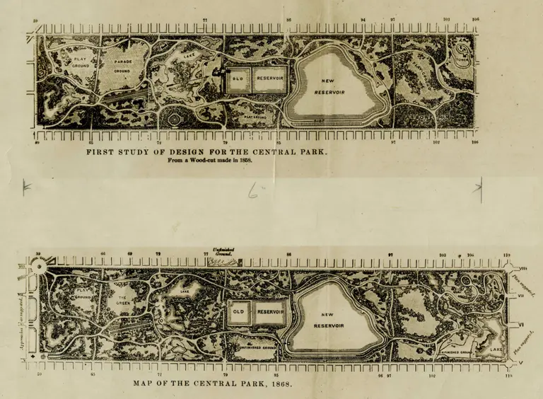
When thinking of influential creators of New York City’s most memorable places, it’s hard not to imagine Frederick Law Olmsted near the top of the list. Considered to be the founder of landscape architecture–he was also a writer and conservationist–Olmsted was committed to the restorative effects of natural spaces in the city. Perhaps best known for the wild beauty of Central and Prospect Parks, his vast influence includes scores of projects such as the Biltmore estate, the U.S. Capitol grounds and the Chicago World’s Fair. In preparation for the bicentennial of Olmsted’s 1822 birth, the Library of Congress has made 24,000 documents providing details of Olmsted’s life available online, Smithsonian reports. The collection includes journals, personal correspondence, project proposals and other documents that offer an intimate picture of Olmsted’s private life and work. The collection is linked to an interactive map at Olmsted Online showing all Olmsted projects in the United States (and there are many). You can search the map according to project name, location, job number and project type.
Explore the documents and map
May 29, 2018

Metro Region Explorer map gives you the facts on any spot in the Tri-State area

As a beta project created by the NYC Department of City Planning, Metro Region Explorer enables you to explore population, housing, and employment trends within the Tri-State New York City Metropolitan Region. The map was developed as part of an ongoing commitment to providing better public access and as a way to better understand information about planning issues that affect the city as well as the region, as many planning challenges are interconnected with the realities of the larger area surrounding the city's core.
Explore the region
February 1, 2018

NYC has the world’s second highest concentration of tall towers

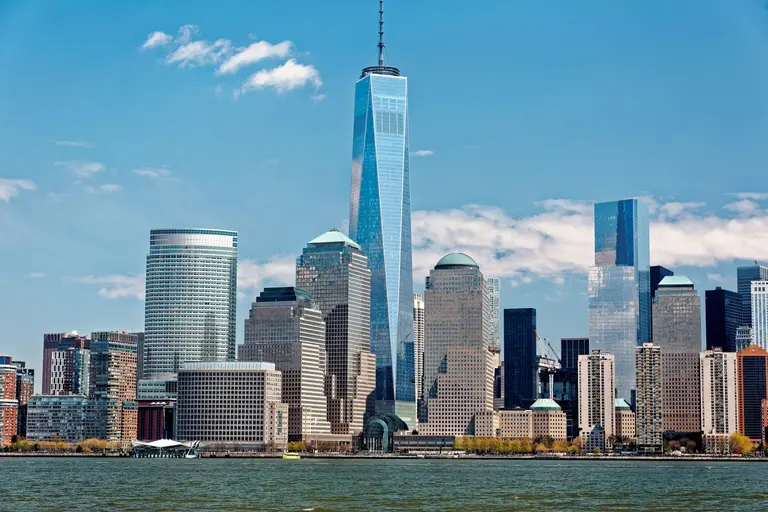
In 1962, nine of the world’s tallest buildings were south of 59th Street in Manhattan–and things hadn't changed much by 1981 when five of the tallest towers were concentrated on the same tiny island, which, with Chicago's three, gave the U.S. nine of the world's top 10 tallest skyscrapers. If you added Toronto's entry that made 10. Today, the only U.S. entry the top ten is lower Manhattan's One World Trade Center. This same tiny island though, is still number two in the world when it comes to concentration of tall towers.
Check out the infographic
November 21, 2017

What do New Yorkers search for on Thanksgiving? Bakeries, BBQ, and bowling alleys

You might be frantically putting the finishing touches on the Thanksgiving feast, stockpiling the “homemade” cookies you’ll bring for dessert, or making sure you’ve got the local pizza joint on speed dial, but Google News Lab knows what you’re up to, of course. Based on data from Google Maps and an analysis of the number of times people request directions to a location, you can find out how fellow New Yorkers (or Angelinos, or Baltimoreans) are planning to spend the precious hours of holiday weekend time.
More astonishing map facts this way
November 14, 2017

New development sales in Manhattan expected to hit $12B by 2020

According to CityRealty's 2017 Manhattan New Development Report, things are really going to heat up over the next few years. While new development sales dropped to $8.3 billion in 2017 from $9.4 billion in 2016 (attributed to a softening in the luxury market), there are a number of new big-time buildings that will commence closings and have the potential to drive total sales up to a whopping $11.9 billion by 2020. One key player is Extell Development’s One Manhattan Square on the Lower East Side. With 815 apartments, it will be the largest condo by unit count ever constructed in the city. And up on Billionaires' Row, Extell's Central Park Tower will have the city's biggest sell-out ever at $4 billion, while Vornado's 220 Central Park South is looking to set the record for highest price per square foot ever in NYC.
READ MORE
October 17, 2017

MAS’ new ‘Accidental Skyline’ report offers 10-point plan to keep supertalls in check

6sqft has reported previously on the increasing alarm caused by New York City's future skyline and its growing army of skyscrapers-to-be, with community groups expressing deep concern about the shadows cast across the city's parks by the tall towers. The Municipal Art Society (MAS) has been leading the pack when it comes to thorough analysis of the issue, which they see as having its roots not only in the sheer height of the new buildings but in a lack of regulation of how and where they rise in the larger context of the city. This "accidental skyline" effect reflects the fact that New York City currently has no restrictions on the shadows a tower may cast–the city doesn’t limit height, it only regulates FAR (floor area ratio). At this week's MAS Summit for New York City, the organization released its third Accidental Skyline report, calling for immediate reform in light of an unprecedented boom in as-of-right–and seemingly out-of-scale–development. MAS president Elizabeth Goldstein said, “New York doesn’t have to settle for an ‘accidental skyline.’”
See more future NYC skyscrapers, mapped
September 29, 2017

Every borough but Staten Island is underserved by city’s affordable housing plan, study says

While in July Mayor Bill de Blasio touted his Housing New York initiative for creating the most affordable housing units since 1989, housing advocates are questioning how many of these units actually match the need of the most rent-burdened New Yorkers. According to a new analysis by the Association for Neighborhood and Housing Development (ANHD), city residents with the lowest income continue to be the most under-served by the affordable units created and/or preserved under de Blasio’s plan in every borough except Staten Island. New infographics from ANHD break down the share of each borough’s rent burdened population at each income level in comparison to the percentage of units created by de Blasio’s plan that serves them.
Find out more
April 7, 2017

How much do amenities impact rent prices in NYC?

When looking for that perfect city abode, apartment hunters often create a list of must-have amenities that also fit within a budget. Now, thanks to Priceonomics and Renthop, you can determine which apartment features have the greatest impact on the overall rent. While the number of bedrooms and bathrooms drive up rent prices the most, the research found that having a doorman, an elevator, available parking and/or laundry-in-building most likely would increase the total rent. In a closer look at NYC, the data shows having a doorman creates the biggest increase of rent in the city, adding about $260 each month.
Find out more
April 4, 2017

This graphic color codes major transit lines in North America

Like New York, Boston's subway system is organized with a different color for each route. Unlike NYC, however, there's no corresponding numbers, so the lines along the T are actually referred to by their respective hues. Which is why Boston resident Ari Ofsevit, a transportation engineering and urban planning graduate student at MIT, found it odd that the Massachusetts Bay Transit Authority didn't use the same colors on their Twitter alerts as were found on their maps and signs. As Next City reported, this inspired him to create a graphic comparing the various colors of 13 major transit lines across the U.S. and Canada.
Find out more
March 23, 2017

The least affordable U.S. city for public transit isn’t NYC (and more fun facts about the cost of commuting)

In light of NYC's recent subway fare hike that bumped the price of a monthly pass to $121, the data jocks at ValuePenguin took a look at public transportation systems throughout the U.S. and ranked them according to affordability, based on the cost of a pass as a percentage of income and the median income of the city's commuters. Among the findings: New York City's transit system isn't the most unaffordable; that honor goes to Los Angeles. Washington D.C. topped the most affordable list among large cities, followed by San Francisco and Boston.
Read on for more insight on the cost of a commute
March 1, 2017

Report says having a roommate can save a New York millennial $728/month

We tend to think of New York as a hub for millennials living paycheck to paycheck, hindered by a higher-than-average cost of living coupled with their average yearly salary of $64,000. But young professionals are struggling throughout the nation. A new report detailed in the Washington Post looked at 25 major cities across the U.S. and found that in nearly half of these locales, "a millennial living alone in a one-bedroom apartment would need to spend more than 30 percent of his or her income on rent — surpassing the threshold for what financial experts say is affordable." The solution, though, could be to get a roommate. Take New York, where millennials spend about 34 percent of their income on rent. By shacking up with a buddy, they can save $728 a month, or 14 percent of their income.
READ MORE
Pitch a story icon Know of something cool happening in New York? Let us know:
February 1, 2017

Map shows where New York City’s refugees have come from since 2002

In the years since the 9/11 terror attacks, somewhere in the neighborhood of 8,000 people have sought refuge in New York City. Around 8,066 refugees have entered the United States through the city according to U.S. State Department Refugee Processing Center data. This week, President Donald Trump called for restrictions on entry to the U.S. for refugees and immigrants from the predominantly Muslim nations of Iran, Iraq, Somalia, Yemen, Sudan, Libya and Syria. A map of the world's nations, courtesy of DNAinfo, shows the 59 countries from which New York City's refugees have come each year since 2002.
Find out how many refugees have actually come to NYC from those countries
January 23, 2017

There are more skyscrapers in NYC than in the next 10 cities combined

Given our growing obsession with skyscrapers–and our growing collection of them–we're pleased to find that New York City has more skyscrapers than the next 10 skyscraper-boasting cities–combined. The infographic from highrises.com (h/t TRD) shows that NYC has 6,229 high-rise buildings, while Chicago has just 1,180, and second-most-populous Los Angeles a mere 518.
See how the cities stack up
January 17, 2017

128 tall buildings were constructed in 2016, a world record

We've just been looking at the amazing growth of the skyscraper in its early years, and now ArchDaily informs us that 2016 was a record year for tall buildings throughout the world. The Council on Tall Buildings and Urban Habitat (CTBUH) announced in its 2016 Tall Building Year in Review that 128 buildings 200 meters/656 feet or higher were completed in 2016, beating the previous year's record of 114 completions. Of those buildings, 18 nabbed the spot of tallest building in their respective city, country or region; 10 were classified as supertalls (300 meters/984 feet or higher). And it looks like we're on a roll...
Find out where the supertalls are rising and what the future might hold
January 10, 2017

Study: Getting to work by public transit is easiest in NYC, San Francisco and D.C.

A recent report from the University of Minnesota takes a look at major U.S. cities in terms of the number of jobs that are accessible to city residents via transit; Streetsblog brings us the news that you'll find the best transit access to jobs in New York, San Francisco, Chicago, D.C., Los Angeles, Boston, Philadelphia, Seattle, San Jose and Denver. The study concludes that in those (top 10) cities, "accessibility ranks all exhibit a combination of high density land use and fast, frequent transit service." According to the report, public transit is used for about five percent of commuting trips in the U.S., making it the second most widely used commute mode after driving. But the commute mode share accorded to transit varies quite a bit from city to city: 31 percent in the New York metropolitan area; 11 percent in Chicago; 8 percent in Seattle.
Find out more and compare cities
December 27, 2016

Watch 24 hours of NYC subway activity in one hypnotizing map

Who knew watching the movements of the New York City subway could be such a relaxing activity. A new data visualization created by Will Geary shows a day's worth of subway routes in motion in one mesmerizing creation. To build the map, Geary used Processing and Carto software, as well as the framework of another tutorial from Juan Francisco Saldarriaga, pulling data from the MTA and Google Maps to determine the flux. And for some extra fun, the whole thing is set to "Rhapsody in Blue!"
Watch the subway map on the move
December 14, 2016

Average Manhattan sales price tops $2M for first time

Despite chatter about the luxury market slowing down, 2016 has seen Manhattan real estate prices continue to climb and set records. The average sales price for an apartment (including both co-ops and condos) was $2.2 million, topping the $1.9 million record set last year, according to CityRealty's newly released Year-End Manhattan Market Report. This is a whopping 91 percent increase from 2006. And things heat up even more in the new development sector, where 1,800 units sold for a projected total of $8.9 billion, a huge jump from last year's $5.4 billion for $1,464 units.
More record-setting data ahead
December 13, 2016

Interactive map reveals the income gap that divides NYC’s richest and poorest

According to a 2016 Pew report, the middle class is shrinking in 90 percent of U.S. cities. It's the first time in our nation's history that the middle class doesn't make up the economic majority. Instead, the highest- and lowest-income households combined comprise over 50 percent of the population. And in New York City, the divide is startling. One in five New Yorkers live below the poverty line, while the upper five percent of Manhattan residents earned more than $860,000 in 2014. GIS software company Esri has created a series of interactive maps that visualize this wealth divide in NYC and across the country, revealing where the richest and poorest live and the new economic divisions that are forming in our major metropolitan areas.
Maps, this way

Our Mission

More than just current events, here you'll learn about the places, people, and ideas that are shaping your city.