November 1, 2016

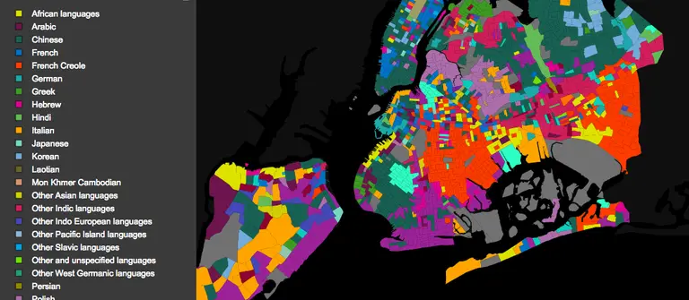
MAP: What languages New Yorkers speak at home, by neighborhood

Life in New York City in all its diversity means hearing a colorful mix of languages spoken every day. Web developer and artist Jill Hubley's new census map (h/t Gothamist) shows us which languages are spoken by New Yorkers at home in their neighborhoods. Hubley intially created the Languages of NYC map for a GISMO exhibit at the Queens Museum entitled, "Map Mosaic: From Queens to the World" with data from the United States Census Bureau's American Community Survey. The result is a colorful tableau of native tongues, from Russian in Brighton Beach to Spanish in Sunset Park, with large swaths of French Creole in Brooklyn and Chinese in lower Manhattan–and those are the ones we already expected. The map allows you to view "islands" of one or more languages or to view them all.
Check out the map
November 1, 2016

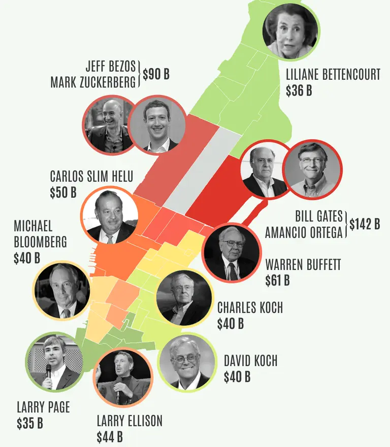
The world’s 12 richest people could buy all of Manhattan’s residential stock

When it comes to the richest people in the world, the disparity is staggering, and what better way to exemplify this than by sizing these individuals up against the nation's most expensive real estate market, in a city that's home to more billionaires than anywhere else. PropertyShark took data from Forbes' World Billionaires List and created an infographic that shows how the world's 12 richest people have enough wealth to buy all of Manhattan's residential stock for $578 billion and still have some pocket change leftover.
See the full infographic here
September 1, 2016

Interactive graphic explores the diversity of Queens through its 59 endangered languages

Queens is one of the most diverse places on the planet, and it's believed that around 500 languages are spoken here. Fifty-nine of these, however, are endangered, meaning that those who speak these languages are the last people on Earth who know them. This number is staggering, considering the fact that UNESCO puts the worldwide number of "critically endangered" languages at 574, which is why artist Mariam Ghani has embarked on a mapping project that explores these disappearing tongues. First shared by Fast Co. Design, The Garden of the Forked Tongues is an online, interactive graphic and an acrylic mural in the Queens Museum, both of which plot colored polygons to represent how the languages are distributed throughout the borough.
All the info
August 10, 2016

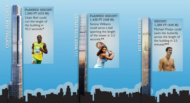
Infographic: How Long Would it Take Top Olympians to Scale NYC’s Supertalls?

Michael Phelps took his world record to 21 gold medals last night; Usain Bolt is poised to become the first athlete to win three golds at three Olympics; and Serena Williams (tied with sister Venus) has the most gold medals of any tennis player in the games. To have a little fun with these athletes' stats, CityRealty.com put together this infographic that shows how long it would take the Olympians to sprint, serve, and swim their way to the top of New York City's three tallest planned and built residential buildings -- the Central Park Tower, 111 West 57th Street, and 432 Park Avenue.
Check out the full-size infographic here
July 26, 2016

Underwater New York Offers Found Objects From NYC Waterways to Spark Imagination and Art

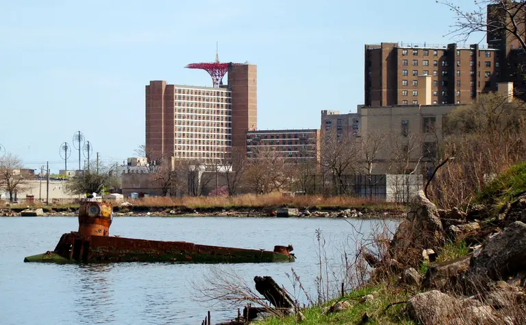
The collectors of curious things at Atlas Obscura bring us the work of Underwater New York, a fascinating catalogue of all the weird stuff that’s been found bobbing, sinking or washed-up from the murky depths of the city’s waterways, from a giraffe skeleton to a grand piano, with a bag of lottery tickets thrown in for good measure. In a fascinating study in what-is-it-and-where-is-it-coming from, founder Nicki Pombier Berger and the site's editors and contributors (artists, filmmakers, musicians, photographers and other storytellers) create contexts for the curiosities that find their way to this aquatic lost and found. New York City waterways, like the swampy southern Brooklyn beach known as Dead Horse Bay, and their submerged treasures are the inspiration for works in this digital gallery of sorts. Berger and fellow editors Helen Georgas and Nicole Haroutunian compile a growing list (it currently contains 150 objects) of waterfront finds that they've discovered via everything from news articles to anecdotes. Contributors are encouraged to use the objects to weave their stories in whatever medium they choose.
Find out more of the bizarre items found beneath the waves
July 18, 2016

Huge Tax Disparities Along Central Park Become Visuals in Architectural Art Installation

"Section 581" by SITU Studio, Photograph by Patrick Mandeville Billionaires get off nearly tax-free and billions go uncollected due to flaws in the way the city assesses property value. As part of a new exhibit at the Storefront for Art and Architecture in Soho, interdisciplinary architecture firm SITU Studio created visual representations of these inequities in one of their most glaring examples: the buildings along Central Park. New York City's property tax structure assigns higher real property taxes to renters than it does to the infamous absentee owners of the trophy condos on Billionaires’ Row, short-changing the city of millions in annual revenue, according to CityLab. The acrylic bands in the SITU models show the disparity between the taxed value of these properties and the sky-high amounts they’d actually sell for.
Find out how the state law is giving billionaires a free lunch
July 5, 2016

‘Periodic Table of NYC Trash’ Identifies the City’s Garbage and Odors

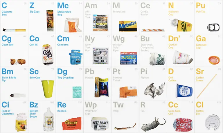
Easily put a name to New York’s discarded paraphernalia and putrid odors with the help of the Periodic Table of NYC Trash. This nifty design, created by writer Molly Young and graphic designer Teddy Blanks, places 118 recurring New York City elements into a handy tabular array that, like the real periodic table that inspired it, provides a useful framework for analyzing behavior (in this case, that of New Yorkers). All of the trash depicted in the poster was pulled straight off our city's filthy streets and photographed by Young and Blanks. What's featured includes everything from an innocuous Metro Card and stray baby sock to gag-inducing finds like a dead rat and a bottle of pee. Everything has also been handily divvied up into nine different categories that include apparel, beverage, food, hygiene, household, lifestyle, municipal, packing, and vices.
See the full size version here
July 5, 2016

Immigration Map Shows Migration Patterns for Every Country in the World

Puzzled at how many conversations about international issues turned to the subject of immigration no matter what the original context might have been, NYC-based entrepreneur and data visualization geek Max Galka created a map showing the flow of immigration to and from each of the world’s nations to better visualize where the patterns really lay. In addition to topics like terrorism, Brexit, this year’s presidential race and the refugee crisis, according to Galka, immigration was "being mentioned in connection with all sorts of topics I never would have expected.” Finding that the debates on immigration, though sometimes heated, were lacking in factual information, he hopes that his mapping efforts, brought to us via his blog Metrocosm, can provide some real-world context on questions like, "how many migrants are there? Where are they coming from? And where are they going?"
Take a look at the map to see who's coming and going
May 20, 2016

Infographic: How NYC’s Supertalls Compare in Height and Girth to Global Towers

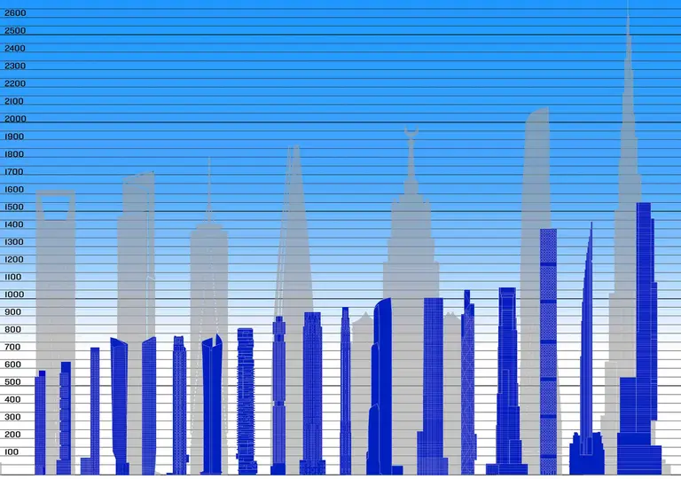
As the Skyscraper Museum so aptly writes, "Tall and BIG are not the same thing." Echoing 6sqft's recent post on global supertalls, the infographic above illustrates how when the height of New York's tallest towers are stacked up against the sky-high constructions abroad (and 1 WTC), our city's skyscrapers truly are "runts on the world's stage." The image also reveals that not only do these towers lack significantly in height, but also in girth. This means what really makes the design of all of New York's new skyscrapers so unique is not how tall they are, but rather, how slender they are.
more on all that here
May 3, 2016

Average Condo Sale in Manhattan Reaches $2.9M, Setting New Record

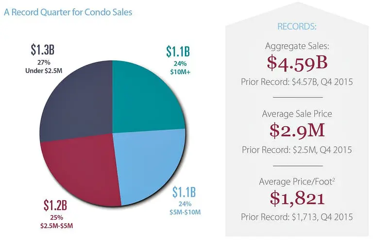
For the second quarter in a row, average condo sales prices in Manhattan are breaking records. The first three months of 2016 saw $4.59 billion in aggregate sales, breaking the previous record of $4.57 billion that was set last quarter, according to data from CityRealty. The average sales price topped out at $2.9 million, also significantly higher than last quarter's $2.5 million. These figures aren't surprising considering 24 percent of all condo sales during the beginning of this year were at or above $10 million, with new luxury developments like 432 Park Avenue, The Greenwich Lane, and 150 Charles Street accounting for the uptick.
More stats this way
April 26, 2016

What Are Top NFL Players’ Salaries Worth in Real Estate?

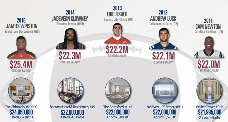
It's no secret that the NFL's top draft picks command starting salaries well into the eight-figure range, but to really put into perspective just how crazy-big their paychecks are, CityRealty's latest infographic takes a look at what the last five #1 picks could buy in Manhattan with their money. And on top of that, how these hypothetical one-off property purchases translate into real estate portfolios in their hometowns. (Teaser: Quarterback Jameis Winston could either buy a $24.95M pad at The Eldorado or 107 homes in his native Tampa, FL!)
Check out the full-size infographic here
April 11, 2016

Do Poor New Yorkers Live Longer? Study Says Yes, Despite the Income Gap

The New York Times recently took a look at the results of a study published in the Journal of the American Medical Association (JAMA). Using data compiled from anonymous earnings records and death certificates, the results offer some provocative insights into the importance of geography to how long people live–poor people in particular. There is, as we've already assumed, a longevity gap between the rich (in this study, people with household incomes of over $100,000 per year) and poor (those with incomes less than $28,000). In Manhattan, for example, the average poor person will die about six years before the average rich one. But that gap is about a year and a half smaller than the same income/longevity gap for the United States as a whole. Tulsa and Detroit, for example, were two cities with the lowest levels of life expectancy among the low-income population, with the results already adjusted for differences based on race.
Find out what the numbers look like where you live
March 17, 2016

POLL: An Irish Castle or a New York Castle – Which Would You Pick?

Get out your green, because in honor of St. Patrick's Day we're putting a twist on the classic real estate comparison conundrum pinning some of the coolest Irish castles currently up for sale against a few New York castles (a.k.a. really expensive condos). Hit the jump to see what's available in the $2 to $12 million range, and then cast a vote for whether you'd rather having a sprawling 700-year-old stone castle with 380 acres of land in Ireland, or a comfy four-bedroom penthouse at The Brompton in Yorkville. And if you're not into castles or condos, we've also figured out how many pints of Guinness you can get for the median price of an apartment...
Which would you pick?
March 10, 2016

Closing Time at 432 Park: A Look at the Numbers at NYC’s Tallest and Most Expensive Building

Closings at Macklowe Properties/CIM Group‘s Billionaires’ Row blockbuster 432 Park Avenue officially commenced just eight days into the new year, and now that enough time has gone by for these sales to be re-listed as rentals, CityRealty has put together an informative infographic that takes a look at the numbers at New York City's tallest and most expensive residential building. There's a lot of fun and fascinating info to be found ahead, but one of the most surprising facts? Of the 141 units available, only 13 have sold to date.
See the full infographic here
March 7, 2016

Subspotting Map Project Shows Where You Can Get Phone Reception in the Subway

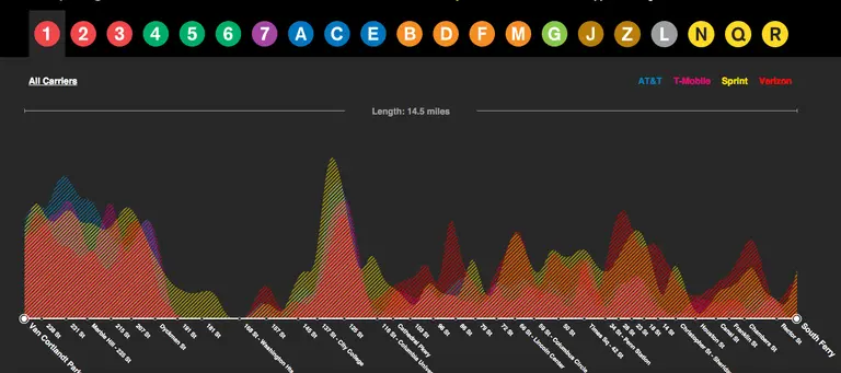
The MTA is apparently well into the middle phase of its project to wire 279 below-ground subway stations with cell reception, but as Citylab recently put it, "there are still places you can’t make a call to save your life.” Into this unfortunate void comes the Subspotting project, brainchild of Daniel Goddemeyer and Dominikus Baur, which offers maps "illustrating the unequal geography of subway reception" and helpfully providing information on where you'll be able to make a call or send a text while in transit. In addition to system and individual line maps, there's an app that shows the quality of reception as different sized bars at each station, and MTA-sanctioned posters.
Can you hear me now?
March 7, 2016

Donald Trump’s NYC Properties Owe the City $27K in Unpaid Fines

Donald Trump's fellow Republican presidential candidates have been focused on him releasing tax documents, but since he claims he's not in the position to do so since he's been audited, this little tidbit might make for some good temporary fodder -- Trump's luxury Manhattan properties owe the city for 19 unpaid violations that have amounted to $27,536 over the past 12 years. I Quant NY scoured the city's building records to find that since 2000, at least 14 of his Manhattan properties have received 460 separate violations, totaling $304,165 in fines. Sure this may be a drop in the bucket for the GOP frontrunner, but it's the lack of compliance that seems troubling, especially since only 6 percent of the instances were dismissed. And 2015 had the most violations to date, with 62 separate fines for "Failure to Maintain an Elevator."
Get the rest of the details
February 12, 2016

Office Romance by the Numbers: Which Professions Are Pairing Up

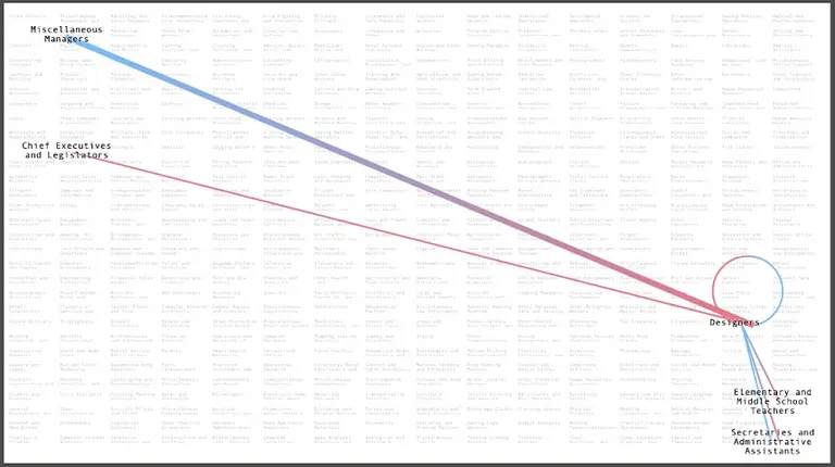
If you’ve got the urge to merge, it might be time for a career change. With the romance-obsessed holiday around the corner, the folks at Bloomberg Business delved into the U.S. Census Bureau’s 2014 American Community Survey to find out which professions are pairing off. To that end, they've created a fascinating interactive chart that reveals the most common occupation/relationship marriage matchups for any selected occupation. Some findings aren’t surprising: "High-earning women tend to pair up with their economic equals, while middle- and lower-tier women often marry up. In other words, female CEOs tend to marry other CEOs; male CEOs are okay marrying their secretaries."
So Who's Marrying Whom?
Pitch a story icon Know of something cool happening in New York? Let us know:
February 1, 2016

How Do Rents at NYC’s First Micro Apartment Complex Compare to Regular Studios?

Just before the new year, listings went live for NYC's first micro apartment complex Carmel Place (aka My Micro NY aka 335 East 27th Street) in anticipation of its opening in March. The nine-story modular development in Kips Bay has 55 studios that are 260 to 360 square feet. Of these, 22 are affordable (more than 60,000 people applied for them), and they'll go from $950 to $1,500 a month depending on size and income. The remaining market-rate units will range from $2,500 to $2,900 per month, which has left many skeptics questioning why anyone would fork over nearly three grand for a space that is far smaller than conventional studios. To put this argument into an actual visualization, the data gurus over at NeighborhoodX created a simple, yet informative graph that compares the rental price per square foot at Carmel Place with that of regular studios across the city (h/t Curbed).
More here
February 1, 2016

Graphs Show How Skyscrapers Relate to Their Cities–and Whether We Need More of Them

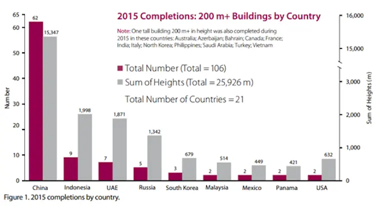
Tall buildings help make cities great. Except when they don’t. Citylab looks at a new study and graphs that show where skyscrapers fit into what makes cities great–and suggests that the middle is where the magic happens. 2015 was a record year for the skyscraper; 106 tall buildings (higher than than 656 feet) went up across the globe, according to The Council on Tall Buildings and Urban Habitat (CTBUH), more than in any previous year; emergent countries that appeared at the forefront of the global economic stage with the dawn the 21st century (China, Indonesia, UAE, Russia) show a big uptick in building upward. The majority of newly-built skyscrapers have risen in Asian nations—especially China–but the United States is in sixth place, with just two skyscrapers completed in 2015.
More infographics this way
January 29, 2016

Interactive Graph Compares L Train Commute Times and Rents With Other NYC Neighborhoods

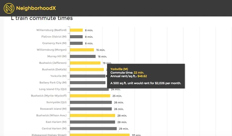
We're hearing lots of anguish and anxiety over the possibility of an L subway shutdown for repairs for as long as a year or more, and we've taken a look at some possible solutions. Now, we've asked the real estate data geeks at NeighborhoodX to go a little deeper beneath the grumbling to find out just how much convenience can be had along that thin grey line, and how it stacks up against other neighborhoods in Manhattan, Brooklyn and Queens. So which other neighborhoods offer commute times similar to the L train stops—and—just as important when choosing a neighborhood–how do their rents compare? And if you're living along the L, in light of the shutdown, what neighborhood alternatives do you have in the city that provide a similar commute?
Find out here
January 19, 2016

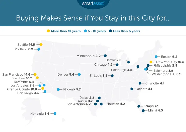
It Only Makes Sense to Buy a Home in NYC After 18 Years, Longer Than Anywhere in the U.S.

Renting in New York can get exhausting–the dreaded lease renewal letters, the constant moves, the thought of shelling out tens of thousands of dollars each year to pay someone else's mortgage. But is it really worth it to buy a home in NYC? According to data from personal finance site SmartAsset, it's only a good decision after you've lived in New York for 18.2 years, longer than anywhere else in the nation by far (h/t Business Insider). The study looked at 29 major cities across the U.S. and calculated their breakeven point–"the point at which the total costs of renting become greater than the total costs of buying." As a baseline, they used a household earning $100,000 annually with a 4.5 percent mortgage rate, a 20 percent down payment, and $2,000 in closings costs.
More details ahead
January 11, 2016

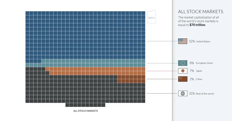
Visualizing All the Money in the World in One Infographic

From the value of all the Bitcoins in the world ($5 billion) to the amount of total global debt ($199 trillion) to the barely-fathomable amount of the derivatives market (as much as $1.2 quadrillion. Yup. Quadrillion), a chart created by The Money Project, produced by Visual Capitalist, attempts to put all the world’s currency in one place in the form of tiny, little squares (h/t Fast Co. Exist). Starting with the question, "How much money exists in the world?" this data visualization starts with the world’s total money supply.
More really big numbers, this way
December 17, 2015

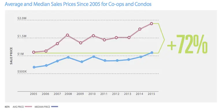
Median Manhattan Apartment Price Climbs Past $1M for First Time

"For the second year in a row, Manhattan real estate prices soared, setting new records. For the first time, the median price for an apartment—including both co-ops and condos—was above $1 million." This is according to CityRealty's newly released Year-End Manhattan Market Report, which puts the median price at $1.1 million, 13 percent higher than last year and 60 percent higher than 2005. Additionally, the average apartment sales price ($1.9 million), the average condo price ($2.6 million), and the average co-op price ($1.4 million) all broke 2014's records by $100,000.
See the report's infographic this way
December 7, 2015

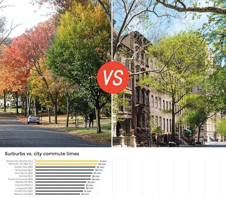
Chart Compares Suburb and City Commute Times–and How Much Extra We Pay for Convenience

When most of us rationalize our outrageous rents (and for buyers, real estate prices), our first go-to argument usually involves something along the lines of how great it is to live so close to work and the bustling city. But as it turns out, there are actually more than a handful of neighborhoods outside of the borders of Manhattan that boast way better commute times than even Brooklyn. Real estate data start-up NeighborhoodX is back again with yet another eye-opening visualization, this time pitting the commute times and real estate prices of various New Jersey, New York and Connecticut suburbs, and a few popular Queens and Brooklyn nabes, against one another.
See all the comparisons here

Our Mission

More than just current events, here you'll learn about the places, people, and ideas that are shaping your city.