November 25, 2015

America’s Top Thanksgiving Searches Are More ‘Tattoo Shops’ Than ‘Turkeys’

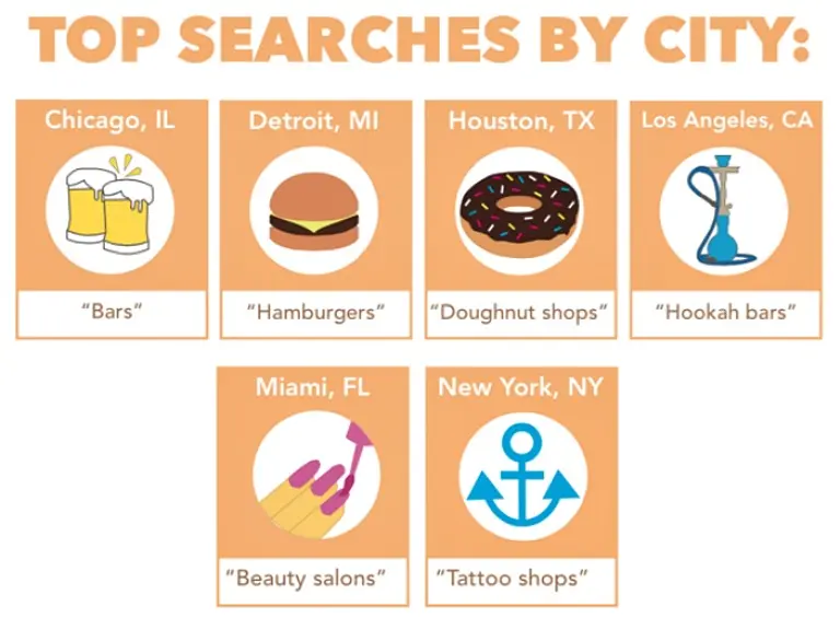
The Butterball Turkey Talk-Line may get inundated with calls on Thanksgiving and the days leading up to the holiday, but when it comes to internet searches there are no turkeys in site. Google Maps analyzed Thanksgiving trends from the past three years to reveal some hilarious and unexpected topics. For example, the top national day-of search is "buffet restaurants," and in New York City specifically, Thanksgiving is apparently a day to find tattoo shops (matching ink for the whole family?). The folks over at CityLab compiled the data into two fun infographics that show the surprising priorities of Americans around the holiday.
More trends this way
November 6, 2015

More Manhattan Rentals Are Listed Above $15,000 Than Under $2,000

Looking for a rental under $2,000 a month? Keep your fingers crossed and head to the Upper East Side. In a new analysis of on-line residential exclusive listings data as of October 8th, The Real Deal concludes that there are more Manhattan rentals priced above $15,000 than there are under $2,000, further proving that the uber-luxury market is not letting up. But for the latter category, the neighborhoods of Yorkville, Carnegie Hill, and Lenox Hill are the best bet. In fact, the UES has more listings below $2,000 than all of Manhattan south of Central Park.
More on the trends this way
October 28, 2015

Detailed Infographic Shows the Ebb and Flow of NYC Skyscraper Construction

Charts related to skyscrapers typically compare the world's tallest buildings, but a new interactive timeline from the Council on Tall Buildings and Urban Habitat (CTBUH) shows the ebb and flow of skyscraper construction in NYC and how it resembles the country's boom and bust cycles (h/t CityLab). The timeline is part of a larger report called "New York: The Ultimate Skyscraper Laboratory," which also examines the function and location of recent supertall towers going up during today's boom cycle.
More infographics and details
September 23, 2015

Infographic Shows How Much Income Tax People Pay in the World’s Major Cities

You might want to think twice before complaining about your tax statement this year. While Americans, and New Yorkers especially, tend to think they're coughing up a ludicrous amount of their salary to Uncle Sam, this infographic (h/t Business Insider) shows how much other major cities across the world pay in income tax and social security contributions. For example, income taxes in Copenhagen are at 44.7 percent and in Stockholm at 27 percent, while New York City is 13.8 . On the other end of the spectrum, the rate in Dubai, Buenos Aires, and Lima is 0 percent.
Check out the full infographic
September 21, 2015

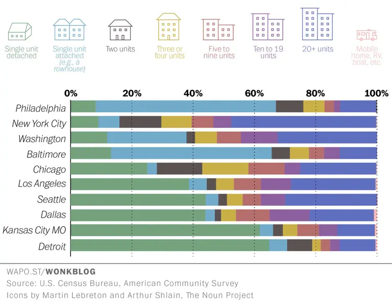
Infographic: The Most Popular Housing Typology in Major Cities Across the U.S.

The American dream may be to own a sprawling single-family home with a picket fence, but clearly very few New Yorkers are interested in that fantasy. Instead, as this fascinating infographic breaking down the most-popular housing typologies across the 40 largest U.S. cities points out, less than 10 percent of NYC inhabitants live in a detached single unit. The majority, in fact, reside in buildings with 20 or more apartments.
See how 40 of America's largest cities stack up against one another
September 4, 2015

Infographic: Here’s How Much Every State Contributes to the U.S. Economy

Would you guess that Texas has a bigger or smaller economy than New York? Which state would you say is the smallest contributor to our nation's $17.3 trillion GDP? This fascinating chart created by HowMuch.net breaks down the relative economic value of each state (in 2014 dollars) into one digestible diagram that's sure to start a conversation—if not offer a whole new respect for states like Florida and New Jersey.
Get a more detailed look here
September 1, 2015

Infographic: The Correlation Between Income and Access to NYC Public Transit

We already know that there are plenty of areas within the five boroughs that are underserved by public transportation, but a new visualization provides an interesting perspective on how this lack of service is related to income. The simple infographic by FiveThirtyEight shows how New Yorkers commute based on income and access to public transportation, revealing five broad categories that range from those with no good options at all to those who have their choice of Uber or public transportation.
READ MORE
August 25, 2015

INFOGRAPHIC: Ten Years of Trump

Love him or hate him, not a day goes by anymore without Donald Trump making headlines. But the Donald was turning heads and raising eyebrows long before he launched his [fill in the blank] presidential campaign. As CityRealty notes, “Over the years, Donald Trump’s buildings have commanded a premium in New York’s pricey real estate […]

July 1, 2015

NYC Makes Up 5 Percent of the Nation’s Property Value

We know New York City is ridiculously expensive, but what about its property values? Because of the city's confusing "market value" system, true property values are often grossly underestimated. To provide a more accurate look, the data buffs over at Metrocosm have put together these visually telling cartograms of real property values in NYC, substituting land area for total property value. The maps not only compare values in New York with those throughout the rest of the country, but they also look at how property values are concentrated within the five boroughs. The data reveals some striking facts. New York City makes up a whopping 5 percent of the nation's property value, coming in at $1.5 trillion. When you single out Manhattan's $733 billion, it could be the 14th most valuable state in the country. The Upper East Side, which occupies less than one square mile, has $96 billion in housing value–more than entire states like New Hampshire, North Dakota, South Dakota, Vermont, Wyoming and Alaska.
More findings, maps, and graphs ahead
June 3, 2015

How Does the One WTC Observatory Stack Up Against the World’s Highest Tourist Spots?

It was a big day in New York City last Friday, when the One World Trade Center Observatory officially opened to the public, welcoming New Yorkers and tourists alike to the top of the tallest building in North America. While the view from 1,250 feet up in the air seems like the apex of the world, the folks over at the Skyscraper Museum put together this fun infographic, which compares the highest publicly-accessible tourist spaces around the world, including observation decks, bars, restaurants, and other sky-high thrills. Turns out, the One World Trade Observatory ranks 9th for observation decks and 11th for all publicly-accessible spaces.
More details ahead
May 21, 2015

The Price of History: Looking at NYC’s Biggest Landmark Condo Conversions

This year is full of celebrations for the 50th anniversary of the New York City Landmarks Law, and in marking this milestone we tend to look at all of the historic buildings that have been perfectly preserved in their appearance and function. But what about those that retain their original character, yet have a new use? The folks over at CityRealty have taken a look at this group, focusing on city landmarks that have been converted from commercial spaces into condominiums. Zoning in on the five largest landmarks (by number of units), they found that owning a piece of history will cost you. In fact, the average unit price in these Manhattan landmarks was 45 percent higher than other condos; in Brooklyn, 26 percent.
Check out the full infographic here
May 19, 2015

Chart Shows Where to Find the World’s Tallest Skyscrapers Over the Past Century

The number of skyscrapers a city can count is often a marker of how much progress they've made; these tall towers point to innovation, technology, ambition and most importantly, they scream "We have money!"—which of course equates to power. For the better part of the 20th century, the United States has accounted for the majority of the world's tallest skyscrapers, but with the emergence of new economies over the last few decades, there's been a definitive shift.
Learn more here
May 11, 2015

Charting the Property Taxes of the City’s 10 Most Expensive Apartments

Back in March, we learned that the owner of the $100 million apartment at One57 (the most expensive sale ever in the city) pays only $17,268 in annual property taxes– "or 0.017 percent of its sale price, as if it were worth only $6.5 million," as we noted. "In contrast, the owner of a $1.02 million condo nearby at 224 East 52nd Street is paying $24,279, or 2.38 percent of its sale price." Why does this happen? It's in part due to the 421-a program, which offers tax breaks for the inclusion of affordable housing and "lowers the billable-assessed value of a property to incentivize real-estate development," according to CityLab. It's also thanks to the city's haphazard system for assessing market values of condos and co-ops. In response to this growing issue of inequality, Mayor de Blasio announced just last week that he hopes to end 421-a for condos, as well as implement an even stricter mansion tax. To make the issue a bit more black-and-white, CityLab has put together two charts that show just how disproportionate the actual value of the city's ten most-expensive apartments is compared with their property taxes. As they note, "In NYC, billionaires pay 1/100th the average property-tax rate."
Find out more here
April 28, 2015

Detailed Chart Shows the World’s Tallest Building Constructed Every Year

An infographic about the world's tallest buildings is not a new idea (in fact, we've featured a great one, as well an interactive version, here before). But the Economist's idea of looking at the race to the top connected with the times and world events is a fresh take. The highly detailed chart shows the tallest building constructed every year beginning in 1885. Each bar represents its height, and the color shows on what continent it was built. The chart also highlights exceptionally noteworthy buildings and certain world events that contributed to the ebb and flow of skyscraper construction over time.
More details ahead
April 24, 2015

Infographic: Here’s NYC’s Immigration Patterns over 387 Years

We often talk about specific neighborhoods' immigration history–Little Germany in the East Village, El Barrio in East Harlem, or the capital of Jewish America on the Lower East Side. But when we look at the city as a whole, there's been some pretty interesting immigration patterns over its nearly-400-year history. To visualize this timeline, the data gurus over at Metrocosm have put together an interactive infographic that shows the change in these immigration waves from 1626 to 2013 and how they relate to world events regarding these given countries.
READ MORE
April 22, 2015

Living Green: Mapping NYC’s Newest LEED Rated Residential Constructions

Happy Earth Day, friends! As climate change weighs heavy on many of our minds, it’s relief to know that there are developers and architects working hard to create a healthier, more sustainable built environment. Eco-friendly residential design has been on the rise in NYC over the last decade, with buildings today boasting everything from solar panels to greywater […]

April 15, 2015

POLL: Is Penthouse Living Worth a 75% Price Increase?

On Monday we took a look at an infographic from CityRealty that shows how much more penthouse buyers pay compared to their neighbors directly below. Analyzing the top penthouse sales recorded in 2014, they found that “high-rise top floor buyers on average shell out 11 percent more per square foot for their pads than their counterparts just below. Looking at the average […]

Pitch a story icon Know of something cool happening in New York? Let us know:
April 14, 2015

How Would a Minimum Wage Hike Change the Way New Yorkers Spend Money?

Today, the Daily News reports that increasing the minimum wage to $15/hour would add $10 billion annually to city paychecks and increase earnings for almost 1.5 million people, according to an analysis by City Comptroller Scott Stringer. Says the paper, "The typical family getting the boost would spend $1,100 to $1,800 more a year on housing, and up to $600 on groceries, $400 on entertainment, and $300 eating out, Stringer predicted." How would this increase in spending compare to a given family's financial patterns before the minimum wage hike? The Washington Post has used newly released data from the Bureau of Labor Statistics to analyze where the poor and rich spend really spend their money. Looking at four categories (housing, transportation, food, and pensions/life insurance) and three classes (low, middle, and high), the results are mainly as to be expected. The rich spend more all around, but as a percentage of their total income, they spend less; the middle class spends the most on transportation; and basically all Americans have similar spending patterns when it comes to groceries. But the big difference between the upper and lower classes is saving. "For every dollar they spend at the grocery store, the poorest households save 12 cents, while the wealthy sock away $3.07 in pensions and life insurance."
What does this mean? See the infographics here
April 13, 2015

How Much More Do Penthouse Buyers Pay Compared to Their Neighbors Directly Below?

So maybe you don't get the coveted "PH" in your address, but you will save tens of millions of dollars by "slumming it" on the floor just below. The data gurus over at CityRealty analyzed the top penthouse sales recorded in 2014 and found that high-rise top floor buyers on average shell out 11 percent more per square foot for their pads than their counterparts just below. Looking at the average selling price, this rings in at a whopping 75 percent more. Is the PH premium worth it? Let us know what you think in the comments.
check out the full infographic here
March 27, 2015

NYC Will Get Richer and Denser, New Report Reveals

Think New York City is crowded now? You ain't seen nothing yet. According to census data and a new report by the Brookings Institute on job proximity, the city is on track for a population boom of professionals raking in big bucks. The city has by far the highest job density in the country, even when the national trend is for both people and jobs to move to the suburbs. Similarly, NYC tops the list of increase in population of college grads between 2007 and 2012 by a landslide. And as The Atlantic observes, this combination is creating a feedback loop that will make our already rich and crowded city even richer and more crowded. "The densest cities tend to be the most educated cities, which are also the richest cities, and often the biggest cities. They’re gobbling up a disproportionate share of college grads. And, as a result, they are becoming richer, denser, and more educated."
More details ahead
March 24, 2015

Are You Considered ‘Middle Class’ in NYC?

Following up on our recent post taking a look at how much you need to earn to be considered "rich" where you live, here's a brand new study by Quoctrung Bui of NPR's Planet Money which investigates what's considered "middle class" in the United States. Although most Americans would humbly identify themselves as median earners, whether they're raking in $30K or $300K, there are actually benchmarks for this segment of the population. But as you may have guessed, they vary greatly depending on where you live.
Find out where you stack up here
March 19, 2015

Skyscraper Museum Reveals Interactive Timeline of the Tallest Buildings Throughout History

The latest addition to the Skyscraper Museum's permanent collection is "The History of Height," an interactive timeline of the tallest buildings throughout history. The web tool is made up of a scrollable stream of flashcards starting as far back as the Great Pyramid in 2650 BCE and continuing all the way to today's tallest, the Burj Khalifa. It also offers information about the innovations that allowed people to build higher, like fireproof floors, zoning laws, elevators, and high-strength bolting, and includes towers that have long since been demolished, but had an impact on the supertall environment.
More on the interactive infographic here
March 17, 2015

25 Epic Buildings That Were Never Constructed

While we all love to ogle the latest and greatest rendering reveals, it's a shame how quickly we forget about the incredible architecture that could have risen once their plans get scrapped. To give a small consolation to the architects who spent countless hours and sleepless nights scribbling skyscrapers with the hope of transforming the built landscape, Rubberbond has created a nifty infographic showing 25 ambitious projects that today, for better or worse, only live on in drawings. From a pyramid-shaped mausoleum in London designed to hold five million corpses to a Sagrada Familia-like hotel Gaudí fashioned for NYC to a giant Bucky dome that could have covered Manhattan, have a look at all the lost designs ahead and then weigh in—was it a good idea these were dumped or would they have been great architectural additions?
See the whole thing here
March 13, 2015

Infographic: The Tallest Buildings of the Last 5,000 Years Charted

From the pyramids of Teotihuacan to One World Trade, here are the tallest buildings of the last 5,000 years. Slovakian artist and designer Martin Vargic created six infographics that chart the history of buildings across Europe, North America, Asia, Africa, South America and Oceania. The infographics, which date buildings (and a few notable monuments) as far back as 2,650 B.C., give a pretty complete look, highlighting the construction's name, shape, height (which does account for a tower's spire), the year it was erected, and the years it was its continent's, if not the world's (denoted by a red shading), tallest building. The charts also give a good snapshot of the great skyscraper race that took hold in the early 20th century, as well as shifts in global money as seen in the emergence of Asian skyscrapers like Taipei 101 and the Burj Khalifa in the mid-2000s. You can get a closer look by expanding the image ahead.
This way for the complete picture

Our Mission

More than just current events, here you'll learn about the places, people, and ideas that are shaping your city.