December 3, 2014

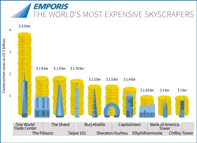
How the Cost of One World Trade Center Compares to the World’s Most Expensive Skyscrapers

Don’t share this with Michael Kimmelman. The New York Times architecture critic who this past Sunday blasted the design of One World Trade for its excess will only find more fuel for his fire with this infographic visualizing the world’s most expensive buildings. The recently opened One WTC is not only the world’s priciest construction, but it outdoes its runners-up, Las Vegas’s Palazzo […]
April 28, 2014

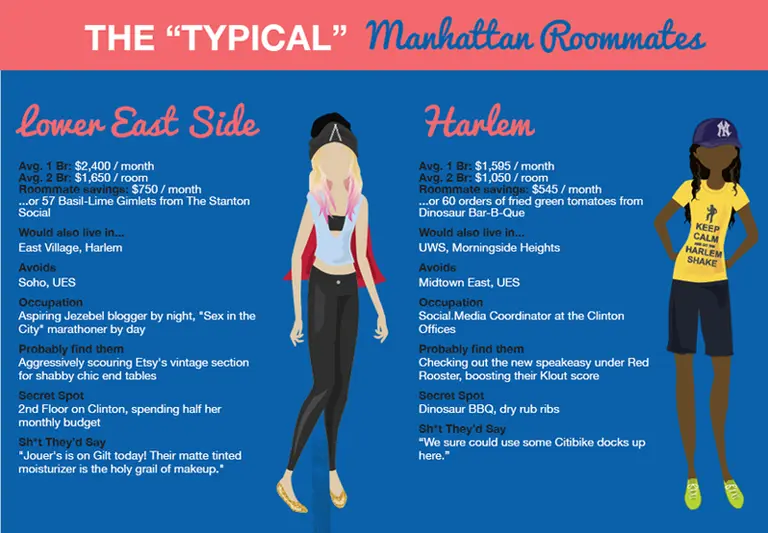
Hilarious Infographic of Manhattan Stereotypes is Spot-On

Every NYC neighborhood has its archetype, and this infographic by Apartment List perfectly depicts every Manhattan nabe to a tee. While you'll of course find the obvious characterizations like the Goldman Sachs associate who galavants around the Upper East Side, hilarious insights like what Chelsea residents do for fun ("People watching at the High Line, eating a popsicle") will give you a giggle. The infographic also provides useful info like the average cost of one- and two-bedroom apartments, as well as how much cash you can save by sharing — all in terms any New Yorker can understand (ex. in Tribeca you can pocket $1,548/month; a.k.a. 19 pairs of Lullemon pants). And though Apartment List's creation just depicts Manhattan 'hoods right now, given the easy target that lies just across the East River, we're keeping our eyes peeled for their take on Brooklyn.
Check out the full-size version here

Our Mission

More than just current events, here you'll learn about the places, people, and ideas that are shaping your city.