January 27, 2016

This ‘Map of Every City’ in the World Is Hilariously Spot On

Click here for the full-size version >> This “Map of Every City,” penned by Chaz Hutton (via Big Think) supplies us with a bite-sized answer to the question we’ve probably all asked at one time or another -- why do all major cities seem to be carbon copies of one another? And chances are there's at least one burg in your borough that fits the description of "Cool Area That Your Parents Would Have Avoided in the '80s."
Look familiar? Check out the full-size map here
January 26, 2016

Mapping World Cities That Already Have Open Gangway Subway Trains

Click here to enlarge map >> Just yesterday, the MTA revealed renderings of what their open gangway subway prototypes will look like. As 6sqft previsouly reported, when it was announced that the new trains got a $52.4 million piece of the MTA's capital plan, "This type of train, basically one long subway car with no doors in between, is popular all over the world, in most cities in China and Japan, in Berlin, Paris, and London, to name a few." So just how far behind the times is New York City? An informative new map from The Transport Politic, which plots the cities in which riders can walk between cars, says pretty far.
Find out more
January 25, 2016

QUIZ: Answer 9 Questions to Find Out Which NYC Neighborhoods Best Match Your Lifestyle

Some of us are all too familiar with matching services where you provide info about yourself and you get back a list of, er, interesting possibilities. But sorting data to find your ideal neighborhood match could be especially helpful when home-hunting in New York City, given the mind-boggling set of choices–it makes sense to get potential picks from things that actually exist (like parks and grocery stores), rather than being hopefully embellished. From the neighborhood data entrepreneurs at PlaceILive comes match.placeilive.com, a newly-launched lifestyle-based home finder that matches you with your ideal New York City neighborhoods based on your answers to nine quick questions.
Find out which neighborhood's right for you
January 20, 2016

Are Shuttle Buses a Viable Alternative to the L Train During a Shutdown?

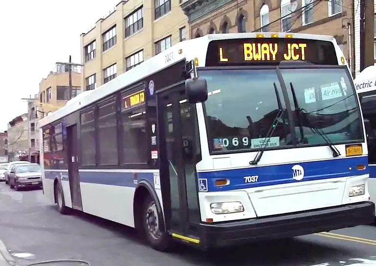
The MTA’s announcement of possible plans to close the L train for months or even years at a time to repair the Hurricane Sandy-damaged Canarsie Tunnel has businesses scrambling and commuters (the train has 300,000 riders on the average weekday) fearful. Data mapping company CartoDB offers a bit of “location intelligence” to better understand the consequences of a shutdown for people living in Brooklyn and, more importantly, what some realistic alternatives to the L train might be. For example, shuttle buses: "If the shuttle bus takes 20 minutes, we are able to calculate the best choices for riders along the L needing to get to Manhattan. Should they go all the way to Lorimer and take the shuttle bus or should they transfer earlier at Myrtle-Wyckoff to the M train or at Broadway Junction to the A?"
Will shuttle buses save the day?
January 19, 2016

It Only Makes Sense to Buy a Home in NYC After 18 Years, Longer Than Anywhere in the U.S.

Renting in New York can get exhausting–the dreaded lease renewal letters, the constant moves, the thought of shelling out tens of thousands of dollars each year to pay someone else's mortgage. But is it really worth it to buy a home in NYC? According to data from personal finance site SmartAsset, it's only a good decision after you've lived in New York for 18.2 years, longer than anywhere else in the nation by far (h/t Business Insider). The study looked at 29 major cities across the U.S. and calculated their breakeven point–"the point at which the total costs of renting become greater than the total costs of buying." As a baseline, they used a household earning $100,000 annually with a 4.5 percent mortgage rate, a 20 percent down payment, and $2,000 in closings costs.
More details ahead
January 19, 2016

The New York Music Map Matches 450 Artists With a Special Spot in the City

From Bob Dylan to Run DMC to MGMT, the number of musicians who have called New York home is astounding. In an effort to visualize the city's musical pulse, the London-based creative communications firm Kingdom Collective teamed up with music writer Frank Broughton and illustrator Adam Hayes to create the New York Music Map (h/t CityLab), which plots 450 artists as points on a map of Manhattan, Brooklyn, Queens, the Bronx, and a piece of New Jersey (sorry, Staten Island). The map is available as an interactive online platform, as well as a decorative print for sale.
More on the map
January 18, 2016

Mapping the Greenhouse Gas Emissions of NYC Buildings

In November, 6sqft shared a study that showed luxury buildings in NYC were among the worst offenders for driving climate change. The report from Climate Works for All stated that "a mere two percent of the city’s one million buildings use 45% of all of the city’s energy." Widening the scope, a new map from Brooklyn web developer Jill Hubley (who also created this fun map of NYC street trees species) color codes the greenhouse gas emissions of all city lots with single properties over 50,000 square feet and lots with multiple properties over 100,000 square feet–those that are required to follow benchmarking laws for energy and water consumption under Mayor de Blasio's plan to cut such emissions 30 percent by 2030. What the interactive map shows is that NYCHA properties have some of the highest amounts of emissions, as do large complexes like Stuy Town and big institutions such as Pace University and the Time Warner Center. The area clustered below Central Park is also a hotbed for emissions. But it's comforting to see that the majority of the map reads teal (lower emissions) instead of brown (higher emissions), and some of the best-faring locales include NYU, Battery Park City, Pratt Institute, and the Brooklyn Navy Yard.
More info ahead
January 14, 2016

The World Metro Map Mashes Up 214 Subway Systems

At first glance, it might look like a metro for some city you're not familiar with, perhaps Berlin or Beijing, but this map is actually a combination of almost all those cities that might come to mind. Titled The World Metro Map, it's a mashup of 214 subway systems, totaling 791 lines and 11,924 stations (h/t Cool Hunting). New York-based collective ArtCodeData teamed up with non-profit Open Access to create the map as a representation of "human mobility" explored through the unifying element of subways. The result is a "digital collage" that's colorful, geometric, and provides a new view of world transportation.
Learn more
January 7, 2016

Half of the Earth’s Population Squeezes Onto Just One Percent of Its Land

Click here for a full size version >> It's widely known that most of the world's population is concentrated in and around cities, but this cool map created by Max Galka (h/t CityLab) shows us exactly what that spatial disparity looks like. Using NASA's gridded population data, which zooms in on the number of people inhabiting every nine-square-mile patch of the Earth, Galka colored all the areas boasting more than 8,000 inhabitants with yellow cells, while those with less than that number were marked black. What's visualized with 28 million cells mapped is that half of the world's inhabitants (about 7.4 billion people to date) occupy just one percent of the Earth's land. The rest of the population is sparsely dispersed over the other 99 percent.
See more here
December 28, 2015

‘Scratch Off’ This Map to Reveal Historic Aerial Imagery

Had no luck scratching off those lottery tickets your grandma put in your holiday card? Then here's a chance to scratch off something where everyone's a winner (well, at least history and map buffs). Urban Scratchoff is a fun interactive map that overlays historic aerial imagery from 1924 atop the same location in current time. Simply drag the mouse over a portion of the map to "scratch off" the present aerial view. You also have the option to swap the layers and have the current view on top.
More on the map
December 22, 2015

MAP: See the World’s Urban Population Grow Over 2,000 Years

While we all like to think of New York City as the center of the universe, our little metropolis really only started to pulsate in the last couple hundred years. Way, way before this (think 1 A.D.) ancient civilizations like the Mayans experienced "urban booms" of their own. This mind-boggling interactive map made by Esri puts thousands of years of global population growth into perspective, ultimately showing us that NYC is kind of just a blip on the radar—or in this case, the 2,000-year timeline of life.
Access the map this way
December 21, 2015

The American Panorama Uses Modern Maps to Create an Historic Atlas of the U.S.

Well ahead of his time, naval historian Charles Paullin created the Atlas of the Historical Geography of the United States in 1932. Its 700 maps covered all sectors of American life, from geographic boundaries to topography and European settlement to the development of railroads. Last year, the University of Richmond digitized these maps, and they've now taken inspiration from the catalogue to create a modern version of the project. Called American Panorama, the platform aims to be an "historical atlas for the online era," according to CityLab. The four interactive maps currently on the site are: The Forced Migration of Enslaved People; The Overland Trails; Foreign-Born Population; and Canals.
Learn more right here
December 21, 2015

MAPS: Where to Find the Top Available One-Bedroom Rental Bargains Under $2,500

Can't seem to qualify for those popular affordable housing lotteries, or stuck on a waiting list 70,000 names long? Well, like many of us who are searching for low-priced rentals, you'll have to forage the city's daunting open market. The typical choices include shacking up with multiple roommates in prime neighborhoods, enduring long commutes in far-flung locales, or having to deal with an un-renovated, pre-war walk-up building. To make your search for these rather un-glamorous apartments a bit easier, we produced a list and map of currently available one-bedroom rentals that are priced furthest below their neighborhood medians. But act fast, because these units disappear quickly.
Check out the interactive maps and listings this way
December 18, 2015

MAP: How Much Do Murders Decrease Home Values?

We know that in New York City, living next to the deceased does little to earn you a discount on your rent or a price chop on a condo. But when it comes to murders, the story is quite different. Finder.com recently culled data from University of Technology Sydney (UTS) and popular real estate websites to find out just how much a murder that occurred on a property can affect the value of a home.
more here
December 11, 2015

Manure Heaps, Fat Melting, and Offensive Privies: Mapping NYC’s 19th Century Nuisances

A New York City nuisance map today would consist of things like text-walking zombies, pizza rats, and Soul Cycle locations. But back in the 19th century, people had bigger problems, such as manure heaps, hog pens, and 400 families wading through "a disgusting deposit of filthy refuse" just to get home. Atlas Obscura uncovered these amazing maps that were created in 1865 by the Citizen’s Association of New York as part of a 300-page report on the city's sanitation and public health conditions in the wake of the smallpox and typhoid epidemics. "Rapid population growth, overcrowded apartment buildings, dirty streets and poor sanitation standards had meant that New York in 1860 had the mortality rate of medieval London," according to the blog.
See the maps and learn more
December 11, 2015

MAPS: Where to Find the Five Best Condo Bargains in Every NYC Neighborhood

With so much focus given to top-of-the-market condo sales and listings, we decided to take a look at the condos at the more "affordable" end of the spectrum, highlighting available apartments priced furthest below their neighborhood median prices. This week we take a look at five listings in five neighborhoods: Chelsea, Park-Fifth Avenue between 50th and 79th streets, Fort Greene, and Murray Hill. But first, be sure to check out 6sqft's interactive maps which pinpoint five of the best available condo bargains in every Manhattan and northern Brooklyn neighborhood compared with their median prices.
Check it all out
December 8, 2015

Mapping the Depressing Annual Salaries of Millennials Across the U.S.

This year, snake people became the largest share of the U.S.'s voting-age population, surpassing 76.4 million baby boomers for the title. But while this younger generation (generally defined as those born between 1981 and 1997) may be dominating in numbers, they're trailing when it comes to their median annual salaries. This map created by Business Insider using data from the from the Minnesota Population Center's 2014 "American Community Survey" in the Integrated Public Use Microdata Series reveals just what working snake people are earning annually—and the results are somewhat depressing. While Midwest states showing medians in the low 20s aren't all that shocking given a lower cost of living, it is surprising to see that economic power players like California and New York ring in at just $21,900 and $25,000, respectively.
See the map in detail here
Pitch a story icon Know of something cool happening in New York? Let us know:
December 1, 2015

NYC Dominates the Country in $10 Million-Plus Sales, See Them All on 6sqft’s Interactive Map

In October, Coldwell Banker Previews International released their semi-annual report tracking the real estate trends and market activity in U.S. cities that attract the largest share of high-net-worth individuals (HNWIs). Unsurprisingly, New York City leads the lists of most closings recorded and listings on the market priced above $1 million, $5 million, and $10 million between the one-year period of July 1, 2014 and June 30, 2015. More astounding, however, is that the number of closings recorded in the city above the $10 million price point is more than the sum of all deals in the next 19 cities on the list combined. According to the study, NYC raked in 217 residential closings of $10 million or more, followed by Beverly Hills and Los Angeles with 34 each. New York again leads the way with 367 listings priced at $10 million or more, followed by Miami Beach, Aspen, and Los Angeles. Regarding New York City, historical data from CityRealty tallies up a slightly higher number of $10 million+ closings over the same time period, totaling 241 such deals. The recently crowned most expensive building in the city, One57, garnered the greatest number of $10M-plus sales for a single building with a remarkable 30 deals -- which by itself is more than all cities in the country aside from the top three. The supertall tower was then followed by a three-way tie between 15 Central Park West, One Madison, and the Walker Tower.
Explore the $10M+ closings and listings on 6sqft's interactive map
November 19, 2015

Think You Can Design a Better NYC Subway System? Try It With Mini Metro

The New York subway system is a complex but pretty efficient network that (for the most part) gets us to where we need to get when we need to get there. But that's not to say there aren't some neighborhoods that wouldn't benefit from a few more stations—and better connections from one line to another. Well, if you're a savvy straphanger that thinks that you can engineer a far more efficient system than the MTA, the game Mini Metro is the perfect place to flex your dormant urban planning skills.
Where to try out the game here
November 19, 2015

Mapping All 1.1 Billion NYC Taxi Trips Since 2009

That's 183,333,333 trips a year; 15,277,777 a month; and roughly 510,000 a day. And it likely took software developer Todd W. Schneider a long time to put all of that data into this stunning map of taxi pickups and drop offs over the past six years. Green boro taxis are represented in their signature color and traditional yellow cabs in white, with brighter areas representing more taxi activity. As Gothamist first noted, "Yellow cab pickups are concentrated south of Central Park in Manhattan, while drop offs spread north and east into Brooklyn, Queens and the Bronx; drop off and pickup activity snakes like a glowworm from Manhattan to the airports: along the Van Wyck Expressway to JFK, and by 278 and 495 to La Guardia." Using the TLC's public data, Schneider also created charts and maps that show taxi travel compared with uber rides; weekend destinations of bridge-and-tunnelers; a late-night taxi index; how weather affects taxi trips; weekday drop-offs at Goldman Sachs and Citigroup; airport traffic; cash versus credit card payments; and the dramatic increase in North Williamsburg taxi activity.
Get a look at the data here
November 18, 2015

Hand-Stitched City Quilts Are Made to Counter the Rapid Digitization of Daily Life

With winter just around the corner, now is a good time to take stock of what you've got packed away in the warm blanket department. If you're coming up short, these City Quilt throws from Haptic Lab can provide both warmth and style. Replicating the age-old tradition of quilting, the Brooklyn-based studio hand-stitches city maps–including details like roadways, rivers, and city blocks–onto fluffy 60-inch x 70-inch cotton blankets. They're available for both Brooklyn and Manhattan (as well as other big cities like Paris, Boston, and Chicago), and Haptic will even add custom details for an extra fee.
Find out more
November 17, 2015

Interactive Map Shows the NYC Skyline in 2020

"Before 2004, Manhattan was home to 28 skyscrapers 700 feet and taller. Since then, an additional 13 have been built, 15 are under construction, and 19 are proposed—47 more in all." Because of this supertall building boom, National Geographic has created an interactive map that lets users explore the NYC skyline in 2020 (h/t Untapped). The light blue buildings are those completed between 2004 and 2015; the orange are under construction; and the yellow proposed.
Get a look at the map here
November 13, 2015

Mapping the Individual Economies of NYC Neighborhoods

What does your neighborhood economy look like? That's the title of this smart new interactive map that shows economic development opportunities at the local level. Created by the Association for Neighborhood and Housing Development, the map has five layers–total risk (shown above), community and infrastructure, employment and education, banking and access, and income and benefits. They're all color-coded and range from least at risk to most at risk. As we can see, the most at risk neighborhoods are in northern Manhattan, the Lower East Side, the Bronx, Sunset Park, Bushwick, Bed-Stuy, and Elmhurst in Queens. The least at risk is the majority of Manhattan and Rego Park/Forest Hills.
Explore the interactive map this way
November 12, 2015

Unclog Your Smartphone Brain With These Urban ‘Maps From the Mind’

Without GPS and Google Maps, most of us probably wouldn't be able to get from point A to point B within our own cities. That's where these clever Maps from the Mind come in (h/t Fast Co. Design). Designed by Archie Archambault, the maps are intended to jog our memories of the basic layouts of cities, bringing our brains back to the pre-digital age of road maps and actual sense of direction. Archambault swaps traditional street grids in favor of basic circles. Not only does it create a graphic look, but it's easy to have the circles represent size and connection.
Find out more

Our Mission

More than just current events, here you'll learn about the places, people, and ideas that are shaping your city.