August 19, 2015

The NYPL Is Mapping Books About NYC Neighborhoods—Add Your Favorites!

The New York Public Library is currently putting together a map of New York City neighborhoods represented in the pages of our favorite books. Novels set in the five boroughs are added to the map as readers suggest them, along with nearby landmarks and attractions so you can get your literary bearings. Currently most of the listed titles in are in Manhattan ("American Psycho" in the Financial District, "Catcher in the Rye" in Central Park, to name just a few); Team Brooklyn is looking sparse (Hello? Paul Auster?), and The Bronx, Queens and Staten Island need you!
Suggest your favorite neighborhood novels...
August 18, 2015

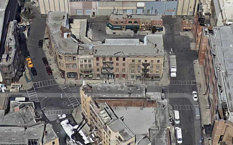
See the New York City Sets of Hollywood Studios Through Google Maps

Not all NYC-based television shows make the city streets their personal set a la "Law & Order" and "Girls." Perhaps the most notable example is "Friends," where, although some exterior building shots and panoramic views are of New York, the scenes involving the actual actors are often less than realistic (don't even get us started on their apartments). Other shows that took place in the city but filmed on a sound stage in LA include "Will & Grace," "How I Met Your Mother," and "Mad Men," among many other shows and movies. A couple of Redditors recently posted links to aerial Google Maps views of famous studios' New York City sets, and it's pretty interesting to compare the actual city to the Hollywood version.
See more fun aerial views here
August 17, 2015

NeighborhoodX’s 3D Map Reveals the Blocks Where Real Estate Prices Are Soaring

Click for the expanded version >> We all have a pretty good idea which NYC neighborhoods command top dollar, but this incredible 3D map from NeighborhoodX really puts things into perspective by pinning the city's 325 neighborhoods against one another in a visually jarring side-by-side comparison. Among the most expensive? For Brooklyn, Gravesend beats out our best guess of DUMBO/Brooklyn Heights with its enclave of multi-million dollar, over-the-top mansions; and in Manhattan, Billionaires' Row rises as a whole other beast with prices soaring as high as its supertalls.
get a more detailed look here
August 17, 2015

Mapping Every County in America by Its Natural Beauty Ranking

New York has come a long way in recent years in terms of improving its "natural beauty." We added the High Line and Brooklyn Bridge Park. We increased ferry service and are sprucing up the East River esplanade. But apparently this is not enough to make our fine city a "desirable" place to live. A new mapping series from the Washington Post takes data from the USDA's Natural Amenities Scale–a measure of the physical characteristics of a county area that enhance the location as a place to live–and color codes from low to average to high just how naturally beautiful and pleasant a given county is. The scale takes into account "six measures of climate, topography, and water area that reflect environmental qualities most people prefer," which includes "warm winter, winter sun, temperate summer, low summer humidity, topographic variation, and water area." And judging by today's stickiness and last winter's polar vortex, maybe it's our extreme seasons that are putting our counties in the "low" category.
Find out more here
August 14, 2015

What’s Your Subway Cred? New Game Judges You Based on the Number of Stations You’ve Visited

Akin to pinning all of the cities you've visited on a world map, "What's your Subway Number?" allows you to visually quantify your worldliness—or in this case your "New Yorkness"—by accounting for every subway stop you've stepped foot in. The game is the clever creation of digital designer Mike Solomon, and breaks straphangers down into four categories: Rich Tourist, Junior Commuter, Official Resident, and NYC Lifer.
Find out more here
August 14, 2015

Map Shows the Countries Other Than Mexico That Have the Most Immigrants in Each U.S. State

New York prides itself on its diversity, so it comes as no surprise that we have the second-highest immigration population in the country. But what may be surprising is that the most immigrants–other than those from Mexico–in our state come from China, according to this informative map. In nearby New Jersey and Connecticut, India is responsible for the largest immigrant group.
More on the map here
August 12, 2015

Map Lets Users Draw Where They Think Their Neighborhood Borders Are

Back in the day, there was no East Village; it was all the Lower East Side. The Upper West Side was one big neighborhood; there weren't subdivisions like Broadway Corridor or Riverside. Brokers didn't invent acronyms like NoMad and DoBro. As time goes on, areas in New York City seem to multiply, but this really all depends on who you're talking to. Since the city has no actual neighborhood boundaries (they divide the city by much larger community districts), everyone has their own idea of where one neighborhood ends and the other begins. And a new interactive map from DNAinfo allows New Yorkers to draw what they think their neighborhood borders are and see how their approximations compare to others.'
See how we did at our first attempt
August 11, 2015

New Census Fact Finder Sheds Surprising Light on Neighborhood Demographics

Think you live in a hipster 'hood? Constantly complaining about the stroller parades down your block? While you may think you have your neighbors pinpointed, a quick look at the hard facts may surprise you. Last week, the Department of City Planning revealed its updated Census Fact Finder, an interactive application that uses data from the U.S. Census Bureau's annual American Community Survey to provide highly detailed neighborhood profiles. Take for example the Lower East Side, often thought of as a playground for well-off post-grads. As The Lo-Down noted, 47 percent of the neighborhood's population is unemployed, only 34 percent have a college degree, and 35 percent pay less than $500/month in rent.
More findings right here
August 7, 2015

51 Percent of Americans Live in the Country’s Nine Largest States

Being face-to-armpit on our morning subway commute and sharing an apartment with five other people can cause us New Yorkers to forget that outside of our five-borough bubble there are places where homes are spaced out and one may need to drive several miles just to get to the grocery store. This mapping series by Dadaviz user Jishai illustrates just how disproportionate the country's population is. As Mental Floss first noted, "For each visualization, the red and orange regions have equal populations." For example, in the map above, we see that 51 percent of the population lives in the country's nine largest states. Other statistics visualized on the maps show that 50 percent of the population live in the 144 largest counties in the nation, and that the country's largest county, located in southern California, has roughly the same population as the 11 smallest states.
See more population maps here
August 6, 2015

Map of ‘Subway Deserts’ Shows Outer Boroughs Left High and Dry

Though we may already know there are places in NYC that we can't easily get to, transit data junkie Chris Whong lays it all out on a map that points out the city's lesser-served regions, at least by underground means. The interactive map shows all NYC land areas more than 500 meters (about .3 miles) from one of the city’s 468 subway stations–that’s about two avenue blocks or six or seven shorter street blocks (around a seven-minute walk) according to Google maps. A big blue dot blots out this radius surrounding the station; everything outside the dot, well, you’re hoofing it (or taking a bus, car or rickshaw).
Find out more
July 31, 2015

1970s Map Reveals Worldview According to New Yorkers

Does anything really exist outside of New York? The creator of this map doesn't think so. Made in the 1970s by an anonymous artist, this maps depicts the worldview of the stereotypical New Yorker. The greatest city in the world occupies the greatest amount of space on the map, while the rest of the country is reduced to a narrow strip of land. That is, the rest of the country that's worth acknowledging.
See the full map here
July 30, 2015

NYC aka New Netherland: Mapping the 11 Different Cultural ‘Nations’ Within the U.S.

Those of us who live in the tri-state area tend to get accused of thinking the country is made up of the northeast, the west coast, and maybe Florida, and then forgetting about the entire rest of the country. A new map that is part funny, part culturally realistic takes a look at the "11 distinct cultures that have historically divided the U.S.," according to Business Insider. The spot-on map comes from award-winning author and journalist Colin Woodward's newest book American Nations: A History of the Eleven Rival Regional Cultures in North America. In Woodward's map, New York City and northern New Jersey is renamed New Netherland, as it was settled by the Dutch and is a very commercial area. The author describes this nation as "materialistic, with a profound tolerance for ethnic and religious diversity and an unflinching commitment to the freedom of inquiry and conscience."
Find out about the other nations of our nation
July 30, 2015

Bidding Wars and Over-Ask Sales on the Rise in Brownstone Brooklyn Neighborhoods

Homes in brownstone Brooklyn neighborhoods have been selling over the asking price and bidding wars are becoming even more commonplace, according to DNAinfo. In the second quarter of 2015, for example, homes in Prospect Heights and Park Slope were selling for 4 percent over their asking price–the highest percentage seen in Brooklyn or Manhattan.
Find out where to expect bidding wars
July 27, 2015

Flushing and the Upper East Side Top the List of Most Traffic Accidents in NYC

Between March 2014 and April 2015, the city reported 223,141 motor vehicle accidents, almost 25 percent of which resulted in injury or death. The Auto Insurance Center used this open-source data, which includes geographical coordinates for the accidents, to create maps and graphs examining where and when the collisions happened (h/t Brokelyn). Queens accounted for 29.5 percent of the total collisions, with Brooklyn coming in right behind at 28 percent. In terms of neighborhoods (broken down by police precincts), Flushing, Queens takes the top spot, followed by Queens Village, the Upper East Side, Cypress Hills, Brooklyn, and Long Island City, respectively.
More data and maps right here
July 20, 2015

What Does Your Zip Code Say About You? This Map Tells All

Want to know if you're a trendsetter, a wannabe, or just a Joe Schmo in a glass condo? This new interactive map called the "Zip Lookup" will reveal to you that your life can pretty much be summed up in five digits. Created by ESRI, a geographic-information firm, Zip Lookup is eerily on point when it comes to figuring out an area's demographics, culture, and daily habits.
How it works here
July 17, 2015

Grim Map Shows the Relationship Between Poverty and Pollution

EJSCREEN is a new online mapping tool from the Environmental Protection Agency (EPA). What makes it different than other pollution maps, though, is that it also includes census data to show the relationship between negative environmental factors and demographic indicators like low-income and minority populations. As Gizmodo reports, "The maps are color-coded to show poverty, and pollution (as measured by fine particle density). Grey is in area that’s below the 50th percentile, with the colors going up to yellow then red as the poverty (and pollution) increases." And as is clear in the animated image above, high-poverty areas like East Harlem, Washington Heights, and much of the Bronx are among the most polluted in the city.
More on the map here
July 16, 2015

In New York City Your $100 Is Really Worth Just $81.77

Saying "NYC is expensive" is a pretty obvious statement, but have you considered what the spending power of your cash really is? The Bureau of Economic Analysis recently enlisted the help of economists at the Tax Foundation to create two maps that examine how much $100 can actually buy you in each state and various metro areas across the U.S. Unsurprisingly, your Benjamins wane in value significantly once you step into the NYC metro area.
Find out more here
July 16, 2015

New Map Shows Where More Than 50,000 Rent Stabilized Apartments Have Been Lost

At the end of last month, the Rent Guidelines Board voted to freeze rents for the first time on one-year leases for the city's more than one million rent stabilized apartments, which make up about 47% of the city's total rental units. They also increased rents on two-year leases by only two percent, the lowest in the board's 46 years. While this historic ruling is a huge win for tenants, it doesn't bring back the astonishing number of apartments that have been deregulated. Since 1994, nearly 250,000 units have lost rent regulation protections, and over these past eight years alone, New York City has lost more than 50,000 rent stabilized apartments. To put that staggering number into perspective, cartographer John Krauss has put together a handy map that shows where all of these 50,000 apartments are located (h/t Gothamist). Using scraped tax bills, he plotted changes in the number of rent-stabilized units, building by building.
How did your neighborhood fare?
Pitch a story icon Know of something cool happening in New York? Let us know:
July 14, 2015

Day vs. Night: What NYC’s Population Looks Like

Click for expanded version >> New York may be the city that never sleeps, but it certainly pulsates far differently depending on what time of day it is. This fascinating map created by Joe Lertola gives us an idea of just how population-filled areas of Manhattan get during working hours, and how the city empties out at night when most workers head back to their homes in the suburbs.
More on how it was created here
July 14, 2015

For the Price of One Soho Apartment, You Can Buy 38 Homes in Memphis

We learned last week that the average sales price in Manhattan has skyrocketed to $1.8 million, and while this figure is definitely newsworthy, it's even more shocking when we look at the average price of an apartment in certain neighborhoods. Take tourist-friendly Soho, for example, where it costs an average of almost $3 million ($2,912,792 to be exact) for a residence. Many New Yorkers may be unfazed by this number–it seems that every day now we're being presented with seven-digit statistics. So the folks over at CityLab, decided to put it in perspective, mapping how many homes in cities across the country that $3 million price tag can buy.
See the breakdown here
July 1, 2015

NYC Makes Up 5 Percent of the Nation’s Property Value

We know New York City is ridiculously expensive, but what about its property values? Because of the city's confusing "market value" system, true property values are often grossly underestimated. To provide a more accurate look, the data buffs over at Metrocosm have put together these visually telling cartograms of real property values in NYC, substituting land area for total property value. The maps not only compare values in New York with those throughout the rest of the country, but they also look at how property values are concentrated within the five boroughs. The data reveals some striking facts. New York City makes up a whopping 5 percent of the nation's property value, coming in at $1.5 trillion. When you single out Manhattan's $733 billion, it could be the 14th most valuable state in the country. The Upper East Side, which occupies less than one square mile, has $96 billion in housing value–more than entire states like New Hampshire, North Dakota, South Dakota, Vermont, Wyoming and Alaska.
More findings, maps, and graphs ahead
June 30, 2015

New Map Plots Every Airbnb Listing in NYC

"Adding data to the debate" is the tagline of this new interactive map called Inside Airbnb, which has plotted all listings as of June 1st from the popular room-sharing website. The searchable bird's eye map was created by Bed Stuy photographer Murray Cox to show "how Airbnb is being used to compete with the residential housing market" in cities around the world (h/t Gothamist). In addition to looking at the trend across the city as a whole, the map allows users to zoom into a specific neighborhood and look at how an Airbnb presence has changed in a given area over the past few years.
Learn more about the map
June 25, 2015

Landmarks Preservation Commission Maps 150 Years of LGBTQ History in Greenwich Village

We're right in the middle of NYC Pride Week, and this Sunday will be filled with festivities surrounding the 45th annual Pride Parade, the largest parade of its kind in the world. And in a perfectly timed decision, the Landmarks Preservation Commission announced on Tuesday that it had designated the Stonewall Inn as the city's first LGBT landmark. The LPC now has even more to share, releasing a fun new interactive map called Taking Pride, which documents 150 years of LGBTQ history in Greenwich Village, the hub for gay activism in the city, and even the world.
READ MORE
June 17, 2015

Help Count How Many Street Trees Are in NYC

Just a couple of months ago, we shared a fun map that lets users explore New York City's 592,130 street trees by species and trunk thickness. Brooklyn web developer Jill Hubley used data from the 2005-2006 Street Tree Census to create the map, but a lot of trees have come and gone in the past nine years. This time around, the Parks Department is crowdsourcing to count the city's street trees as part of its Trees Count! 2015 project. As Brooklyn Magazine reports, "Participants will be armed like park rangers, walking around different neighborhoods with tree identification guides and tape measures, recording data that will eventually trickle into an interactive map that encompasses all five boroughs."
Find out how you can get in on the action
June 10, 2015

Trolley Map from the 1930s Shows How Easy It Was to Get Around Brooklyn

Long before there was a subway packed full of angry crowds and unidentifiable organisms, New Yorkers in Brooklyn enjoyed above-ground commutes serviced by a streetcar system. This map posted recently by a Redditor is a blast from the past, showing just how complete and comprehensive this network was. In fact, by 1930, nearly 1,800 trolleys were traveling along the streets of BK from Greenpoint to Gowanus to Bay Ridge and beyond. Though the system proved to be profitable (yes, NYC once ran a transit system that actually made them money), the streetcars were eventually forced out of the city by none other than the auto industry.
find out more and see the complete map here

Our Mission

More than just current events, here you'll learn about the places, people, and ideas that are shaping your city.