June 8, 2015

Harlem Rents Jump 90 Percent over the Past 12 Years, Bed-Stuy Not Much Better at 63 Percent

Take everything you think you know about "affordable" alternatives to pricey neighborhoods and throw it out the window. This map from the Community Service Society (first shared by the Daily News) analyzes newly released census data that compares median rents between 2002 and 2014. The data is drawn from a New York City Department of Housing Preservation and Urban Development survey of 18,000 New Yorkers every three years who had recently moved, which "eliminates the tendency of lower rents paid by long-time tenants to smooth out market changes and mask the changes that affect tenants who are looking for a place to live," according to CSS. The report shows that rents citywide have increased 32 percent over the past 12 years, not a new or surprising figure. But it also shows drastic increases in neighborhoods that have been traditionally thought of as more affordable. Central Harlem saw the biggest jump at 90 percent; the average rent in 2002 for new residents was $821 and now it's skyrocketed to $1,560. Other no-longer-affordable neighborhoods are Bed-Stuy at a 63 percent increase and Washington Heights/Inwood at 55 percent. The other 'hoods topping the list include less surprising areas like Brooklyn Heights/DUMBO/Fort Greene at 59 percent and Williamsburg/Greenpoint at 53 percent.
More findings from the report
May 28, 2015

Money Mapped: New York Has the Same GDP as Spain

We all have a general idea as to which states contribute the most to the nation's GDP, but this handy map offers a little more food for thought. Created by Mark Perry of the American Enterprise Institute, the map compares the gross domestic product of each U.S. state with the national GDP of economies abroad.
READ MORE
May 26, 2015

Report Poorly Parked Cars and Bad Drivers with the ‘TowIt’ App

Few things are as enraging and unnerving as the way New Yorkers drive. And although no one wants to be a tattletale, there's finally a way to help better patrol bad drivers right from our smartphones. Called TowIt, this handy app allows concerned citizens to snap photos of motor violations, geo-tag them, and then send them in real-time for ticketing or towing by law enforcement and city officials.
Find out more and where to download the app
May 22, 2015

New York Public Library Releases Interactive Map of Its 80,000 Historic Photos

For us NYC history nerds, the New York Public Library's digital archive is one of the most valuable tools. We can search historic photos by address, building name, or neighborhood. This can get a little tedious, though, especially if a location no longer exists or we don't know the exact street number. But sleuthing for vintage pictures just got a whole lot easier thanks to a new mapping tool from the library's NYPL Labs team. OldNYC is an interactive map that features red dots on every location for which the collection has photos from the 1870s through the 1970s and lets you explore and interact with the images.
Find out more here
May 21, 2015

MAPPED: Here’s What Americans Love to Eat the Most by State

Though we often chalk American cuisine down to hamburgers and apple pie, in reality folks across the country indulge in foods far more diverse. Foursquare and Mapbox have created a new map that reveals what foods Americans are statistically eating more of in every state. To make the map, they used an algorithm that analyzed Foursquare’s data set of menus, tips, and ratings—which represent stats from some 55 million users and two million businesses worldwide over the span of six years—and zoomed in on the food and drink items that appeared to be "disproportionately popular" across the states. In addition to getting what was uniquely popular to each state, they were also able to use the algorithm to determine just how much more—represented as a percentage—individuals seek out that favored food or drink item as compared to the national average. So, what do New York inhabitants crave the most? Hint: It's not pizza.
FInd out here
May 18, 2015

Live Data Map Lets You Watch the World’s Mass Transit Systems Move

If you've ever marveled at how the world's public transit systems keep people moving across town and back every day, TRAVIC (Transit Visualization Client), which shows scheduled routes of trains and buses as well as real-time positions (the MTA provides real-time data feeds) from more than 200 public transportation systems worldwide, will keep you busy for a while. The data map, created by Swiss-German IT company GeOps and the University of Freiburg, lets you watch the C train (or your own regular punishment) crawl slowly through its scheduled stops–and wonder why there seem to be so many more trains running on the Paris Metro.
More this way
May 15, 2015

What Are New Yorkers Listening To? The Answer May Surprise You

Decades later, and New Yorkers are still gyrating to the tunes of the Rolling Stones. The Journal recently culled the top artists and songs played in bars and restaurants across the city (via e-jukebox vendor TouchTunes) into a map, and they found that although New York is about as diverse as they come, we pretty much all love the same music—or at least groove to the same stuff as we throw back a few.
Find out more here
May 7, 2015

Organize Your Music by City with Spotimap

Next time you really feel like getting in that "New York State of Mind," just organize your playlist to include only NYC-centric songs. This would normally be an arduous task, but thanks to a new Spotify-based mapping program called Spotimap, you can sort and stream music relevant to a specific city simply by clicking on it, marked by a green musical note, on a map. As CityLab reports, once a user clicks a city, a list of songs about that place will pop up based on this highly detailed Wikipedia list. For New York, the map offers 2,707 songs about the city, sorted in alphabetical order.
Find out more here
April 27, 2015

These Psychedelic, Geometric Landscapes Are Actually Google Earth Images

Let's face it, Google Earth, while incredibly helpful, is not the most esthetically pleasing thing we've ever seen, which is why we were shocked to learn that these beautiful landscapes are actually satellite images from the site. Argentinian artist Federico Winer's new series "Ultradistancia" features Google Earth shots from around the world that have been edited with different magnitudes, perspectives, colors, and luminosity. Winer feels that the resulting psychedelic and geometric landscapes are about "taking infinite tours over our planet from the marvelous screens of Google Earth to the encounter of geometries, shapes and topographies, natural and humans."
See more of Winer's images
April 27, 2015

WSP Eco Map Tracks the Hidden Minetta Creek and Trees of Washington Square Park

It's easy to get distracted in Washington Square Park by all the NYU students and street performers, but there's a lot more than meets the eye in this historic public space. For instance, did you know the Minetta Creek runs under the park and through the surrounding neighborhood? Or what about all those beautiful trees, wouldn't it be fun to know a little more about them? With a new mobile map called the WSP Eco Map, you can identify the species of many trees in the park, locate other environmental park components like nesting boxes, and see exactly where the Minetta Brook/Creek is hiding.
Find out more here
April 24, 2015

Maps Compare NYC’s Footprint to Other Cities Around the World

Considering that the world's population can fit inside New York City, it's easy to believe that our great metropolis is the biggest city around. But is that actually true? A fun new mapping series from storage site SpareFoot takes an overlay of NYC's footprint and places it over other major cities, countries, and landmarks from the around the world. The visuals are helpful in seeing how easily we can misrepresent size in our heads. For example, as SpareFoot notes, "New York's 8.4 million residents make it the 21st most populous city in the world (when measuring within the city limits) and of course first in the United States. By area, the 305 square miles of land delineated by its city limits make it the 24th largest city in the US by land area." And internationally, it doesn't even make the list of top 250 largest cities by land, reports Gothamist. Just look at London--it's nearly twice the size of New York. Yet Boston and San Francisco are about 1/6 the size of NYC.
See how NYC stacks up to the competition here
April 22, 2015

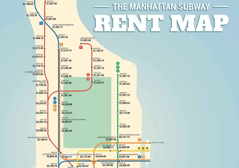
Subway Rent Map Shows Manhattan Rental Prices Along Each Train Line

The folks over at Thrillist have put together the fun new Manhattan Subway Rent Map, which shows "where you can't afford to live, by stop." The figures come from the median rent per bedroom near every Manhattan subway stop. For the most part, the trends are what you'd expect -- prices along the 4, 5, 6 line get incredibly lower above 96th Street; living near a 14th Street train station will cost you; and the A, C, E train carries pretty steep prices throughout Manhattan until you reach 125th Street. But what's interesting is that the 59th Street corridor reigns supreme, with prices across the board coming in around $2,800.
See the full map here
April 22, 2015

Living Green: Mapping NYC’s Newest LEED Rated Residential Constructions

Happy Earth Day, friends! As climate change weighs heavy on many of our minds, it’s relief to know that there are developers and architects working hard to create a healthier, more sustainable built environment. Eco-friendly residential design has been on the rise in NYC over the last decade, with buildings today boasting everything from solar panels to greywater […]
April 14, 2015

This Map Lets You Explore NYC’s 592,130 Street Trees by Species and Trunk Thickness

If you feel like your allergies go into overdrive when you're in the city, don’t be so quick to blame it on all the dust and must being kicked up by passing cars. As it turns out, New York’s flora is far more diverse and abundant than you’d suspect. Jill Hubley, a Brooklyn web developer, took data from the 2005-2006 Street Tree Census and found that there are about 592,130 trees on public streets alone. But beyond pinpointing where each street tree sits, Hubley's map also identifies a tree's species and trunk thickness. What emerges from her study is a kaleidoscope of colors and a fascinating look at the city's biodiversity.
Find out more here
April 8, 2015

You Can Now Tour the Gowanus Canal Without Catching Syphilis or Other Ailments

Conversations about the Gowanus Canal are usually accompanied with a quip about STDs or mutant dolphins, but all joking aside, there's no denying its murky waters also carry quite a bit of mystery and allure. The infrastructure, the architecture, and of course what's floating within, is nothing short of intriguing, because really, what's actually down there? Researchers at the Brooklyn Atlantis Project are just as curious as we are and they've constructed an unmanned water vehicle to go where no sane man dare go.
Find out more here
March 30, 2015

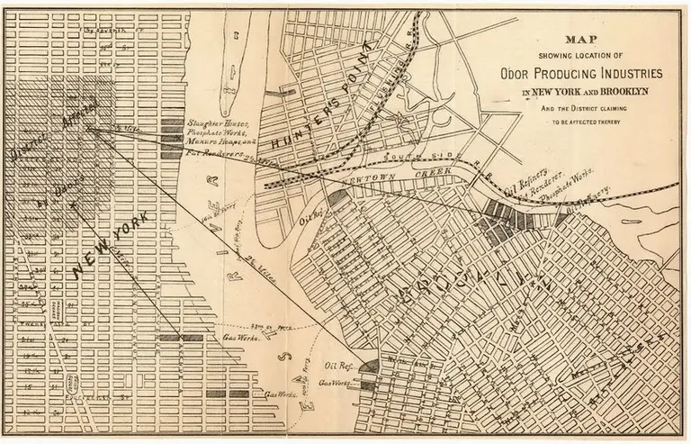
19th Century ‘Stench Map’ Explains Why Brooklyn Became the Industrial Borough

A stench map today would include things like urine, rotting pizza, cigarettes and flavored vapors, and whatever unidentified odor of the day is pouring out of the subway. And while these are clearly unpleasant, at least they can be neutralized with some soap and water or the passing of time. But in the 19th century, the stenches of the city were far more permanent, stemming from the various industrial sites across Manhattan and Brooklyn (the five boroughs weren't yet consolidated). CityLab has uncovered an historic map from 1870 that shows the locations of New York's odor-producing industries, including oil refineries, slaughter houses, fat renderers, and gas works. In the 19th century, it was believed that foul odors carried diseases, so the New York City Metropolitan Board of Health created the map of stenches (then known as "offensive trades") to pinpoint the areas affected.
What did this mean for Brooklyn?
March 23, 2015

The Subway That Could Have Been: Mapping Never-Built Train Lines and Abandoned Stations

We all know now that NYC has the worst commutes in the nation and that our subway system just keeps getting more unbearable. So it makes perfect sense that proposals for new train lines and alternate modes of transit like gondolas, ferry systems, and streetcars keep popping up. But this isn't a new phenomena; there have been many proposed subway lines that were never built, as well as stations that were taken out of service. A fun interactive map from WNYC called Lost Subways shows both of these, illustrating the subway that could have been.
Explore the map here
Pitch a story icon Know of something cool happening in New York? Let us know:
March 19, 2015

Battery Park City, Harlem, and the Lower East Side Top the List of Child-Friendly Manhattan ‘Hoods

It's no secret that families are ditching Manhattan for Brooklyn or the Suburbs, where they can get more space for their money and maybe even a backyard, but a new report shows the shifting dynamics of those families who decide to stay in the big city. According to amNY, the analysis conducted by AddressReport.com shows that only 6 percent of households in Hell's Kitchen and the Financial District have a child under 18 living in them, and in neighborhoods like Midtown, Soho, the West Village, and Gramercy, most of which are often thought of as more family-friendly, only 7 percent of households have at least one youngster. To be expected, Battery Park City is ranked as the most child-friendly neighborhood, where 36 percent of households have a child. Another shoo-in is Tribeca at 26 percent. Surprisingly, East Harlem at 32 percent, Harlem at 29 percent, and the Lower East Side at 20 percent round out the top five, none considered traditionally family-oriented.
See the full map here
March 16, 2015

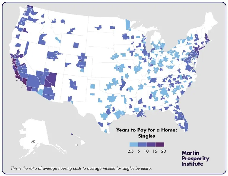
New Maps Show How Much You Need to Work in Order to Own a Home in NYC and Other Major Metros

Have you been thinking about buying a home in NYC? Well if you're single, get ready for a life of mortgage-gouging hardship. A new study conducted by the Martin Prosperity Institute takes a look at how much Americans spend on housing, where in the United States we're spending the most, and how many years we'll need to put in if we want to own a home in a big city.
maps and results here
March 16, 2015

Railfan Atlas Maps Train Porn Photos from All Over the World

Though many of us would rather not look at another train once we get done with our daily commutes, others of us revel in the images of railfandom, a subculture of train enthusiasts. One self-professed rail geek, Nick Benson, even went so far as to create the Railfan Atlas, a worldwide collection of Flickr train photos. The images are geotagged, and there's a heat map that shows the hottest spots for train porn.
Click here to see the most popular spots in NYC for railfandom
March 13, 2015

New Map Reveals Which Luxury Skyscrapers Are Siphoning Your Tax Dollars

By now it's no secret that there's an unbalanced tax system in place for those living in the city's luxury towers, but exactly how much is being lost–and where–has for the most part been a mystery. To shed some light on just how much of our money goes into subsidizing the likes of One57 and its eye-poppingly expensive friends, the Municipal Arts Society (MAS) has created a map (h/t Gothamist) that shows not only how much tax each of the city's top buildings skip out on annually under the 421a tax abatement, but how long their exemption will last—which together can add up to staggering amounts for many. Last year alone, MAS found that we forfeited $1.1 billion in tax revenue and 60 percent of that went to building apartments in Manhattan targeted at the 1 percent.
Find out more here
March 10, 2015

Here’s a Map of Where the World’s Insanely Rich Live

Ever wondered where the world's richest people live? While London and New York are ol' standbys, as you may have guessed, it looks like the wealthiest of the wealthy are popping up in completely new locales. CityLab recently took a look at Knight Frank’s Wealth Report 2015, which identifies the world's "ultra-high-net-worth individuals" (UHNWI), a set of the global population that accounts for those with more than $30 million or more in net assets, and found that there are roughly 173,000 people in the world who fall in this category. To put that number in perspective, these folks make up the upper 0.002 percent of the world's 7 billion inhabitants and hold over $20 trillion of its money.
Find out more here
March 1, 2015

Map This: Seven Cool New York City Maps That Will Enlighten You

Maps have changed quite a bit since we were kids. The information age and rapidly evolving technology have allowed us to turn once-intimidating amounts of data and numbers into cool visualizations that can totally transform the way we understand the world. From looking at where tourists flock in our city to surveying how old every building in Manhattan is to measuring just how noisy NYC is compared to the rest of the states, here are seven of our favorite city maps—all of which will help navigate New York in a whole new way.
Who doesn't a love a good map?
February 27, 2015

‘NYC Anthropocene’ Maps Visualize the City’s Oil and Chemical Spills Since 2010

When we think of chemicals, oil spills and toxic land, locales like Gowanus and Freshkills are among the first to come to mind. But all across the city are hotspots where spills have taken place. In an ongoing project called NYC Anthropocene, graphic designer and data guru Michael Appuhn is documenting all the areas where the city has seen these flubs since 2010, as well as some of the areas in Manhattan, Brooklyn and Queens storing oil, petroleum and various chemicals in bulk. While the map isn't really anything to have a scare over—many of these are used for home heating or are fuel stations (although we won't discount that spills can cause groundwater contamination including some public water supplies)—it's interesting to see the distribution across the city.
See the map in full here

Our Mission

More than just current events, here you'll learn about the places, people, and ideas that are shaping your city.