February 26, 2015

Apartable Website Helps Renters Find Out if a Building Has a Negligent Landlord

Looking to buy in NYC is a task, but finding the right place to rent can be a veritable nightmare. While apartments may look spic 'n span on the surface, oftentimes tenants find out the hard way (e.g. after hastily throwing down thousands on a broker fee and signing a two-year lease for fear of losing out on the space) that their landlord is pretty terrible when it comes to maintenance and safety. Enter Apartable, a new website that helps potential tenants investigate whether or not a building they're interested in is a slum they need to avoid, or if it's up to snuff.
Find out more here
February 25, 2015

Do You Really Know Your Neighborhood? Interactive Map Helps You Find Out More on Who’s Around

No, this isn't a celebrity stalker map. This cool new map from PlaceILive lets you find out more about how your neighborhood rates when it comes to everything from demographics to health to transportation to daily life, safety, sports and leisure and entertainment, which even takes into account how many ramen houses and cheese shops are within reach.
Find out more here
February 24, 2015

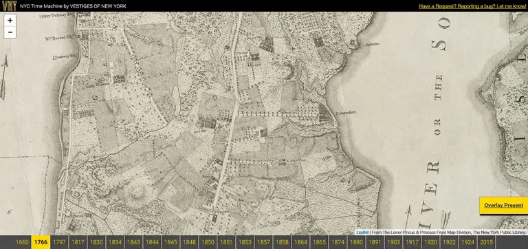
NYC Time Machine Lets Users Navigate Overlaid Maps from 1600 to Present Day

Cartographers and history buffs will have a field day with this online tool known as NYC Time Machine. Using public data from the New York Public Library, the resource allows users to “navigate perfectly-overlaid maps of NYC from 1660 to present day.” The site is part of Vestiges of New York, which overlays historic photos and current images.
More details
February 23, 2015

Interactive Map Pinpoints Where in NYC Tourists Flock (and Locals Avoid)

If you're a New Yorker who grumbles at the sight of slowpoke tourists lollygagging down Manhattan's crowded streets, you'll want to see this map created by data artist Eric Fischer called "Locals & Tourists." Fischer collected tweets from across the five boroughs (and beyond) to determine what areas were most concentrated with out-of-towners (the red) and what areas were dominated by locals (the blue).
Find out more here
February 19, 2015

Proposed ‘Triboro Rx’ Subway Line Would Better Connect the Outer Boroughs

The problem with moving to many affordable neighborhoods in Brooklyn, Queens, and the Bronx is the lack of transportation options, but a new report from the Regional Plan Association calls for a Triboro RX subway line, which would weave together existing subway stops in far-reaching spots, as well as provide additional locations. And forget toll hikes to fund the line; it would run mostly above ground on existing freight train tracks, making implementation easy and cost effective.
More on the transportation proposal and see the full Triboro RX map
February 18, 2015

In 2080 NYC Will Be Hotter, Rainier, and 39 Inches Underwater

Or at least that's what a report released today by the New York City Panel on Climate Change says. Looking at the next century, the startling analysis finds that average temperatures could rise 4.1 to 5.7 degrees by the 2050s and as much as 8.8 degrees by the 2080s; yearly heat waves will triple in occurance; there will be many more days over 90 and 100 degrees; annual precipitation will increase by 5 to 13 percent by the '80s; the Northeast will see more intense hurricanes with extreme winds; and sea levels are expected to rise 18 to 39 inches by the '80s and 22 to 50 inches by 2100, meaning the amount of land within FEMA's proposed flood insurance rate maps will double, covering 99 square miles of the city. But don't start planning your exodus just yet. The Mayor's Office is well aware that their findings "underscore the urgency of not only mitigating our contributions to climate change, but adapting our city to its risks."
More on the report and see the full map
February 10, 2015

What Would NYC Look Like If Sea Levels Rose 100 Feet?

We know that rising sea levels are one of the scarier parts of global climate change. Just take a walk past the beachfront houses in the Rockaways or on Staten Island that have been raised on stilts. According to the Real Deal, "the US Geological Survey estimates that if all the world’s glaciers melted, sea level would rise by about 80 meters, or more than 260 feet." Though this could take thousands of years, it would make unrecognizable many of the world's coastal cities, including New York City. A stunning map series created by Jeffrey Linn, a Seattle resident with a background in geography and urban planning, visualizes major US cities in "this doomsday scenario" using actual geographic data. In New York City, after sea levels rose just 100 feet, the island of Manhattan is almost submerged; Brooklyn and Queens look like little archipelagos; and the Statue of Liberty is out to sea.
More details ahead
February 9, 2015

Mapping Where in NYC Millennials Live

The initial results may not surprise you–young adults living in New York City tend to set up shop in North Brooklyn, the Far West Side, the Upper East Side, the East Village and western Queens. This data is courtesy of a new mapping project from the University of Waterloo School of Planning in Ontario called Generationed City. Using census and crowd-sourced data, the project compares demographic patterns of millennials (typically defined as those born between 1980 and 2000) to that of older generations like baby boomers. It looks at North American cities with populations over 1 million where it's commonly accepted that millennials live in central parts of cities. While the largest chunk of NYC-based data is pretty on par with what we already knew, there are some other trends, both within the city and compared with other cities, that are a bit more curious.
More findings ahead
February 4, 2015

Map Revealed for de Blasio’s City-Wide Ferry System

While there were plenty of highlights in Mayor de Blasio's State of the City address yesterday–from affordable housing to raising the minimum wage–it was undoubtedly the announcement of a city-wide ferry system that really got New Yorkers talking. De Blasio said that the ferry service will open in 2017, with pricing on par with the Metrocard, as a way to accommodate the growing population of New York. It will serve neighborhoods including the Lower East Side, Astoria, the Rockaways, Sunset Park, Brooklyn Army Terminal, Bay Ridge, Red Hook, and Soundview, among others. A new map released today shows the entirety of the system, breaking down existing ferry lines, those planned for 2017 and 2018, and those proposed.
More details and the full interactive map ahead
February 3, 2015

Mapping How the NYC Subway Could Operate in a 40-Inch Snowstorm

Though winter storm Juno isn't going down in history as the biggest snowstorm to ever hit NYC, it was the first time the city completely shut down the subway system due to a snowstorm. Governor Cuomo and the MTA said the shutdown was necessary because a portion of almost every train line runs outdoors. Not happy with that reasoning? Then you'll really enjoy this map from WNYC called the Snowpiercer; it proposes how the subway system could operate during a 40-inch snowstorm.
See the full map here
January 14, 2015

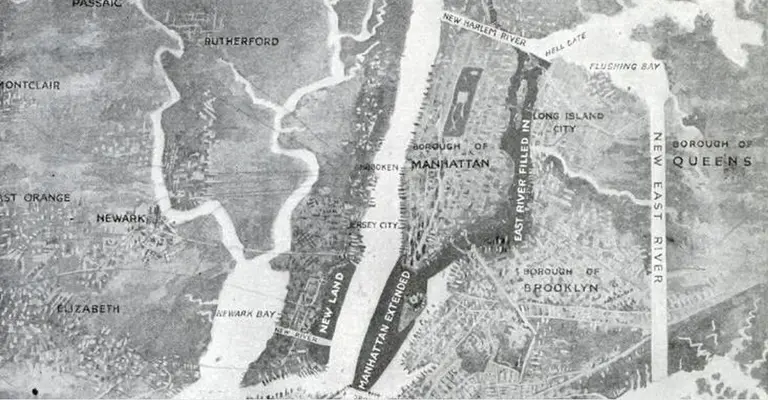
A Madcap Engineer Wanted to Pave Over the East River to Create a “Mega-Manhattan”

The East River may not be the most beautiful body of water we've ever witnessed, but that certainly doesn't mean we'd like to see it paved over. That's exactly what T. Kennard Thomson, an engineer and planner, proposed in 1911, hoping to create a mega-Manhattan. Plus, he wanted to add a long hunk of infill at the southern tip of Manhattan, creating a new peninsula bolstered by Governor's Island, add more new land in the Hudson between Bayonne and Manhattan, and relocated the Brooklyn Navy Yard.
Let's take a closer look at this ambitious, but never realized, plan
December 23, 2014

Check Out the NYC Holiday Window Displays with Google Maps

We're starting to think Google wants us to never leave our apartments again. Not only can we tour the elite Gramercy Park without a key and explore NYC in 3D, but now we can even check out the department store holiday window displays with Google Maps, welcome news for those of us who want to get in the holiday spirit without battling the crowds. The Observer reports that the feature is available in London and New York, the latter showcasing those windows at Saks Fifth Avenue, Macy's, and Bloomingdale's. It's part of Google Maps' new Business View feature, which makes it possible to virtually go inside businesses and provides special offerings like a 360-degree tour of the Colbert Report set.
Take a look at this year's holiday windows
December 17, 2014

Explore NYC in 3-D with Google Maps’ Latest Update

For those of you who remember the quirky Times story featuring a Google team's attempt to document every inch of Ellis Island, here comes the the payoff. The awe-inspiring world of Google Maps and Google Earth is growing into an even grander time suck with a slew of new city sites rendered in 3-D. Their latest update now lets us explore New York's landmarks from top to torch to spire, and all the details in between, right from our desktops. Some of the most impressive sites worth a gander include the Statue of Liberty and One World Trade Center.
READ MORE
December 2, 2014

You Can Now Tour Gramercy Park Without a Key, Thanks to Airbnb and Google Maps

For the vast majority of New Yorkers, the closest look they've gotten into Gramercy Park is peering through the perimeter wrought iron gates. As one of the most elite and inaccessible outdoor spaces in the city, only those who live in dwellings circling the park have keyed access via an annual fee. That is, until now. Thanks to a rule-breaking Airbnb-er, the world can now revel in the verdant splendor that is Gramercy Park.
Find out how this guy got all the snaps
December 2, 2014

6sqft Gift Guide: Neighborwoods Map Coasters

Coasters are definitely high on the list of "gifts for people who you don't know what to give," and if you're like us, you're always searching for sets that aren't the standard square cloths or round pieces of wood. So, we've found the perfect coasters--not only are they unique and visually appealing, but they have a personal touch. Neighborwoods Map Coasters were created by San Francisco graphic designer Aymie Spitzer, who has a passion for hand-lettered vernacular and antique maps. The cedar wood coasters celebrate the special neighborhoods of some of the country's biggest urban sites, including Manhattan and Brooklyn.
More on Neighborwoods Coasters here
December 1, 2014

This Map Shows the Holiday Craziness of NYC Airport Taxi Trips

Still recovering from a Thanksgiving travel fiasco? Or maybe you haven't even made it home yet. Either way, this map is probably not going to make you feel better. It's a visualization of taxi trips from NYC-area airports between Thanksgiving and New Year's. The project was inspired by a previous mapping endeavor, NYC Taxis: A Day in the Life, and was created by designers at ImageWork Technologies. They looked at taxi trips originating from JFK and LaGuardia in 2013, and even have a feature that allows users to filter the results by individual airline terminals.
More details ahead
November 20, 2014

How One Man Created a 3D Map of Manhattan When It Was Just Hills, Rivers and Wildlife

Many of you probably recognize the image above, but what you may not know is that creating it required far more than a bit of Photoshop magic. The work of Wildlife Conservation Society ecologist Eric Sanderson, this incredible photo is a true-to-life depiction of what once grew on the island of Manhattan before it was all paved over. By using an 18th-century map, a GPS and reams of data, Sanderson has recreated, block by block, the ecology of Manhattan in the early 17th century. "We're trying to discover what Henry Hudson would have seen on the afternoon of September 12, 1609 when he sailed into New York Harbor," says Sanderson. Watch his riveting TED talk on the 'Mannahatta Project' ahead and see what used to make up areas like Columbia University, Greenwich Village, and even Times Square at the time of the American Revolution. You'll certainly look at what remains from our city's verdant, hilly and marshy past in a whole new way.
Watch the video here
Pitch a story icon Know of something cool happening in New York? Let us know:
November 10, 2014

Urban Reviewer: A New Map Tool Reveals NYC’s Vacant Lots Ready for Revitalization

New York City is home to some of the world's most spectacular parks, and though we may pride ourselves on these well-tended green spaces, more than a handful of neighborhoods don't see more than a single tree for every 60-foot stretch of concrete. Enter 596 Acres, a grassroots land access nonprofit looking to change all of this with the Urban Reviewer. Developed with the help of a team of volunteer researchers, urban planners and designers, this new online tool allows anyone to view the staggering amount of publicly-owned lots that once had an urban renewal plan in the pipeline but were scrapped due to bureaucracy. By mapping out all of the vacant spaces across the city, 596 hopes that we as a community can take a top-down approach to turning these urban blights into public gardens, play lots, and spaces where people can “co-create.”
Find out more here
November 10, 2014

Warby Parker Creates Upper East Side Literary Map

You might have noticed that hipster eyeglass emporium Warby Parker took over the former Lascoff Drugs store on Lexington Avenue and East 82nd Street. The community is quite satisfied with their thoughtful reuse of the historic pharmacy, and in return, the company seems to be very in tune with the neighborhood of their latest outpost. Warby's latest foray into the world of the Upper East Side is a map of famous literary locations, from the Barbizon Hotel, fictionalized as the Amazon in Sylvia Plath's The Bell Jar, to Eloise's home at the Plaza Hotel.
More on the map here
October 22, 2014

New Mapping Tool Urban Layers Tracks the Age of Every Building in Manhattan

A new mapping tool called Urban Layers lets users see almost every building still standing in Manhattan today and reveals exactly when it was built. The data goes back as far as 1765. The interactive map by Morphocode provides insight not only into the history of a specific building, but into the evolution of entire neighborhoods, too. And for New York City history fanatics like us, this user-friendly tool is definitely going to come in handy.
More on the mapping tool here
October 13, 2014

A Google Maps Comparison of How Much Williamsburg Has Changed Since 2007

My, the difference a few years makes. Never was that more apparent than with Google Maps Street View’s new function that allows you to take a peek back in time and see how much your neighborhood has gentrifi--err--transformed since 2007. The photos culled by the WSJ ahead focus in on the unprecedented changes Williamsburg has undergone over the last six years. The alterations are particularly apparent at Bedford Avenue and North 7th Street, where some cosmetic improvements have been made to the building facades. However, the transformation is rather mind-blowing when you see the difference new developments by the waterfront have made to the neighborhood’s aesthetic.
Take a look at Williamsburg's astonishing transformation here
September 19, 2014

NYC Gets a New Neighborhood Map from the City Planning Department

Every few years the New York City Department of City Planning releases a new map to document changes in demographics, geographic profiles and neighborhood boundaries. The maps have been produced since 1994, and following its 2010 update, the City has just released a 2014 version. In addition to offering some insight into the current socio-economic makeup of our […]

September 16, 2014

Pee-Eww! Artist Kate McLean is Creating a ‘Smellmap’ of NYC

New York City stinks, yes, but this city of ours is rich in smells like no other. To document the odors that linger, excite and nauseate inhabitants, British multi-sensory artist Kate McLean and her army of sniffers are running around town with their noses to the wind—and deep in trashcans. McLean has so far mapped a block of Greenwich Village and her latest jaunt took her and her team out to Bedford Avenue, where she found the most offensive odor to be "the aroma of a marijuana joint". Not convinced?
Her findings here
August 19, 2014

New App Wheely Will Make the NYC Subway More Accessibilty Friendly

If you ride the New York City subway you likely have some type of app installed on your smart phone that provides a map of the underground system or calculates the time to the next train. And it's just as likely that your app doesn't have a feature for accessibility. For those who cannot push through a crowd on the stairs or bolt up the left side of the escalator, the subway is extremely hard to navigate and oftentimes quite useless, as only 18% of stations have accessible elevators. To address this major flaw in our mass transit system, Anthony Driscoll developed a new app called Wheely, which helps those with accessibility needs (wheelchair users, the elderly, parents with strollers, injured people, etc.) better navigate the subway.
All the details on the smart new app here

Our Mission

More than just current events, here you'll learn about the places, people, and ideas that are shaping your city.