May 27, 2016

MTA Flaunts Future Subway Map With Second Avenue Line

Perhaps in an attempt to distract disgruntled riders from looming shutdowns and never-ending delays, the MTA has released a new subway map that features stations along phase one of the Second Avenue line and the reinstated W line to Astoria. The former isn't planned to open until December (which, as Gothamist notes, we'll believe when we see) and the latter November, but if you were stuck on a sweaty platform this morning, this eye candy is surely a welcome treat.
See the full map here
May 24, 2016

Your Daily Commute Never Looked So Good As It Does in This Colorful Data Visualization

The daily commute to work and back might be the last thing you want to see more of, but sometimes it helps to see things in a new light: Here's your daily traffic torment, subway sardine-fest or bus-stop hustle, represented in candy-colored motion. Michigan-based data wrangler Mark Evans shows us the workday migrations of American commuters using census data so that they resemble a jubilant gathering of rainbow dots, expanding and contracting from each county with the day's open and close (h/t Citylab).
Check out your colorful commute
May 17, 2016

Map Mashup: The NYC Subway System Gets Re-Stylized as The London Tube

Pretty much everyone can appreciate a good map, and many of us are downright obsessed. Then there’s Cameron Booth, who has devoted a serious amount of his time to interweaving maps to transit systems all around the world with one another. The Portland, OR-based (by way of Syndey, Australia) graphic designer tweaks and reimagines the world's city transit maps on his blog; Booth has also helped test and create map apps for cities throughout the world. You could think of it as a way to travel everywhere at once, while not leaving home (as long as you stay within the bounds of this virtual transit system). Booth has tried his hand at versions of the transit systems of Paris and Portland, major U.S. highway routes and Amtrak train maps, and it’s both a graphic delight and an eye-opening way to see how cities’ transit systems get you from point a to point b. Take, for example, his project that combines the London tube diagram with the New York City subway system map.
Get a closer look at the maps
May 6, 2016

The Garden State of New York: Jerseyans Move to Manhattan and Brooklyn More Than Anyone

New Yorkers might want to stop hating on Jerseyans, because without the bridge and tunnel demographic the city would be a barren wasteland, at least according to this fun map from Very Small Array. First spotted by Brokelyn, the map uses census data to plot the state from which most people come in a given neighborhood (excluding those originally from New York). And as you can see, New Jersey makes up the majority of the city, followed not surprisingly by California. Florida, the third-place state, is a bit more unexpected, as is the fact that Mill Basin/Bergen Beach is full of Alaskans.
More data this way
May 2, 2016

Interactive Map Shows How Your Neighborhood Has Recovered From the Housing Market Crash

Most Americans are finally starting to feel a bit of relief that the economy is getting back on its feet, but when it comes to the housing market, it's not as cut and dry as we might think. Analyzing data from Black Knight Financial Services from 2004 to 2015 (the bubble, burst, and recovery), the Washington Post asserts that the country's housing arc has only worsened inequality. "It also helps explain why the economic recovery feels incomplete, especially in neighborhoods where the value of housing — often the biggest family asset — has recovered little, if at all," they explain. For example, an average single-family home gained less than 14 percent in value over the past 11 years, but homes in the nation's priciest neighborhoods have gained 21 percent. And interestingly, in Bed-Stuy, Brooklyn, an area that saw a huge gentrification push during this time period, single-family home values have tripled and risen by 194 percent -- the largest increase of any metro area in the country. The Post has taken the data and compiled it into an interactive map that lets users simply input a zipcode to see how the area has fared.
More national and local trends ahead
April 19, 2016

This Map Visualizes Manhattan As a (Unimpressive) Mountain

The Manhattan skyline is inarguably getting taller and taller, and when we look up at the towering behemoths surrounding us, it's easy to feel completely dwarfed. But this man-made landscape pales in comparison to the soaring heights of many natural wonders. That's where this cool visualization from Vivid Maps comes in. "If Manhattan was a mountain..." uses the height of the city's buildings and plots them as a mountain topography map, using actual geologic monikers like Greenwich Valley, One World Trade Center Peak, and Bellevue Plateau. As you can see, save for the Financial District and Billionaires' Row areas, Manhattan mountain is actually quite unimpressive.
Get a look a the full map
April 15, 2016

Find Your Neighborhood on This Interactive Map Made From Local Brooklyn Litter

There's no shortage of trash in NYC–even better than seeing it picked up is when someone is doing something interesting with it. Atlas Obscura introduces us to artist-cartographer Jennifer Maravillas, who has transformed the litter found in neighborhoods throughout the 71 square miles (the map is called "71 Square Miles") of Brooklyn into a map of the borough. Each neighborhood on the map is made up of paper litter–like flyers, advertisements and notes–found in that same neighborhood. The result is a bright, multicolored collage on which each bit of litter corresponds the place Maravillas found it. You can enter your address and find it on the interactive map, along with the trash you might see every day.
Check out the trash on your block
April 7, 2016

This Map Tells You How Frequently NYC Subways Actually Run

This New York City Transit Frequency map, from Ft. Collins, Colorado-based public transit enthusiast and urban adventurer Tyler A. Green, is a mapped visualization of how frequently the city’s subways and buses travel along each line. You can use it to see where—and on which days—trains and buses run most and least often. The darker the color of a transit line on the map the more frequent your prospects are going to be. Four viewable data layers on the map represent buses and trains on Fridays and Saturdays. Hover over lines to see exactly how many trains or buses run in an hour between any two stops.
Take a look at the map
April 7, 2016

You Can Now Investigate the Unseen Microbiology of the Gowanus Canal With the BK BioReactor

After all these years of jokes about catching syphilis or turning into a green mutant alien, it's hard to imagine the Gowanus Canal as a pollutant-free place, but beginning this year it will undergo dredging and sub-aquatic capping as part of the USEPA Superfund Cleanup plan. This also includes the Gowanus Canal Sponge Park, "an 18,000-square-foot public space that will be built with engineered soil to absorb (hence “sponge”) stormwater that would otherwise pollute the canal, as well as plants to break down toxins and floating wetlands," as 6sqft previously reported. But before the notoriously toxic canal turns into the Venice of Brooklyn, a group of microbiologists want to catalogue and draw attention to exactly what type of unseen organisms have accumulated over the past 150 years, as they feel it's important for work at other polluted urban environments. To do this, they've created the BK BioReactor, a roving watercraft that takes samples from 14 specific points along the canal. This data has been turned into a "mobile library," complete with an interactive map that shows which microorganisms are located where and how heavily distributed they are. For example, Atrazine, a herbicide affecting the hormonal system, is present in most of the sites, as is Epsilonproteobacteria, which inhabit the digestive tracks of animals.
See what else is lurking in the Gowanus Canal
March 25, 2016

Chatty Maps Tell You What You’ll Hear on Given Streets and How It’ll Make You Feel

Chatty Maps is an interactive project that reveals what sort of experience your ears will have on specific city streets. Leaflet-based maps of New York, San Francisco, Chicago, Boston, Washington, Miami, Seattle, London, Barcelona, Madrid, Milan and Rome map each city's roadways, which are colored to correspond to sounds on the street (transport, nature, human, music and building), based on tags taken from social media. Select your city and find a street on the map (or search for the street of your choice) to view the corresponding sounds. For each street, you also get a data visualization that attempts to track the relationship between street sounds and human emotions. Streets with dominant music sounds, for example, are associated with strong emotions of joy or sadness.
Check the map to find out how the city sounds at street level
March 16, 2016

New Interactive Map Lets You Explore New York City’s Landmarks

The Landmarks Preservation Commission has just launched a new interactive map that allows anyone to explore all of the city’s landmarked sites (h/t Curbed). The map, called Discover NYC Landmarks, is part of an LPC initiative to "bring greater transparency, efficiency, and public access to the agency." The new tool has mapped every single one of the city’s designated landmarks, including 1,347 individual buildings, 117 landmarked interiors, 114 historic districts, 10 scenic landmarks and even sites that are calendared for LPC consideration.
Start exploring, this way
March 15, 2016

This Illustrated 1926 Map of Manhattan Shows the City as It Was, Both Fanciful and Familiar

This fascinating vintage map of "The Wondrous Isle of Manhattan” is an illustrated version of the island as it existed in 1926, when it was designed and illustrated by Charles Vernon (C.V.) Farrow (1896-1936) and published by Fuessle and Colman. The map, though not to scale, highlights scores of actual attractions like landmarks and parks. Familiar buildings and streets are labeled, as is the city’s transit system at the time, with elevated tracks running along the avenues.
Look closer for details of 1926 life in wondrous Manhattan
March 7, 2016

360º Views: This Is the Largest Panoramic Photo of New York’s Skyline Ever Taken

Just when we thought we'd seen every angle of the New York City skyline possible, here comes a mind-bogglingly detailed panorama courtesy of photographer Jeffrey Martin. According to the Daily Mail, the sweeping (and interactive!) image was the product of two days spent atop the Empire State Building, with Martin wielding a Canon 5Dsr and a 135mm lens shooting more than 2,000 frames that were later painstakingly stitched together. The image is in fact so large and exhaustive that its 20 Gigapixels would give way to a photo that's 57 feet wide and 27 feet tall if printed!
Click here to access the interactive panorama
March 7, 2016

Subspotting Map Project Shows Where You Can Get Phone Reception in the Subway

The MTA is apparently well into the middle phase of its project to wire 279 below-ground subway stations with cell reception, but as Citylab recently put it, "there are still places you can’t make a call to save your life.” Into this unfortunate void comes the Subspotting project, brainchild of Daniel Goddemeyer and Dominikus Baur, which offers maps "illustrating the unequal geography of subway reception" and helpfully providing information on where you'll be able to make a call or send a text while in transit. In addition to system and individual line maps, there's an app that shows the quality of reception as different sized bars at each station, and MTA-sanctioned posters.
Can you hear me now?
March 4, 2016

MAP: Where to Find NYC’s Current Affordable Housing Lotteries

The number of affordable rental units up for grabs through the city and state's housing lotteries has been on the upswing. There are now more than 30 open to a variety of household sizes and incomes, with the bulk of the lotteries geared towards low-income households. For instance, in buildings currently accepting applications, annual incomes for a single-person household range from $18,789 to $36,300 and two-family households from $20,160 to $41,460. However, a growing number of drawings are now available to middle-income households, where for those open, a single person can make anywhere from $44,400 to $105,875 annually to qualify. To stay on top of it all, 6sqft gathered all affordable housing buildings now accepting applicants and compiled them into one handy, interactive map.
Check it out here
February 24, 2016

How Far From NYC You Could Travel in One Day Between 1800 and 1934

Back in 1800, a New York stagecoach couldn't get outside the northeast, and a trip to Charleston, South Carolina took ten whole days of sailing—these are just two examples of just how arduous traveling in the 19th and early 20th centuries was. To visualize this difficulty, as well as to show the major advances made over a relatively short time, Quartz created this simple map that shows how far from NYC one could travel in a day between 1800 and 1934.
More on the map
February 23, 2016

Minimalist Subway Map Posters Are More About Beautiful Design Than Finding Your Way

Cartographer Andrew Lynch has spent a lot of time looking at the NYC subway system. The CUNY Hunter alum recently perfected the entire system in a series of hypothetical but geographically accurate "Future NYC Subway" maps. But while studying the paths of the city's most important people mover, Lynch noticed they looked rather lovely, but just too, well, cluttered. From this thought came a series of colorful minimalist subway line posters (h/t CityLab) that Lynch calls "totally accurate, totally useless," but nice to look at nonetheless.
Get your own, this way
February 19, 2016

Dream Subway Map Includes a 10th Avenue Subway and a PATH to Staten Island

For most New Yorkers, subway dreams are simple things like trains arriving on time and getting a seat, but cartographer Andrew Lynch has big visions for what could become of NYC's transit system (h/t Gothamist). In his most recent iteration of the Future NYC Subway map, he "sought to plan out a system expansion which would be as cost effective as possible by addressing current service bottlenecks, train car issues, current ridership and population growth." This includes: a PATH train to Staten Island: a K line to connect the Brighton Beach Line (B/Q) to the Crosstown (G) at Bedford-Nostrand Avenues; a 10th Avenue L train extension; a majorly enhanced Second Avenue subway; and a Bushwick-Queens line.
The details on all these ideas
Pitch a story icon Know of something cool happening in New York? Let us know:
February 18, 2016

MAPS: Where to Find the Best Studio Rental Bargains Right Now

Last week we took a look at the lowest priced studio condominiums in Manhattan and northern Brooklyn. Now, here's a glance at the lowest priced rental studio units currently on the market. More than 60 percent of city-dwellers are renters—that's more than double the national average. And with the rental vacancy rate hovering around three percent, it's no surprise NYC is among the most expensive places to rent in the country. The most affordable neighborhood in Manhattan or northern Brooklyn to find a studio rental apartment is Bedford-Stuyvesant, where the median rent is $1,422 per month. Bed-Stuy is then closely followed by Crown Heights and Harlem, with median rents of $1,550 per month. The most expensive neighborhoods to rent in are NoLiTa ($3,848), the Lower East Side ($3,489), and TriBeCa ($3,465). Below you'll find a list of ten of the best individual studio deals on the market right now, and a map showing the studios priced farthest below their neighborhood medians. But move fast because these deals tend to disappear very quickly!
See it all here
February 17, 2016

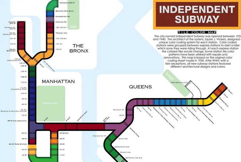
This Map Explains the Historic Tile Color System Used in NYC Subway Stations

We know the crowds that pack into our city’s subway cars each day are more than colorful enough, but the system also has a super-geeky color-coded navigation system that exists even outside of the main map’s primary colored lines. The city-owned Independent Subway was opened between 1932 and 1940. Up until 1967, it was the last of three former competing subway systems, and contributed six major lines to what is now the unified New York Subway: A, B, C, D, E, F, G, Q (partial). Squire J. Vickers, the system’s architect, designed a special color coding system for each station. Color coded stations were then grouped between express stations to make riders aware of the zone they were passing through. At each express station, the color of the tiles would change. Some station tile color patterns have been altered with subsequent renovations. The system map is based on the original color coding sheet from 1930. After WWII, almost all new subway stations featured their own unique architectural designs and colors
Find out what color your stop is
February 9, 2016

Mapping 22 Million Citi Bike Rides Across NYC

Software Engineer Todd W. Schneider is a super data geek in his spare time, analyzing New York City’s publicly available stats on topics like the transportation system. Recently, he took a closer look at the Citi Bike system (h/t Untapped), which clocked over 10 million rides in 2015–22.2 million rides from July 2013 through November 2015–making it one of the world's largest bike share systems. Schneider's findings spotlight general trends in Citi Bike usage and give us the big picture, via charts, maps and some fascinating animation, on the migrations and tendencies of our busy population of blue and white bikes.
See where all those bikes are going
February 8, 2016

MAPS: Where to Find the Best Studio Bargains in NYC Right Now

Let's face it, if you're the average New Yorker and aren't shacked up or down with having a roommate, a studio is probably where you're heading. According to data from CityRealty, the median price for available studio condominiums in Manhattan and northern Brooklyn stands at $782,000. While there are a paltry number of these apartments available, roughly 200, these pint-sized units allow many first-time condo buyers and those with smaller budgets to enter the condo market. For neighborhoods with more than two studio condo units on the market, Washington Heights has the cheapest median average, coming in at just $633 per square foot, less than half the city's median of $1,389 per square foot. Soho, on the other hand, with its 18 availabilities, has the city's most expensive studios with a median price per square foot of $2,025. Keep in mind, however, that many downtown studios are "studios" in name only. For instance, the most expensive such unit in the city right now is a $6.75 million penthouse loft at 37 Greene Street, encompassing 3,200 square feet of raw space and a 2,400-square-foot rooftop terrace--likely not what that minimalist, low carbon footprint-seeking buyer has in mind. So, below is a list of the five best individual studio deals on the market right now, and a map showing the studios priced farthest below their neighborhood median averages.
See it all here
February 5, 2016

Map Shows Where Foreign-Born New Yorkers Live

New York's immigration history is a long and complex one, and still today 37 percent of city residents are foreign-born. Using data from the 2010-2014 American Community Survey, the NYU Furman Center created this easy-to-read map that shows the top ten countries of origin, how many such New Yorkers there are (each dot represents 500 residents born in the respective country), and where they live (h/t Untapped).
The full map and more info
January 29, 2016

Design Firms Launch Kickstarter for Hyper-Accurate,12-Foot-Long Model of Manhattan

Could this become the coolest New York souvenir ever? Two Manhattan-based design firms, TO+WN Design and AJSNY, have teamed up to sell a model of Manhattan that will blow all the others out of the water. Using detailed aerial scans of the city, the firms created a 12-foot-long model of Manhattan that represents every last landmark, skyscraper, brownstone, park and event hall. Impressively, they've managed to replicate current-day Manhattan down to a 1:5000-scale–and they're calling their mini Manhattan a "Microscape." If you want a piece of this, you're not the only one. The project's Kickstarter, which recently launched with an $8,000 goal, is already more than $17,000 funded with 26 days left.
Learn more about the microscape
January 28, 2016

Keep Track of Your World Travels With This Colorful Scratch-off Map

Whether you spend your days hopping from one city to the next or save up your vacation time for an epic yearly adventure, traveling is a great way to regroup and relax. Every new destination means new memories, and who doesn't want to keep track of the journey along the way? These two maps from will help you do just that while also adding some worldly decor into your living space. Both the Scratch Map and Scratch Map Deluxe feature a fun scratch-off surface that reveal vivid bursts of color with just a few coin swipes.
Find out more here

Our Mission

More than just current events, here you'll learn about the places, people, and ideas that are shaping your city.