Triarch Uses Lipstick Hues and Gallery Walls to Meld Two Downtown Apartments
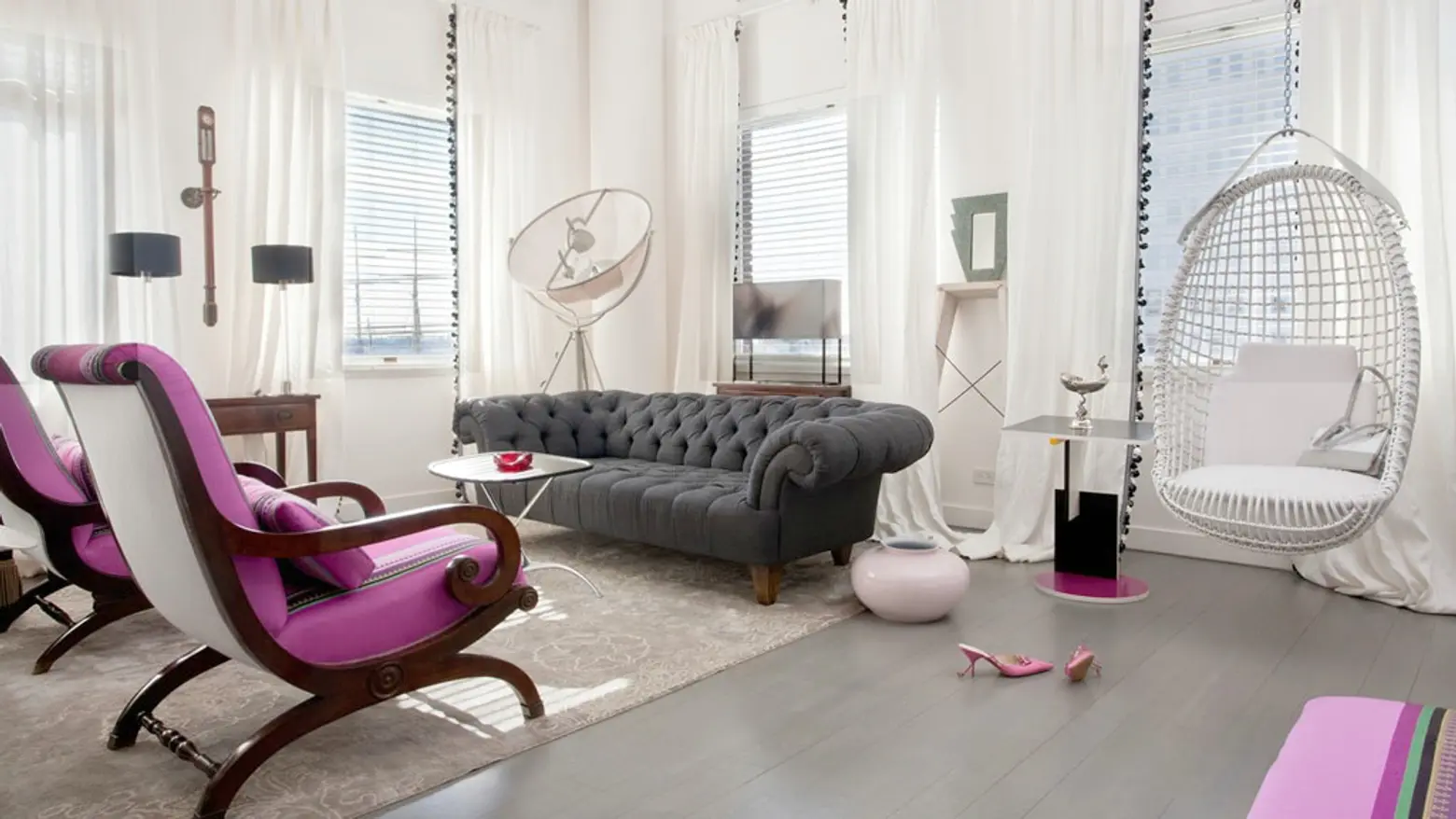
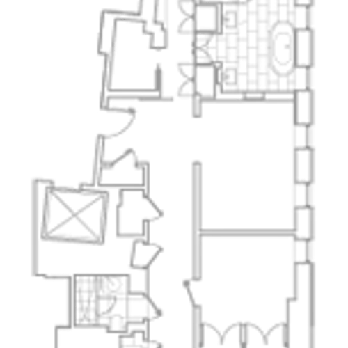
At this Beekman Street residence, two small apartments had been combined into one large one by a previous owner. Architecture and design firm Triarch reworked the floor plan to better connect the apartment’s series of separate rooms. The end result combines candy-coated pops of pink, red and purple, eye-popping art and contemporary finishes to make the home feel playful and creative, as well as livable.
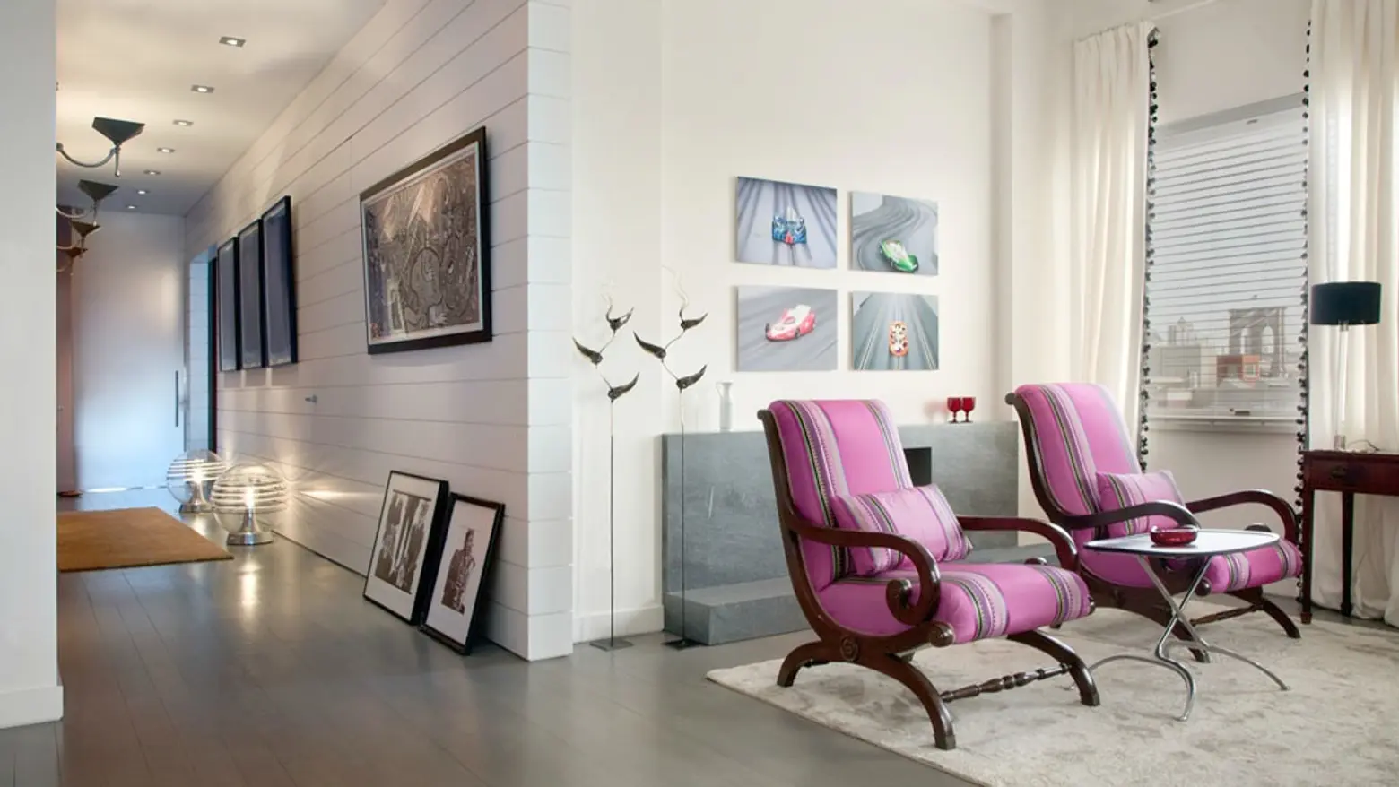
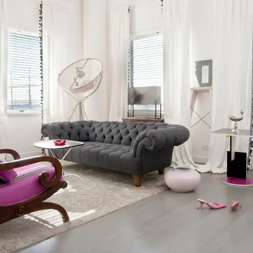
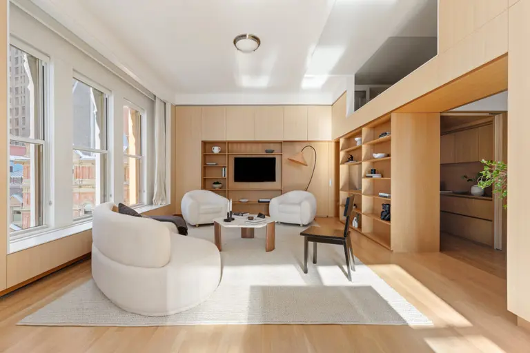
Once past the entrance, the apartment opens up into a collection of living spaces. The corner home is filled with light, but magenta and grey add richness to the bright white backdrop in case the home’s sleek angularity be mistaken for minimalism.
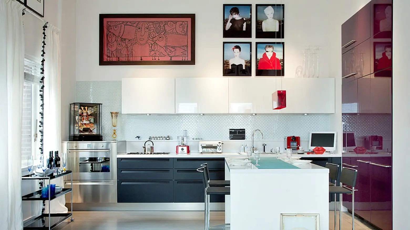
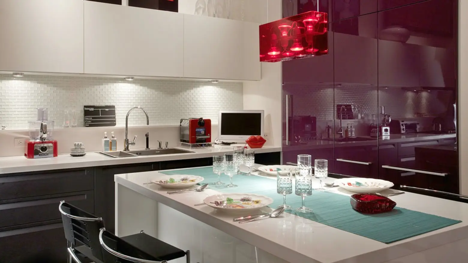
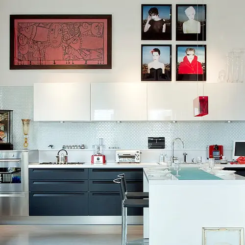
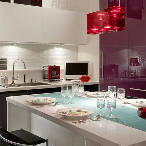
In the kitchen, a deeper shade of purple and hits of crimson keep things from fading to black and white. There’s plenty of wall space for art–and plenty of art.
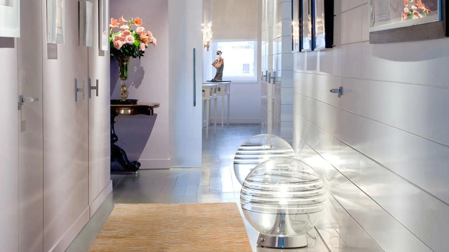
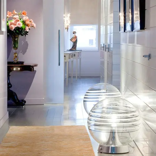
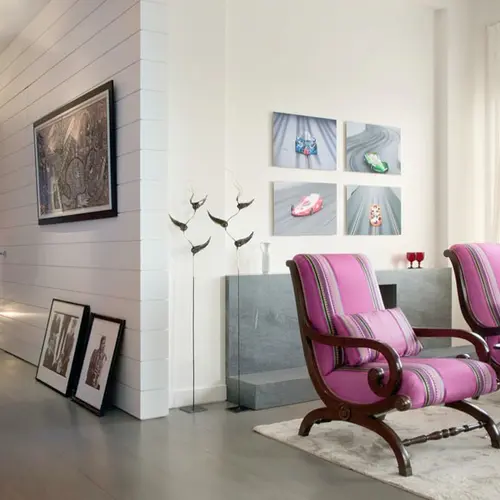
Triarch created a “circulation spine” in the form of a long gallery space that connects a series of separate rooms. This “facade” meant for the display of art serves to connect the apartment’s entrance to primary public areas.
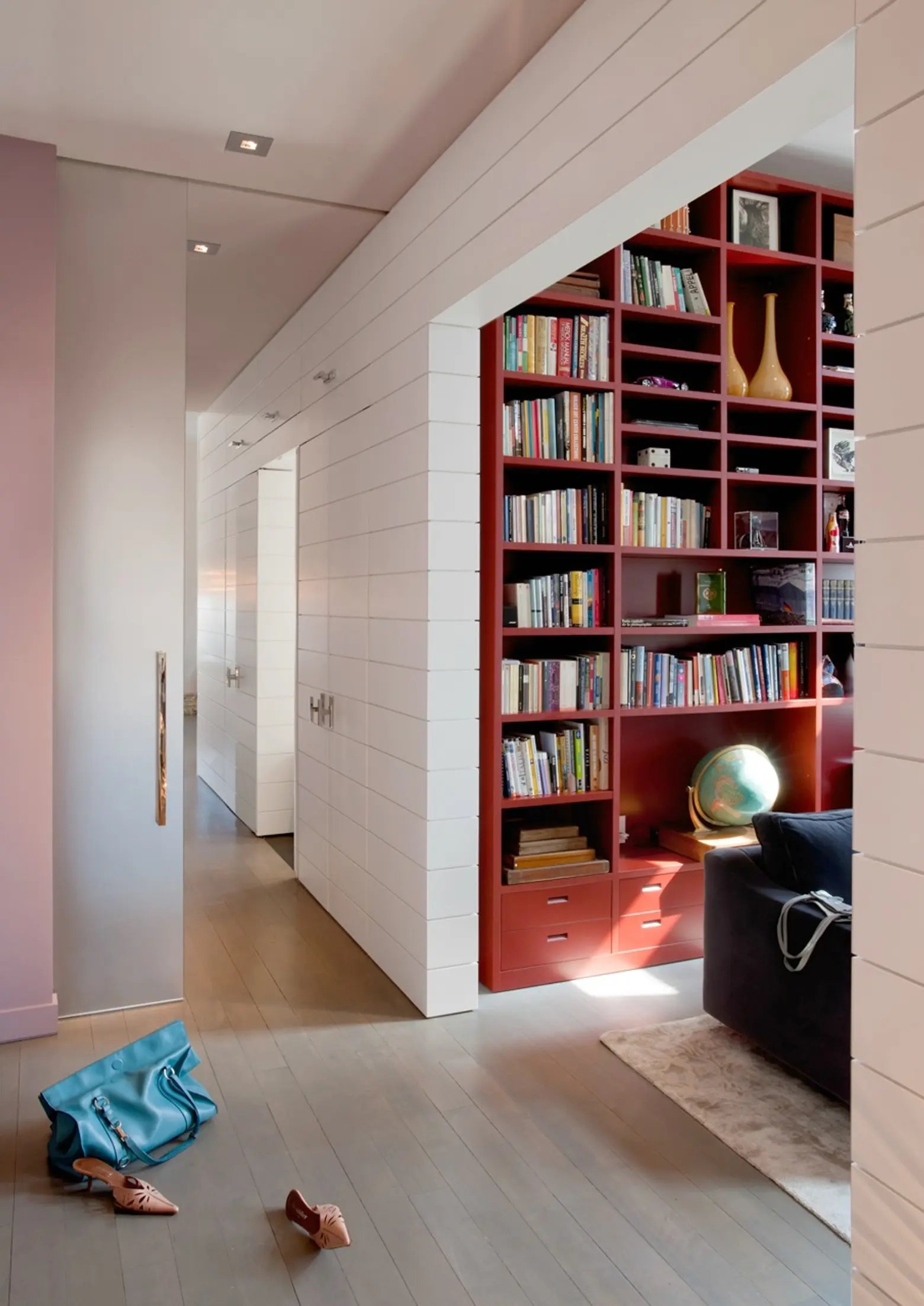
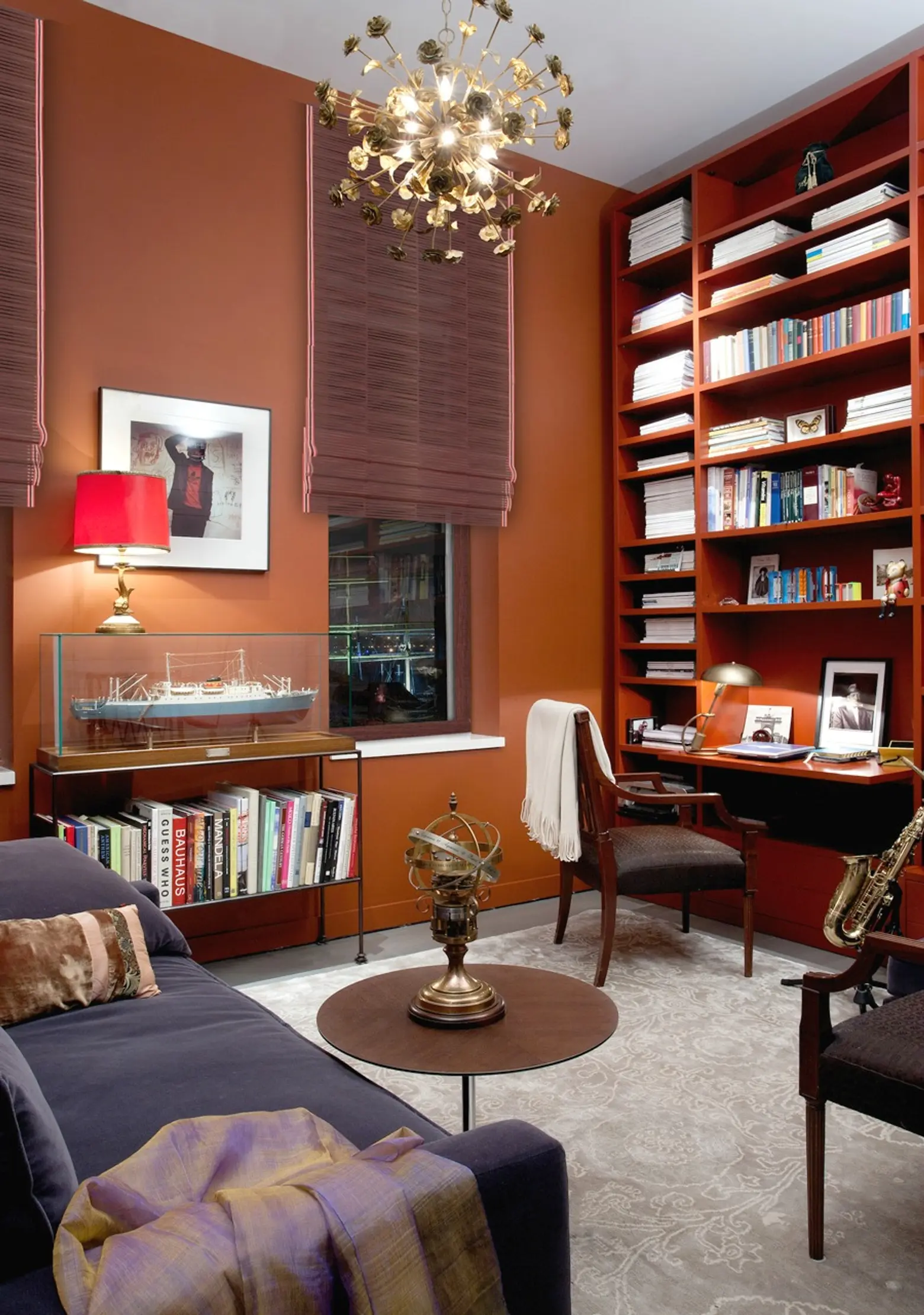
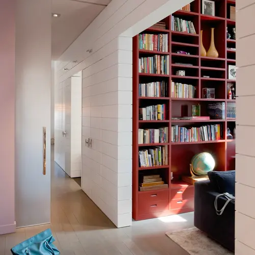
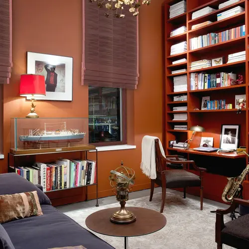
The white-washed gallery gives way to more rich color in the rooms–like sepia and cinnamon in the library/office.
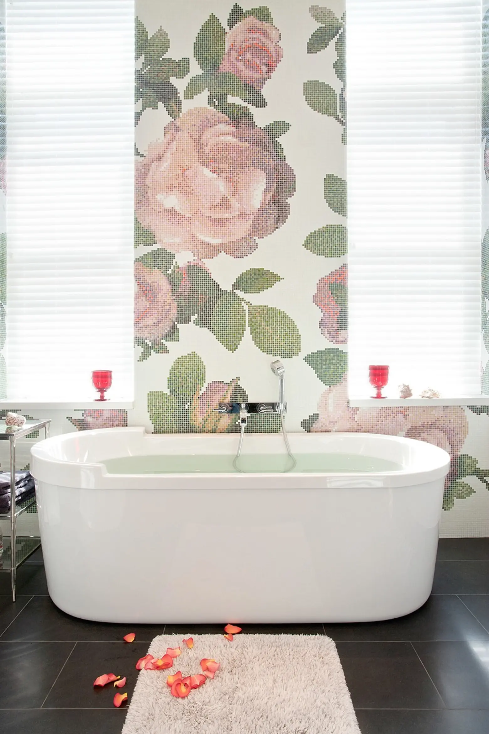
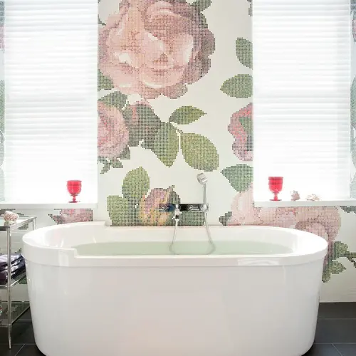
This capsule-shaped tub is free-standing, but at least it isn’t in the bedroom. A pixelated floral wall treatment is feminine and modern–and the color is a paler version of the lipstick hues found throughout the home.
See more architecture and interiors by Triarch here.
RELATED:
- Perfume Heiress Pauline Rochas Lists Trés Chic Williambsburg Loft for $2.6M
- This Montauk Beach House by Ghislaine Viñas Could Be in Malibu or Miami
- Dapper Duplex Loft in an Iconic Noho Cast Iron Building Asks $6.2M
Images courtesy of Triarch
