How Bike-Friendly Architecture Can Transform Cities for the Better
NYC is well on its way to becoming a bike-friendly city. With Citi Bike expanding and designs for bikes of all shapes and sizes growing in popularity, it’s only a matter of time before we start seeing architecture built specifically for cyclists’ use. In his article, “10 Points of a Bicycling Architecture”, originally published on ArchDaily, Steven Fleming explores ten ways major cities, like New York, can make this happen.
A revolution is occurring in street design. New York, arguably the world’s bellwether city, has let everyday citizens cycle for transport. They have done that by designating one lane on most avenues to bicyclists only, with barriers to protect them from traffic. Now hundreds of cities are rejiggering to be bicycle-friendly, while in New York there is a sense that more change is afoot. Many New Yorkers would prefer if their city were more like Copenhagen where 40% of all trips are by bike. But then Copenhagen wants more as well. Where does this stop? If you consider that we are talking about a mode of transport that whips our hearts into shape, funnels many more people down streets than can be funneled in cars, has no pollution, and costs governments and individuals an absolute pittance, you won’t ask where it stops, but how close to 100% the bike modal share can possibly go and what we must do to achieve that.
© Steven Fleming and Charlotte Morton
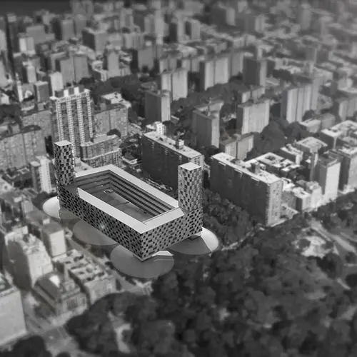
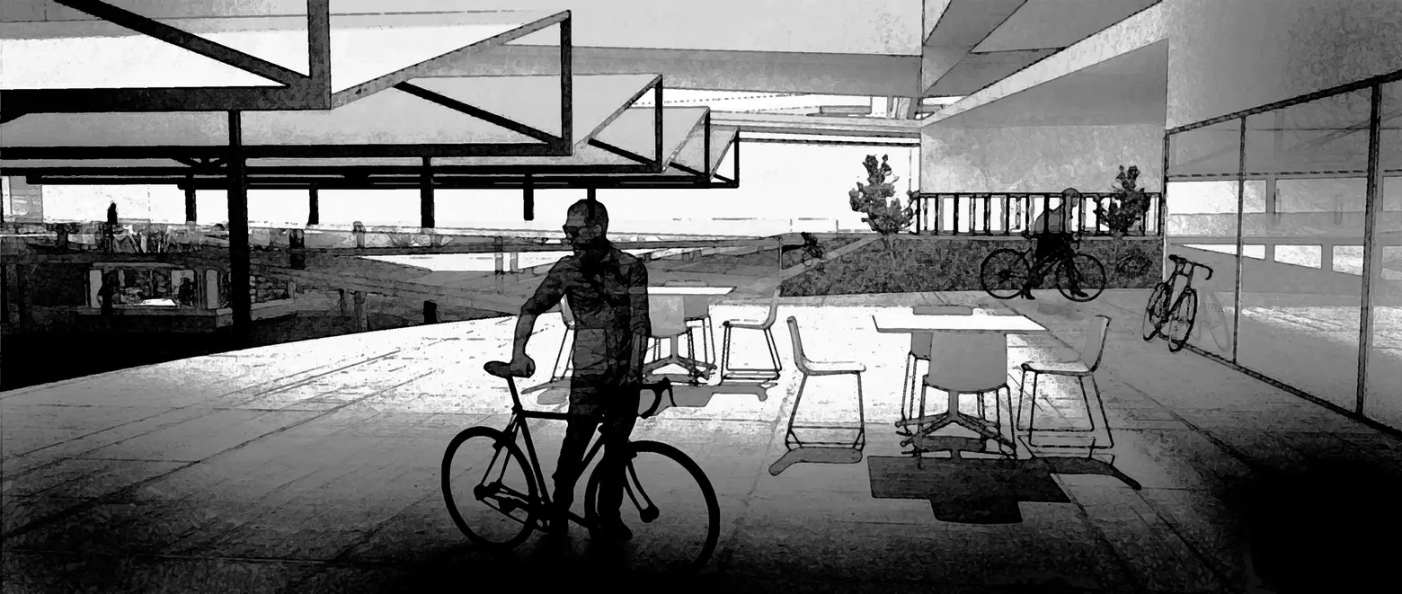
The highest benchmarks have been set by China where, until a few decades ago, cycling accounted for around 80% of all trips in some cites. Mao Zedong could achieve that by enforcing a collectivist vision. In democracies we have to come up with enticements. Most, I suggest, will come from the imaginations of architects. This article is illustrated with a design provocation I have developed with Charlotte Morton, on a symbolic site in Manhattan. The Frederick Douglass Houses are emblematic of the post WW2 attempt to transform New York into a city for driving when, as we know, it was built as a city for walking. The site could be densified again with more lift-access and walk-up apartments. In other words it could be dragged back in time from the 1960s era of driving to the 1860s era of walking. But what if it could be dragged forward in time? What if it could display the architectural principles that would accompany a future age of bicycle transport? Below are ten ways to make this happen.
1. Make bicycles handy things to use within buildings
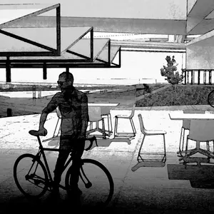
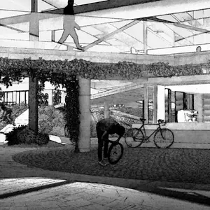
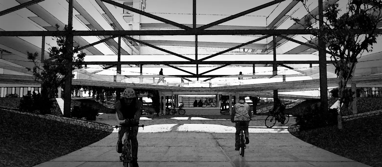
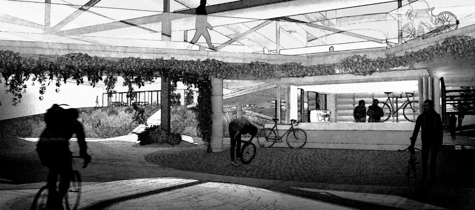
So much bike theft could be prevented if only we realised that bikes aren’t caked in manure. They may have been in the days of the horse, but these days wheelchairs and children’s strollers go from the street into buildings and nobody minds. So why don’t we take our bikes inside too? Imagine the advantages to a parent. He or she would be able to ride from inside their apartment directly to the cold food aisle at the back of the supermarket. With a cargo bike they could take their sleeping baby along for the ride and use their bike as a trolley. Or what if an office worker’s bike accompanied them like a briefcase? They could dock their bike at their office desk, then their home office desk, then the table at the café where they like to check emails. Their pannier bag could open out like part of a portable office.
© Steven Fleming and Charlotte Morton
2. Let the bike be the quickest way to leave home.
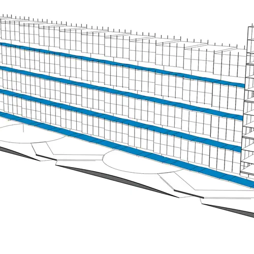
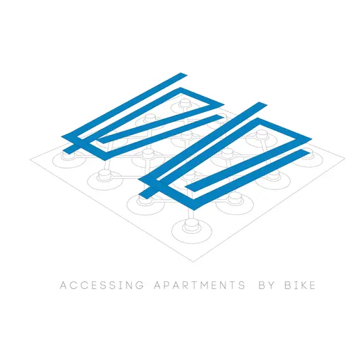
In apartment buildings that have aerial streets that slope to the ground (like BIG‘s 8-House in Copenhagen) or where a sloping site rises to intersect the planes of access galleries (as happens at Park Hill flats in Sheffield) the quickest way to the ground from a high level apartment can be on a bike. My next book, Velotopia, will have ideas for apartment block types that push this idea even harder. Residential areas are conceived as bike reservoirs, discharging maximum numbers of people to the street with their bikes.
© Steven Fleming and Charlotte Morton
3. Weather protection
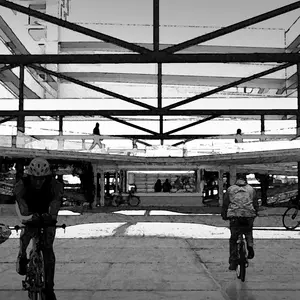
Despite what a few apologists for bike transport might say, rain deters a lot of people from cycling to work or to school. Anyone who says commuting by bike ought to be different from driving or taking the bus, by not having a roof, has enjoyed way too much praise for riding to work in all weather. Naturally they resist design comforts that would get the lily-livered cycling as well. Ignore their petty agenda! As architects we need to be focused on protecting citizen cyclists from the wind, harsh sun and the rain thus putting cycling on an equal footing with other all-weather modes.
4. Sculpt the terrain to control cyclists’ speed
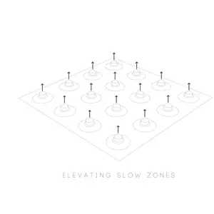
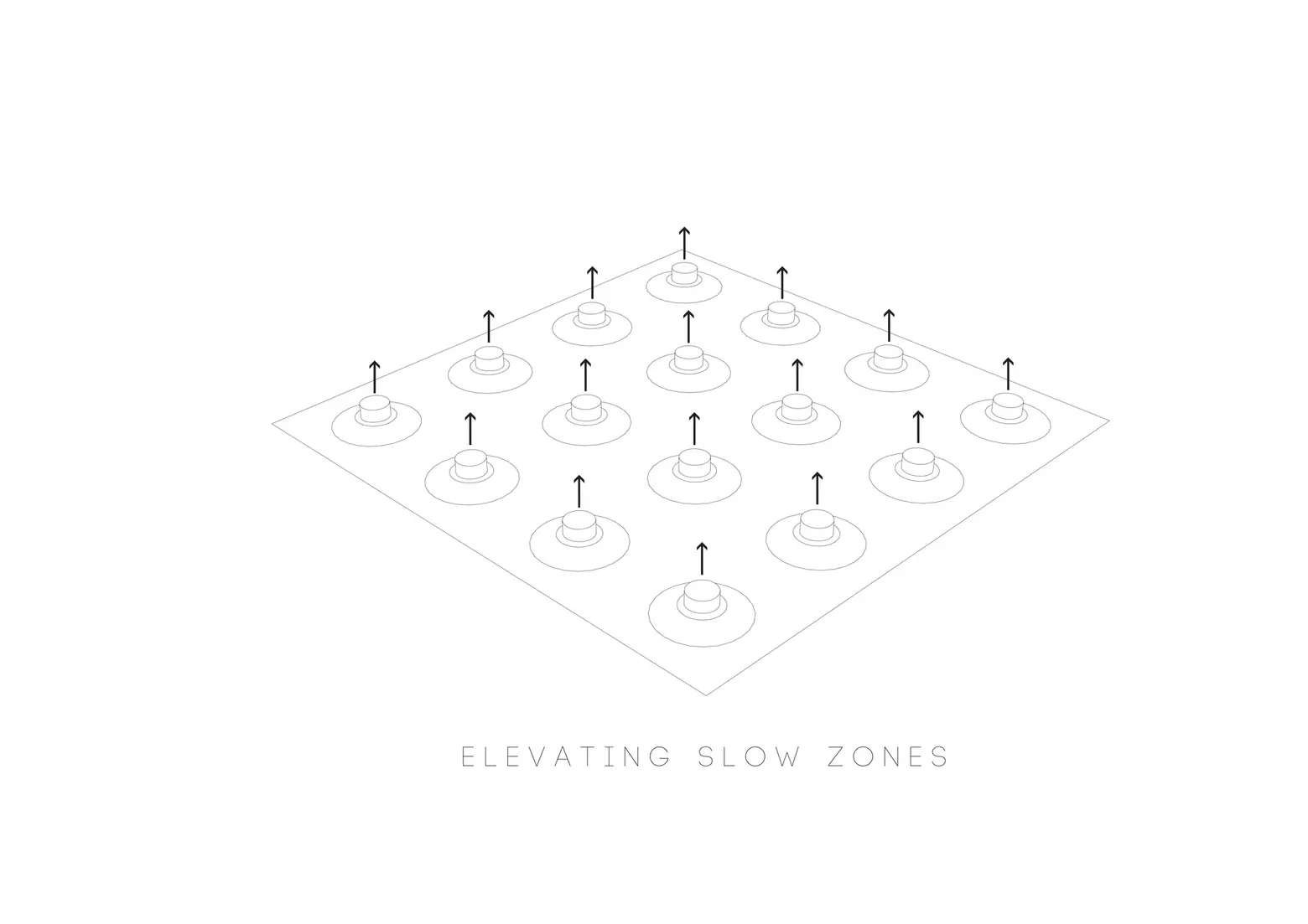
At any place where bikes should slow down, like a cross-road or activity node, riders can be saved the hassle of braking if, as designers, we raise the ground at those points by one or two meters. People on bikes will slow as they rise, then regain their speed as they dip away.

© Steven Fleming and Charlotte Morton
© Steven Fleming and Charlotte Morton
5. Make peace between bikes and pedestrians
Cars can be banned from our cities, or at least from broad tracts throughout them, but people on bikes and people on foot need to make peace. Consider this then: that cobbles are fine under foot but are awful to ride on, while an off-camber roadbed is no trouble to ride on but would cause a pedestrian’s ankles to roll. Now you join the dots. Also, carrying on from point 4, elevated shared zones can be linked with bridges, leaving low level, gravity-forced zones, for faster cycling.

© Steven Fleming and Charlotte Morton
6. Appreciate cyclists’ cognitive maps of their cities
Many drivers know what it is like to arrive at destinations through basement car parks connected by cross-city tunnels, while more than one subway user has caught two trains to go between points they later found were a short walk apart. Those of us who are habituated to bicycle transport have yet another image of our city, often dominated by waterfront and rail corridor trails, and linear parks. Architects need to take bicycling communities’ cognitive maps of their cities into consideration when analyzing sites, planning through-site links, and determining where to place entries.
7. Cycling Dissolves the mobility/access dichotomy
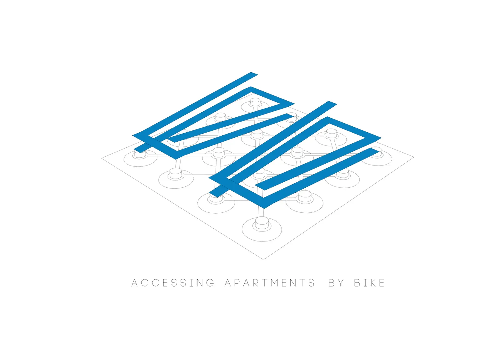
Once we accept that the tool for transporting people across cities in record time, can be pushed or even ridden inside, the dichotomy we see in a car city between mobility and access no longer applies. Arterial bike routes can double as platforms for commerce.
© Steven Fleming and Charlotte Morton
8. Dispersal of shops
People stroll at 3-5 kilometers per hour and bike at 15-25 kilometers per hour. This means that in a bicycle-oriented district shops can be five times further apart spatially, but no further apart if we measure in seconds. Rather than concentrating activity along avenues, which always leaves side streets with no passive surveillance, shop fronts can be dispersed.
9. The mogul-field concept
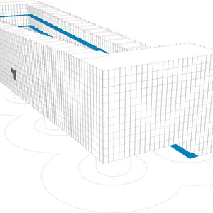
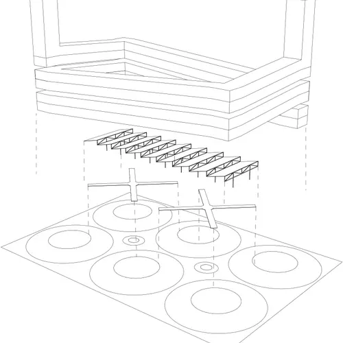
Some of the earlier principles I have mentioned—dispersing shops, elevating shared spaces to help cyclists slow down and discarding old distinctions between access and mobility routes—give rise to an alternative to the traditional street as the basis of city planning. The ground plane can become a field of broad moguls. The ramped access galleries of helical apartment blocks overhead, and the entries to solitary shops that have been evenly dispersed across a wide district, would be found on the crests. Pedestrians could move between crests via bridges and people on bikes could use the gravity-forced zone lower down. Cycle tracks at those lower levels can pass beneath blocks overhead, letting cyclists make beelines between any two points in the city.
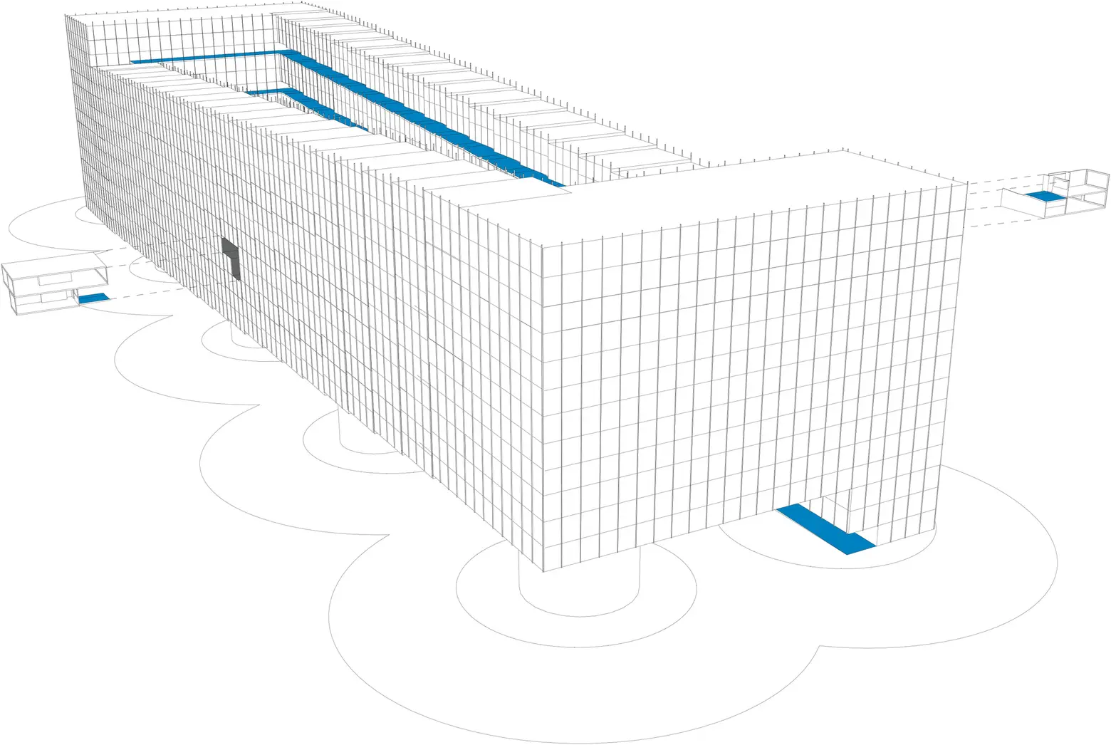
A typical bicycling residential block. © Steven Fleming and Charlotte Morton
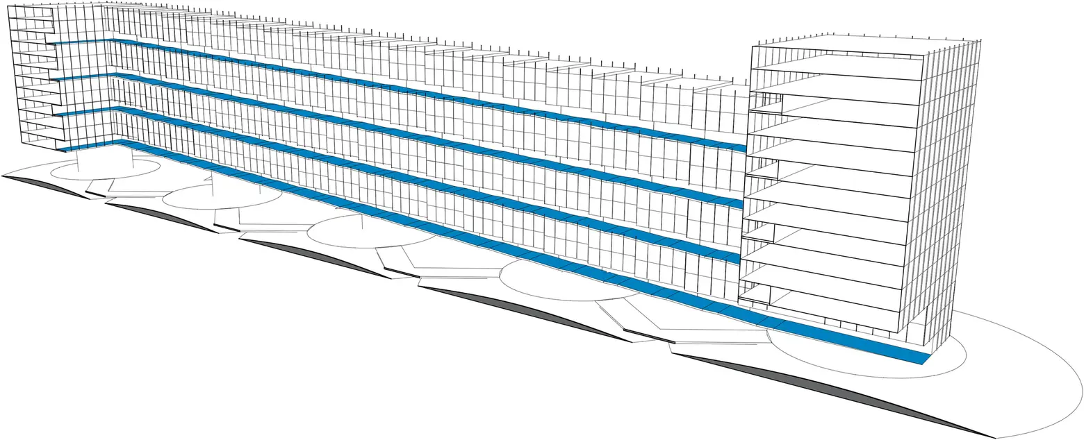
Section of a typical bicycling residential block. © Steven Fleming and Charlotte Morton
10. Provoke with proposals
What is the real lesson to be learned from provocative visions like Le Corbusier’s Voisin Plan, or Frank Lloyd Wright’s Broadacre City? If we think it is that provocations are dangerous, we miss the real lesson of history, which is that provocations bring change. That was a bad thing in the ’50s when the new vision was to fill cities with cars. The situation is different now that cities need fixing. Chances are, a vision of a bicycling city, if it captured the public imagination, would be a force for positive change.
The car-city paradigm was introduced to New Yorkers in an exhibition called Futurama at their 1939 World’s Fair. The idea was to make buildings tall and thin so that, down at ground level, there would be space for much wider roads—mobility for mobility’s sake. All that resulted were towers in a car park and residents with farther to walk.
© Steven Fleming and Charlotte Morton
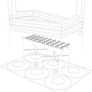
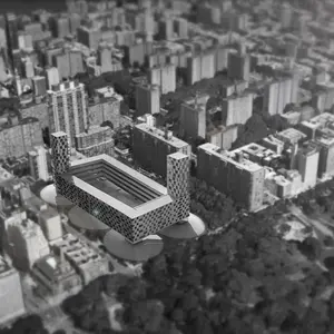
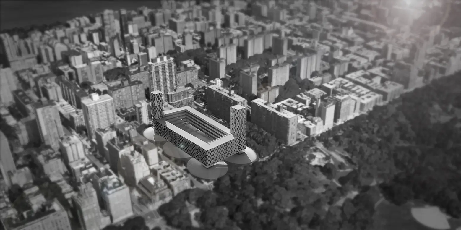
The proposal is to replace two towers with a double helical block that would have ramped access galleries serving every apartment. The cycle track running parallel to the 97th Street Traverse through Central Park would be extended to meet the site. New off-road cycle tracks reaching across the Frederic Douglass Houses site would draw people on bikes from Amsterdam Ave and blocks to the North of 104th Street. For an increasing number of New Yorkers who have swapped walking, driving and transit for cycling on most occasions, the site would become a key portal between Central Park’s extensive bike network and the Upper West Side. Many cyclists might see it as the perfect address.
Dr. Steven Fleming is an academic at the University of Tasmania, Australia and the author of the book Cycle Space, and the forthcoming book Velotopia, which will be published by NAi010 Publishers in Rotterdam. He consults building industry professionals and government agencies about building for bikes. Find him on the web at cycle-space.com and follow him on Twitter @behoovingmoving.
