INTERVIEW: HS2 Architecture’s Tom and Jane Talk Residential Design and Their 20-Year Collaboration

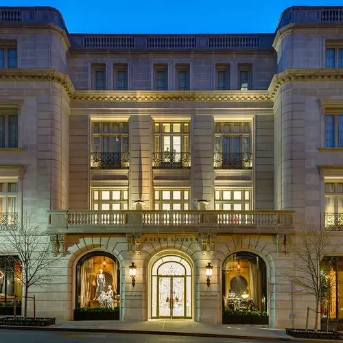
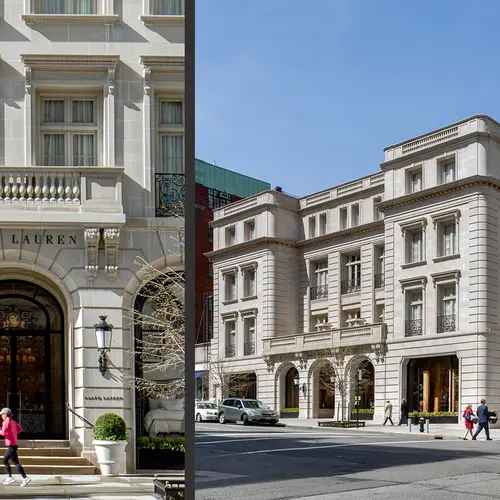
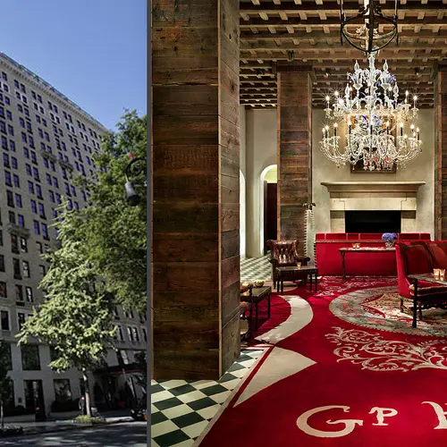
HS2 Architecture‘s name may not ring all that familiar, but you’ve certainly come across their projects before—and we’re not just talking on 6sqft. HS2’s power pair, Tom Hut and Jane Sachs, have been working together since 1994, enduring the ups and downs of the NYC market and putting some spectacular and very recognizable designs out there while at it. Does the Gramercy Park Hotel ring a bell? Maybe the Palazzo Chupi? Or maybe you’ve shopped at the Ralph Lauren Store on Madison and 72nd. Easily one of the most underrated architecture firms working today, HS2 is really a force to be reckoned with when it comes to the built environment.
In celebration of their 20th anniversary, we recently sat down with founders Tom and Jane to talk about their studio, their work, and the roller coaster ride that has been New York City architecture over the past two decades.
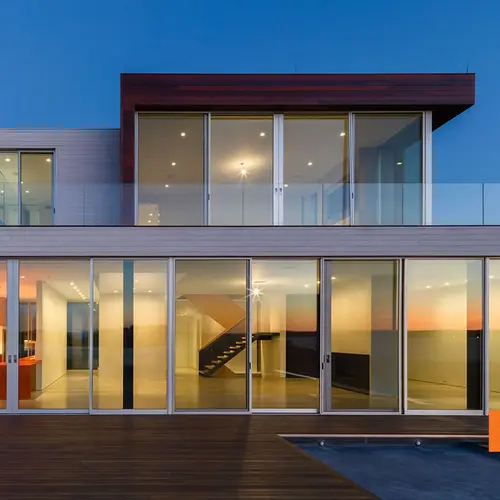
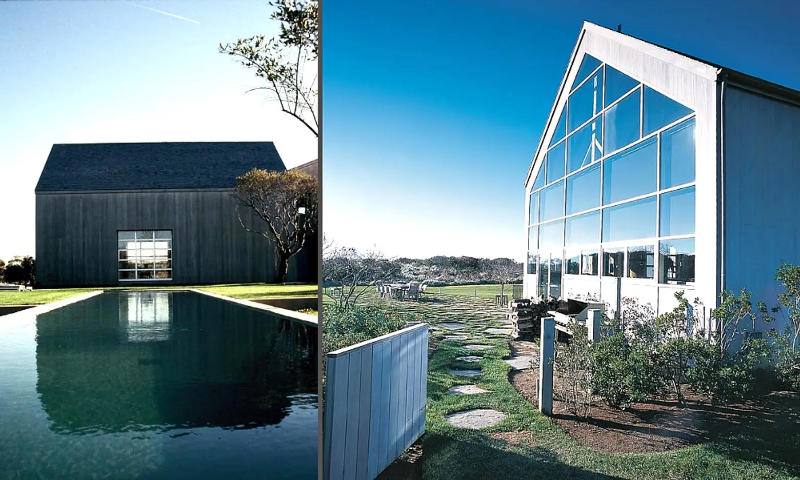 Image: The Chiat Beach House
HS2 is celebrating its 20th year this year. How did you two start working together?
Tom: We were actually introduced to each other. At the time I was working as a freelance architect for the Guggenheim Museum and Jane was a recent grad of Columbia Architecture School. She had a project she was able to bring to life, and after meeting, we decided that we’d work together on it in an informal way. Our relationship became more of a formal one as other projects came in.
Do you have a favorite building you’ve designed or a project you’ve worked on?
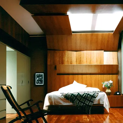
Jane: I think our first house. I have a real fondness for that house and that client. It was the Chiat Beach House which unfortunately I hear is being torn down! That was the first ground up project we worked on together, and the client was great. He was in the advertising business, so he knew how to be a good client—which is when to hold your ground and when to get out of the way.
Tom: I would have to agree with that. Everything else has been…different compared to that. [Laughs]
How has the industry changed since you first started your practice?
Tom: For us, the types of projects and clients we have has escalated as our portfolio has grown. We’re able to do bigger and better projects with clients that are more interested in doing the things we’re interested in doing. In terms of the industry, 1993 was a bad one, and 2000-2003 weren’t too good either. Then of course there was the so-called recession of 2008. But now we’re feeling the boom.
We’re a small firm. We still get things just here and there, but when we do get them, they are fairly significant projects. So, I feel that if we are seeing things, the bigger fish feeding at the top are definitely gorging on all sorts of yummy stuff.
Jane: I think the biggest change, especially in New York, is that there has been this big push for starchitecture, which I think is quite great. Finally there is some interesting, new, modern architecture in the city. And there have been some great projects. It’s a very exciting time for us as architects.
Tom: We do private work and we do very little public or institutional work. But I think the city under De Blasio is going to veer in that direction. We may miss that train completely, or we may be able to get some of it, but the private sector has recovered its bearings and we benefit from that.
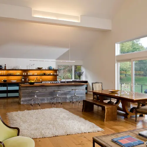
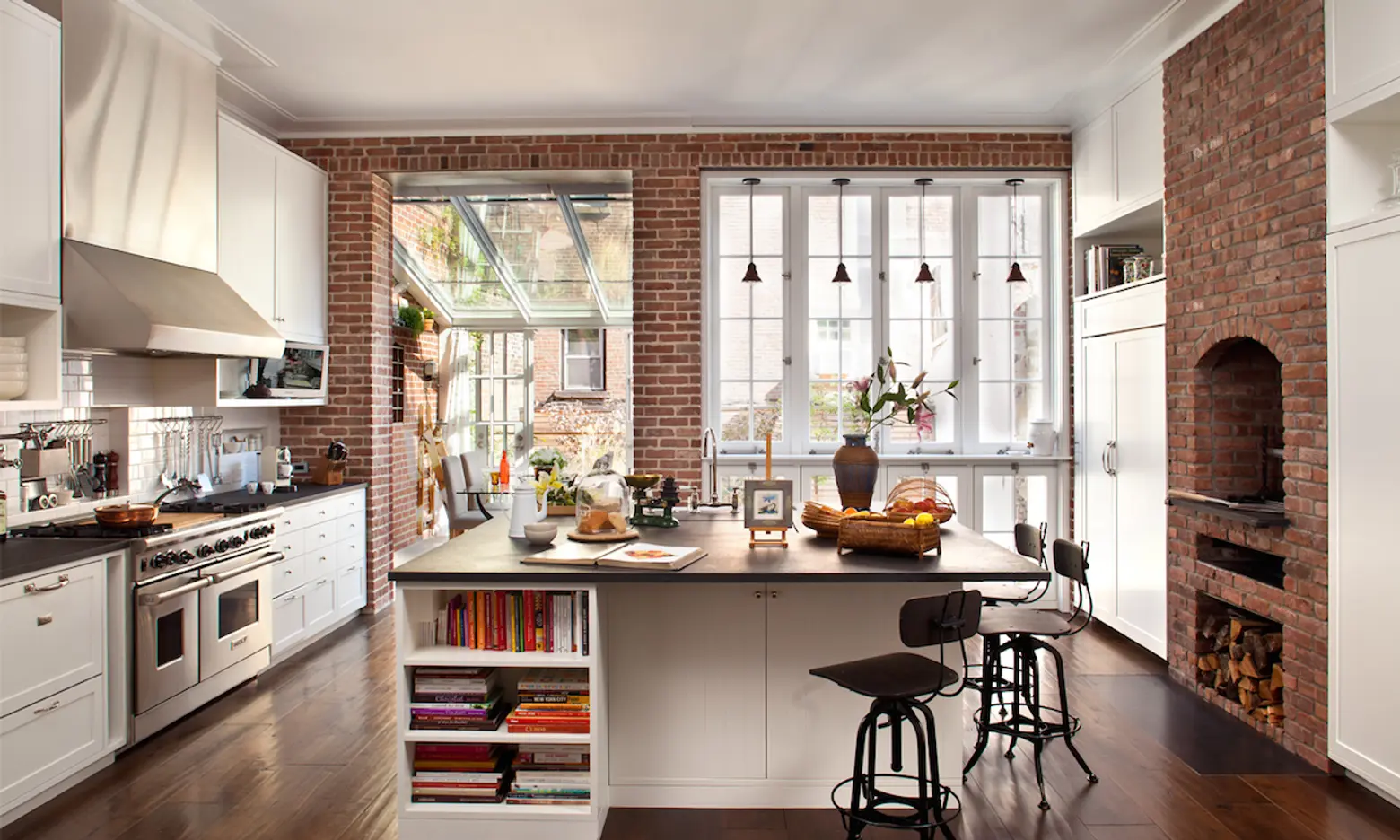 Image: The greenhouse dining room of one of their West Village remodels
So, let’s talk a bit about how you approach a design project. What are the first things that you think about?
Tom: It often depends on the project. Like any good architect, we start with a plan and make sure that the plan is intelligent and effective. Then we work with spatial issues. We get to texture and colors last. But if we have an opportunity to think spatially, that usually comes pretty quickly after the plan-making and siting. In many ways we are formalists—we believe in form, but we’re not restricted to a particular palette. We celebrate many different materials and colors.
Jane: Also, in looking at our projects, I hope that you can see a difference between them. And that difference is based on who our client is. Because it’s not just looking at the programatic requirements and fulfilling that, but also trying to give a look and feel that reflects the people who are inhabiting the spaces we design. A lot of our work is residential, so we pretty quickly get grounded into programs and lifestyles.
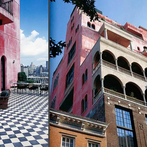
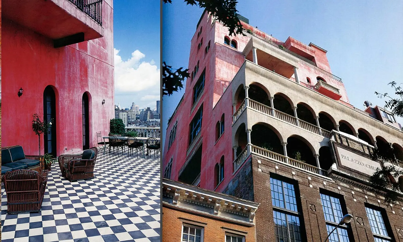 Image: Palazzo Chupi in the West Village
You’re both very modest about your work, but you’ve worked on some high profile buildings in NYC—Palazzo Chupi, the Ralph Lauren Polo store uptown, Gramercy Park Hotel. Is the approach here different?
Tom: When we saw Palazzo Chupi go up, we had to swallow a few times. It was great. The common element in all of those projects is collaboration. We were lucky to work some very interesting, collaborative people on these projects—Julian Schnabel, Ian Schrager, and the many fantastic in-house real estate, architect and design guys at Polo. The ability and excitement that comes with working in a larger team in different creative capacities was really a lot of fun. Julian is a great example of an individual with a truly unique vision,. Mixing it up with him was a great experience.
Jane: What’s great about architecture is that you always learn something. Even in collaborations where we may not be the lead designers, there is always something to take away—and that’s especially true on these big projects where a lot of coordination is involved in bringing it all together. The “doing” of architecture is the big part of it. There is so much emphasis placed on the aesthetic, but the building of it is also a great kick. Seeing it all go up, and seeing something that has been on paper for so long materialize, it’s a great feeling.
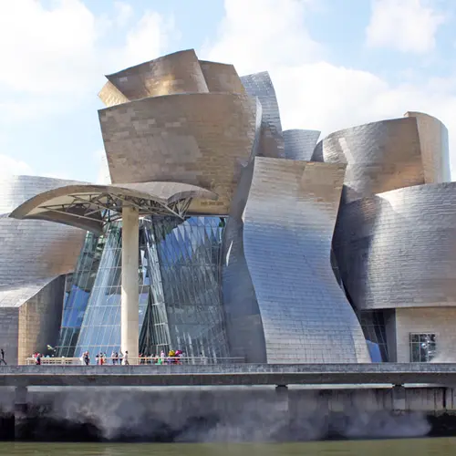
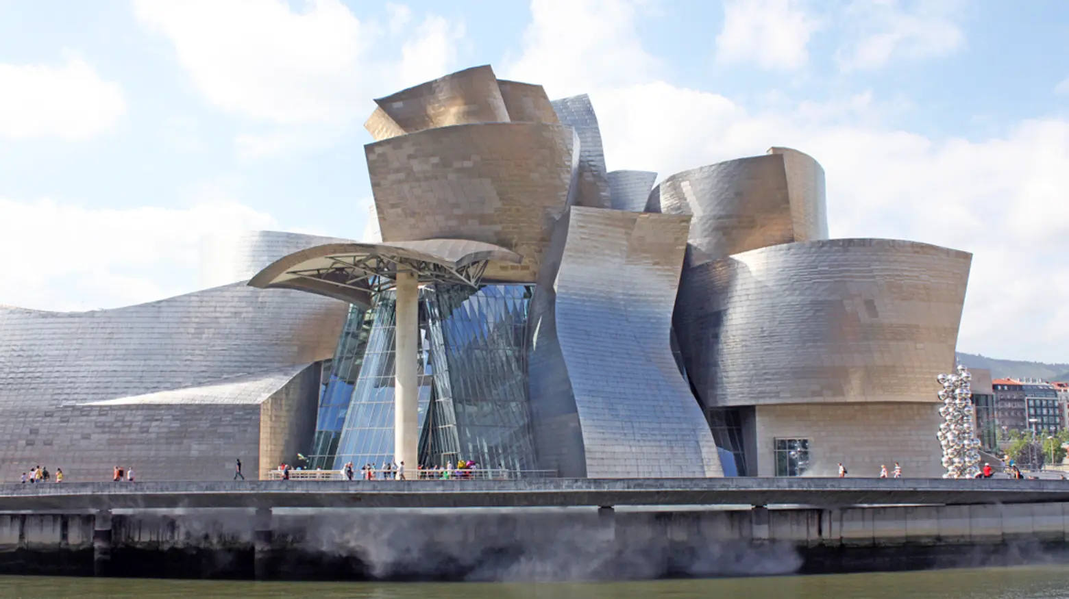 Image: The Guggenheim Museum in Bilbao, Spain
Tom, you’ve worked on the Guggenheim Museum with Frank Gehry. Obviously that is a very iconic, precedent-setting piece of architecture. Is there anything you took away from that experience that informs your work today?
Tom: Yes, but more from the technical rather than the design standpoint. I was immersed in art environments. My responsibility was not the design, of course, I was working for the Guggenheim, so we were charged with trying to maintain the programmatic and technical criteria through the project. I learned a tremendous amount about museum environments and that very much stays with me to this day.
In terms of design, I think that Gehry doesn’t get enough credit for is his urbanistic chops. That was a very well-thought-out, very well sited building in an urban context. I come from an education and background that is grounded in site and context, and that project really reinforces how important site and context are for any major building.
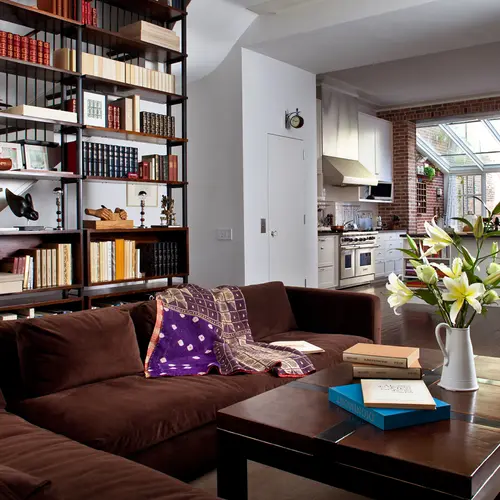
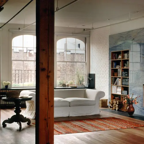
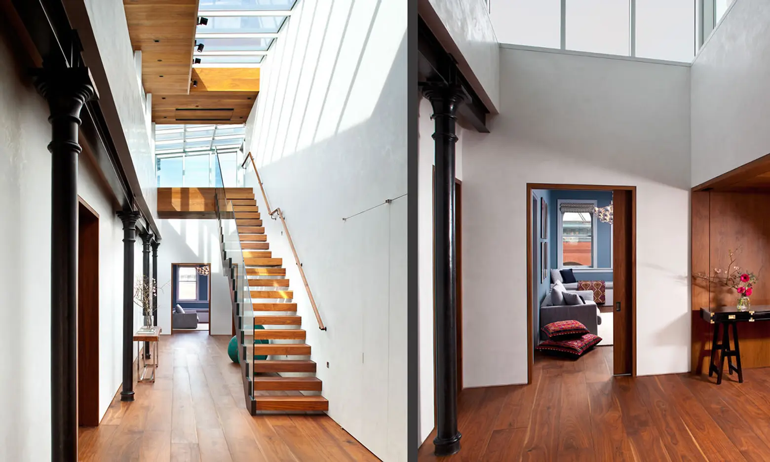 Image: Wooster Street Loft
Do you predict anything new for residential design, or is there anything you’re seeing more of?
Tom: There is a very strong reduced, minimal modern. It’s full blown. But at the same time there’s still a lot of that recycled barn board aesthetic going on. I also think sustainable strategies are also a big thing. We personally try to approach our projects with a green mindset when possible.
Jane: I think ultimately a lot of aesthetics are just what people are used to. Nowadays, you go into many more public spaces and expensive hotels and you see very extreme modern spaces. I think people are getting used to that aesthetic and are more accepting of having that in their home. It’s also in product now—your kitchen, your appliances, furniture—IKEA is sort of mass-producing that feeling.
For me, I come from an art background and when I went to architecture school I was so surprised at how conservative the thinking was. There were questions being asked in architecture world that in the art world hadn’t been asked in ages. But I think it’s because we’re talking about people’s homes, where changes aren’t so simple because you have to live with these things. But there are great modern museums, libraries, concert halls, and all of these things that are really starting to become a part of the fabric of life, and people are realizing “I feel good in this space” and that they don’t have to be in a more traditional one. It’s trickling down.
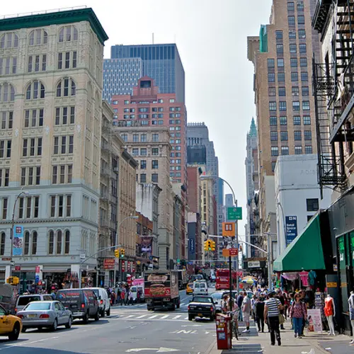
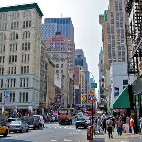
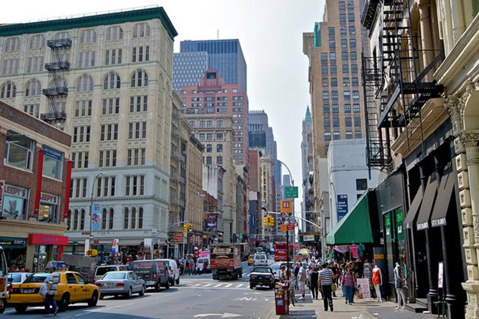 Image: Where Canal Street meets Broadway
How long have you been in your current studio location (Broadway and Canal)? How has the neighborhood changed since you’ve moved in?
Jane: We’ve been here 14 years, and actually, we chose this neighborhood because it’s three blocks from my house. [Laughs] We looked around at a lot of places and this floor was a sweatshop when we took it over, so we redid it. Canal Street has changed, but in some unexplainable way, this corner we’re at manages to resist in the face of all of these incredible, expensive lofts on Lispenard and everywhere around. This corner is still incredible; packed with millions of tourists, people flashing you these fake Louis Vuitton bags.
Tom: This is pretty much the heart of the counterfeit handbag and jewelry industry. [Laughs]
Jane: Every time you get out of a cab they ask you.
What are your homes like?
Tom: Well I live in a house and Jane lives in a loft.
Jane: I’ve lived in lofts all of my life, so I’m dying to go the other way. I’ve always lived the minimal modern. I’m on Crosby Street. The challenge for me is creating the separation between public/private space. It’s all pretty public with the dogs and kids. I don’t even have a door to my bedroom.
Tom: I live in a Tudor, which I never thought I would end up in. But we’re un-Tudoring it.
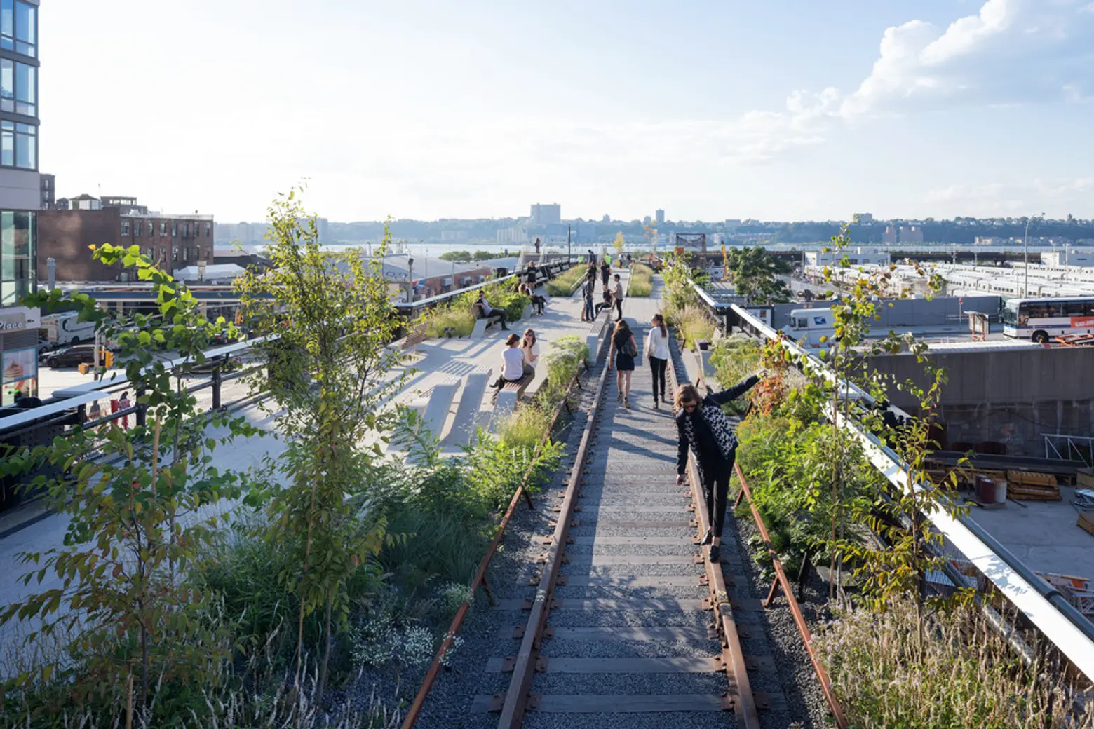 Image: Section 3 of the High Line Park
Jane: I think that the Diller Scofidio + Renfro design of Lincoln Center is great. It totally opened up that corner of the city.
Tom: I wish I would have done the High Line.
Jane: That’s a great one. There are a lot of these great, undiscovered places in New York, and New Yorkers are hungry for that stuff. You give them a patch of green and 300 people will sit there.
[This interview has been edited]
+++
HS2 ARCHITECTURE
414 Broadway, New York, NY 10013
HS2 projects featured on 6sqft:
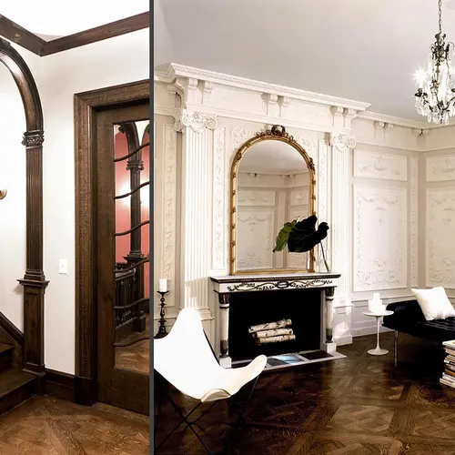
- HS2 Architecture’s Grandiose Upper West Side Townhouse Renovation
- Chiat Beach House by HS2 Architecture was Built with an 18th Century Barn Frame
- HS2 Architecture’s Wooster Street Loft: Elegant Furnishings plus Industrial Details Add up to Perfection
- This West Village Remodel by HS2 Architecture Wows with a Greenhouse Dining Room
You can also see more projects in our gallery below.
