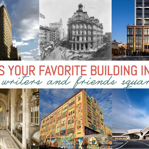
What’s Your Favorite Building in NYC? 6sqft’s Writers and Friends Square Off
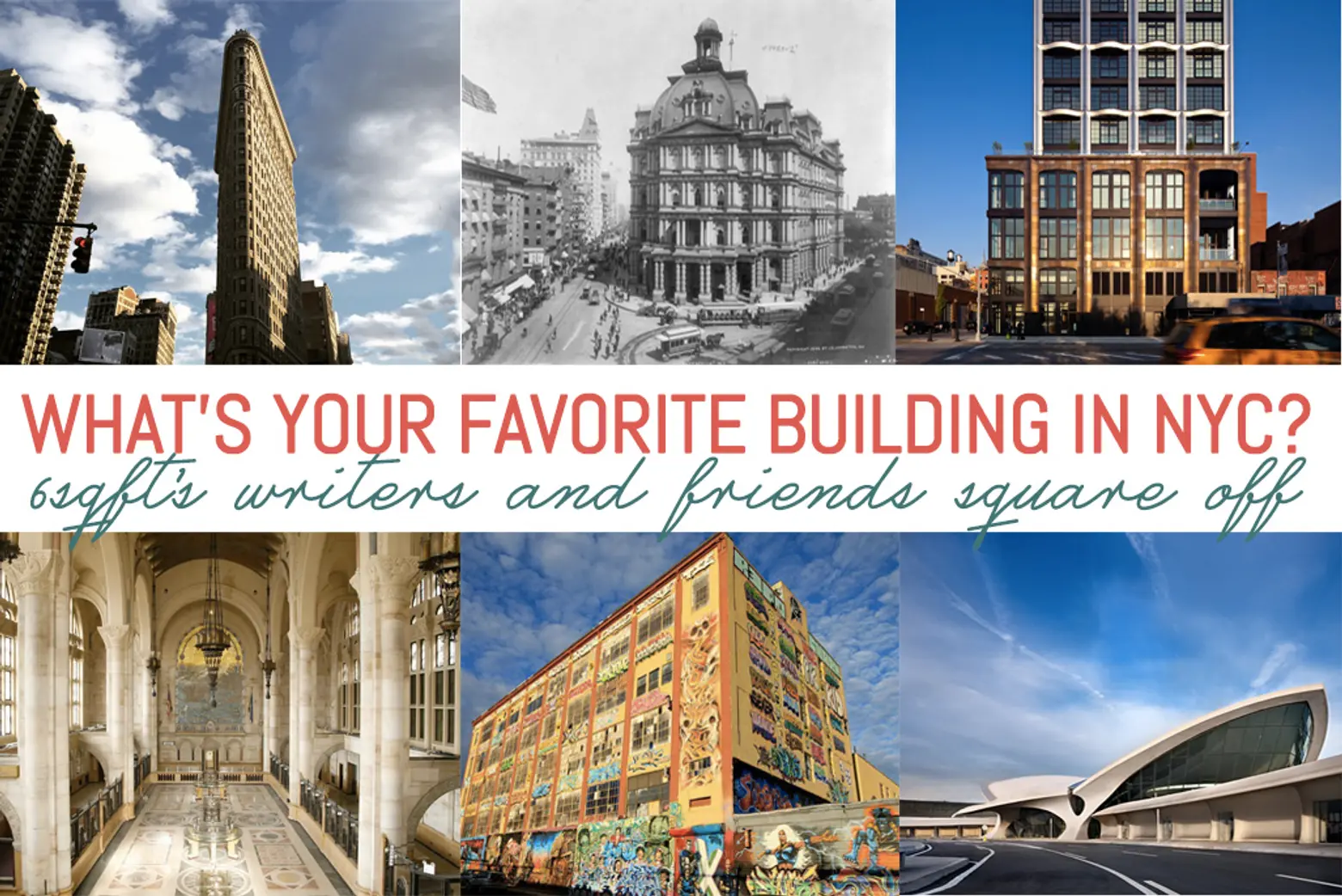
Once upon a time, when 6sqft was not yet launched, a group of writers were asked for their thoughts on their favorite building in New York City. Their choices, some easily recognizable and others a little further from the beaten path, were mixed together with those of a few folks a lot like our readers—interested in and passionate about all things New York. The result? A wonderful blend of what makes this city great: its diversity, not simply demographically but also in the opinions of those eight million souls who weave together the fabric of all five boroughs to create the most interesting city in the world. And it stands to reason the most interesting city in the world is home to quite a few interesting buildings. As one might expect, there was barely a duplicate in the bunch. Some weren’t even on our radar!
Is your favorite on the list? If not, we’d love to know what you think in the comments.
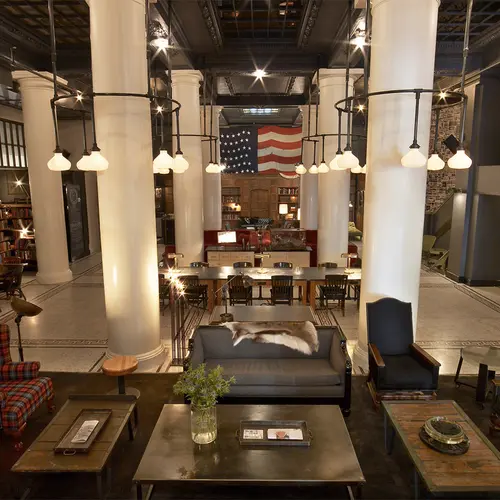
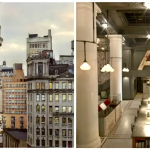
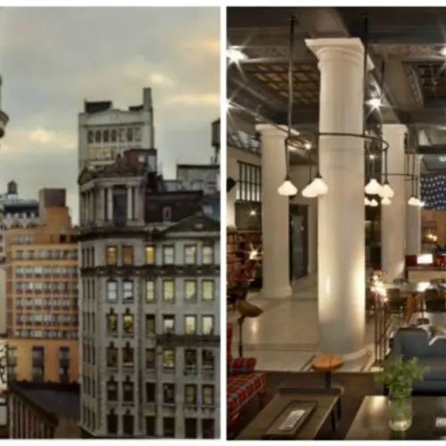
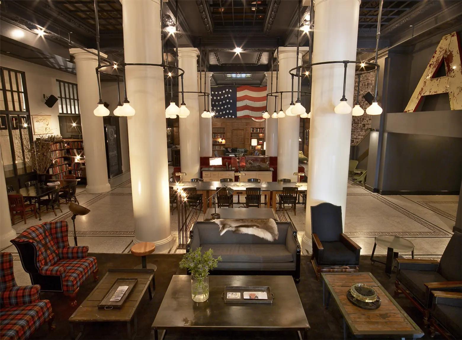 Image courtesy of Ace Hotel
David Basulto, Architect and Co-Founder/Editor-in-Chief of ArchDaily
Building: Ace Hotel, 20 West 29th Street
My favorite building in the New York is the Ace Hotel. The building, a classic masonry structure from early past century, has been renovated by Roman & Williams. The mix of unique salvaged pieces, and a simple contemporary design result in a timeless design where I feel at home during my constant trips chasing architecture. The contrast of the dark, cozy interiors with the light-filled rooms in the corner of the building, and a fantastic view of Broadway and of the Empire State Building, connect you with Midtown Manhattan. The lobby is a socially intense place, where I can be working all day at the large communal table, holding meetings and randomly meeting people from the creative and tech scenes in New York who come here for the same reason: to be connected.
The work of Atelier Ace curating everything that happens inside the building, and also attracting interesting neighbors such as Stumtown Coffee Roasters and Opening Ceremony, has had a positive effect on the neighborhood, bringing in creative industries and changing the landscape of a location with a tremendous potential.
Not just a timeless New York building with cool interiors, but also the detonator of a neighborhood improvement. That is good architecture.
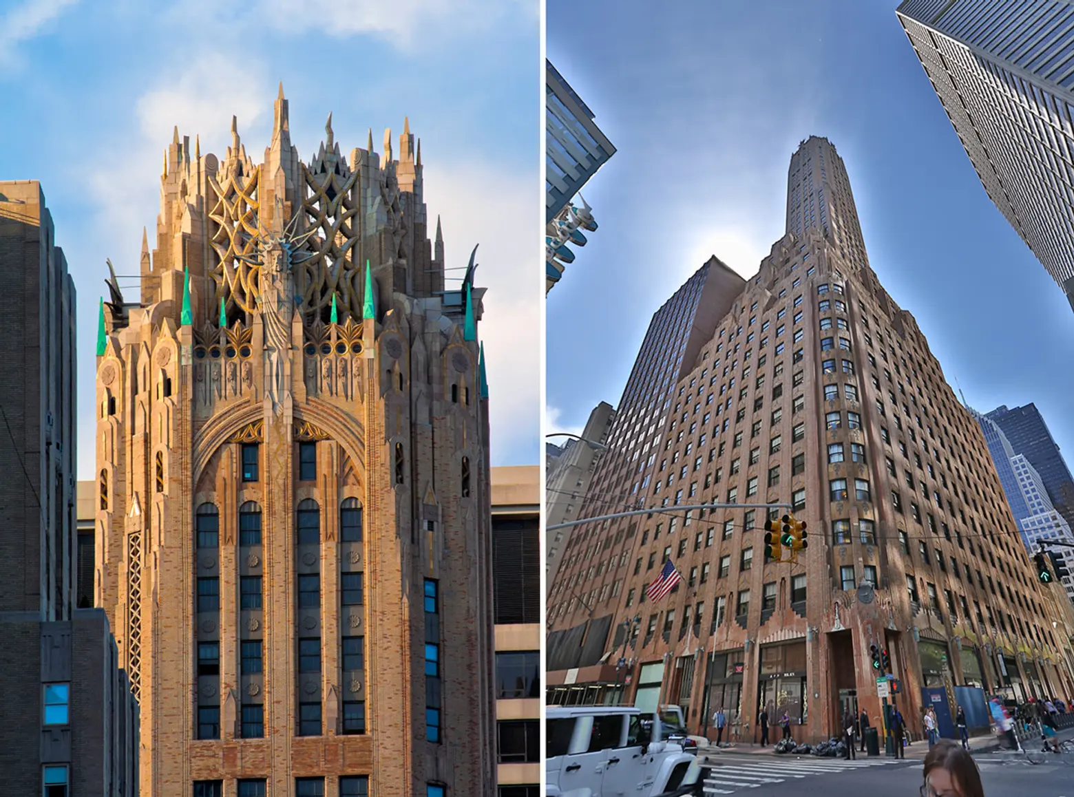 Images: Detail view by syscosteve (L); Exterior street view via Skyscraper City (R)
Lori Zimmer, Founder and Managing Editor of Art Nerd New York
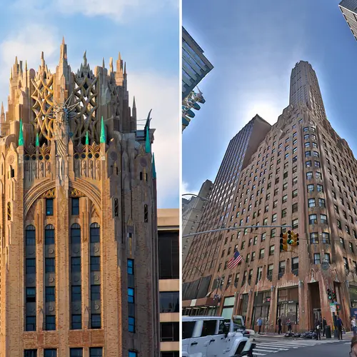
Building: The General Electric Building, 570 Lexington Avenue
My absolute favorite building in New York is the Art Deco gem, the General Electric Building at 570 Lexington Avenue. This building epitomizes the time when architecture could convey power—in this case in the form of electricity. Designed in 1931 by Cross & Cross, at street level the facade gives hints of its Art Deco awesomeness, with ornate lightning bolts depicting electricity. But the best part is the massive Gothic tower topped with an ornate crown which is meant to be electricity and radio waves. It is incredible.
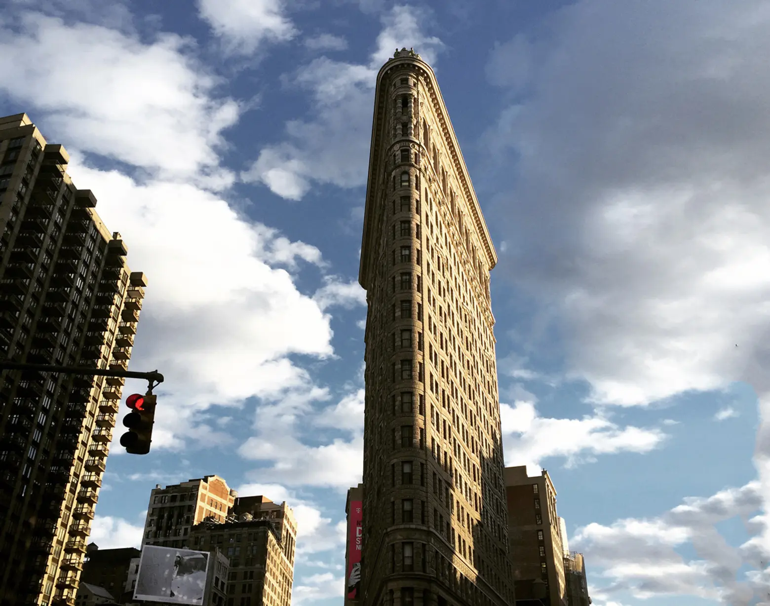 Image by 6sqft
Aisha Carter, Contributing Writer at 6sqft
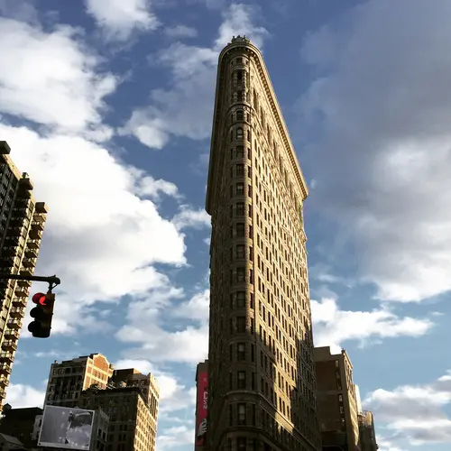
Building: Flatiron
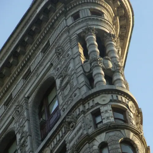
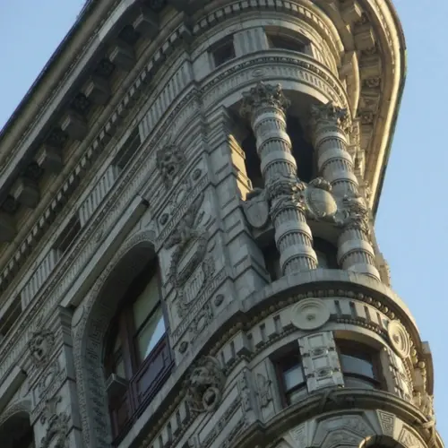
I have to claim the Flatiron building as both my favorite and the most interesting building in New York City. For starters, it used to be one of the tallest buildings in Manhattan and now, it’s dwarfed by all of its successors. I used to work half a block away and I hated walking near it on cold winter days. A friend and I did some research and found that the wind tunnel was notorious back in the early 1900s, blowing up women’s skirts and baring their ankles and legs. The old-fashioned wardrobe malfunctions were so predictable, they named the place 23 Skidoo and men would flock there, waiting to catch a glimpse.
Lastly, the most interesting aspect of that building is from a personal experience with an art installation done a few years ago. I was running an errand when I noticed a group of people staring up at the building. Being a typical New Yorker, I ignored it, but when I was stopped at the light, I looked up and saw a man standing on the edge. Only about a year before a man had famously jumped from a friend’s apartment in Long Island City, so my mind panicked. After discovering it was an installation, I find it funny that I was the only person who assumed the worst. For the rest of my time at that office, I would smile to myself whenever I passed the Flatiron Building.
Andrew Cotto, Brooklyn Writer and Author of The Domino Effect and Outerborough Blues
Building: Flatiron
The Flat Iron Building never fails to imply cohesion and beauty. Beyond the gorgeous design, the building’s symmetry speaks to the magic of New York, where things, are often almost too wondrous to be true.
Susan Cohen, New Yorker Spotlight Editor at 6sqft
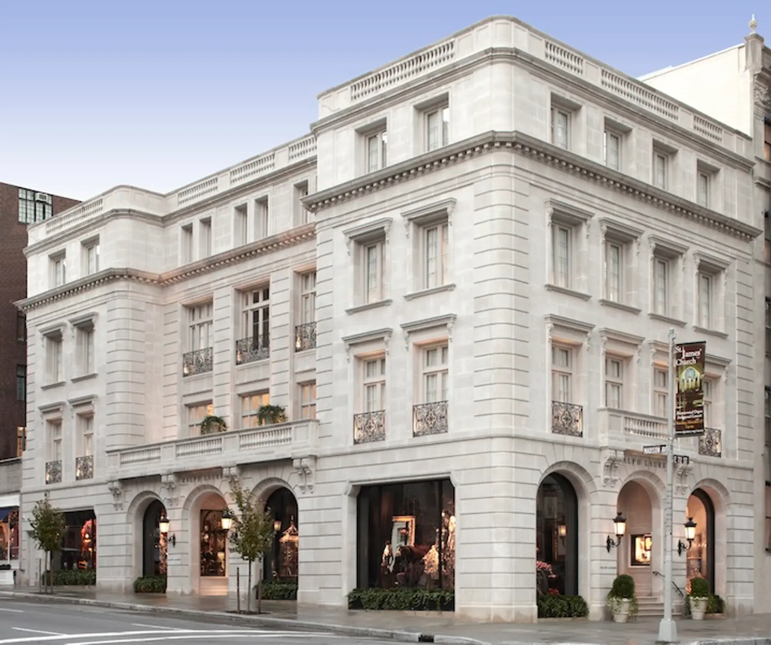
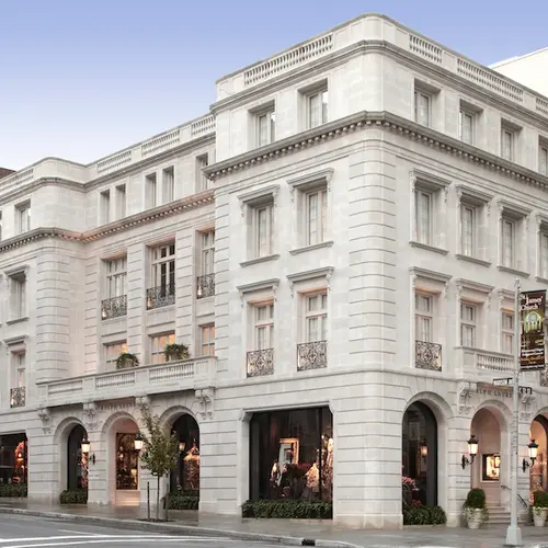
Building: Ralph Lauren Store on Madison and 72nd
I consider the building a mini oasis of sorts. It’s Europe meets Madison Avenue and it’s divine, especially when the light hits it just right. The Upper East Side has very crisp, warm, and engaging light. In a way, it’s almost a signature characteristic of the neighborhood.
Dain Gordon, Freelance Graphic Designer
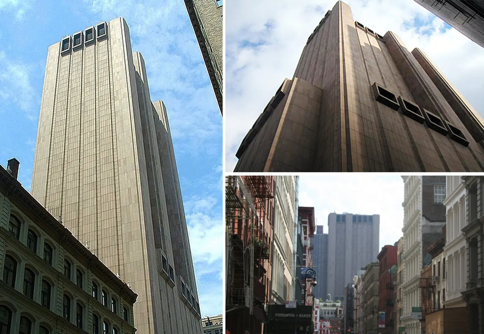
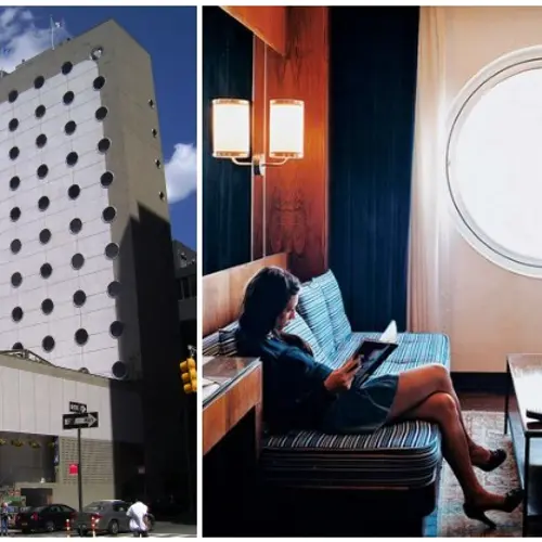
Building: AT&T Long Lines Building
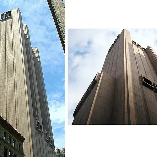
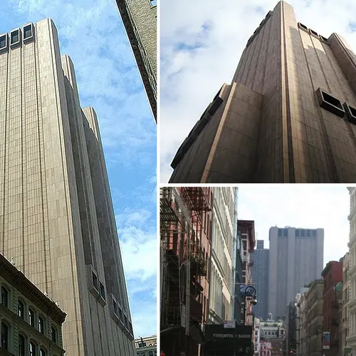
While not the most beautiful thing, I’ve never put as much thought towards any structure in NYC as I have towards the brutalist AT&T Long Lines Building. It makes you feel small, insignificant, and oppressed. And each time I look at its windowless facade I can’t help but think of the poor souls toiling their lives away under the flickering fluorescent lights. It always makes me appreciate my current workplace, wherever that might be.
The funny thing is that I hated it for so long that I eventually ended up liking it. When you bring something up in conversation enough, you start to question your initial impression. It really is astounding how something so devoid of feeling can stir up a narrative and emotion the way it does for me. It’s also a nice juxtaposition to the glass towers that are shooting up all over the place.
Dana Schulz, Associate Editor at 6sqft
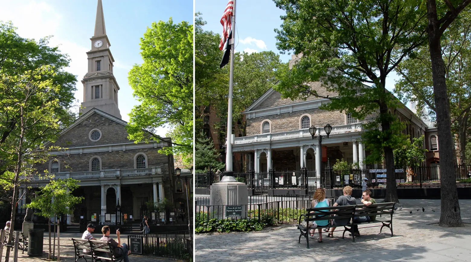
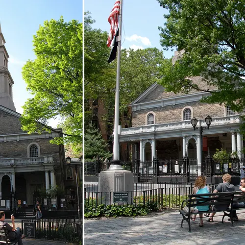
Building: St. Mark’s in-the-Bowery, Manhattan
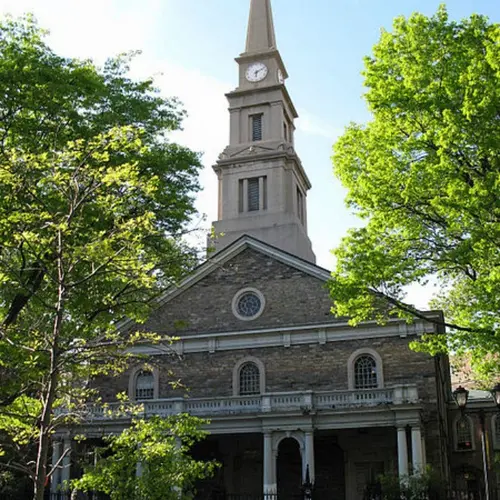
Every building in New York has a story and a past. Even the dullest looking structure has had generations of New Yorkers pass through its doors. One building in particular, though, always intrigues me. I am a self-professed East Village lover (though I am one of the many who has been forced out by sky-rocketing rents), and I think we can all agree that St. Mark’s in-the-Bowery is, quite literally, a cornerstone of the neighborhood.
Not only is this the city’s oldest continuous site of worship and the second-oldest church building, but it was built as part of Peter Stuyvesant’s farm. To top it off, Peg Leg Pete is actually buried in the small cemetery adjacent to the church. The façade of St. Mark’s is a classical religious style, and its angled position is a fun reminder of the pre-Grid days. The church has survived several fires, which I like to think is representative of the resiliency of the neighborhood, having gone through so many incarnations in the last century. Today, it serves as a home to the Neighborhood Preservation Center (in the rectory), the Poetry Project, and Danspace Project—a true patron of its community. A little-known fact is that there is a private apartment above the former rectory. I certainly wouldn’t mind waking up to a view of the steeple and cobblestone plaza.
Leonard Steinberg, Broker and President of Compass
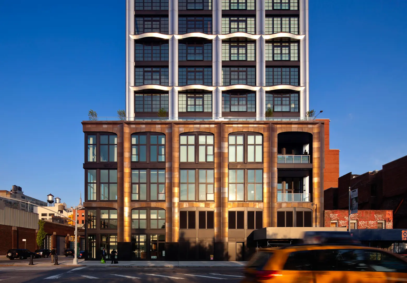
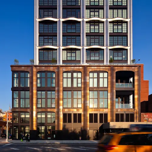
Building: 200 11th Avenue, Chelsea
My favorite building is 200 11th Avenue. I love that its three-dimensional, not flat and boring. The facade in terracotta and stainless steel shimmers in the light. I love the ceiling heights and the fact that there are so few apartments in the building. The Chelsea Cove Park is directly in front of the building, and the sky garage, a parking spot attached directly to the apartments, accessed via a car elevator, is a truly unique feature. But admittedly I am a bit biased because I introduced the architect, Annabelle Selldorf, to the developers and live in the building.
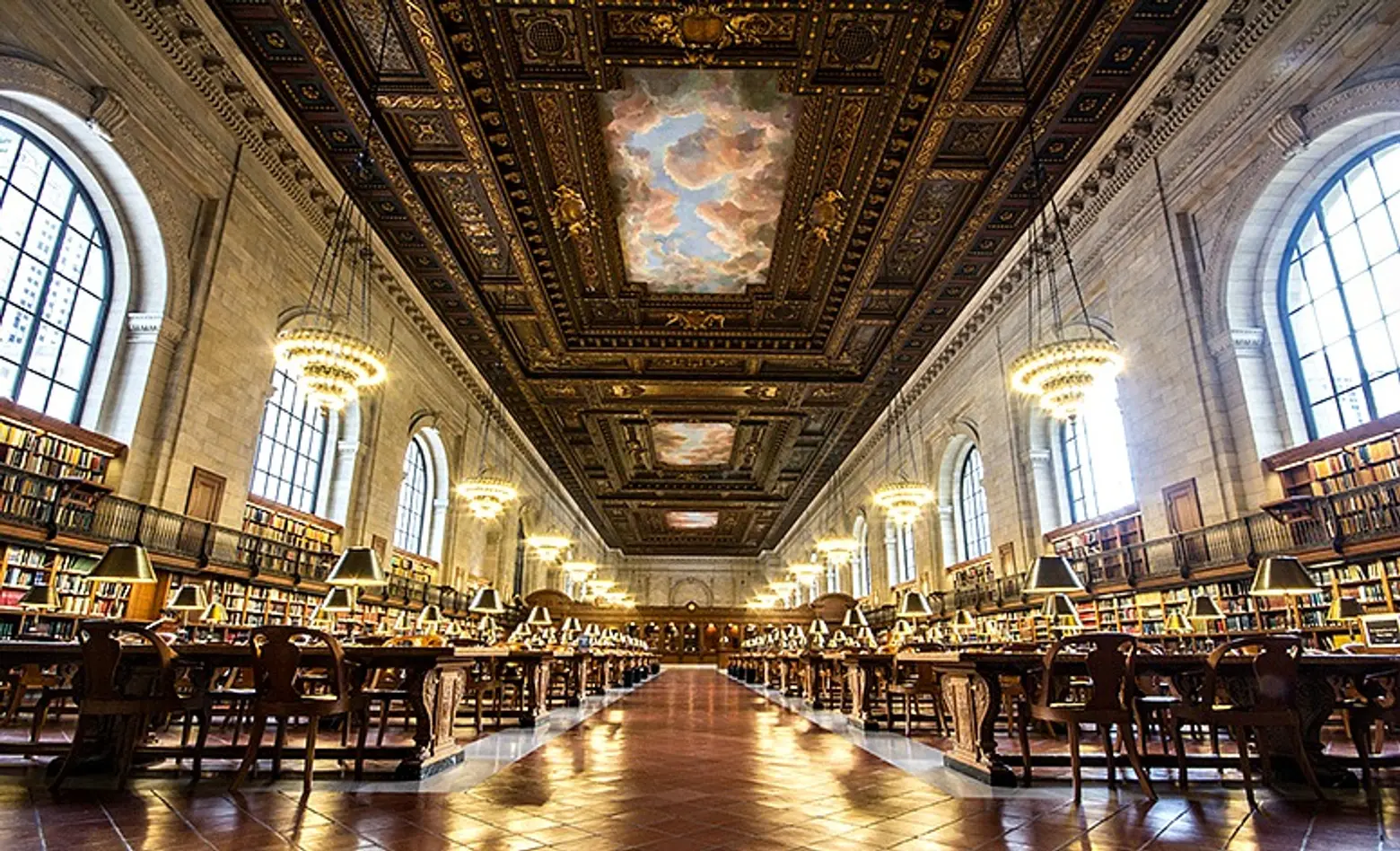
Penelope Bareau, Contributing Writer at 6sqft
Building: The New York Public Library
For decades my favorite building in the world has been the New York Public Library on 5th Avenue and 42nd Street. Nowhere to my knowledge is there such a glorious, magnificent building that ordinary citizens are welcome to enter—not just to enter, but to roam around freely in and to avail themselves of the riches inside without paying a thing. It’s almost un-American! The beauty and the plenty of it all continue to amaze me.
Diane Pham, Founder and Managing Editor of 6sqft
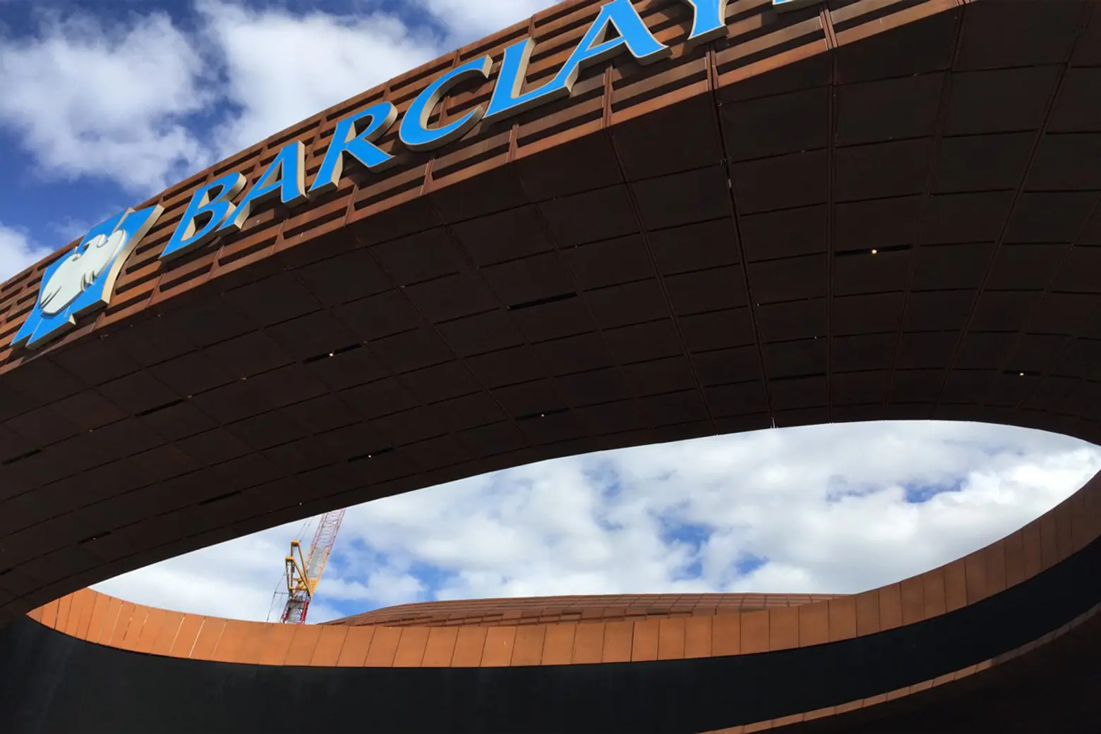
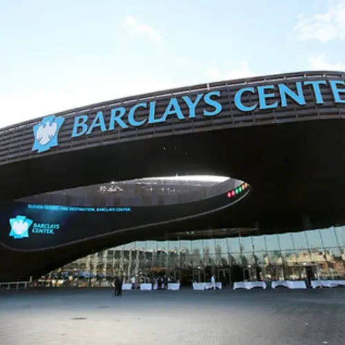
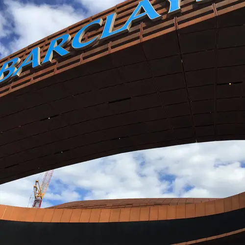
Building: Barclays Center, Fort Greene, Brooklyn
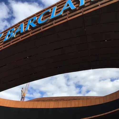
While I often find my gaze transfixed on New York’s historic structures, Brooklyn’s Barclays Center wins my vote for its form, materials and its impact on its neighborhood. A lot of people have bemoaned the design over the years, but there have been few modern additions (props to the High Line) in the city able to do what the stadium has done for its immediate locale. If you’d been to the area pre-Barclays, you’d know it was one of the most unwelcoming areas of Brooklyn—grimy, noisy and just unpleasant all around. Now, not only is there now a stadium for Brooklynites to call their own, but this new construction has given way to a wealth of new public spaces, businesses and housing developments to the area—and even more are coming (much-welcomed by long-time Fort Greene residents like myself!). Aesthetically, the patina and shape of the Barclays Center perfectly embodies the energy of its urban corner while also providing a visual break from the boxy and overbearing Atlantic Terminal. And how great is it that the architecture frames the sky? You can’t look up through that oculus and not be awestruck by what you’re seeing. In a way, it reconnects people with nature.
Michelle Young, Founder of Untapped Cities
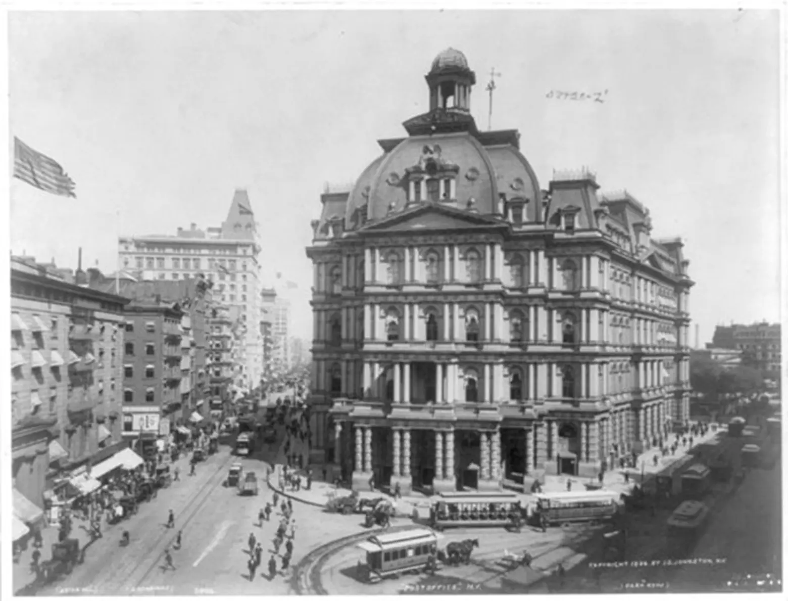
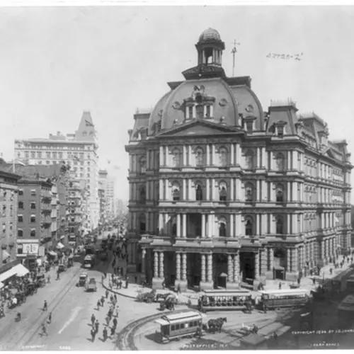
Building: “Mullet’s Monstrosity,” the demolished city hall post office
My favorite building in New York City is now lost—the former post office in City Hall Park, which I included in my new book Broadway. The building was situated at the southern tip of City Hall Park, across from the Woolworth Bbuilding and was the largest post office in the world at the time of its construction in 1869. The French Second Empire-style building was pretty much universally hated, and even had the nickname “Mullett’s Monstrosity,” after the architect Alfred B. Mullett. It was demolished in 1939 before any of the landmark laws, but I think today it would be considered a handsome building by most standards. The French Second Empire style is also very specific to a period of time in New York City architectural history, which you’ll catch in the Gilsey House and the former facade of Bloomingdale’s (that still exists). If you dig into Mullett himself, you’ll see he was disliked for a lot of reasons personally for his arrogance and domineering personality—which likely explains the architecturally critique of the building during his time. Today, the City Hall Post Office is considered one of Mullett’s finest works. Besides how impressive it looks in vintage photographs, I think it serves as a reminder of how public opinion can so easily sway preservation.
Toru Hasegawa, Co-Creator of The Morpholio Project
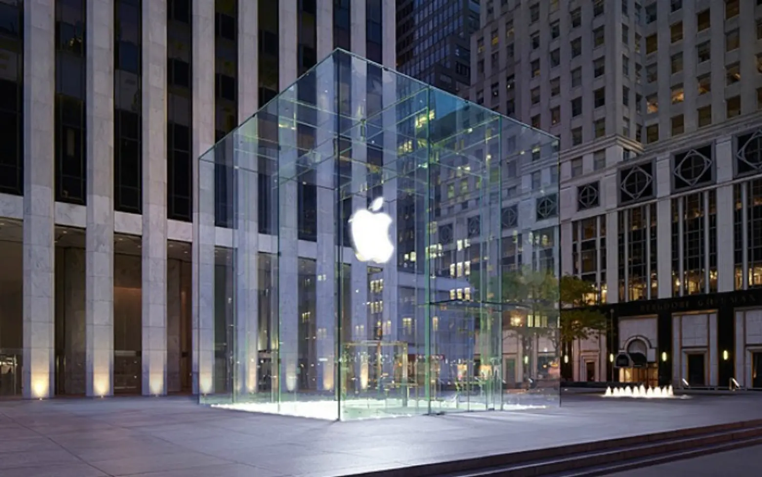
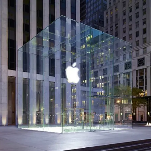
Building: Apple Store, Fifth Avenue “Cube”
I share the philosophy with fellow technologists that ultimately, “technology should disappear.” Apple has tested that theory to the extreme in that our iPhones only have one button. Ok, yes, it virtualized all the buttons to be software but the larger point is, rather than fitting the software to the hardware, fit the hardware to the software. Making a building that actually disappears? Now that is a challenge. Zen Garden architecture is designed to allow the surroundings to be a absorbed into the architecture itself. The “Cube” manifests a similar concept, pulling the gardens of NY’s Central Park from one corner, the iconic “rock garden” of twentieth century skyscrapers surrounding an 18th century plaza, and underneath concealing the shrine to the “cult of technology”.
As for it’s detailing, according to blogs such as Gizmodo, they reduced the skin from 90 panes to 15 panes of glass total, thereby also reducing the amount of hardware that held them. That is like telling a writer to summarize 250 words of thought into a haiku. Achieving an edge by simplification (or subtraction) is much more difficult that by adding. This is always my preference and something I strive for in my own philosophy of creating both software and architecture.
Leigh Kamping-Carder, Digital Editor at The Wall Street Journal
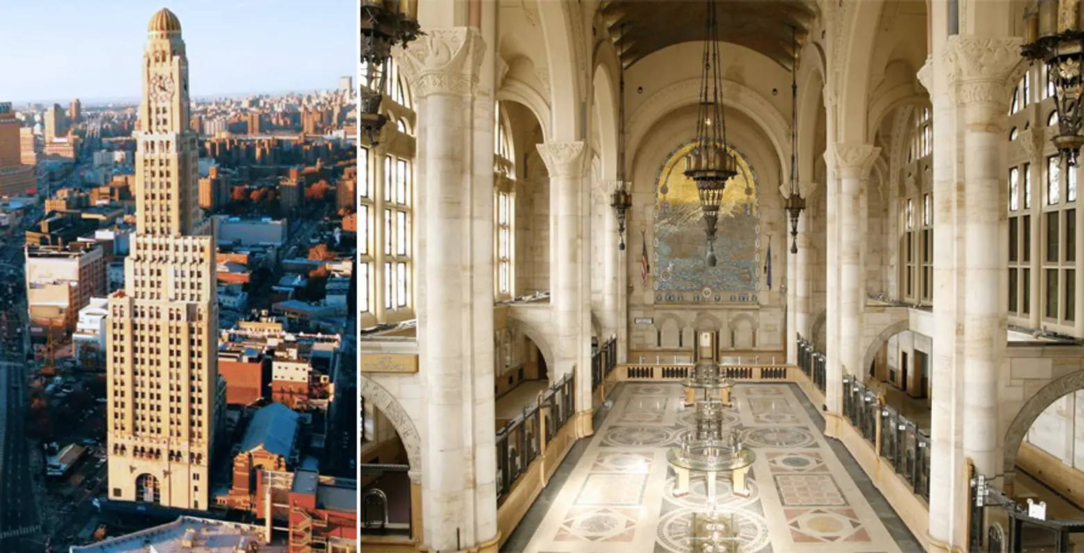
Building: 1 Hanson Place, Fort Greene, Brooklyn
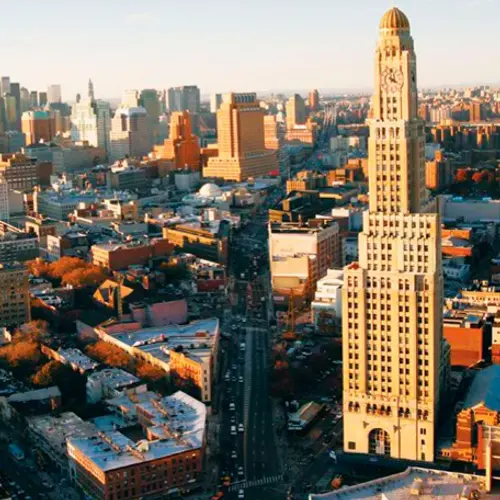
Formerly the Williamsburgh Savings Bank and once the tallest building in Brooklyn, 1 Hanson Place is both an icon and a compass, thanks to its cupola-topped clocktower. Inside, you’ve got epic vaulted ceilings and intricate mosaics. Oh, and condos. Expensive condos. (What could be more Brooklyn than that?) Simply put, I’ve always thought of this as the place I’d live if I had the money.
Alyssa Alimurung, Community Manager at 6sqft
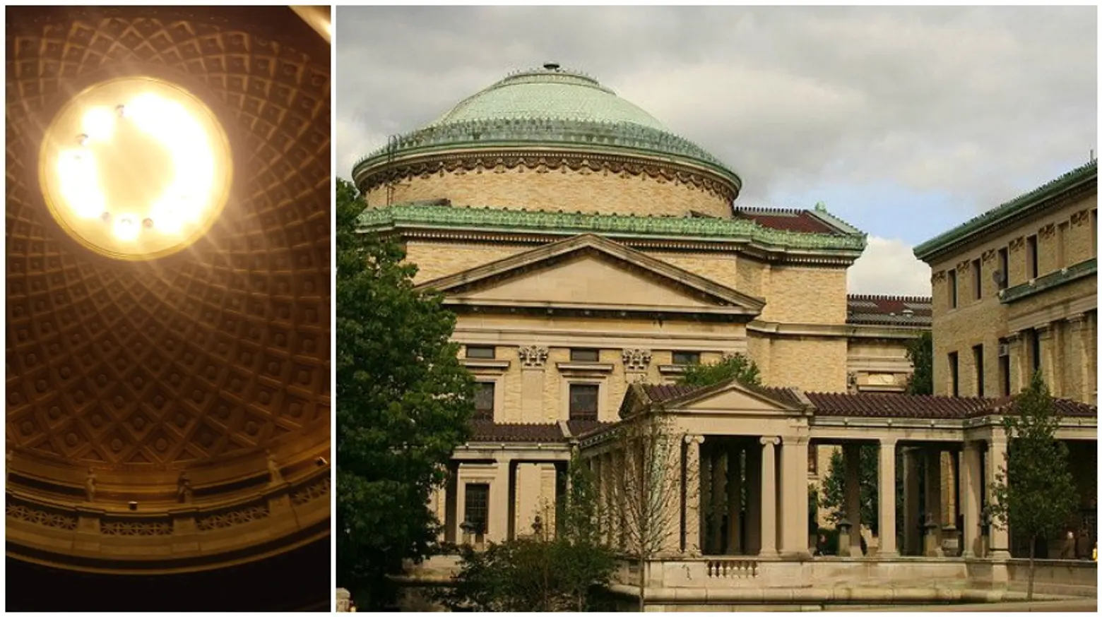
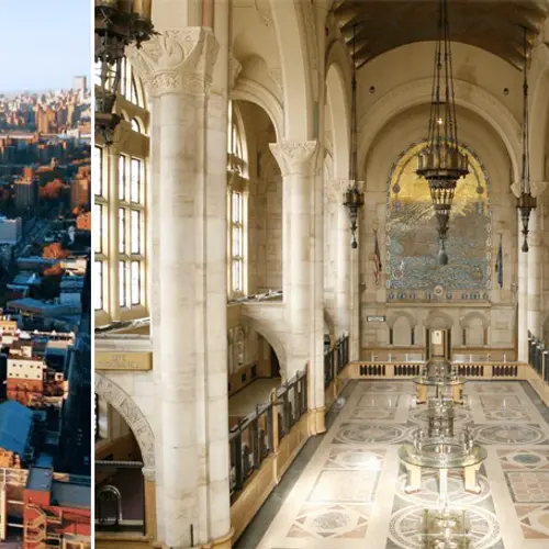
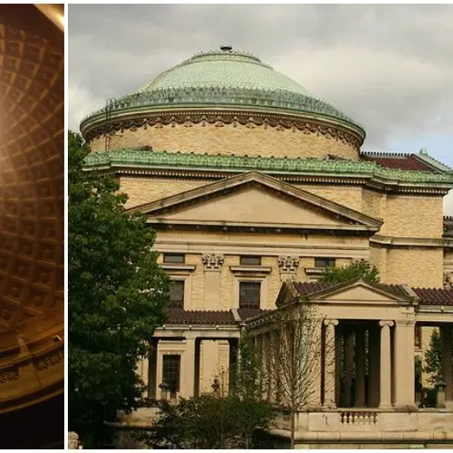
Building: Gould Memorial Library, 2155 University Ave, Bronx
Probably the one building I’ll always want to go back to. I wouldn’t have been brought to this beautiful place if it wasn’t for openhousenewyork’s Landmark Dash last April. Three of my lovely colleagues and I participated and ran around three of the five boroughs exploring and completing challenges at landmarked interiors. This particular site, the Gould Memorial Library at the Bronx Community College, sticks out to me the most of all the ten interiors we went to. It’s truly a gem. You can hear everyone’s oohs and aahs as soon as they enter the library. Somewhat of the American Pantheon, the library is laced with Tiffany stained glass, rare Connemara Irish green marble and marble mosaic tiles from Italy. Attached to the library is The Hall of Fame for Great Americans, a promenade honoring the likes of Clara Barton, Washington Irving, and Booker T. Washington, just to name a few. What makes this site even more special is that it’s located on the highest point of NYC, so the view is breathtaking.
Jason Carpenter, Writer and Journalist
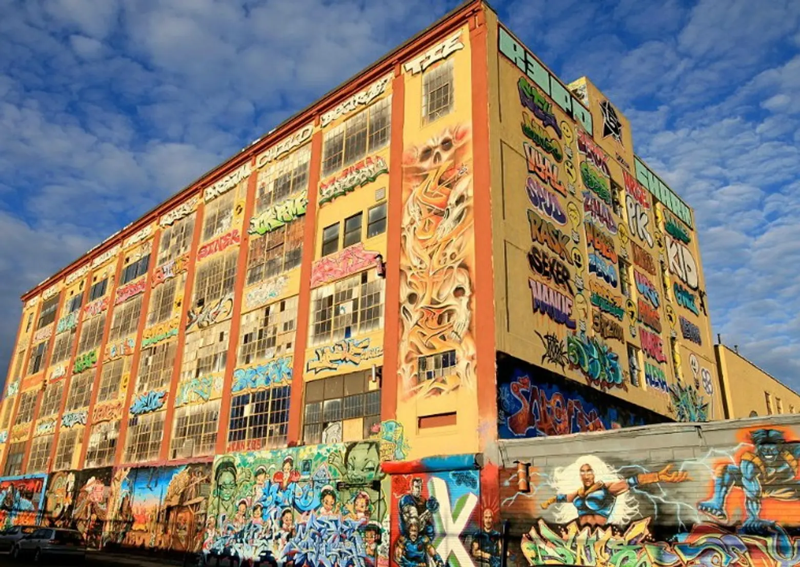
Building: 5Pointz, Long Island City
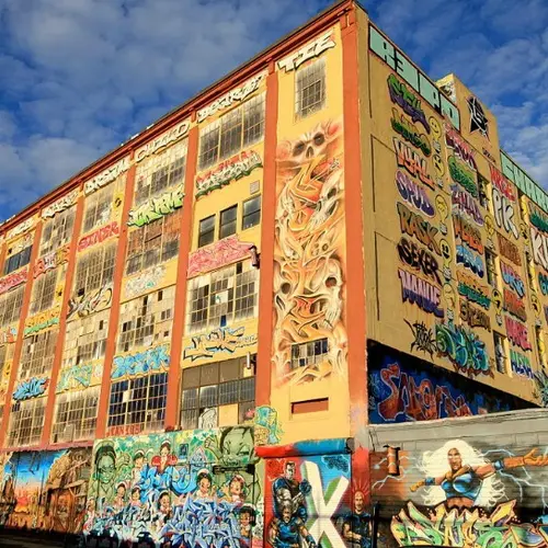
For years, 5Pointz in Long Island City was the first building I would show to my friends and family visiting from out of town. To me, it was a monument of everything that was right in New York City. It was about preserving a very unique form of art (graffiti) and doing it in such a way that artists could express themselves without the fear of the police or other neighborhood thugs coming in to ruin their beautiful (and sometimes controversial) banners of inner-city art. It became known as a monument of cooperation, a neighborhood landmark that everybody knew and loved. It was a building that made small children beam with amazement and allowed some of the city’s hippest artists to conduct their art in an “urban cool” environment.
Filmmakers, documentarians and photographers traveled far and wide to film against a backdrop of hardcore New York yesteryear, while skate punks from the Bronx to Jersey made their way to 5Pointz just to do tricks in front of its murals. 5Pointz was the hearth of underground cool for decades. But greed always trumps cool. And greed is what killed 5Pointz. The building, which was only a couple of days away from securing a type of landmark status, is now just a sad building on Jackson Avenue.
As it turns out, developers planned on breaking ground for a new luxury development next door. And since the neighborhood now has more Range Rovers in it than artists, the rich people won.
Before the landmark status could be awarded, a crew of workers surrounded the site as if it were a terrorist at an airport. They swarmed all over the roof and on its loading docks. Then they pulled out their guns. Paint guns, of course. And proceeded to white wash enormous patches of the building as people from the neighborhood watched in horror. And while artists choked back tears. And while some greedy developers licked their lips. RIP, 5Pointz. Riding the 7 through LIC will never be the same.
Henry Melcher, Assistant Editor at The Architect’s Newspaper
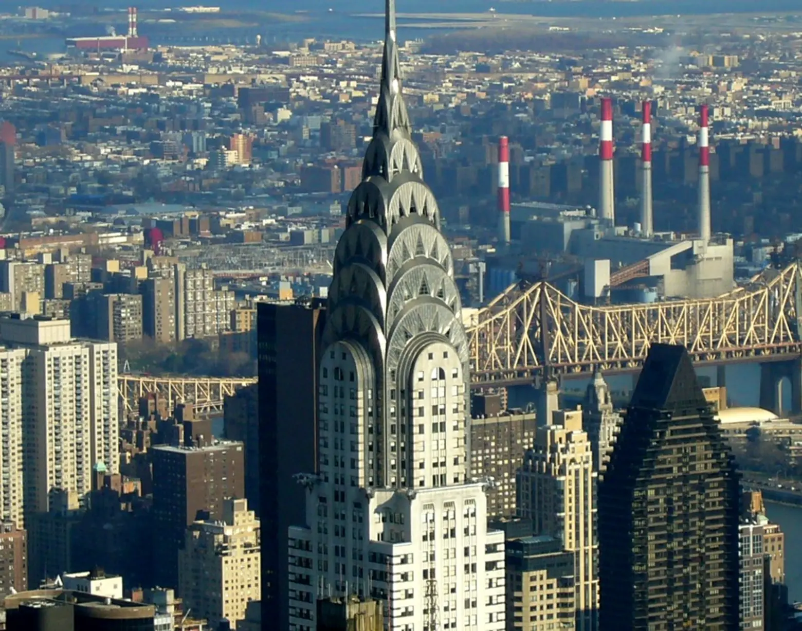
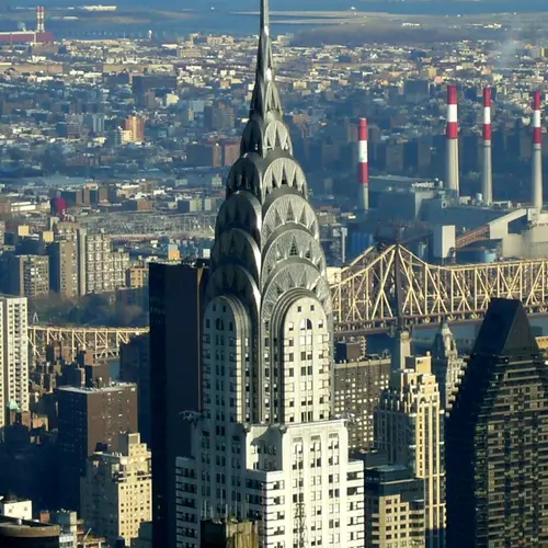
Building: The Chrysler Building, 405 Lexington Avenue, Turtle Bay
Saying that the most interesting building in New York City is the Chrysler Building sounds like a copout, especially for an architecture reporter. I should surely pick something less obvious, right? Maybe a passive house in Brooklyn, or a storied factory off the beaten path, or how about the Newtown Creek Digester Eggs? Any of those answers would be fine (if not a little esoteric), but who are we kidding here? The most interesting building in New York City is clearly the Chrysler Building.
This alone should seal the deal: When Van Alen’s Art Deco icon was under construction, it was locked in a race with 40 Wall Street to become the tallest tower in the world. And the only reason the Chrysler Building won is because its spire was secretly being constructed inside. And when the thing was finally installed, it only took about an hour and a half to set into place. I could go on about its architectural merit, impressive structure, and how Walter Chrysler pushed for eye-catching architecture instead of value-engineering his company’s headquarters down to a glass box, but I’m probably out of space.
Yuka Yoneda, Managing Editor at Inhabitat NYC
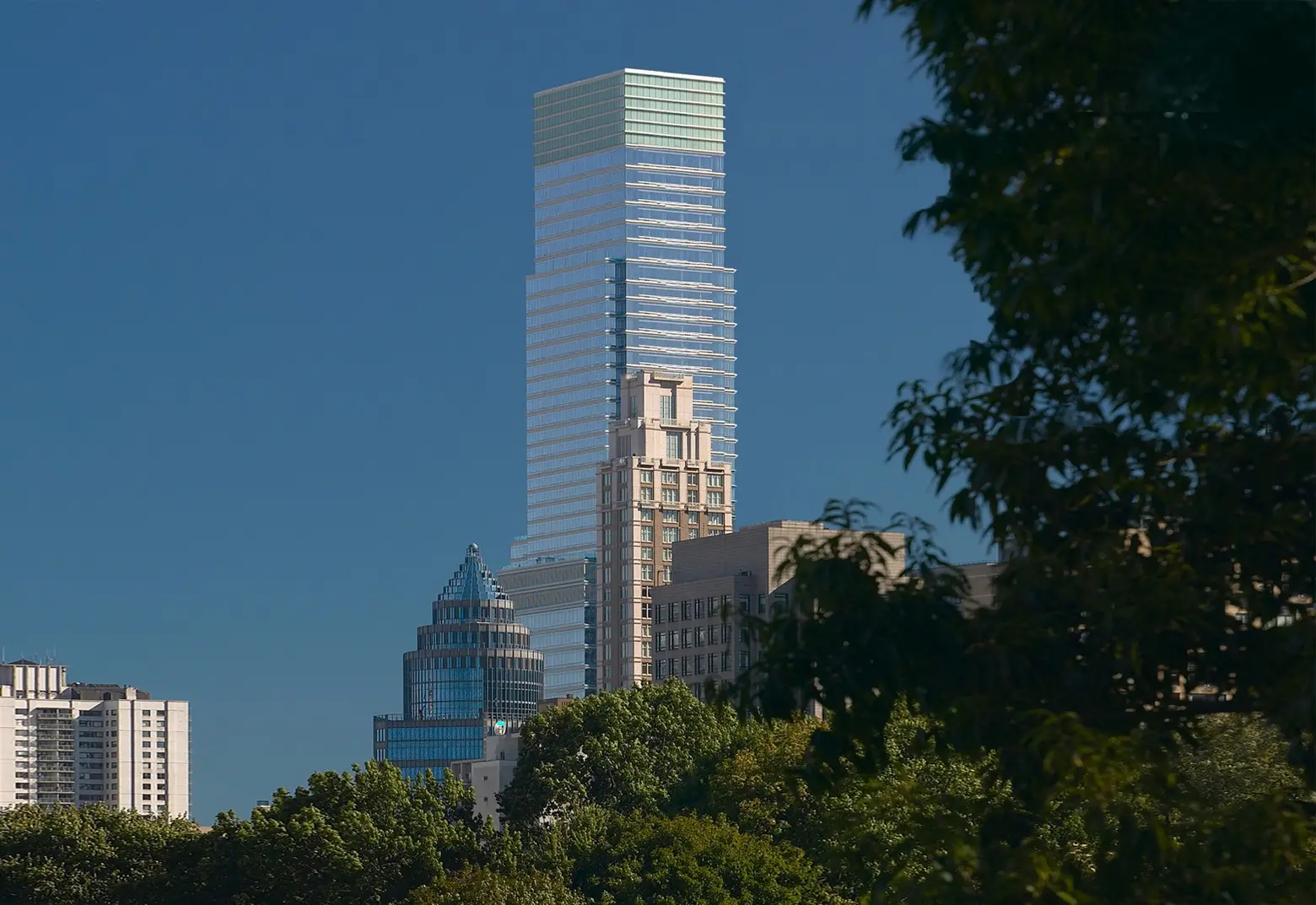
Building: 731 Lexington Avenue, Midtown
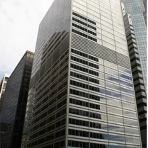
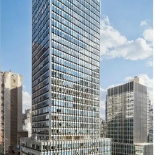
The Empire State Building‘s LED lights are famous for illuminating the NYC skyline in an ever-changing array of colors, but if you look closely, you’ll notice another Manhattan building helping out with its own lightshow. I first noticed the rainbow-hued bands atop 731 Lexington Avenue while snapping photos from the Long Island City waterfront, and made a note to try and find out what the boxy building was. But when I returned a few nights later, I had trouble locating it because this time, it was lit up in a bright white. After some research, I learned that the Pelli Clarke Pelli-designed structure is home to Bloomberg’s headquarters in NYC (which is why it’s also known as Bloomberg Tower). There’s nothing flashy or even particularly interesting about the building during the day (although it does have a really cool glass atrium), but the fact that it participates in adding a bit of fun to the night skyline in its own modest little way really captured my heart. It also has energy-efficient features such as a low-flow chiller, low-e glass to minimize solar gain, and daylit spaces to reduce electricity dependency during the day.
Michelle Cohen, Features Writer at 6sqft, content producer worldwide
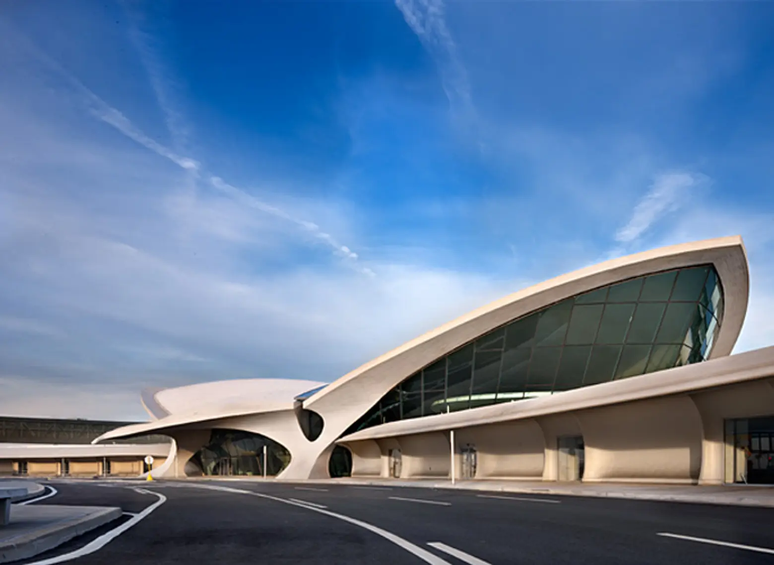
Building: The TWA Flight Center at JFK
The TWA Flight Center at what is today John F. Kennedy International airport represents both the ephemeral and the ageless; our vulnerability at the end of the “American century” and the enduring beauty of inspired modern design. When Eero Saarinen died suddenly at the age of 51, he was one of America’s most celebrated architects. He had been able to capture an “American moment” incorporating both the clean, modern lines of the International Style and the familiarity and warmth of Frank Lloyd Wright. In designing the TWA terminal, the challenge was to evoke the drama, excitement and romance of travel in the structure itself. In the ensuing decades of its heyday, the terminal embodied the glamour of air travel for millions who passed through its gates.
Ondel Hylton, New Developments Editor at 6sqft; Digital Content Director, CityRealty
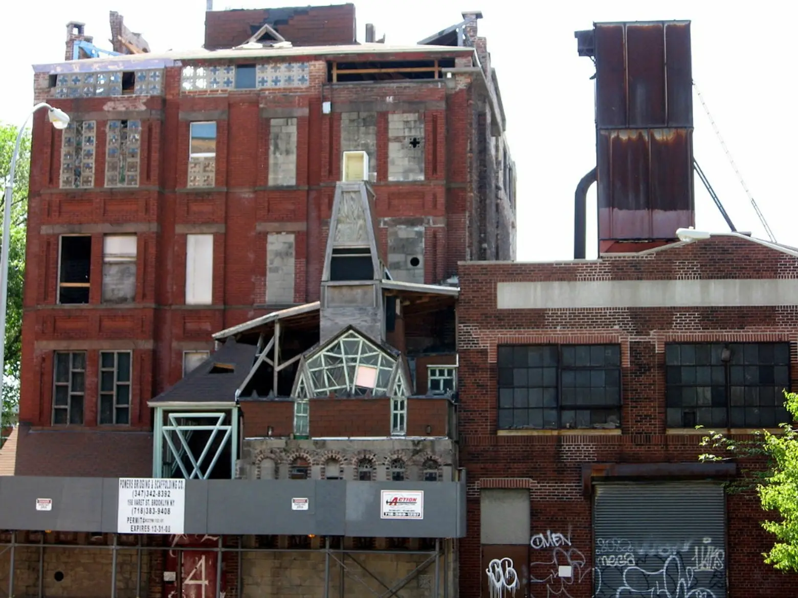
Building: Broken Angel in Clinton Hill, Brooklyn
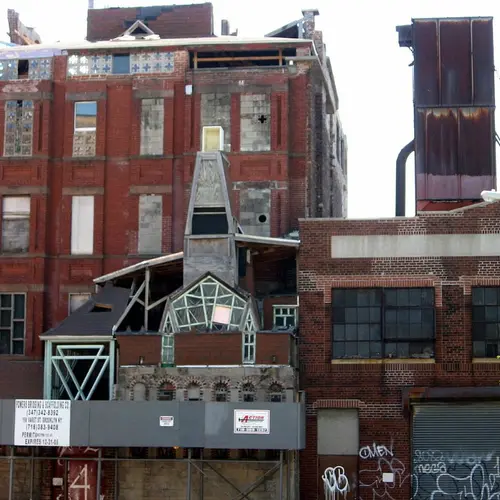
I’ll confess Broken Angel in Clinton Hill, Brooklyn is my most fantasized former fling. Former since the structure built by two daring New Yorkers is now largely dismantled (being replaced by condos). Its once whimsical silhouette built atop an 1856 warehouse was deemed unsafe and unsalvageable by the unimaginative. But during my studies at Pratt, the structure playfully crested over the low-rise neighborhood from studio windows, seemingly urging us to break free from our regimented designs to create a more human-spirited architecture. Most professors scoffed it off as sculpture, but its teetering 50-foot crown of unusual mosaics composed of triangular shards and jutting pieces of woodwork seemed to encapsulate an endangered aspect of New York; where communities, no matter how tattered looking, were built from the ground up. Though Broken Angel may be gone, I hope the city’s ability to inspire imaginations and nurture grassroots ideas is never lost.
Emily Nonko, Contributing Writer at 6sqft, Founder of The Bed-Stuy Blog
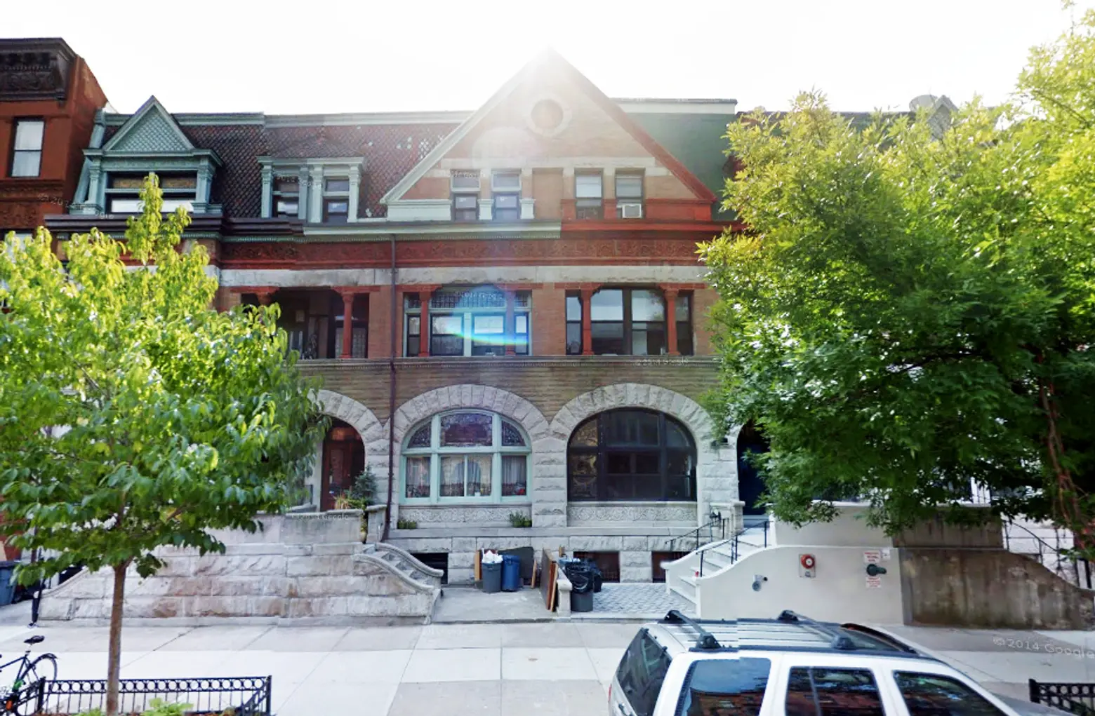
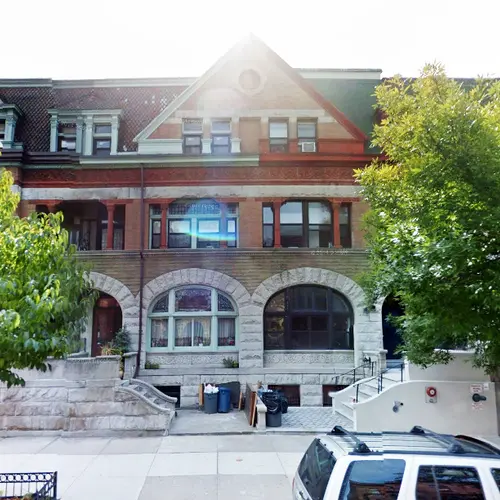
Building: 246-252 Hancock Street, Bed-Stuy, Brooklyn
I love all the iconic NYC landmarks, but there’s nothing like stumbling upon great architecture that isn’t so well known. When I first moved to New York I was biking around Bed Stuy and had to stop to admire a 246-252 Hancock Street, between Marcy and Tompkins. It’s this striking, grand Romanesque home designed by the great Brooklyn architect Montrose Morris. By now, it’s a little run down, but it hasn’t lost its presence — it’s a beautiful, comprehensive design seen from across the street, with tons of incredible details to pick out from close up. Better yet, that whole block is full of mansions and gorgeous townhouses. Now I live in Bed Stuy and still get that same happy feeling, looking at it for the millionth time.
Stephanie Hoina, Contributing Writer at 6sqft
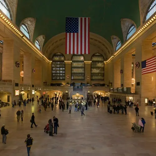
Building: Grand Central Terminal
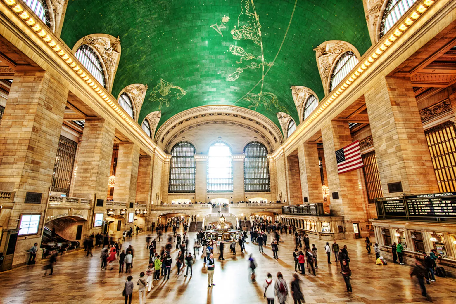
Ask ten people this question and you will most likely get ten different answers. Ask a hundred and I suspect my choice will be a front-runner. Grand Central Terminal, with its beautiful marble and intricate arches, is more than a train station that’s pretty to look at. Completed a little after the turn of the century it dramatically changed the way people travelled to, from, and within the city, and was instrumental in New York’s commercial and cultural development. One has only to spend a few minutes standing in the center of the main terminal by the iconic clock to witness why this is the most interesting building in the city: the people. It has been said that New York is a city of “eight million stories”. No doubt the majority of them passed through Grand Central at one point along the way. The collective experiences of every person who has walked under the backwards constellation on its massive domed ceiling, combined with the architectural beauty and functional necessity of this treasured landmark, leaves no doubt in my mind that Grand Central Terminal tops the list of New York’s best.
Paulette Lovallo Lebow, NYC Resident
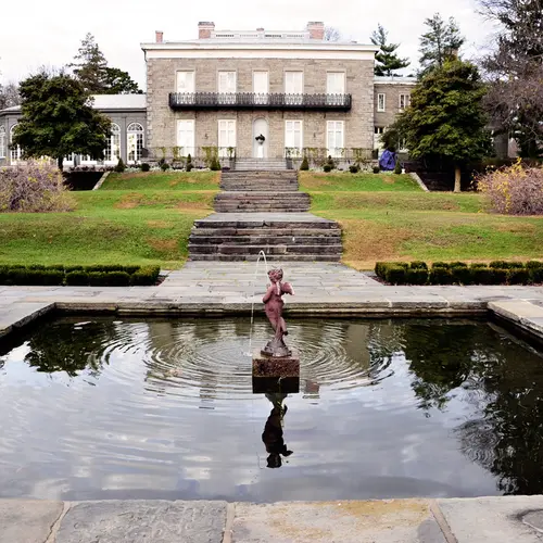
Building: The Bartow Pell Mansion, Bronx
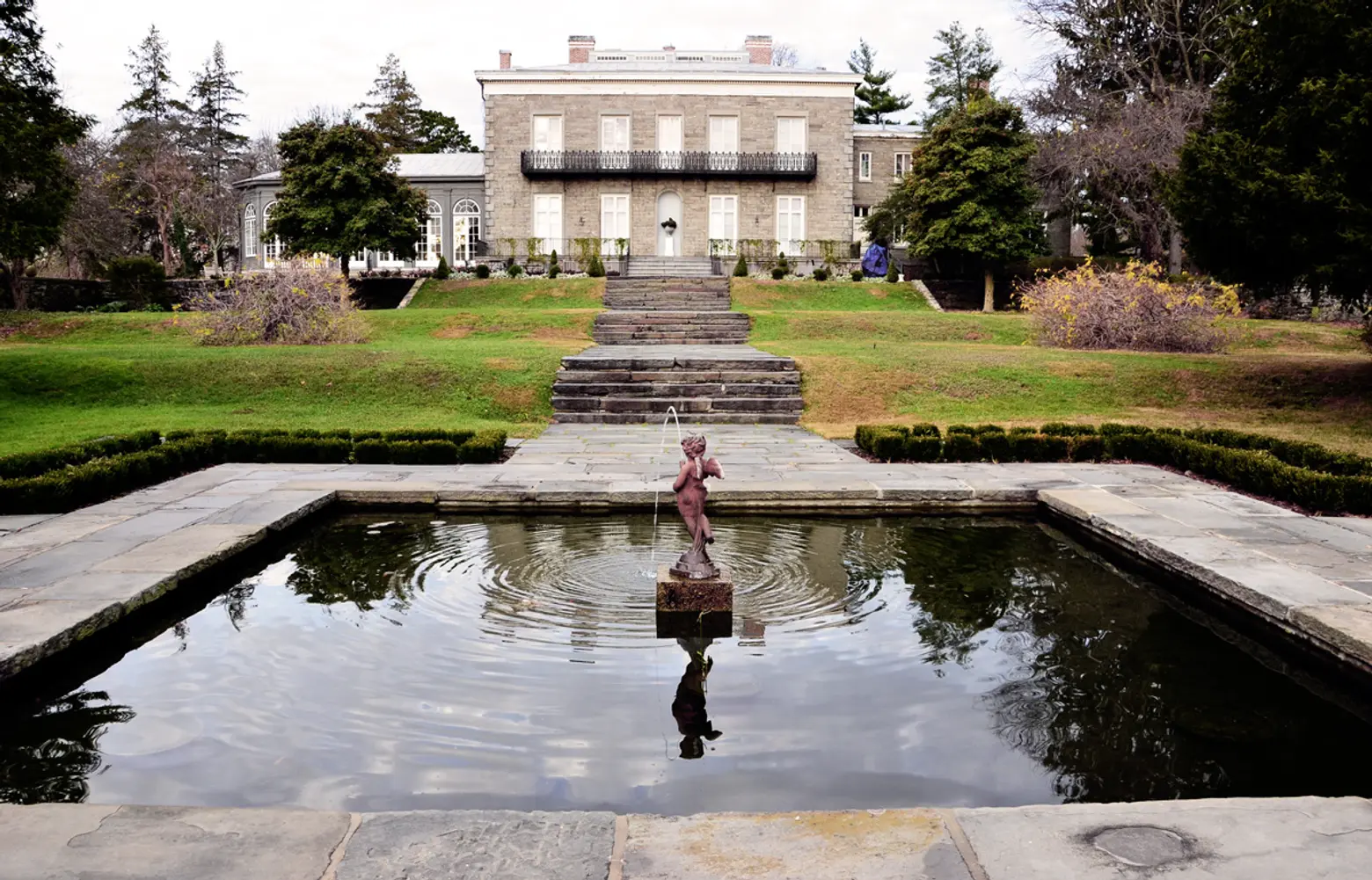
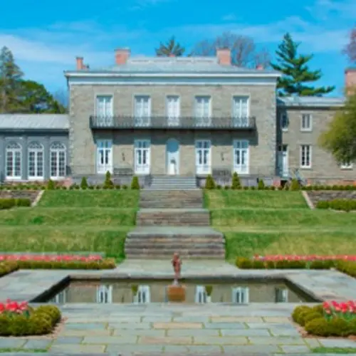
A New York City landmark. It gives us a visual of life in a manor almost 200 years ago. The decorative interior shows you how life in a manor for the English Aristocracy was lived. To see and be in such a country setting in an urban area is a thrill to behold. Where else can one step in to a beautiful medicinal and herbal garden planted as it would have been 178 years ago. From the second floor view the acreage and view the sound. The Bartow-Pell Mansion is stepping back to a rich history, from every corner stone to the greek revival-classic furniture. Their reminiscent traditional paint colors, complex designed rugs.and handcrafted furniture shows the formal style of living that existed. No slouching back on the couch in this house, A very unusual stair case coils to the upstairs. My favorite room is the Orangery. I can see myself having non native plants being tended to my the Manors gardeners. Smelling orange blossoms, and enjoying a palm tree from a far away place, right in the house. The arched windows and paint color make me want to curl up with a blanket around me and read a great classic novel.
Patty Lee, Editor at Zagat
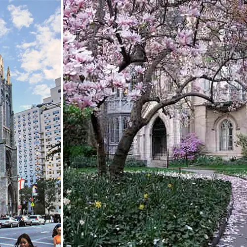
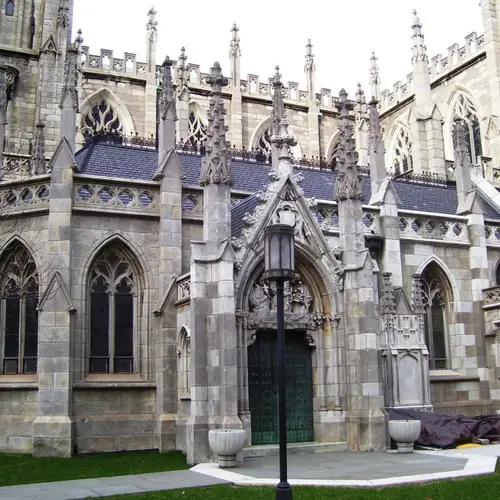
Building: Grace Church, 802 Broadway
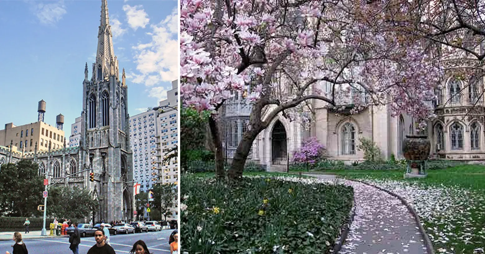
Like a lot of New Yorkers, I walk through the city with tunnel vision—I hop off the subway and instantly barrel towards my destination without taking much time to look at the people and things around me. But there’s always been one building that I hit pause for and that’s Grace Church, just off of Union Square. It’s not quite as famous or towering as cathedrals like Saint John the Divine and St. Patrick’s, but its Gothic revival architecture, with the elegant spire and stone facade, is a breath of fresh air on the overly commercial strip of Broadway. It’s especially beautiful in the spring, when the cherry blossom and magnolia trees frame it in the most picture-perfect—or I guess nowadays, that’d be Instagrammable—fashion.
Alexa Jaccarino, Managing Editor at VeryShortList
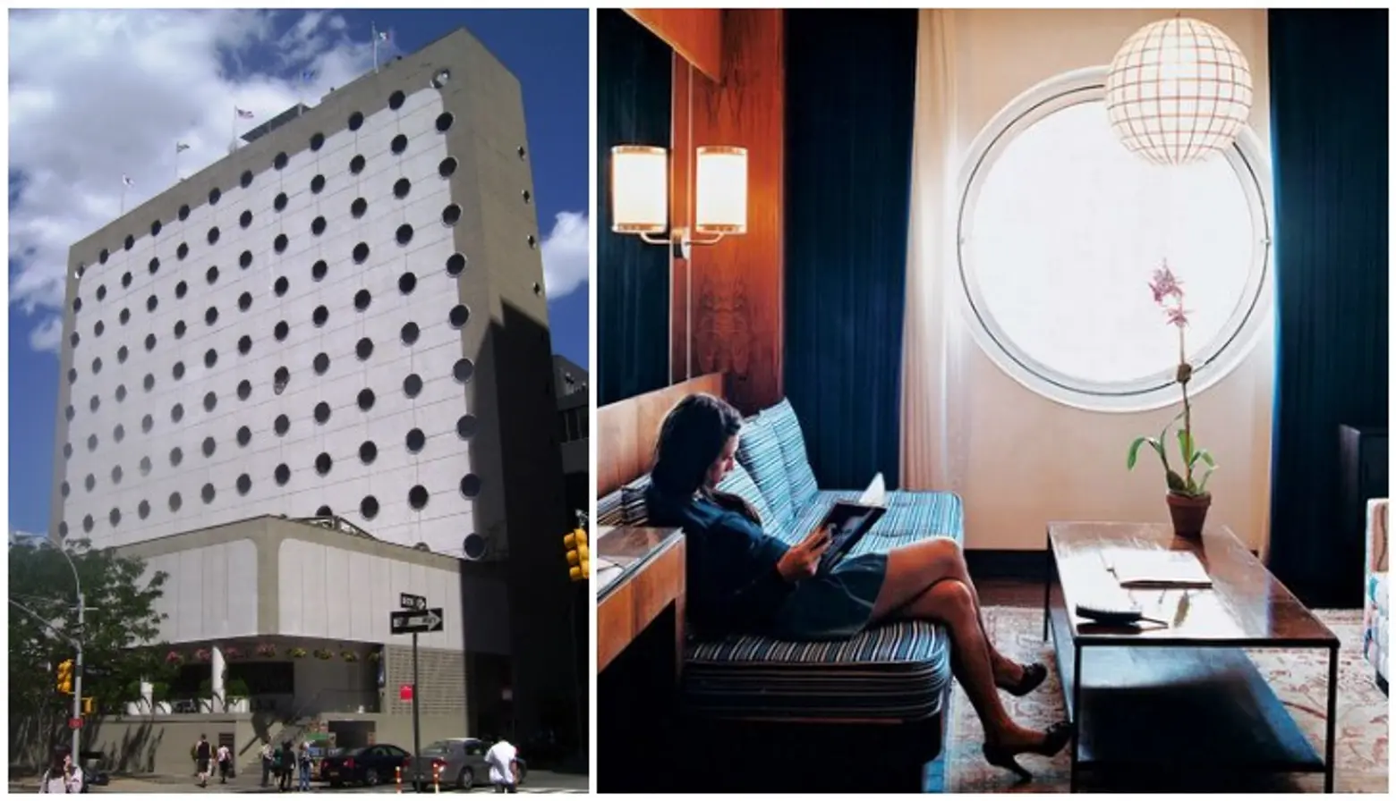
Building: The Maritime Hotel, 88 9th Avenue, Chelsea
One of my favorite NYC buildings (maybe not the most interesting) is The Maritime Hotel. I imagine many people would disagree with this choice, but it’s my pick for the simple reason that I enjoy any space that can make me feel the ocean in New York City. Having a drink al fresco at La Bottega on a sunny summer day with the nautical, porthole-d hotel rising above was heaven… hoping the Batali takeover will give us all some new fine Mediterranean fare too.
Rory Stott, Managing Editor at ArchDaily
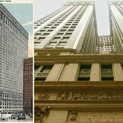
Building: The Equitable Building, 120 Broadway, Financial District
New York is a fascinating city which means so much to different people; the long-time hometown of their family, the city where they found their calling, or the destination for their memorable honeymoon. But to the majority of the world’s population, myself included, who haven’t had the good fortune to visit, the city has a whole different meaning—because perhaps more than any other city in the world, New York has managed to collapse all of its complexity, its realness, into a matrix of icons and symbols. New York is the reference for what countless generic cities are expected to look like; it is a symbol of human civilization itself in films from Planet of the Apes to The Day After Tomorrow. What’s more, New York itself is a symbol made up of symbols: my own first encounter with the city came as a child watching the film adaptation of Roald Dahl’s James and the Giant Peach, where the Empire State Building serves as the symbol of New York, and New York as a symbol of hope and new beginnings.
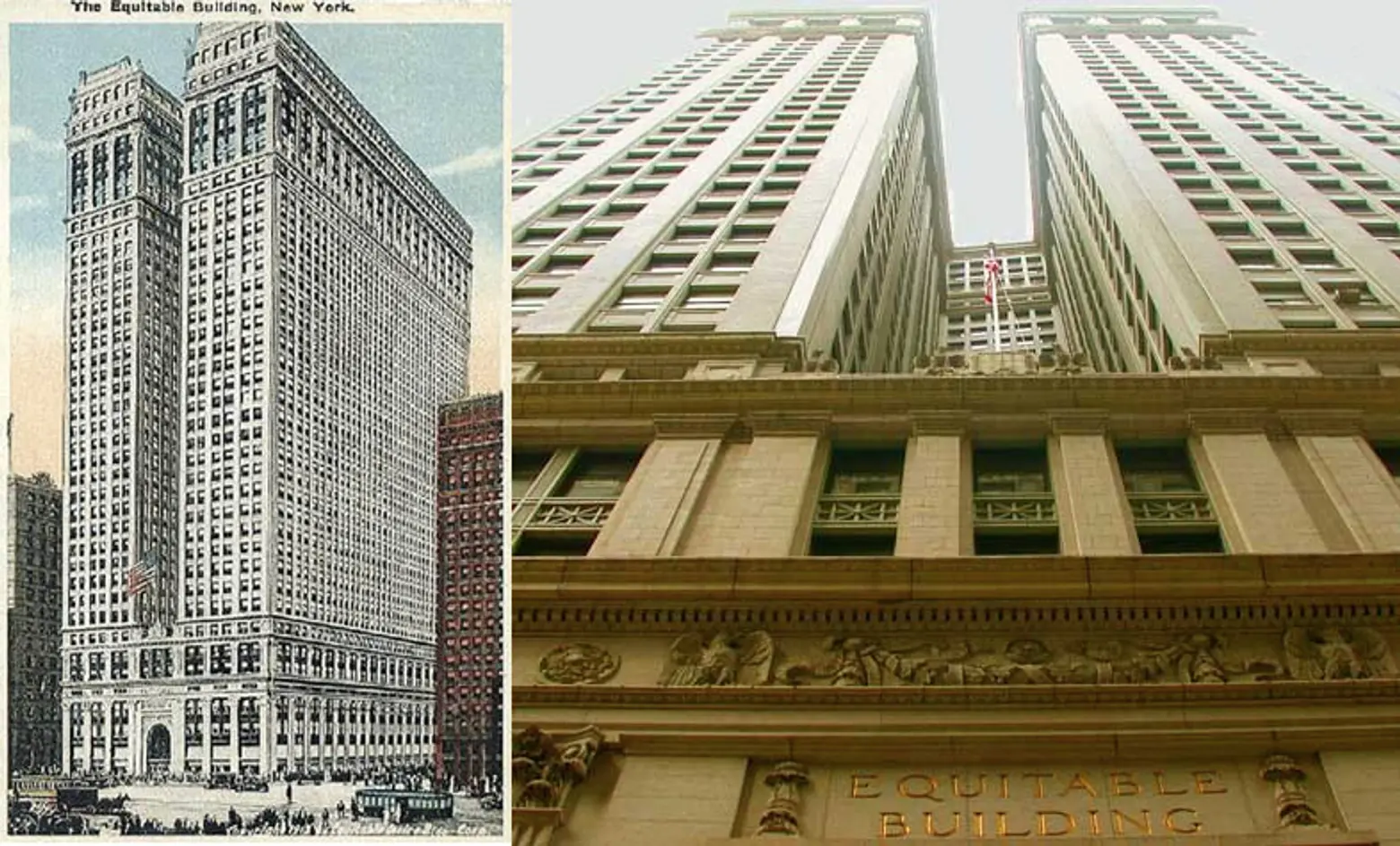
For some eight decades then, the Empire State Building has lived a dual life as both a real building experienced by people, and as an icon to be seen around the world. But it could have been very different without one much lesser-known building: the Equitable Building at 120 Broadway. The Equitable Building was constructed in 1915 as a replacement for the earlier Equitable Life Building (itself a fascinating building as the “world’s first skyscraper” – a dizzying seven stories), and its sheer 40-story walls and overbearing physical presence instantly caused an uproar, with residents fearing that more such buildings would cause New York’s streets to become a maze of dark shadowy corridors. The existence of the Equitable Building led directly to New York’s famous 1916 Zoning Resolution, which set out rules requiring setbacks on buildings above certain heights, and these rules were absolutely fundamental in determining the shapes of the heroic buildings of the 1920s and ’30s. Without the Equitable Building, the Empire State Building could have been a plain, 400-meter-tall cuboid—it might have been completely unsuitable as a recognizable icon. The Equitable Building is therefore the missing link between the messy world of New York as a real city, with outraged residents and zoning laws, and the fantastical world of a young boy and his insect friends floating on giant fruit toward an idealized metropolis. For my money, that easily makes it one of New York’s most fascinating buildings.
Get Insider Updates with Our Newsletter!
Leave a reply
Your email address will not be published.





Well, you left mine off the list – The Dakota! So much history, so much mystery, so much tragedy, the odd fusion of beauty and brooding it exudes, there’s just so much that fascinates me about that building that it will forever be my favorite…
I love the Lipstick Building at 885 Third Avenue! Completed in 1986, the 34-story, 453-foot Class-A office tower at 885 Third Avenue, between 53rd and 54th Streets, was designed by Philip Johnson with John Burgee Architects. The cylindrical shape and red granite and steel façade were initially described as a looking like tube of lipstick, an association reinforced by the red coloration surrounding the ribbon windows that encircle the façade. It is modern architecture at its most inventive. After three decades after its debut, it continues to be internationally-recognized as a bold icon along the Midtown Manhattan streetscape.
— Linda Alexander, Alexander Marketing Corp.
One of my favorites didn’t make the list, and I find it iconic although a lot of people forget about it: The American Radiator Building (now the Bryant Park Hotel). It’s black brick with gold gothic spires (symbolizing coal & fire in its day but I just think it looks like an epic piece of jewelry floating in the sky). The entryway is covered in black & marble mirrors. Say what you will, but to me it just exudes coolness. Dark, mysterious, even a bit creepy and ominous, it looks a bit like an evil dungeon dressed up with a sexy sense of style. One day when I strike it rich, it will be mine… Mwahahahaha! (At least I got the evil laugh ready.)