Map: Here’s where you can afford to live in NYC in 2018
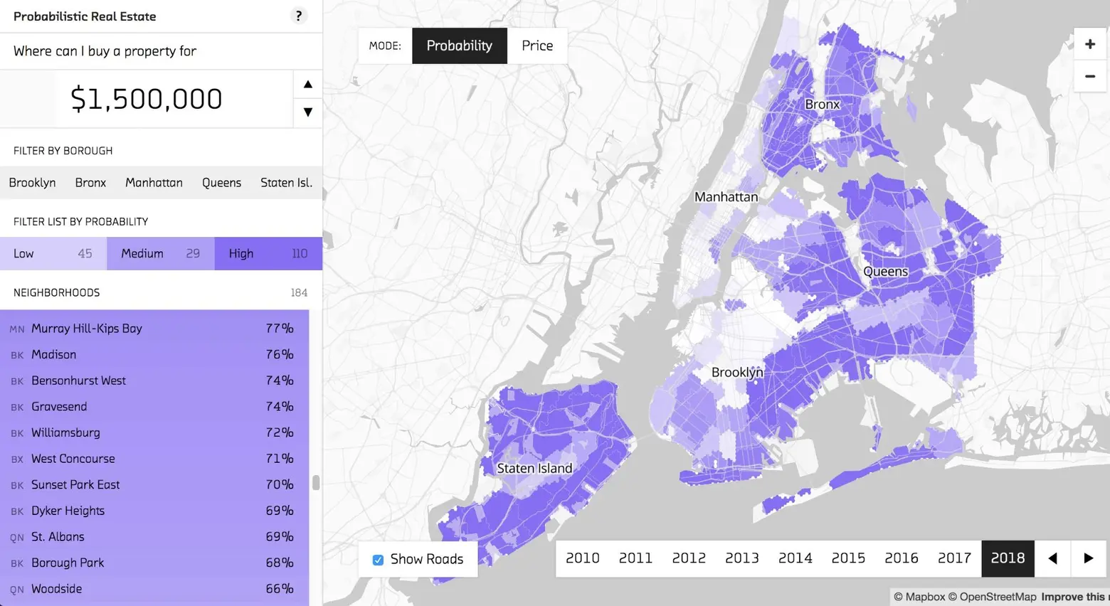
For New York home buyers, a lot can change in a year. A neighborhood that was considered affordable can all of a sudden become out of reach, whether it be from new developments like a subway or good old fashioned gentrification. For this reason, Fast Forward Labs created an interactive map that predicts the price of real estate in 2018. As Google Maps Mania explains, “The map allows you to input a housing budget and see how likely it is that you will be able to afford to buy a property in different New York neighborhoods during different future time periods.”
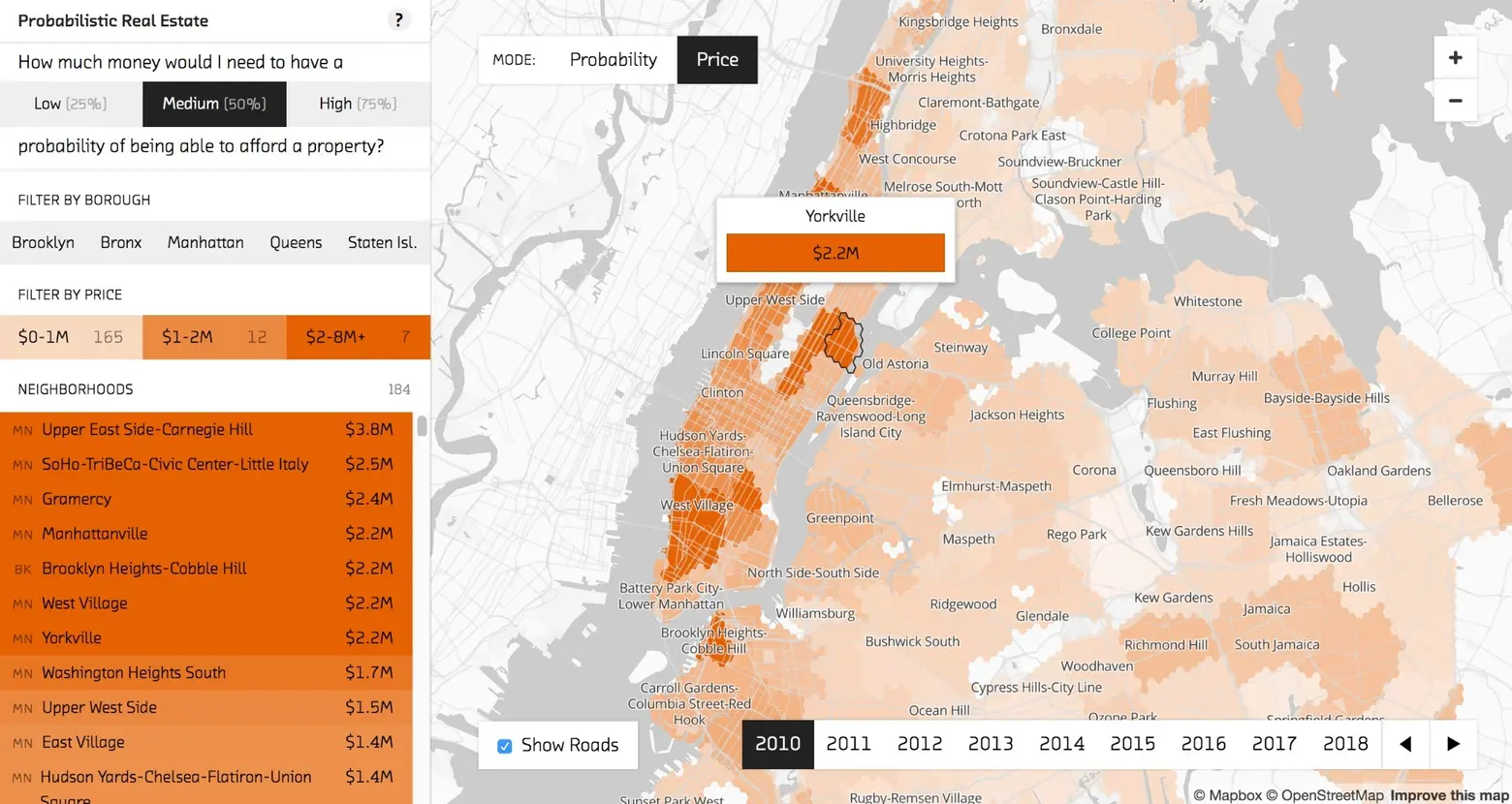
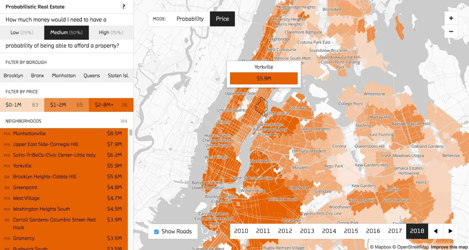
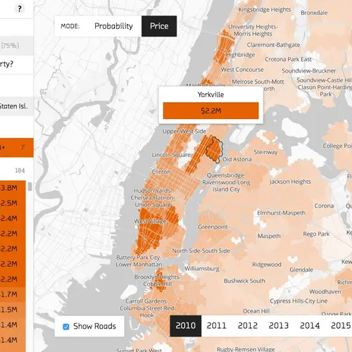
Of course these are merely predictions, but they’re based on Fast Forward Labs’ Probabilistic Real Estate Prototype, a system of developing hierarchical models by grouping together observations and studying their similarities. For neighborhoods where less data was available, they filled in the holes by looking at similar areas. For example, if the West Village was lacking, they’d use data from the East Village and Brooklyn. For the most part, though, the predictions assume that past and current trends will continue, which is why you can toggle the years back to 2010; this also provides a way to visualize a neighborhood’s trajectory over the past seven years.
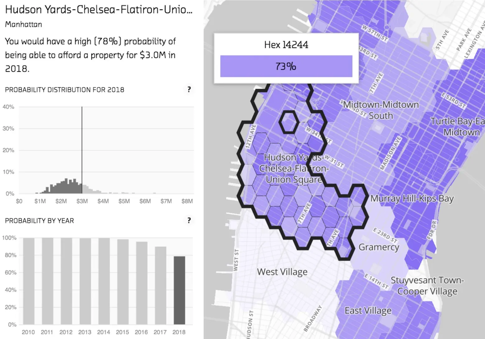
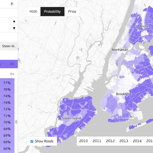
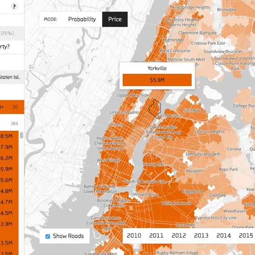
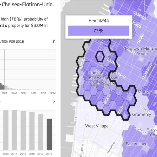
The map has two interfaces: Probability mode, where users can input a price and see the likelihood that they’ll be able to afford a property in a neighborhood; and Price mode, where you can see how much cash you’d need to have a high, medium, or low chance of purchasing a home in each neighborhood. After zooming in to a neighborhood, there are graphs that show how a given neighborhood has evolved since 2010. There’s also the option to zoom in further and select a specific segment of an area to get data that’s nearly down to the block.
Use the interactive map here>>
[Via Google Maps Mania]
RELATED:
