100 Barclay: Restoring and reinventing a historic Tribeca landmark

This post has been sponsored by 100 Barclay. To learn more about available condos or to schedule a tour, visit the official 100 Barclay website.
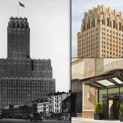
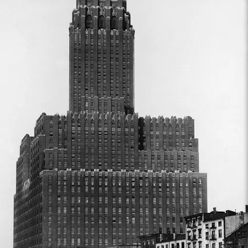
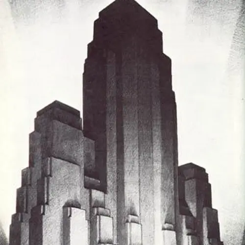
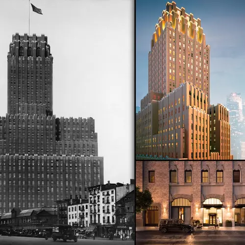
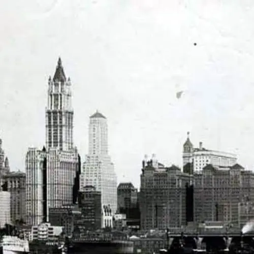
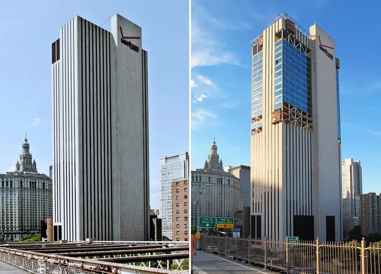
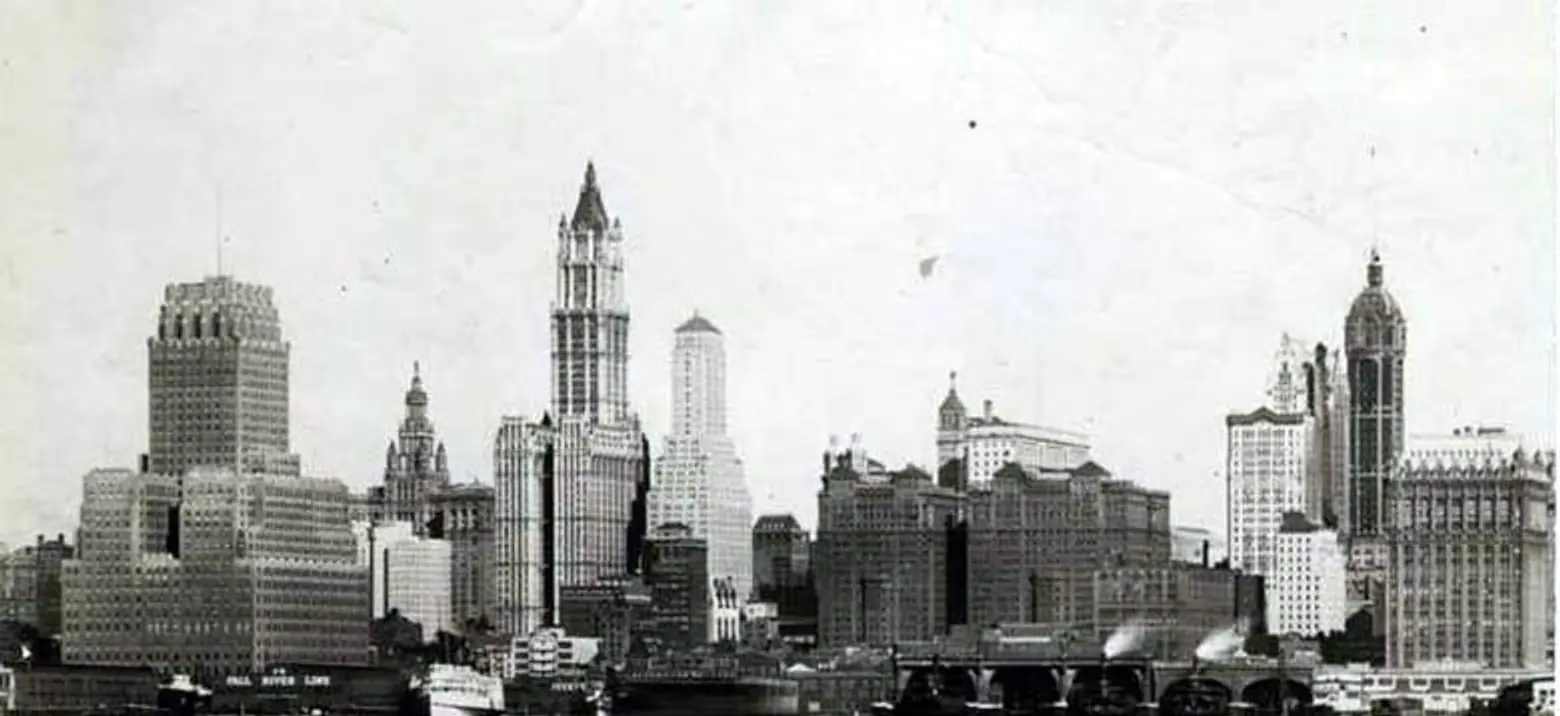
Finished in 1927, 100 Barclay is one of New York City’s most pivotal structures. Designed by one of our country’s most esteemed architects, Ralph Walker, while he was an associate at McKenzie Voorhees & Gmelin, the tower began construction in 1923, during a time marked by a dramatic shift in architecture and the beginning of the Roaring Twenties. Originally known as the Barclay-Vesey Building, the 32-story building ascends to a height of nearly 500 feet, which made it one of the globe’s tallest towers upon completion. The voluminous building was also built as the largest telephone company building in the world, encompassing more than 1.2 million square feet of office and telecommunication space. Its Hugh Ferris-inspired massing, and nature-influenced ornamentation stands as a monument to man’s prowess and the machine age, and is widely recognized by architects and historians to be the first Art Deco skyscraper, a prototypical example of the style in its finest form.
Walker was very influenced by Eero Saarinen‘s designs and he was interested in how he could use the 1916 Zoning Resolution to his advantage. Walker saw the use of setbacks as a way to make buildings appear more dramatic and dynamic, while still taking a prominent position in the New York skyline. As New York Architecture recounts, “This building was widely published and it captured the imagination of New Yorkers. It was also very influential in getting other designers to use these kinds of forms on the city’s architecture. It was so successful that Ralph Walker became a partner in the firm, which became known as Voorhees, Gmelin & Walker.” Walker would go on to design a number of other striking New York City skyscrapers in the same vein, though increasingly ornate.
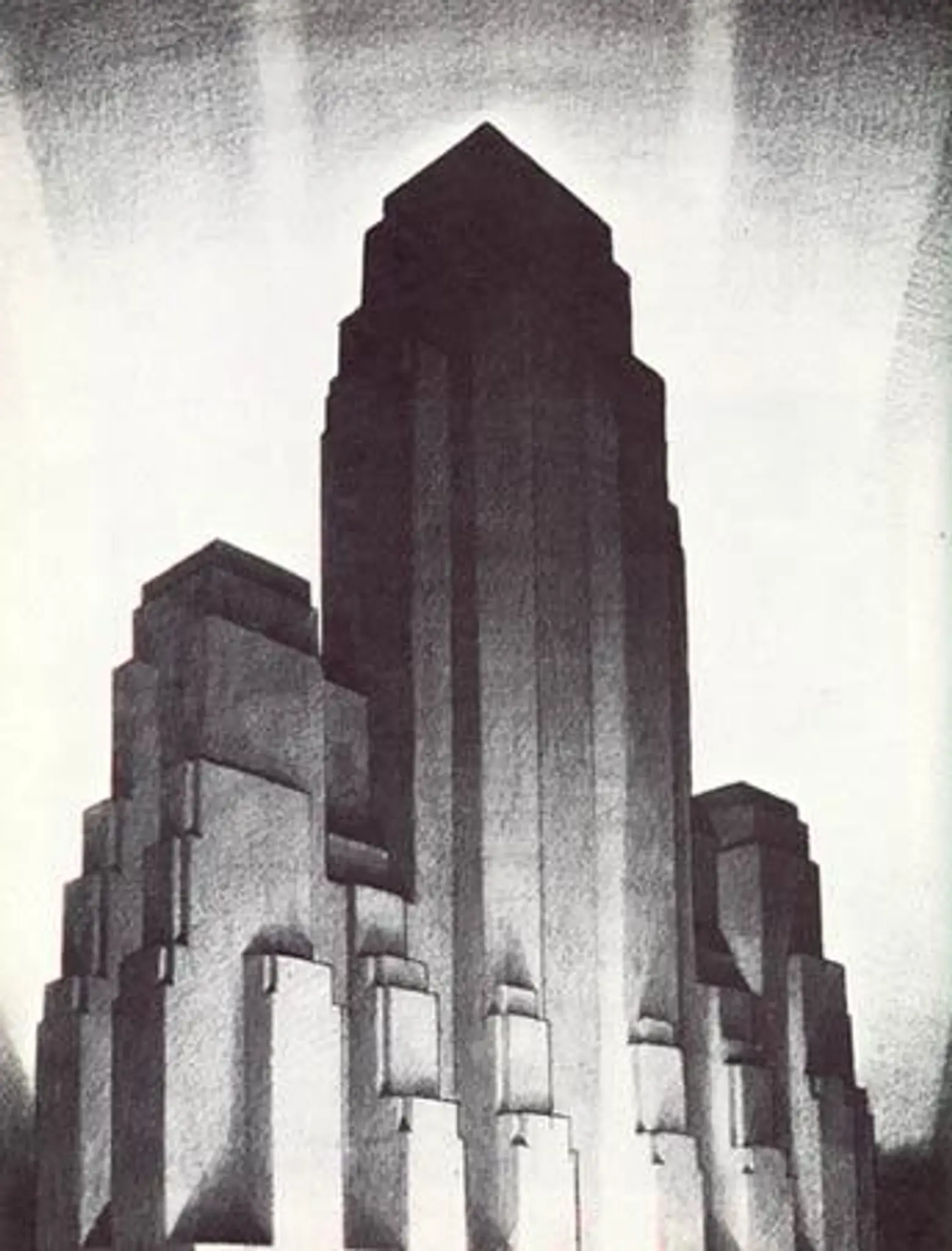 Rendering from the 1920’s by Hugh Ferris
The importance of this structure cannot be overstated. As such, it was made an official city landmark in 1991. As the Landmarks Preservation Commission wrote in their designation “built at a time of great progress and transition in American design, it was a product of the atmosphere of architectural creativity and originality which flourished in New York in the 1920s.” In fact, the same year it opened, it won the Architectural League of New York’s gold medal of honor, the League proclaimed it a “fine expression of the new industrial age.”
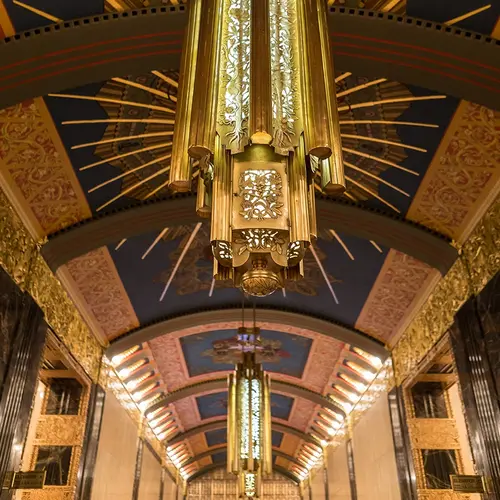
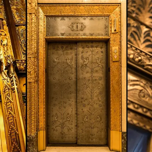
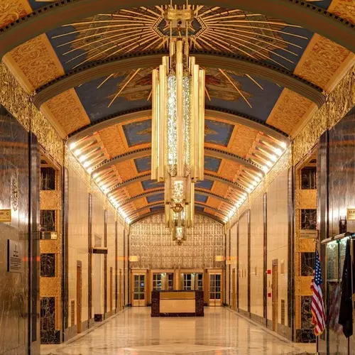
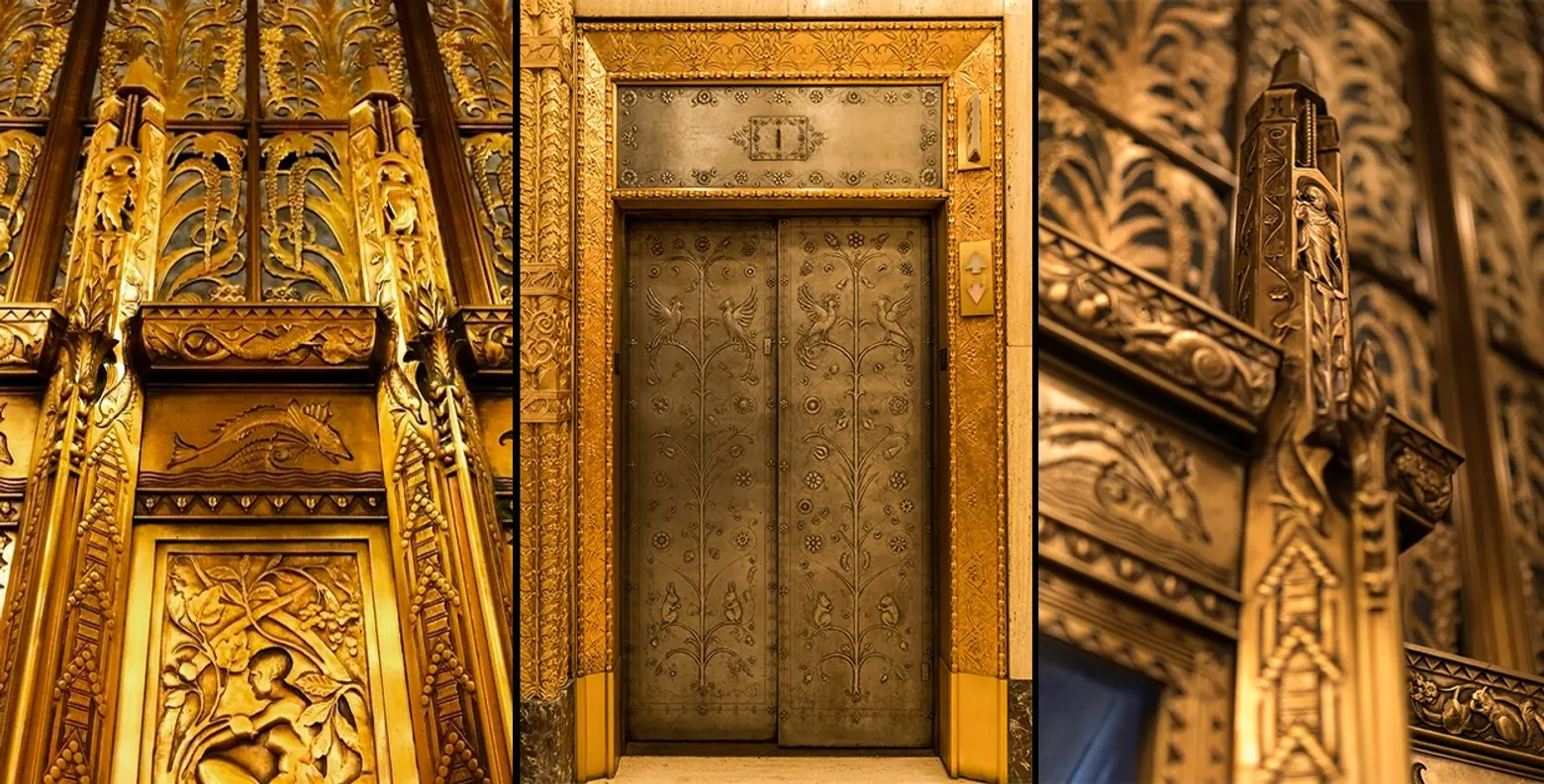
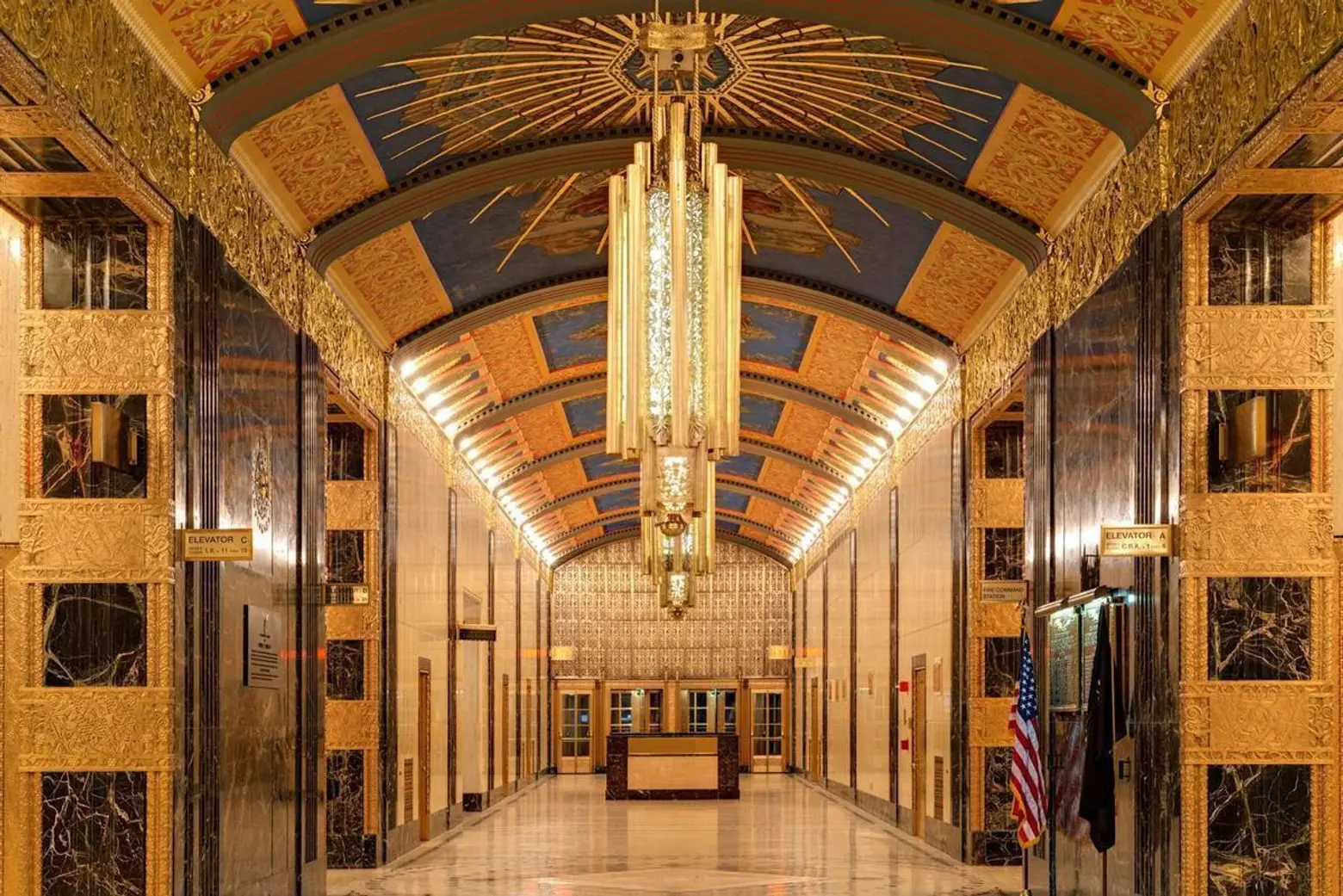
The building would serve for decades as the headquarters for the New York Telephone Company, then hosting NYNEX, Bell Atlantic and then Verizon who still occupies the lower floors today. The building’s function also manifests itself in its form. Although built quite solidly from masonry, a number of exterior adornments reveal elements relating to telecommunications, including a bell, which was the New York Telephone Company’s icon. Inside, the ornate lobby with its marble, travertine and inlaid bronze hosts an incredible ceiling mural depicting the evolution of communication from Aztec runners to ships to the telephone.
 Images via Landmark Branding
In 2013, Ben Shaoul’s Magnum Real Estate Group purchased the upper 21 floors of the building with the intent of converting the building, since renamed 100 Barclay, into 158 grand condominiums with a slew of amenities, including an 82-foot-long lap pool. Understanding the importance of the building and the need to preserve its character while giving it a modern update, Magnum tasked Ismael Leyva Architects to design the interior units (they also served as the executive architect) and DXA Studio to serve as the landmarks and exterior design architect. In the interviews ahead, Manish Chadha and Leonard Vidrak of Ismael Leyva Architects, and Greg Bencivengo and Jordan Rogove of DXA Studio give us some insight into the recent work done on the majestic building.
UPDATING THE ARCHITECTURE
This is a huge and old structure among a number of important NYC buildings. What were the most challenging aspects of the preservation and restoration effort?
DXA Studio: Current building codes and zoning resolutions gave way to a number of limitations, many of which are antithetical to the design of the original building. A lot of these required a significant amount of ingenuity to accommodate, and that includes Post-Sandy flood considerations, the effort to conceal mechanical services, a reduction of exhaust louvers on the building’s façade for windows, and altering areas that were originally constructed with more elaborate means, such as the storefronts. Additionally, the landmarked lobby, which spans the width of the building from east to west, required a division of the commercial and residential tenants. As required by Landmarks, we needed to implement a visually unobtrusive screening partition that would respect and reference the history of the space without resorting to pastiche.
Did you need a special set of consultants and designers address some of the upgrades or changes?
DXA Studio: We worked with preservation consultant, Higgins Quasebarth & Partners, to study the building’s history and better understand how to appropriately integrate modern design elements with the historical aspects of the building. Sullivan Engineering handled the Local Law 11 work, including masonry restoration and repairs, particularly visible in the Vesey Street Arcade Guastavino vaults. Abel Bainnson Butz enlivened the building with landscaping at the new residential entrance and resident amenity spaces at existing outdoor terraces.
Your work is wide-ranging, but what’s more interesting for you, historical rehabilitations or ground-up constructions using more modern finishes?
DXA Studio: We are drawn to the adaptive reuse of historic buildings because of their inherent complexity and challenges they present. The design process is informed in ways that aren’t commonly pursued in ground-up projects—100 Barclay represents a dialogue between cultural values of the past and contemporary concerns about the quality, cost, and desirability of space, which is extremely relevant in New York City.
How do you feel pre-war structures like this compare to modern buildings?
DXA Studio: Optimizing shared space dominates the design of modern buildings, particularly as the market and “saleability” of said space takes precedent over the apartments themselves. You don’t really see the same sort of grandiose spaces you’d find in pre-war structures in contemporary developments. In addition, the construction methods used in pre-war buildings are often much better quality. You’ll get a better acoustic performance in a pre-war than in architecture under construction today.
100 Barclay epitomizes ideals central to New York City’s history. As the first Art Deco skyscraper in New York City, the construction of 100 Barclay pushed this movement forward with innovations that still feel relevant today. Despite being situated adjacent to another architectural icon—that is the World Trade Center—the building maintains the monumental presence which it was originally designed to have. It is its robust materiality, well-calculated proportions, and practical massing.
CREATING ELEGANT AND LIVABLE INTERIORS
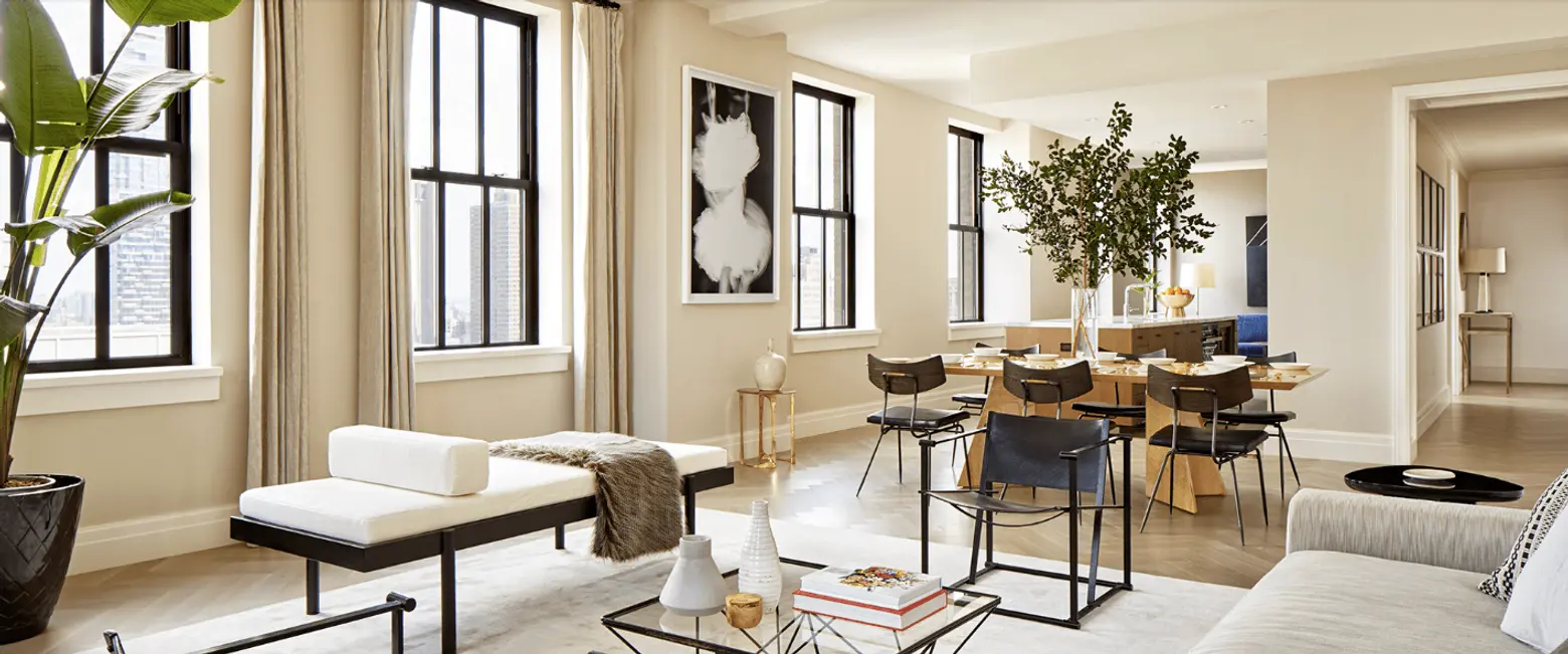
How did you incorporate the Art Deco essence of the building into the residential interiors?
Ismael Leyva Architects: In the apartments, careful consideration was taken in laying out the plans. It was important to keep a formal layout in terms of the planning and to add a modern twist for the current market. This balance references a more transitional approach to the overall building design. Art Deco as a design movement was a combination of a modern style with the use of rich materials. We tried to keep the overall theme throughout our process and feel that it is very evident in the final design.
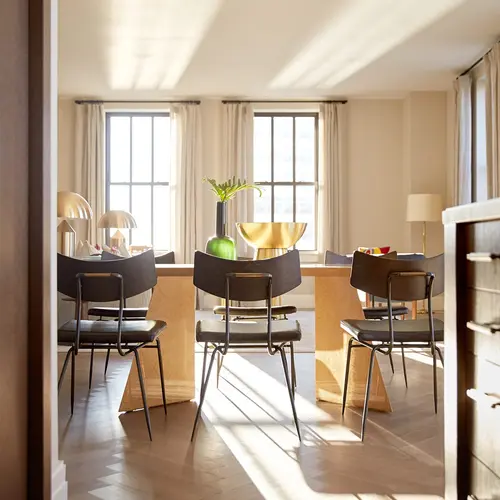
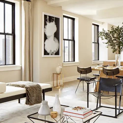
But it was an architectural puzzle to convert a commercial office building, with its large and often varying floor plates, into a luxury residential condominium. We created a functional scheme that incorporated modern-day living within the Art Deco shell. They are not contemporary, but semi-traditional to transitional. Foyers and galleries are reminiscent of the pre-war style, but where large kitchens open to a family room, den, or living rooms, those are instances where contemporary elements were designed into the apartment layouts. The varying floor plates, which was a challenge at the start, gave us the opportunity to create a variety of sizes and programs within the apartment types. That enables us to cater different buyers, young professionals, and to large families.
The apartment units were designed with classical Art Deco “openness” and “mystery.” The high ceilings in living rooms, galleries, and bedrooms are highlighted with ceiling molding, and this shows some of the more popular Art Deco interior design principles. The building has a variety of apartment typologies ranging from studio to five-bedroom apartments and a penthouse. At the top floors, the arched 20-foot-high Art Deco windows are meant to showcase the views of Manhattan. The building setbacks have become apartment terraces with historic parapets combined with glass railings—again showing the combination of Art Deco style with contemporary finishes and design.
While preserving the integrity of the historical lobby, we created a new residential lobby facing Barclay Street. The new lobby design incorporated various Art Deco elements combined with a contemporary residential function and layout. This blend of design and function created an overall transitional approach to the project.
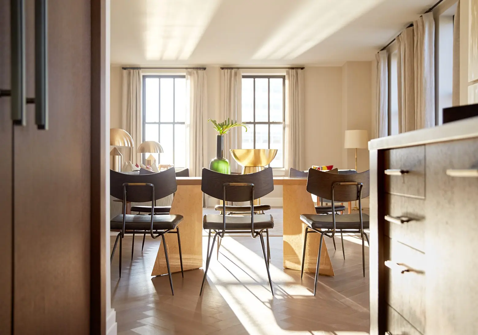
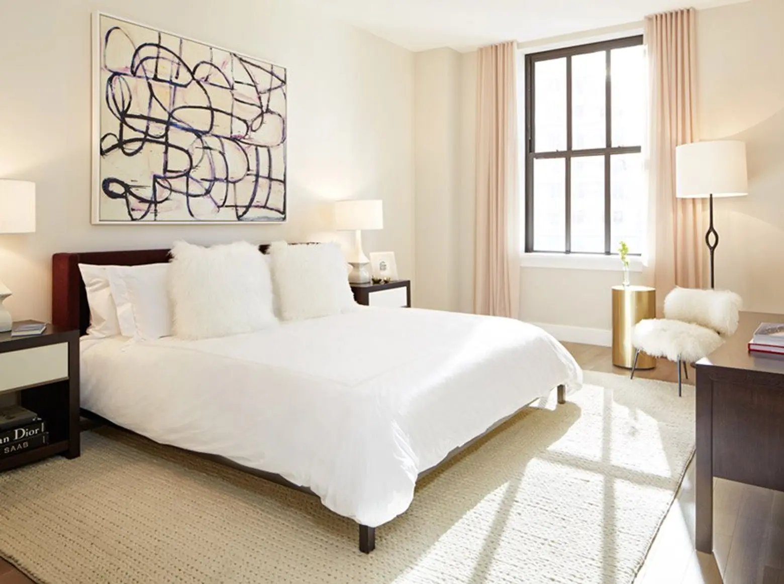
How did you decide on what balance to strike between the old and new aesthetically?
Ismael Leyva Architects: When working on projects with landmark status, it is always important to maintain some iconic features while updating the overall space and its functionality. A few examples of this would be keeping the overall appearance on the penthouse level, but upgrading the windows to maximize the light and view as well as capturing space back on every floor from reducing the number of elevators needed.
We worked with both a landmarks consultant to ensure that the integrity of the building was maintained during the revamp process as well as an interior designer who selected all of the residential lobby and apartment finishes along the design framework that we created. The architect and interior designers have had a sensitive approach to all architectural and interiors elements. They have achieved this by incorporating tall doors with stained wood veneer finishes as well as dark bronze finishes on many of the design elements.
What’s more interesting for your team? Historical rehabilitations or ground-up constructions using more modern finishes?
Ismael Leyva Architects: Historic conversions are a stand-alone type of architecture that combines the knowledge and talents of a project team. Rejuvenating a historic commercial building with a new residential or retail program has the potential to change city living and affect change in a community.
+++
 This post has been sponsored by 100 Barclay. To learn more about available condos or to schedule a tour, visit the official 100 Barclay website.
+ Visit the official 100 Barclay site to explore the building further
RELATED:
