MAP: Visualizing Urban Development from 3700 B.C. to 2000 A.D.
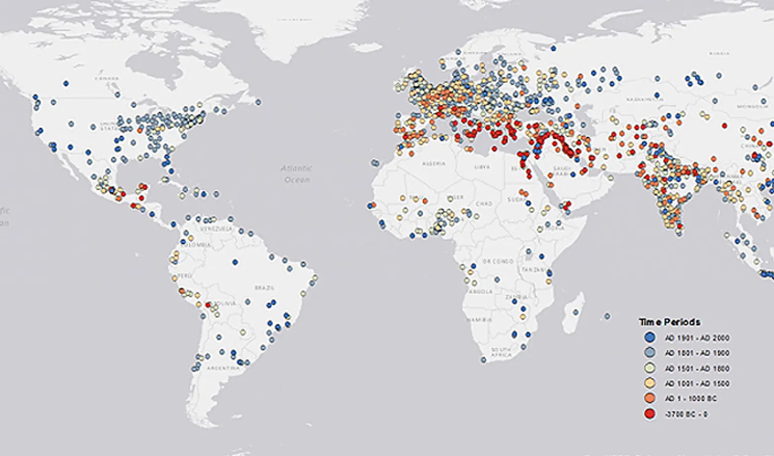
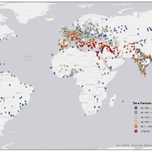
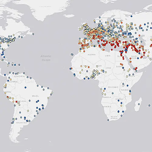
Previously, 6sqft featured an interactive map from Esri that showed how the world’s population boomed over the course of 2,000 years. Now comes a new paper and visualization (h/t CityLab) from Scientific Data that takes population and archeological records from as far back as 2250 B.C. and transforms them into a fascinating map that reveals the world’s first recorded urban centers, and how they’ve distributed themselves over 6,000 years.
The work is the result of an intensive undertaking by Yale University researcher Meredith Reba, who with her team dug through tables and tables of notes and numbers (dating between 2250 B.C. and 2000 A.D.) documented by historian Tertius Chandler and the political scientist George Modelski.
In her paper, Reba writes, “Whether it is for timely response to catastrophes, the delivery of disaster relief, assessing human impacts on the environment, or estimating populations vulnerable to hazards, it is essential to know where people and cities are geographically distributed. Additionally, the ability to geolocate the size and location of human populations over time helps us understand the evolving characteristics of the human species, especially human interactions with the environment.”
The map is color coded with red and orange markers pinpointing the oldest recorded urban centers, while the blue and gray dots signify newer settlements. The distribution across the U.S. is quite fascinating, albeit largely unsurprising. Most dots turn up blue or gray, but there are yellow clusters on the east coast and even a stray orange dot in the Midwest.
CityLab points out that the dataset is not comprehensive, but it does begin to give us an “understanding [of] how cities were born, multiplied, grew—and how they took over the world.”
[Via CityLab]
RELATED:
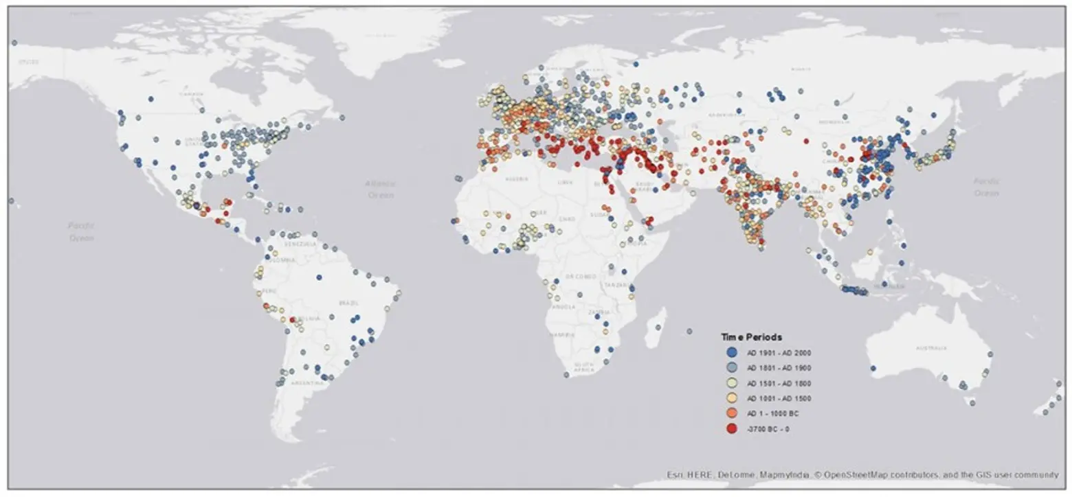 Click to enlarge >>
