Skyline Wars: In Lower Manhattan, A New Downtown Is Emerging
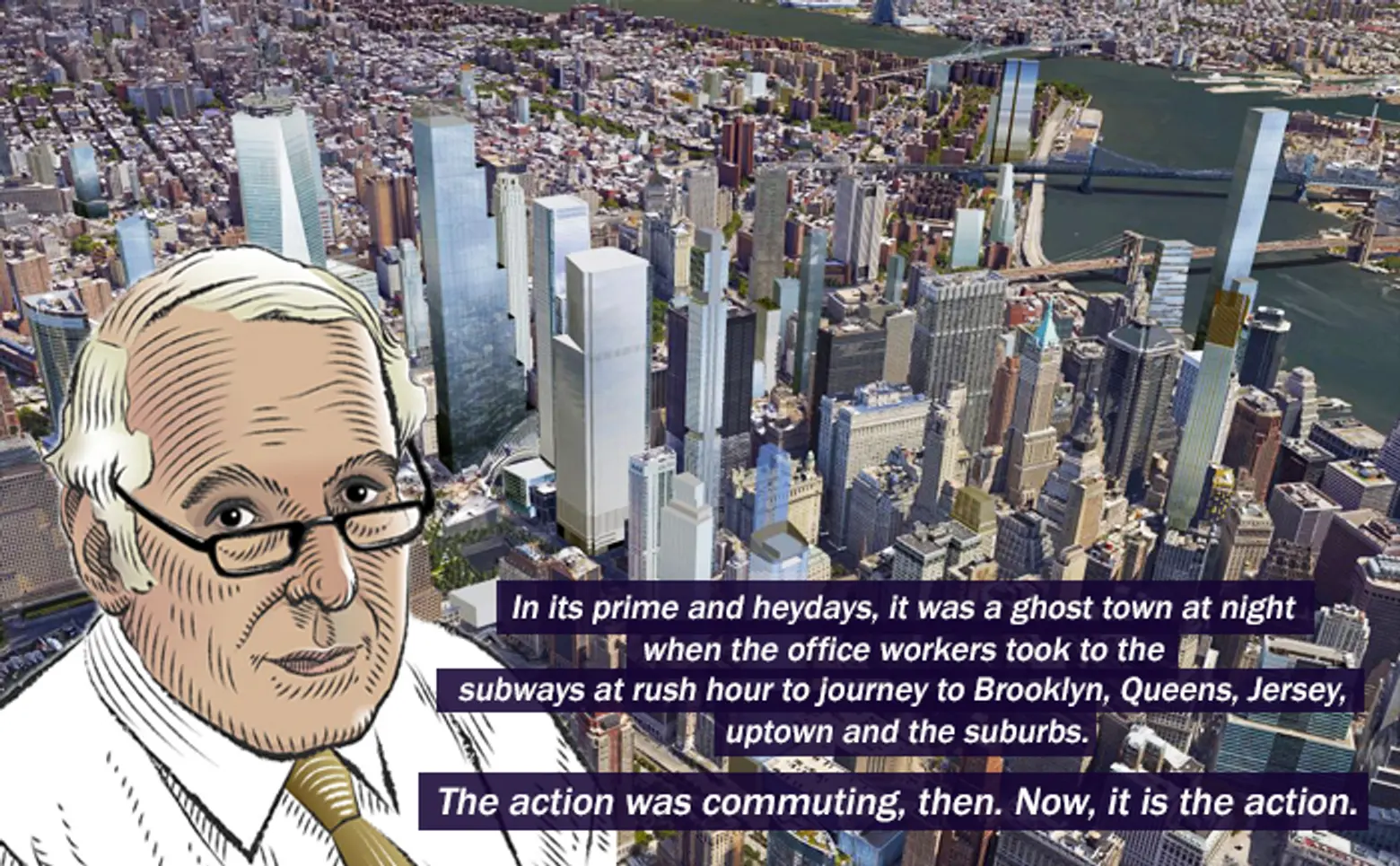
Carter Uncut brings New York City’s latest development news under the critical eye of resident architecture critic Carter B. Horsley. This week Carter brings us his fourth installment of “Skyline Wars,” a series that examines the explosive and unprecedented supertall phenomenon that is transforming the city’s silhouette. In this post Carter looks at the evolution of the Lower Manhattan skyline.
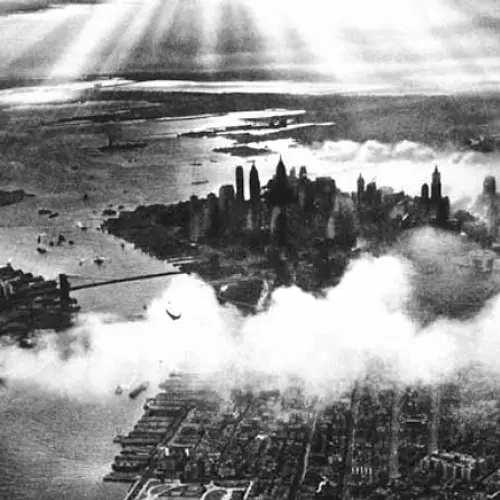
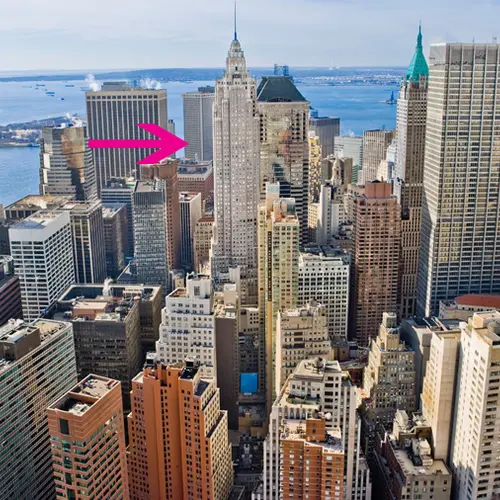
Lower Manhattan at the start of the Great Depression was the world’s most famous and influential skyline when 70 Pine, 20 Exchange Place, 1 and 40 Wall Street, and the Woolworth and Singer buildings inspired the world with their romantic silhouettes in a relatively balanced reach for the sky centered around the tip of Lower Manhattan.
Midtown was not asleep at the switch and countered with the great Empire State, the spectacular Chrysler and 30 Rockefeller Plaza but they were scattered and could not topple the aggregate visual power and lure of Lower Manhattan and its proverbial “view from the 40th floor” as the hallowed precinct of corporate America until the end of World War II.
The convenience and elegance of Midtown, however, became increasingly irresistible to many.
David Rockefeller dug his heels in and fostered the construction of the mammoth One Chase Manhattan Plaza skyscraper that dramatically blunted the downtown skyline but was such a dramatic act of faith that before long the twin stainless-steel towers of the World Trade Center rose up awesomely, disrespecting the skyline’s centrality but giving the city a new, asymmetrical and taller skyline.
The twin towers were designed by Minoru Yamasaki of Seattle with Emery Roth & Sons of New York, and their very shiny facades gleamed most impressively even though their very narrow windows inhibited their vistas greatly. One of the towers boasted the lavish and very expensive Windows on the World Restaurant, but most of the public settled rather happily for its huge basement mall of shops and eateries beneath its usually wind-swept enormous plaza where a bloodied King Kong fell in the first remake of his movie.
When the towers, which were intended to bolster the economic well-being of Lower Manhattan, were erected, their excavated foundations formed the barren, 92-acre landfill in 1975 that would eventually become Battery Park City. The towers initially were on the riverfront and much of their 10-million-square feet of office space remained vacant for some time.
Despite their depressing economic impact on downtown office leasing and their oft-kilter tilting of its skyline their irrespressible shine and their tense duality “doubled down” their worldly impact and helped New York regain its dominance as the world’s high-rise center even though the towers were eclipsed in height a bit by the Sears Tower in Chicago first and then by the twin Petronas Towers in Malaysia somewhat later.
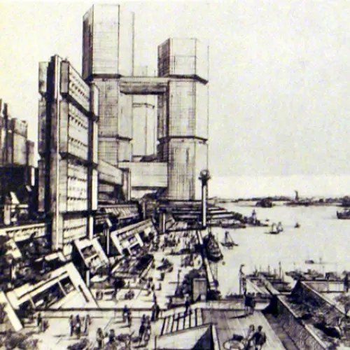
The jolting impact of the World Trade Center would be considerably softened in a few years by the eventual build-out of Battery Park City with its World Financial Center designed by Cesar Pelli next to its center. The myriad mid-rise residential towers by many different architects and many delightful follies and parks and a long riverfront esplanade planned by Alexander Cooper and Stanton Eckstut won out over a huge “megastructure” plan with three conjoined octagonal office towers at the southern end.
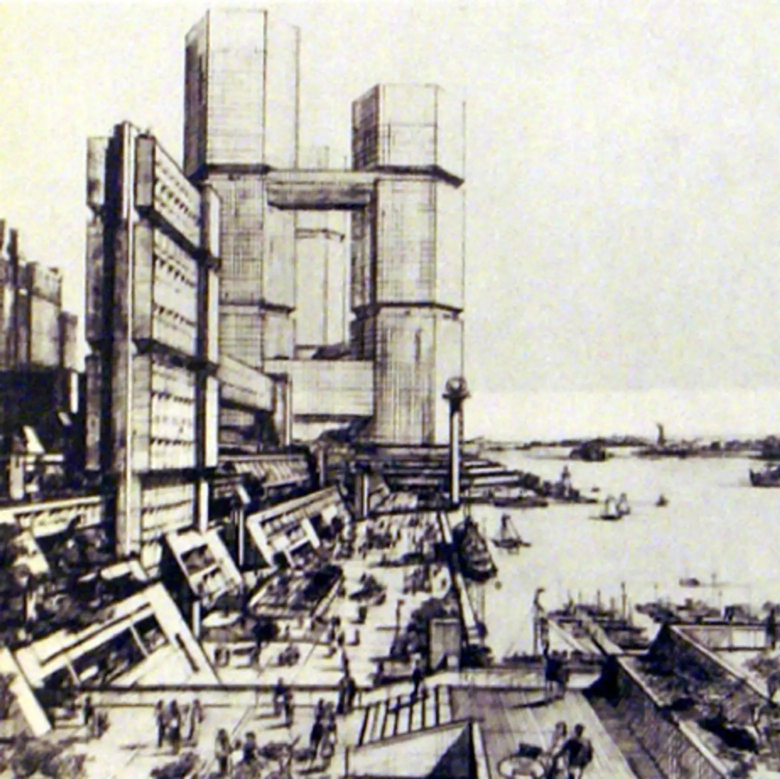 Three octagonal towers planned at the southern end of megastructure at Battery Park City
It’s always fun to dip into the history books and see how people throughout the 20th century envisioned the world of tomorrow.
According to the official Battery Park City website, the drawing was commissioned by then-Mayor John Lindsay, and was in essence Battery Park City’s first official master plan. This particular rendering was a collaboration between the mayor’s preferred architects, the firm of Conklin & Rossant, Governor Rockefeller’s team, and Philip Johnson (who was referred to as “a sort of architectural marriage broker”).
The three octagonal towers, connected by large sky-bridges, were quite huge and imposing and appeared to slightly resembled the cinched double-waists of the PanAm/MetLife building straddling Park Avenue in Midtown. They appeared to be shorter than Yamasaki’s twin towers that were demolished by the terrorist attacks of September 11, 2011.
After design competitions and much controversies, a master plan for their “rebuilding” was created by Daniel Libeskind that featured a 1,776-foot-high tower including its spire and three lower but quite tall towers clustered around a memorial park.
It took a long time for government officials and the families of those lost in the attacks to reach consensus on what should replace the original twin towers.
The result was that the tallest tower on the northwest corner of the site was to be designed by David Childs of Skidmore, Owings & Merrill to the west of a performing arts center that eventually was to be designed by Frank O. Gehry that was next to the second largest planned tower designed by Sir Norman Foster with a slanting top divided into a four diamond shapes.
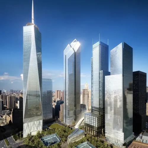
The 1,254-foot-high Foster tower was just to the north of a transportation hub designed by Santiago Calatrava that featured openable, feather-like wings like a bird south of which would rise a 1,100-foot-hightower with four spires designed by Richard Rogers. The southeast corner of the site was the 975-foot-high new tower designed by Fumihiko Maki. All the towers were centered a landscaped plaza with two large sunken waterfalls occupying the former footprints of the Twin Towers.
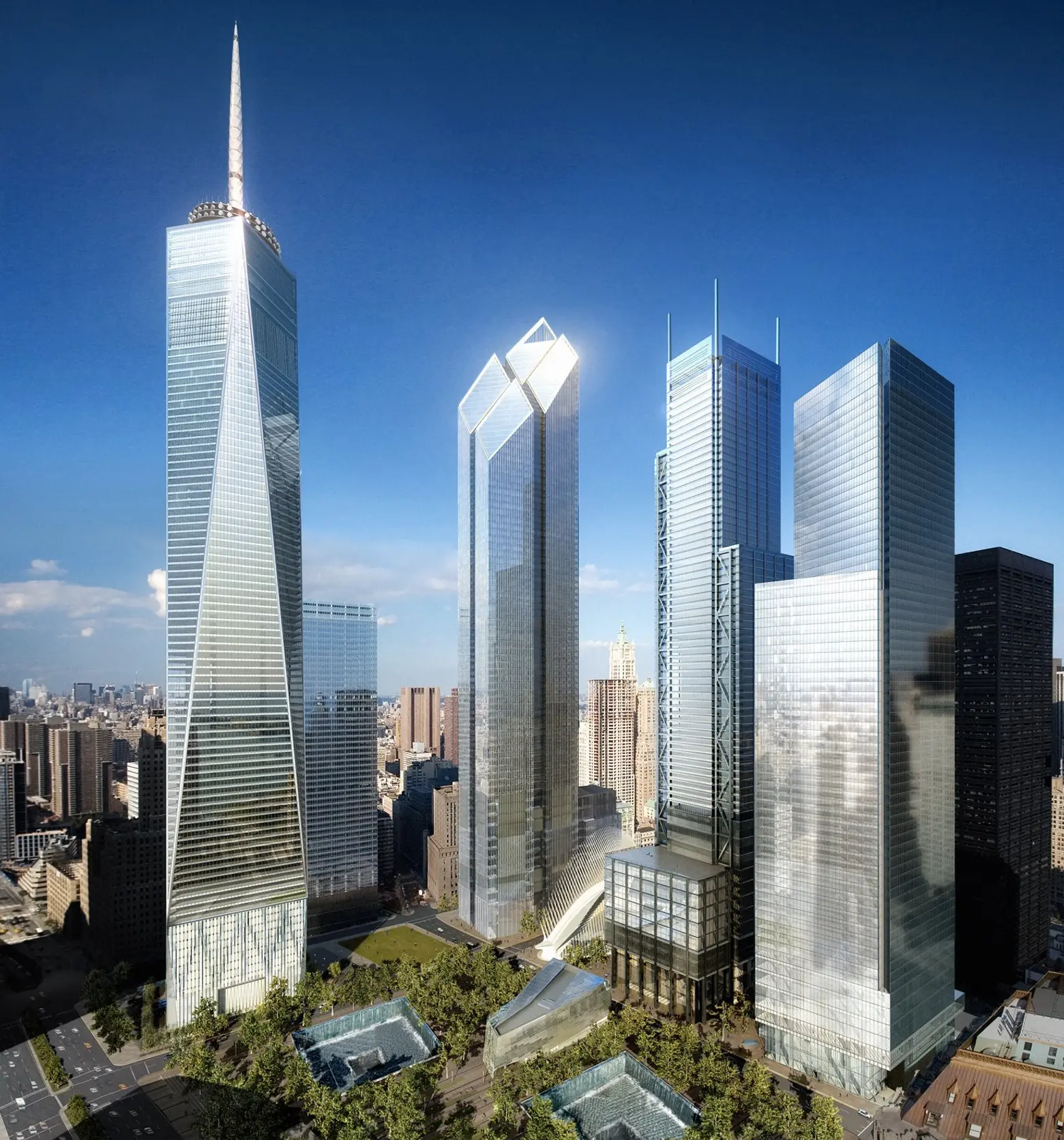 The World Trade Center redevelopment plan, viewed from the southwest, in 2006 with towers by Childs, Foster, Rogers and Maki from left to right
The plans for the site encountered many problems: the police insisted on a redesign of the tallest tower because of concerns it might be vulnerable to a car bomb and Calatrava’s transportation hub went considerably over budget and schedule, requiring that its roof could no longer be opened.
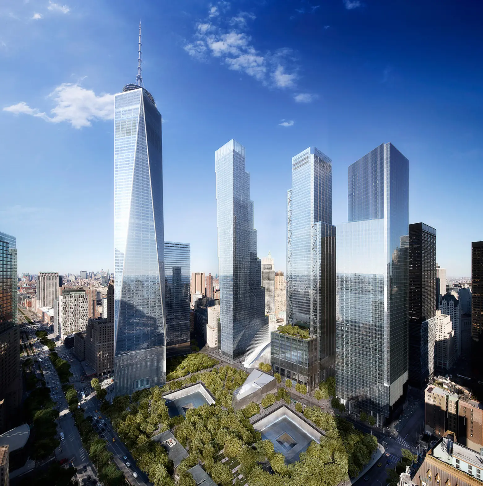 The World Trade Center site with the World Trade Center tower at left, Bjarke Ingels’s tower in the center next to Calatrava’s transportation hub with immovable wings just to the north of Richard Rogers’s Tower with no rooftop spires
In 2015, the observatory at the tallest tower opened with admission tickets at $32 and Maki’s Tower 4 was open, but the middle two towers were not. Larry Silverstein, who was building the towers got Rupert Murdoch to sign on his organizations as a major tenant for Tower 3 that had been designed to accommodate financial firms that needed large trading floors. As a result, the design by Sir Norman Foster was replaced by a new design by Bjarke Ingels Group (BIG) that was significantly different.
The new design stacks six boxy setbacks that are slightly shifted vertically with a non-setback and slightly cantilevering façade facing west. The setbacks provide “hanging gardens” and their slightly exposed undersides provide dramatic lighting opportunities. From the memorial park, the tower’s unusual massing is not very apparent and its reflective-glass verticality appears in relative harmony with the two southern towers and the slanted glass facades of the World Trade Center tower. Its real drama, however, is reserved for views from the northeast where its tilting and lurching form adds a venturous dynamic to the composition of the large site as well as shifting its vertical emphasis more to the east.
Ingel’s very bold design with its torqued cantilevers was the boldest at the site and included special large spaces for the news organizations that may get lost in “value-engineering” for “normal” office tenants. While it made no attempt to be contextual with the rest of the center’s development, its complexity, scale and unusual design were very compellingly intriguing.
Meanwhile, the Port Authority and Mr. Silverstein decided to remove the spires/antennae from the four corners of the Rodgers tower, presumably to cut costs although somewhat diminishing the “high-tech” aesthetic of the tower. The asymmetric design of the tower still retains its high-tech-style corner cross-bracing.
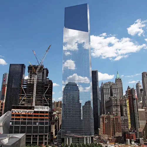
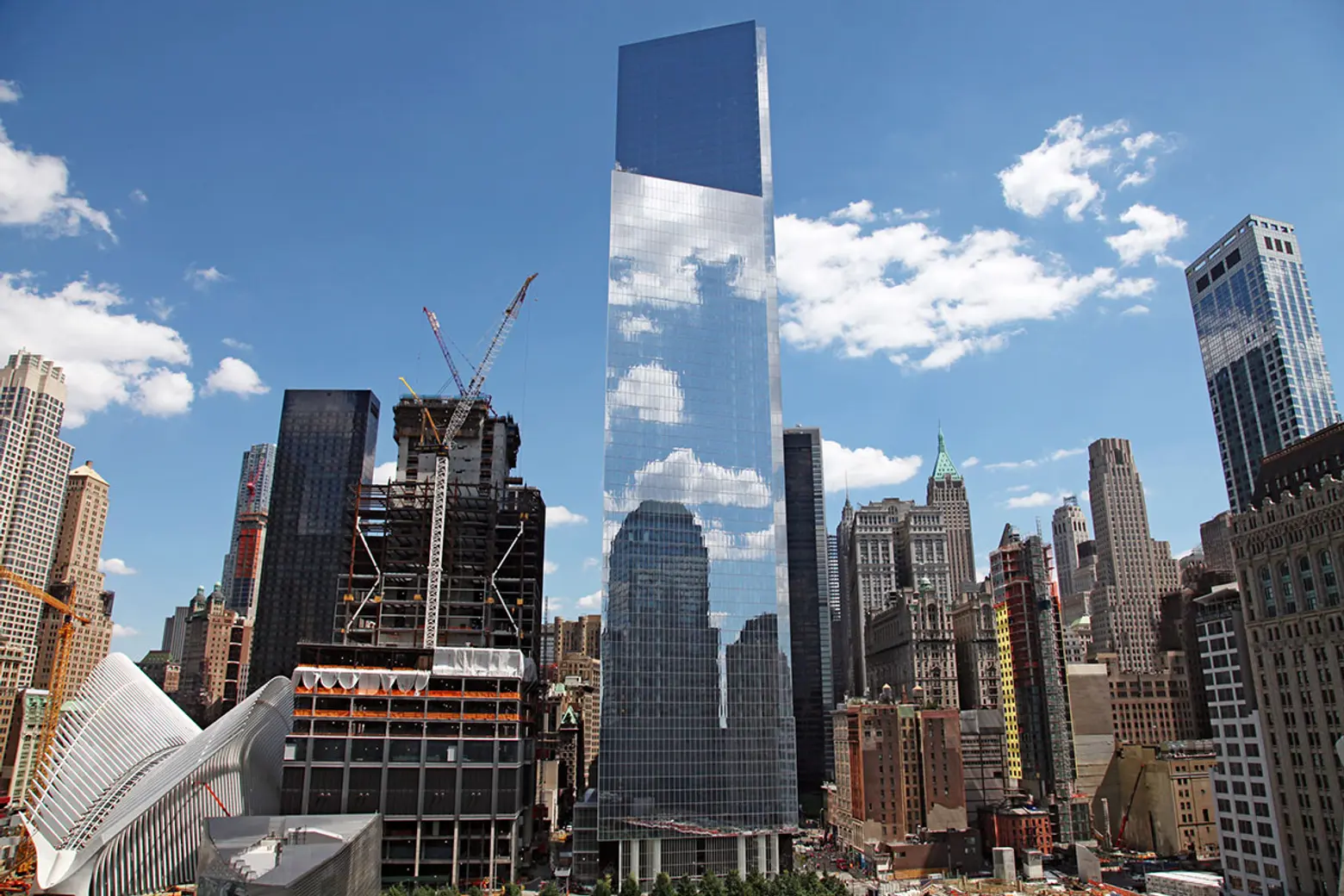 4 WTC designed by Fumihiko as photographed on July 31,2015
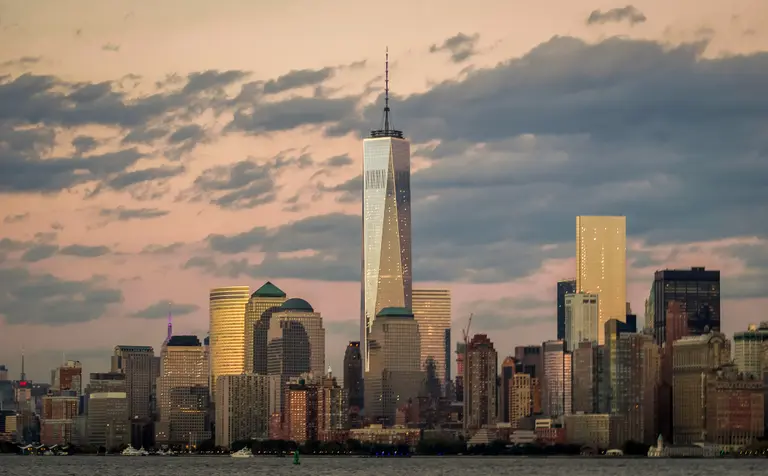
The Maki tower has enjoyed high visibility because the Ingels and Rogers towers have not yet obscured views of it from Midtown and because it has enjoyed a short reign as Lower Manhattan’s tallest tower after 1 World Trade Center. Its clean and simple lines coupled with an angled top that makes it sparkle from Midtown at sunsets has fashioned it a surprisingly prominent skyline component.
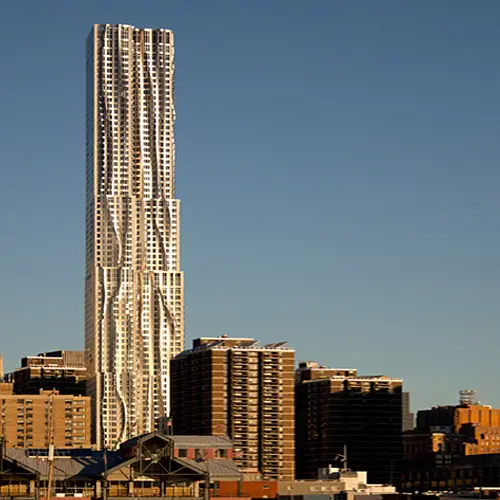
The Maki tower edges out the 891-foot-high 8 Spruce Street mixed-use tower by Frank O. Gehry whose swirling facades are the city’s most convoluted and sensual except for the totally flat south façade that is rather jarring. Gehry’s slender stainless-steel tower stands in pretty proud isolation not far from City Hall. It has 834 rental apartments as it was planned before the onslaught of the luxury large condominium apartment supertall towers that are transforming the Plaza/Central Park South District.
 8 Spruce Street from the east with the shorter Woolworth Building at the left
Gehry, who is widely acknowledged as the world’s greatest living architect, also designed the relatively small but lyrical IAC Center in Chelsea that is notable for its large glass “sails.” His most notable New York City design, however, was a large downtown museum structure on a platform in the East River south of the South Street Seaport for the Solomon R. Guggenheim Museum, the gargantuan son of Bilbao, the sumptuous and very curvy titanium-clad museum in Bilbao, Spain, that was the most important building in the world of the last quarter of the 20th Century.
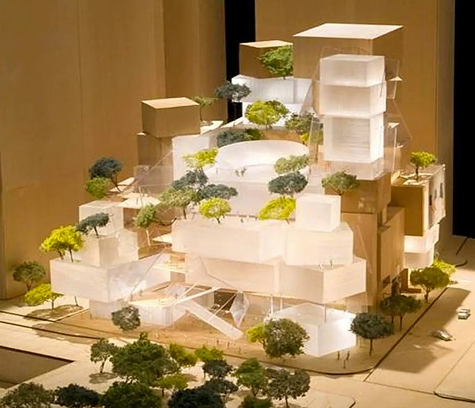 Gehry’s abandoned design for a performing arts center at the World Trade Center site
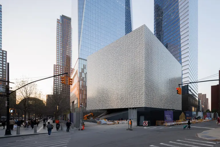
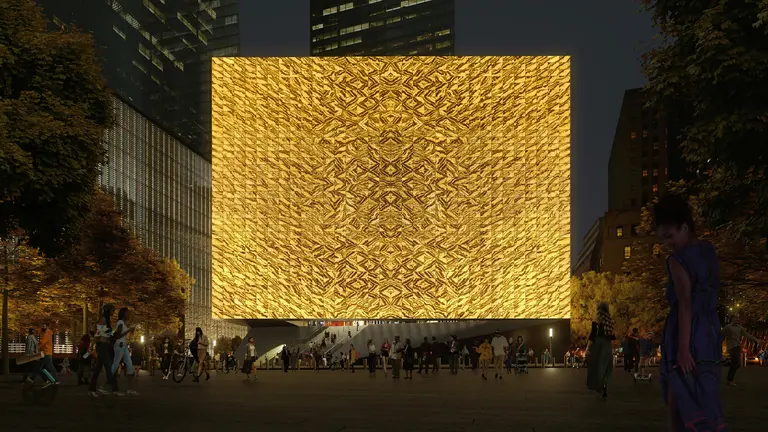
Gehry had designed a large performing arts center for the World Trade Center site between the World Trade Center tower and what had been the Foster tower site. Incredibly, the planners of the World Trade Center site abandoned the plan that would have included a new home for the Joyce Theater, one of the city’s nicest dance centers. Lower Manhattan needs a major culture facility and it was inexcusable to abandon Gehry’s plans in both instances certainly in this golden age of billionaires. Instead a design by Brooklyn-based studio REX led by Joshua Prince-Ramus, a former protégé of starchitect Rem Koolhaas, will go up in its place.
Despite some missteps at the World Trade Center site and the remarkable residential conversion of most of Wall Street fabled office towers, Lower Manhattan is by no means a wasteland. Bolstered by the fantastic robustness of Tribeca, Soho and Chinatown, it is thriving. In addition to thousands of new residents, it has scads of new eateries and hotels.
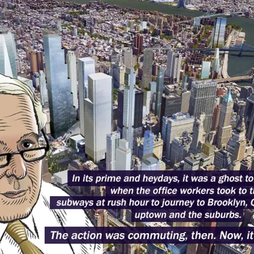
In its prime and heydays, it was a pretty much a ghost town at night when the office workers took to the subways at rush hour to journey to Brooklyn, Queens, New Jersey, uptown and the suburbs.
The action was commuting, then. Now, it is the action and far more convenient for night life than uptown.
***
What follows are other prominent towers currently on the rise, in the pipeline, and already existing, in Lower Manhattan.
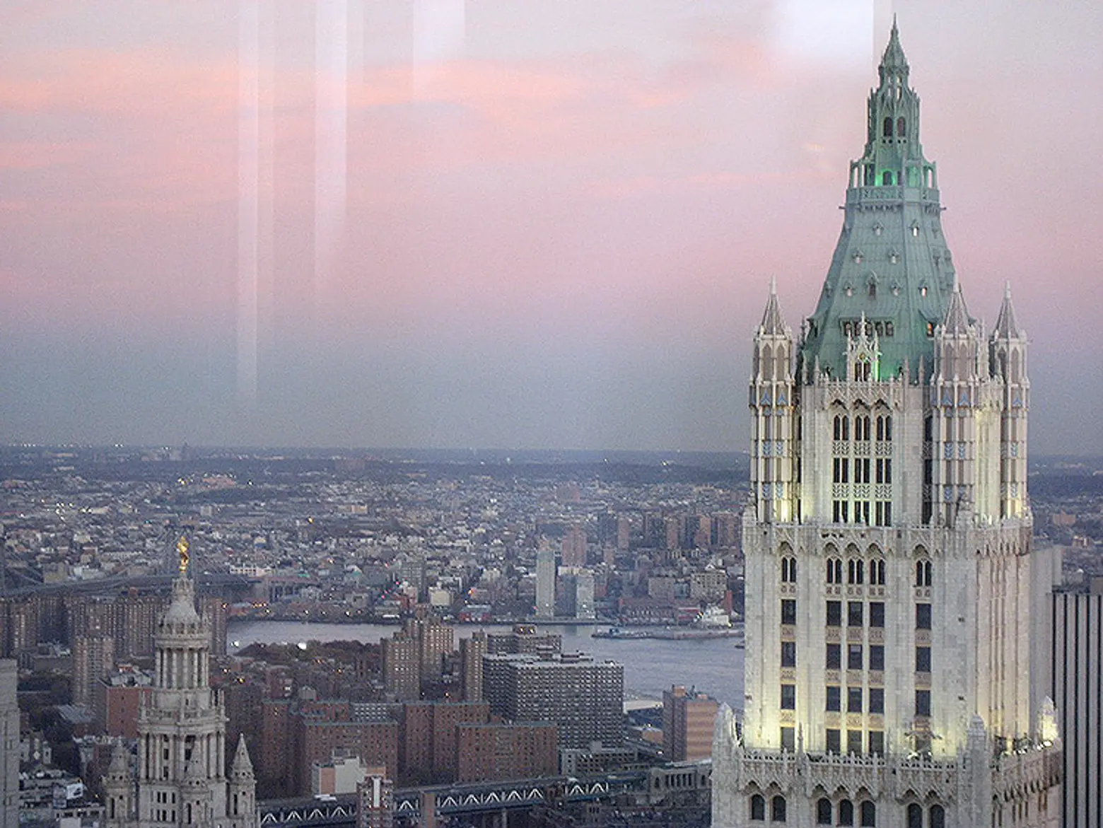
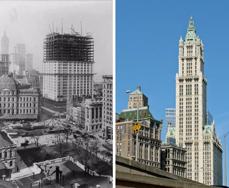
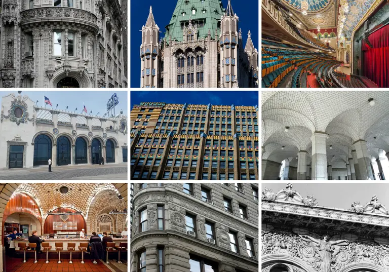
Its daytime allure, of course, has never faded. I once asked Philip Johnson what was his favorite building and without hesitation he said “The Woolworth Building.” As a choir boy at Trinity Church I would wonder around between the 11AM and 3PM Sunday services and fell in love with Gothic traceries, Art Deco details and especially the Woolworth Building whose lobby’s ceiling was the most spectacular and colorful tiara for a building I had seen, and whose gargoyles were enchanting. I was, however, mystified by how many dentists had offices on the highest floors. Now, of course, those top floors are being converted into luxury residential spaces.
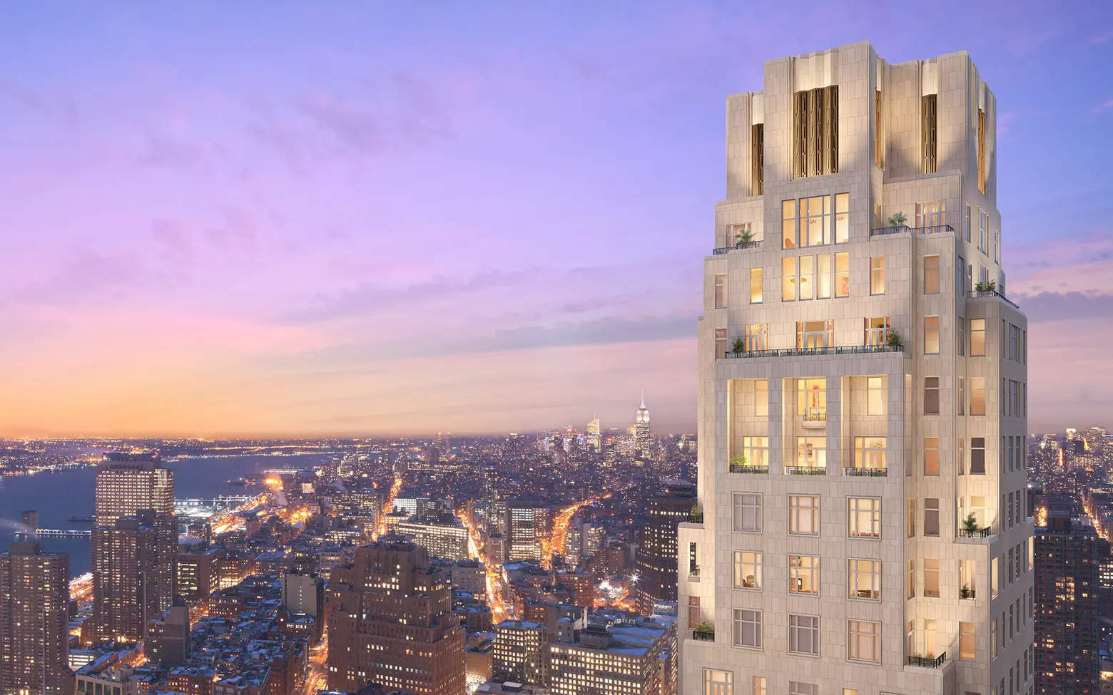
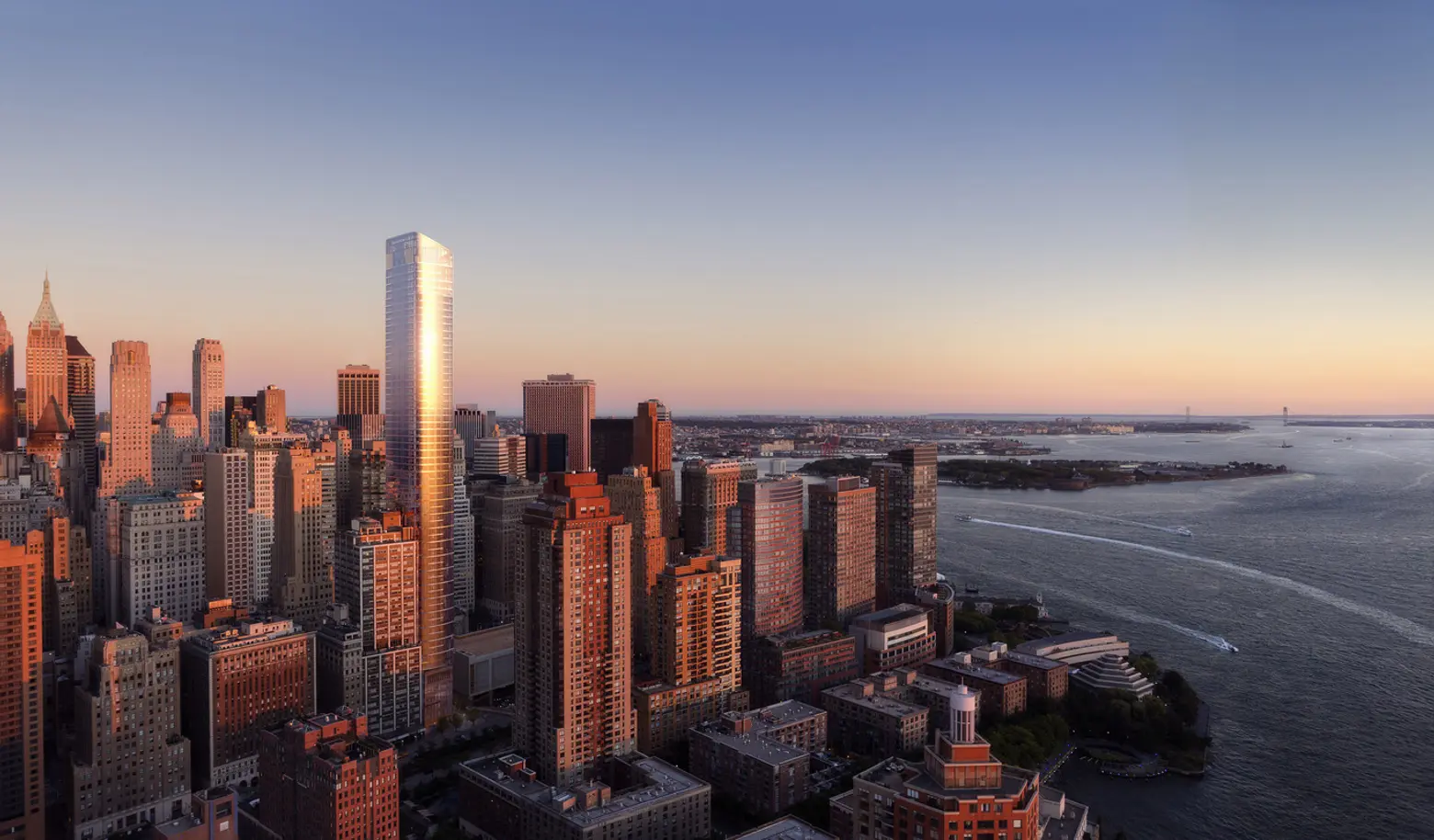
The west half of the Woolworth block is now occupied by 30 Park Place, one of Robert A. M. Stern’s Art Deco-inspired, Post-modern skyscrapers that will include a 157-room Four Seasons Hotel on its first 22 floors and 175 luxury condominiums at next 50 or so stories. Silverstein Properties, which is building much of the nearby World Trade Center, is the developer. Stern, the dean of the Yale School of Architecture (but whom will soon leave this post), designed 15 Central Park West, which became the most successful luxury condominium building in the city a few years ago, and now he is designing two other major Art Deco-style residential condominium towers, 220 Central Park South, and 520 Park Avenue. 220 Central Park South appears to be the best of the Stern towers based on renderings but 30 Park Place is impressively vertical. Although it is substantially taller than the Woolworth it acts as a nice intermediary between the Woolworth and the taller towers of the World Trade Center.
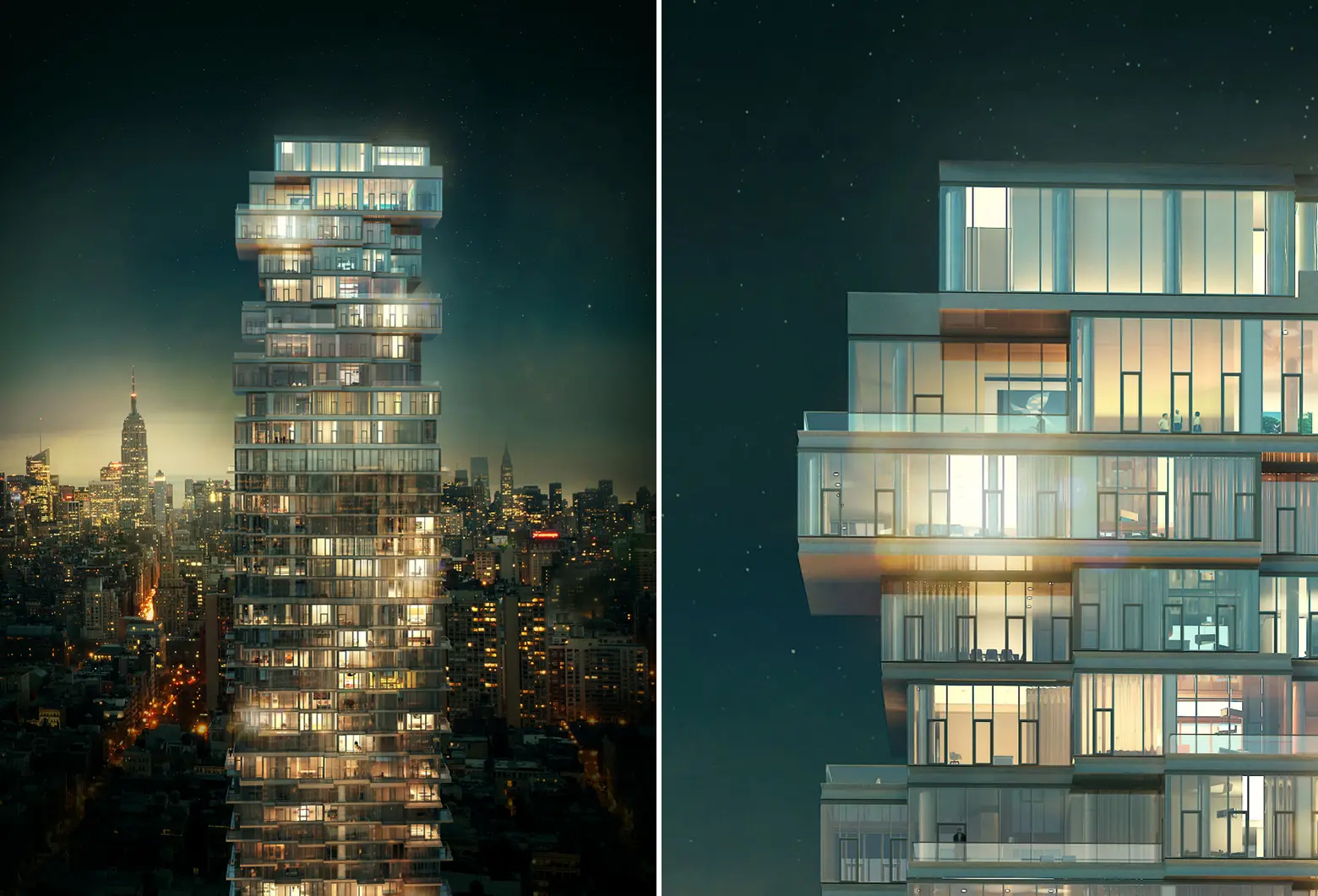
30 Park Place is just about as high as Maki’s tower at the World Trade Center site and just a bit higher than another skinny neighboring tower, 56 Leonard Street. The latter is a stunningly rickety structure especially at its top and it rests one corner of its base on a silvery globule, a large sculpture by Anish Kapoor.
The 821-foot-high tower has been designed by Herzog & de Meuron, the architects of the fabulous “birdcage” stadium for the recent Chinese Olympics, and of the graffiti fence with Coke bottle-green glass columns for Ian Schrager at 40 Bond Street, one of the city’s most spectacular small residential buildings. Alexico is the developer of 56 Leonard Street, which has 145 apartments.
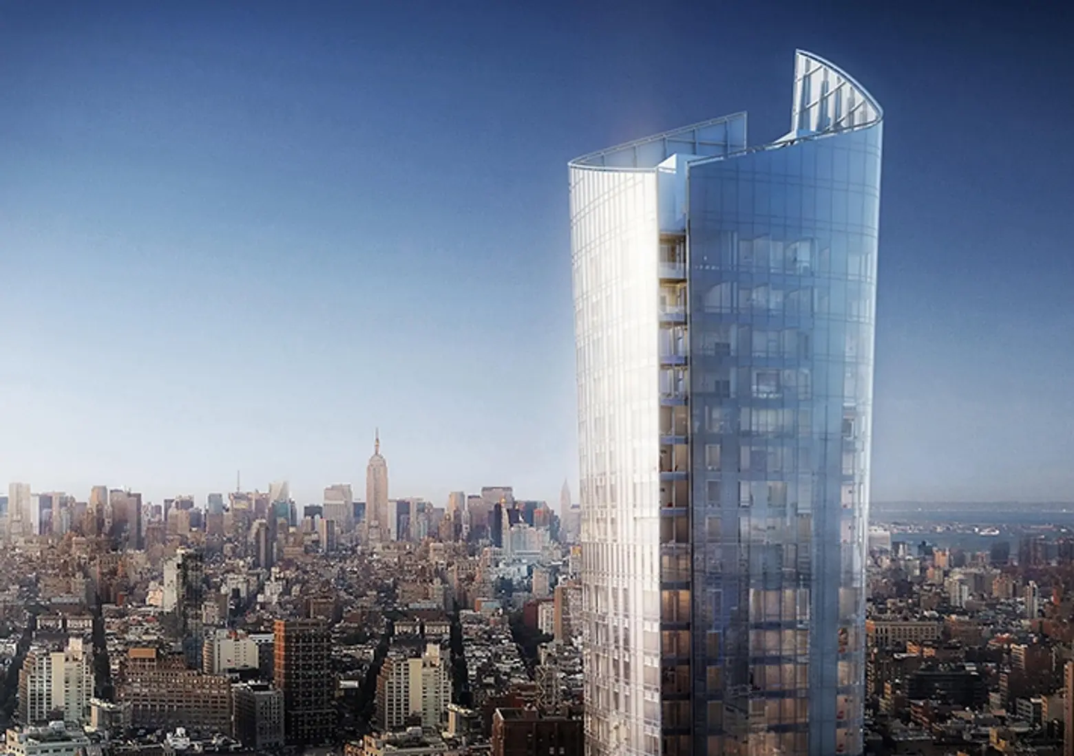
A bit north of the World Trade Center and one block north of Park Place is the very sleek glass tower designed by Kohn Pederson Fox at 111 Murray Street in Tribeca for Steve Witkoff, Fisher Brothers and Howard Lorber. The 792-foot-high tower will have 157 apartments and a dramatic flared top similar to one also designed by the same architects for Ian Bruce Eichner at 45 East 22nd Street near Madison Square Park.
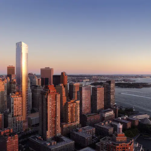
111 Murray Street shares its cool, minimalist and very “modern” aesthetic with 50 West Street, a slightly shorter tower south of the World Trade Center site overlooking the Battery Park City and the harbor. It has been designed by Helmut Jahn of Chicago for Francis Greenberger. Jahn is best known here for CitySpire, Park Avenue Tower and 425 Lexington Avenue but his masterpiece is the State of Illinois Center in Chicago with its enough curved atrium.
While there are many glass-clad towers in the city, 50 West and 111 Murray promise to be exquisitely refined and very graceful, proving it’s never too late to teach old dogs new tricks. They will also join Richard Roth’s very beautiful curved glass tower overlooking Battery Park at 17 State Street at the top of any list of the city’s best silvery reflective glass skyscrapers, proving it’s never too late to shine brilliantly at less than jumbo or super tall size. (It’s still not easy to speak of such towering structures as not super tall, proving it’s never too late to try to listen to murmurs between the shouts of the loudest and biggest.)
The new Lower Manhattan construction activity is less disruptive than what is occurring in Midtown as the aggregate skyline is already pretty massive and dense.
Near 30 Park Place, Sharif El-Gamal is ambitiously planning a 667-foot-high tower designed by Michael Abboud of SOMA with residential condominium apartments adjacent to a three-story Islamic museum designed by Jean Nouvel, who has a designed a supertall at 53 West 53rd Street adjacent to the Museum of Modern Art. The El-Gamal mid-block tower will have 70 stories and offer unobstructed views of Midtown starting about 300 feet high above which the apartments will be full-floor units. The tower will have numerous small setbacks and cantilevers with interiors designed by Ismael Leyva. El-Gamal had originally planned an Islamic Center and Mosque for the site but abandoned those plans when they created a controversy.
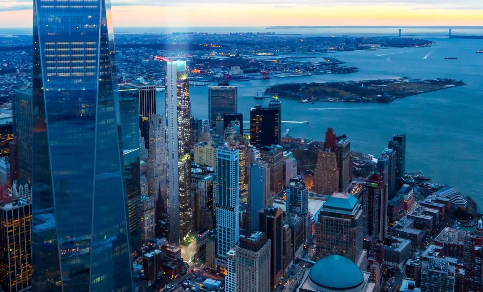
Another ambitious plan is a 898-foot-high, 88-story tower at 125 Greenwich Street south of the World Trade Center on the southeast corner at Thames Street that is being advanced by SHVO, Bizzi + Partners, and New Valley. These developers had acquired the 9,000-square-foot site from Fisher Brothers and the Witkoff Group, and their architect is Rafael Viñoly who designed Harry Macklowe’s already topped out and extremely visible 432 Park Avenue between 56th and 57th Street. Whereas 432 Park Avenue is a sheer, smooth concrete tower and enormous skyline “thrust,” the slightly lower 125 Greenwich Street is more segmented and articulated with two substantial “breaks” in its ascent that culminates with a few setbacks and a spire. The rendering was first posted by 6sqft who observed that it would become downtown’s tallest residential tower.
The east side of Lower Manhattan has not been ignored.
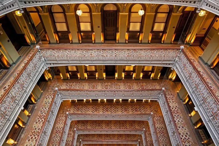
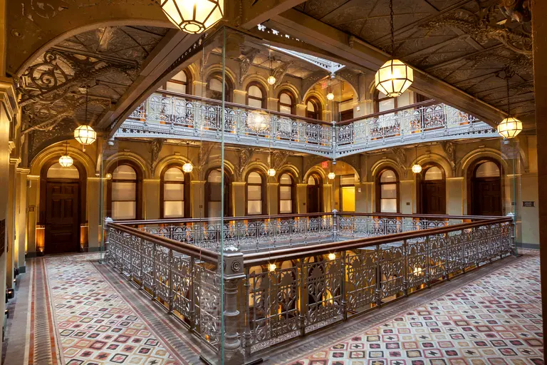
Beekman Residences at Temple Court
One of Lower Manhattan’s greatest architectural treasures was the large skylit atrium at Temple Court on Beekman Street that had for many years lain fallow until 2015 when its spectacular “Bladerunner” space was restored for a new hotel and a new 47-story residential tower was erected next to it. Gerner Kronick & Valcarcel is the architectural firm for the 47-story, 547-foot-high project that is topped with two pyramidal forms echoing the more substantial pyramidal towers of the low-rise building. One might quibble that the tower is a bit awkward next to the historic structure but anything that contributed to restoring the atrium justifies just about anything.
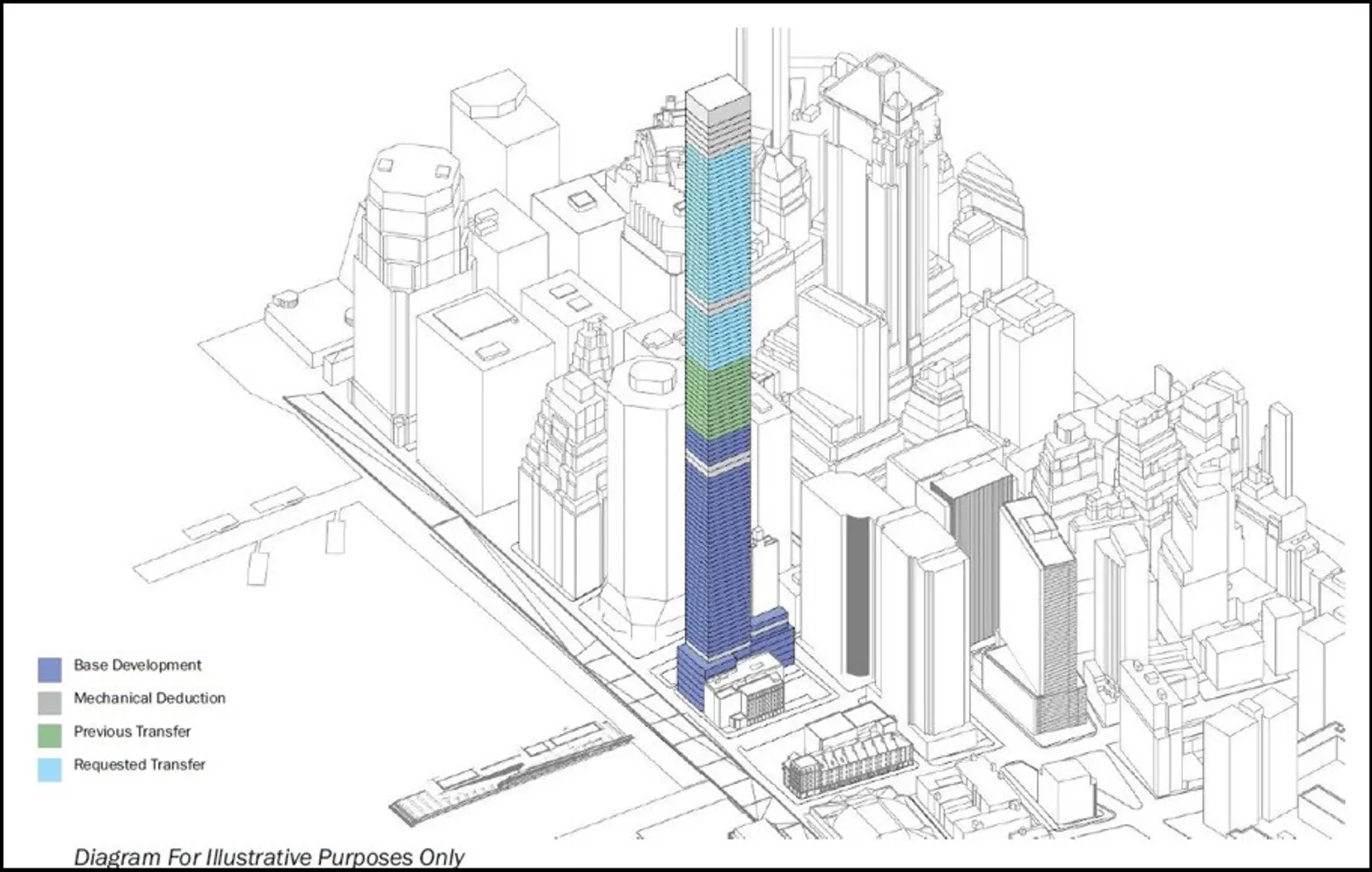 80 South Street, center, showing what a SuperTall tower would look like near the South Street Seaport
Earlier this year, the City Planning Commission approved the transfer of thousands of square feet of air rights from an adjacent lot to 80 South Street, a move that allow for a the construction of a building spanning 1,067,350 square feet, of which slightly over 512,300 could be used for residential space, complemented by a hotel, office, and/or retail space.
An August 2015 article by Crain’s reported that China Oceanwide Holdings of Beijing had announced it has agreed to pay $390 million for the development site at 80 South Street that had been previously planned for a stack of ten townhouses by Santiago Caltatrava for developer Frank Sciame, who subsequently abandoned that plan which had been widely hailed as innovative and very important for Lower Manhattan.
The article said that the Chinese investment also indicated it was in contract to also acquire a neighboring parcel at 163 Front Street from the Howard Hughes Corporation. The article said that a building on the sites could have about 440,000 square feet of residential and 380,000 square feet of commercial space and would be substantially taller than the Calatrava scheme.
It was also noted that “in late 2013, the Shanghai-based company Fosun, purchased the nearby downtown office building 1 Chase Manhattan Plaza, which was designed by Skidmore, Owings & Merrill, for $725 million, subsequently renaming it 28 Liberty St,” adding that it recently won “approval to create retail space it plans to spend $200 million building under the property.”
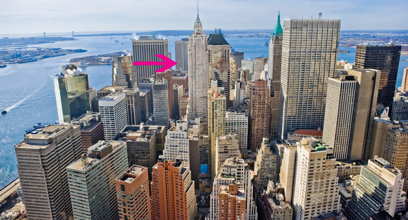
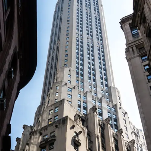
Another major and iconic downtown Art Deco-style skyscraper, the former Cities Service/AIG tower at 70 Pine Street, shown above with its illuminated top with many setbacks and a substantial spire, is being converted to 644 rental apartments and 132 extended stay apartments. Its former observatory that I once described as the world’s greatest room has eight small balconies and no columns and it and the two floors beneath will become restaurant spaces.
Cities Service sold the 952-foot-high building to the American International Group (AIG) in 1976 when it moved its company headquarters to Tulsa, Oklahoma. It served as AIG’s world headquarters until 2008, and the building was sold to developer Youngwoo & Associates in 2009. The building was later purchased by MetroLoft, which sold it to Rose Associates. Today, 70 Pine Street is held by Luxembourg-based Eastbridge Group and Rose Associates.
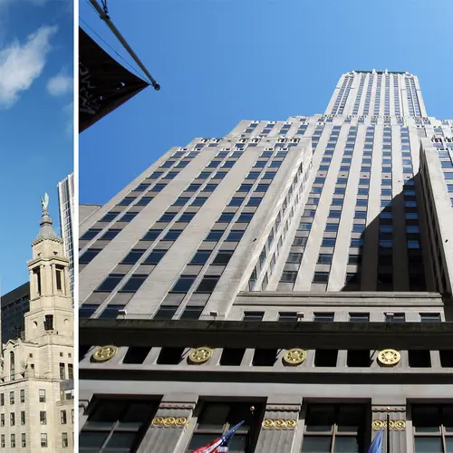
40 Wall Street
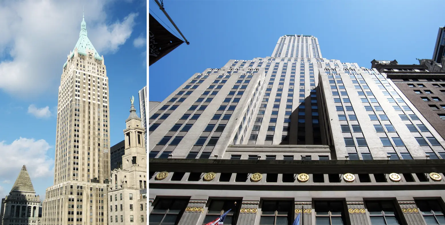
The 927-foot-high tower at 40 Wall Street building was designed by H. Craig Severance, along with Yasuo Matsui and Shreve & Lamb and for a couple of months in 1930 it was the world’s tallest. The Chrysler Building in Midtown wrested that title away, however, when it hoisted a 125-foot-high stainless-steel spire from within the building’s crown. Its 1,046-foot height easily bounded past 40 Wall’s.
Originally named for the Bank of Manhattan Trust, which later merged with the Chase Manhattan Bank, it was completed in just 11 months.
In 1982, Joseph J. and Ralph E. Bernstein purchased 40 Wall Street and were later found to be acting on behalf of Ferdinand E. Marcos, the late President of the Philippines, and when he was removed from power and his assets in the United States were frozen, the building was placed in limbo.
In 1995, it was acquired by Donald Trump, who planned to convert the upper half of it to residential space, but the cost of converting it to residential space proved to be too high then, and it remains 100 percent commercial.
Its green pyramidal roof remains one of downtown’s signature tops and its elegant massing makes it still impressive.
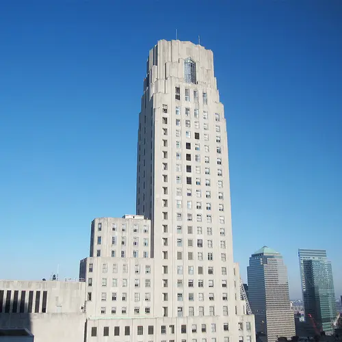
20 Exchange Place
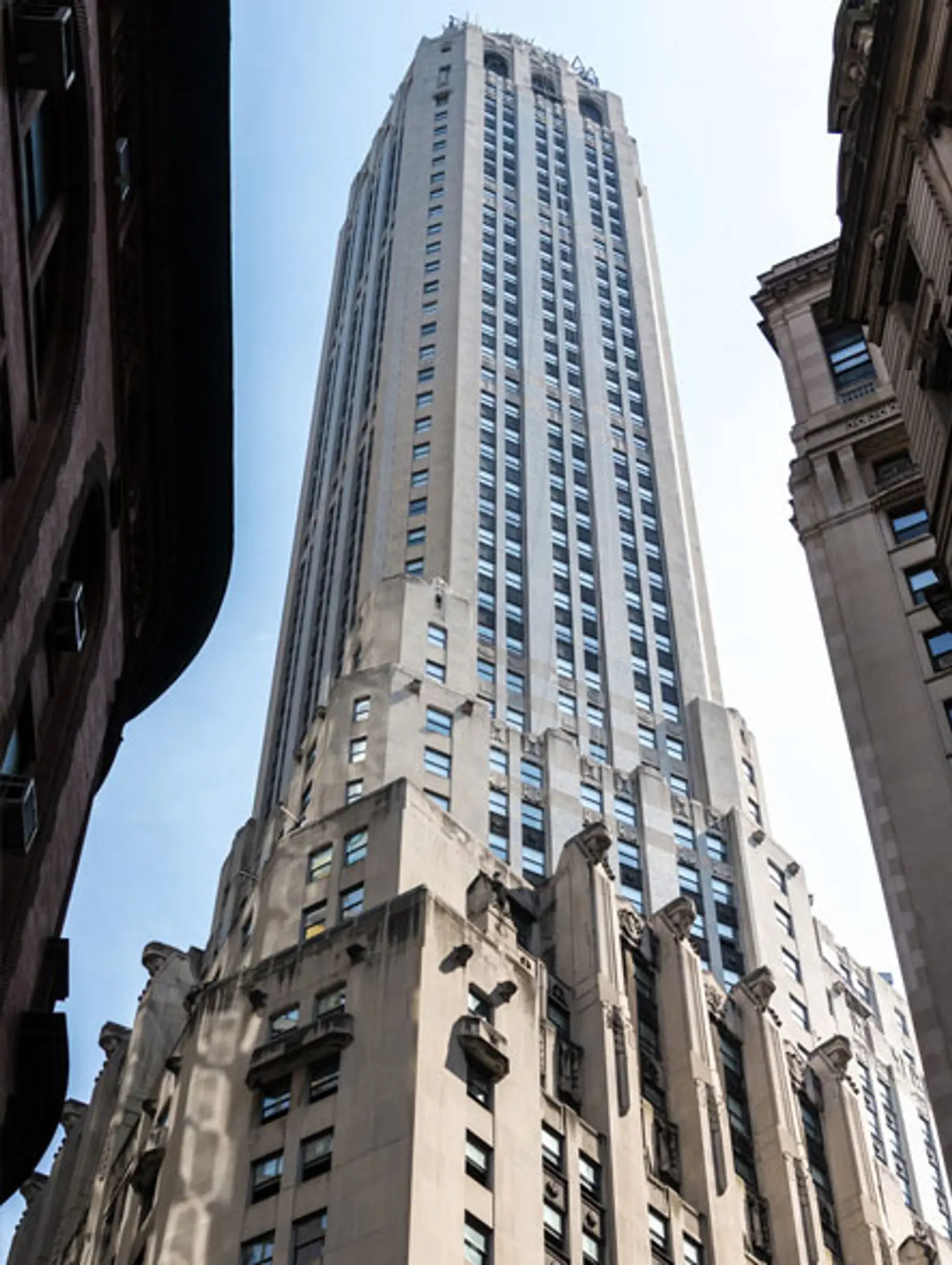
Another great downtown building is 20 Exchange Place, which was completed in 1931. It was originally designed by Cross & Cross for the predecessors of Citibank as the world’s tallest building at 846 feet high but the Depression forced it to be scaled back to 741.
The 16th through 57th floors of the building have been converted from commercial to residential space by Metro Loft Management.
The building has marvelous ornamentation including hooded characters on its major mid-level setback who are most mysterious and a good variation on gargoyles.
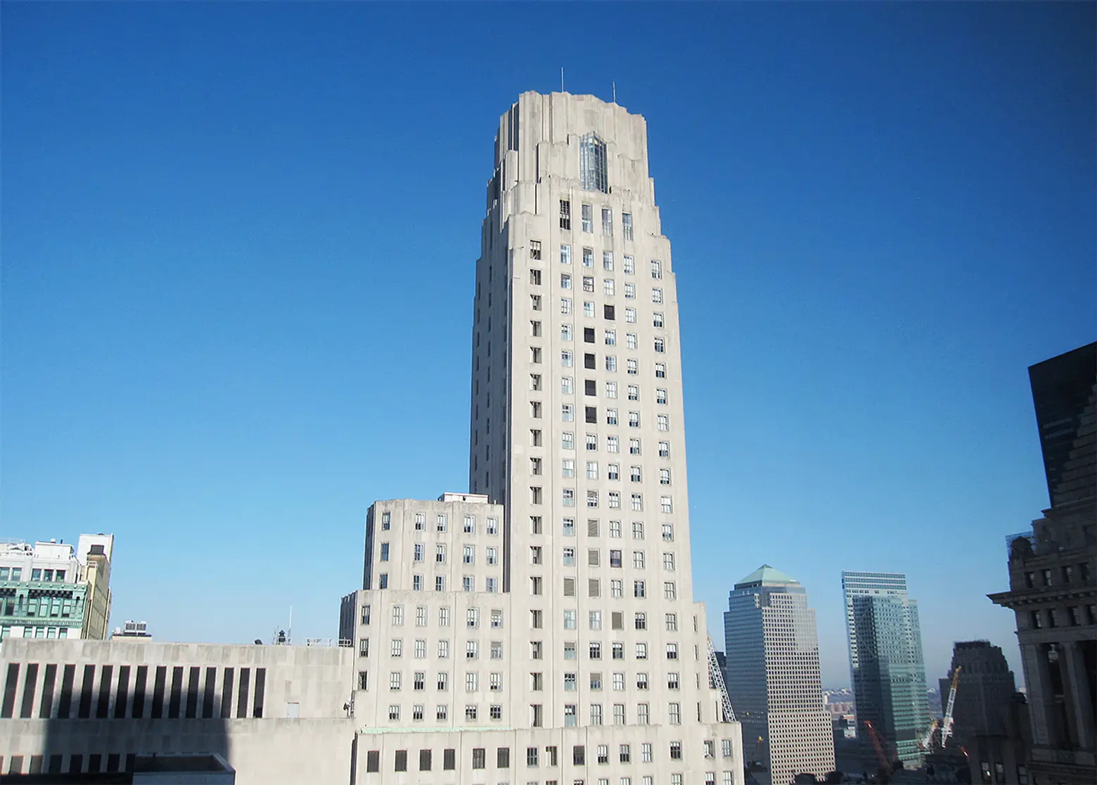
Another major downtown landmark is One Wall Street across Broadway from Trinity church on its graveyard.
One Wall Street was known as the Irving Trust Company Building until 1988 when it became the the Bank of New York Building, and since 2007 it was known as the BNY Mellon Building since 2007. In May, 2014, the Bank of New York Mellon Corporation announced that it was being bought for $585 million by a venture headed by Harry B. Macklowe that plans a residential and retail conversion for the Art-Deco-style skyscraper.
Designed by Ralph Walker, it has fluted limestone facades and is 654 feet high.
The Wall Street entrance is a two-story banking hall lined sumptuously with blood-red and gold designed by Hildreth Meiere.
Retail base to south annex building of One Wall Street on Broadway
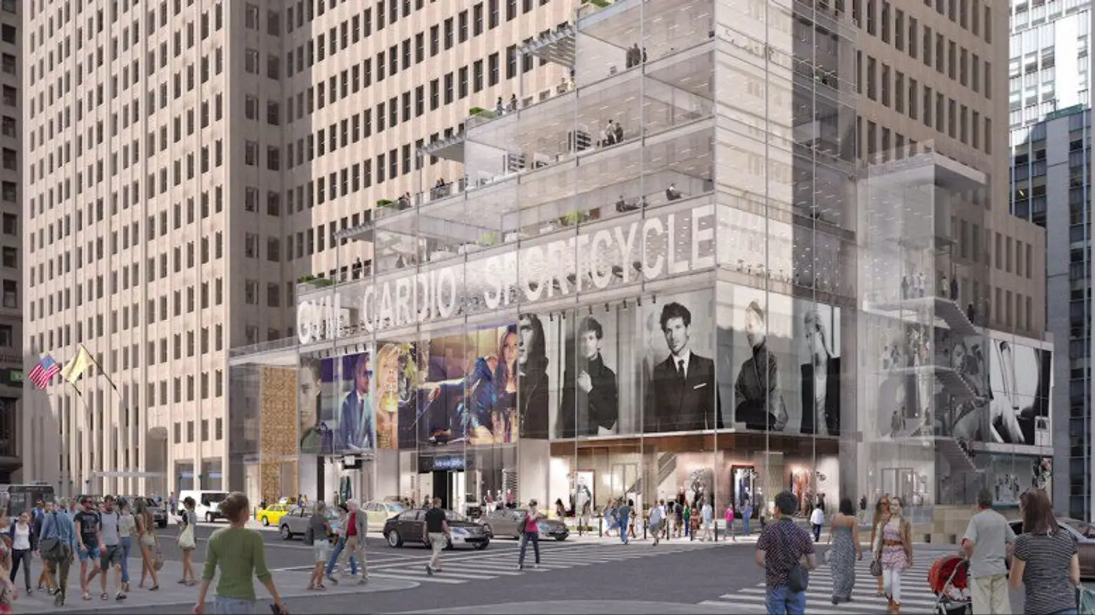
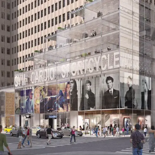
In 1963-1965, a 36-floor addition to the site was constructed to the south of the tower to provide extra office space and in 2015 a roof-top addition was designed by Robert A.M. Stern that was surprising out of context with the landmark quality of One Wall. Even more startling was the multi-tiered new glass base to the annex that was very inappropriate for the building and the location.
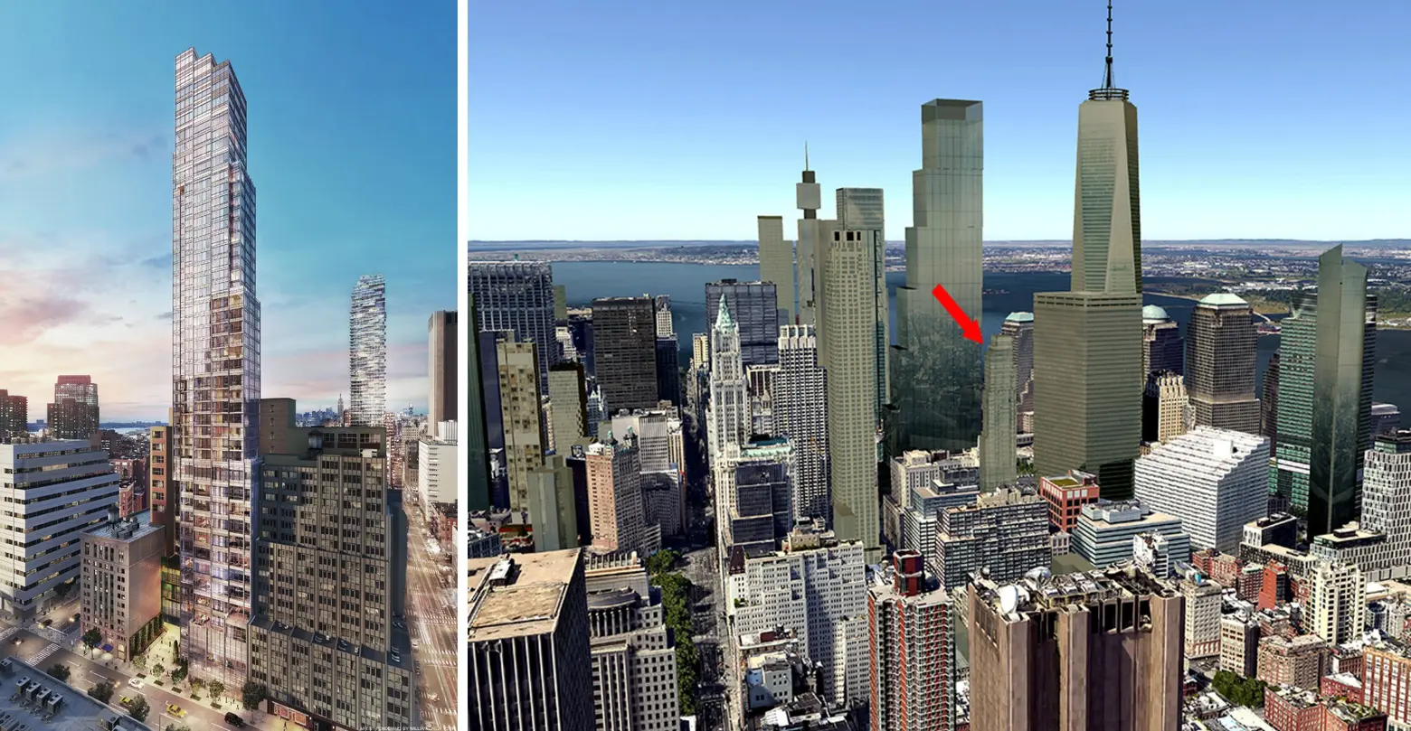
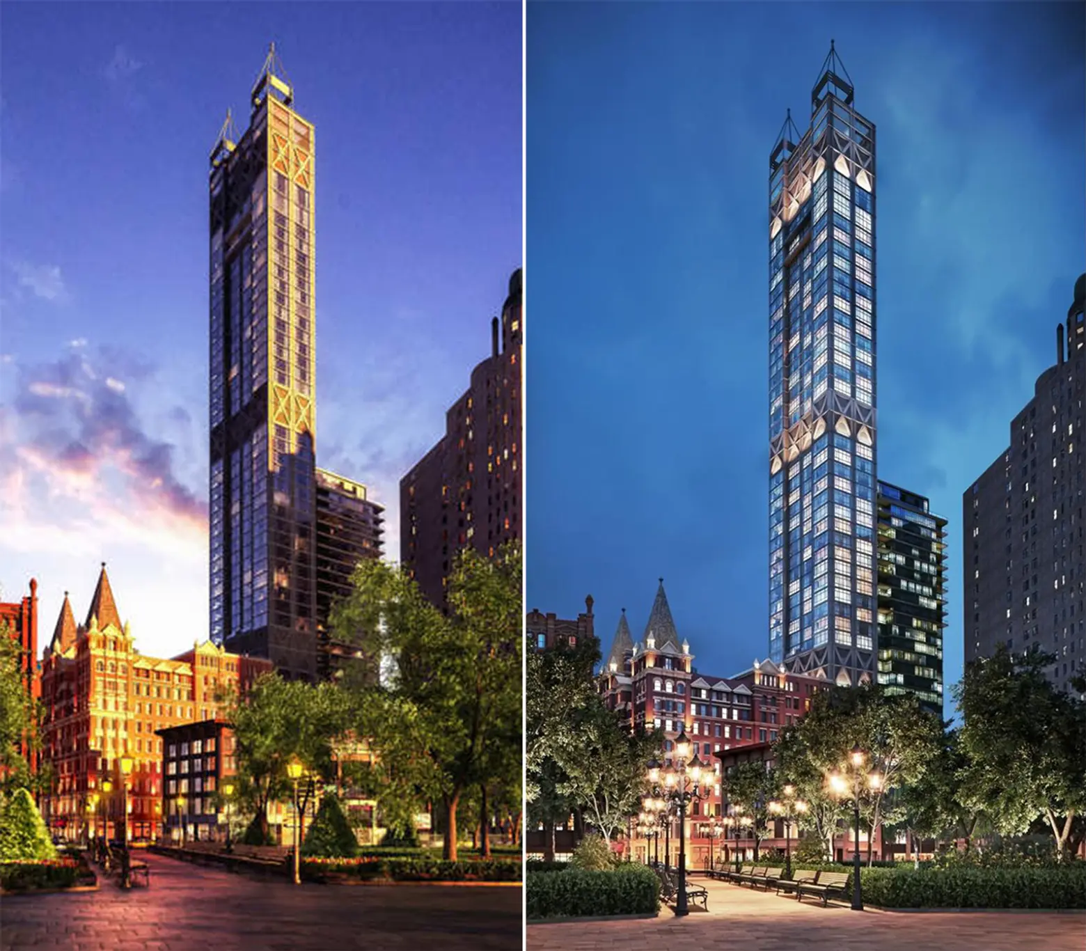
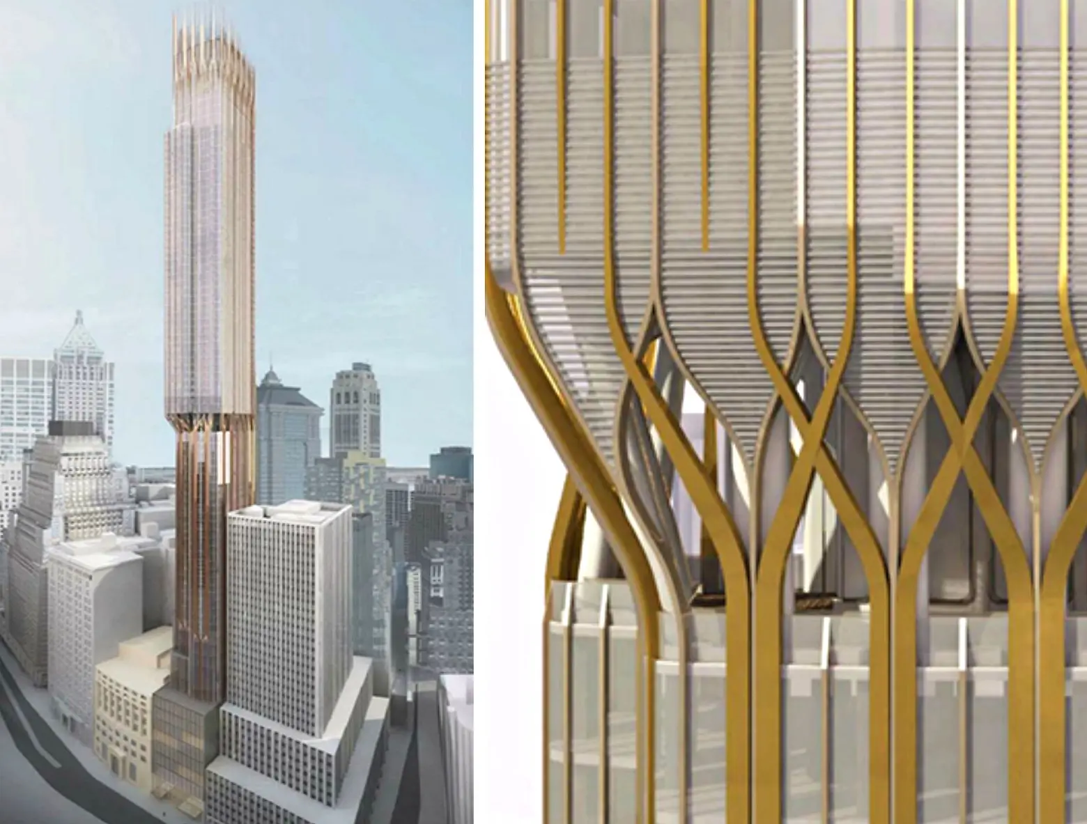
A much taller, new tower at 45 Broad Street was recently disclosed. It will reportedly rise about 1,100 feet and 86 stories with about 245 apartments. It is being developed by Robert Gladstone’s Madison Equities and the Pizzarotti Group of which Rance McFarland is a principal.
New renderings uncovered in February, indicate that its design by Cetra/Ruddy is rather ungainly but bold design for its narrow site. Above a base that holds the street’s building line, it is setback about half way up has a dramatic cantilever with curved piers that some commentators compared to Minoru Yamasaki’s curved piers at the base of his twin towers at the World Trade Center. While the World Trade Center’s piers were stainless steel, those on the proposed Broad Street tower will be gold colored.
At its top, the asymmetric tower has a more gothic design with an ornate, slightly building crown with numerous spikes or finials comprising a definite skyline statement a bit too close to the top of a small corner setback.
The base of the tower appears to have two entrance marquees but no fancy fret work like it has planned for the cantilever that would have spruced up the streetscape.
What remains unfinished is the East River frontage. Controversy still surrounds the mid-size tower planned at the South Street Seaport where SHoP has redesigned its exoskeleton building into a glossy tower with brown patterns. More important what design China Overseas Holdings comes up with for its 80 South Street site that can accommodate a major and prominent tower.
Hopefully, the Solomon R. Guggenheim Museum will find donors will to fund Gehry’s wondrous and sinuous riverfront museum on a platform in the East River that not only add much needed cultural space to the downtown scene but also the city’s most fabulous razzle-dazzle.
 Gehry’s design for the waterfront was never realized
***
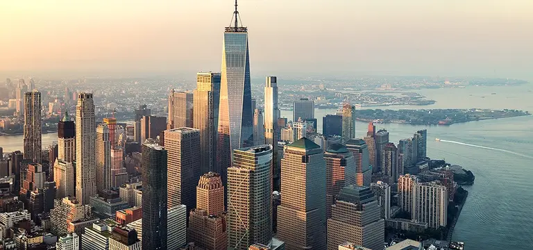
The emerging new downtown is not as “thorny” as the supertall onslaught in the 57th/Central Park South corridor, but it is, by and large, filling in a lot of gaps nicely. The new World Trade Center is not as stupendous as the old one, but newer neighbors are mitigating its abrasiveness.
Stern’s 30 Park Place is taller than the marvelous Woolworth Building, but its handsome top does not clash with it. Furthermore, it and Herzog & de Meuron’s 56 Leonard make a formidable northward push of the downtown “mountain” while softening somewhat the jolt of Gehry’s 8 Spruce Street. 56 Leonard’s “jenga” top also harkens back to the spectacular tower bulge of the great but demolished Singer Building.
Meanwhile, the glossy elegance of the smaller but still tall 111 Murray Street and 50 West Street are very polished “book-ends” on the north and south sides of the World Trade Center site and shiny accents for the red masonry mass of the residential blocks of the Battery Park City complex and more modern accents for the complex’s World Financial Center by Cesar Pelli.
+++

Carter is an architecture critic, editorial director of CityRealty.com and the publisher of The City Review. He worked for 26 years at The New York Times where he covered real estate for 14 years, and for seven years, produced the nationally syndicated weeknight radio program “Tomorrow’s Front Page of The New York Times.” For nearly a decade, Carter also wrote the entire North American Architecture and Real Estate Annual Supplement for The International Herald Tribune. Shortly after his time at the Tribune, he joined The New York Post as its architecture critic and real estate editor. He has also contributed to The New York Sun’s architecture column.
RELATED:
Interested in similar content?
Leave a reply
Your email address will not be published.








so many years will pass!
my bets and hopes for the 45 Broad St. and 111 West 57th St.
Can’t Frank Gehry design something different then what he’s been doing like these strips. Once, twice even three times but now its boring.