Go Inside the Trippy Apartments of 1970s Urban Dwellers
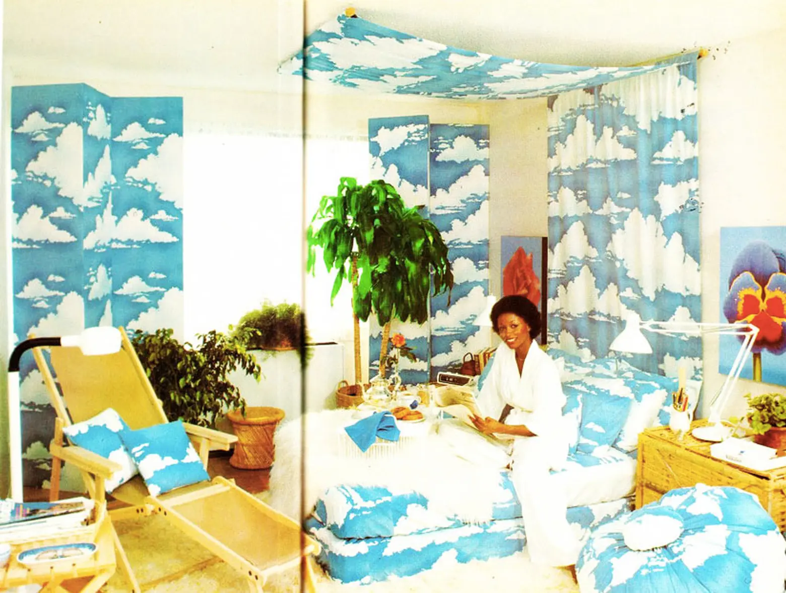
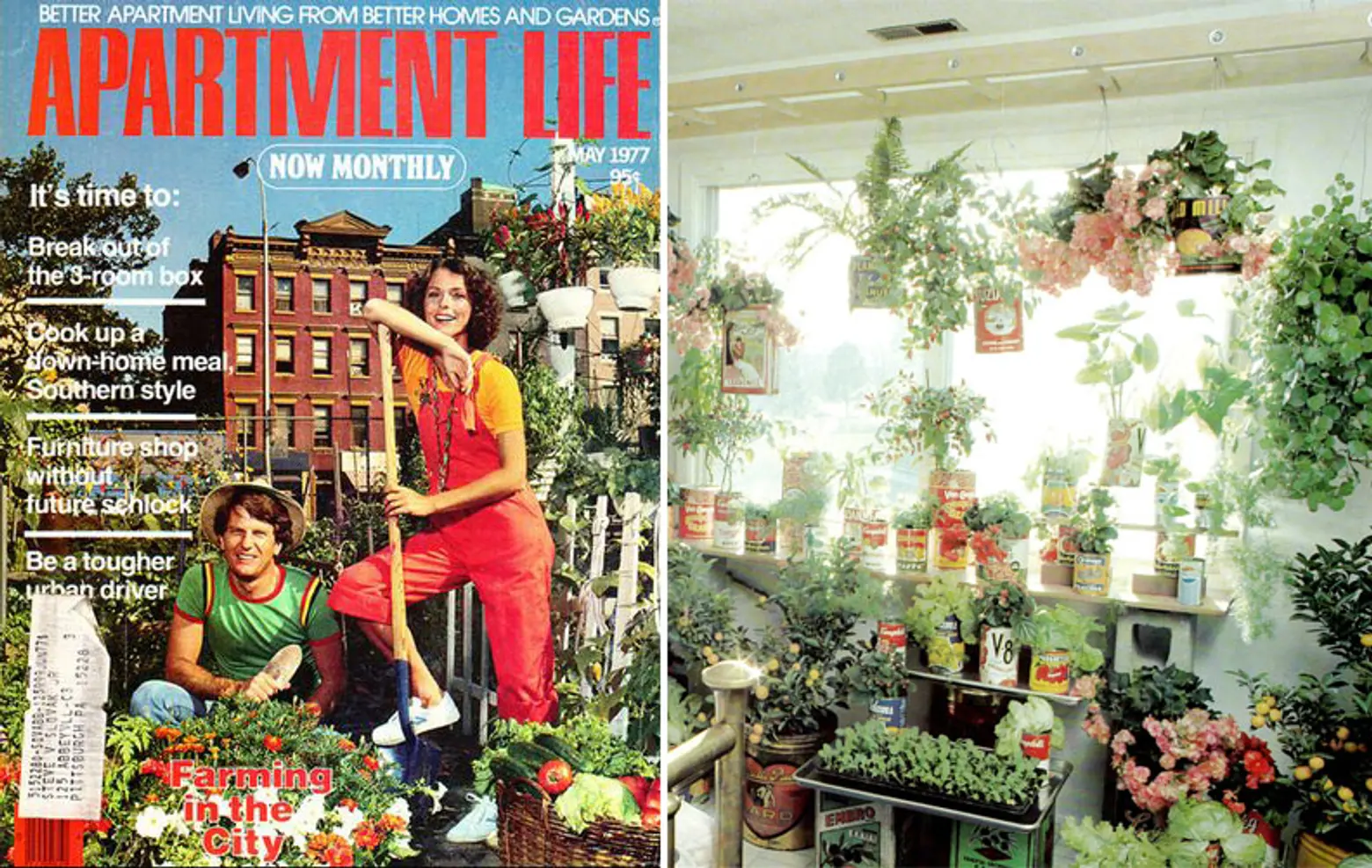
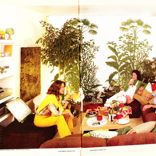
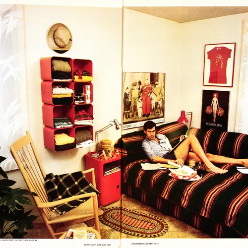
Mid-century modern is often touted as the ideal when it comes to design, but while that era gifted us beautiful and timeless works from the likes of Mies and Charles and Ray Eames, not everyone at the time was keen on keeping with this design aesthetic. As the 70s gave way to a slew of political and social change, many homes also saw revolution of their own from the streamlined to the downright psychedelic. Case in point: All of the interiors featured in old issues of Apartment Life, a city living lifestyle magazine from the 70s.
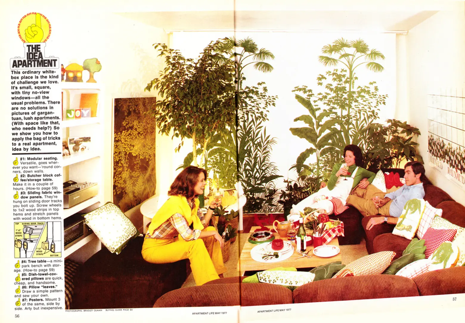
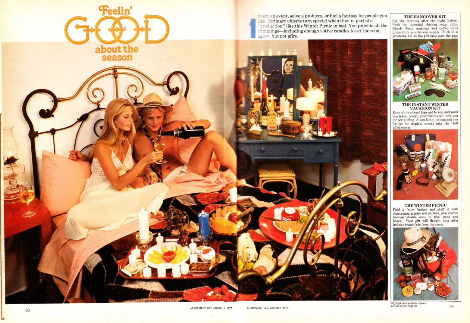
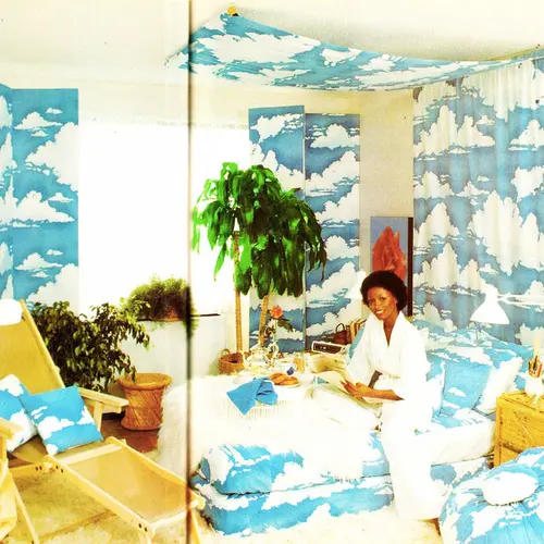
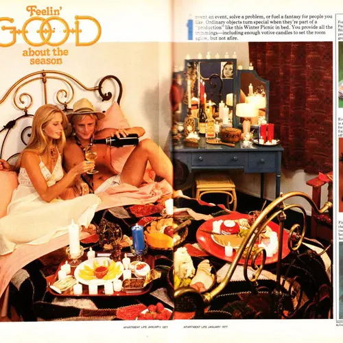
But what might be better than ogling all the decades-old acid trip decor in these old issues is reading the captions of the glossies. Like the folks featured in our My sqft series, Apartment Life talks the challenges of urban living (like no-view windows and limited storage), in addition to offering up some tips on how to deal (solution: build yourself a “butcher block storage/coffee table” they say!). They’ve even got a great idea for beating the below-zero blues: A “Winter Picnic” in bed.
Apartment Life was published from 1974 through 1981 before becoming now-defunct Metropolitan Home, and according to RetroSpace who scanned the pages you see here, “No magazine is a better time capsule of 1970s living than Apartment Life… for a few glorious years in the 70s, Apartment Life perfectly encapsulated the culture, the fashion, the look and the feel of the time.” We also love the fact that the magazine transports us back to a time where people built, knit and sewed things by hand, rather than clicking an add-to-cart button online.
Ahead are some of our favorite editorials, which we love for a variety of reasons—but mostly for their ridiculousness.
(Click on any image to see an enlarged version)
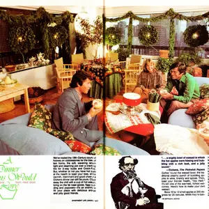
In the above, Apartment life looks at how to turn ordinary objects into something special by creating a “production.” This couple is practicing mind over matter with a “Winter Picnic” of summery foods and fashions.
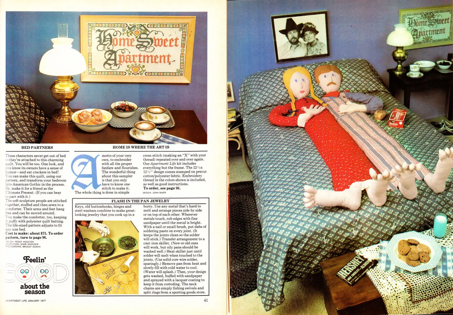
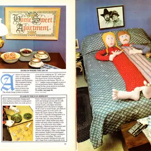
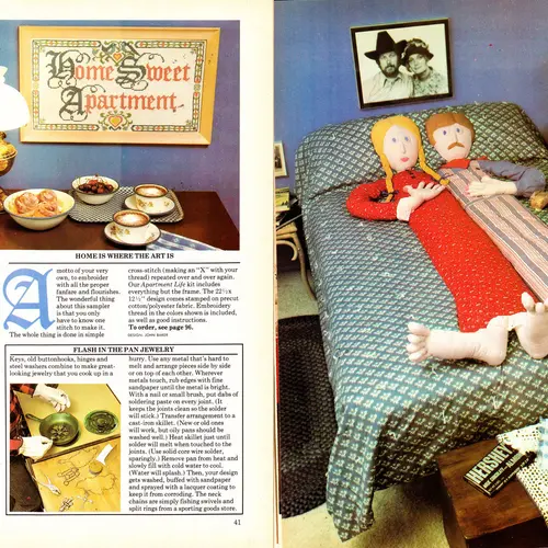
“These characters never get out of bed,” Apartment Life quips over this ultra-creepy DIY quilt cover that even has arms and feet that “hang free and can be moved around.” More hilariously, the photo styling includes a box of Zesta saltines atop the bed and a plate of cookies and giant Hershey’s almond bar at the foot.
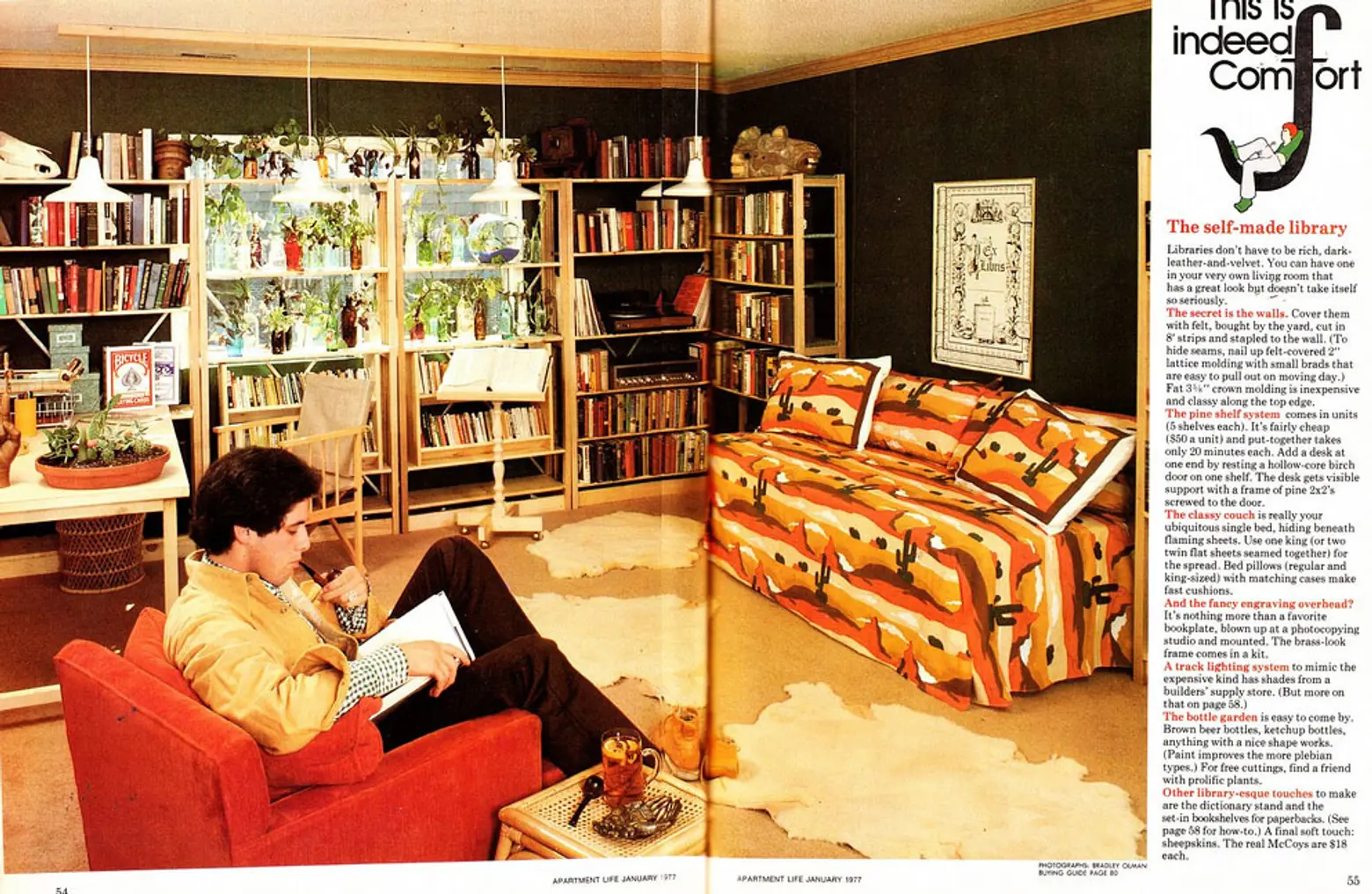
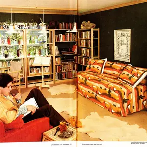
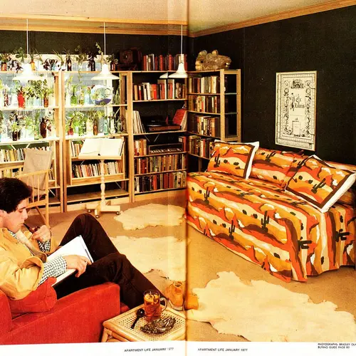
We’re not even sure where to start with this room; the article suggest stapling dark felt to walls to emulate the sophisticated “rich, dark-leather-and-velvet” look of a library, but the blazing cacti bed sheets we’d say counter the effect to class things up.
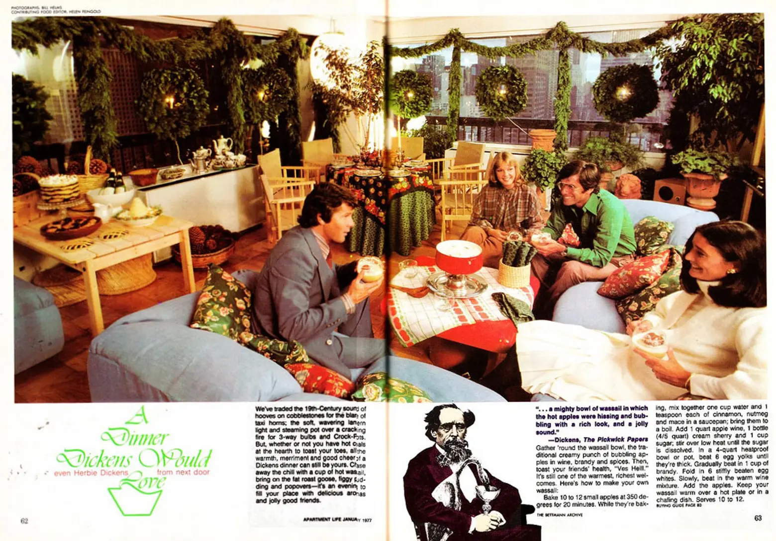
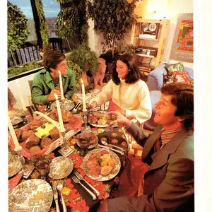
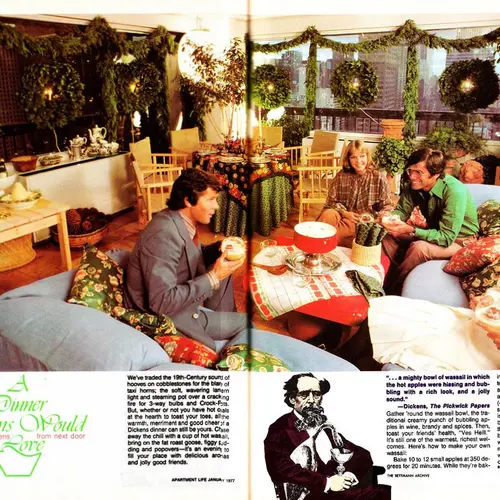
More is more, and back then you could never have too many wreaths around the holidays. Above you’ll also find a recipe for a “creamy punch of bubbling apples in wine, brandy and spices.”
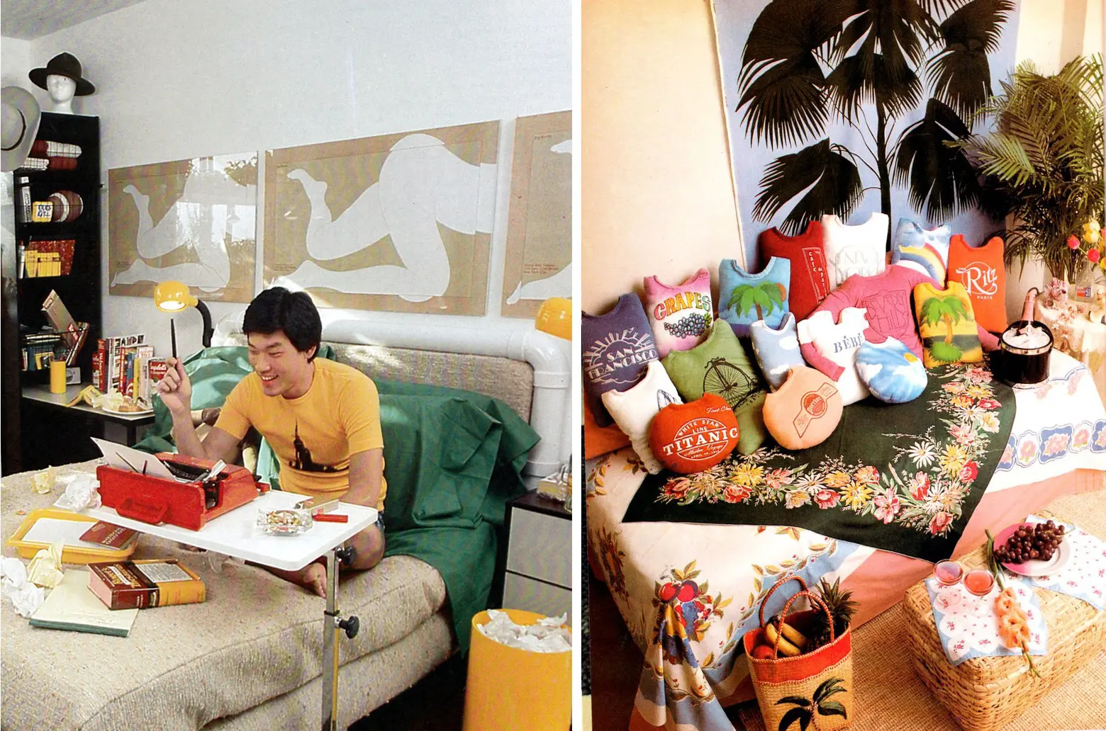
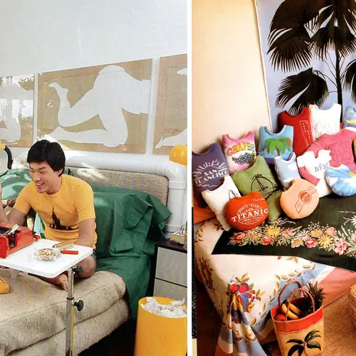
Struggling freelance writers also worked from their beds back then; while souvenir shirt pillows served as a great way to show where you’ve travelled to—not to put off doing laundry.
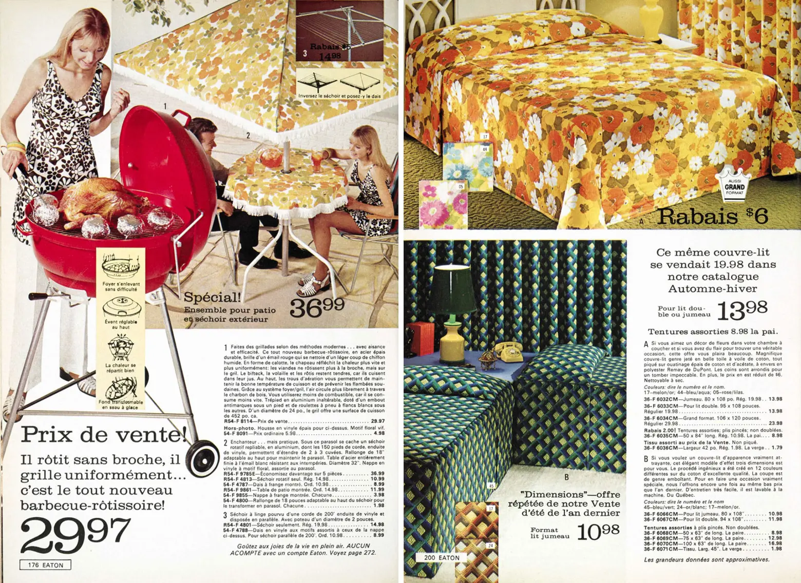
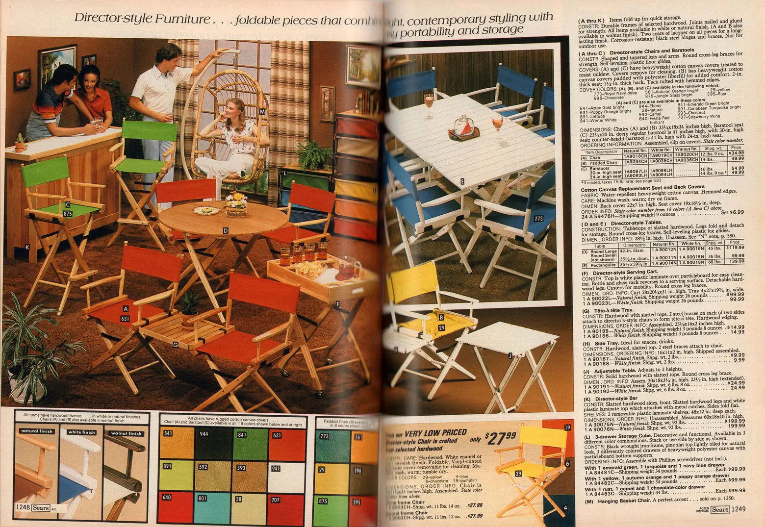
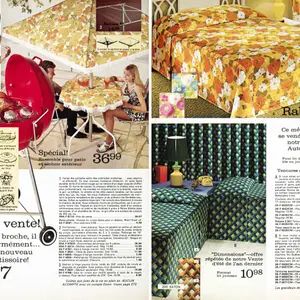
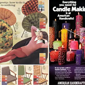
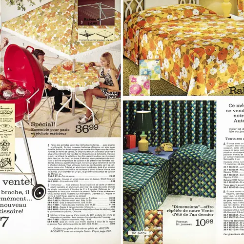
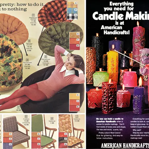
RetroSpace also scanned some ads of the day, showing that back then you could not only get your patio furniture to match with your tablecloth, but also your bed and curtains.
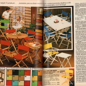
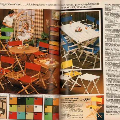
And finally, director-style furniture in your favorite colors. Need we say more?
See a few more tears in our gallery below.
All images via RetroSpace.org flickr
RELATED:
- Mad for Modern: NYC Homes That Are Cooler Than Don Draper’s Park Avenue Pad
- An Architect’s Gift from the Jet Age: The TWA Flight Center at JFK International Airport
- Modern-Spotting: The Lost Eichlers of Rockland County, NY
Interested in similar content?
Leave a reply
Your email address will not be published.



















Ok, I’m showing my age, but I LOVED this magazine which inspired me to build my own platform bed, decorate my first apartment with a bookshelf made of flue pipe and boards, replete with found objects, art books and plants, and had a regular feature that showed how to replicate high end looks on a budget. I still miss its down to earth, budget friendly advice. I suppose it’s been replaced by blogs – great for information, but I don’t think it can replace my breathless enthusiasm when a new issue appeared in my mailbox.
Way before my time, but some of it I liked! I like it better than the bleached white look we have now, gosh I hate the all white, snow blinding effect, most decorators insist on ruining interiors with. So boring, and makes me feel I am in a hospital room lol. Give me some color, and natural elements instead of the all white, and chrome look. Thank you.