New Yorker Spotlight: Michael Schneider on Telling Tales of Immigration on Ellis Island Using Technology
Modern-day storytelling ranges from the age-old tradition of oration to the modern take of 140 characters. But what happens when the story is a mix of old and new and is intended for an audience that ranges from elementary school students to centenarians? That’s where ESI Design, a firm dedicated to enriching the human experience, steps in. ESI was founded in 1977 by Edwin Schlossberg. Their unique focus on melding traditional techniques with modern technology made them the perfect fit to design the recently launched Peopling of America Center at the Ellis Island National Museum of Immigration.
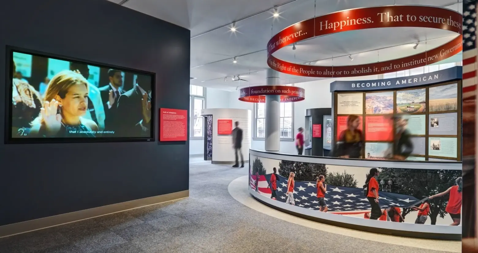
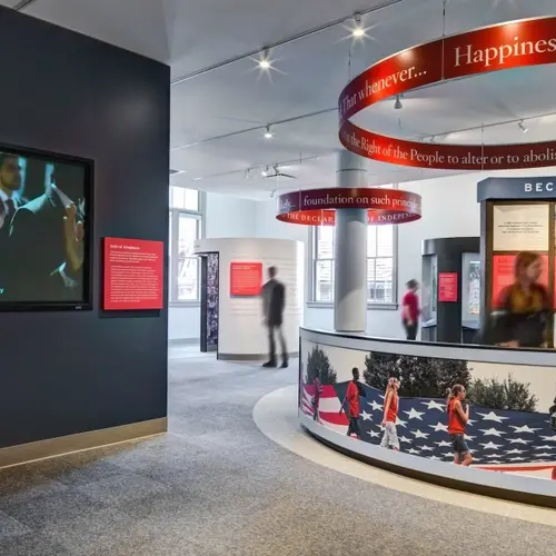
The center–conceived with the vision and support of the Statue of Liberty – Ellis Island Foundation and its president Stephen Briganti and the National Parks Service–highlights journeys undertaken before Ellis Island opened in 1892 with “Journeys: The Peopling of America – 1550s-1890,” which opened in 2011. On May 20th, another wing called “The Journey: New Eras of Immigration” opened to give visitors the chance to look at immigration that took place after Ellis Island closed in 1954.
One of the visionaries at ESI is senior designer of media and technology Michael Schneider. For the Peopling of America Center, he was responsible for figuring out which of the available technologies worked best for the new exhibits and their audience. We recently spoke with Michael to learn how ESI approaches storytelling and, specifically, how the firm designed the galleries for the Peopling of America Center.
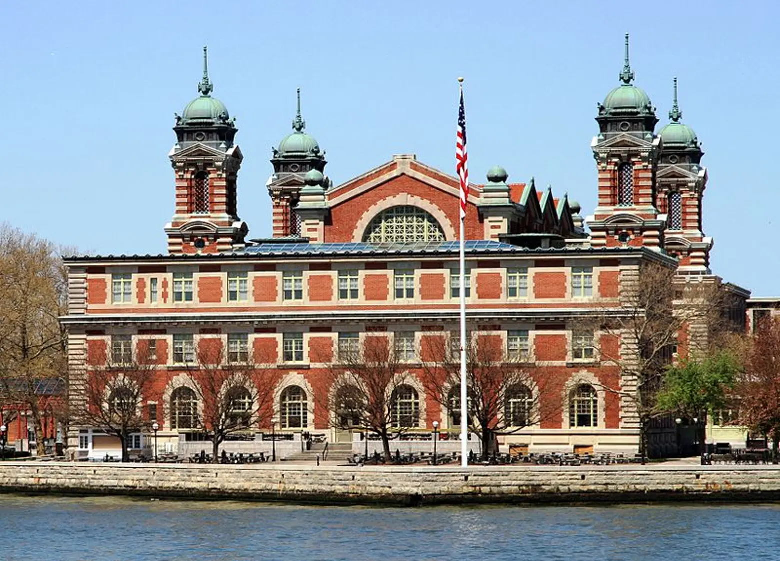
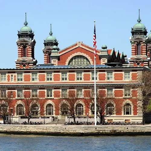
Ellis Island via Wiki Commons
ESI Design does very unique work. Can you provide an overview of firm’s design mission?
ESI Design is focused on the idea of storytelling through experiential design. So, the idea of being able to create a space within which you understand the stories and the reasons that space exists, and within that space, there’s opportunities for you to actively engage with it and to learn or partake in a larger story. We’ve done that in the institutional area working in children’s museum, history museums, science museums and Ellis Island, but then we also do that for more commercial design while working in flagship stores telling the story of that company. We also do this in the media architecture world, where we’ve been working in large commercial buildings and giving them a sense of identity by infusing them with technology and design that connects their community and the people within them to the larger environment.
What drew you to this type of work as opposed to traditional design?
I’ve always been interested in collaborative storytelling. I did a lot of installation and performance artwork earlier in my career, as well as traditional Korean folk singing and storytelling. I’ve always been tied to the idea of using space and environment to engage people in a story, so this was a way to do that on a larger scale using the technology and tools that are available to us today.
What kind of training do the designers at ESI have?
One of the unique things at ESI is that our designers come from very diverse backgrounds. We have people with backgrounds in visual design, architecture, interior design, technology design, and interaction design. We also have writers, researchers, and a really great management team that has a background in intricate projects that require a lot of different expertise. I went to graduate school at NYU in their Interactive Telecommunications Program. We have a number of designers at ESI from there. That’s a program that teaches diverse skills about how to do multifaceted problems and come up with really compelling solutions.
Why do you think ESI was chosen to design the Peopling of America Center at Ellis Island?
ESI Design is a company that has an amazing staff of storytellers, people who really dive in deep and understand what the fundamental issues are that need to be exposed, discussed, and told based on the audience that’s coming through the space we’re designing. I think that in this exhibit particularly, the Statue of Liberty – Ellis Island Foundation was looking to turn Ellis Island into a larger immigrant experience. Our team has been able to get in and understand what the stories are that we can tell and how we can engage the visitors, and I think it turned out to be an amazing match.
What went into creating this engaging immigration experience?
We had two full-time researchers and writers on staff that dove into research, visited libraries, and conducted person-to-person interviews of immigrants to start to pull out the different individual stories that could help tell this larger story of immigration. After they did that for a while, we started working with the History Advisory Committee that the Statue of Liberty – Ellis Island Foundation brought together, which was composed of 20-30 academics and historians who have been working with the Foundation for over 30 years now. And so together with them, we went through the narrative arch and started to look at specific stories that we thought would work well.
How did working in a such a storied, historic place like Ellis Island influence the design process?
I think one of our challenges, which here at ESI we face a lot, was creating this experience which has to go into a real space. In this case, the space had to be respected, so we really weren’t able to alter the original architecture of Ellis Island and had to fully understand its physicality. Just figuring out the history of that building helped us tell that story. We did things like taking light readings to see how light moves through the space throughout the day and the seasons, so we knew where we could put light sensitive experiences. We had an acoustic specialist and took audio readings. We knew how loud it was when 600 fifth graders came into the space, so we created an exhibit that would be intelligible in that experience.

Was there a general theme that drove the team’s vision?
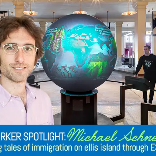
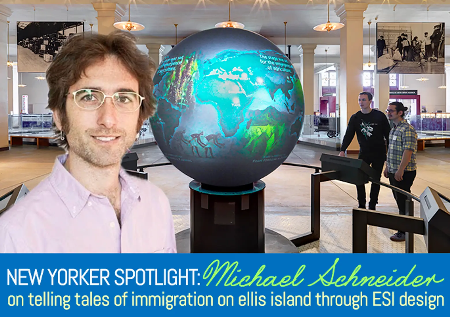
We wanted to find a common story that had a narrative structure and could be used throughout the immigration story. We used that theme of journeys. When you walk into Ellis Island, there’s this immersive projection globe that shows global migration and how people have moved, and that’s the first introduction to this topic. You’ve got the globe of the earth in 200,000 years of movement. Our hope there is to show how people have always moved to get a better life or to get away from something or towards something better. This is something that always happens.
Once they get into the specific eras of immigration, then we break the journey into five areas: Leaving, Making the Trip, Arriving, Struggle and Survival, and Building a Nation. It’s all the different people who have come here and define what the United States is. It has the underpinning narrative of the pre-Ellis Island era, as well as the post-Ellis Island era.
How did the firm employ current technology in these exhibits to make immigration more accessible?
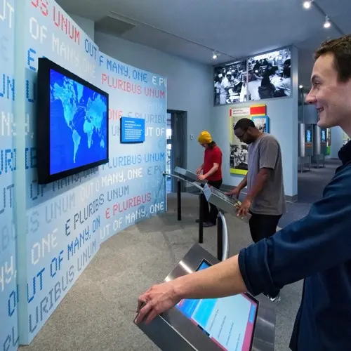
We use technology very differently in each part of the exhibit. In Global Migration, the World Migration Globe, a diameter project globe is a cornered, centerpiece for this overall experience. It’s double-height so you can view the full visual experience, and we were able to create these incredible animations across it.
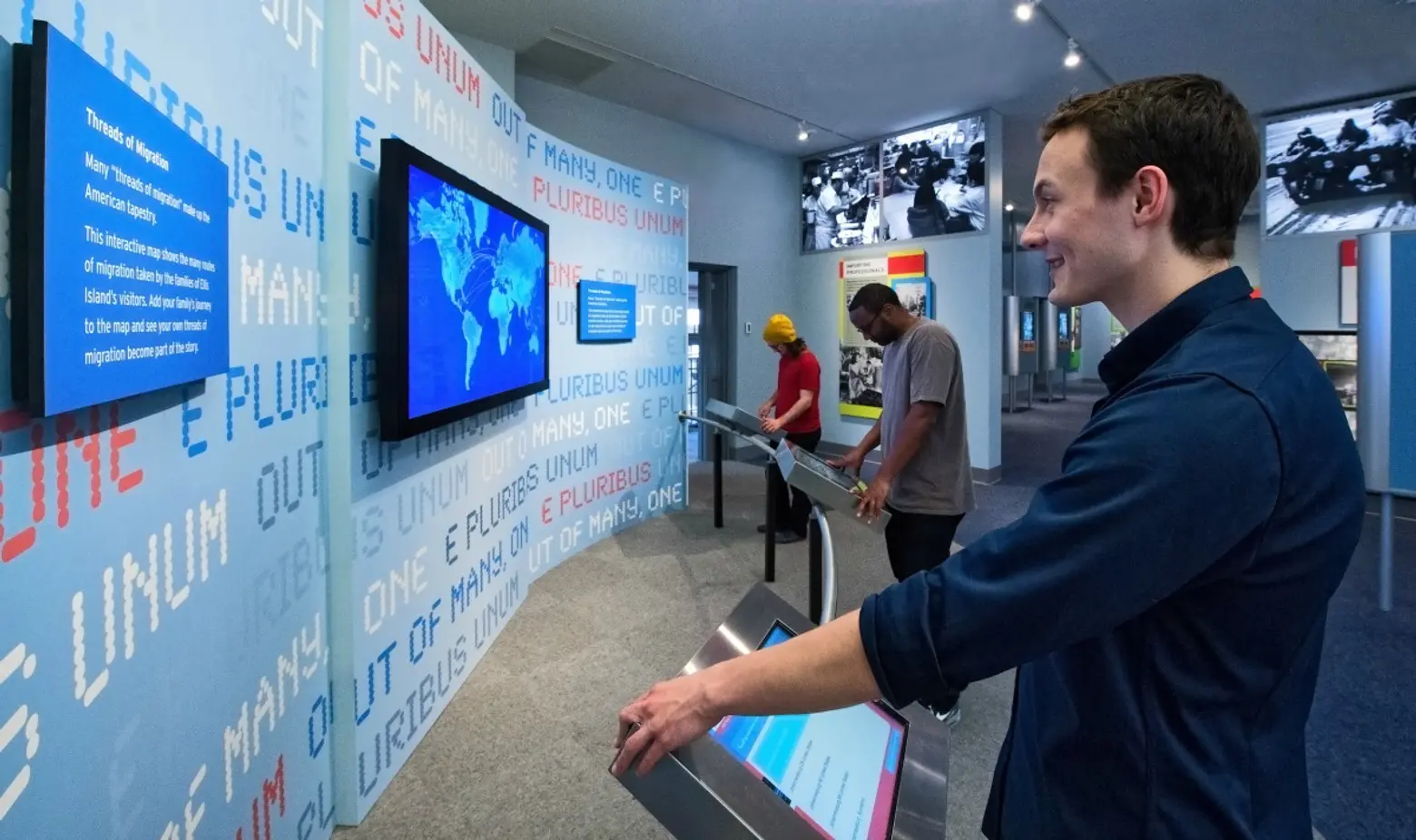
Once you get into the two exhibits, we use technology to create two different experiences. One is immersive and ambient in nature. In the pre-Ellis Island era, this is a time when the only thing that remains are words. We have journals, diaries, manuscripts, and letters. We had actors read these texts, and we’ve created these little stories with them where one or two people can put their head into a window and listen to the stories. These story windows tell the individual’s experience through their real words at each stages of their journey. The manuscript is available so they can read it as well.
Within each of these stages, there’s also an audio threshold. So when you walk into “Making the Trip,” there’s an atmosphere of sound that’s created–the sound of boats leaving, of the dock, of songs that were sung on the journey across. You’re immersed in this environment of actually making the trip. When you go through the gates of survival, you hear people arguing about whether or not the Irish can stay. You’re immersed in the turmoil of the immigrant trying to find their place in the United States. There is this overarching ambient environment by audio.
When we get to the post-Ellis Island days, it’s an era of television, video, film, and so our approach of creating an ambient environment and then telling these individual stories was done using images and video. When you walk into the Arrival gallery, you’ve got a big video that feels like the arrival monitor at an airport, and it’s showing montages of real TV clips of immigrants arriving, whether they’re coming from an airport or a boat or, in extreme cases, through borders. That montage is on top of a track that was specially composed; it sets the pace of that stage of the journey.
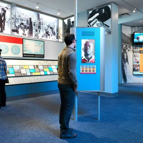
Within the exhibits, there are individual stories told on interactive story kiosks where you can walk up to a high definition monitor, and an immigrant comes on and tells you about their experience on that part of the journey. It’s set up so you’re standing there in front of them, and they are almost life size, as though they are talking intimately to you. There’s 24 different stories that are told, and we gathered them working with the History Channel.
With the galleries, did the team design with the range of individuals who would be visiting and their various needs in mind?
One of the things we do here at ESI is think about how a story is successful to a broader range of people. There’s stories at all different levels–physical levels, as well as how deep into the story we are going. There’s a timeline in each of the different stages, and there’s actually little areas that are built specifically for younger children, which are much lower to the ground and tell stories about what children brought with them when they emigrated. Did they bring a doll, a specific toy? There’s ways for very young children to access this story, the same for middle school and high school students.
We also worked hard to make this exhibit accessible for people of different abilities. One thing to call out is that all the exhibits have inductive technology built in so people with hearing disabilities are able to have all of the audio broadcast directly into their hearing device, or they can take a device from the island to get the information broadcast directly to them like a miniature radio. Everything is open captioned. For people with visual impairment, there’s an audio description of the entire exhibit. I think that’s a really important part for an exhibit like this where you’re going to get 2-3 million visitors a year, acknowledging that this is a story that can be accessible to everyone.
When you walk through the completed Peopling of America Center, how do you feel?
I was actually talking to a co-worker, saying how I still can’t walk through and listen to these stories and not get emotional. The stories are so amazing, and yet they are the stories of the people who make up this country–the stories of my ancestors and your ancestors. It makes me incredibly proud to be part of creating this experience that allows people to get better connected with the experiences that people have gone through to get better lives for themselves.
***
ESI Design
111 5th Avenue, 12th Floor
New York, NY 10003
[This interview has been edited]
Exhibit photos via Andy Ryan; Photos of Michael Schneider via ESI Design
RELATED:
- New Yorker Spotlight: Behind the Magic of Macy’s Thanksgiving Day Parade with Creative Director Wesley Whatley
- New Yorker Spotlight: Mark Stumer of Mojo Stumer Takes Us Inside His Architectural World
- New Yorker Spotlight: Curator Sarah Forbes on the Museum of Sex (It’s Not Exactly What You Think It Is)
