1920s Popular Science Illustration Stacks the Future American City Like a Layered Cake
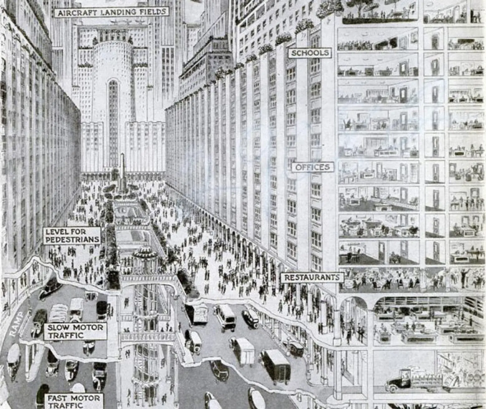
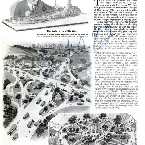
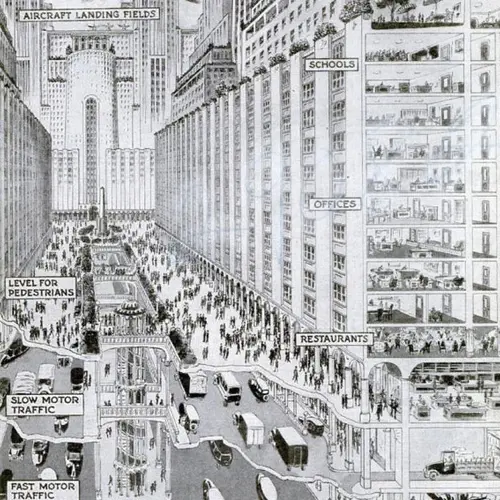
As the automobile became more widely available in the 1920s, the idea of living in the suburbs became far more appealing to Americans. Residents of large cities sought to escape increasingly crowded streets (thanks to industrialization), and with newly paved roads and auto ownership, taking on a commute was well worth the space and comfort that was paid out in return. While many urbanists and architects in the ’20s predicted that suburban migrations would give way to sprawl (and it eventually did), other urban “futurists” balked at the idea of decentralization, and believed instead that Americans would be living and thriving in high-density vertical cities. Architect Harvey W. Corbett’s “May Live to See, May Solve Congestion Problems” is one such proposal that sees everything from homes, offices, schools, green space and even aircraft landing fields stacked on top of each other for the ultimate metropolis.
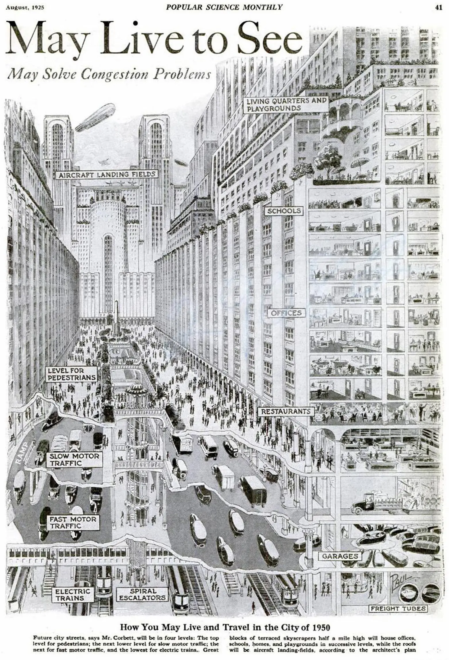
The image created for the magazine piece depicts the American city of 1950. In the Popular Science article attached to the illustration it’s written:
- “Future city streets, says Mr. Corbett, will be in four levels: The top level for pedestrians; the next lower level for slow motor traffic; the next for fast motor traffic; and the lowest for electric trains. Great blocks of terraced skyscrapers half a mile high will house offices, schools, homes, and playgrounds in successive levels, while the roofs will be aircraft landing-fields, according to the architect’s plan.
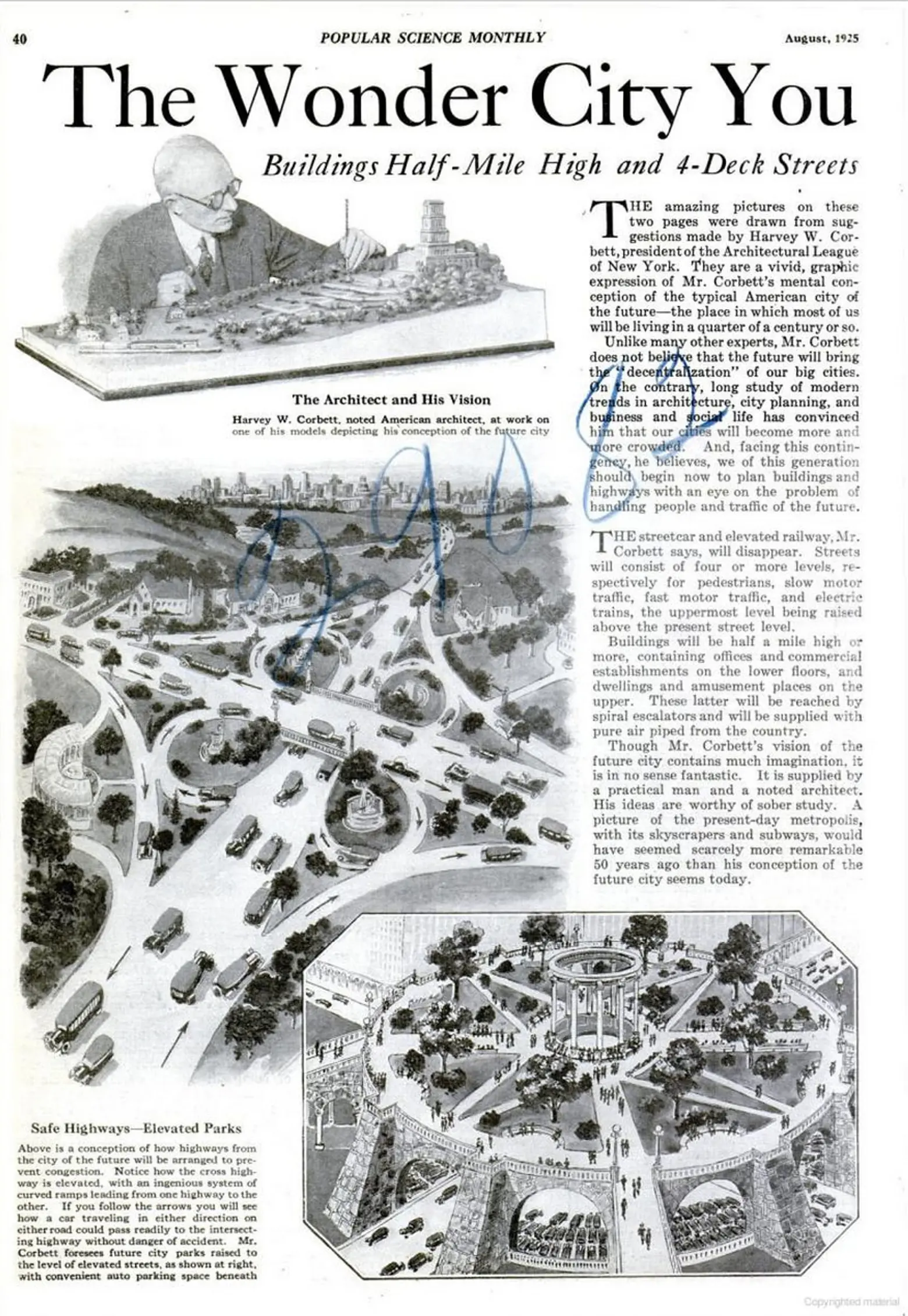
- “Unlike many other experts, Mr. Corbett does not believe that the future will bring the ‘decentralization’ of our big cities. On the contrary, long study of modern trends in architecture, city planning, and business and social life has convinced him that our cities will become more crowded. And, facing this contingency, he believes we of this generation should begin now to plan buildings and highways with an eye on the problem of handling people and traffic of the future.”
Though pieces of the drawing are pretty out there, certain elements did come to fruition. As The Urbanist‘s Stephen Fesler points out: “On the ground, restaurants and retail would prevail as the active, engaging uses that city dwellers would be accustomed to. Upper floors, meanwhile, would also contain the necessities for living, professional services, education and child-rearing, and leisure. Strikingly, Corbett believed that people would put rooftops and terraces to use as gardens and parks. Just imagine!”
There is also of course the prediction of half-a-mile high towers, which are very much a reality today, and overcrowding. Some of the more appealing bits include giving the streets back to pedestrians while assigning underground roads to both motor traffic and subways.
[Via The Urbanist]
RELATED:
Get Inspired by NYC.
Leave a reply
Your email address will not be published.










This vision actually was realized in small scale by Olmstead when he designed Central Park during the 1860s. He created separate roadways for coach and pedestrian traffic and the separated roads are still in use today.