EXCLUSIVE PHOTOS: Take a Tour Inside the Brand New Whitney Museum!
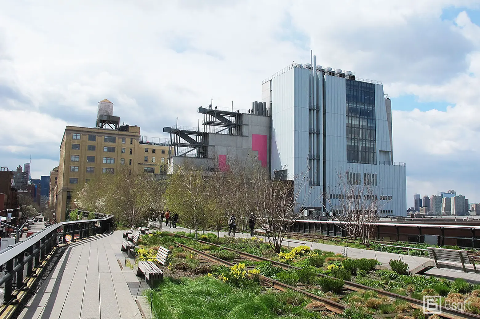
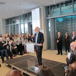
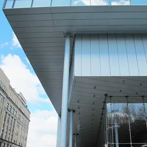
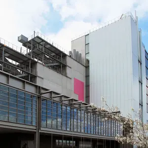
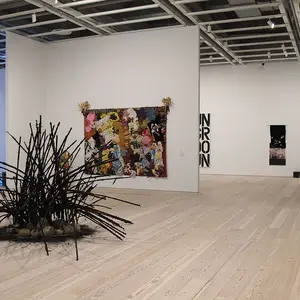
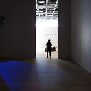
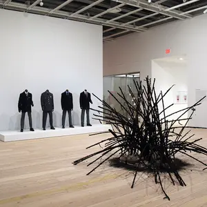
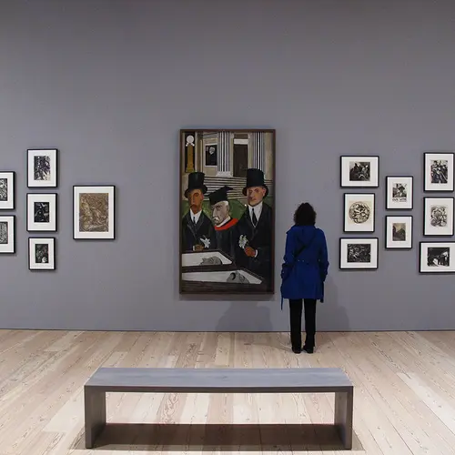
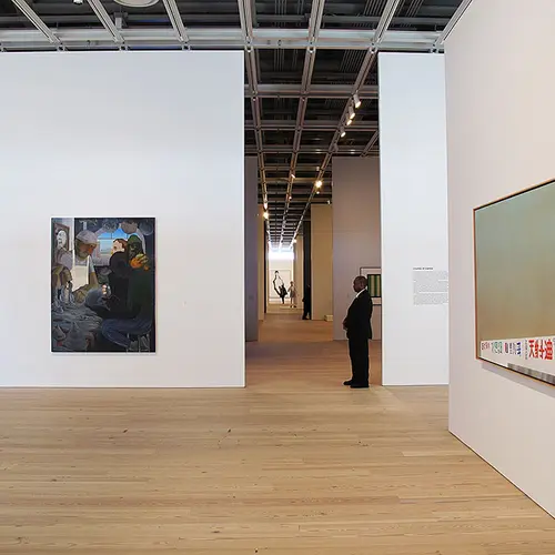
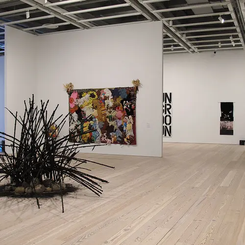
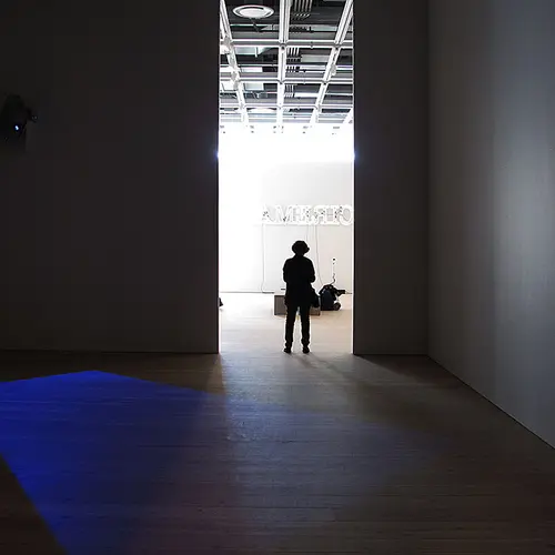
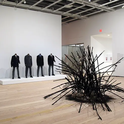
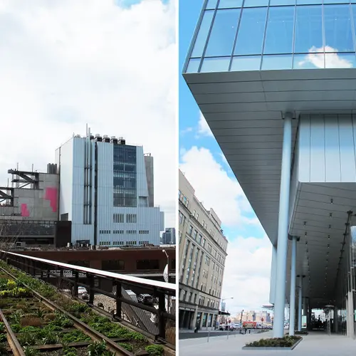
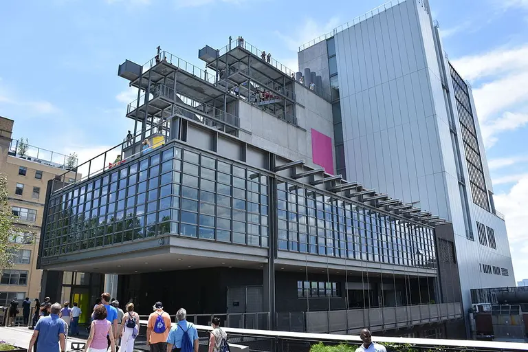
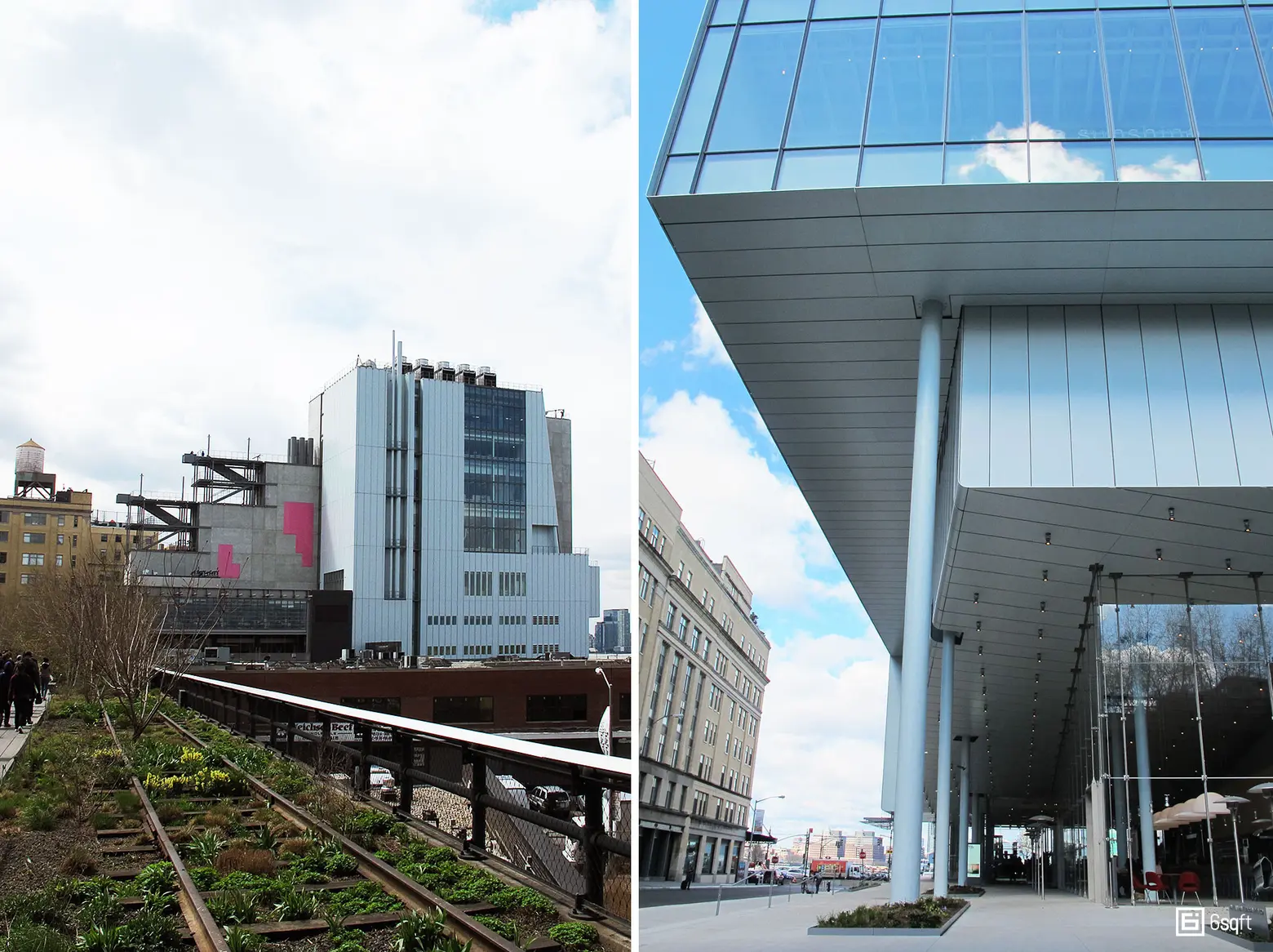
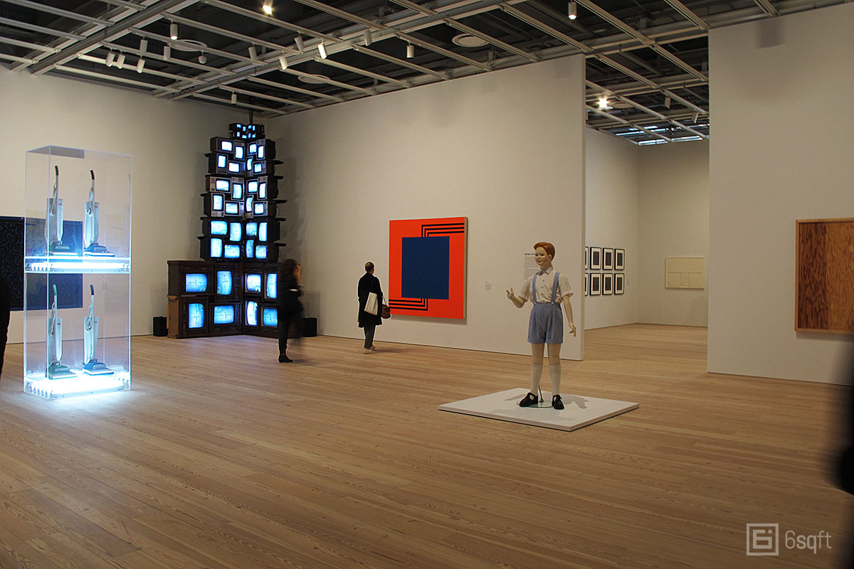
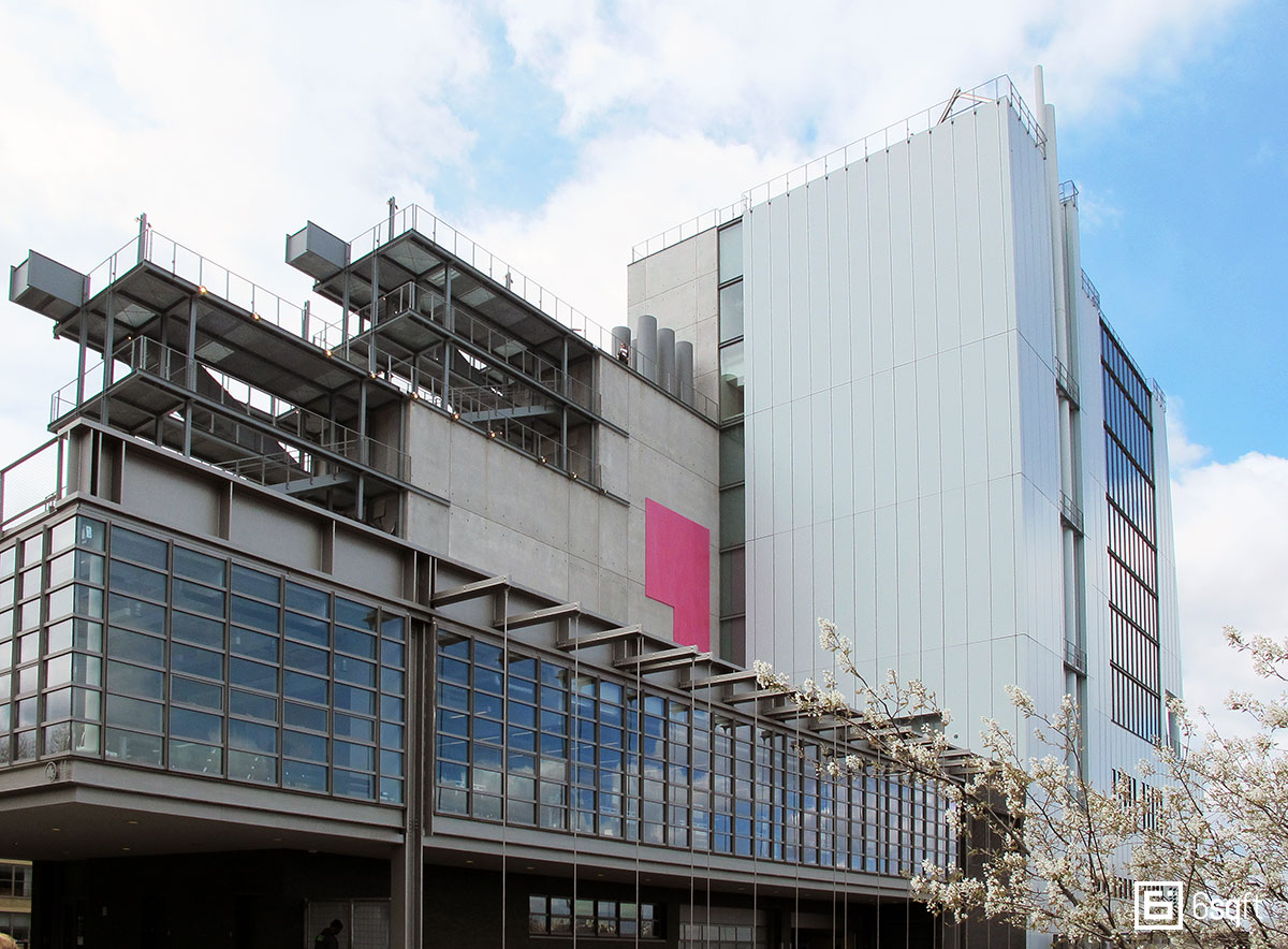
May 1st will mark a new era for the Whitney when its brand new home along the High Line swings its doors open to the public for the first time. A project that has been decades in the making, the $422 million structure designed by Renzo Piano is a game changer for a museum that had long outgrown its Upper East Side space. Boasting a whopping 220,000 square feet of column-free spaces, this glass and steel behemoth is a dynamic assemblage of shapes and angles, and perfectly outfitted to host the Whitney Museum’s 22,000 works and then some. Though the museum won’t officially open for another few days, this morning 6sqft joined a trove of celebrants at the pre-opening preview of the new High Line-hugging masterpiece. Take an exclusive photo tour with us inside ahead.
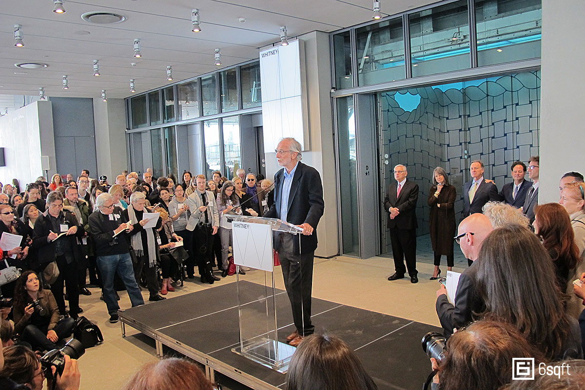
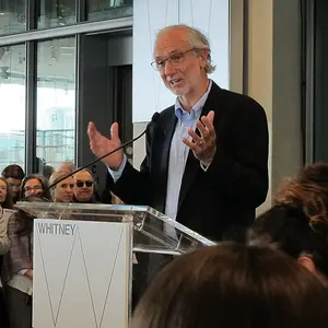
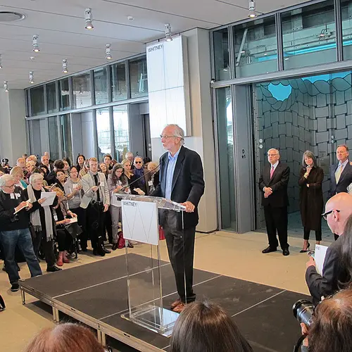
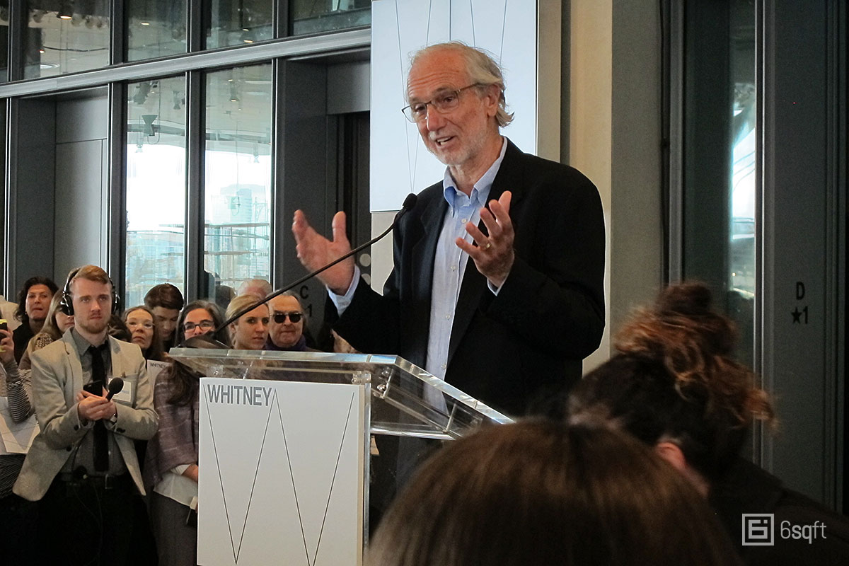 Architect Renzo Piano addressing the crowd
Unlike many of his contemporaries, Piano’s projects have always steered clear of following a signature style or “starchitect branding” to make his work identifiable, instead, the architect has always put site context and function above all; you can see this in his design of the California Science Center, the New York Times building, and even with the Jean-Marie Tjibaou Cultural Centre in far flung New Caledonia. The new Whitney is no exception.
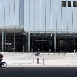
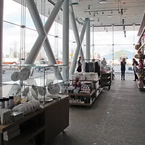
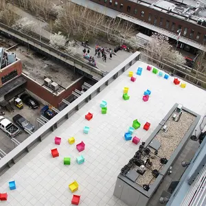
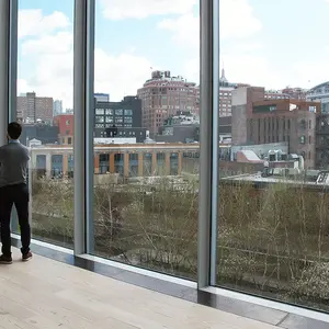
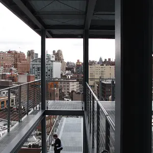
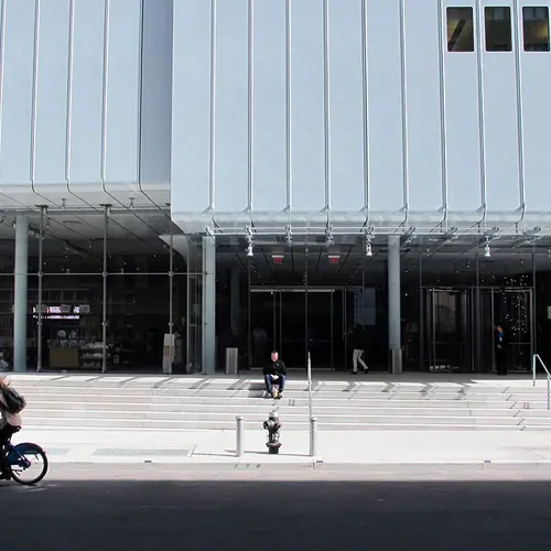
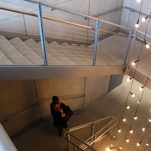
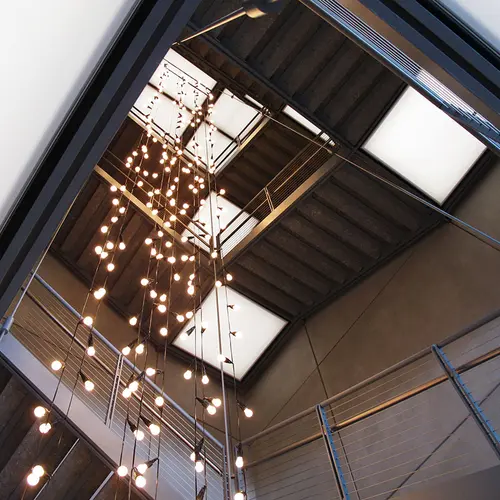
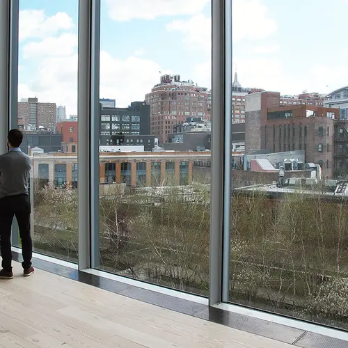
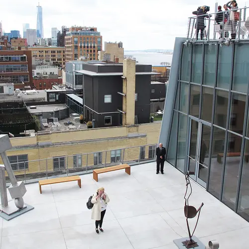
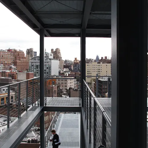
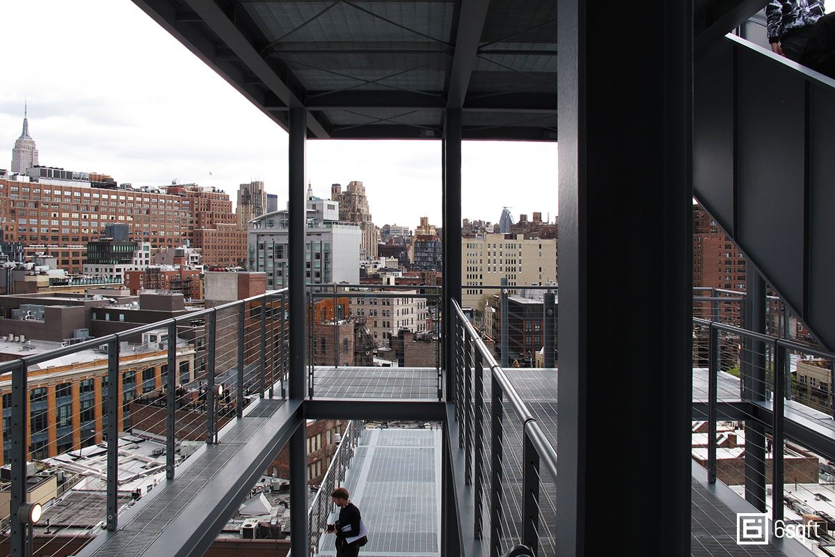
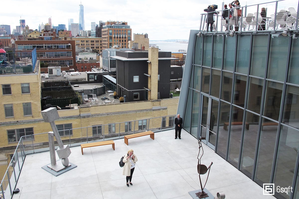
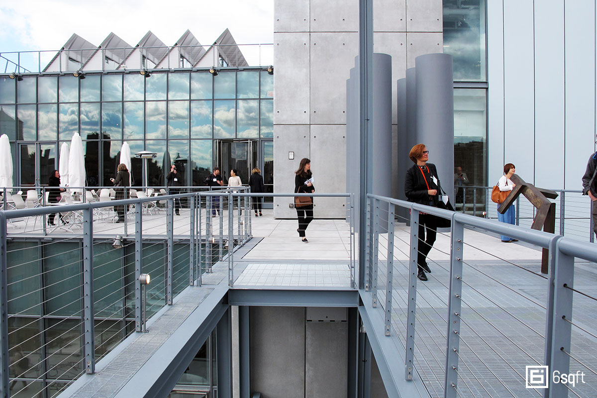
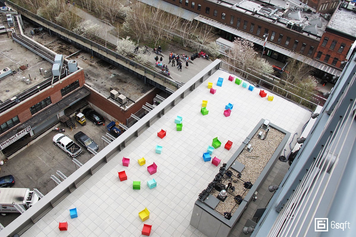
The building features generous and flexible exhibition spaces, floor-to-ceiling windows and outdoor staircases that connect to open-air terraces on three floors—and it does not stand alone. All of the elements of the structure were designed to connect the museum to the city, referencing its views and its history. The architect was also very adamant about creating an inviting piazza for the city—much like he did with Richard Rogers with the Pompidou Center in Paris—which can be seen in the museum’s expansive steps and gracious entrance. “There should be no barrier between the city and the building,” Piano said this morning.
Though the building has received more than its fair share of criticism for its seemingly muted and stringent design, New York Times architecture critic Michael Kimmelman’s review offers a lot of food for thought:
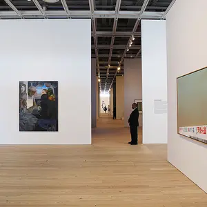
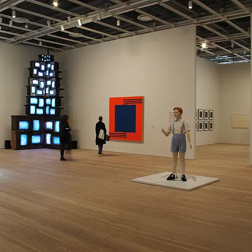
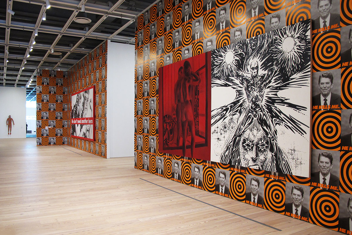
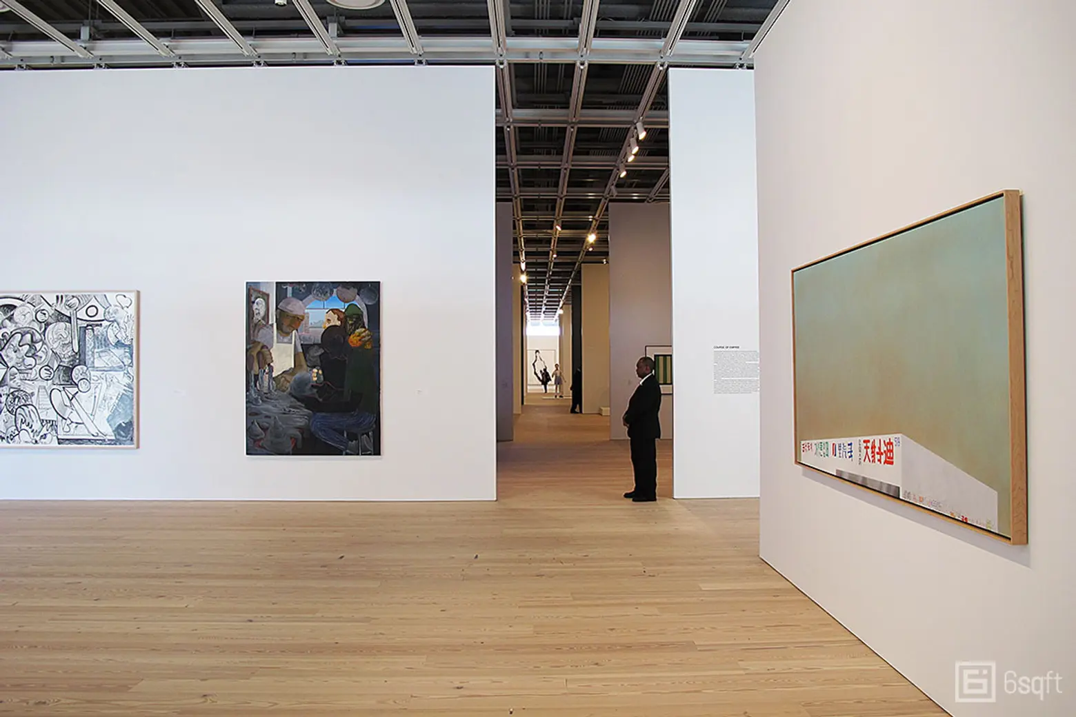
Yes, it is a mishmash. But buildings take time to reveal their true selves. Mr. Piano’s galleries borrow from the old downtown loft aesthetic, with windows on both ends. They’re nonprescriptive spaces with artfully gridded ceilings for hanging movable walls in myriad configurations. They give the museum more elbow room and may prove to be the ticket: nimble and airy…
The new museum isn’t a masterpiece.
But it is a deft, serious achievement, a signal contribution to downtown and the city’s changing cultural landscape. Unlike so much big-name architecture, it’s not some weirdly shaped trophy building into which all the practical stuff of a working museum must be fitted.”
+++
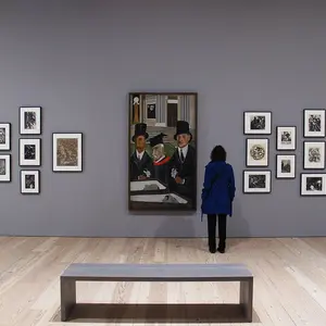
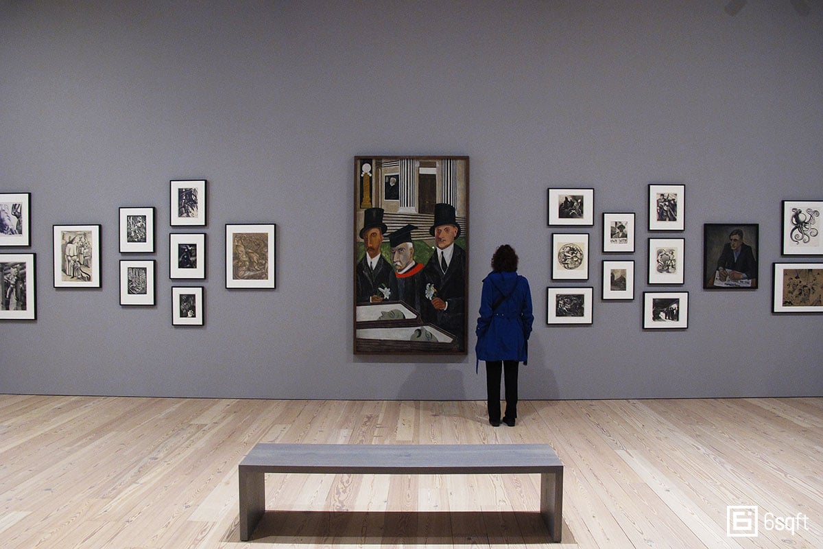
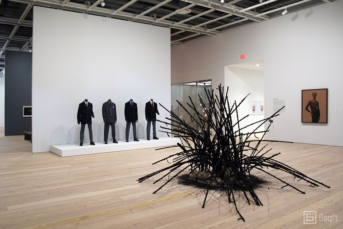
The inaugural exhibition of the Whitney will feature 650 works by 400 artists spread throughout the museum. The museum opens to the public on May 1st, and there will be a block party celebrating the new space on May 2nd, which includes free admission for all!
More photos here:
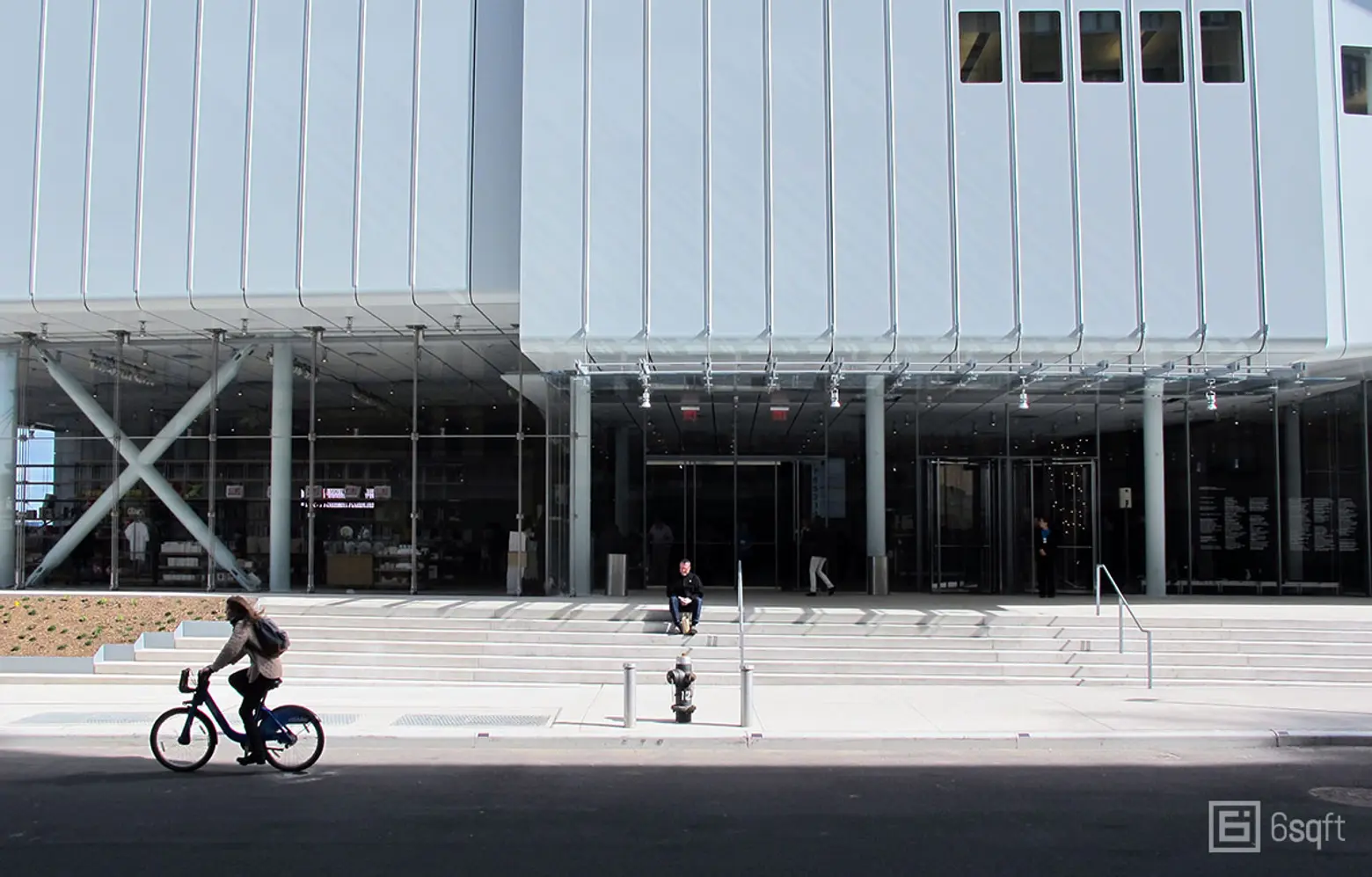
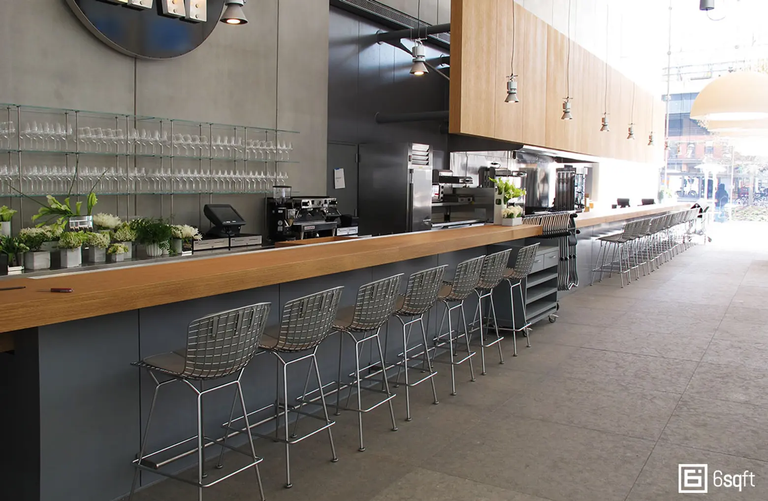
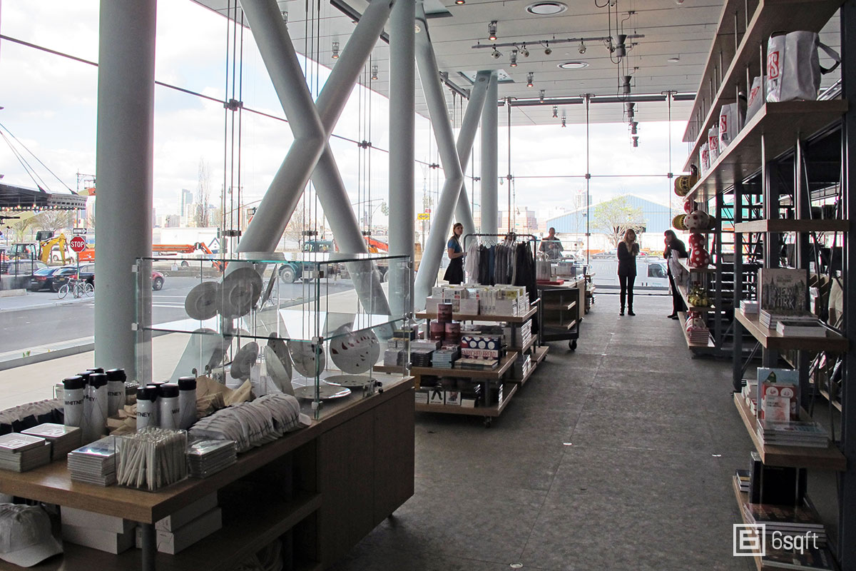
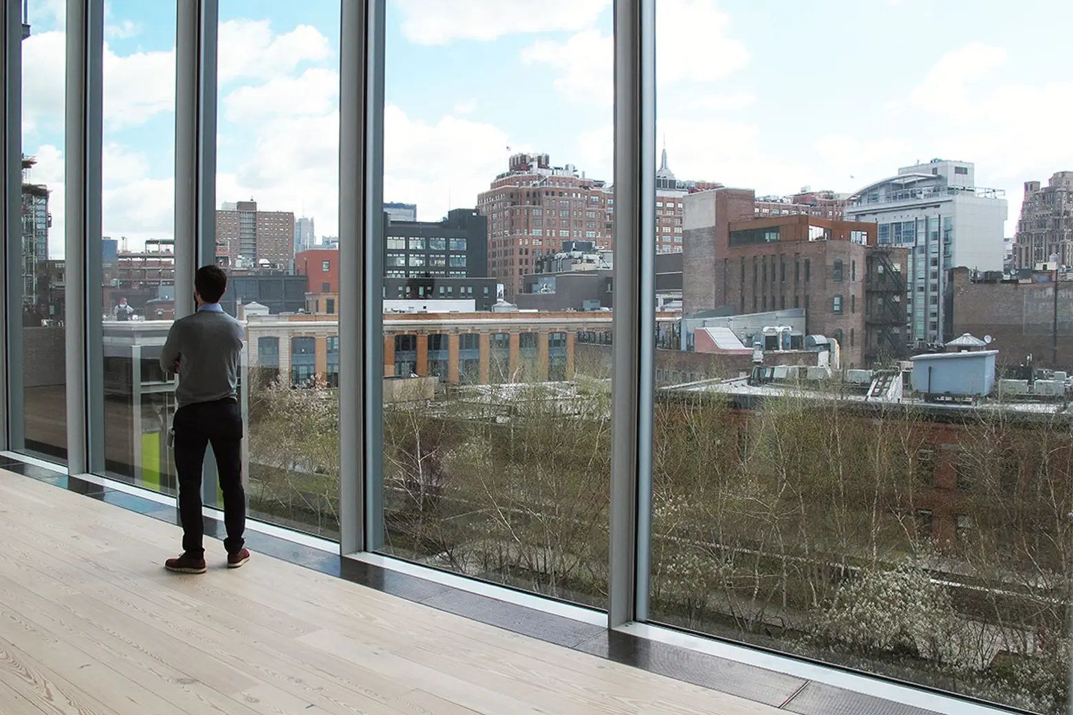
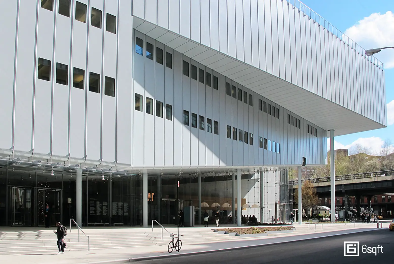
Whitney Museum of American Art
99 Gansevoort Street
New York, NY 10014
RELATED: Looking Back at the Gansevoort Pumping Station, the Building the New Whitney Museum Replaced
All images by 6sqft
