Los Angeles Has Designed the Perfect Parking Sign–Can NYC Take Note?
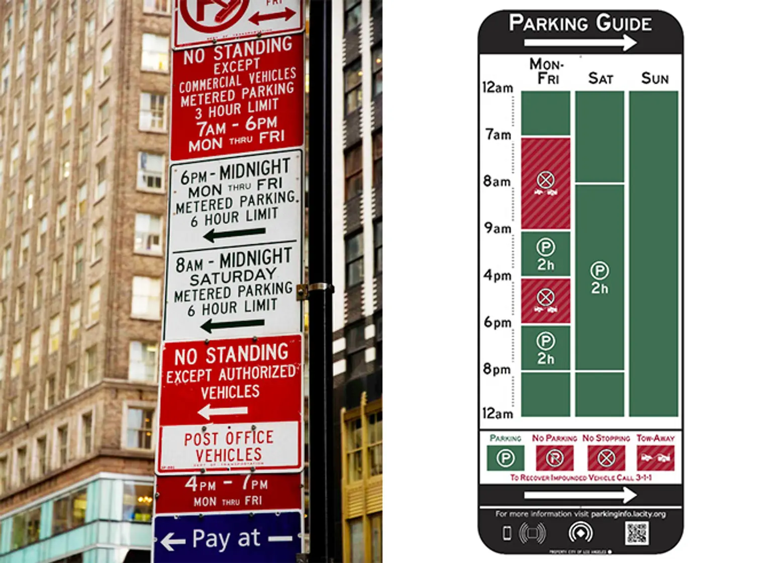
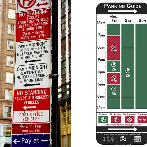
Images courtesy of Parkwhiz (L) and LA Mayor’s Office (R)
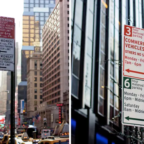
If you own a car in New York, you know that parking can be a downright nightmare. Finding a spot is like hunting for a needle in a haystack, and when you do find one, it’s hard not to approach it with trepidation: Why is this spot empty? New York City parking signs typically run the gamut of perplexing to misleading at best, requiring a Rosetta Stone and a prayer to keep a parking ticket from happening. But there’s a beacon of hope shooting through all of that confusion in the form of well-designed signage.
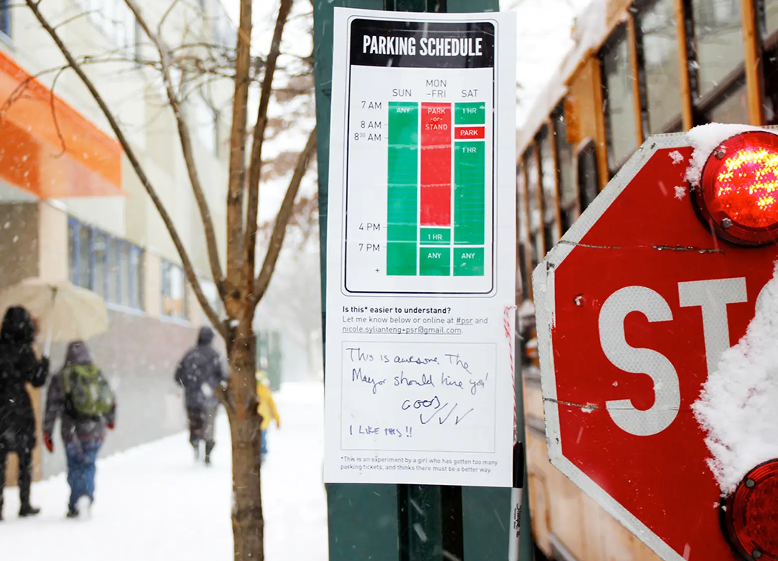 Image courtesy of Nikki Sylianteng
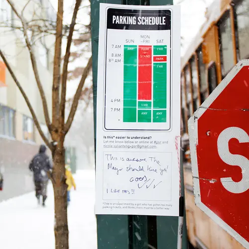
Unfortunately for us, that ray of light originates in Los Angeles. On Friday, the City of LA unveiled their new “easy-to-read” parking signs which follow a simple grid system and color-blocking to communicate whether or not a driver can plant their car in an open spot. The brilliant sign is the creation of designer Nikki Sylianteng, whose work caught the eye of LADOT director Seleta Reynolds last year when she went about plastering them around Brooklyn and Manhattan. Yes, you read that right, this genius idea has graced the streets of New York—so in addition to pangs of envy, it also comes with a missed opportunity.
In fact, Wired even profiled Sylianteng:
Sylianteng has been going around Manhattan and Brooklyn hanging up rogue revamped parking signs. “A friend of mine called it functional graffiti,” she says. She’ll stick a laminated version right below the city-approved version and ask drivers to leave comments. In that way, Sylianteng’s design is still a distance from being a reality, but so far, she’s gotten pretty good feedback. “One person wrote: ‘This is awesome. The mayor should hire you.’”
Sadly, no officials took note.
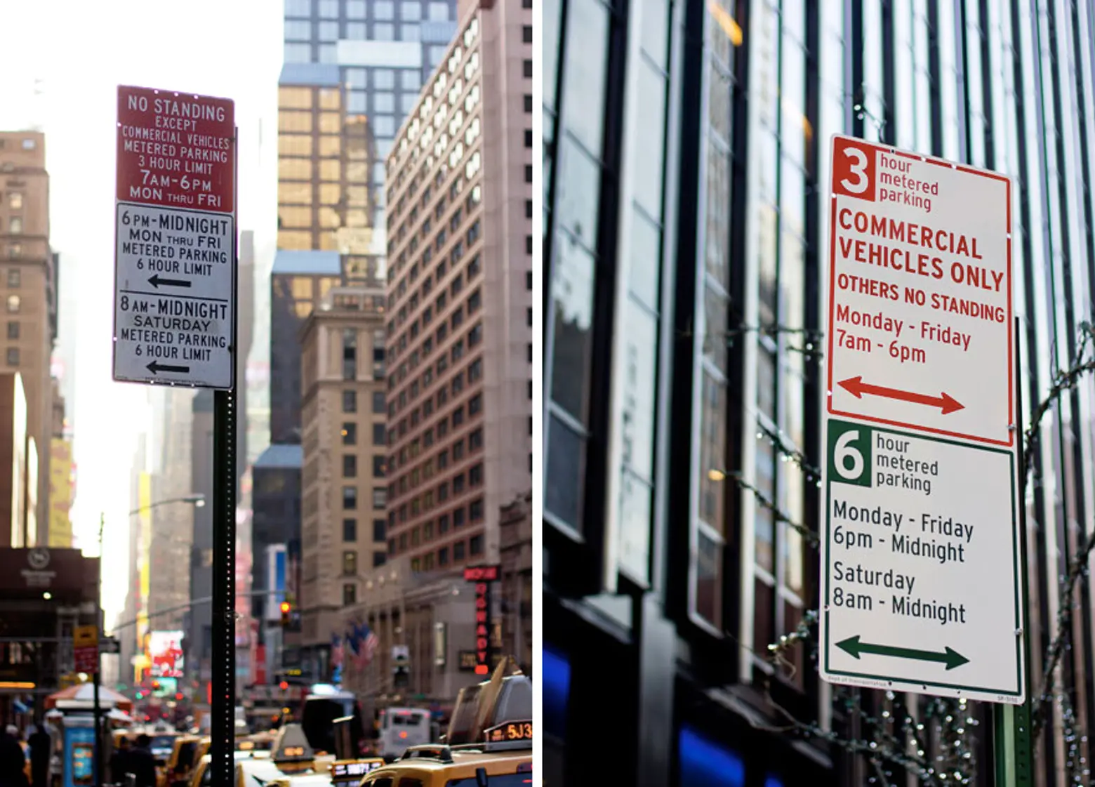 Images courtesy of Pentagram
But to be fair, the NYC DOT has tried to improve the situation. In 2013, they hired Pentagram to redesign the signs, but the design firm chose to focus in on the minutiae such as font size, alignment and capitalization, rather than rethinking it completely. Although there was a marked improvement, it’s definitely not as clear as Sylianteng’s which gets rid of most the text and opts for a visual explanation that answers whether or not you can park and for how long.
The signs also come equipped with a bit of tech, able to transmit data via Bluetooth to smart devices and connected vehicles. Individuals will be able to keep updated on nearby happenings and more basically find out for sure whether they’re parked somewhere illegally.
Sylianteng invites other cities to adapt her design, which is free for use as the Manual on Uniform Traffic Control Devices prohibits patents on parking signs. Here’s hoping it catches on in our city.
RELATED: The Price of Parking: There’s More Than One $1 Million Parking Space in Manhattan
