Musical Data Project is the Soundtrack to Income Inequality Along the Subway
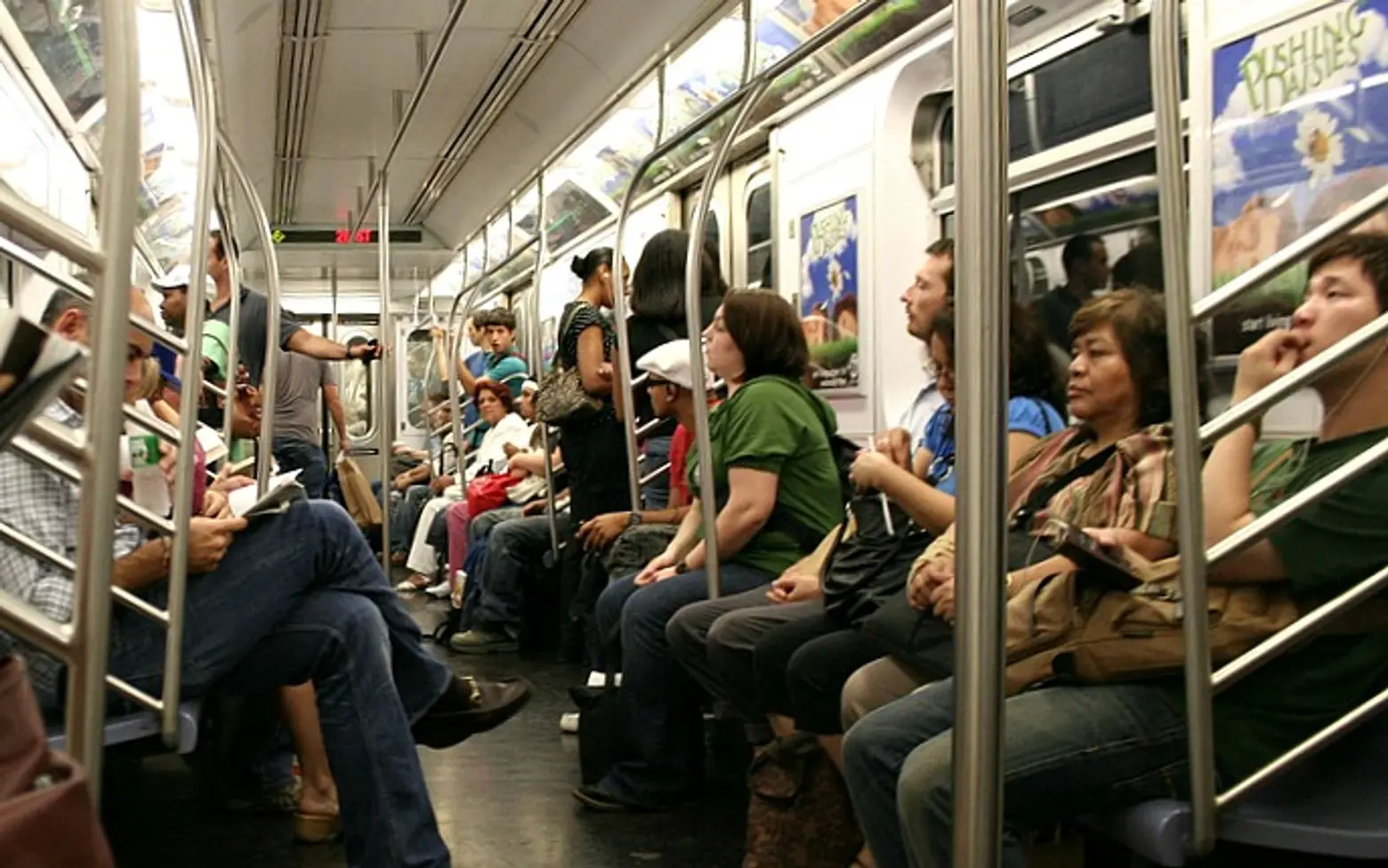
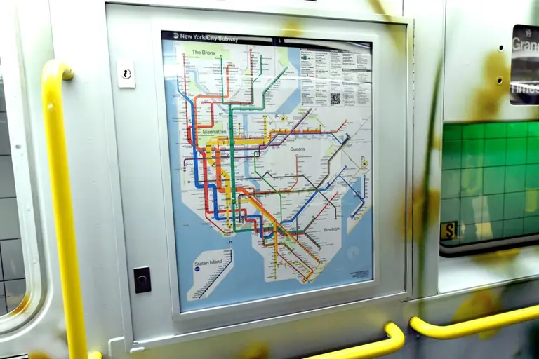
While we love a good infographic or interactive map, this “musical data-viz project” really sparked our interest as a new way of looking at geographic trends. Artist and programmer Brian Foo translated a 1.5-hour subway ride on the 2 train into a 4.5 minute song that rises and falls based on the income of the neighborhood the train is passing through. What results is an audibly beautiful rendition of the often not-so-pretty diversity in the city’s income levels.
Brain Foo took inspiration from The New Yorker‘s “Inequality and New York’s Subway” project, which visually graphed income inequality along of the city’s subway lines. Foo, of course, took a musical approach to this theme, using snippets from various compositions that he feels “exhibit the energy and orderly chaos of the NYC subway system itself.” His song is split into 48 segments, one for each of the rides between stops on the 2 train. The song gets the loudest around Park Place and Chambers Street in the Financial District and the softest between East 180th Street and Bronx Park East. According to CityLab, “In real life, that section has a median income that’s roughly 7 percent of the richest segment of the stretch in the Financial District.”
The song is part of Foo’s Data-Driven DJ project, a series of music experiments that combine data, algorithms, and borrowed sounds. He’s planning to release an entire album with at least 12 songs by 2016.
[Via CityLab]
