Karim Rashid’s East Harlem HAP Building Gets a New Color Scheme After Much Opposition
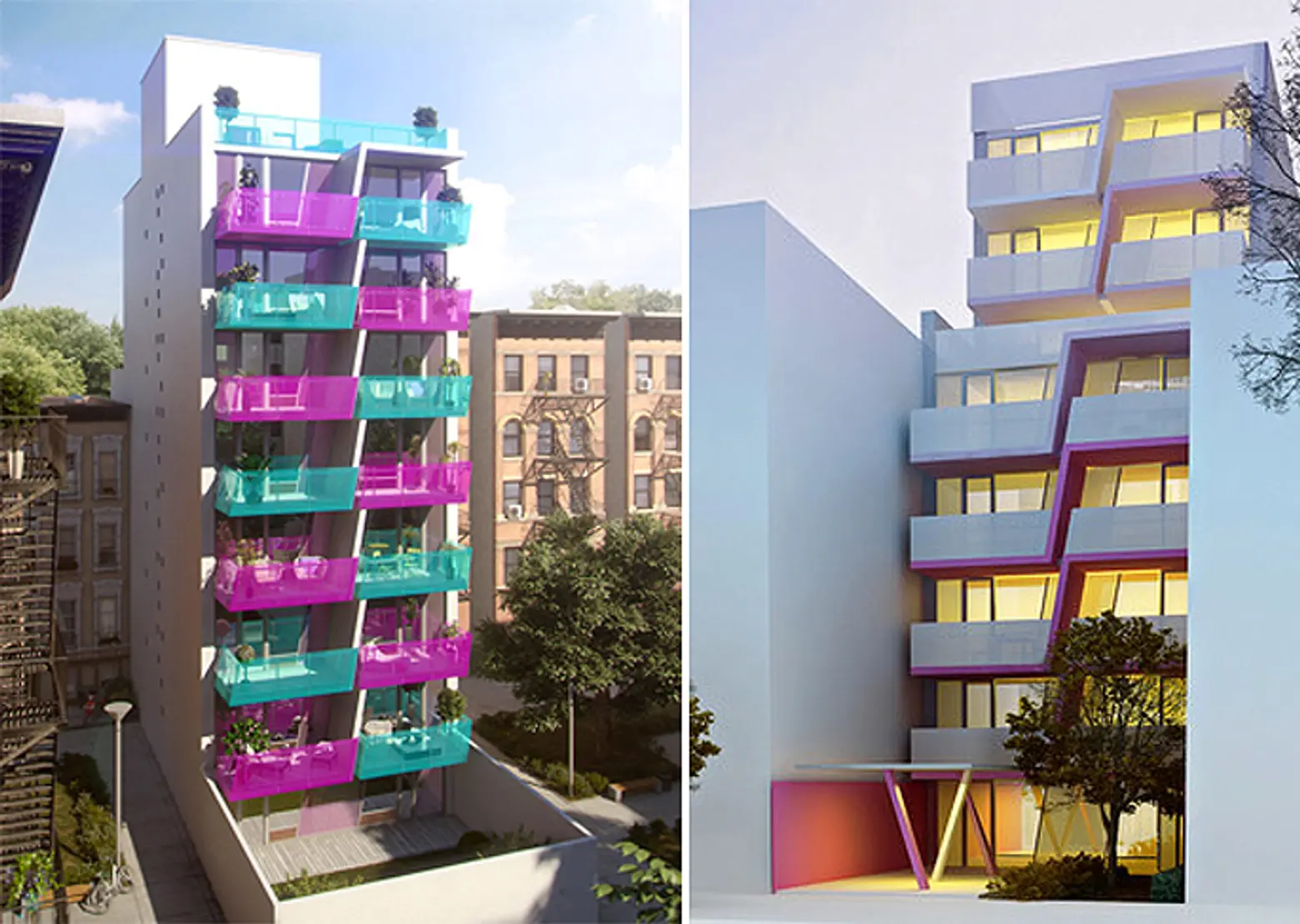
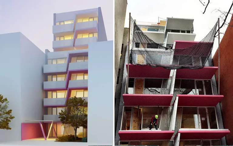
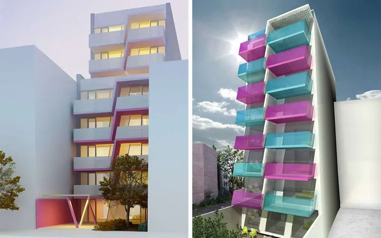
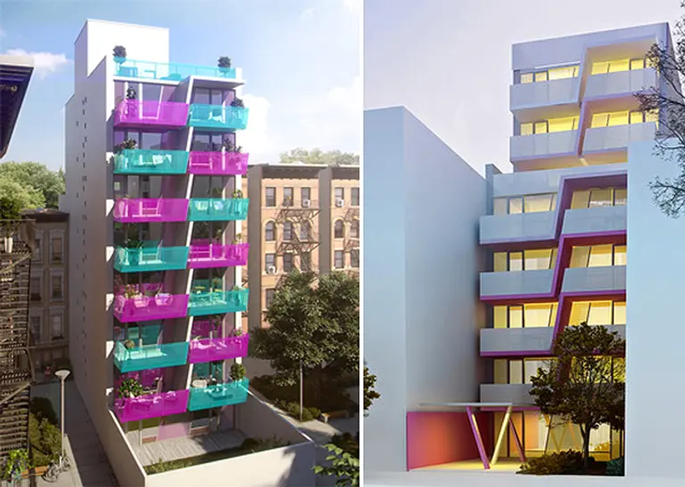
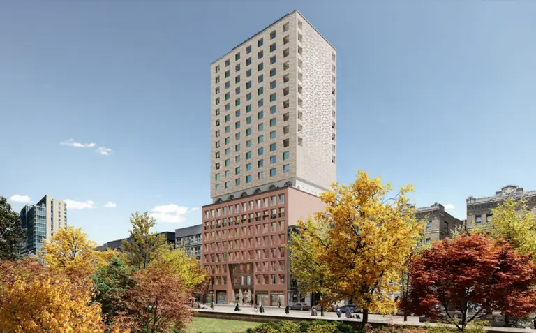
After much outcry, the Karim Rashid-designed residential building at 329 Pleasant Avenue in Harlem will be getting a new color scheme. According to the WSJ, locals have voted to scrap HAP Five‘s color-blocked magenta and turquoise design for a facade of simple white balconies with a less audacious “translucent cirrus with [a] graduated magenta balcony trim”.
Rashid recently defended his color choice in an interview with 6sqft saying: “Contemporary design tends to be cold, alienating, and sometimes very inhuman. I’m interested in showing the world how a contemporary physical world can be warm, soft, human, and pleasurable and color plays a large part of the warmth of my designs. I use colors to create form, mood, feeling, and to touch the public memory. Color is not just ‘is’ and is not intangible—it is very real, very strong, extremely emotional and has a real physical presence.”
Unfortunately for the designer, neighbors didn’t agree. Eran Polack, chief executive of HAP Investments LLC (the developer), told the WSJ, “Going forward we will be using the preferred color scheme in our development.”
But don’t think locals are putting their picket signs away just yet, there are still a slew of others who want the building stopped completely. Laurena Torres, a commercial real-estate broker who lives nearby said: “I have 1,143 people who say they don’t want this building to be here, period. Forget about the colors and the 300 votes for pink, green or smoke. The bottom line is all of them are ridiculous because the property is totally incongruous.”
What do you think? Is this building site insensitive any way you slice it, or is the modern design a step in the right direction?
[Via WSJ]
Explore NYC Virtually
Leave a reply
Your email address will not be published.










Have you SEEN this neighborhood? This is actually a NICE part of the neighborhood but Pleasant Ave is STILL littered with tenements and bland recent infills and doesn’t look like the beautiful brownstone block above. And less than a block away is Costco and Target – they allow that big box garbage in the neighborhood but this get’s the community’s backlash? Talk about misplaced priorities – unless the priorities are about blocking gentrification and don’t have anything to do with design. Let’s call it like it is and not talk about context when it’s about something else. ...
Read moreIs this building site insensitive any way you slice it…YES or is the modern design a step in the right direction… NO Your designers might have given thought and taken the community’s culture and history into consideration before coming up with your “modern” design. It’s amazing how OUTSIDERS base their ideas on the pretense that they know better and have the best intention for a community. Folks in the community are not opposed to change as long as it’s a benefit to the neighbors and the community and NOT THE DEVELOPER’S who don’t live in the community. ...
Read more