Swipe Left or Right? There’s Now a Tinder for Architecture
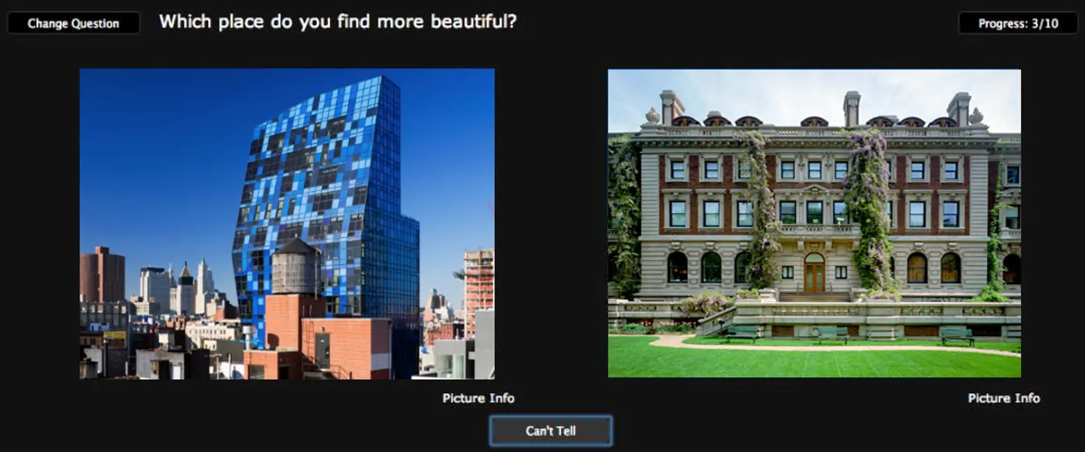
Don’t get too excited. That’s architecture, not architects. But either way, if you’re an architect, or just an opinionated architecture enthusiast, you’ll love “swiping” left or right on this fun new app developed by Daniele Quercia and her team at Yahoo Labs in Barcelona, Spain.
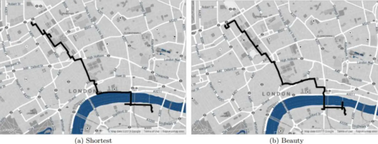
The app isn’t as haughty as it sounds and was actually created for those who like a little urban eye-candy as they get from point A to B. “The goal of this work is to automatically suggest routes that are not only short but also emotionally pleasant,” say the developers.
Users of the app are presented with two routes to their destination and they can decide which is the more beautiful based on the two images shown to them. The app’s routes are based on what users of a crowd-sourced website, called UrbanGems.org, have deemed the most stunning architecturally. Generally speaking, Querica and her team found that alternative routes were on average no more than 12% longer (about 7 and a half minutes) than the routes recommended by common mapping services.
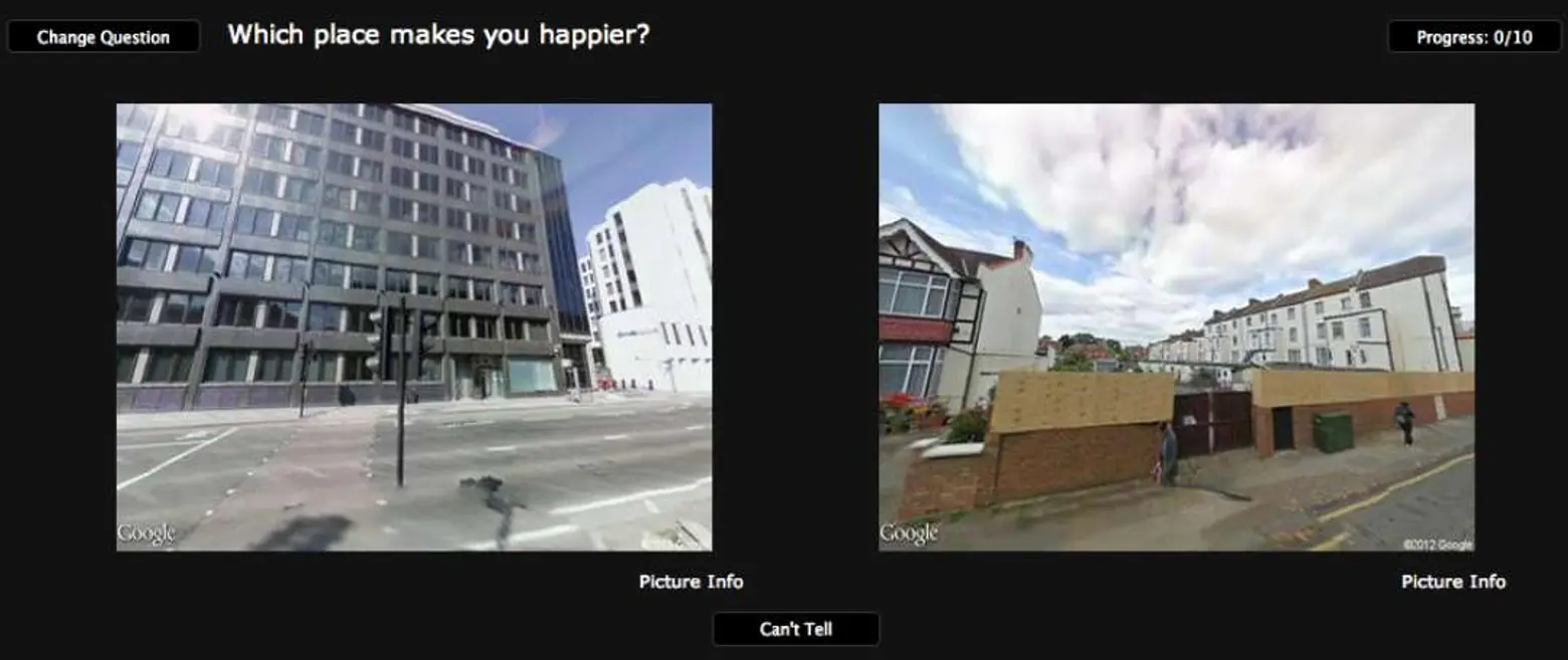
Unfortunately the app isn’t available for New York City just yet (only London), but its creators want to bring a wide array of international cities into the mix. Plans are to use aggregate data from Flickr — namely geo-tags, picture counts, and comments — to determine the most favorable buildings in an area.
We definitely look forward to the NYC release, and as Architizer so aptly writes: “Finally, we have the ‘Hot or Not’ of urbanism.”
[Via Architizer]

