My 3,000sqft: Architect Wid Chapman renovated his Upper East Side home using color and openness
All apartment photos by Ashok Sinha
Wid Chapman‘s parents were profound modernists, his father an architect who worked for Marcel Breuer, and his mother an artist who studied with Josef Albers. The career that Wid has built for himself as an architect and interior designer who specializes in hospitality design is uniquely his own but showcases the influences of his parents. When it came time to design his personal apartment on the Upper East Side, it was his own family who influenced the renovation. “Providing space intimate enough for our small immediate family but room for an extended one, the project reconfigures and reshapes extant spaces to defer to the apartment’s sweeping Central Park views,” said Wid, adding that “color and materiality” were also central to the project. Ahead, take a full tour of this one-of-a-kind apartment and hear from Wid about his background and career and the specifics of the renovation.
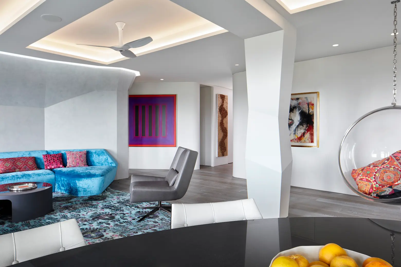
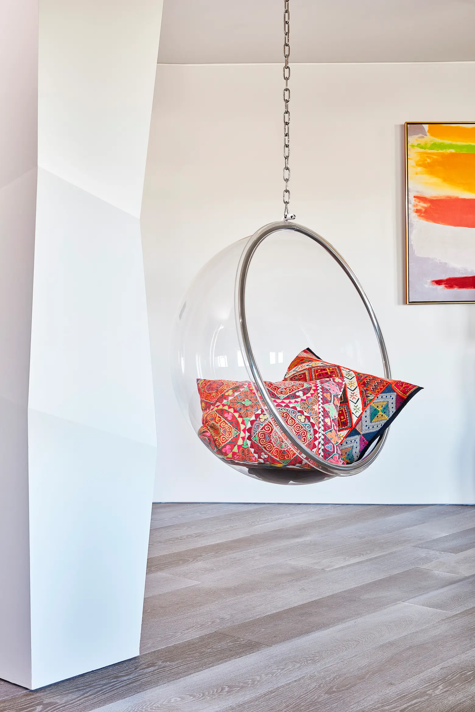
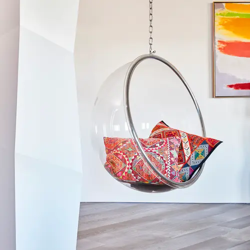
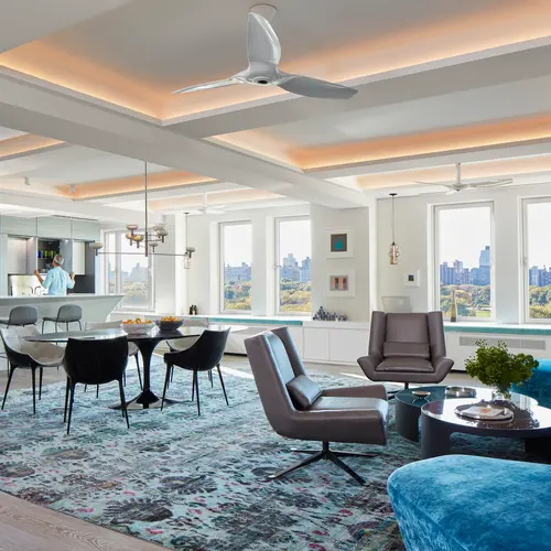
A Bubble chair by Eero Aarnio lends a playful touch; the dining room table is an Eero Saarinen
How did your parents’ work and passions inform your career?
Well, before my father worked for Breuer, he began his career working for another Bauhaus legend, Walter Gropius, at TAC (The Architects Collaborative), in Cambridge, MA. My mother, after studying with Albers, went to work for TAC as their in-house color consultant. That’s where my parents met. So these circumstances informed my whole life, as you can imagine. Later, my parents moved to New York, and my father worked for Breuer (my mother for the architecture firm Perkins and Will).
Architecture permeated my upbringing. My father had a firm in Cambridge, which was a very dynamic place for design at the time. In 1969, the glassy new building, Design Research (DR), opened up on Brattle Street. It was a retail mecca for all that was new and modern in interior design and furniture. I used to love going into Cambridge to both my father’s office and to DR.
My mother later became a painter and art teacher. Albers was indelibly important to her teaching and was strongly reflected in her paintings. In college at RISD, I took the “Albers” color theory class (taught by another alum). That course opened my eyes to the subtleties of color and their complex relationships with one another.
Now that you have your own firm, how would you describe your professional design style?
I don’t think I have a specific style, more a point of view. The final form reveals itself as you synchronize with your client and their goals. We design a lot of restaurants and are guided by cuisine, identity, location, etc. So, while each one might have a different theme, the process we enter into is very consistent. Our process for each design is one of filtering, abstracting a concept that honors the client’s intention while bringing creativity and architectural harmony to the project. We really focus on the shaping of space as opposed to demarcating individual rooms. We layer and layer to create distinctive zones and changes in experience that are integrated and seamless.
Would you describe your personal style differently?
Well, personal style implies how and where I live, which is inherently different than designing a restaurant. It also is a place where I live with my wife, a son, and more transiently, older children, and both of our extended families. So, “home” is a very unique design brief, with very particular needs and functions. The design of our apartment was a rich collaboration with my wife, Shachi.
Your apartment is in a historic Emory Roth building. Did that inform your architecture and design choices when renovating?
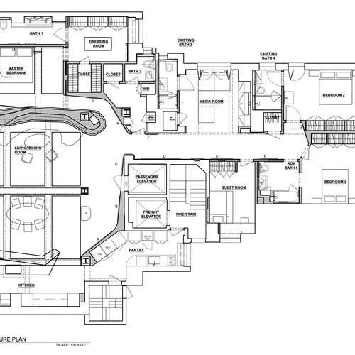
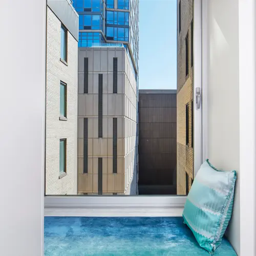
It’s a fine historic building, but much of the Roth features had been gutted by the renovation of the building in 2006. The apartment plans had been maintained but, in our mind, no longer relevant for modern living. The size and spaces allocated to kitchens and bathrooms felt inadequate, the gathering spaces too formal and too rigid, and the views of the park overly restrictive. We felt the grandeur of the views and the elegance of the building required a complete re-think of the apartment’s internal design.
The apartment is on the 14th floor
Tell us more about how you designed the apartment with its Central Park views in mind.
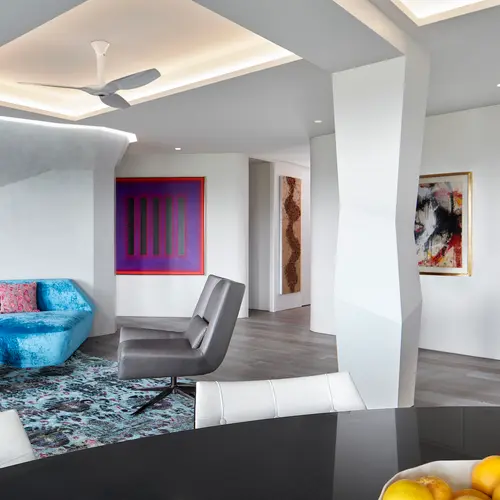
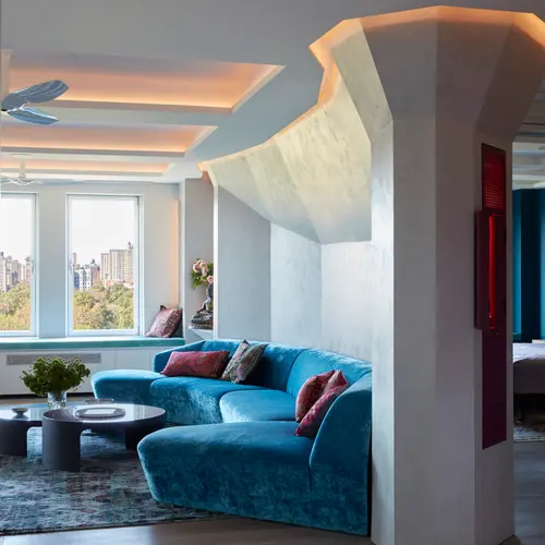
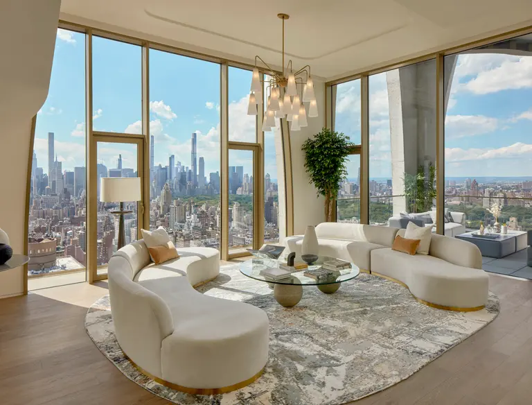
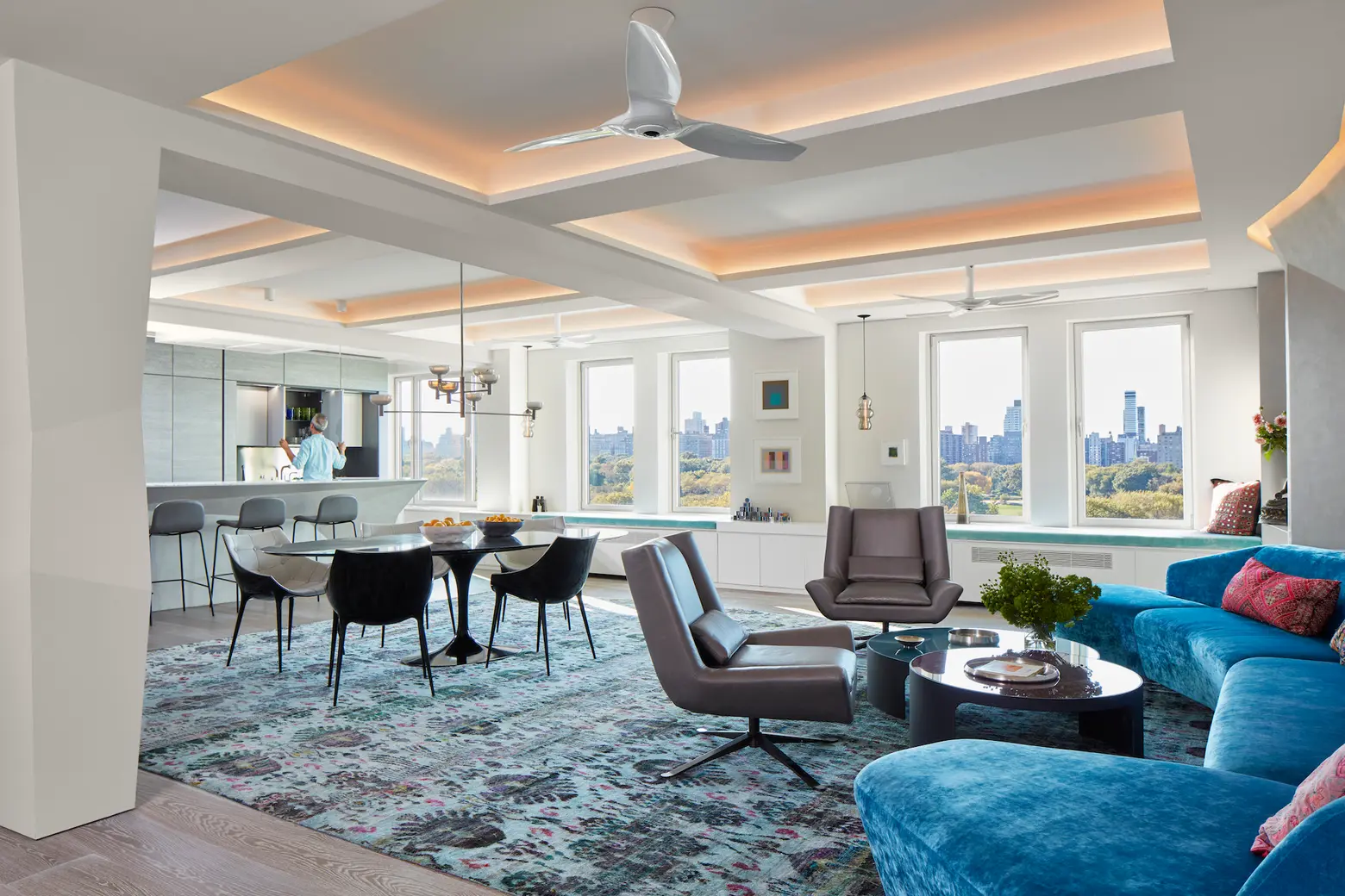
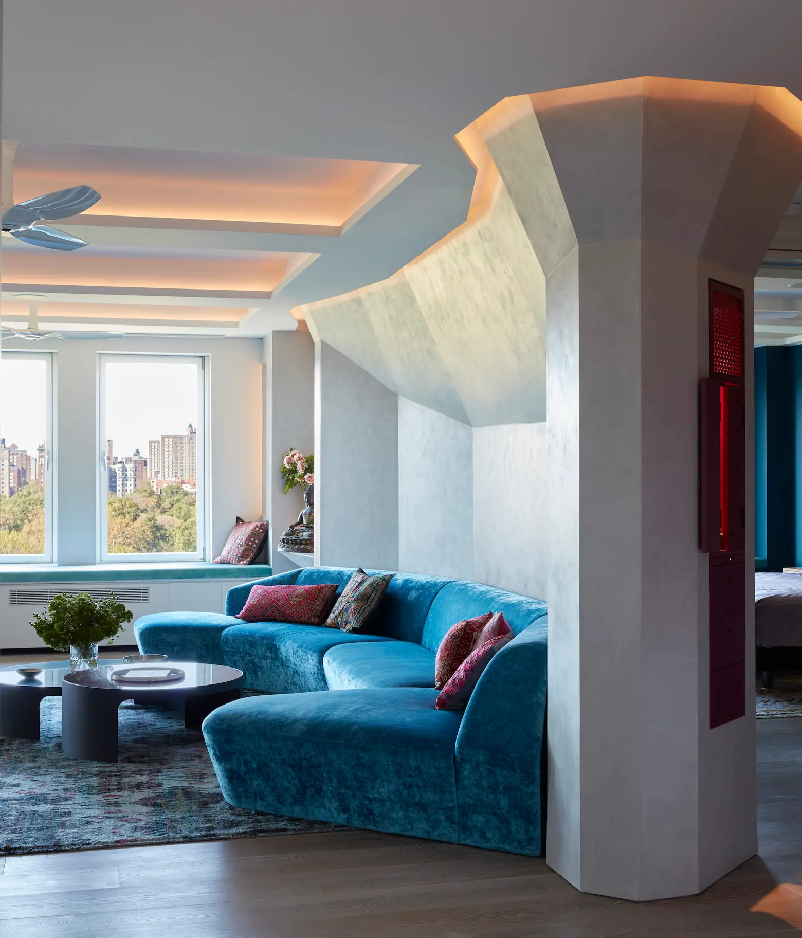
Following the previous point, we were determined to eliminate most vestiges of the extant layout. The original apartment was broken up into many small rooms. There was no hierarchy. In the process of renovating, we removed all the walls except the exterior and structural columns. In putting back walls, we extensively modeled the negative space along with the positive space. Along the west Central Park side, we created one comprehensive area for kitchen, dining, and living. The east walls of this large space are all shaped and angled to form an “embrace” of the dramatic views.
You’ve mentioned that your family likes to entertain. How did this play into the renovation?
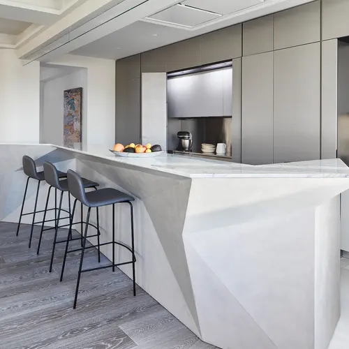
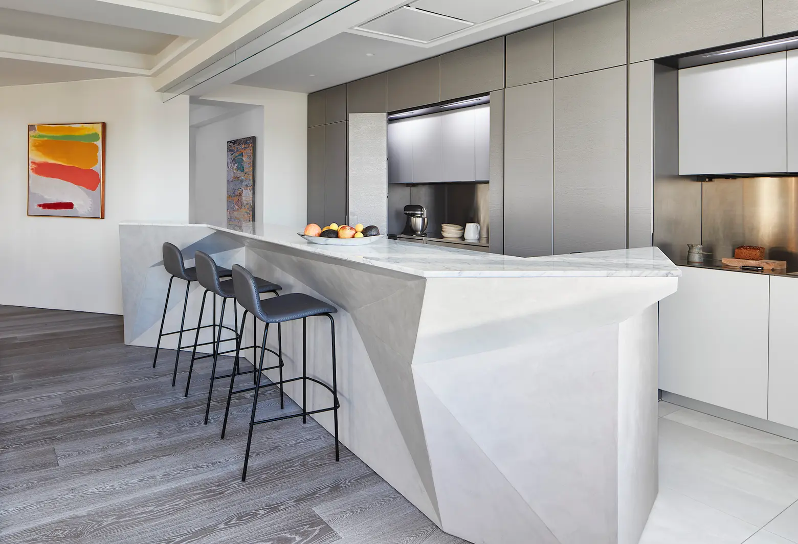
The kitchen, on the south side of this great room, is completely open to the living and dining areas. The south back wall of the kitchen is where many of the typical functions are housed.
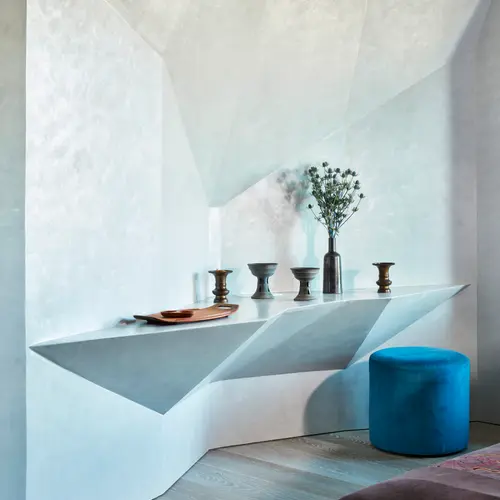
A faceted shaped floating island contains the flush cooktop. A higher counter on the dining side disguises the cooking zone from a distance while providing a bar area for drinks and a more casual repast. It also allows for more interaction and collaboration while cooking and preparing food. This whole area is open and spacious and a place we imagined (and it has come to bear) that eight to 10 people at a time might be gathered around the island on both sides, cooking, eating, drinking, chatting. At the same time, the entire back wall of the kitchen can be concealed with discreet folding doors that transform this functional area to a flush set of silver-finished oak panels.
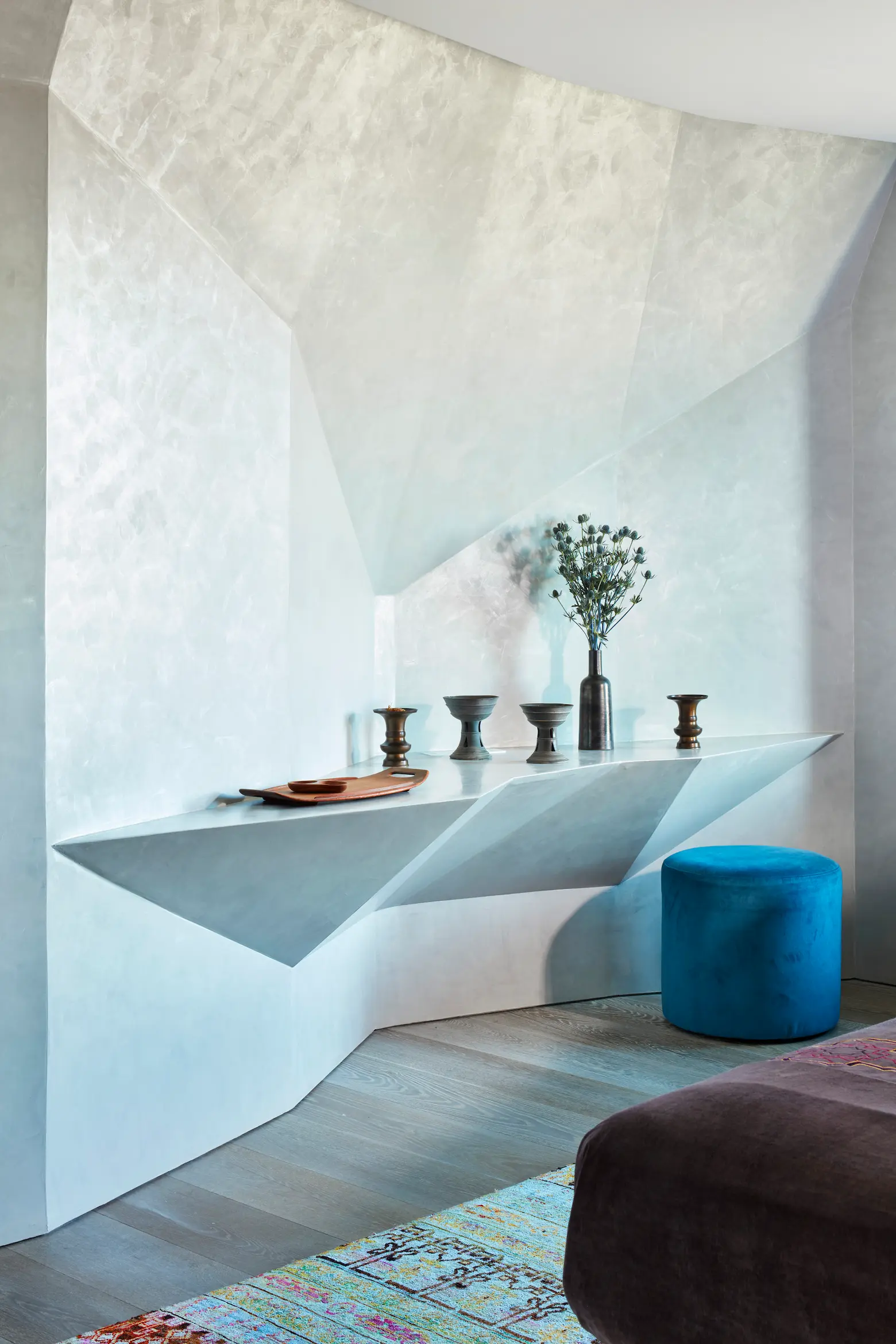
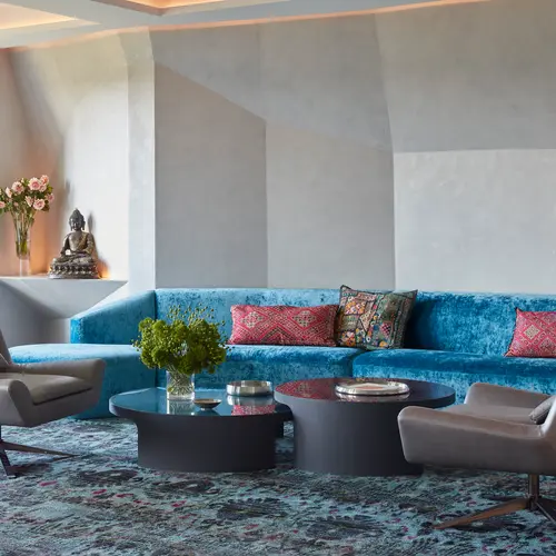
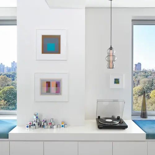
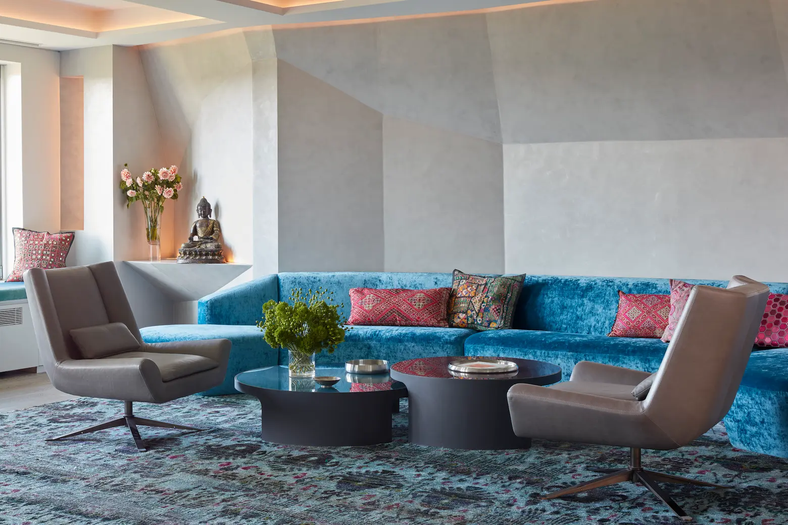
At the other end of the room, there’s a sculptural wall in the same formal language (and Venetian plaster finish) as the island. The shaped wall embraces a large, custom-made sofa that mirrors the facets of the wall. This area alone has been known to seat 15 people at a time. The nearby window seats, taking advantage of the park views, provide for even more seating.
Your home has a lot of pops of bright color. How did you decide which colors to incorporate and where to use them?
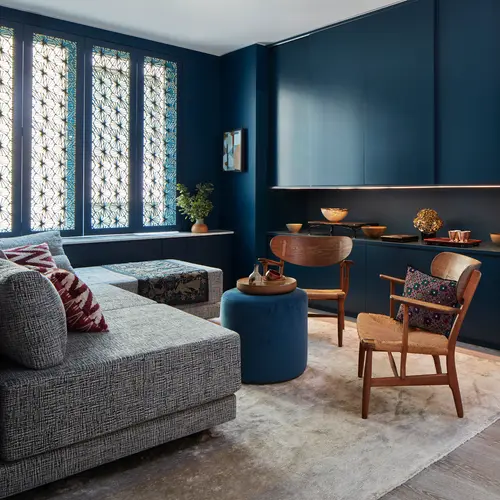
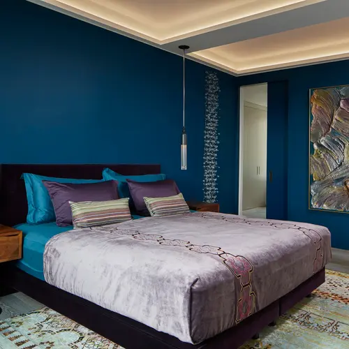
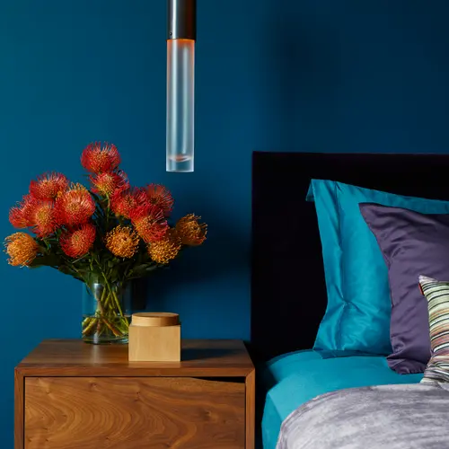
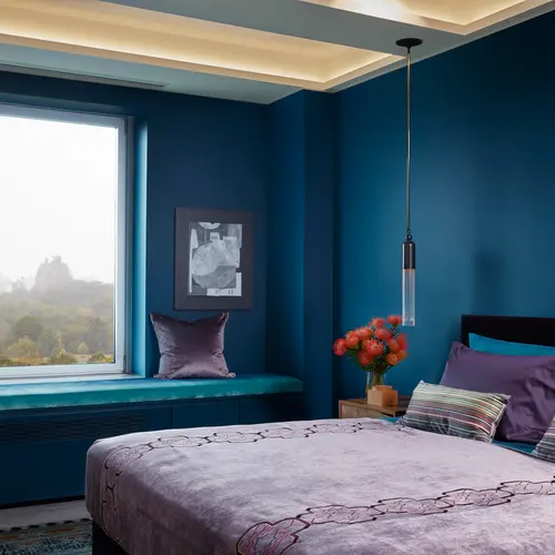
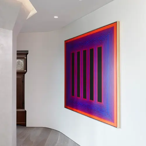
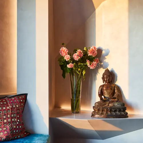
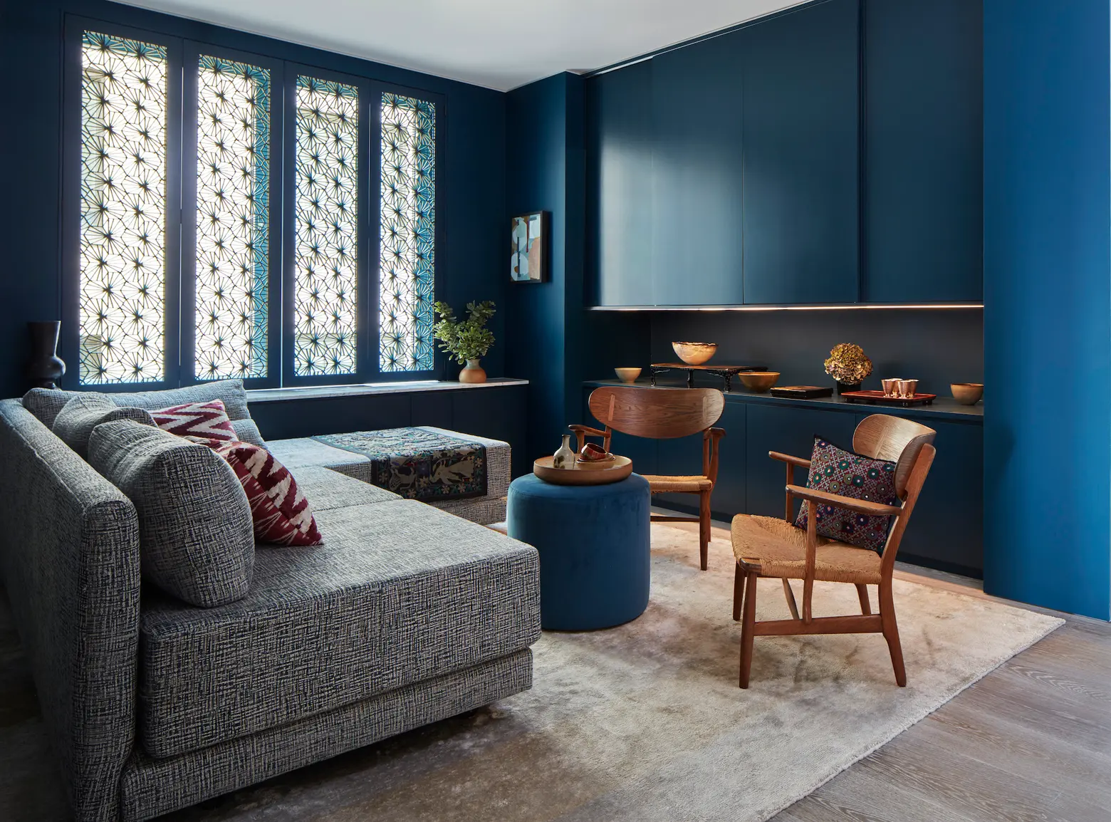
In the living and dining areas, blues are most prevalent in the textiles and the rug. This choice was informed by the sky outside, which has such a strong presence. In terms of wall colors, throughout this space, we selected a quiet tone of snow that would allow the eye to be drawn to the view, the sculptural object, and the art. This color expands into the gallery hall and provides a beautiful backdrop to our art collection. Elsewhere, in the master bedroom and media room, we chose a very deep blue-green. We wanted to create a more intimate, cocooning quality to these spaces. This also creates a different relationship between the wall color and the art on display in these rooms in that the wall color is no longer “neutral”—it’s an active participant.
What is your favorite thing about your home?
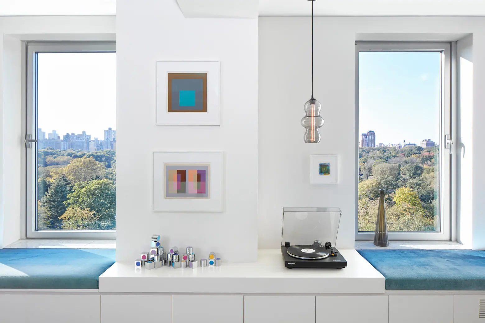
The dramatic relationship to the Central Park view. I’m equally mesmerized by it when I wake up to it on bright spring mornings as foggy winter ones. We are immersed in nature in all seasons and all times of day. The late spring evenings produce incredible skies with stunning rich and varied dyes–both an intensity and mellowness of light that illuminates and bounces off the angled, shaped walls…incredibly dynamic and captivating.
The winter nights bring out the lamps that light and twinkle along the paths in the park in a magical in a Narnja like way. As you can tell, living here makes you an avid observer of your surroundings, something we have come to cherish, especially during this period of quarantine.
What are your family’s favorite things about it?
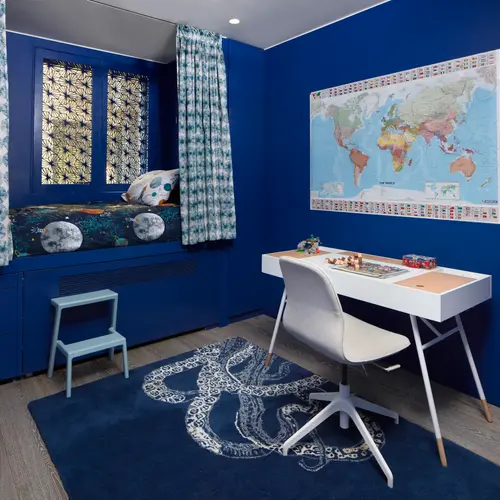
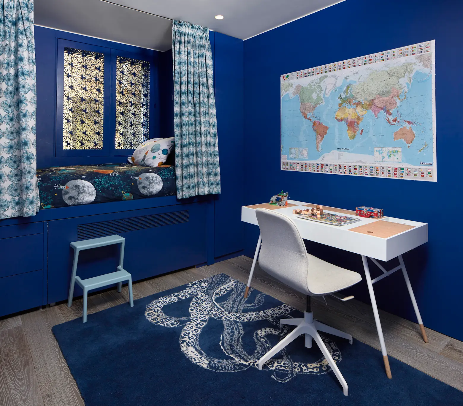
I think that varies. My son loves the swing chair in the living room. But he’s also spends a lot more time now in his own room, studying, reading, and resting. His room is a different deep color of blue that affords him his own cocoon and privacy, something that has become more important to him as he just turned 12!
Are you viewing your apartment differently since the quarantine began? Has it made you realize that you’d like to make any changes?
Well, I never would have thought I’d be spending so much time, non-stop, in my home. We have truly used the space in all the ways we envisaged and many more. We spoke of the joys of living with a view of the park but the sounds of it have come into a life of their own. The wildlife has exploded, and the usual cacophony of traffic has been replaced by bird song. The apartment’s spaces were designed to provide endless configurations of use, and in this time of being sequestered, we have enjoyed the variety and playfulness it provides. One of the unexpected challenges we’ve faced is noise mitigation from three Zoom calls going on at the same time! It’s working out okay, but there is no doubt quarantine will produce some valuable learnings for architects to apply to their future projects.
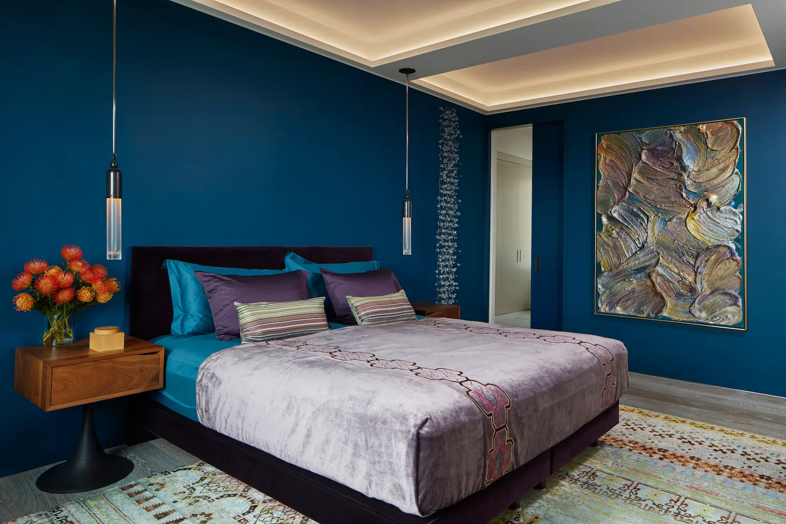
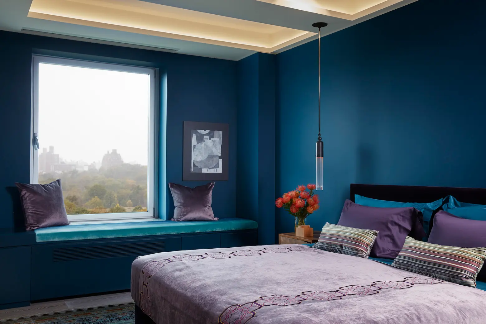
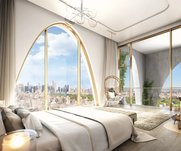
The master bedroom
What brought your family to the Upper East Side?
It was the proximity to the park. My wife is a Londoner and missed the green spaces she grew up knowing, but she is also a city dweller, so being anywhere outside the city would have been impossible to imagine. As he gets older, having the green space right on our doorstep makes such a difference for my son. The location provides all the benefits of city life while being peaceful, green, and open.
What are your favorite things to do in the neighborhood (post-quarantine)?
We’re near the museums, and so in normal times, we enjoy immersing ourselves in all they have to offer. Being next door to Mt. Sinai Hospital–noteworthy in this pandemic—has been both reassuring and humbling to see the dedication of healthcare professionals and volunteers. There is also a discrete enclave of commercial venues along Madison Avenue that give the area a unique charm. It has a clear history, but there’s also some welcome transformation occurring.
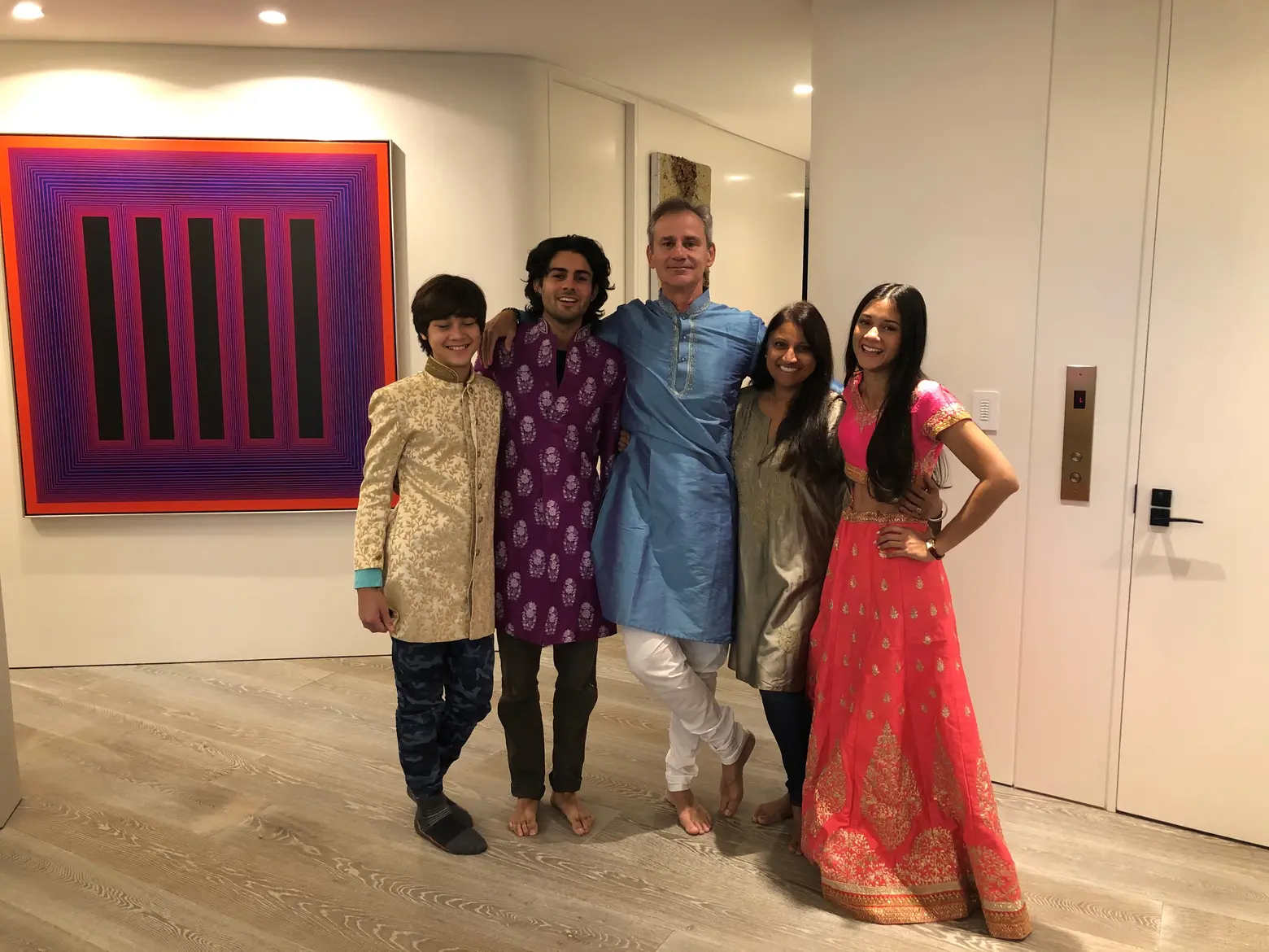
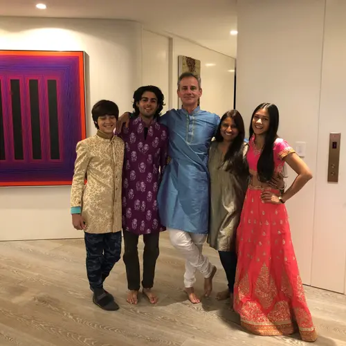
Wid and his family in the apartment, Courtesy: Wid Chapman
RELATED:
- My 3,000sqft: Power broker Louise Phillips Forbes shows her family-friendly Upper West Side home
- Our 1,100sqft: A move to the Bay Ridge waterfront gave this couple serenity and space
- My 5,400sqft: Inside father and finance pro Stephen Fox’s sprawling Long Island City condo
All apartment photos by Ashok Sinha
