Bjarke Ingels’ design for WeWork’s Lord & Taylor takeover shows few changes
Via Bjarke Ingels Group
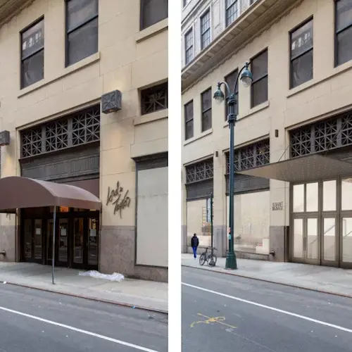
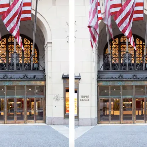
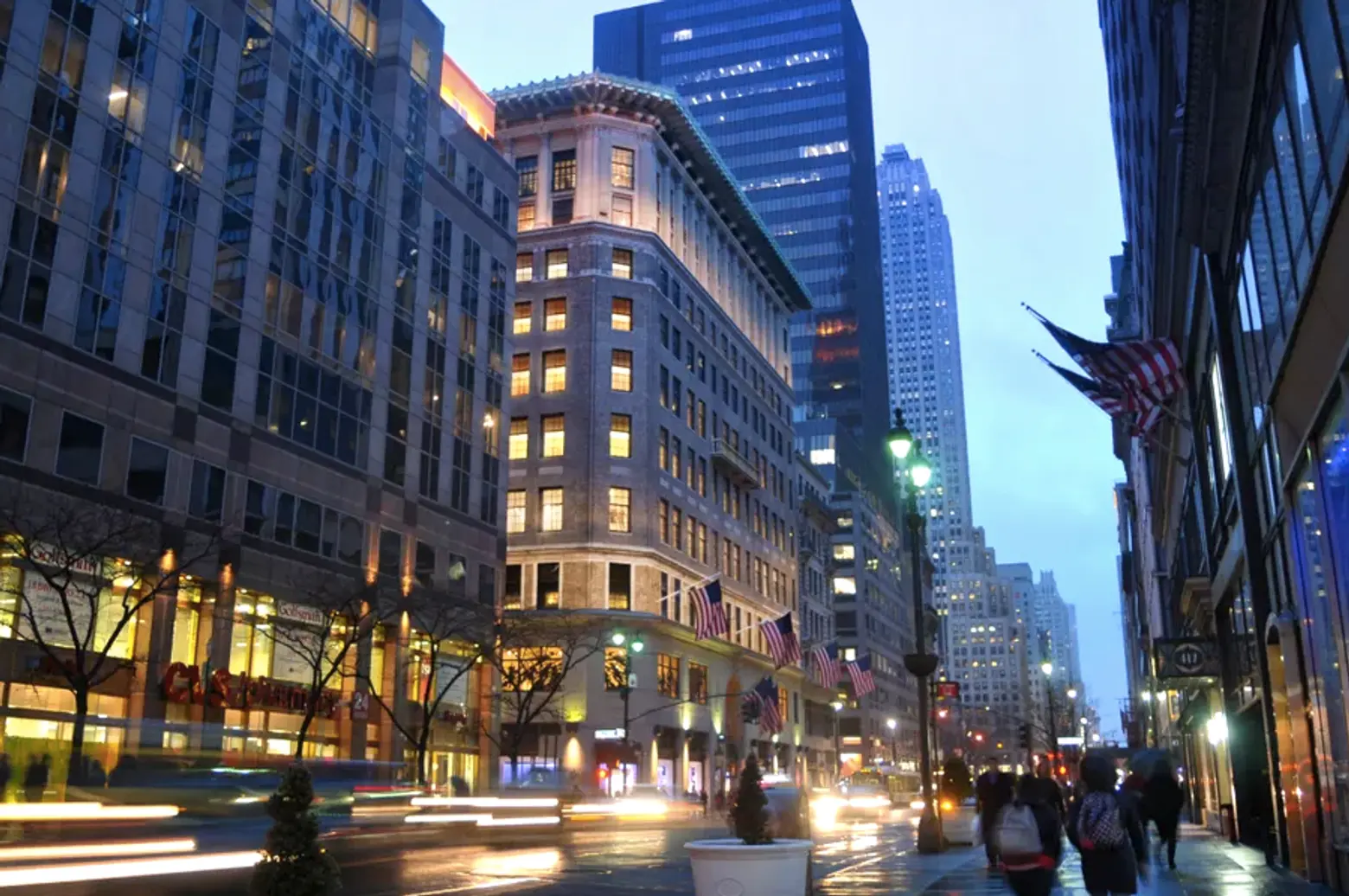
The first set of renderings of Bjarke Ingels’ restoration of the landmarked Lord & Taylor building was released last month and it appears the starchitect’s firm will not sway too far from the original structure’s design. WeWork hired BIG last year to preserve the 104-year-old store, which will become the co-working company’s new global headquarters. In its presentation on Oct. 30 to Manhattan’s Community Board 5, the firm explained its plan to reconfigure the ground-floor, install canopies, replace signage, and more, as first reported by the Associated Press.
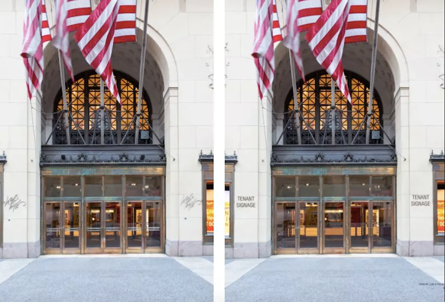
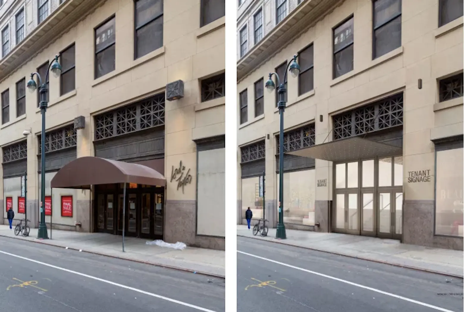

Updates to the iconic Fifth Avenue shop include adding a translucent, glass courtyard to the rooftop to serve as a private space for employees and installing new masonry openings on the secondary facade.
But besides those changes, other modifications are much more subtle. As renderings uncovered by Curbed reveal, the bay windows will be restored to their original size and the entrance will be expanded and made more accessible. Balconies on the sixth floor and the historic exterior will also be restored.
Lord & Taylor is in the middle of a store closure, just a year after Hudson’s Bay Co. sold the Italian Renaissance building to WeWork for $850 million. As 6sqft reported last month, Lord & Taylor, officially closing its doors early next year, launched a final store closing sale that will run through the holidays.
According to AP, Granit Gjonbalaj, the chief development officer at WeWork, called the project “an opportunity to honor our home city’s rich history, while also building toward the future by revitalizing this iconic space as a heartbeat of culture, commerce, and innovation.”
RELATED:
