Where I Work: Architecture firm Woods Bagot shows off their ‘raw’ FiDi studio
6sqft’s series “Where I Work” takes us into the studios, offices, and off-beat workspaces of New Yorkers across the city. In this installment, we’re touring the Financial District offices of architecture firm Woods Bagot, located on the seventh floor of the Continental Bank Building at 30 Broad Street. Want to see your business featured here? Get in touch!
Internationally acclaimed architecture firm Woods Bagot opened their first office in 1869 in Adelaide, Australia. 150 years, 15 offices, and 850 staff members later, they’ve designed projects from a master plan for Perth to a mixed-use tech center in Singapore to a rental tower right here in Brooklyn. After opening their first NYC office a decade ago in Midtown, the rapidly expanding firm decided it was time to design a work space for themselves. So last summer, they moved into a brand new 11,000-square-foot home in Lower Manhattan.
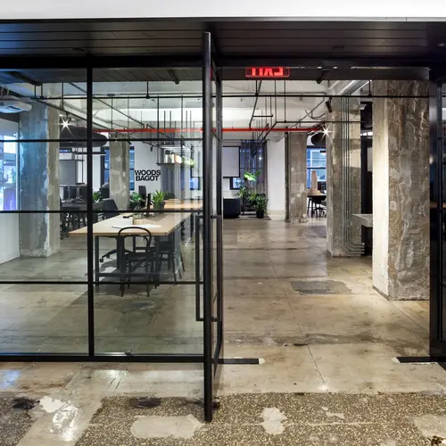
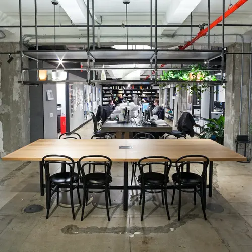
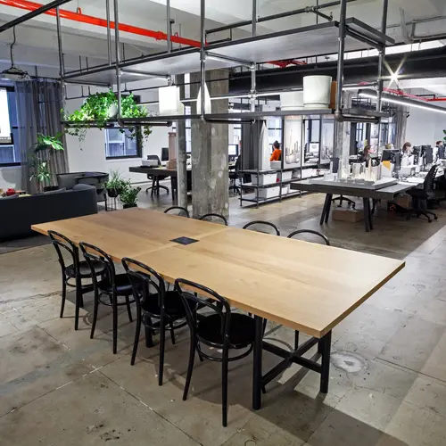
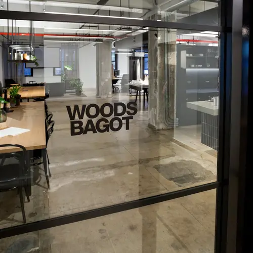
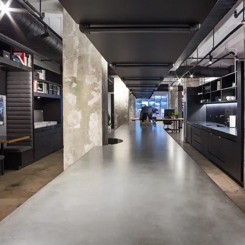
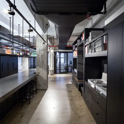
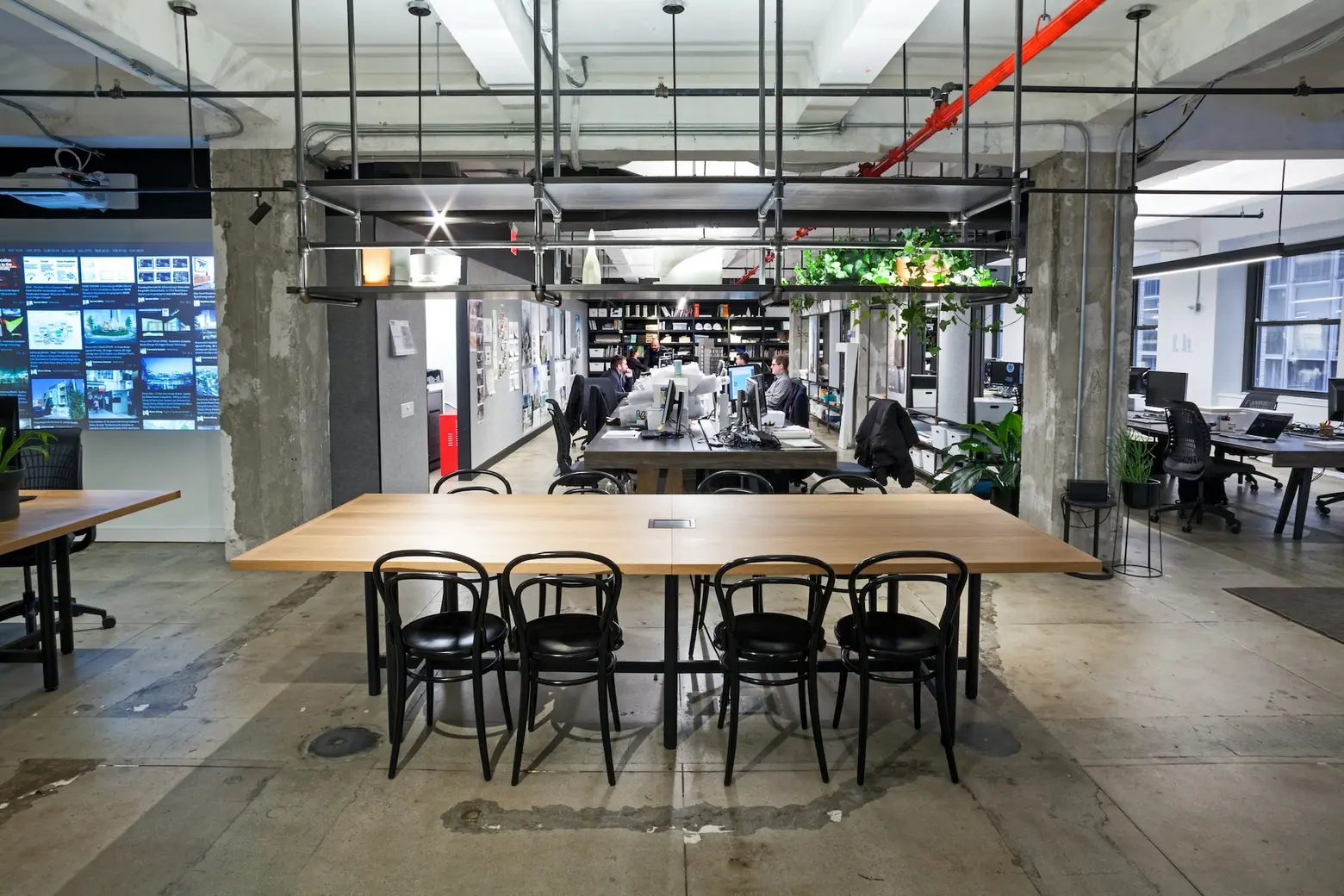
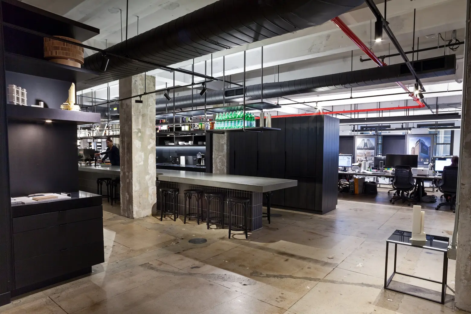
The vision of Woods Bagot’s head of global workplace interiors, Sarah Kay, and head of global hotels, Wade Little, the studio has done such an impeccable job creating a “raw” feel that guests often think it’s the original interior. Using a simple color palette of black and white, along with industrial elements like raw columns, exposed pipes, and cracked, stained concrete floors, they’ve managed to infuse “New York City grit” into their modern space, complete with virtual reality technology, 3D printing, and, most importantly, an industrial-strength espresso machine. 6sqft recently visited Woods Bagot to see the space in-person and chat with Sarah Kay about how she approached the design, what a typical day in the office is like, and what we can expect to see in the near future from this incredible firm.
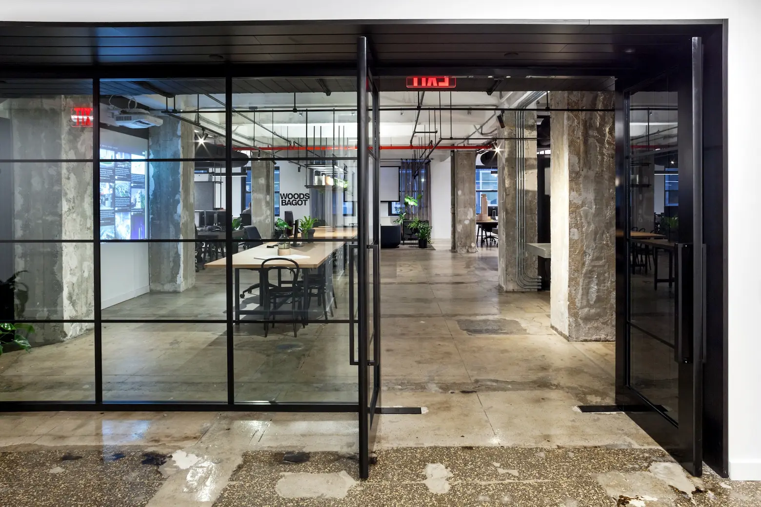 The design idea is that a “street” runs through every space, with different functions happening around it.
You came to New York 18 months ago to build Woods Bagot’s Workplace Interiors sector in NYC. How did that go hand-in-hand with designing the new space?
We are making great progress in building the team and lifting the quality of our work. Tara Roscoe leads the workplace Design team here and her influence on major projects like Google Tokyo and our local projects has been game-changing.
My colleague Wade Little (who designed the office with me) arrived in New York some months earlier, came to build the Hotel and Hospitality sector here, and he is having similar success, already working with Danny Meyer and other leading New York restauranteurs hoteliers.
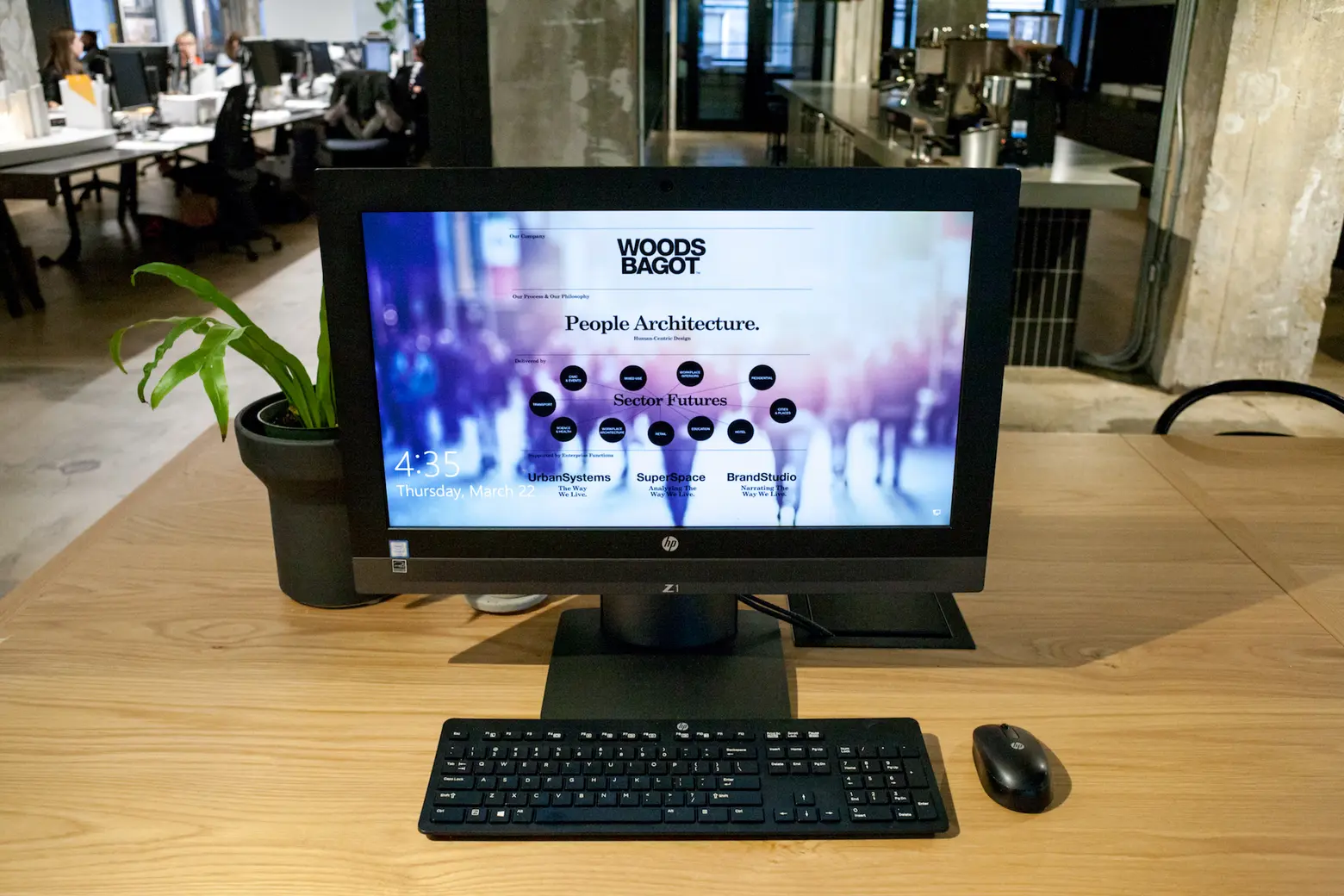
So, the design of the office was a bit of a side project, albeit a VERY important one. From my work with major global companies I understand the immense positive outcomes good workplace design can have on business culture and business success – I am still always surprised though when I see this in action with my own company. Woods Bagot had been in New York for 10 years, but without a workplace, we had designed for ourselves, we hadn’t found a home. Now we absolutely have; we feel established in the city and we know who we are. A workplace that is designed around being welcome, open, hospitable and built around creation and product reinforces every day that this is who we are – a people architecture firm.
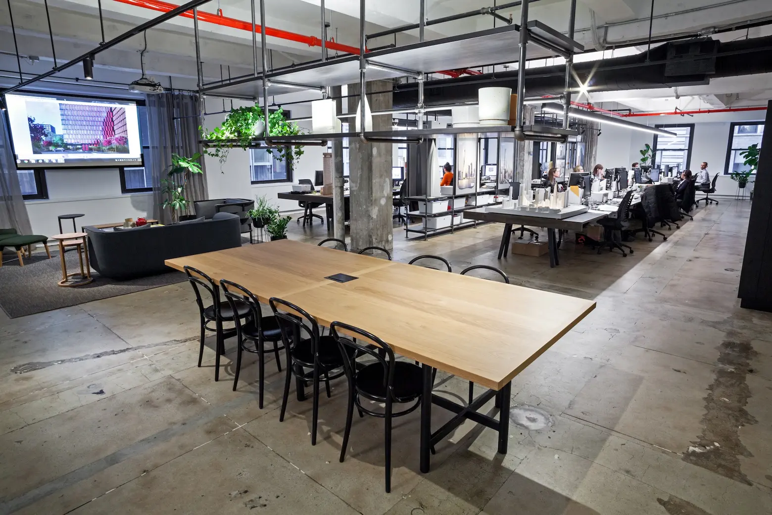
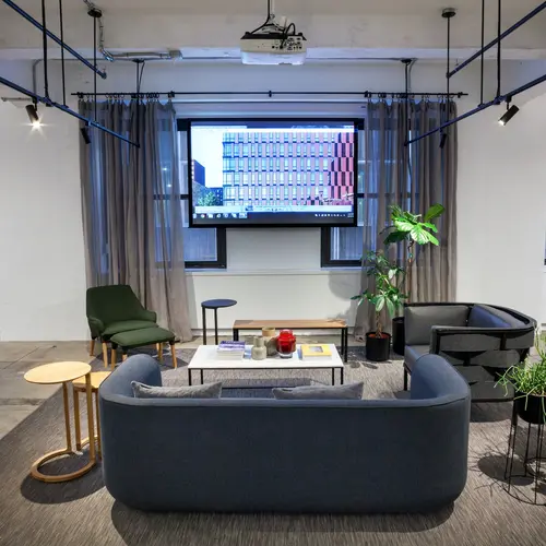
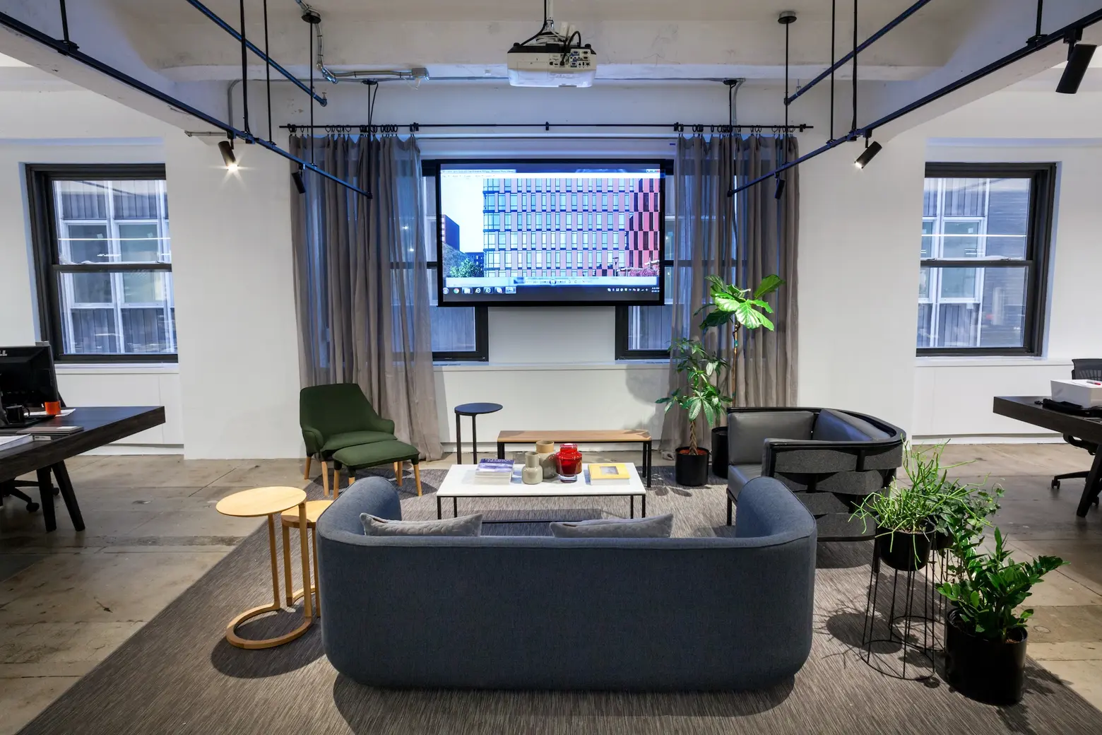 To juxtapose the gritty elements, Sarah incorporated comfortable couches, soft drapery, and plants.
How much did employee feedback factor in?
Quite a lot actually, but not in the sense of what do you want it to look like, more in the sense of who do we want to be, what is our vision for Woods Bagot in New York. What is the company that you want to be a part of and to help build into its next generation. This engagement has really helped a culture of singular vision and direction for the team.
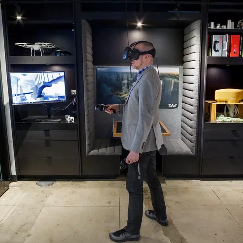
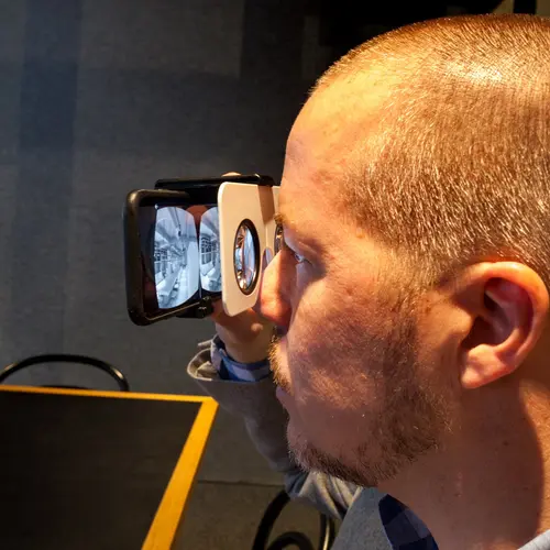
In a more physical sense, we did build a pretty exceptional Virtual Reality model of the space and there was some great feedback on details of spaces from the VR experience; virtually walking through the space was really helpful in fine-tuning dimensions etc.
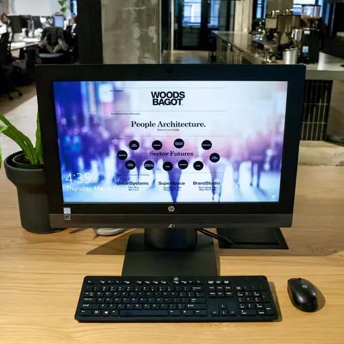
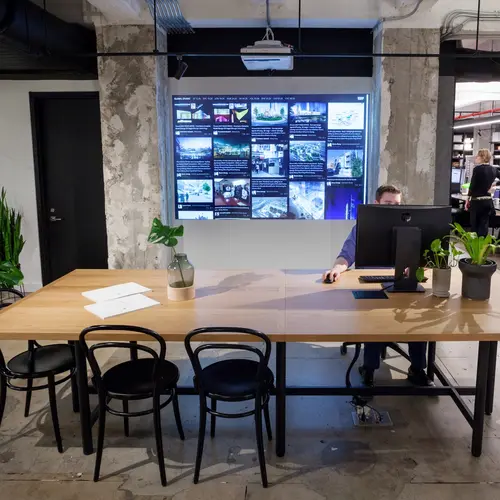
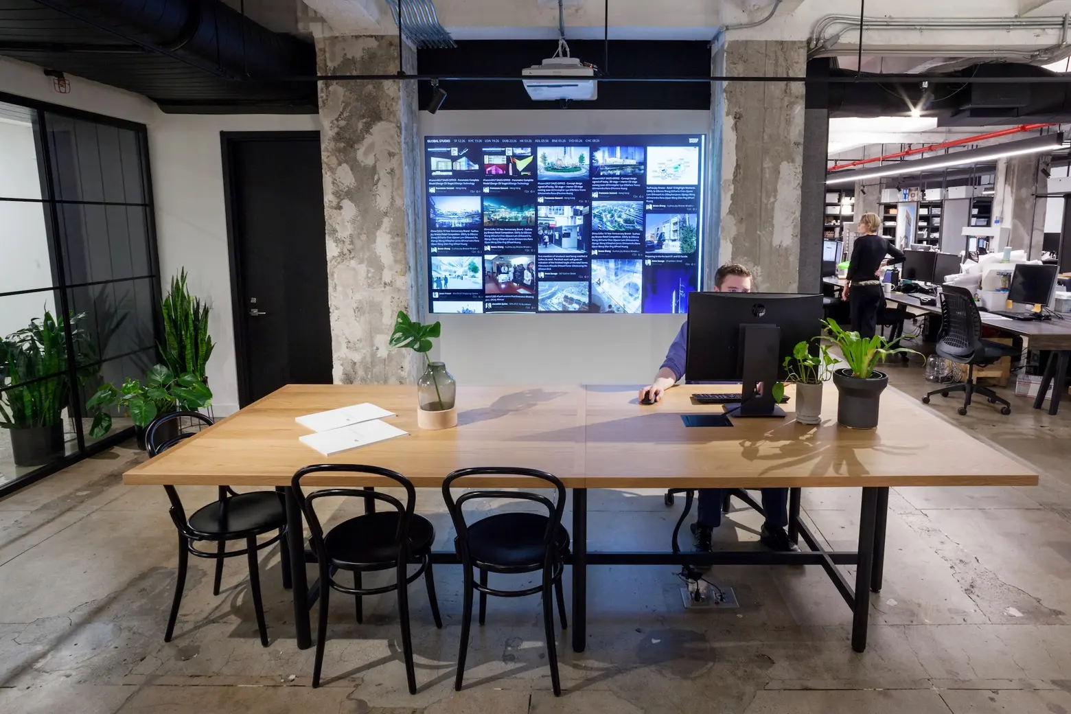 The Design Intelligence portal is constantly updated in a Facebook-like way.
How does this office compare to the firms’ 15 others around the globe?
Woods Bagot prides itself on its approach to being globally connected – we work as “one global studio” across our 16 studios – sharing talent, projects, and clients seamlessly across all. It is usual for us to have two or more studios working on a project, and New York is often sought after to contribute digital design expertise to other studios. You can see this global studio approach in our space – the live streaming Design Intelligence portal is displayed behind the arrival desk displaying uploads of latest design work from around the globe, and our global glasshouse area- where experts from around the world Video Conference in to present ideas to the studio, and of course the seamless VC equipment in each Workshops space.
This “one studio approach’ means that the whole company is very aligned in terms of vision and values. We follow a design methodology and all the same systems and processes. It is no surprise because of this each studio has a similar vibe and some consistent design features. They are all pretty raw, a place to create and get a bit messy, they all have the work on display in a real-time, work in progress sort of way, they all have a VR lounge and they all put coffee front and center – we are all very focused on our clients and staffs experience when in the space.
Is there anything that’s surprised you about NYC office culture versus Australia and London where you’ve also lived?
There is still an enormous amount of private office and cubicle type workspace here compared to London and Australia, actually compared to the rest of the world, which is so strange considering the cost of real estate here. Apart from space-saving, our clients in other parts of the world see huge cultural benefits to moving to a more agile (fast changing) more collaborative, and more diverse (lots of choices of space) workspace. NYC should try it; you will love it!
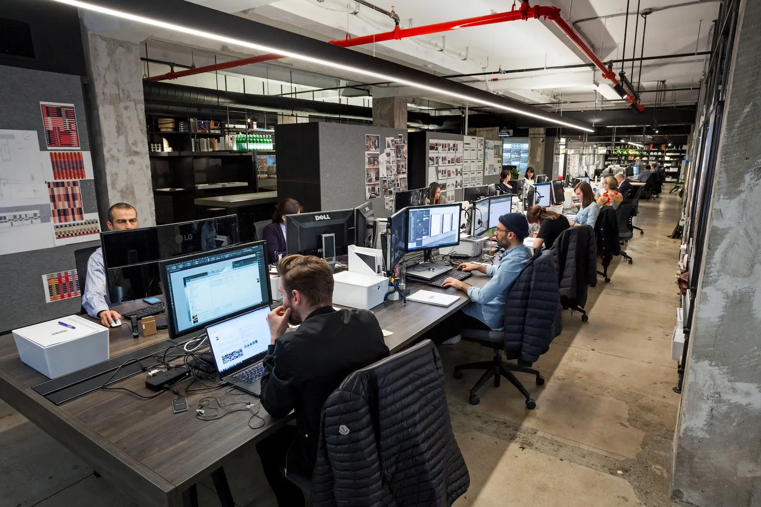
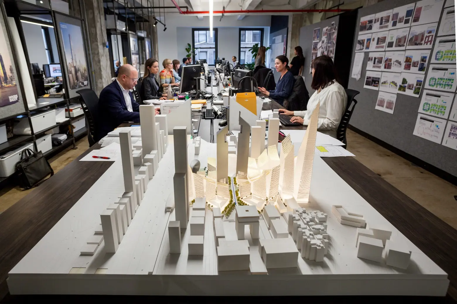
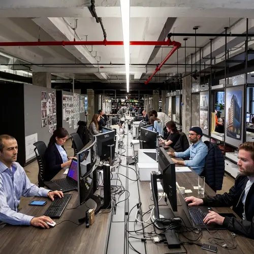
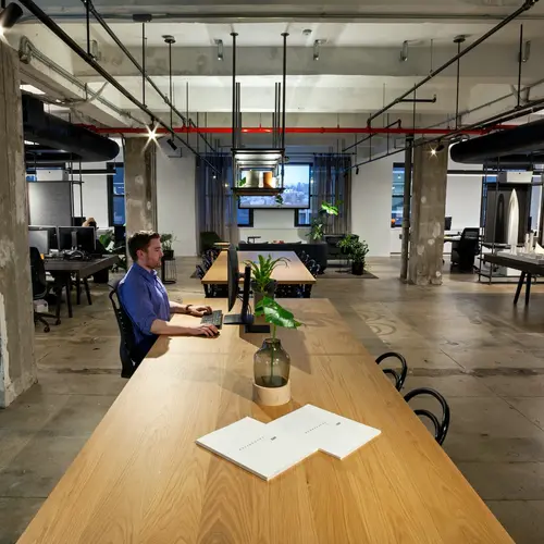
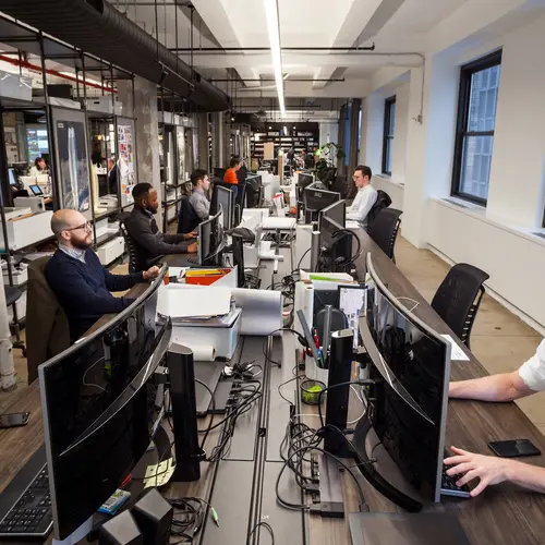
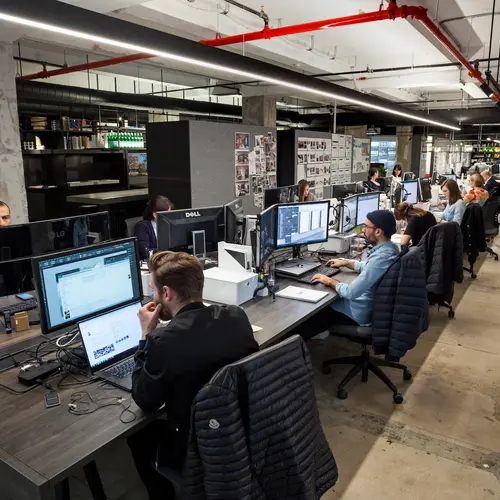
Along those lines, there are no individual offices or even personal workstations.
I have been at the company for 20 years and it has pretty much always been this way. We are pretty flat in structure and subscribe to a culture of “multi-authorship,” where everybody has a design voice and everybody can and should contribute to design decisions; we are not a top-down design firm. The collaboration that occurs between people in an open workspace is key to this culture.
You mention that people think the industrial look of the space is “raw,” when in reality you designed it this way. Can you tell us about this process?
When we first saw the space it was difficult to imagine how it could ever be converted to the aesthetic that we wanted – raw and authentic materiality, the bones of the building (the architecture) available for everyone to see, an honesty to the building process.
The space was fully fitted out in maximum ’90s style – dropped tile ceilings (below the window line), carpet, partitions, cubicles. We love to show clients the before and afters so they can see that nearly any space can be transformed in this way.
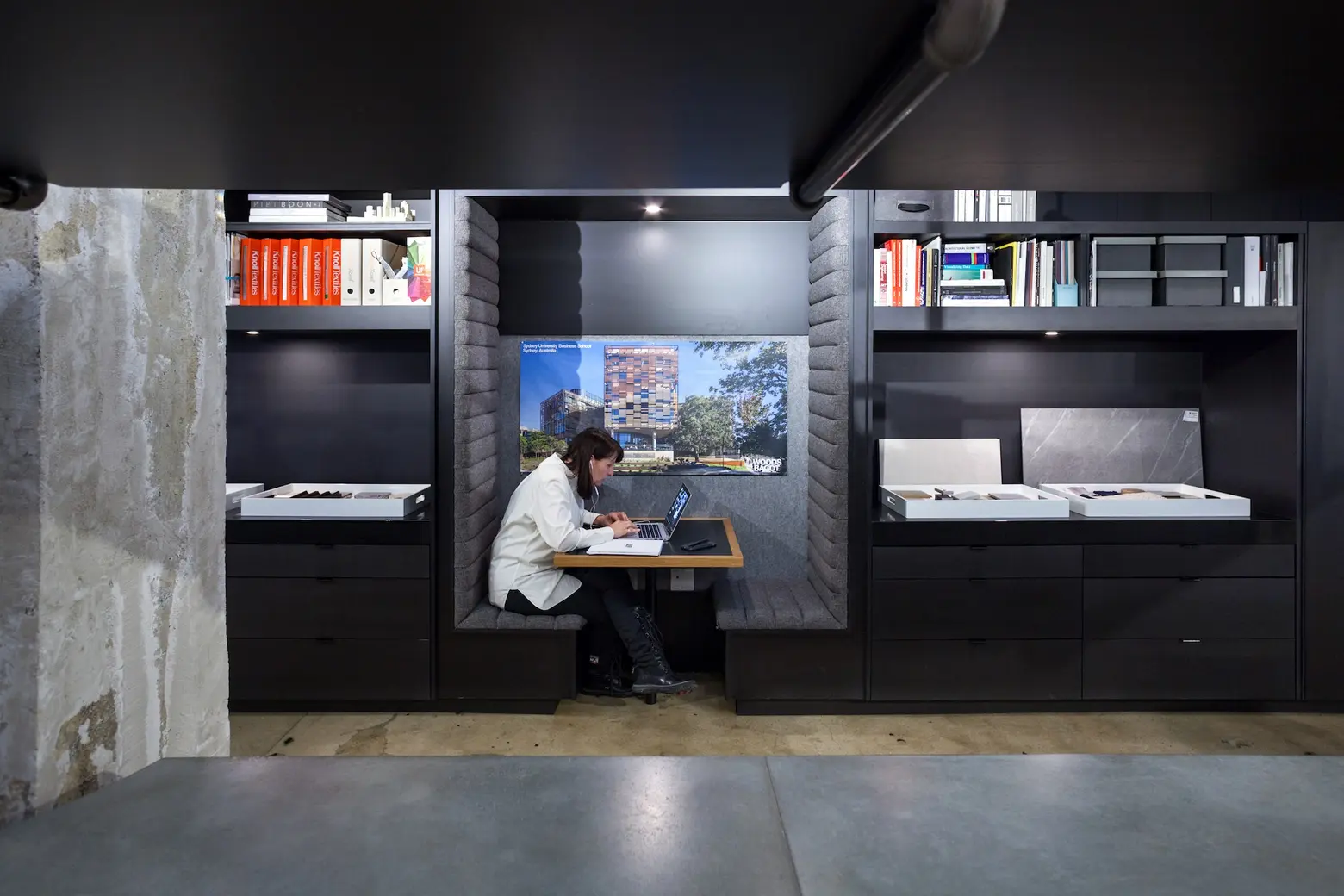
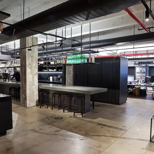
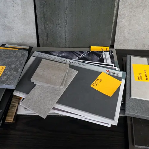
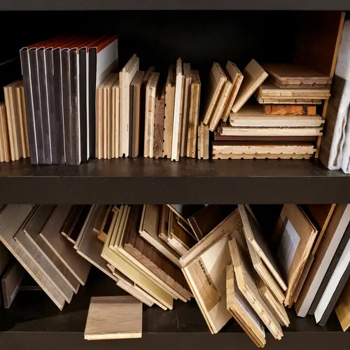
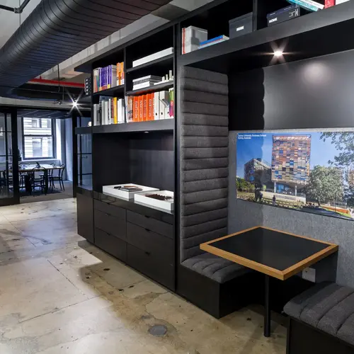
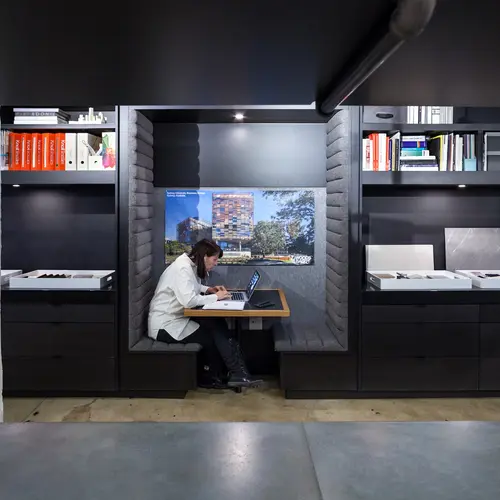
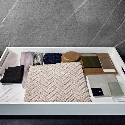
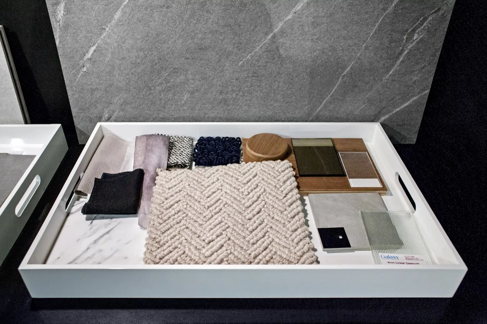 Filing cabinets were replaced with “holes in walls” — overhead storage lining the flexible workbenches. This whole wrap-around system is referred to as the “materials lab.”
What seems to be everyone’s favorite thing about the space?
Here are some responses:
I love the large desk space we have. There is enough workspace for each one of us so it feels that there is always enough air even with the pressure of the constant deadlines. And… the kitchen and workshop 4 are very nice spaces… Because of the dark colors, the space always feels a bit laid back and calm no matter what’s going on.
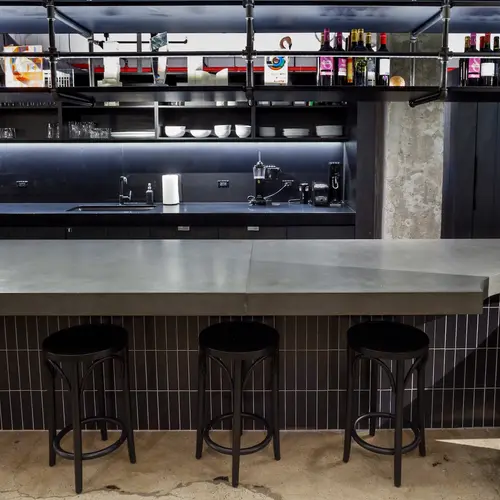
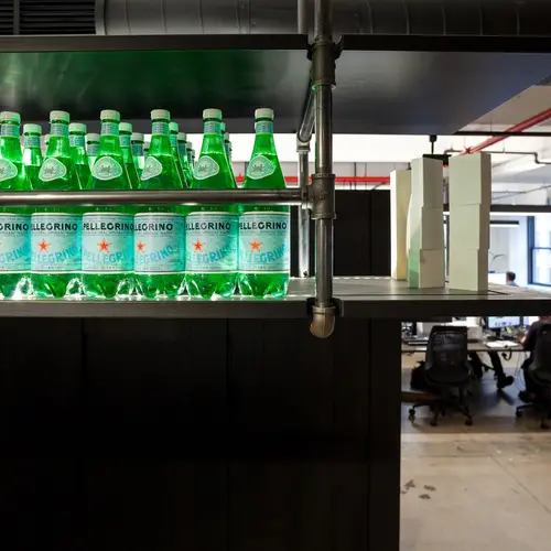
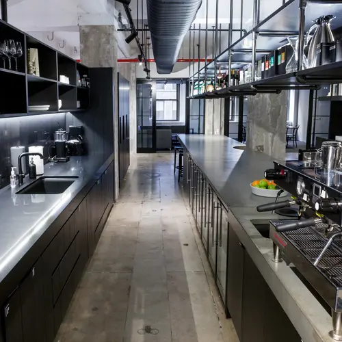
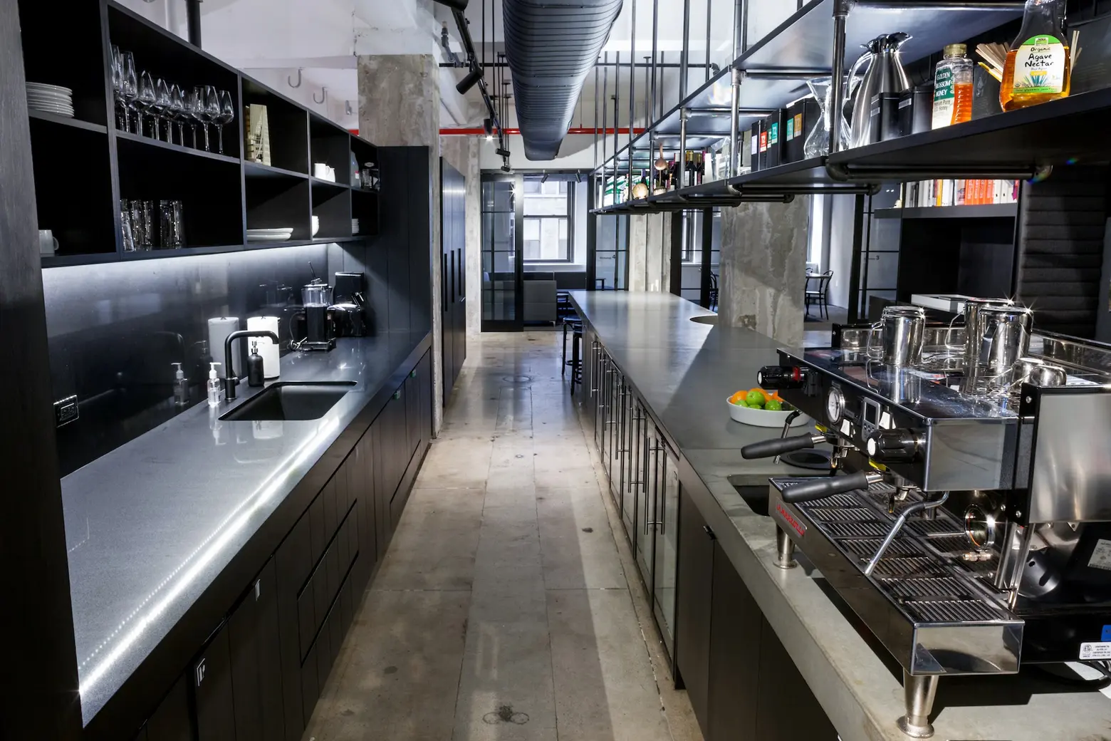
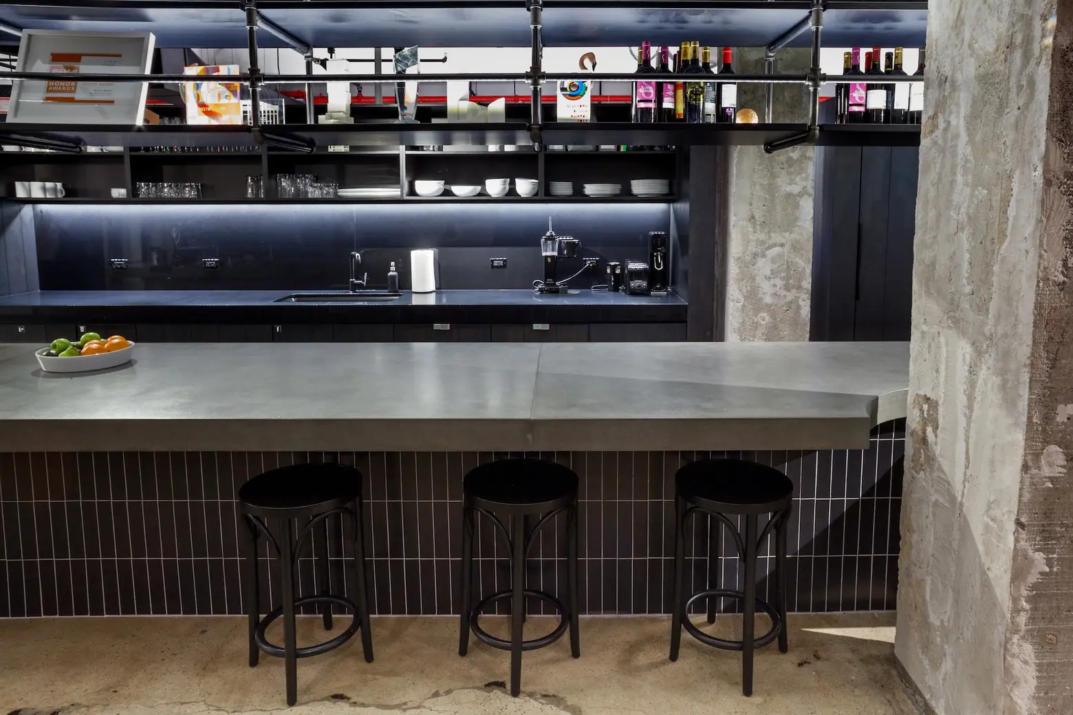
The pantry and kitchen area – such a great setting for happy hours and other informal gatherings pre- and post-meeting with clients.
The look and the variety of spaces. From the open office to the kitchen/bar area, to the conference rooms and informal meeting spaces. The new technology, particularly in the conference rooms.
That amazingly well-designed kitchen.
Are you kidding me? The studio is terrific! Stunning! Really sleek and well designed.
The pantry area is a great place to meet, eat, and have quick conversations.It’ss a great communal space to hang out.
The touch of greenery and the rawness of the materiality in the studio and the juxtaposition between the two!
Casual open atmosphere.
Open space, high ceilings, and generous common spaces.
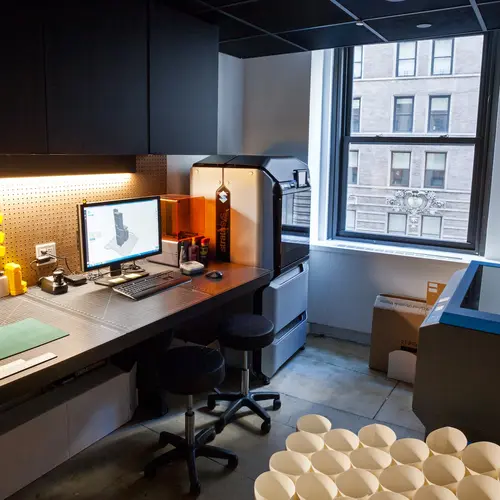
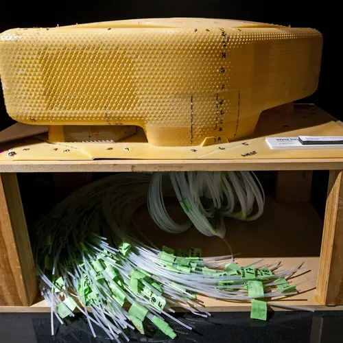
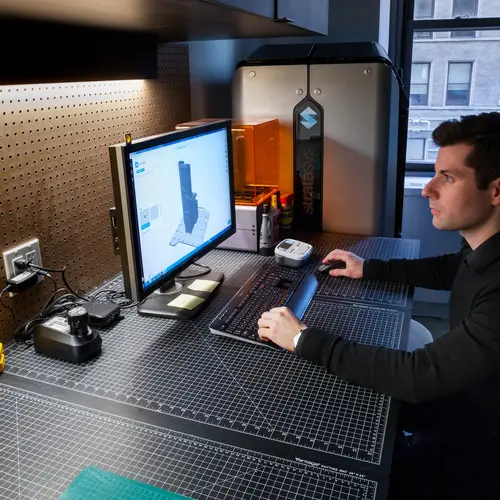
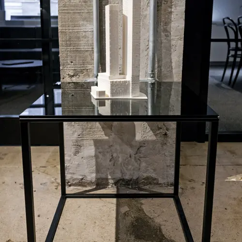
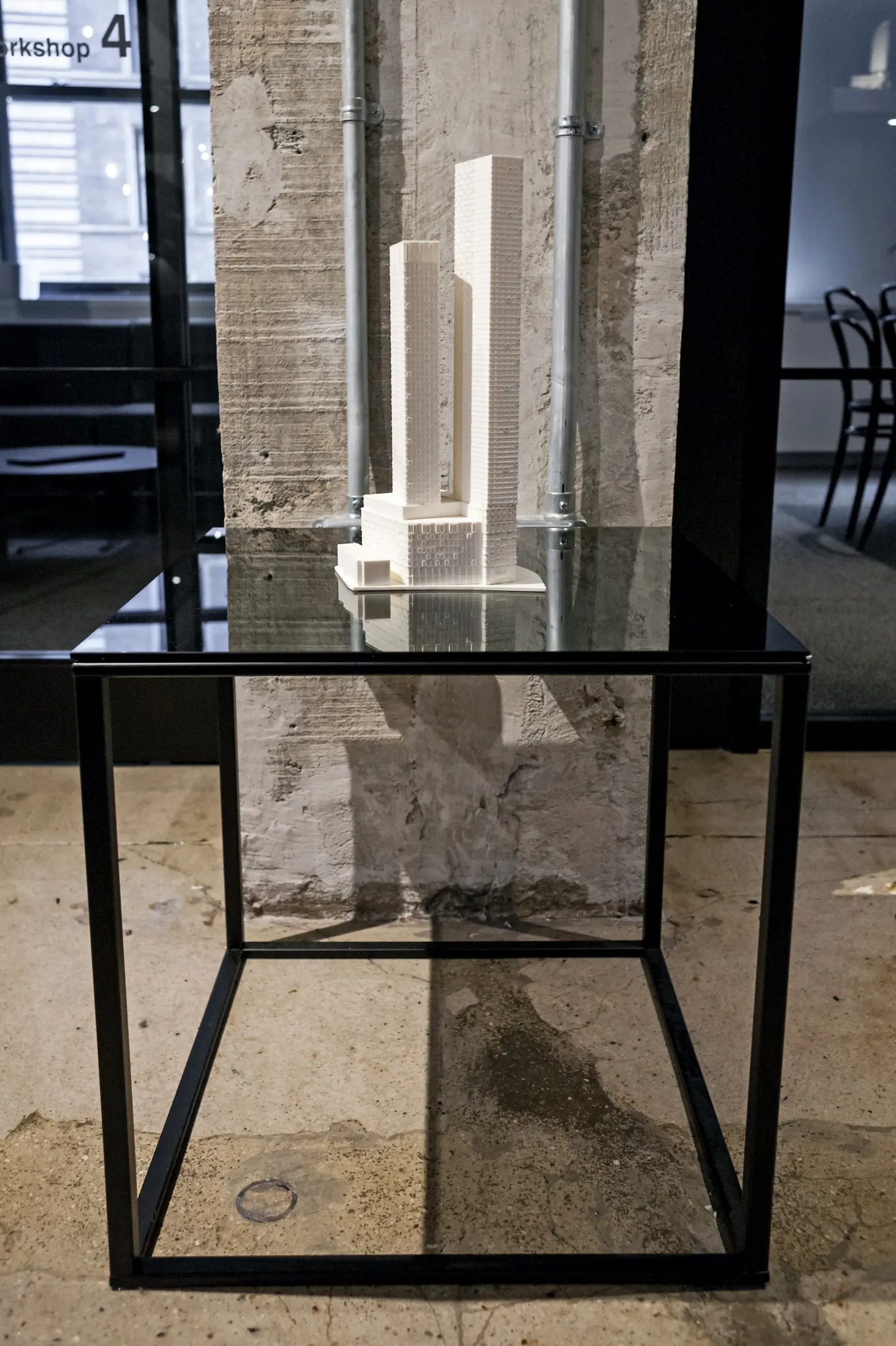
The addition of a model shop is great for the design process and allows us to study form in a way that wasn’t possible a year ago.
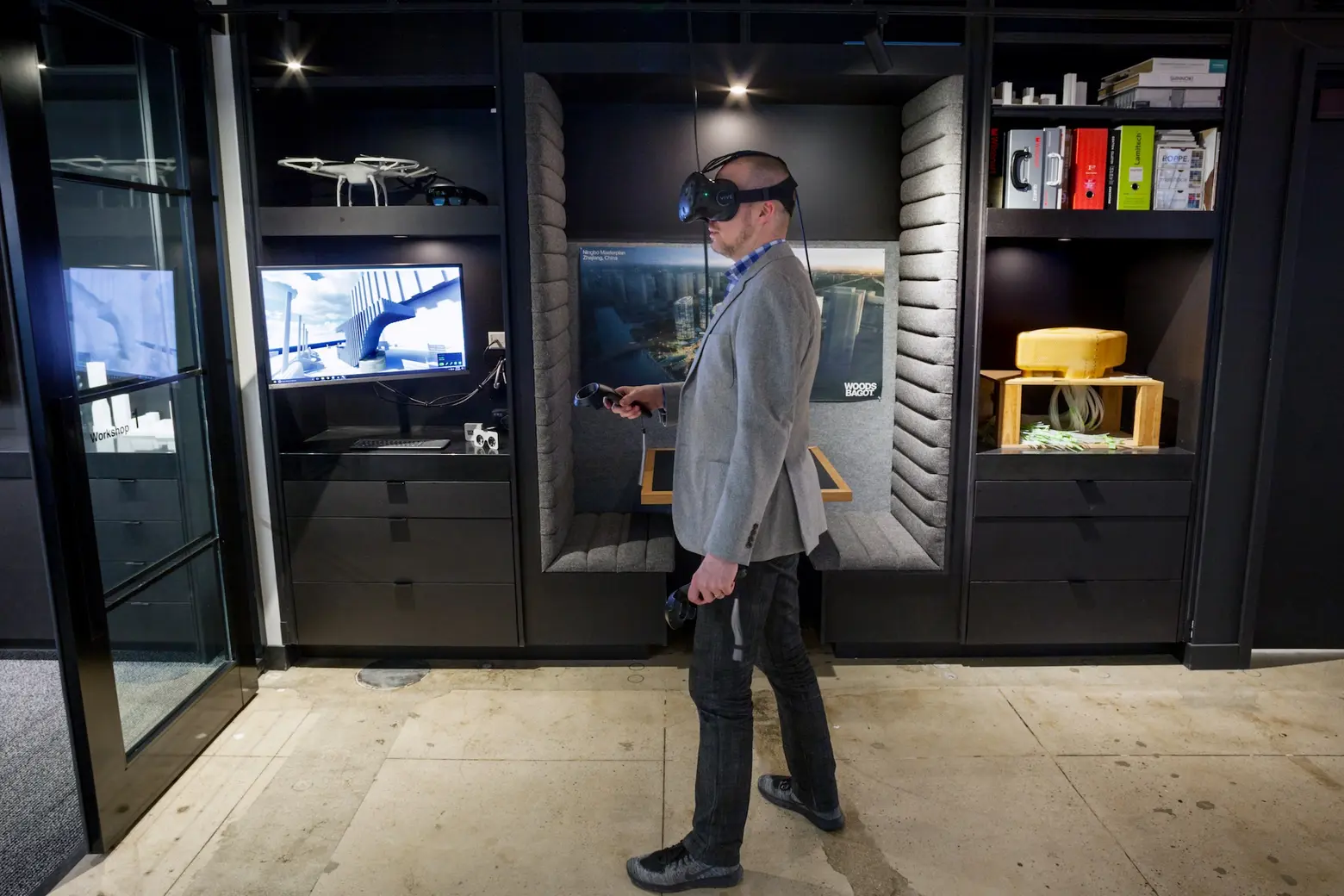
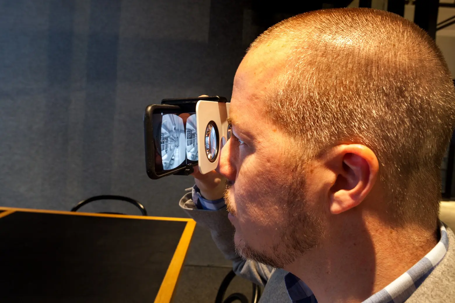 The virtual reality lounge
Can you tell us a bit about the different technologies that have a place here?
Technology is a huge part of our business and really enables our global studio approach. It is really multifaceted from global communication platforms, like the Design Intelligence Portal to Video conferencing at all laptops and phones, to digital design tools like 3D printing, Virtual Reality and parametric specialization and then to data-focused tools that enhance our design outcomes – like our SUPERSPACE computer analytics team. We bring our clients into our technology spaces (our VR space, video conferences with global experts in our studios), and we also bring our technologies to the clients (VR apps on their phones to review their designs).
Technology is actually key to architecture’s future and we are embracing these changes passionately.
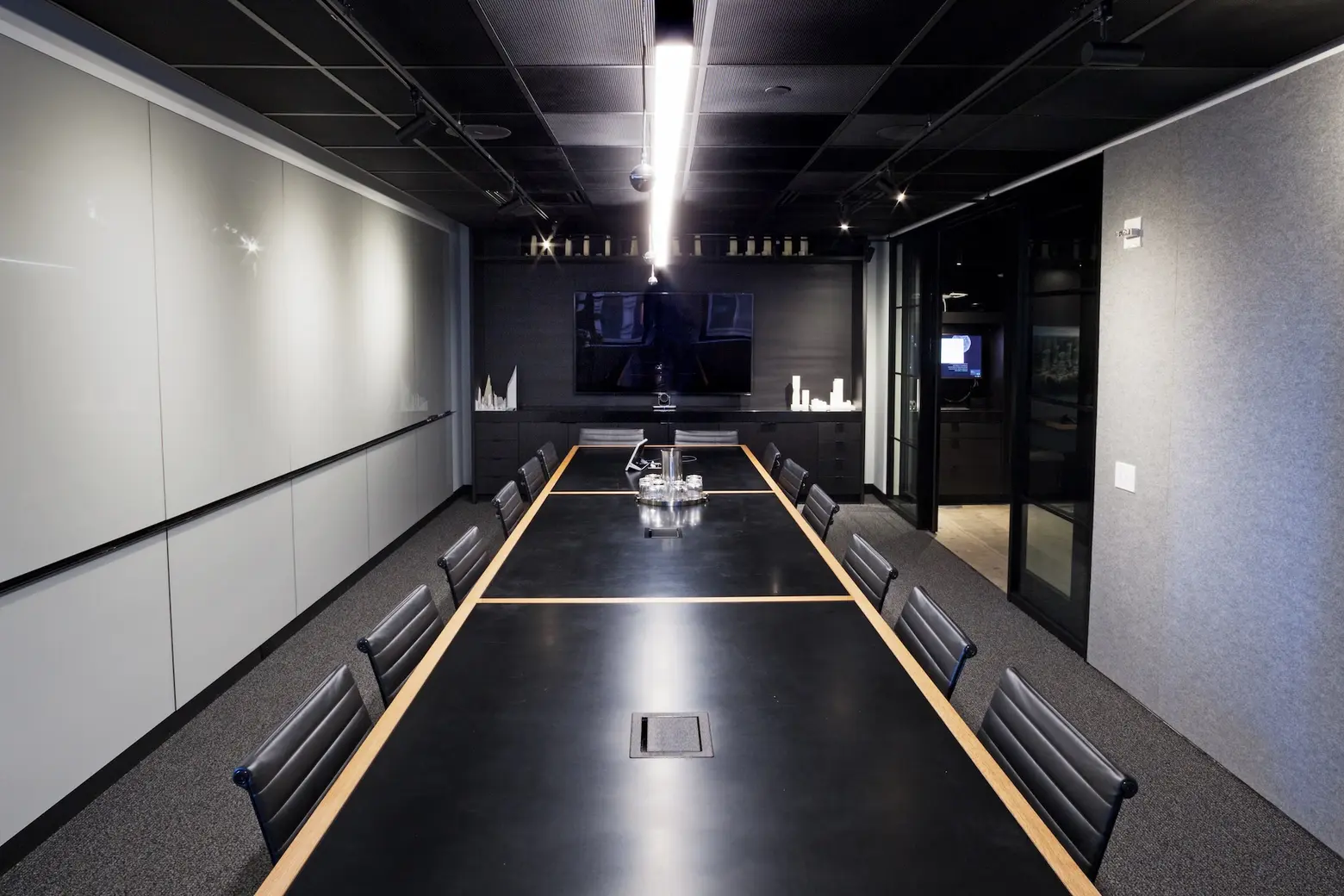
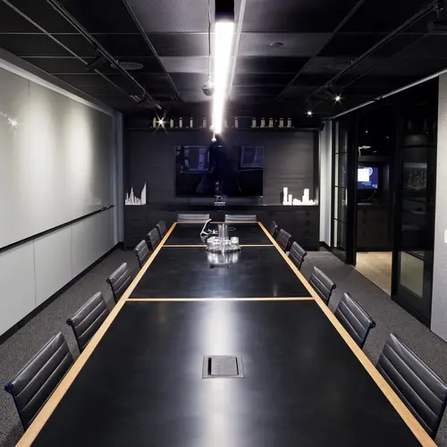
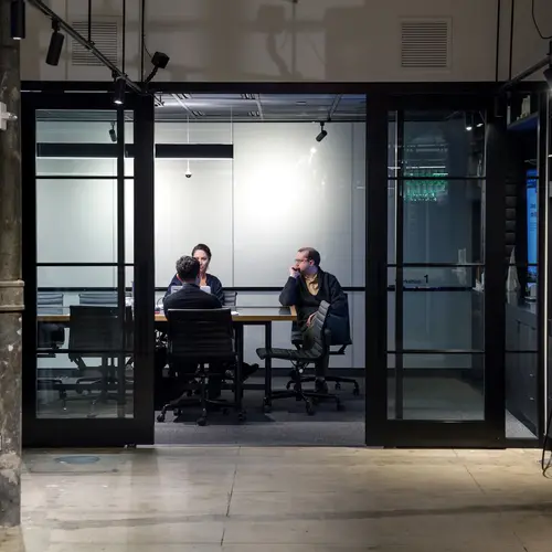
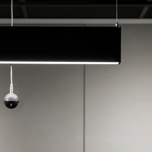
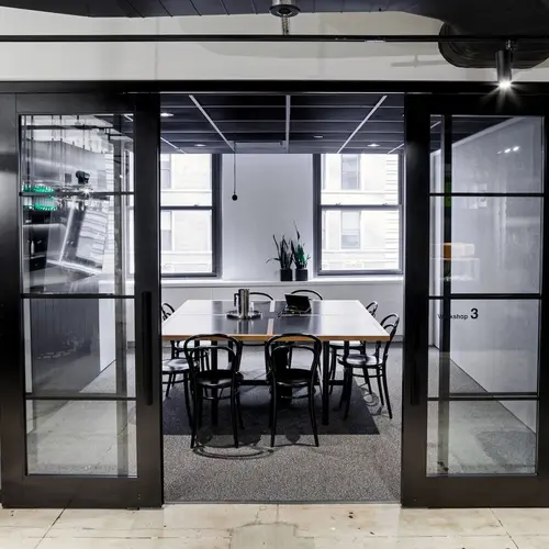
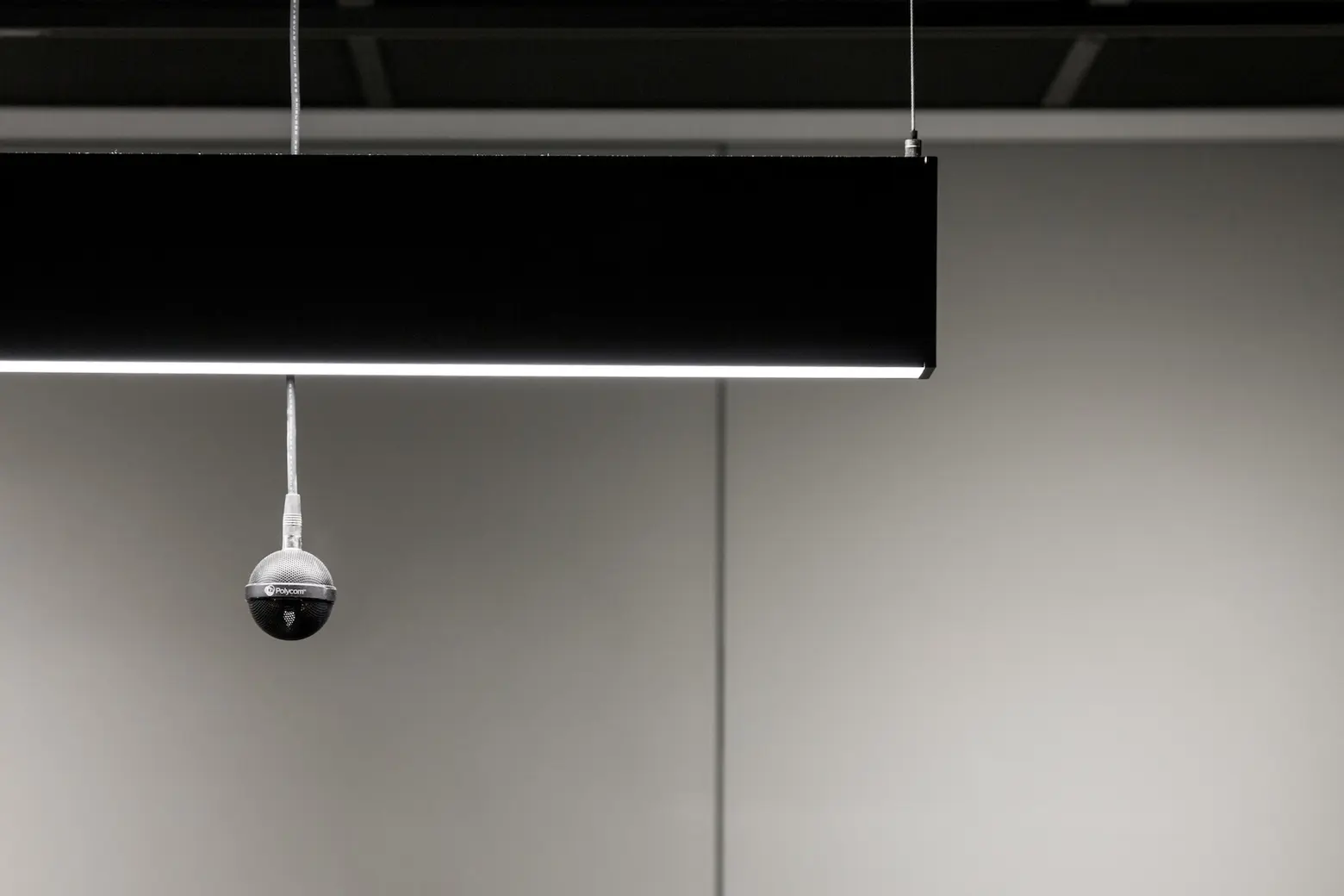 Instead of “conference rooms,” the firm has four “workshops” to emphasize the studio’s purpose as a place for making. Ceiling-mounted microphones ensure that architectural drawings never cover up speakers during meetings.
How do these technologies allow the NY office to interact with the others across the globe?
Sooooo many ways… the DI Portal, video conferencing in each workshop, VC on all laptops and phones – available from home, train, airport – anywhere, a VOIP phone system that’s completely integrated into our computer system, Skype chat, Slack channels.
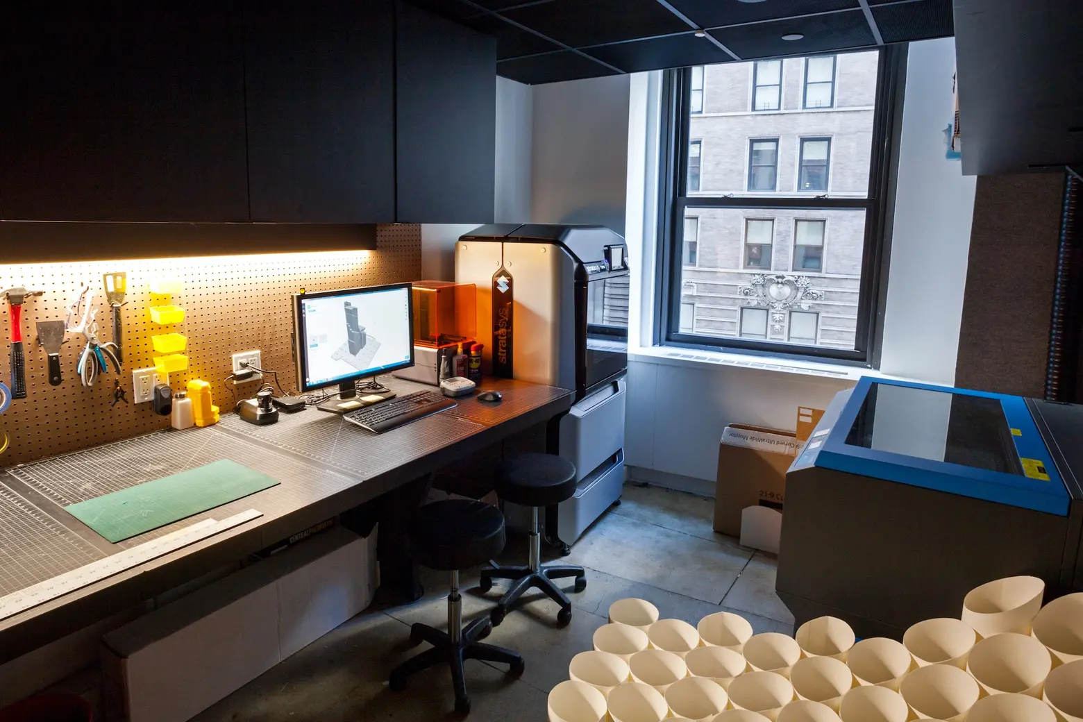
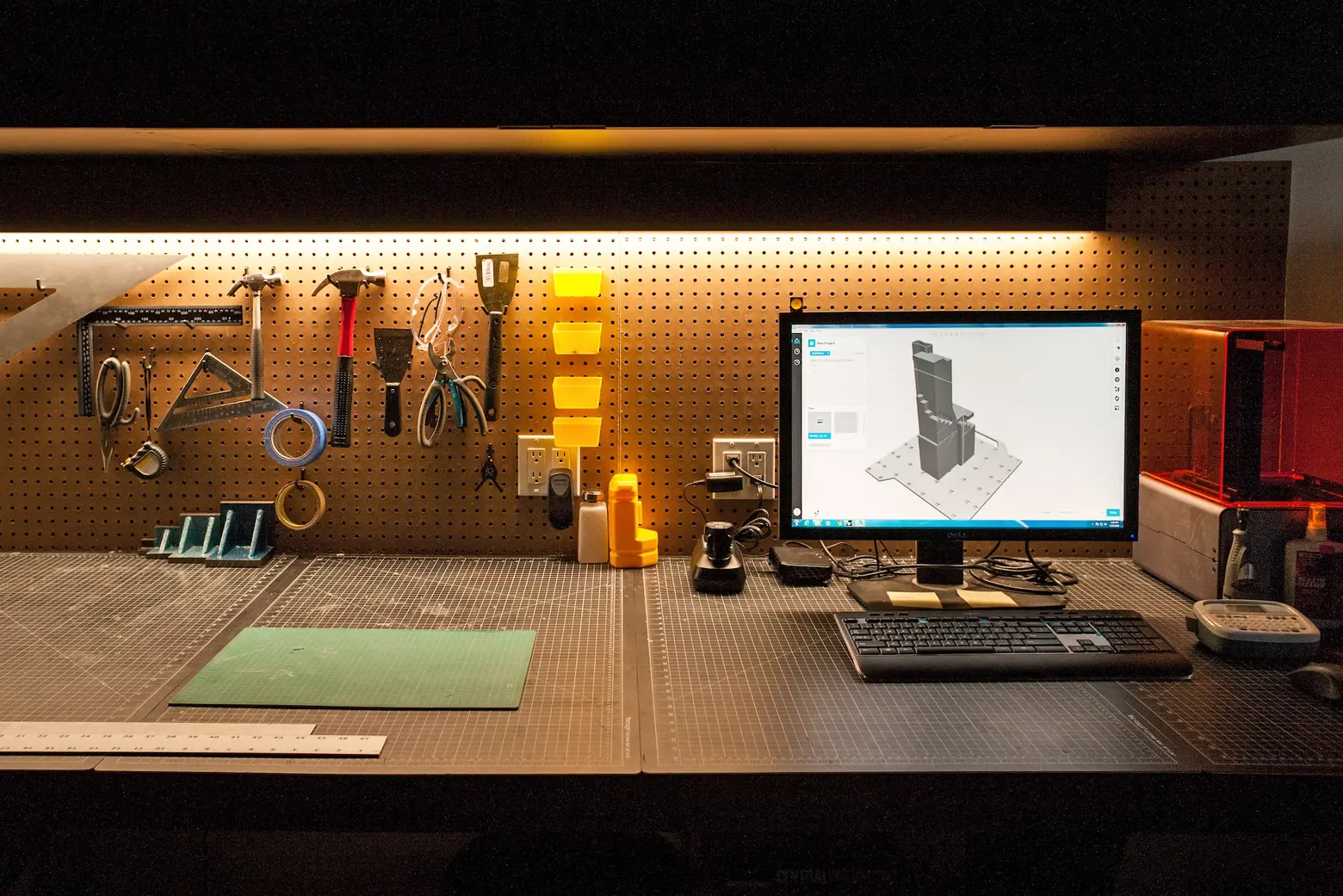
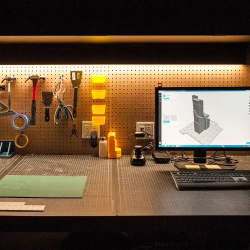
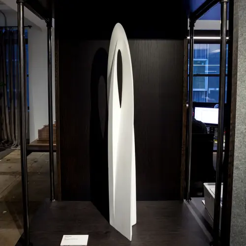
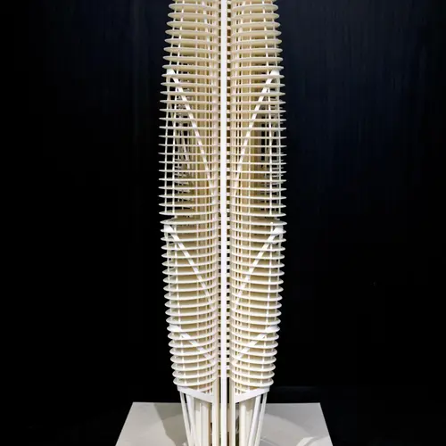
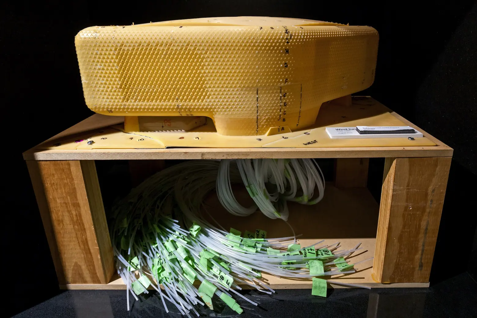 The modeling and 3D printer room
What’s great about having an office in FiDi?
People love the history, the density, the abundant transportation, and the proximity to the harbor and rivers. The fact that the street is closed to most vehicular traffic gives the space outside a friendly pedestrian feeling, special and set apart from the typical New York entry experience.
When the team ventures into the neighborhood, where do they like to go?
The Seaport, Stone Street, the Battery, the Oculus, Century 21, Luke’s Lobster, Sophie’s, Royal Wine Merchants Liquor Store…. Down the road less traveled.
+++
All photos taken by James and Karla Murray exclusively for 6sqft. Photos are not to be reproduced without written permission from 6sqft.
