The Village’s Twin Peaks: From a quirky ‘Swiss-chalet’ to a landmarks controversy
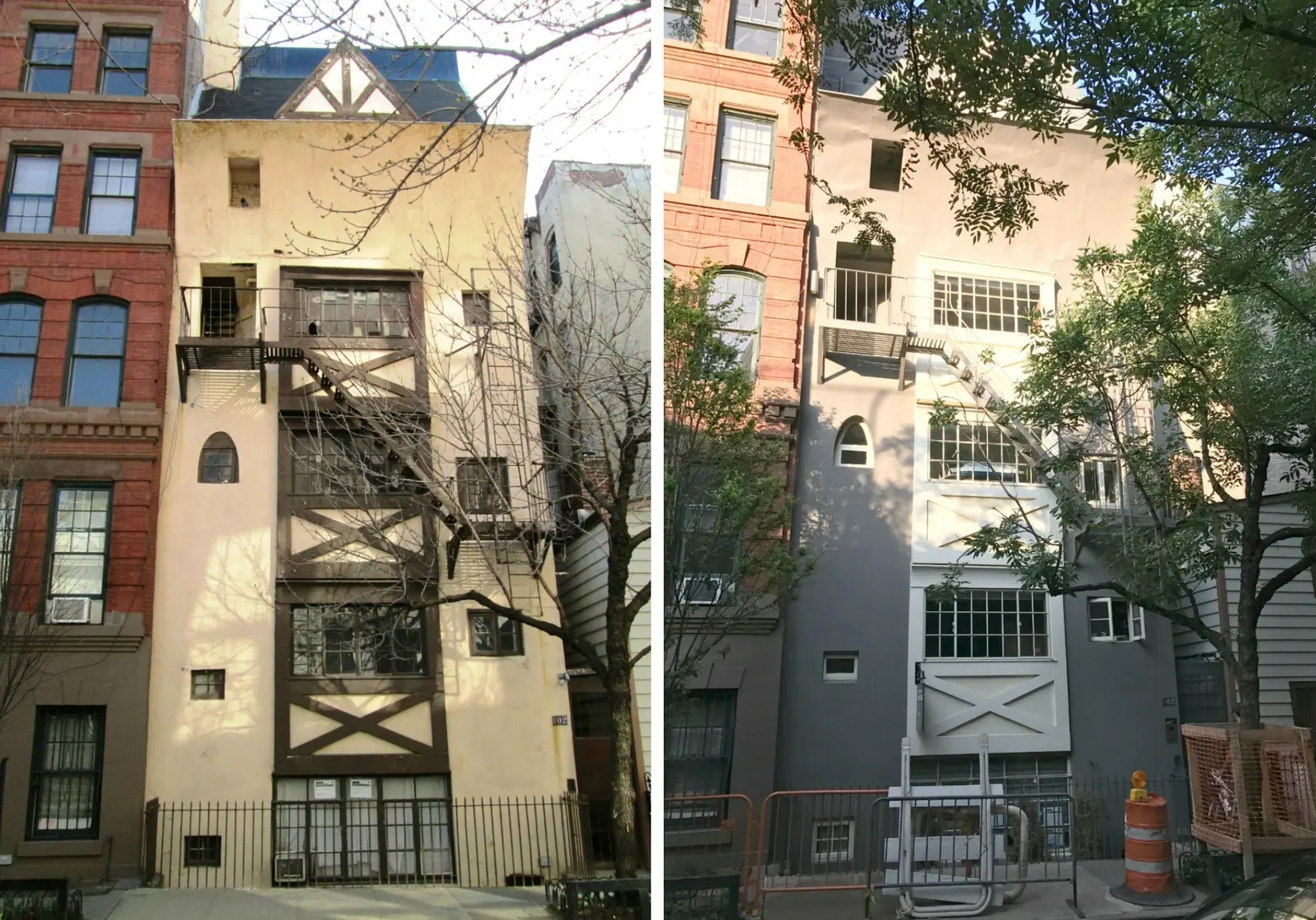
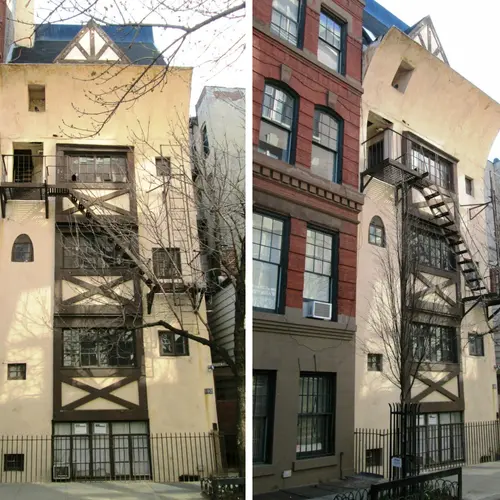
102 Bedford Street in 2015 (left) via Wiki Commons, and as of today, via GVSHP
Few buildings capture the whimsy, flamboyance, and bohemian spirit of early 20th century Greenwich Village as does the building known as “Twin Peaks” at 102 Bedford Street. Described as a “wonderfully ludicrous mock half-timbered fantasy row-house castle” by architecture critic Paul Goldberger, the present incarnation of the building was born in 1925 as a radical remodeling of an 1830 rowhouse into a five-story artists’ studio apartment building. In the mid 20th-century, the building became even more iconic with a cream and brown paint job that mimicked its Alpine cottage inspiration. However, a more recent paint job stripped away this history, resulting in a controversial landmarks battle.
At Twin Peaks’ unveiling, no effort was spared to emphasize its free-spirited and iconoclastic associations. According to press accounts, film star Mabel Normand was invited to christen the building by smashing a bottle of “pre-Napoleon” champagne on one of the chalet-style gables, while Princess Amelia Troubetzkoy burned acorns in a bronze brazier as an offering to Pan. The pagan ritual was complemented by the sprinkling of holy water by Archbishop William Henry Francis of Chicago, and actresses Helen Hayes and Minnie Madern Fisk tossed flowers from above onto onlookers in the street.
Press accounts also made clear that the fantasy-like Swiss-Chalet design eschewed conventional color schemes and instead chose a deep black base for much of the façade, with the windows and timbering painted a contrasting “rainbow-hued” assortment of orange, blue, and green. Erring on the side of understatement, the New York Sun described Twin Peaks as “one of the most curious looking buildings” in the city.
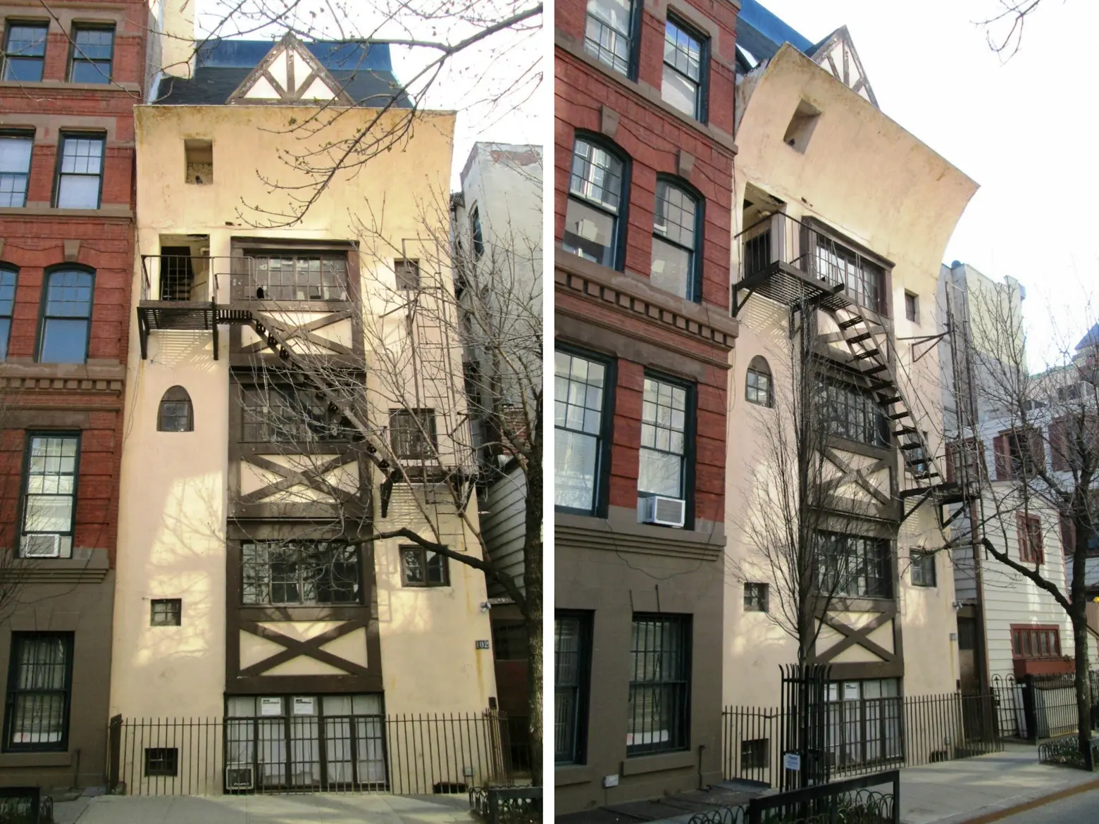
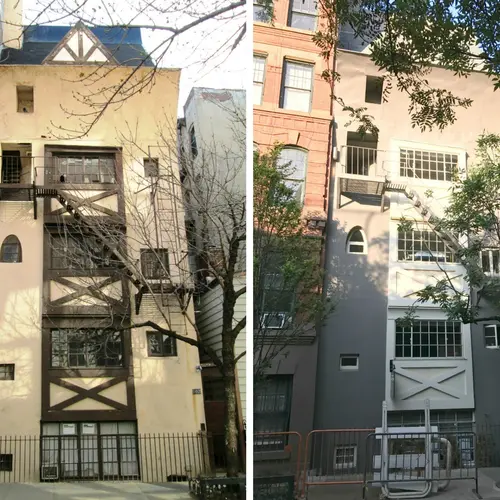
The building in 2015 via Wiki Commons
Sometime in the mid-20th century, the building was repainted in the color scheme most New Yorkers came to know and love – a light cream base with dark brown accents on the timbering and windows, to more closely mimic the Alpine cottages which served as inspiration for the original design. A search of press and other accounts yields no evidence of complaints about this change, as Villagers and New Yorkers seemed to embrace this scheme as true to the eccentric and light-hearted spirit of the beloved building, which in the intervening years had become a Greenwich Village landmark (literally and figuratively; in 1969, the building was included in the Greenwich Village Historic District, granting it landmark protections).
And thus Twin Peaks has remained an icon of Greenwich Village quirk and whimsy for nearly a century, as the building was known to attract romantic or eccentric types willing to live in tiny “artist” studio apartments compensated with high ceilings, large windows, and unmatched charm, history, and eccentricity.
But in 2014 a new owner decided the building needed a makeover, including a toned-down and cleaned up paint job. Rather than subject the proposal to the public hearing process at the Landmarks Preservation Commission, where the public has a chance to weigh in and provide evidence and arguments about every “significant” proposed change to a landmarked structure, the applicant successfully lobbied the LPC to go around the requirements by considering the makeover a “restoration of historic conditions.” They were therefore granted approval for the changes behind closed doors.
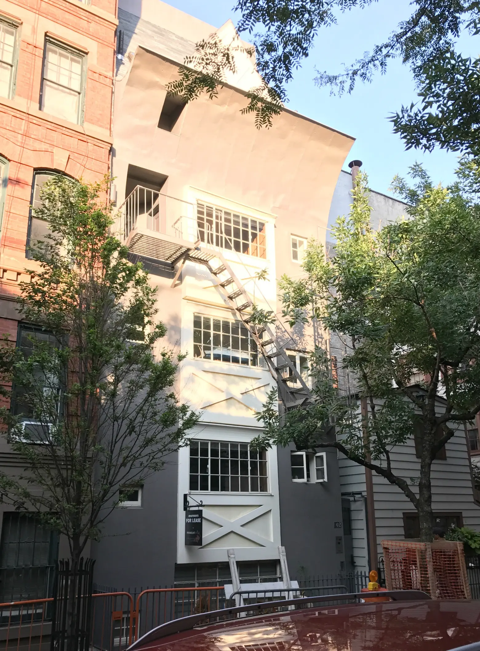
The current color scheme; photo courtesy of GVSHP
The new scheme appeared earlier this year and was neither a reapplication of the chalet-style paint job of the last 60+ years nor a restoration of the deeply contrasting black base with contrasting “rainbow hues.” It features a dull, battleship gray coating with beige-cream accents below the windows. No longer an ode to creativity and whimsy, the makeover resembles the color scheme for a storage warehouse or a 1950s suburban split-level home, rather than a symbol of 1920s Greenwich Village bohemia.
GVSHP and local elected officials pointed out the non-restorative paint job and lack of a public hearing to the LPC, but the Commission asserted that the new grey-and-beige scheme still qualified as a “restoration.” Despite these decisions, opponents are still advocating that the LPC reverse its decision.
+++
This post comes from the Greenwich Village Society for Historic Preservation. Since 1980, GVSHP has been the community’s leading advocate for preserving the cultural and architectural heritage of Greenwich Village, the East Village, and Noho, working to prevent inappropriate development, expand landmark protection, and create programming for adults and children that promotes these neighborhoods’ unique historic features. Read more history pieces on their blog Off the Grid.
Get Inspired by NYC.
Leave a reply
Your email address will not be published.









I know it’s a minor detail, but the actress at the unveiling was Mabel Normand, not Dormand. Unfortunately, she is mostly forgotten today, but she was hugely important in the early history of cinema. Otherwise, great story!
Sorry, but the grey and white scheme looks better than the cream and brown. I’m all for preservation of history, but one of the best things about NYC is the constant change. Buildings change, tastes change- at least the current owner cared enough to refresh the building. This article is written with such obvious bias against the change, it’s laughable.