Artist Remko Heemskerk’s Graphic Urban Prints Are Inspired by His Personal Experiences in New York
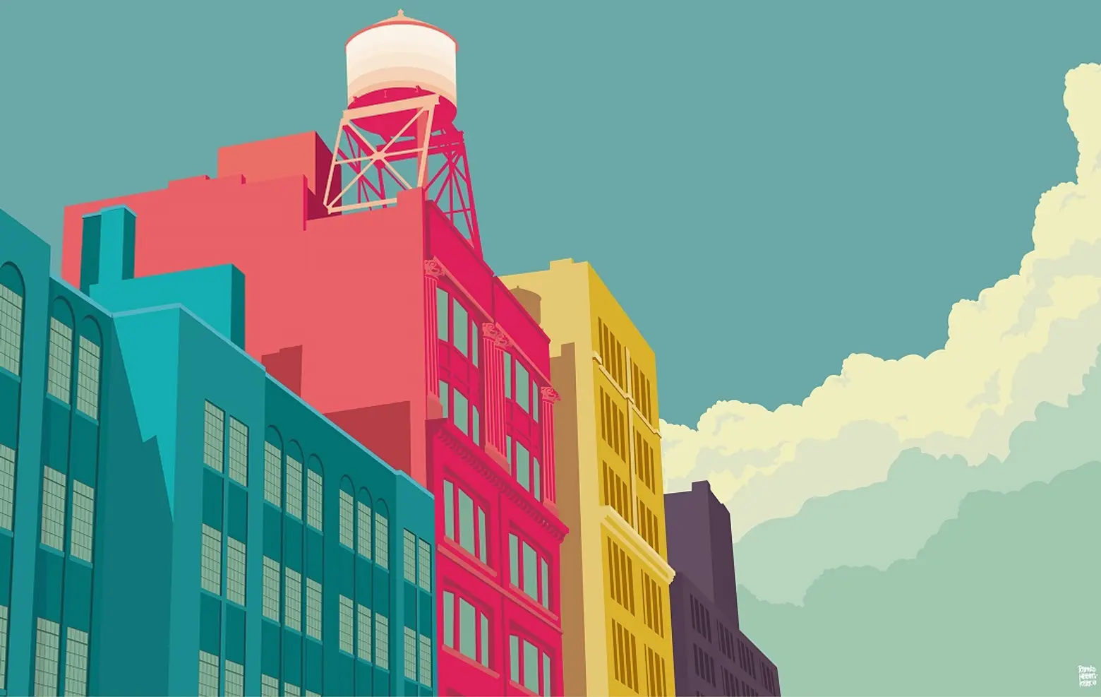
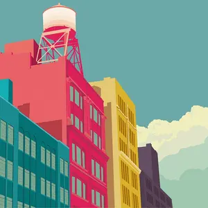
East 10th Street, East Village © 2012 – 2015 Remko Heemskerk
It’s pretty common to find photographs or paintings of iconic New York City landscapes and streetscapes, but there’s usually not much of a reason behind the artist’s choice other than that everyone knows these sites or they’ll likely sell well. Netherlands-born artist Remko Heemskerk, however, created this print series from the inspiration of his personal experiences living in the city. Each site has a special meaning to him, whether it be the view from his apartment window or the spot where he and his wife kissed goodbye every morning.
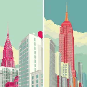
The visual element that sets Heemskerk’s work apart is its bright, graphic composition. Rather than using realistic colors or traditional black-and-white, he chose a style that he feels reflects the vibrancy of New York City and its residents.
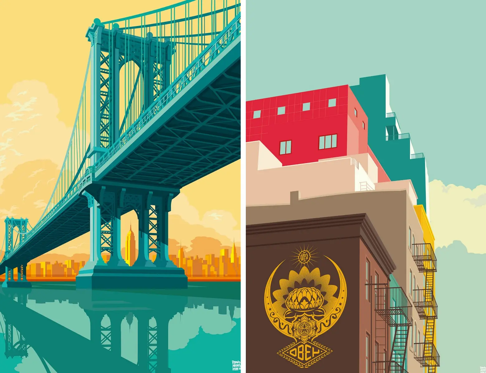
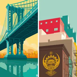
Manhattan Bridge (L) and Shepard Fairey, Obey, Lower East Side (R) © 2012 – 2015 Remko Heemskerk
Remko Heemskerk moved to New York three years ago when his wife got a job at the UN. He had left behind a 15-year career as a graphic designer and art director, so decided to start drawing again when they landed in Greenwich Village. His work quickly evolved into the now-world-famous block-color building and streetscapes, all of which have a personal story for the couple. For example, Shepard Fairey’s stencil on the Bowery represented for the couple “the gateway to the Lower East Side,” where they would go for “cheap beer and good snacks.”
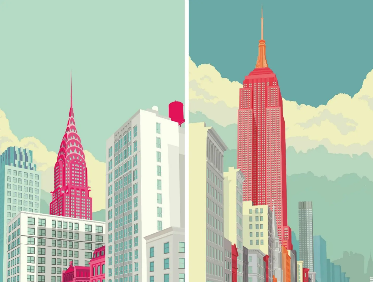
Chrysler Building (L) and Empire State Building (R) © 2012 – 2015 Remko Heemskerk
The artist sketches his ideas on paper and then transfers them to Adobe Illustrator and Photoshop, where he uses color to highlight a specific building or aspect. He says of this process:
I had that idea for a long time. Some buildings are so grey and boring that I can’t see them without color. I always say that my artwork is pure architecture but the color represents the vibe and the people in the city. A striking composition is more important than reality. I like to change the real world. Sometimes I put photos in Photoshop and copy and paste everything until I have the perfect picture. Those files can be a basis for an illustration file. But even then, I change everything in Illustrator. Sometimes the perspective isn’t right. Or the shadows don’t fit. That is just what I like about being an illustrator. I’m playing God and creating my own world.
Heemskerk and his wife are now back in the Netherlands, where he is still creating works from photographs taken while in the city. His cheerful work is so popular, in fact, that NYC & Company hired him to design their See the City campaign encouraging tourism to all five boroughs.
[Via Untapped via Boo York City]
RELATED:
- Franck Bohbot’s “Light On” Photographs Showcase NYC Landmarks After Dark
- Photo Series Captures Three Years of NYC Subway Cars Being Dumped in the Atlantic Ocean
- New Yorker Spotlight: Photographer Barry Rosenthal on Living in the Financial District and Finding Inspiration in Nature
