The Nets reveal new Barclays Center court design, inspired by Brooklyn

Images by Mike Lawrence; courtesy of the Brooklyn Nets
Images by Mike Lawrence; courtesy of the Brooklyn Nets
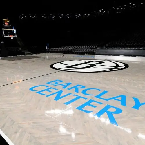
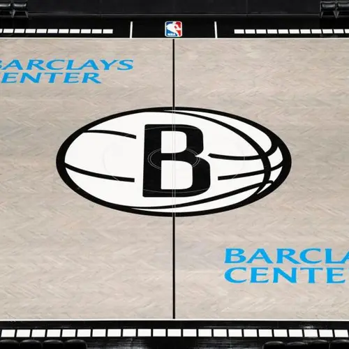
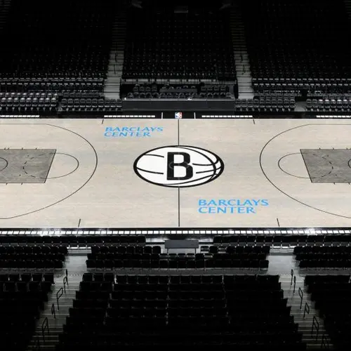
The Nets have revealed a new primary court design just in time for the 2019-20 season. It’s the first full redesign of the court since the Nets moved to Barclays Center in 2012 and it’s very much inspired by the team’s roots. The new floors retained their trademark herringbone pattern but got updated with a fresh gray hue—an unusual, but symbolic, choice.
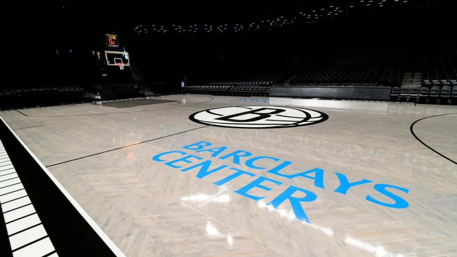
“The colors of the floor, weathered wood and concrete gray, represent the numerous playground courts found throughout the borough, the brownstone-lined streets and Brooklyn’s industrial foundation,” the team said in a statement. “The palette engrains the grit and determination of the borough into the team’s playing surface.”
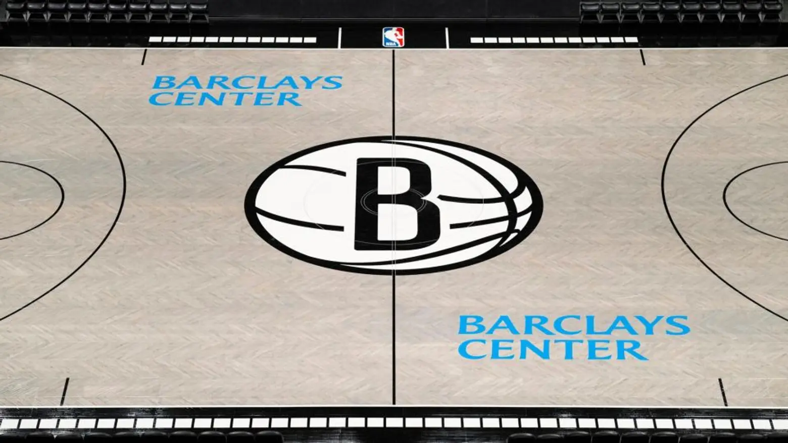
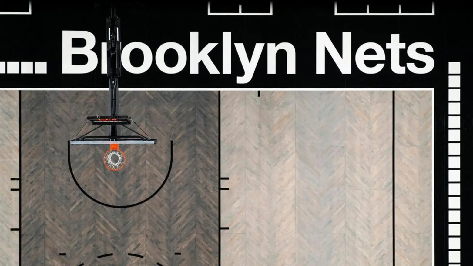
A simplified and enlarged version of the Nets’ iconic logo takes up center court while the baselines display the team’s name in a subway-inspired typeface, and a subway-tile motif fills in the rest of the perimeter.
The Nets will inaugurate the court with their preseason matchup against SESI/Franca Basketball Club of Brazil on Friday, October 4.
RELATED:
- Brooklyn’s highest penthouse sells to Nets point guard Spencer Dinwiddie
- Cuomo breaks ground on Belmont Park arena; see new renderings of Islanders’ future home
- All Barclays Center coverage
Images by Mike Lawrence; courtesy of the Brooklyn Nets
