Crowd-sourced maps show where tourists and hipsters land in every big city
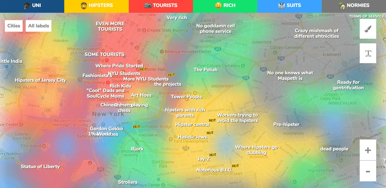
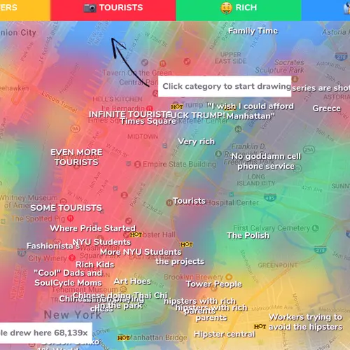
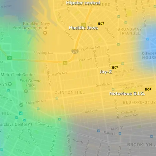
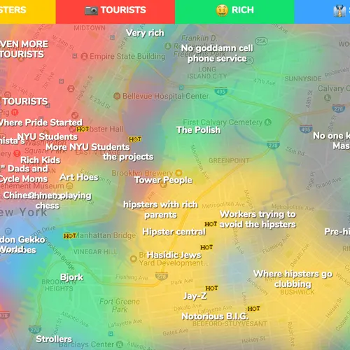
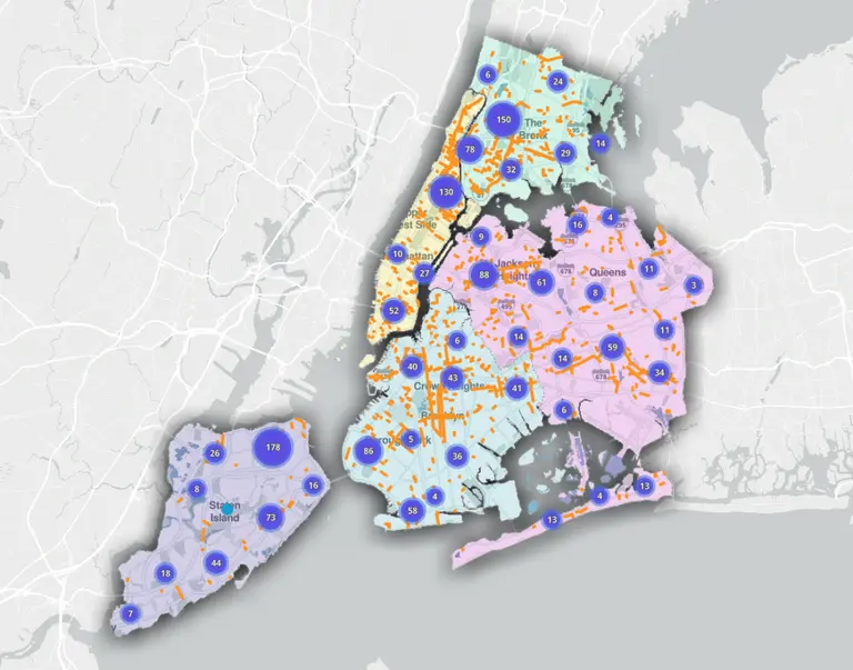
While most New Yorkers can describe each neighborhood in just a word or two, a new website takes these definitions and puts them on a map, giving users a better understanding of how locals see each city block. As ArchDaily learned, the platform, Hoodmaps, crowd sources information, letting the public “paint” parts of the city using six colors to represent “uni”, “hipster,” “tourists,” “rich,” “suits” and “normies.” In NYC, it’s no surprise users painted Times Square, Hell’s Kitchen and the High Line in red, marking high tourist spots. And of course, Williamsburg was yellow marking it “hipster central” on the map.
The website, created by Pieter Levels, features a thousand of the world’s largest cities. Similar to a website like Wikipedia, the site is constantly being edited with new content from the public. Levels first came up with the idea while traveling in a city and not being able to find the cultural areas instead of just the tourist hot spots.
Data from the map provides direct insight into public perception of a neighborhood. This could potentially be used by architects or urban designers to gain a better understanding of each community. Other cities with high user activity on Hoodmaps, include Los Angeles, San Francisco, Austin, Paris, Vancouver, London and many more.
If users have conflicting opinions about how to label a neighborhood, the most popular color will be shown. While helpful labels include “good restaurants” and “too much traffic,” other labels reinforce negative stereotypes. To control unfavorable or untrue labels, users can up or down vote them, or tag them as “NSFW.”
The website continues to be edited and expanded, with the goal to eventually let users create and share their own maps. Levels also hopes to use the website as a way to make statistical conclusions. Explore and edit content for thousands of cities using Hoodmaps here.
[Via ArchDaily]
RELATED:
