Designing One Vanderbilt: The architects of KPF discuss the incredible 1401-foot undertaking
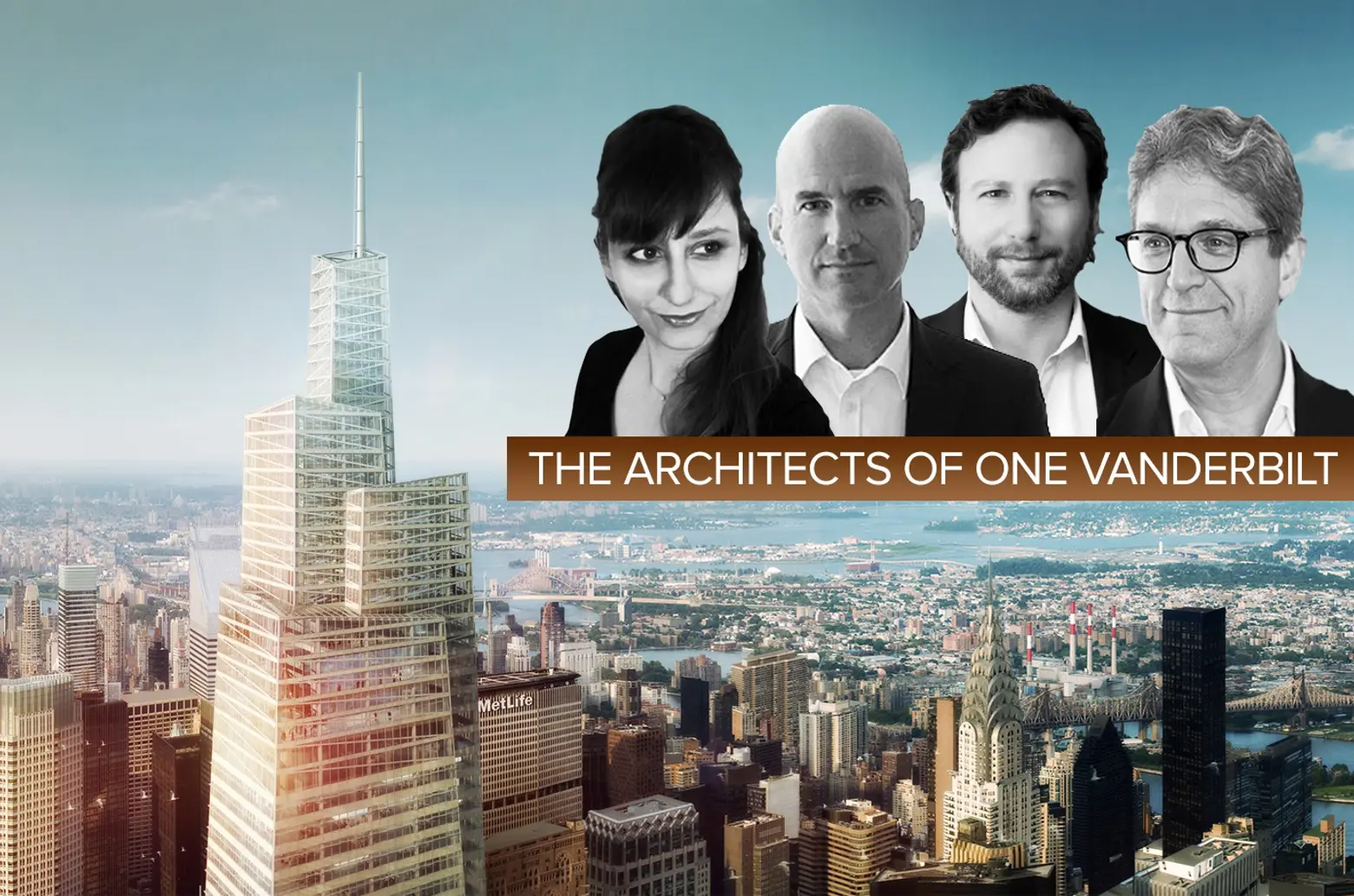
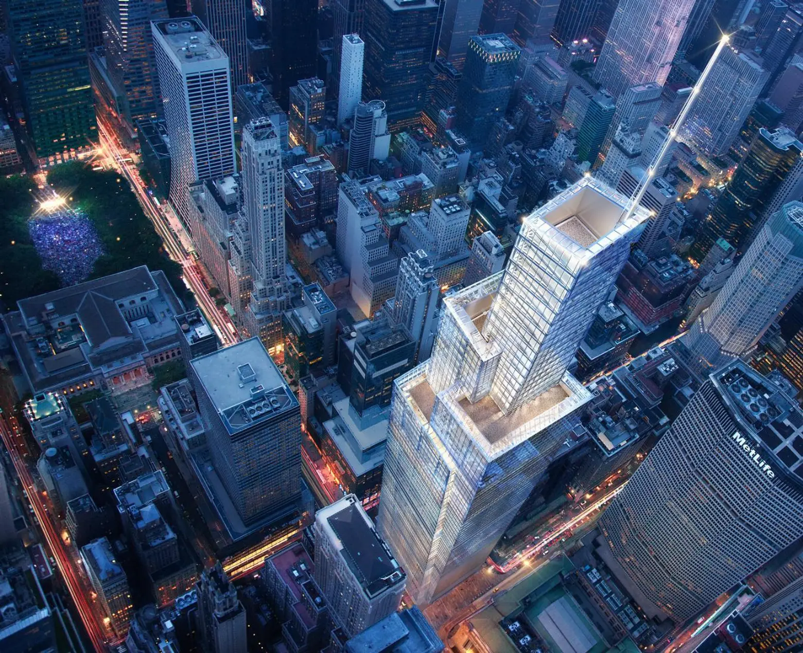
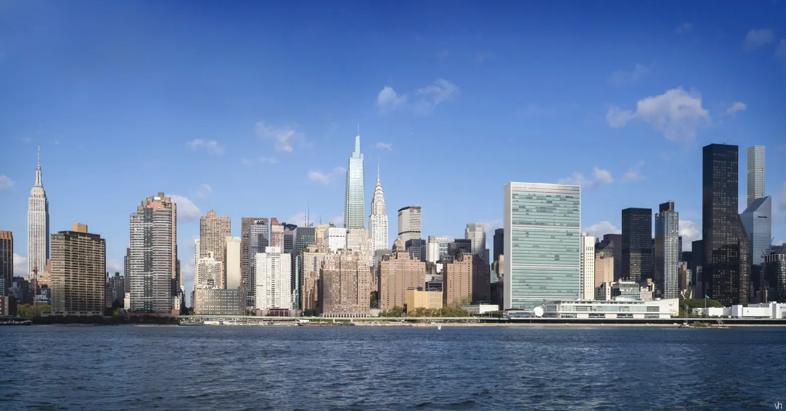
There are a number of towers on the rise poised to change the New York City skyline, but few are anticipated to have an impact as significant as One Vanderbilt. Developed by SL Green and designed by Kohn Pedersen Fox (KPF), the glassy supertall will extend an incredible 1,401 feet into the clouds to become the city’s third tallest tower (following One World Trade Center and the in-progress Central Park Tower) while also bringing a staggering 1.7 million square feet of office space to Midtown Manhattan. But beyond its height and girth, this massive development is expected to elevate its surroundings a profound way. Indeed, the enshadowed “iconic but aging” district surrounding Grand Central, long-deprived of public space and life beyond weary commuters, will be turned into a verdant block dedicated to all New Yorkers.
As part of the development, SL Green will spend $220 million on local transit improvements and incorporate a brand new pedestrian plaza of nearly 15,000 square feet at the base of the tower. Above, there will be a new observation deck located at the 1,020-foot mark of the supertall, a design gesture set to rival the perch of the Empire State Building. Indeed, One Vanderbilt, which broke ground in October 2016, has become the paragon for a civic-minded Midtown East renaissance.
“It’s gratifying to be breaking ground not just on this building, but on what it represents: a massive investment in our transit and pedestrian infrastructure, and a first step toward the future of East Midtown,” Manhattan Borough President Gale A. Brewer said at the October event. “When development is done carefully, collaboratively, and produces real investments in the public realm that improve the neighborhood, everyone wins.”
As one might expect, designing an office tower demanding more than the most leasable square feet possible was no easy task. And to get an idea of the herculean effort that went into the project, 6sqft visited with the One Vanderbilt design team at KPF.
Ahead, hear what project leads Jamie von Klemperer, Andrew Cleary, Jeffrey Kenoff and Darina Zlateva had to say about getting this project off the ground, as well as their thoughts on what we can expect from other supertalls in NYC in the future.
***
KPF has become the leading builder of supertalls around the globe and now has two 1,000-plus-foot-tall structures underway in New York. On a scale of 1 to 10, with 10 being the most challenging, where does One Vanderbilt fall in terms of difficulty. What are some of the challenges posed by this particular site and by the city?
Andrew Cleary, Technical Director: Definitely a 10, but not due to technical reasons alone. The technical complexity of designing a supertall like One Vanderbilt is undeniable, especially when faced with the need to fit and coordinate twice the amount of buildable square footage into an already very constrained site. However, it was the Entitlement and Approval process that One Vanderbilt initially faced that proved one of the project’s hurdles. The path to final approval straddled two administrations, coordinated diverse criteria required by a multitude of municipal agencies, and was subject to the review of seemingly countless public and semi-public stakeholders. KPF’s challenge was to navigate the complex procedural process by maintaining design flexibility and simultaneously preserving the basic principals of the design concept. Although the process wasn’t always straightforward, the result is a singularly elegant design that will successfully join Manhattan’s skyline.
How did One Vanderbilt’s position right next to Grand Central influence the tower’s design?
Jamie von Klemperer, President of KPF and Design Partner: One Vanderbilt reinterprets the dynamic ramps of Grand Central’s internal section as a soaring composition of diagonals that culminate into a prismatic sky garden of observation decks. We designed the tower to be clad in a series of glazed terra cotta spandrels and these are meant to recall the Guastavino tiles within the terminal. The design reinterprets the detail of that great structure using a modern eye.
Do you think One Vanderbilt could become the future standard of high-rise design in New York City? Especially in the way the building carves out public spaces at its top and bottom and supplements the network of infrastructure around it?
Darina Zlateva, Senior Designer: We should say that SL Green is an incredibly forward-looking developer that believes in and is committed to the betterment of East Midtown. Marc Holliday, SL Green’s CEO, recognized the importance of the site to the district early on and did not shy away from the responsibility of developing there. As part of the special permit for a FAR 30 tower, SL Green is putting $220 million towards transit oriented improvements in and around Grand Central; this is the largest private contribution of its kind in the New York City’s history. The amount will fund platform and stair upgrades on the 4/5/6 subway line, a direct connection to the Shuttle, a new connection to East Side Access, a Transit Hall on Vanderbilt, and the execution of a pedestrianized Vanderbilt Plaza, among other improvements.
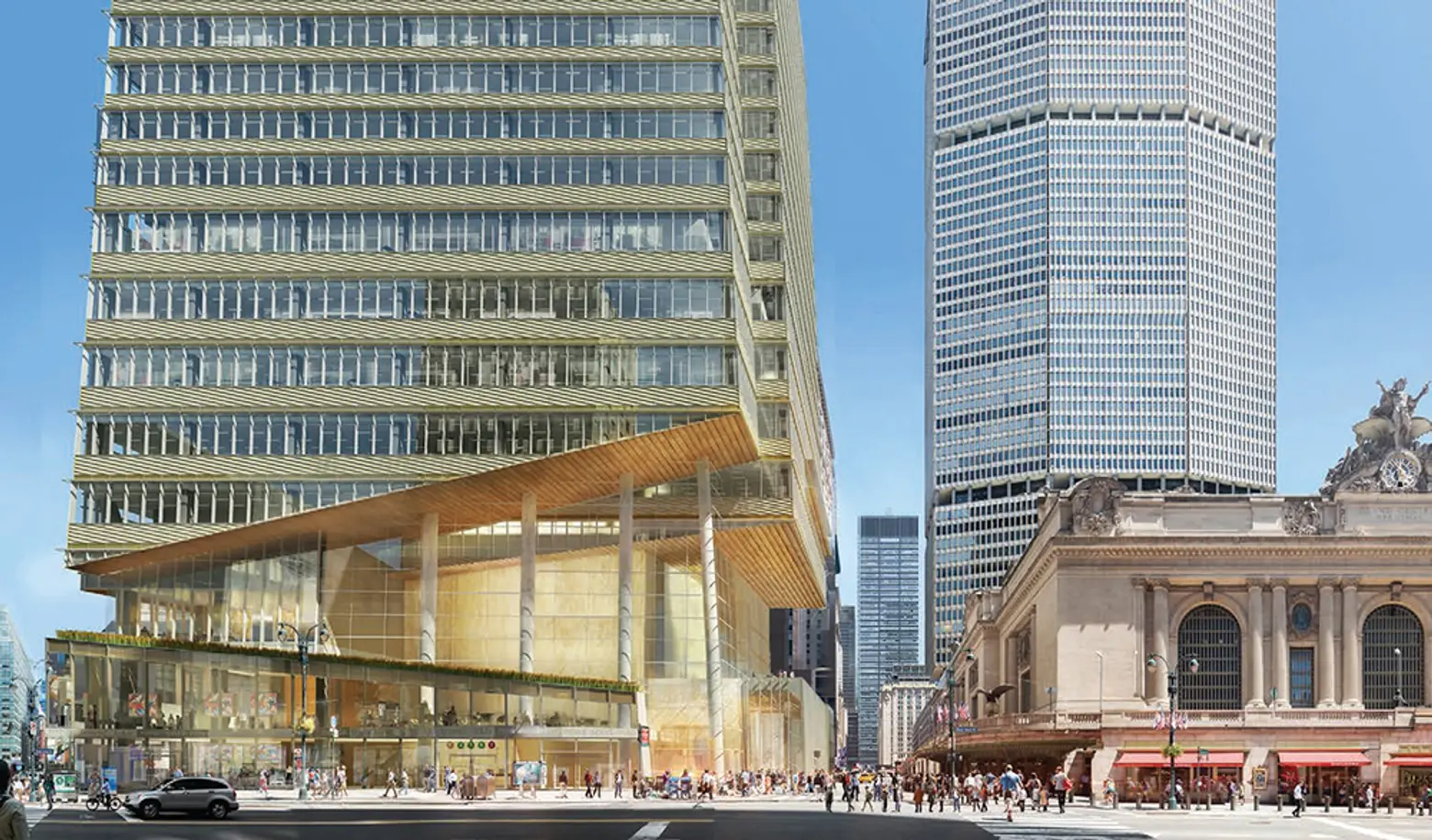
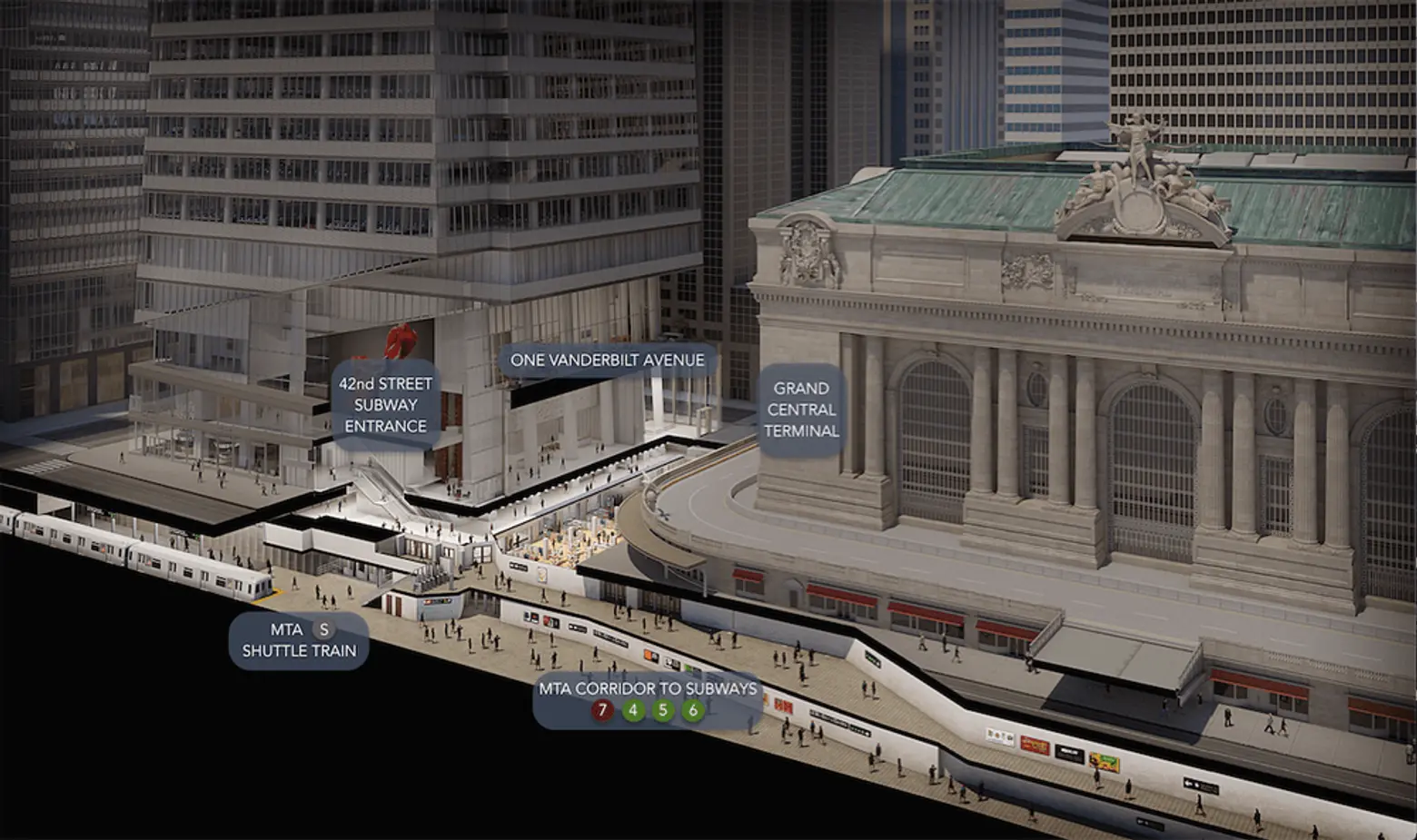
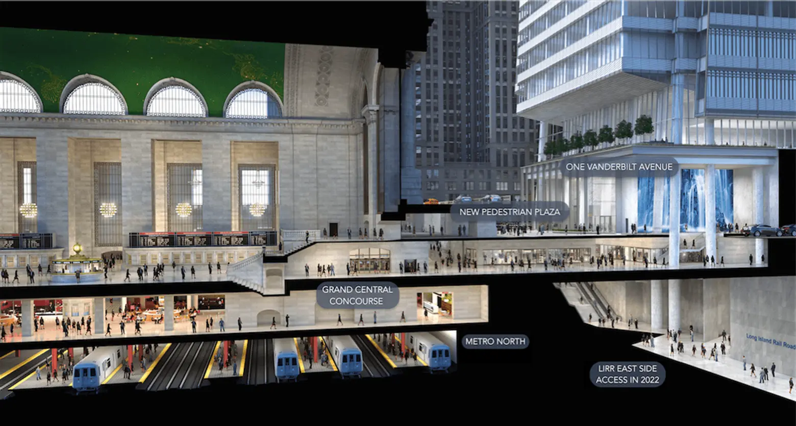
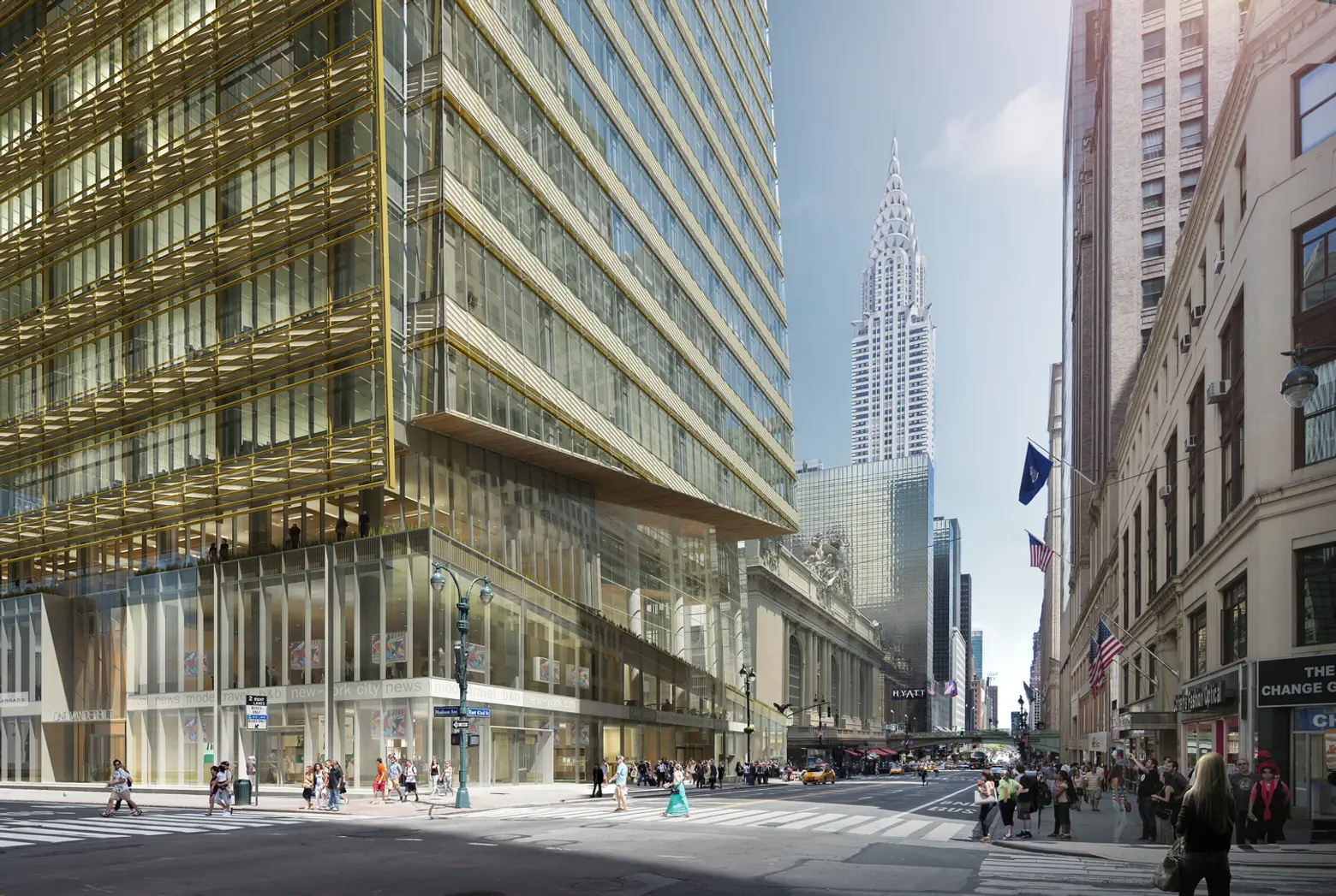
The formal qualities of the building were developed under the auspice of Amanda Burden. As Planning Commissioner, she underscored the importance of the public realm in ensuring the health of our city and its citizens. To be considered for a special permit the design of One Vanderbilt had to demonstrate “superior design.” This charge remained in the DNA of the building—even after the initial rejection of the zoning amendment—and you can see it in the sloping volumes that allow light and air down to the street, the pulling back at the base to allow a clear view of Grand Central’s cornice, the use of terra cotta over curtain wall, and the design of a new transit hall which corresponds in finish with the rest of the building.
At the heart of One Vanderbilt is a belief in an architecture that is for both development and public good. By this standard, it’s certainly something all great buildings should aspire to!
A decade ago, KPF designed CIT’s new headquarters, a building just one block west of the One Vanderbilt site. That building was thought to be cutting edge at the time. What major advancements in terms of the design, engineering, and construction of commercial high-rises have emerged since then? What innovations are being integrated into One Vanderbilt?
Andrew Cleary, Technical Director: Although both buildings reflect a similar, measured approach to urban design, the difference of scale between the two buildings—One Vanderbilt at 1.7 million square feet and 1,401 feet tall versus 505 5th Avenue at 250,000 square feet and 400 feet tall—required our team to develop an entirely distinctive approach to the whole process. We had to create a unique set of custom design “tools” and working methodologies that allowed us to meet often stringent approvals and construction milestones while simultaneously allowing us to be creative and flexible within the design.
From the outset, the team leveraged the parametric capabilities of several design modeling platforms that allowed us to shape an elegant composition of tapered volumes while at the same time calculating the distribution of shifting floor areas, varying floor heights, and viable leasing options. As a result, the subsequent design development phases overlapped significantly with technical coordination and the procurement schedules for vendors and consultants.
For example, the team worked with the structural and MEP trades to develop parametric models in an effort to reduce construction conflicts and schedule delays; The height of the building ensured that this was no small task. As it rises to its height of 1,401 feet, the tower’s steel frame is laterally braced back to the core by complex steel truss work intricately woven through various MEP equipment spread across a series of double height mechanical levels. The team also conducted aerodynamic wind tunnel tests to analyze the pressure distribution of wind on the building’s cladding and structural systems. This informed the design criteria for a 500-ton tuned mass damper that will be installed at the top of the tower to reduce building movement caused by high winds at such lofty heights.
In short, while One Vanderbilt is a much different building typology than 505 Fifth Avenue, the design aspirations of both buildings are united by a common pursuit of thoughtful and responsible urban design.

We have noticed many new and retrofitted New York City commercial buildings are providing more clerestories, outdoor terraces, and recreational spaces for tenants. What do you think is driving the change? How and where are these spaces integrated into One Vanderbilt?
Darina Zlateva, Senior Designer: The retrofitting of these old buildings emblematic of the changing nature of how people work. Companies like WeWork have revolutionized what it means to work in an office. At the same time, more people are living and working in metropolitan areas. For corporations, recruiting the best talent goes hand in hand with the employee workplace experience. We wanted to redefine and elevate the workplace model in Midtown Manhattan with One Vanderbilt.
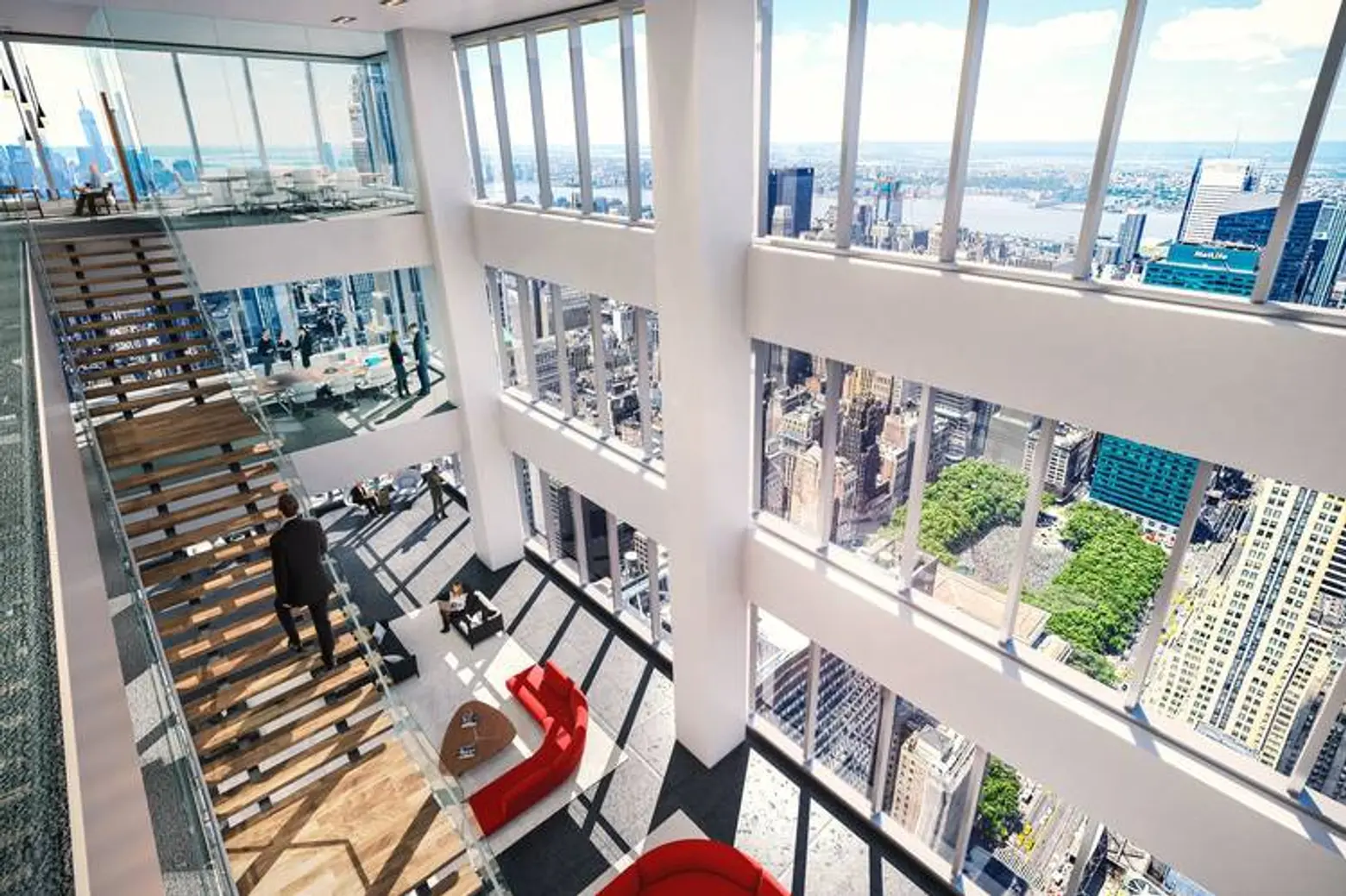
For a client, the tower is designed to offer incredibly diverse leasing opportunities. The tapered form allows a range of floor plates, from massive 40,000-square-foot high-density floors at the base to 20,000-square-foot boutique floors at the top. All of the floors are column free with floor-to-ceiling windows. Another distinguishing feature of the tower is the additional range of floor-to-floor heights. There are four typical heights ranging from 14.5 feet to 18 feet, and a handful of floors soar up to 20 feet. These heights, particularly with floor-to-ceiling glass, open the spaces to the city and bring natural light deep into the center of the building.
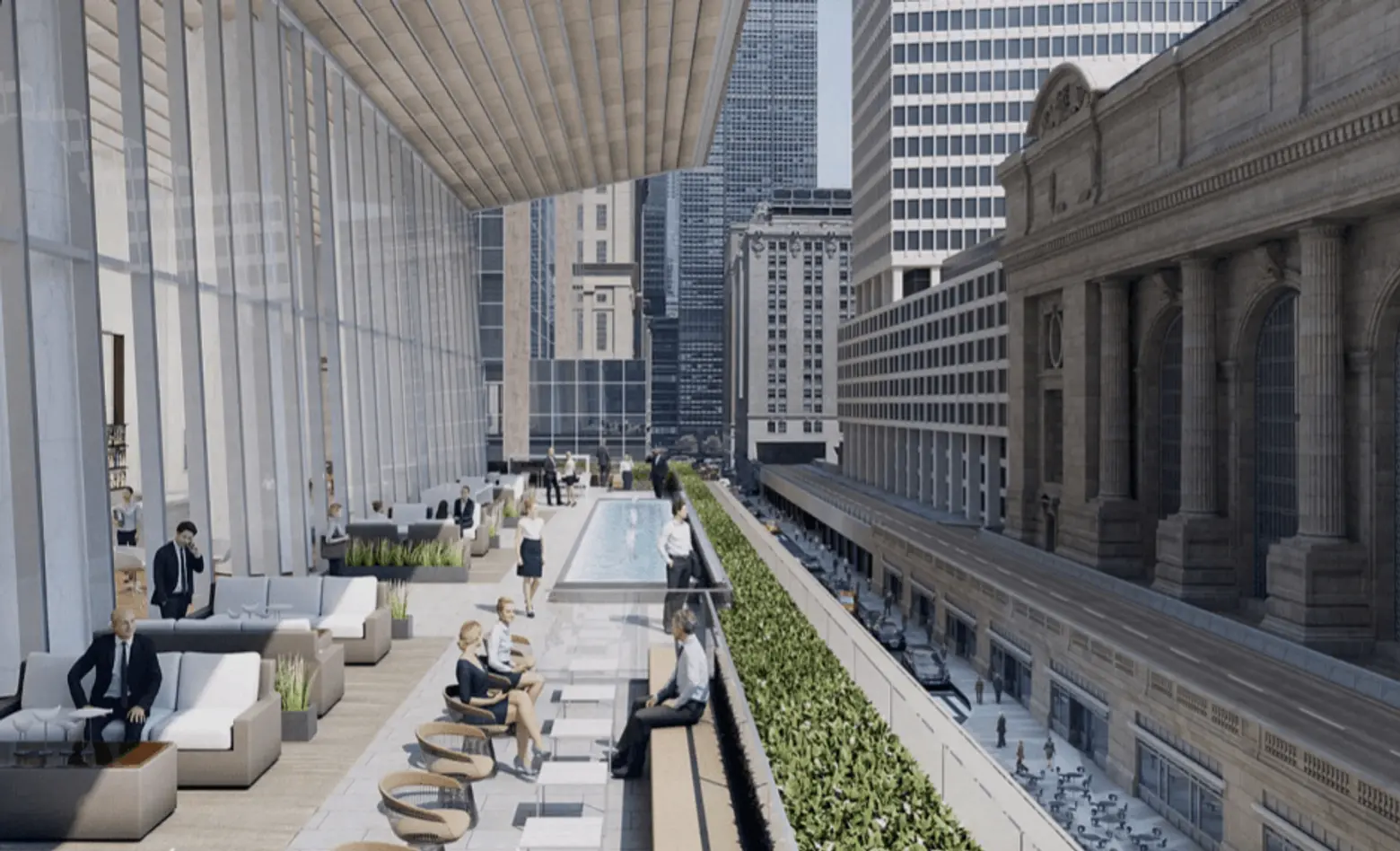
We incorporated outdoor terraces throughout the tower. On the third floor, a landscaped terrace overlooking Vanderbilt Plaza is coupled with a 30,000-sqaure-foot tenant-only amenity floor that includes a state-of-the-art auditorium, a 30-seat boardroom, travel showers, and hotel-style social lounges.
Any predictions on what the future NY skyscrapers will look like and new features they will offer?
Jeffrey Kenoff, Design Partner: New York’s skyline is likely to change more in these next eight years than it did in the 80 years after the Empire State Building was completed. With newly modified FARs, public-private partnerships, the East Side Access opening and continued urban population growth, it’s not hard to imagine an amplification in the role and the significance of supertalls in Manhattan and especially Midtown.
The biggest changes we’ve seen, and hopefully will continue to support as a profession, include an increase in program diversity, elevated public and private park terraces, and an overarching goal to improve city infrastructure and public spaces with each project sustainably. These extend beyond the site to benefit the entire city at multiple levels. The city grid has proven to be an amazingly friendly model for supertalls as it ties single developments with the urban grain while giving individual sites the parameters they need.
Lastly, and possibly most exciting, are the unforeseen changes which are a bit harder to predict. New technologies in energy, transportation, and building systems will play an expressive role in all future towers and ultimately allow for taller, smarter, and more connected skylines. My bet is on a super sky bridge in the city’s extreme future.
[This interview has been edited for clarity]
RELATED:
Explore NYC Virtually
Leave a reply
Your email address will not be published.








Looks like yet another piss-ugly glass cereal box, and to think they destroyed a beautiful substantial brick and hand sculpted terra cotta building that blended well with Grand Central Terminal for this crap! Nothing looks more stupid and out of place than an ugly glass box next to a Beaux Arts masterpiece!
Not a huge fan of this design, but I like that it is elevating what office space should be. Also, the area directly around Grand Central is pretty miserable for pedestrians. Some green space and approachable retail will certainly not hurt.