Great Game Changers: How the Pan Am Building redefined Midtown architecture
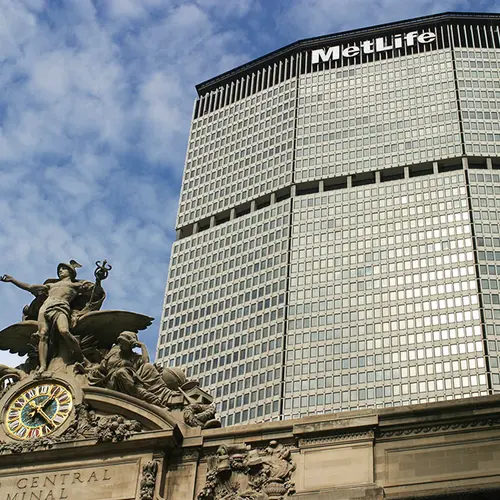
Perhaps the most detested Midtown skyscraper by the public, this huge tower has nevertheless always been a popular building with tenants for its prime location over Grand Central Terminal and its many views up and down Park Avenue. It is also one of the world’s finest examples of the Brutalist architecture, commendable for its robust form and excellent public spaces, as well as its excellent integration into the elevated arterial roads around it.
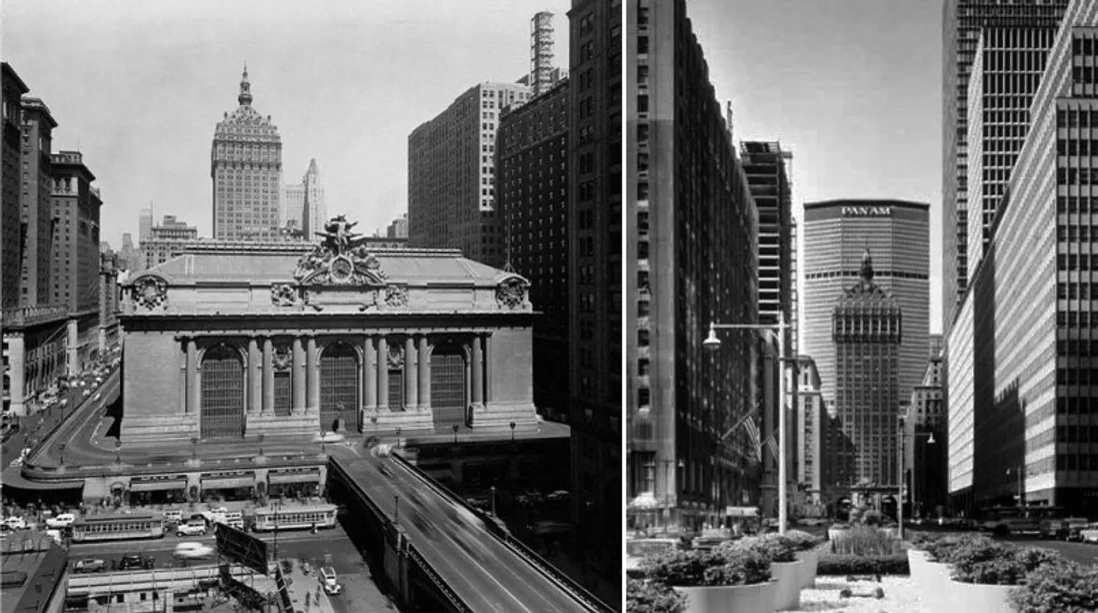
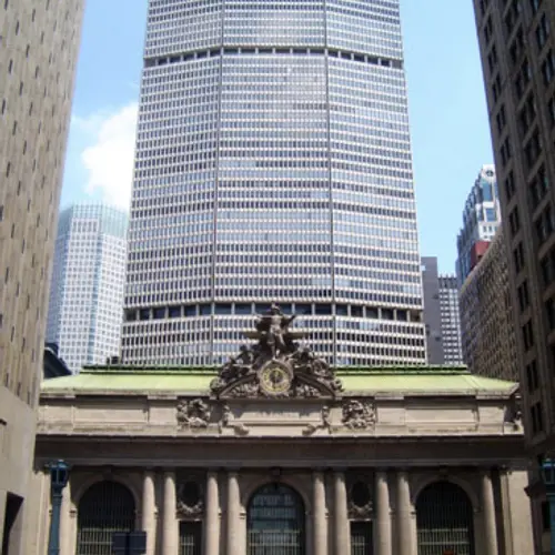
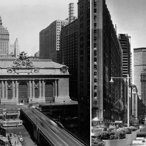
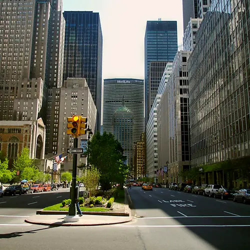
However, there is no argument that it is also immensely bulky with a monstrous height. As shown in the photograph ahead, to its north, the building completely overshadows the Helmsley Building, an iconic product of Warren & Wetmore’s Terminal City complex. The pyramid-topped Helmsley Building once straddled the avenue with remarkable grace, and as one of the city’s very rare, “drive-through” buildings, it was the great centerpiece of Park Avenue. But by shrouding such a masterpiece in its shadows, the Pan Am Building (today the MetLife building) desecrated a major icon that will unfortunately never recover from such a contemptible slight on a prominent site.
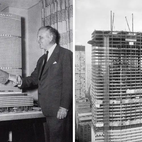
According to James Trager in his 1990 book, “Park Avenue, Street of Dreams,” William Zeckendorf, head of Webb & Knapp Inc., proposed in 1954 an 80-story, 4.8 million-square-foot tower, 500 feet taller than the Empire State Building, that would replace Grand Central Terminal. The pinched-cylinder design by I. M. Pei, perhaps his finest, was, however, quickly abandoned. But the next year, Erwin S. Wolfson, head of the Diesel Construction Company, proposed a considerably smaller tower on the present site of the MetLife Building, north of the terminal’s main concourse. His proposal was made to the New York, New Haven and Hartford Railroad, which had an interest in the terminal, and his plan was designed by Fellheimer & Wagner, part of Grand Central’s original design team. The terminal’s principal owner at the time, the New York Central, was experiencing serious financial difficulties and had created a major controversy when it planned to install a three-level bowling alley in the 55-foot-high waiting room of the terminal. This plan, too, was abandoned, but in 1958, Emery Roth & Sons came forward with another idea for Wolfson, a 50-story, three-million-square-foot tower with a helipad and parking for 2,000 cars.
In “New York 1960, Architecture and Urbanism Between the Second World War and the Bicentennial,” Robert A. M. Stern, Thomas Mellins and David Fishman, noted that Roth’s plans also called for two 1,800-seat theaters, a 1,200-seat movie theater, and an open-air restaurant on the seventh floor. These features were eventually deleted from the plan.
The building, they continued, which was then called the Grand Central City Building, was to be clad in aluminum and glass and the “north-south tower rising from the base would not be significantly wider than that of the New York Central Building” and “would thus cause a minimal disruption of the vista up and down Park Avenue.”
The authors noted, however, that “Wolfson felt uncomfortable with the modesty of the Roth design” and “asked Richard Roth to suggest a few possible design collaborators.” Roth suggested Walter Gropius, who in turn suggested Pietro Belluschi.
In an interview in 2001, Richard Roth provided the following commentary:
Wolfson decided that he might need a ‘name architect’ in order to secure financing, which was all but non-existent. Since I had just graduated from architectural school I was asked to draw up a list of famous architects. Wolfson, besides being my father’s closest friend, was my godfather. I drew up a list based on whom I wanted to meet. The first choice was Mies, who was my idol, second Corbu. They were followed by Wright, Gropius, Belluschi, Breuer, Goff et al. Erwin and my father decided that Mies, Corbu or Wright would be too difficult to work with. Grope and Pietro were both heads of architectural schools and Erwin and my father thought they would just be happy to get some money and disappear. Ha! Gropius took over and Pietro took a real back seat. I later worked with Pietro on five other projects and he told me of his uncomfortable relationship with Grope and because of Grope’s position in the world of architecture, took an all but non-role.
Mr. Roth also noted that Gropius lamented the quality of granite used in the public spaces but when asked about the use of pre-cast concrete, “his answer was that he liked it!”
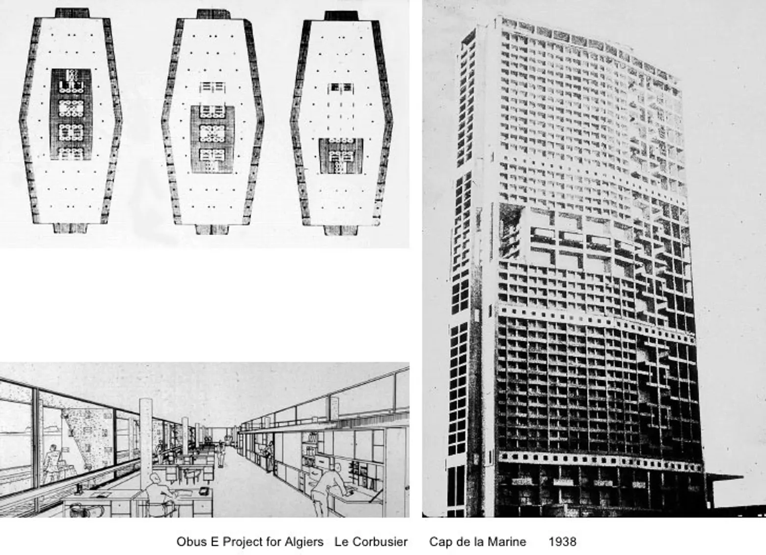
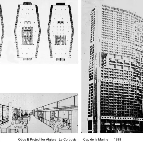
In 1959, the three architects came up with a revised plan of a larger building with an “elongated” octagonal plan and a very bold pre-cast concrete facade. Stern, Mellins and Fishman observed that the new design was based on “a well-known prototype, Le Corbusier’s unrealized skyscraper for Algiers (1938-42)” and was “also related to Gio Ponti and Pier Luigi Nervi’s technologically innovative, far more sveltely proportioned Pirelli Building, then under construction in Milan.”
While such comparisons have a slight validity as far as form elements, namely a strongly indented facade in the former and squeezed ends in the latter, they are quite a stretch. The Roth, Gropius, Belluschi design is a highly original plan that could hardly be described as derivative.
Trager noted that Wolfson got $25 million for the project from Jack “King” Cotton, an English investor, and Pan Am became the major tenant.
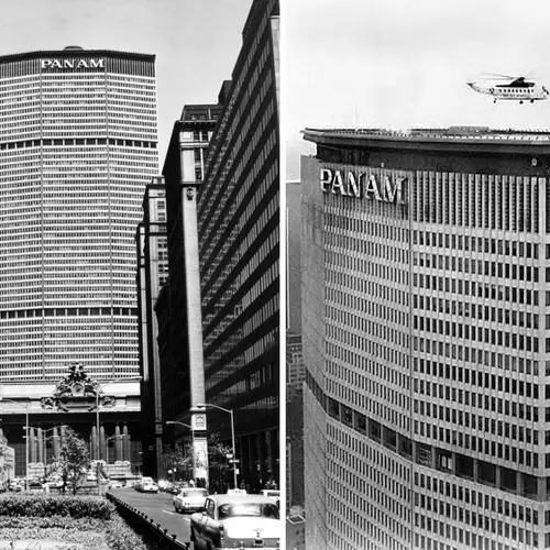
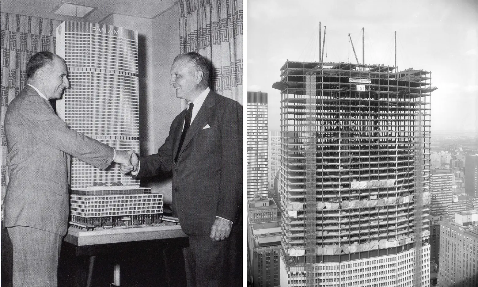 Images: A model of the building via Wired New York (left); Under construction via Skyscraper City (right)
When it was completed, the 2.4-million-square-foot building became the world’s largest office building in bulk—a title it would lose a few years later to 55 Water Street downtown. The building was also not popular: Ada Louise Huxtable of The New York Times described it as a “colossal collection of minimums” and “gigantically second-rate.”
A few years after its construction, Penn Central (owner of the air rights over the terminal) incurred even more public wrath than the developer of the Pan Am Building when it proposed another major office tower over the terminal’s famous concourse. In a major preservationist controversy that went all the way to the U. S. Supreme Court, Penn Central argued that the original developer and architects of the terminal had not only planned a major tower to rise over the concourse but had also put its foundations in the corner piers of the terminal. The original 30-story tower was similar in design to the New York Central tower to the north of the Pan Am Building but had a broader and less ornate roof.
Interestingly, the new proposed tower was designed by Marcel Breuer, the architect of the revered Whitney Museum of American Art on Madison Avenue and 75th Street and the leading practitioner of Brutalist architecture in the country. The city and the civic groups that brought suit against Penn Central and its plan were successful in getting the U.S. Supreme Court to uphold the city’s right to review proposed changes to the exterior of the terminal, which had been designated an official city landmark. The court argued that the financially troubled Penn Central had not exhausted all of its economic opportunities in selling off the undeveloped air rights over the terminal’s properties.
Contrary to the jubilant proclamations of the city’s preservationist community, the ruling actually did not exclude the possibility of a new tower and the air rights controversy continued for many years and affected nearby sites. The rules of the development game in New York were changing rapidly. The demolition of the former Penn Station in 1964 led to the creation of the city’s landmarks law the following year, and civic groups began to take lessons in media management from the civil rights movement. Indeed, these groups began to assert more influence on politicians who were initially tentative about pursuing landmark regulations because of serious concerns about legal challenges from the city’s real estate owners and developers.
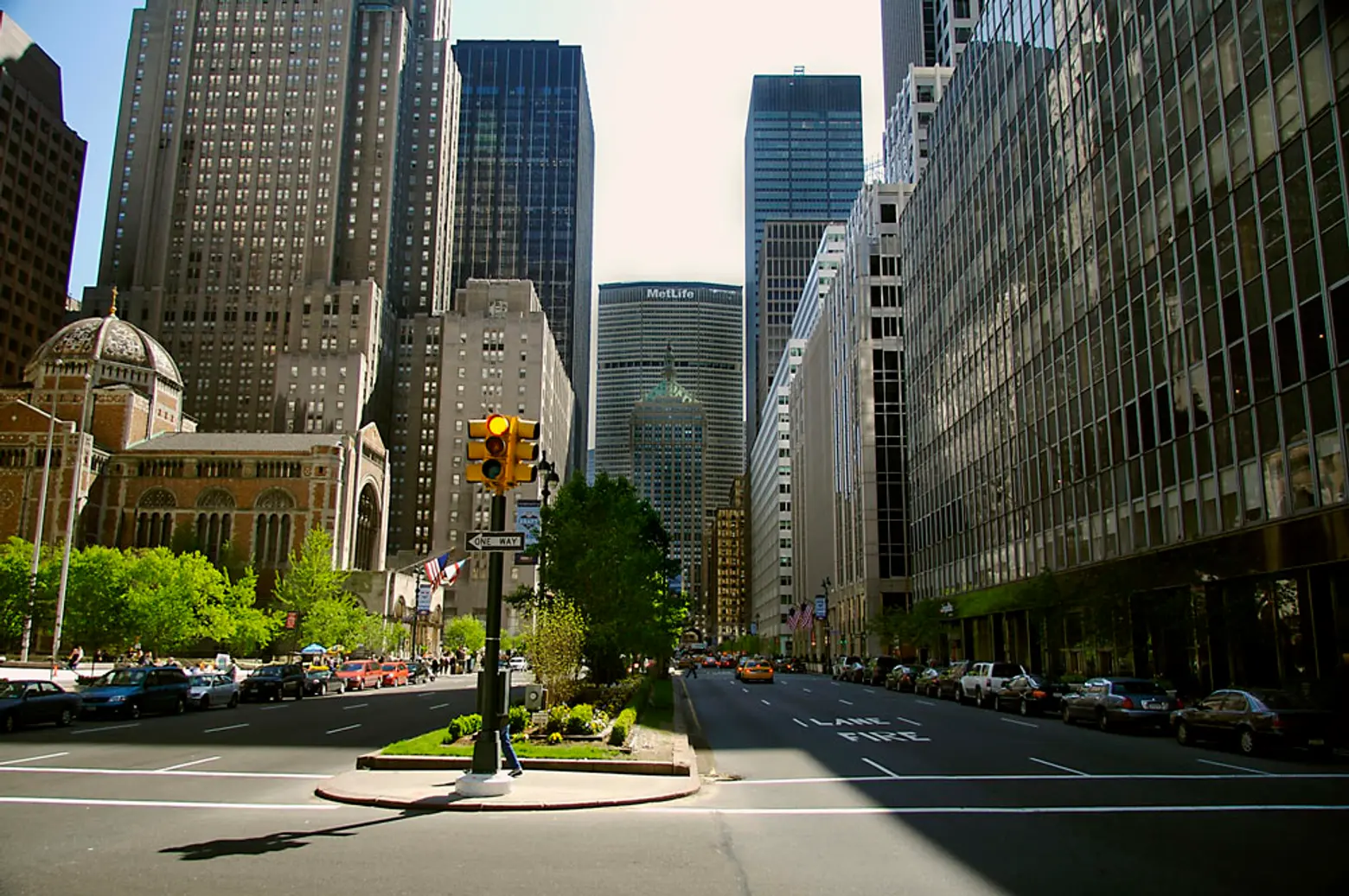
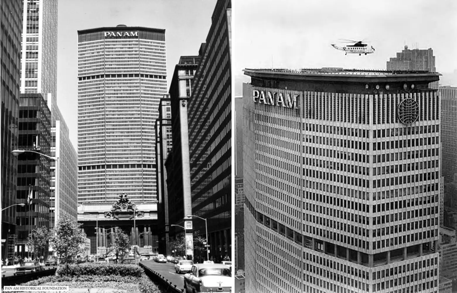
As a skyscraper, the MetLife Building is actually a great achievement if one could ignore its vista blocking. By slightly bending back the outer thirds of its north and south facades, it lessens the tower’s great bulk from many viewpoints. And by indenting, with widely spaced colonnades, the two major “mechanical floors” that house much of the building’s huge heating and air-conditioning equipment, the architects effectively broke the monotony of such large facades in an inventive and very attractive manner. The latter treatment was also enhanced by creating a dark band on the north and south facades beneath the flat roof that provided a better background for placing logos and was a Modernistic attempt to figuratively make a “cornice” statement.
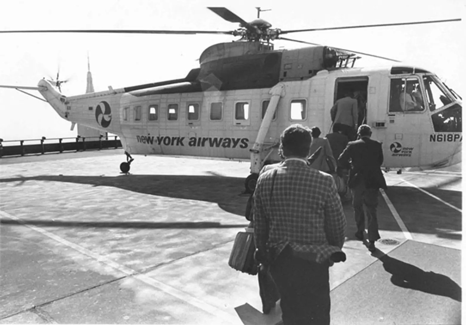
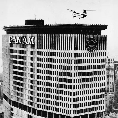
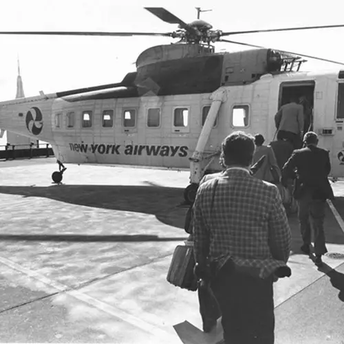
While in planning part of the roof was given over to major HVAC equipment, the rest was given over in 1965 to a heliport for large helicopters to whisk travelers to and from the city’s airports. New York Airways offered a seven-minute flight to Kennedy Airport for $7 in helicopters that carried eight passengers. It was closed in 1968 because it was not profitable, but reopened February, 1977, only to close again three months later when the landing gear of a large, 30-passenger helicopter collapsed as passengers were about to board and one of its rotor blades broke off killing four people on the heliport and a pedestrian on the street. This marked the end of the controversial, but incredibly exciting service.
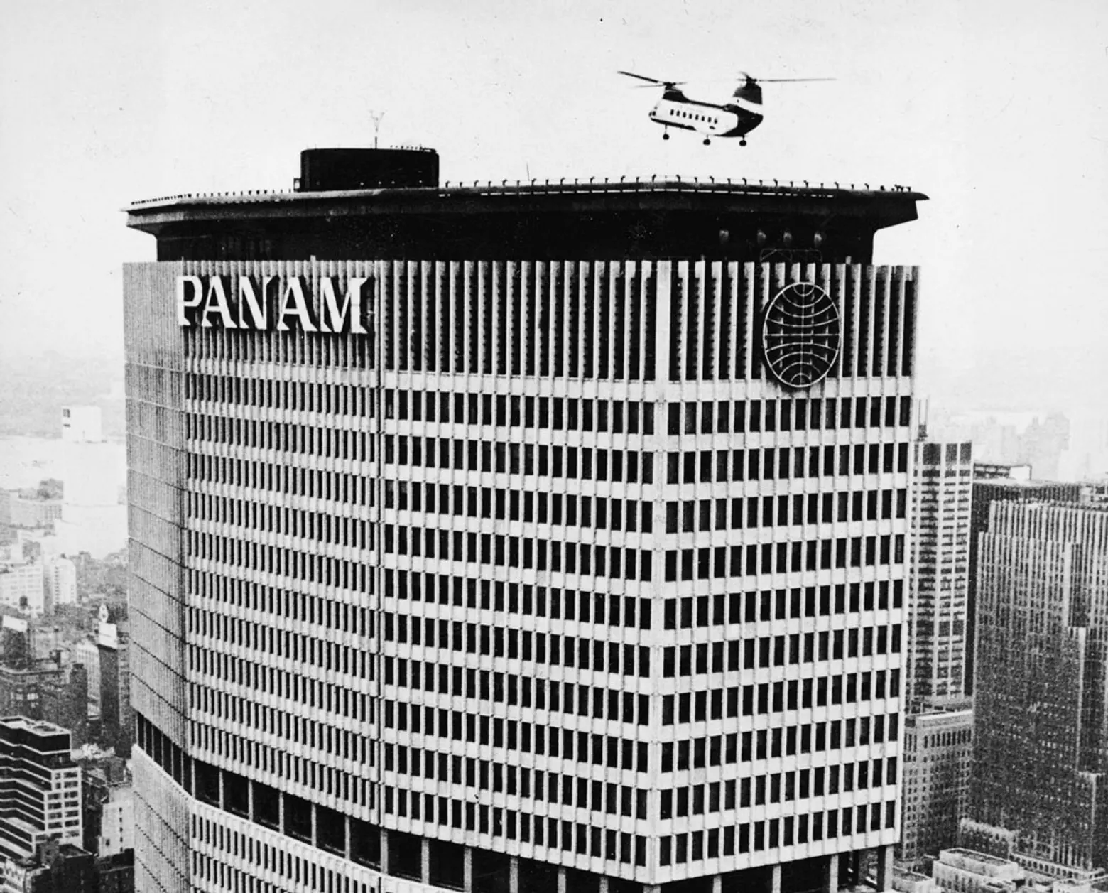 Image via PanAm.org (top) and Wired New York (bottom)
While romantic steeples and pinnacles delight many, flat tops are not inherently bad. At Trump Tower, architect Der Scutt used the tower’s stepped plan to create interesting aspects despite its flat roof, and David Childs of Skidmore, Owings & Merrill had large vertical illuminations divert attention from the twin flat roofs of the Time Warner Center at Columbus Circle. At Pan Am, its helipad roof almost seems to hover ever so slightly above the tower thanks to a subtle indentation right beneath the roof line.
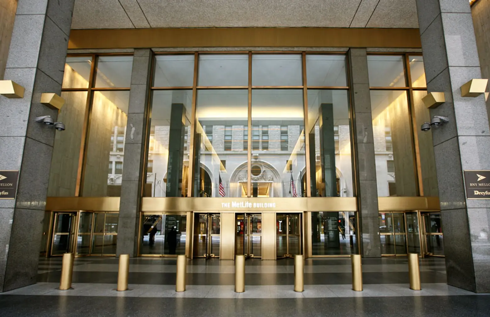
But if the building’s innovative form and helipad were unappreciated, its lack of fine detailing has not gone unnoticed. The merits of the tower’s form were terribly compromised by the developer’s cheapness in not installing high-grade walls in the lobby. Almost all of the large, polished granite panels in the public spaces have been severely blotched and are unattractive.
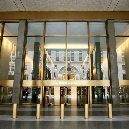
To make matters worse, a major redesign and renovation of the lobby spaces in 1987 did not improve matters much. The Egyptian motif splashed around the lobby and building perimeter by designer Warner Platner were not only inappropriate and incongruous but were almost universally perceived as ghastly and garish. In early 2002, the lunettes and most of Platner’s design were removed and the north entrance is now blandly modern and the main entrance space has been slightly encroached upon by glass retail spaces.
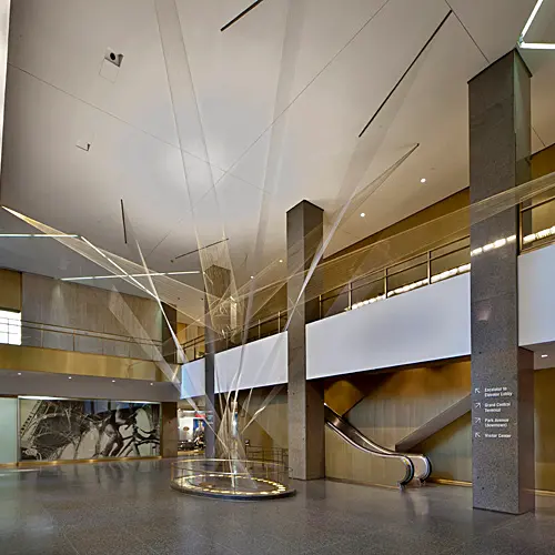
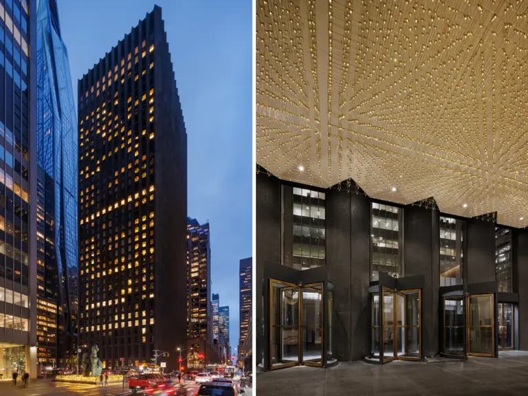
It would be wrong to assume, however, that the owners of this building were without any aesthetic sensibility. Richard Lippold’s gilded-wire sculpture in the Vanderbilt Avenue lobby is wonderful (although authors Stern, Mellins and Fishman oddly found it “disappointing,” describing it as “decidedly earthbound and stagy”) and a large red, black and white banded painting by Josef Albers over the escalator bank between the building and the terminal was rhythmically rich, but subsequently removed and was replaced with a slightly curved gilded wall with a black column.
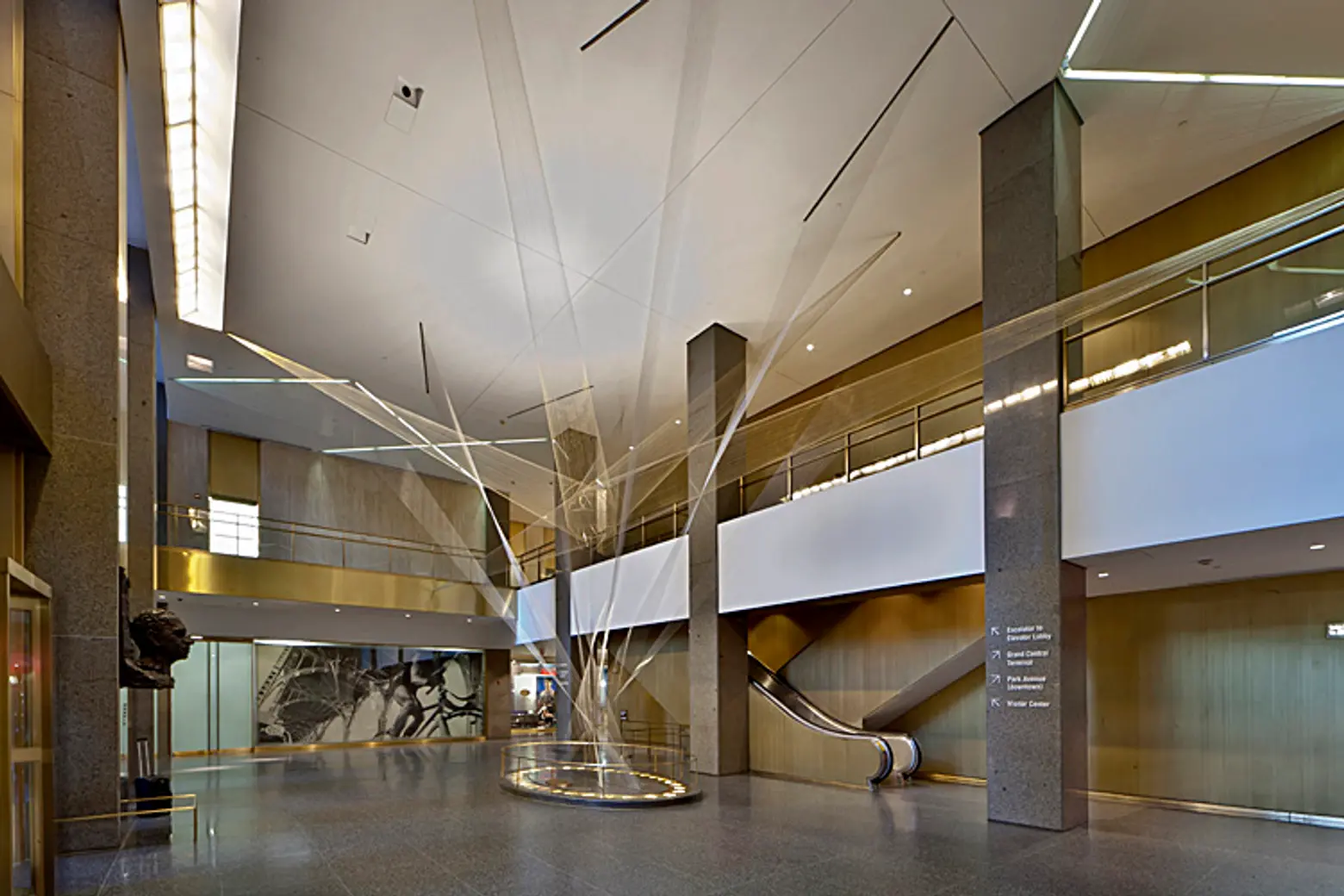 View of Richard Lippold’s beautiful sculpture inside the Vanderbilt Avenue lobby. Image via Archinect
A major private dining facility, the Sky Club, was on the 56th floor, which for a few years also had a public restaurant with impressive views. Luncheon clubs have faded as three-hour martini fetes are now widely frowned upon.
Historically, this building was erected at a time when large office tenants wanted large floors to minimize the inconvenience of having to shuttle between several floors. The floor sizes here are several times larger than those in the nearby Chrysler Building, for example, and one could argue that the form of this building is one of the most successful of its generation’s large skyscrapers.
It is a shame that this building was not built turned on its axis on the 8th Avenue end of the demolished Pennsylvania Station across town. It would have been hailed as a spectacular new urban asset that preserved major vistas, and would have helped save a great landmark and rejuvenate a quite messy neighborhood.
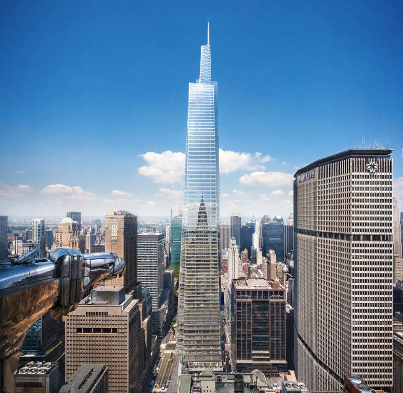 One Vanderbilt Avenue tower designed by Kohn Pedersen Fox for S. L. Green will tower over MetLife Building straddling Park Avenue
Some of the public antipathy towards the building might be abated when S. L. Green’s mammoth One Vanderbilt Avenue finishes construction on the nearby block bounded by Vanderbilt and Madison Avenues and 42nd and 43rd Streets. In height, the tower will significantly dwarf the MetLife building straddling Park Avenue.
RELATED:
