Inside the mind of Ernest Burden, one of New York’s preeminent architectural renderers
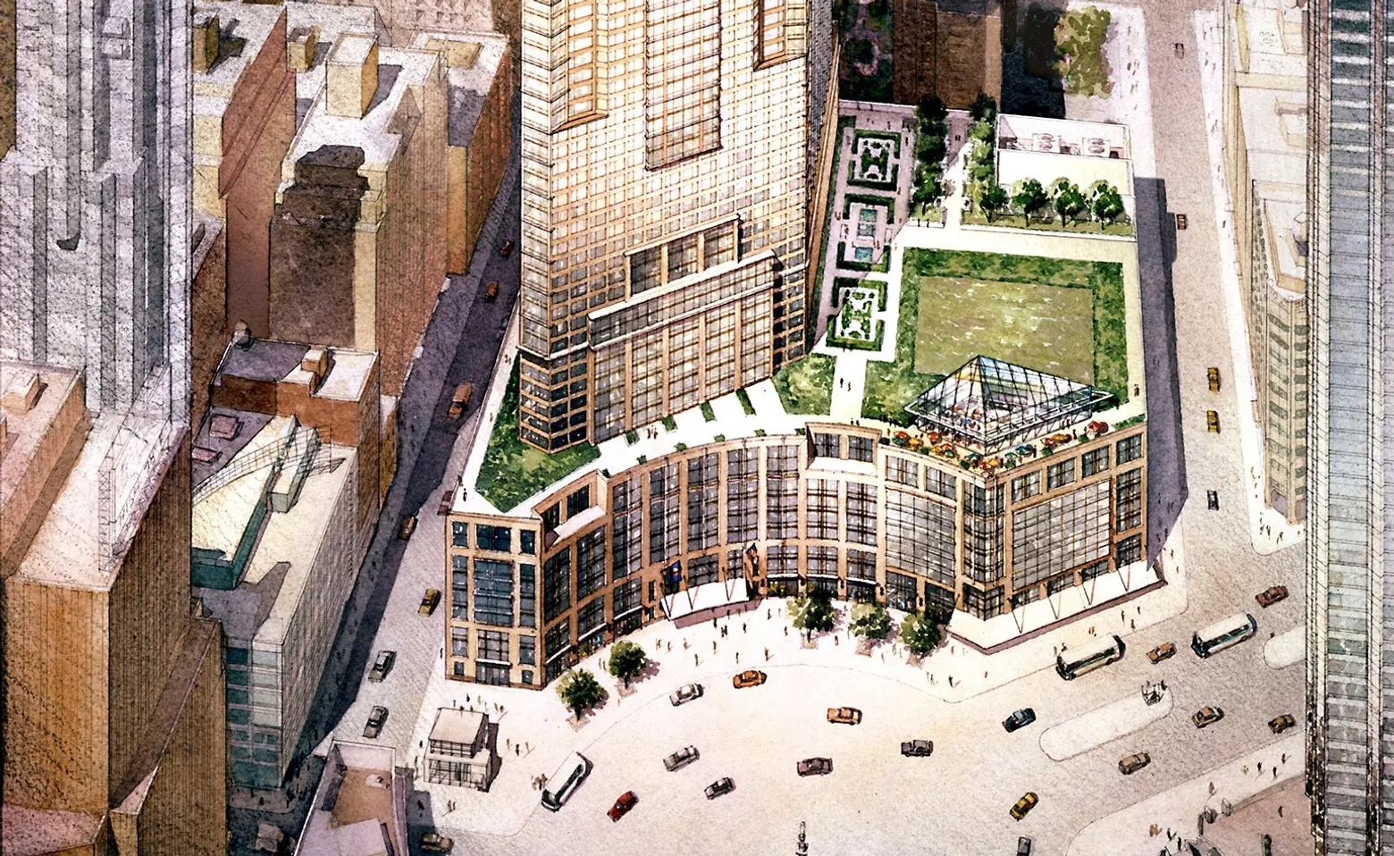
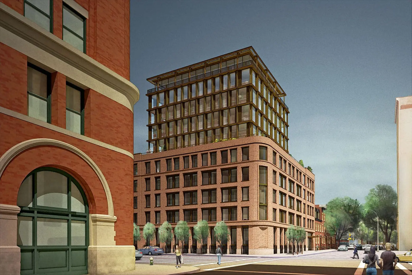
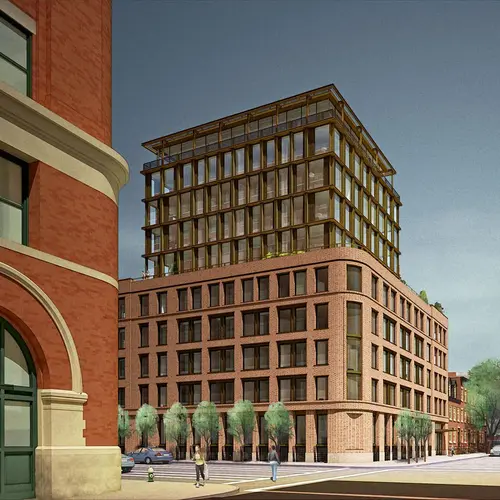
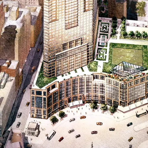
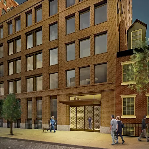
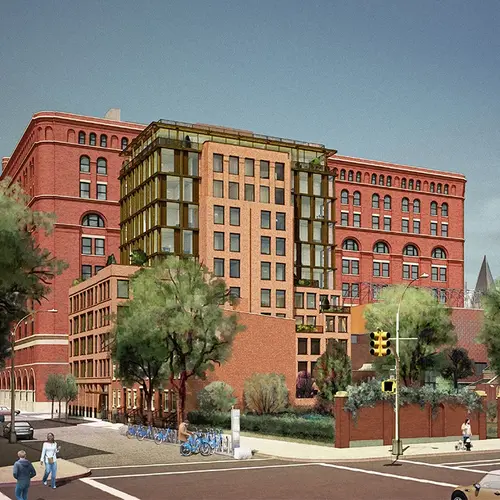
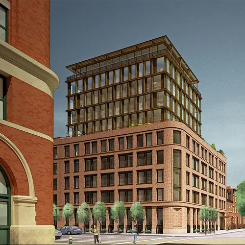
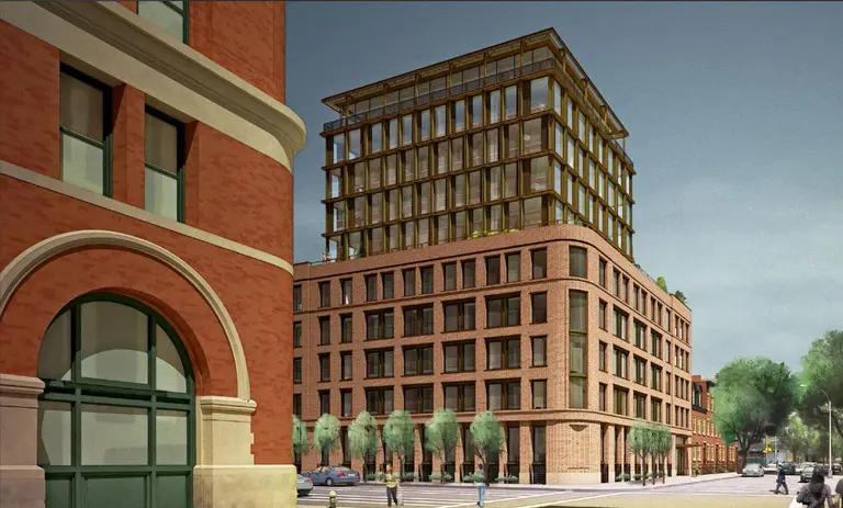
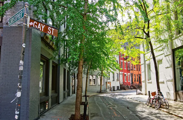
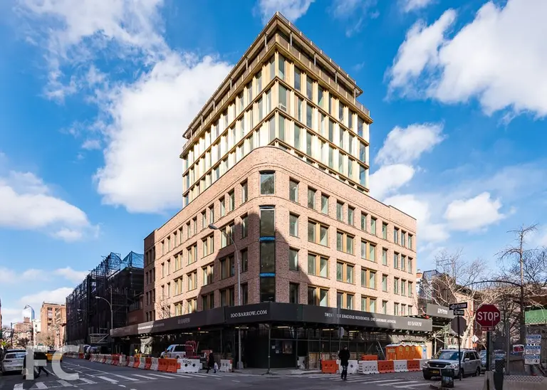
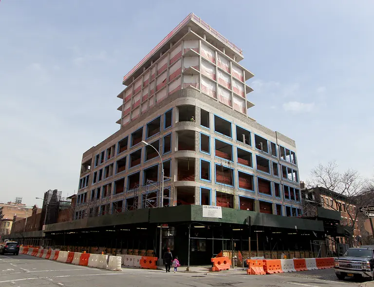
The art of architectural illustration paints a window into the future and intends to portray a designer’s vision or work in its purest, most ideal light. As the art form has progressed from hand mediums to digital, Ernest Burden III and his studio Acme Digital have straddled the industry’s dramatic transformation using both computer and manual approaches to inform and improve what they produce. As a renderer with more than 30 years in the industry, Ernest’s roster of clients include some of the country’s biggest real estate heavyweights, such as the Trump Organization, Related Companies and Tishman-Speyer Properties; and renowned architectural clients like I.M. Pei, Robert A.M. Stern and Kohn Pedersen Fox. Recently, Ernest completed a collection of renderings and detailed vignettes for Toll Brothers‘ and Barry Rice Architects‘ 100 Barrow Street. In the series, he effortlessly juxtaposes the timeless intent of the new structure with the energy of the surrounding West Villlage. In fact, Ernest’s renderings played a considerable role in the Landmarks Preservation Commission’s vote to approve the project in 2014.
To learn more about Ernest’s unique style and his thoughts on the evolving business and craft of architectural rendering, 6sqft sat down with him for a chat.
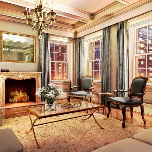
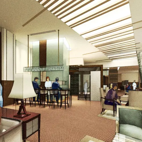
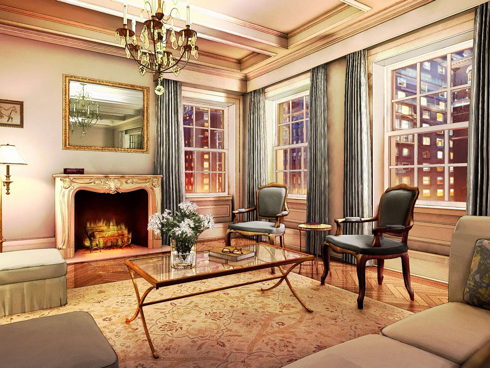 A rendering of a living room for Barry Rice Archictect’s 823 Park Avenue
Can you tell us a bit about your background and how you fell into rendering?
“Fell into” is an apt term. I had always wanted to be an illustrator. I wanted to draw spaceships and alien worlds, and maybe work in movies. My father’s work was as an architectural illustrator, and I had no interest in doing it myself; I can still hear myself adamantly declaring to my friends at Art and Design High School that the one thing I would NEVER do was rendering. But I needed a job, and a renderer friend of my father agreed to hire me. I ended up learning the trade and when I set out on my own that is where my skills aligned with clients willing to write checks, so I did renderings while still drawing fantasy things and designing objects. But there kept being rendering commissions and it turns out I’m good at it.
These days there are people coming into rendering from computer graphics. I don’t know if that is becoming the majority or if architectural training is still the common launch of new renderers.
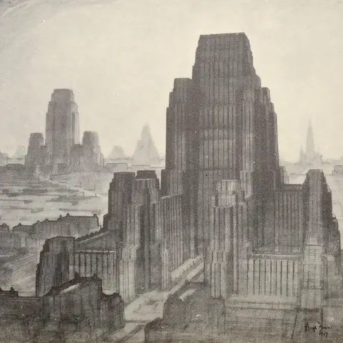
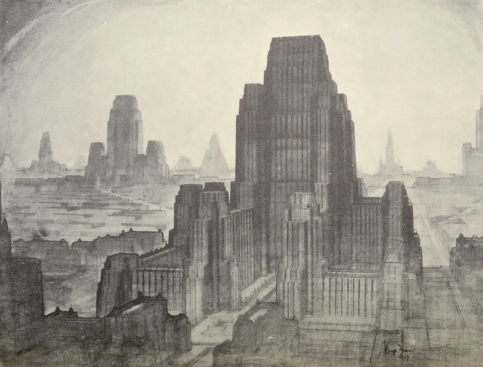 “The Metropolis of Tomorrow” drawn by Hugh Ferris
Which artists, architects and designers inspire your work most?
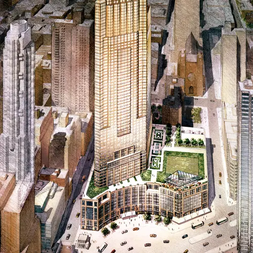
As an artist there are so many, but within the rendering field I can point out a few. The first is a very commonly mentioned founder of the field of rendering as a distinct profession—Hugh Ferris. Ferris’ work was bold and evocative, using the best aspects of staging, dramatic lighting and classical composition. It was a perfect match for the exuberance of the early 20th century, envisioning a grand concept of cities as utopian centers for enlightened people. Ferris worked on many of the most important architectural projects in NY, so not only was his work visually stunning it was also influential in how the public saw the built environment. While his work is all black and white, originals I have seen have hints of color under the chalks.
Probably the most important influence on my work is my mentor and former employer, Brian Burr. I started working for Brian when I was 16 as a studio assistant, and he taught me perspective drawing and so much more about architecture and rendering. He has a keen love and understanding of architecture and a sharp eye, plus the artistic skills to bring those together into great renderings. His work is the best of the best.
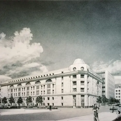
In a broader sense, I have to mention Tom Schaller. Tom re-defined what rendering meant in the New York market by sticking to his passion for expressive watercolor at a time when the rest of us were doing overly large, hyper-detailed ink or airbrushed work. It seemed that was all clients wanted. Tom persisted, wrote a great teaching book on watercolor rendering, and later, the clients all wanted us to paint like Schaller. It opened up the market for creative work again.
Of architects and designers, I have always felt inspired by the many great buildings of McKim, Mead and White, Wallace Harrison, and of course Frank Lloyd Wright. In the realm of visionary architectural drawing, I couldn’t miss honoring the influences of Piranesi, Dr. Suess, Roger Dean, the great Lebbeus Woods, and my father, Ernest Burden, who was also one of the best renderers who ever worked in New York.
Is there an architectural style or type of building you prefer to illustrate?
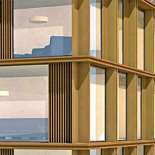
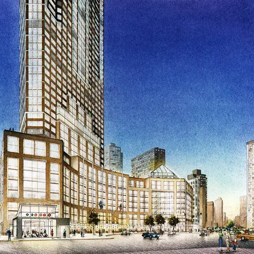
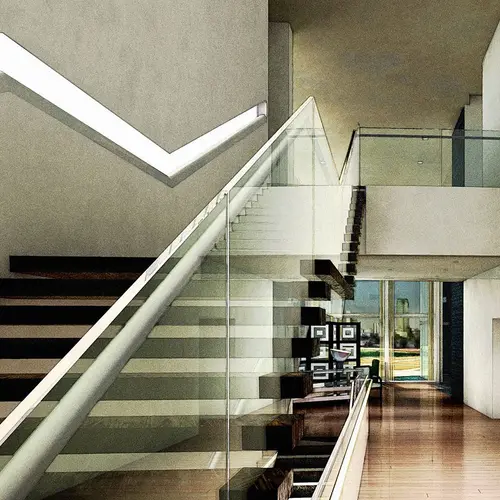
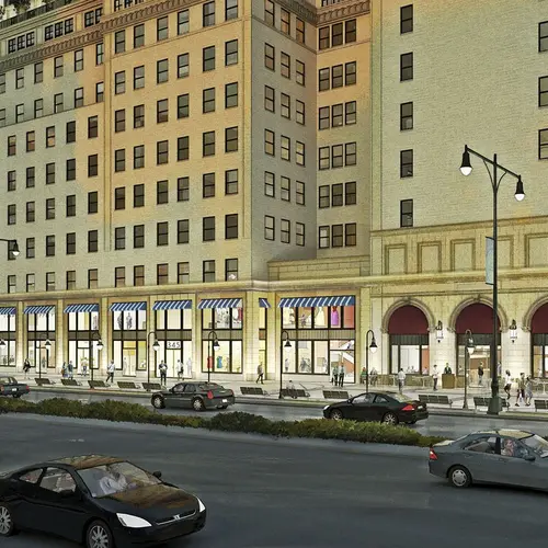
That’s a hard one. I love drawing classical details, though it is harder and takes longer to do than simple forms. But I find the challenges of depicting modern designs more satisfying. Glass is an ever-changing material that presents differently moment-to-moment, time of day, angle. It is a material that by its nature is invisible yet can be structural and can pull the context in. So how we portray it can make or break a rendering. Traditional designs tend to use glass as subordinate to the massing of stone. I love it when glass plays a more forward role and becomes a design element all its own.
But no matter how modern a design is, it will likely be next to townhouses, or in a row of taxpayers with mail-order decorative elements. So as a renderer you have to expect to be drawing them all, often into the same picture. It’s pretty rare to get to draw something like Gehry’s Louis Vuitton Foundation, sitting as a jewel shining splendid in a park.
How long does it take to produce a drawing?
I once answered that to a client as “all available time plus one hour,” and delivered the work on a Sunday that was daylight saving, so that was the extra hour. That sounds like bad time management on my part, but there are reasons it is true. When you care about your work, you keep trying to make it great until you run out of time. Clients love to make changes along the production schedule, including calling at 2AM before a morning deadline. That, more than anything, takes up all the spare time. It is so common with architectural clients that as a renderer you just have to figure out ways to deal with it and not get upset.
Working digitally can greatly shorten a production schedule because of the ability to repeat elements and generate multiple views from a common scene model. But if the project is for a single rendering, the timing is much closer to hand rendering. Working as a single artist, it can take a few weeks to draw and paint an urban exterior. Interiors have less context to show, but can be full of pesky furniture, which is really hard to lay out or model. So the timing is similar. A studio full of workers using stock models like furniture, cars, typical background buildings and objects made in earlier projects can of course do the same work in just a few days. Working digitally also pushes the no-more-changes date closer to the deadline which clients love, but in doing so are taking that time at the cost of the artistry going in.
There should be a day or two to plan lighting, color balances and composition, at the very least. Those are the things that take a rendering from good to great, from competent to compelling, and yet those are the things there is never enough time for when you are being pushed for an ASAP delivery.
Before digital and the internet, starting a project involved taking the subway to Midtown and bringing home a fat roll of blueprints. They smelled like a cat box that needs changing and that was the smell of knowing I had work, knowing I would be able to pay the rent next month.
To what degree have you adopted computer rendering?
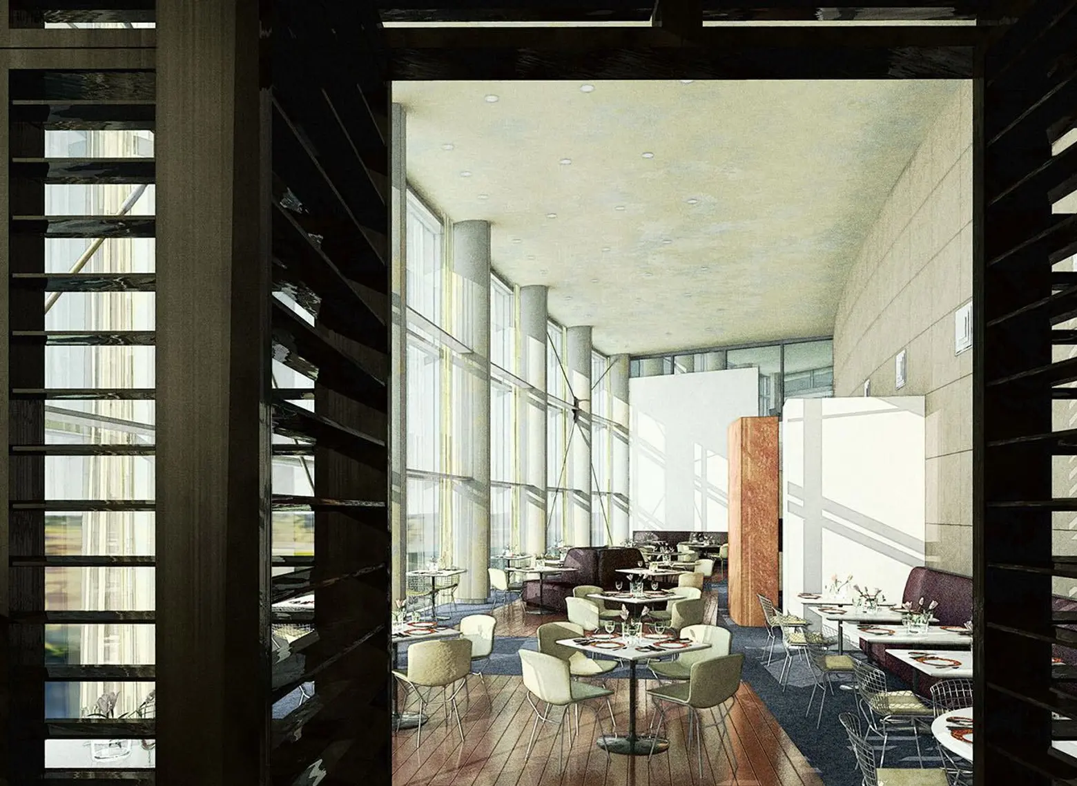
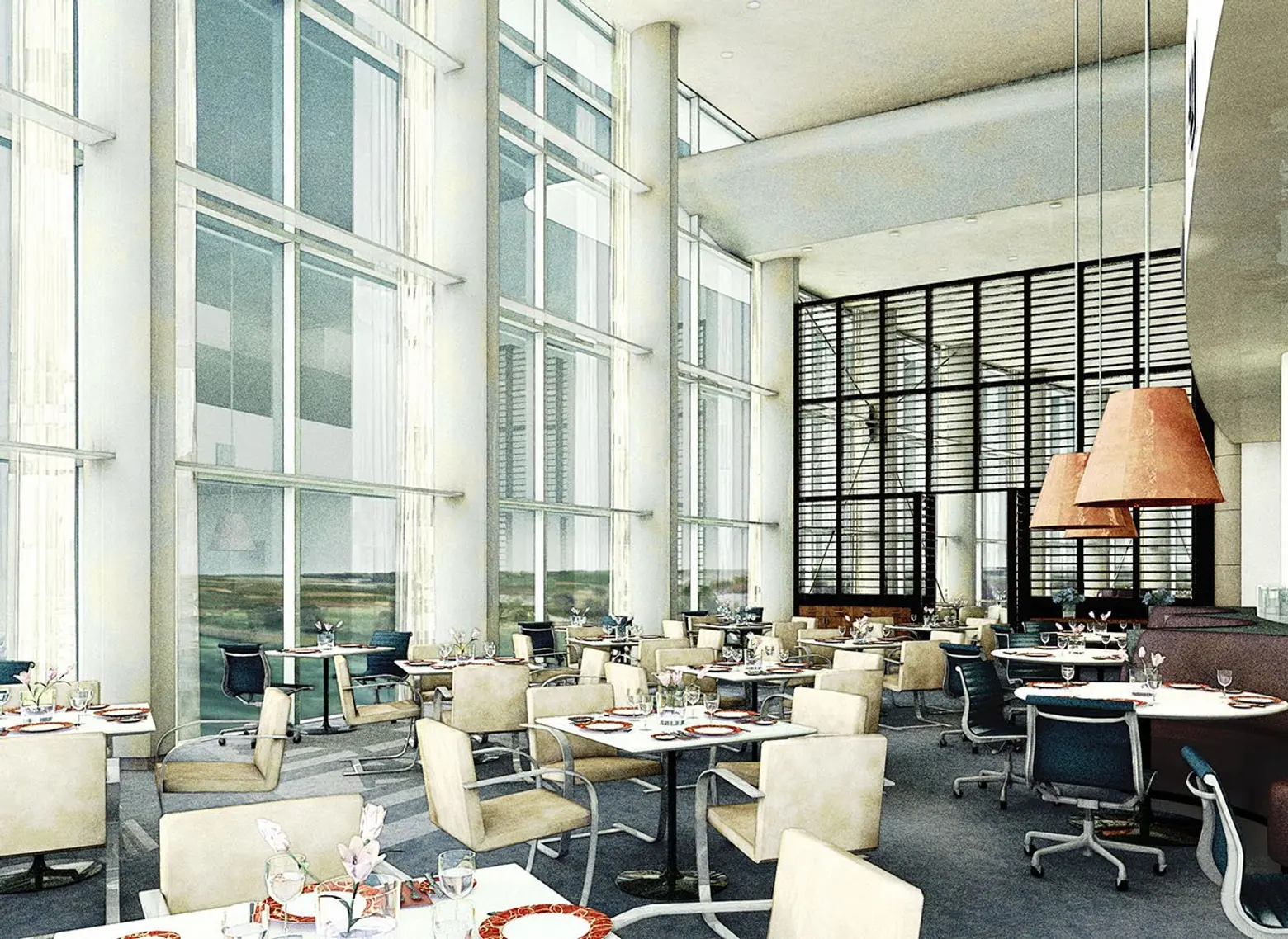
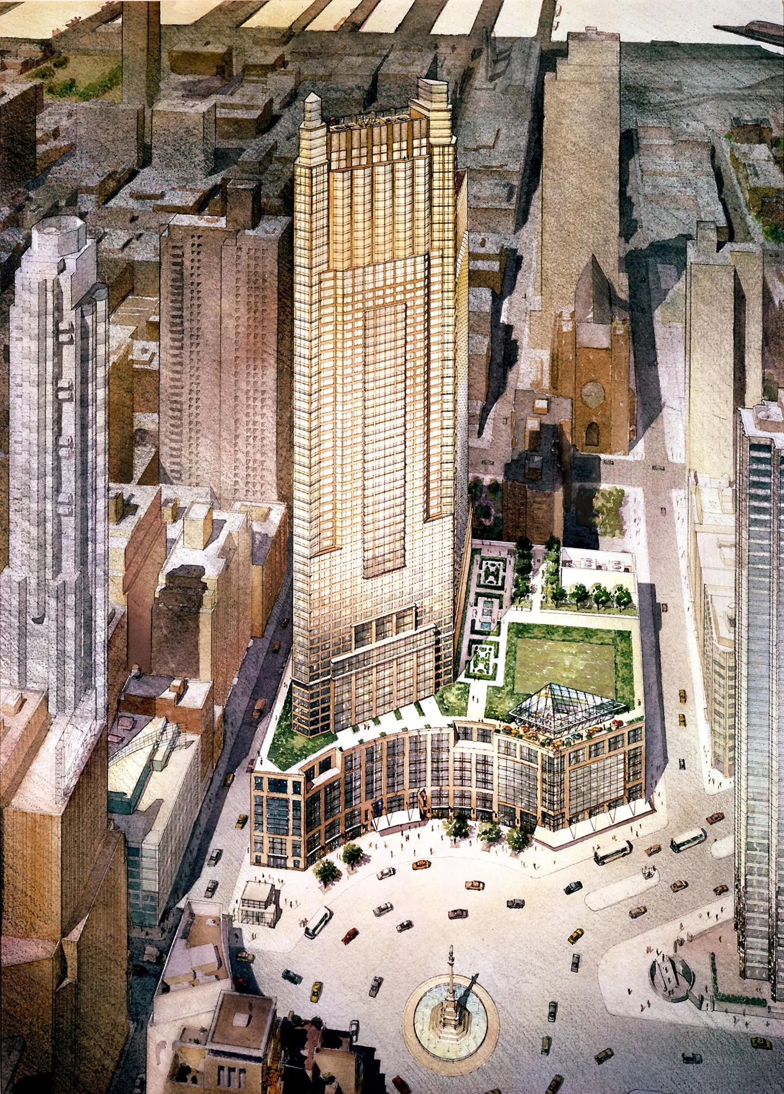
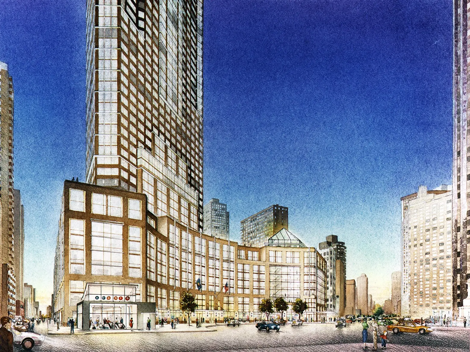
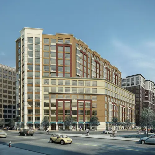
100 percent of my work over the last 10-15 years has been all digital. Sometimes I will draw or paint an element and scan it into a 3D environment, but my focus has been doing work that blend the best of digital and traditional but without just being fake watercolor. Occasionally a client asks me to do pictures that are more photo-real. Even so, it is important to approach the images as art and not snapshots.
Even though I worked in traditional media for two decades, and was very good at mechanical perspective, the basis was 3D from early on. I was a very early adopter of 3D modeling in NY. The first rendering I did that was based on a CAD 3D model to generate my layout was a high-rise for Kohn Pedersen Fox, done in 1987. It was airbrushed watercolor with colored pencil, but the beginning of digital. Later, one of my colleagues, Sven Johnson, began scanning his paintings and dropping in visual elements in the new hot tool, Photoshop. Seeing that opened a new front for me. I added more and more digital, for example casting shadows and adding graphics and logos over layouts and then printing or plotting those and painting over them. The client just saw a delivered watercolor. But the digital was in there, too.
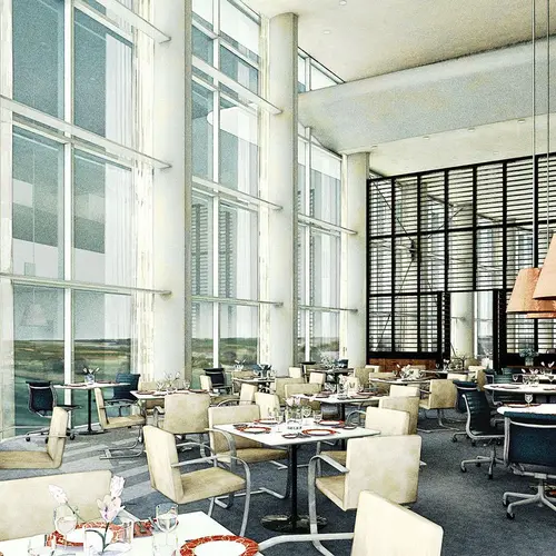
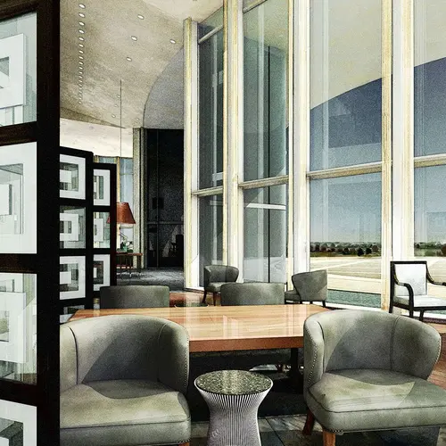
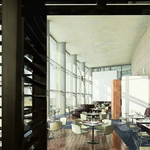
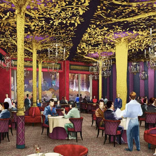
Since the hand renderings were all based on 3D models, I would often try doing full digital renderings on my own time. I was waiting until I could do something digital that had the same vitality of what I had done by hand. I never felt it did, until I started renderings of the Per Se restaurant for Adam Tihany. I had been experimenting with computer rendered test views and some magic happened. I had hit upon something that combined aspects of both digital and drawing. The client loved them, and that technique is the basis of my “look” ever since.
What’s lacking in the digital toolbox?
One thing lacking in digital rendering is spontaneity. There isn’t really a way to scribble and sketch beyond using a digital pencil, which isn’t much different.
I spent many Sundays standing next to Robert A.M. Stern in the “War Room” as he reviewed the team’s progress for the week. He would tape up yellow trace and take a fat pen and scribble over the various drawings, often not sparing us his candid opinion. His instincts are amazing. It is how a lot of the creative work in architecture is still done—hands drawing quickly on paper to convey ideas. Then we run off to put it in CAD and model it up. In time, the computer tools will evolve into something that adds to the age-old methods, perhaps through VR. Digital is still new and young. We are all still figuring out how to best use it. In the end, it’s just another tool to create with.
When working on paper, it is always important to protect what you’re working on. I had an almost-complete rendering on a table in my studio covered with trace and blueprints. Something must have been frustrating and I threw down a scale, causing it to dent the illustration under the papers. There is no un-do for that. The next day I was showing the rendering to my client, one of the nicest people I’ve ever worked for, architect Hugh Hardy. He noticed the dent in his picture and I was left to sheepishly explain what happened. He clapped his hands together, put his head back and said “that’s WONDERFUL”.
There’s no digital equivalent of that.
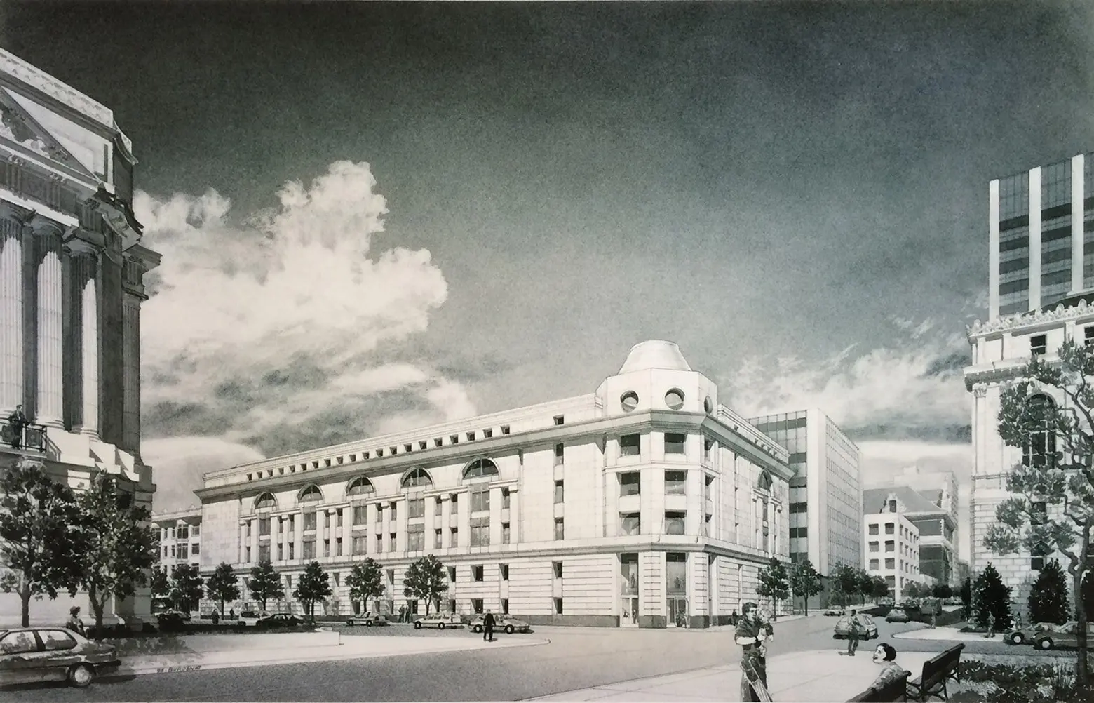
Do you believe some detail can only be recreated by hand?
Yes. Hand work still has an inherent connection to human perception. It is readily accepted, even when imprecise. We forgive the lack of accuracy in favor of our comfort with a very human expression. We fill in the details, feel the things that are only suggested because we know those things. It connects our experiences with new ideas.
Likewise, there are some things that can only be represented by digital, for example, time-based transforms. That can be lighting changes or even building elements that re-shape themselves in response to the environment and the needs of the occupants.
Does existing in a digital-dominated environment hurt a designer’s creativity or thought process?
All media is transformative, meaning a painting of a hat is not a hat. It’s best to understand both, and how they work together to create something that is more than a painting and more than a hat. The only true representation of a building is the building itself. The rest have biases. The current trend in rendering is photo-real, which suggests that a photo is “real.” It is not. It can be useful, but more stylized, evocative work can be, too, by activating people in different ways, perhaps more emotional ways. All media is also reductive, it cannot capture everything about what it depicts. So it is up to the artist or photographer or architect to bring forward aspects of the subject, even at the expense of others. That is creative choice and artistic narrative and it is how good work is done, no matter the media. There is a danger in thinking that the perceived perfection and so-called real nature of digital is all you need to effectively communicate your design.
We are in an interesting stage in the normalization of digital methods of producing architecture. When I started my career, there was no digital and the people who taught me had never known it. I learned to do perspectives with a pin and triangles, as it had been done for centuries. The people starting in rendering now are kids who have never known life without computer-generated imagery everywhere. Some of them are learning classical methods but the default work is digital, just as many of my seniors never learned the 3D. People my age are the bridge. There is just this one generation of professionals who grew up with pencils on paper and adopted drawing tablets feeding Photoshop. So which do I prefer? Both.
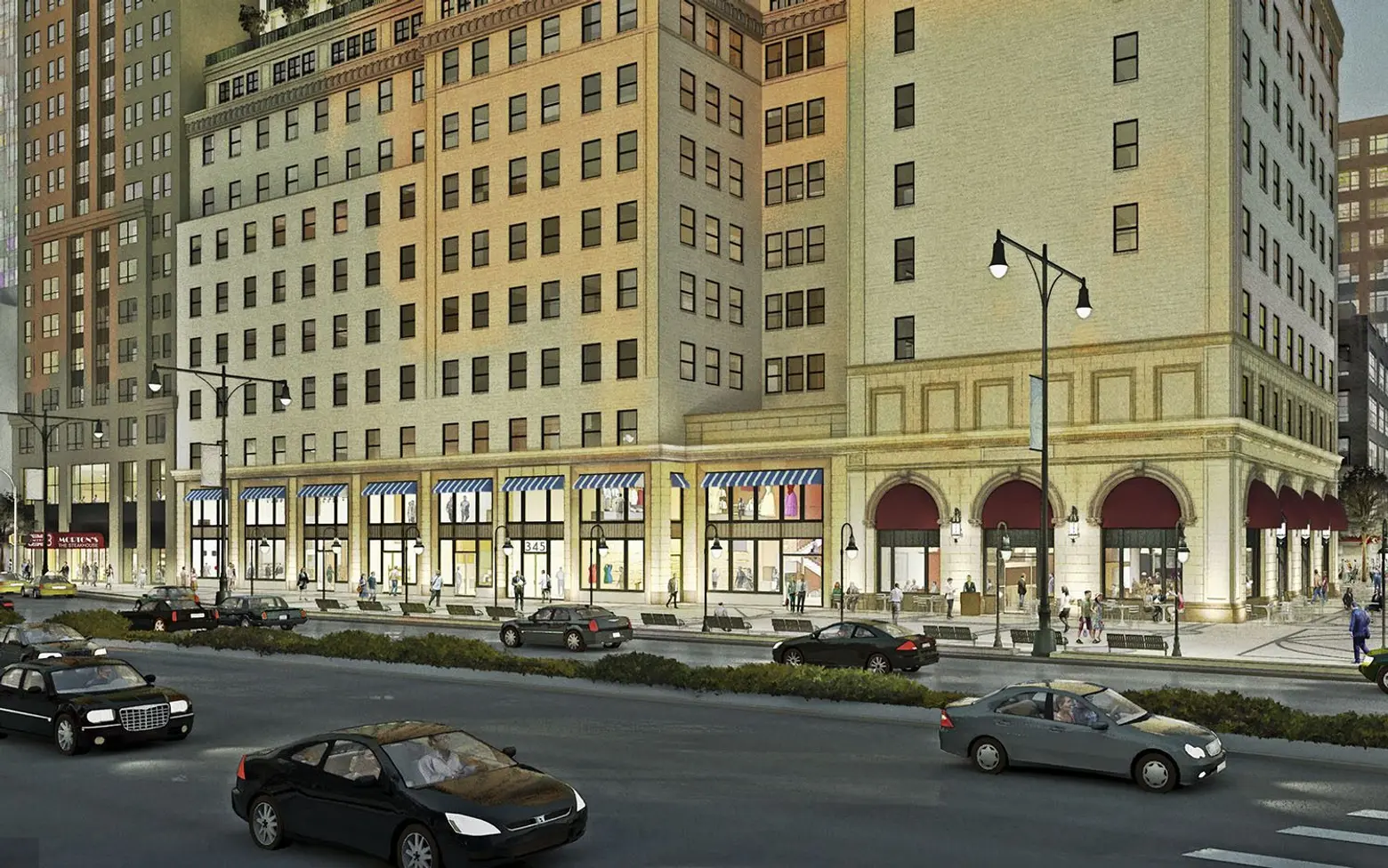
What’s the thing you dislike most about computer renderings?
There’s very little that I dislike about digital renderings. There are issues around what they have done to the industry that are not so great. Probably the biggest is that with the sameness that defines the vast middle-ground of work being done across the world, the work has become a commodity, and not the hand-crafted art it used to be. That is probably inevitable with the global equalizer of the Internet. It used to be that if you saw a rendering in NY, it was probably done in NY by one of my friends and I could quickly tell you who did it. People had styles, and some of them commanded rather respectable fees.
I am tired of that sameness, but there are still people doing stunning work using the same tools and techniques as everybody else. The lack of suggestion and understatement in photo-real work sometimes is annoying. But some renderers, like me, do work that is softer and, I hope, warmer. Some renderings rely on clichés of staging and composition, but then you see a piece that shows creativity and true storytelling.
Another change that digital renderings brought was the structure of the businesses that provide them. When the work was hand rendered, clients were buying a “name” as much as a picture. They expected that if they were buying a Tom Schaller rendering that Tom himself would be painting it. But with digital, a small studio was at a disadvantage. Clients expected that when they commissioned digital work, there would be a studio filled with young minions working away for not much more than coffee and bandwidth. Time of delivery and low cost became prime factors in who got the work. Change happens. I have been navigating the new market, adapting as best I can. I re-named my studio from my name to Acme Digital. The Acme is an old-fashioned term, and the Digital is to say “yes, it’s digital.”
Things are evening out and I am very hopeful for the future of architectural rendering. Here in NY something has evolved that really didn’t exist before. There are studios with many artists and film-makers employed that are normal places to work and be part of major projects. Some of these studios are producing world-leading work that is far-and-above the commodity. DBOX produces work that is regularly amazing, and my favorite studio, Neoscape, does too. I have known the owners for many years and they are great people who have managed to start and grow a stable rendering studio in a time of great change. There is SteelBlue in San Francisco, where some really talented people I know have landed. When you see work at that level there isn’t much to dislike about digital rendering.
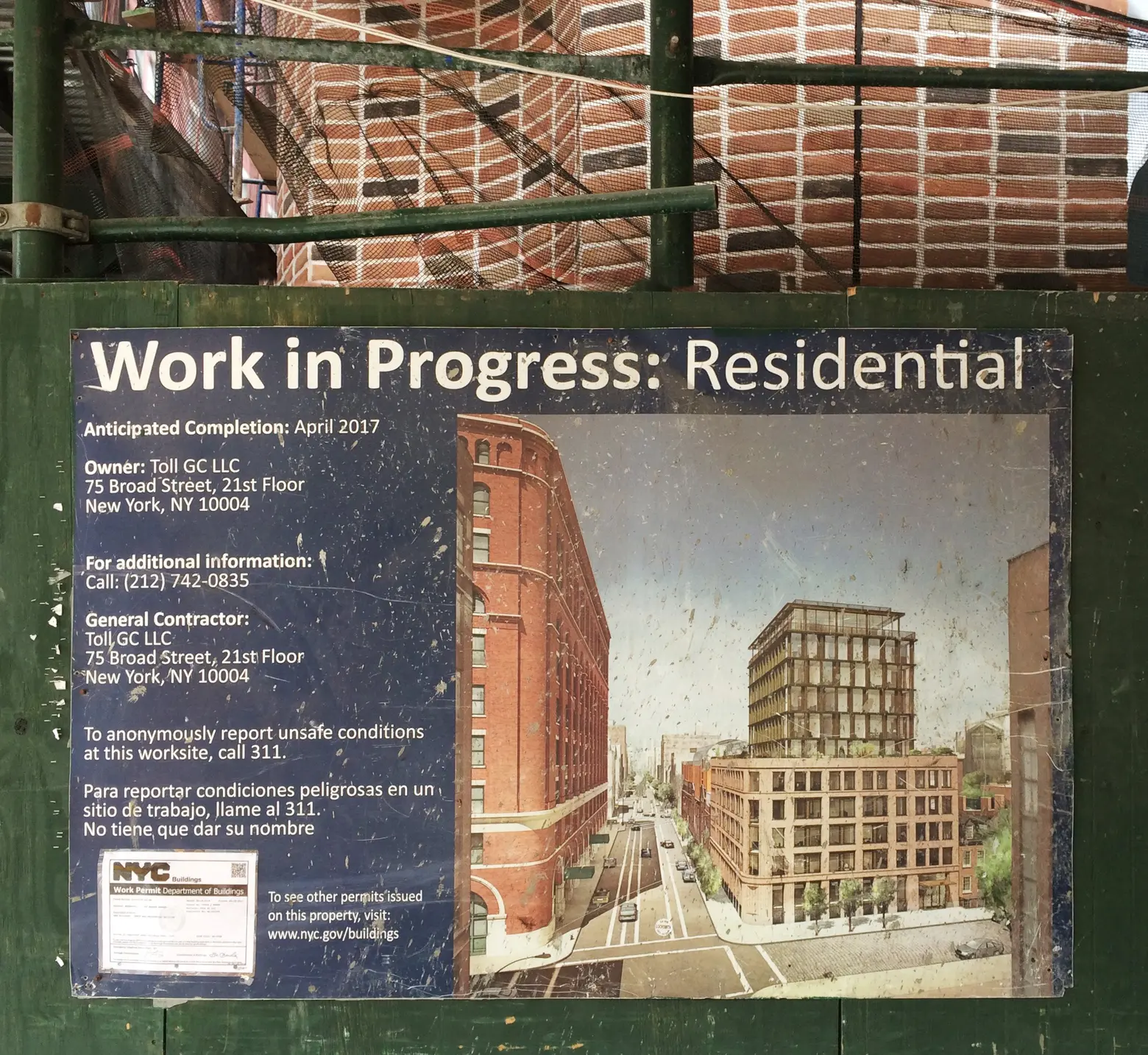
How do you feel looking back on your career?
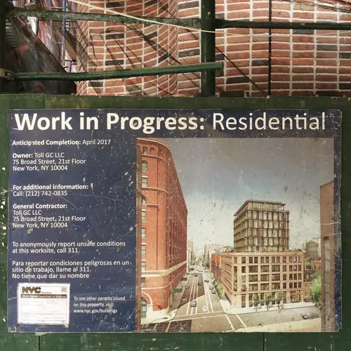
“Work In Progress,” That is why you hire a renderer. I am never more proud of my work than when I walk by a construction site and see my work up informing people about what is coming.
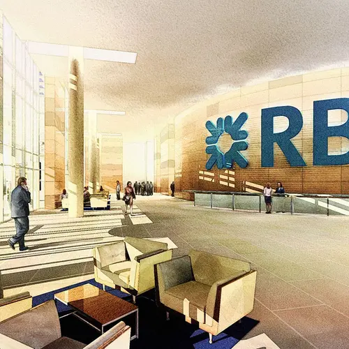
My kids are probably tired of it by now, but when we walk around New York, I see many buildings I worked on. I will point at a building and say “I rendered that!” Then we turn a corner, and again, “oh, and I rendered the lobby of that building, too.” Walking around the city proudly saying “I rendered that!”—that is why you hire a New York renderer.
All images courtesy of Ernest Burden. This interview has been edited and condensed.
RELATED:
Explore NYC Virtually
Leave a reply
Your email address will not be published.







Virtual staging has a lot more advantages than real home staging. Hasten has developed unique virtual staging solutions for more that 150 brokers in NY. Find more info at www.hasten.me Please let us know your thoughts.