Interactive map reveals the income gap that divides NYC’s richest and poorest
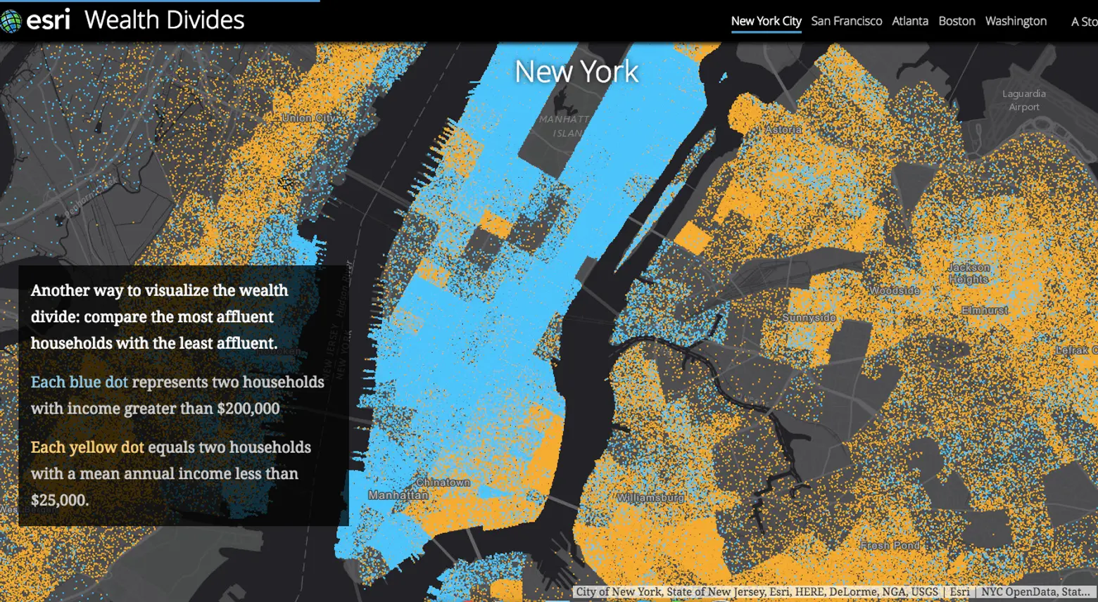
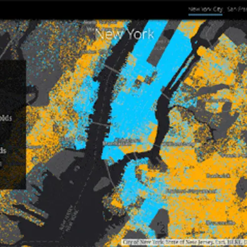
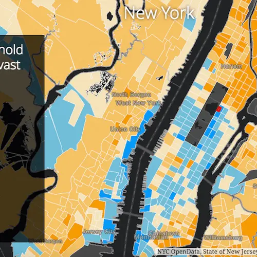
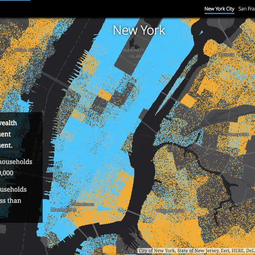
According to a 2016 Pew report, the middle class is shrinking in 90 percent of U.S. cities. It’s the first time in our nation’s history that the middle class doesn’t make up the economic majority. Instead, the highest- and lowest-income households combined comprise over 50 percent of the population. And in New York City, the divide is startling. One in five New Yorkers live below the poverty line, while the upper five percent of Manhattan residents earned more than $860,000 in 2014. GIS software company Esri has created a series of interactive maps that visualize this wealth divide in NYC and across the country, revealing where the richest and poorest live and the new economic divisions that are forming in our major metropolitan areas.
Click here for interactive map.
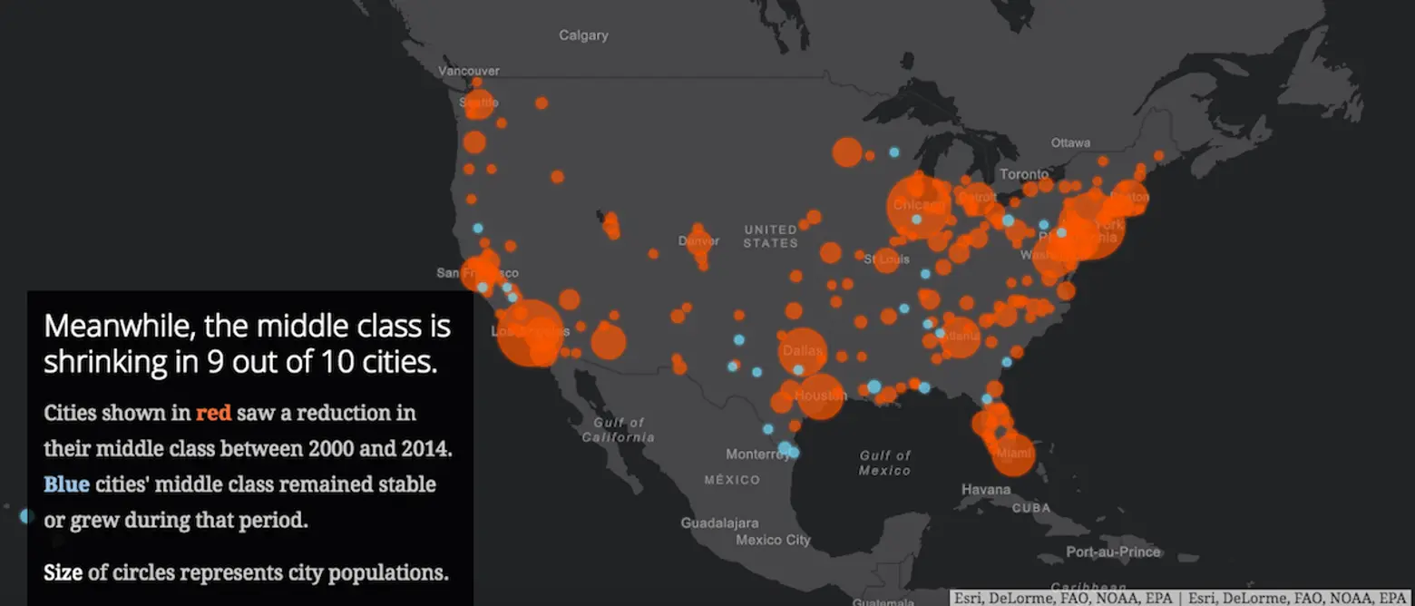
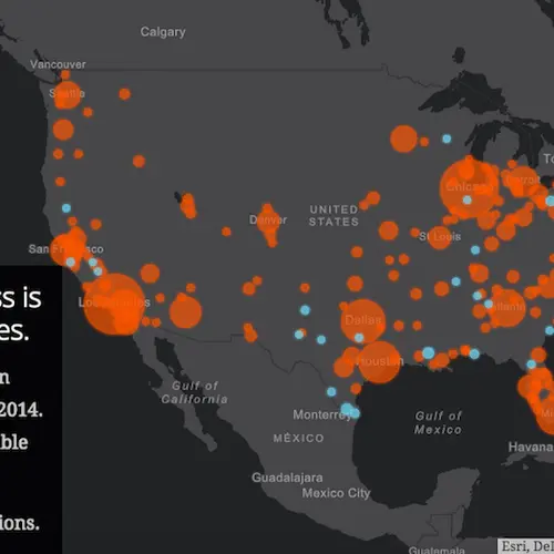
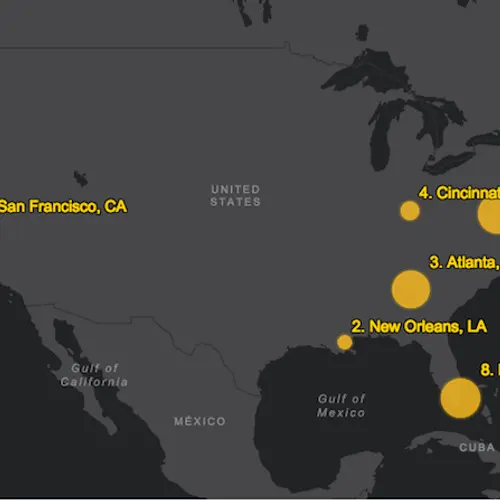
In 108 of 229 U.S. metropolitan areas the number of people in the middle income tier fell between 2000 and 2014. The Institute for Policy Studies tells us that the top one percent of earners possesses twice as much of the nation’s total income as they did in the middle of the last century. The interactive version of the map above shows the net change in the middle class population in each of the cities on it.

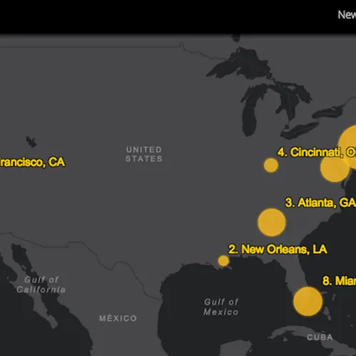
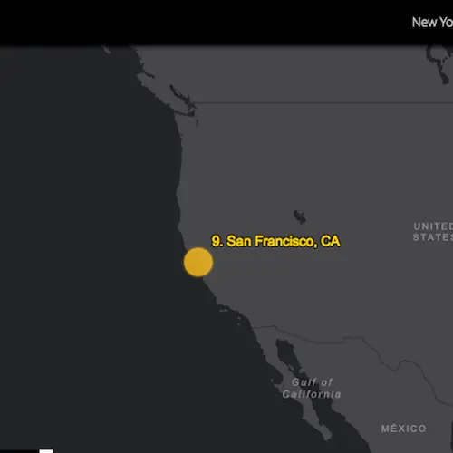
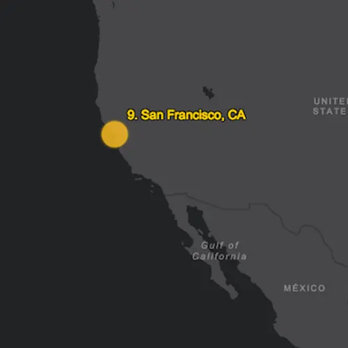
Income differences are steep in many American cities. The cities shown above have the most income inequality.
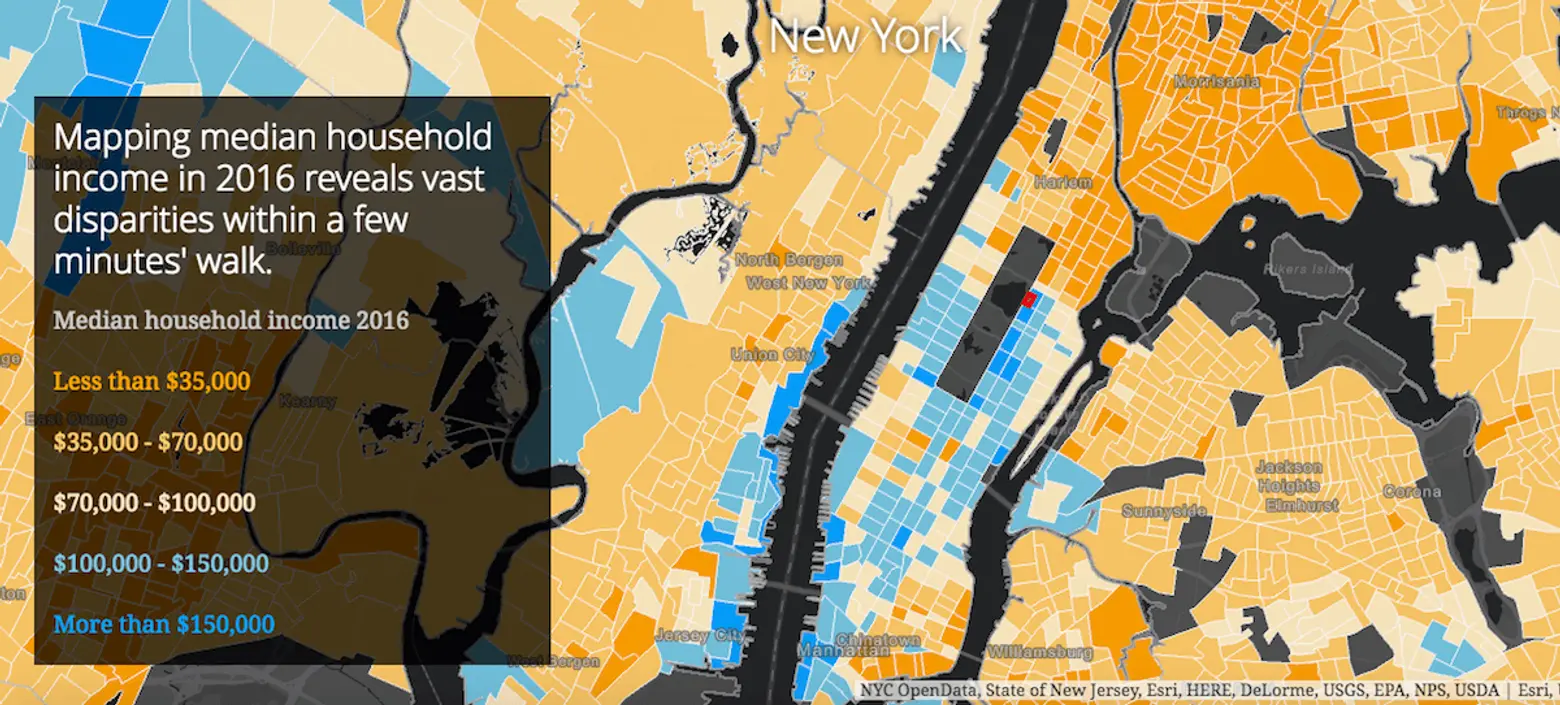
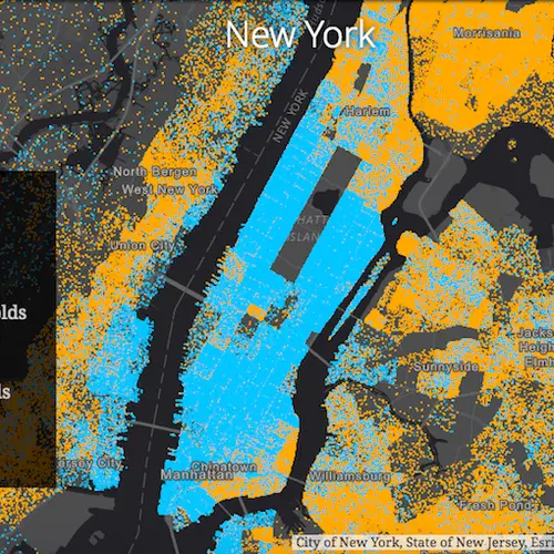
The Esri maps highlight the fact that, “neighborhoods in close proximity to one another often reflect dramatic differences in economic status. And many of the boundaries between wealthy and low-income areas are shifting as cities gentrify and immigrant populations fluctuate.” In New York City, Manhattan has the highest concentration of wealth.
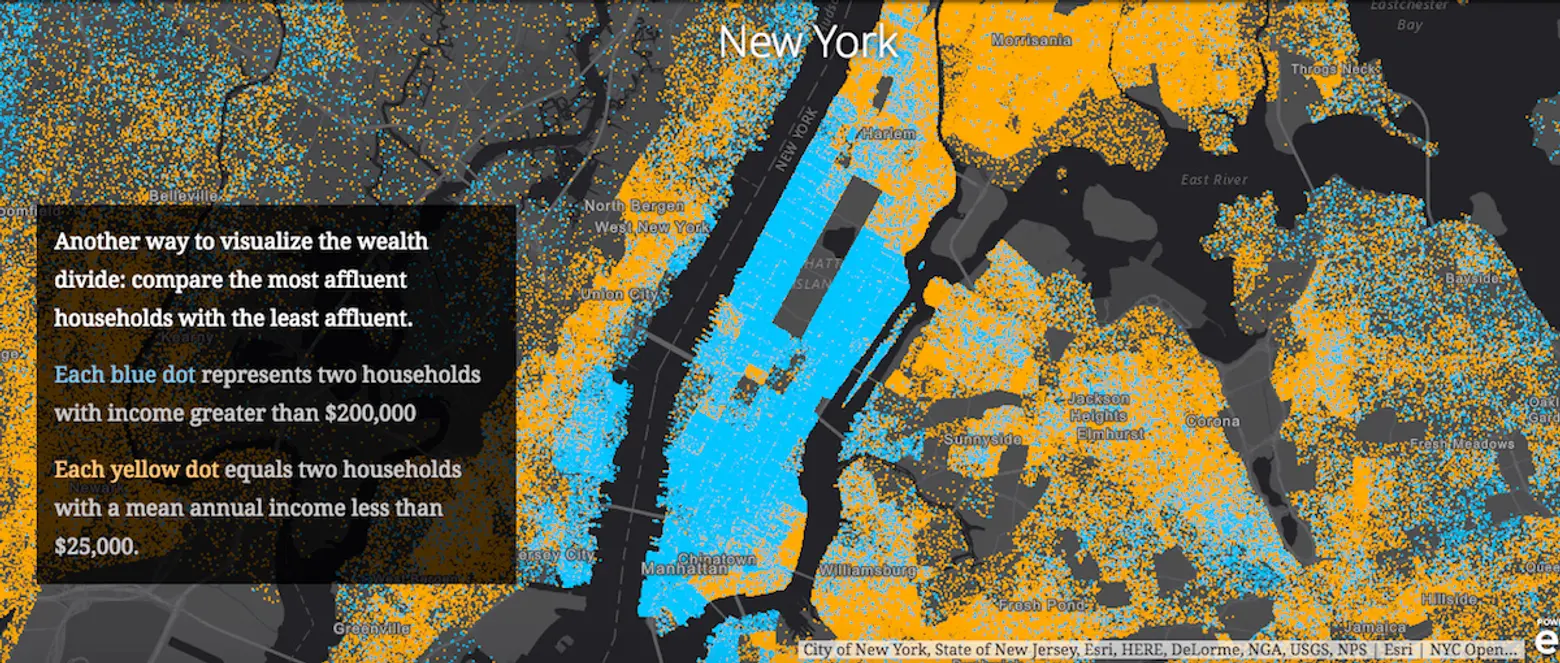
Click here to compare wealthy and low-income household counts.
Though Manhattan has always been something of an anomaly in its proximity of rich and poor–wealthy enclaves exist almost next door to low-income housing, for example–mapping median household income in 2016 has shown huge disparities within an easily walkable distance. And at the start of what may someday be known as the Trump era, it may be most revealing to visualize the wealth divide by comparing the most affluent households with the least affluent.
It’s also interesting to investigate cities as varied as New York City, Boston, San Francisco, Washington and Atlanta, as each one has been influenced by its own unique social and economic imperatives. Suburban sprawl in Atlanta, for example, may reflect residual 20th century geography while newer influences like tech wealth have dramatically altered the economy in and around San Francisco.
Also mentioned in the Esri map story is the fact that gentrification is “expanding Manhattan’s wealth to outer boroughs, especially Brooklyn.” The fact that rapid gentrification is affecting all of the cities mentioned here, though, may be due more to a nation-wide change from 20th century “suburban” living to a preference for attributes that can be found in more “sub-urban” neighborhoods that surround urban centers, which in turn attracts the wealthy to formerly middle-class and low-income areas.
[Via Esri]
Get Insider Updates with Our Newsletter!
Leave a reply
Your email address will not be published.













The rich get richer —and the poor get shafted. Again and again.
But wait. The great wheeler & dealer promises to save the day.
But he only leads us into a grim darkness, from which we may never escape…