INTERVIEW: Architect John Cetra on the Upper West Side’s Dahlia and the changing concept of home
Images courtesy of CetraRuddy
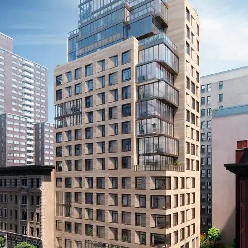
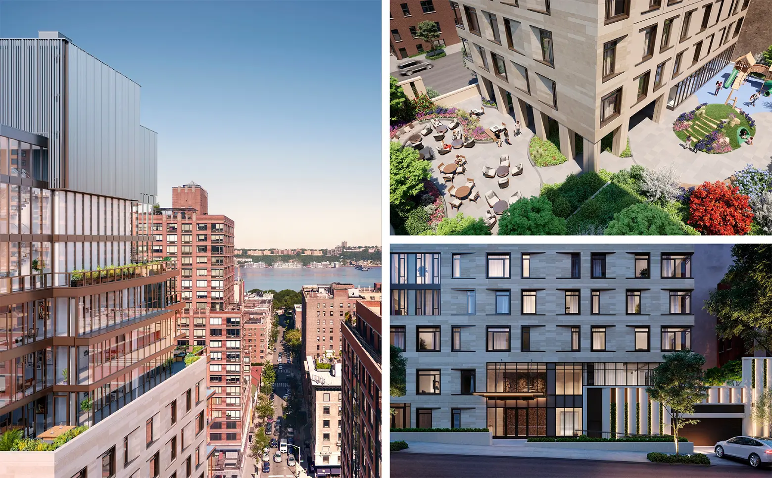
Designed by CetraRuddy and RKTB Architects, Dahlia at 212 West 95th Street celebrates the Upper West Side‘s classic residential blocks of pre-war architecture while adding innovative design elements. The condo’s 38 homes and common areas are designed to be more spacious than the average Manhattan apartment, and perks unheard of in New York City include a huge 5,100-square-foot private elevated park, a fitness center with a yoga room, and a private parking garage. Plus, each apartment is situated on a corner of the building, so there’s no shortage of views and natural light. 6sqft recently offered a peek at the 20-story building’s interiors, and we’ve now chatted with architect John Cetra about this new addition to the Upper West Side, the neighborhood, and how apartment building design must be sensitive to changing times and the idea of home in the city.

Photo of John Cetra, courtesy of CetraRuddy
The building’s website mentions that “The Upper West Side is often called the most New York of all New York neighborhoods – and for good reason.” What are some of the ways the neighborhood surrounding Dahlia has transitioned and changed over the years? How does it embody the spirit of New York City today?
I think it has always been a neighborhood with a family orientation. A lot of the new buildings that have gone up–and Dahlia is one of them–were designed with that thinking in mind. The city after WWII started suffering from suburban flight, and that was an area where I think the changes affected the housing stock. I would say in the last 10 years, there has been a resurgence of those family-oriented larger units.
I think the other thing that’s very interesting about the Upper West Side is that it had a lot of SROs [Single Room Occupancy buildings]. A project we did in the early ’90s was Euclid Hall on 86th Street and Broadway. It was turned into an SRO, and it was not very well maintained. The city had taken back the building and sold it to a non-profit housing provider called the West Side Federation for Senior and Supportive Housing. We got involved with them and renovated the building. We kept it as an SRO, but now it was an SRO that was run by a nonprofit housing provider who went in and provided a tremendous amount of support services to the people who were living there. And that’s interesting because the neighborhood, I’m sure, lost some of the SROs but not all of them. And many of them that are there have exceptional services. And that means the whole community is much more diversified, not very wealthy or extreme cases of living below the poverty line. It’s really quite a mix.
Gentrification was happening much more organically with the combination of preserving these homes for people who needed assistance. That, I think, is a big part of why it’s such a unique neighborhood. You can walk down Broadway from Lincoln Center all the way to 96th Street, and you really see a cross-section of New York that is very, very diverse. There’s a lot of historic preservation also, which has helped to preserve the housing stock along West End Avenue and Riverside Drive.
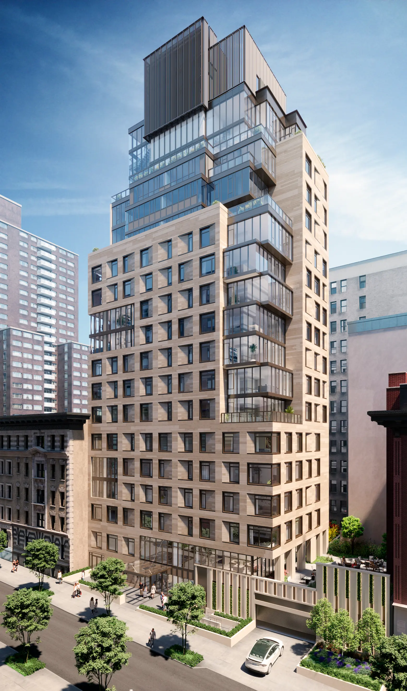
Image courtesy of CetraRuddy
How does the building work with the context and the architectural history of the neighborhood?
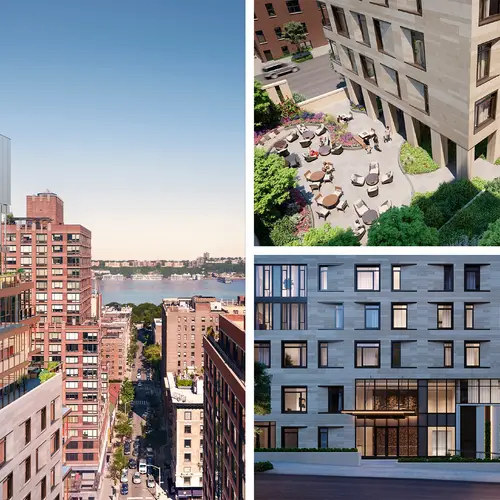
The material was selected purposely to blend in with the masonry context of the neighborhood. Second, if you look at some of the buildings just to the east where there’s the coining on the corners and there’s a limestone trim around some of the window openings, I think you see a color sensitivity that we took from the existing context that was very very important.
There are a lot of tall buildings in the neighborhood, though not supertalls. So the neighborhood has a fear of tall buildings. Just down the street, buildings that were built in the ’70s and ’80s are 35 or 40 stories tall. And there are a lot of older buildings that are similar in height to us. So I think that the idea that you can have a mix of building heights is something that adds to the texture of the neighborhood.
We tried to take the best of all of those buildings and bring them into a contemporary language. The glass boxes ascend up the building–you’ll notice that it starts on the sixth floor–and there’s sort of a datum line there with other buildings that are similar–older buildings that flank us which are similar in height. Above that, we wanted to celebrate this additional height and the view.
When you’re standing on the west side of Broadway and you look at the building, it’s really a pleasant surprise. Your eye kind of travels up. You see the solidity in the lower part of the building and how that transitions into a little bit more glass, and then at the top where there’s the most glass. We like to create some surprises, but we want to do it in a way that respects every single neighborhood that we work in.
It’s fascinating to know that the building is clad in a porcelain material.
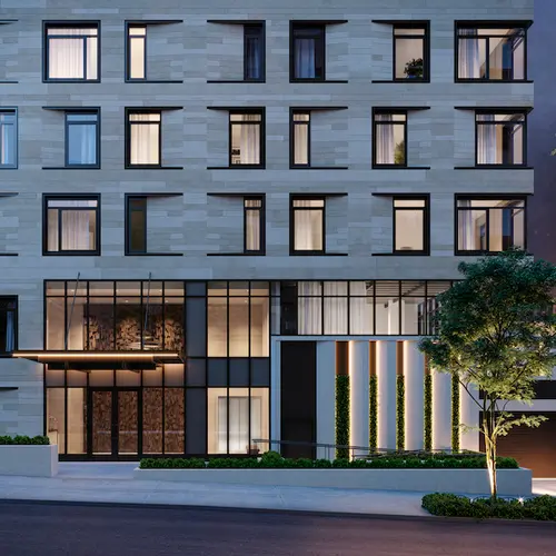
We wanted to create some diversity of composition there. So we used these porcelain panels and created larger window frames and then inflected the material into the wall to create some depth, which made an interesting syncopation. There’s more texture and a slight color variation like you would find with a natural material. It’s indestructible as well. And in terms of energy efficiency, it’s a rain screen system, so there’s an insulated layer of material behind it.

Image courtesy of CetraRuddy
We’ve brought up the idea of home; apartments at Dahlia are two-, three- and four-bedroom, which is larger than what we’re used to in the average Manhattan apartment. They’ve been referred to as family-sized apartments. What are some of your thoughts on the growing relevance of that aspect of a building and what it adds to the possibilities of city living?
To reinforce the notion of family and home, this building was unique in a couple of ways. One is that it’s literally in the middle of the block. There’s an older building on the corner of Amsterdam Avenue and one on the corner of Broadway, and all of the buildings around it are pretty high-density like old loft tenements. They were close to the rear yards. When we analyzed the options that were available through the zoning resolution, we found that the site was big enough to create a smaller footprint but then to open up some other possibilities for light and air to get onto the street, because the building would essentially cast a shadow on 95th Street. So we realized that we could push the tower to one side, and create this really wide side yard. I love side yards– you can have a continuation of buildings and density, but it’s really great to have some openings in the grid.
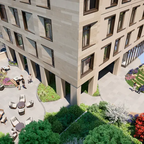
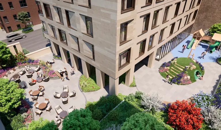
We have parking in the building that was originally there; above the parking, we created this open space for the residents. This also brought light down to 95th Street. And the garden was designed to spill over the building wall so that you could look up and see some green and vegetation.
We also set the building back to create a sense of entry and arrival. So instead of bringing the building right to the street line, you have some green spaces between the sidewalk and the building entrance. It was a way to create a little bit more open space and a little bit of greenery in a very dense part of the city, which would benefit the community at large.
We put the amenities inside the building’s second floor. Going back to the family orientation, one-third of the open space is dedicated to a children’s play area. There’s an indoor children’s area as well. Everybody around the block can look down onto this space and see it. Some of the buildings on 94th Street that used to face the garage now face a landscaped roof deck–even around the back.
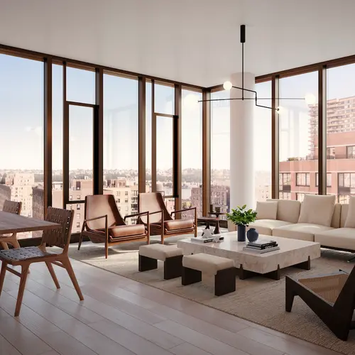
When we realized we could get the building a little taller and we had this open space, we wanted to celebrate that somehow, because the views to the west are really magnificent. You can see the Palisades and over them through the buildings between Broadway and the river. We wanted to take advantage of that. On the northwest corner of the building, we created a composition of glass cubes. All of them are living rooms for each apartment that ascend toward the top of the building where there is more glass.
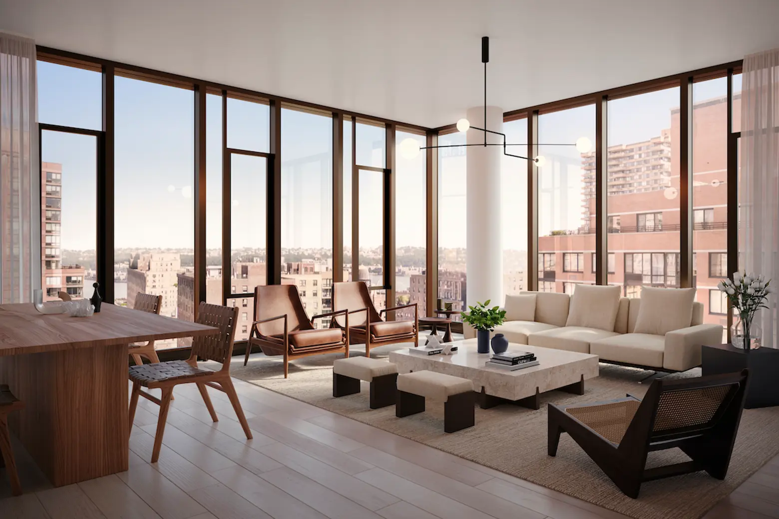
Image courtesy of CetraRuddy
In what way do you think Dahlia speaks to future New York? A similar but broader question: What are your thoughts on the changing definition of “modern” when it comes to architectural design?
We try to stay away from classifying our buildings as one or the other. To us, modern design is about context, so we look for a story. We try to tell the story of how we interpret a community and a neighborhood in the way we design a building. Or maybe it’s something about a client or a unique moment in time.
I would also add that, especially now with COVID-19, we have to see how we can use our design talents to create better buildings. The thing about some of our buildings–and this one is the perfect example–is that they don’t have a lot of apartments per floor. Most of them are only two apartments per floor. So that allows every apartment to have cross-ventilation because they have rooms that face the back and front, and some of them even have side windows. So it gives people an opportunity to live in a healthier environment.
The other thing is the idea of flexible spaces within apartments. We’ve done that in a number of our projects. What used to be called the home office…
Now it’s just called the office!
Right. So it’s great to design units with flexibility; that’s really really important. And we’ve been doing surveys with our staff of 80 or 85 people about what’s important to them and what they think are some of the important things we should be considering in the future. And of all the people who work with us who live in the city, every one of them in one way or another has tried to find some kind of green space that they can actually claim for themselves whether it’s on the fire escape or a deep window sill.
One of our employees actually wanted to create a lawn, but he didn’t have space; so he painted two pieces of sheetrock green–he sort of sees it as his “outdoor space.” And then he took over another part of his little front yard and planted a real lawn. He was talking about how he kept moving the table where he works closer and closer to the window to be close to that green space and daylight.
We have to make sure that our buildings can maximize daylight; they can be energy efficient, but it’s so important, having that green space plus daylight. So it’s important for us to design buildings around some really basic things: light and air.
 Image courtesy of CetraRuddy
That makes sense, just because times change doesn’t mean people do. To get a bit more micro-focused, on the subject of amenities: At one point, lofts with lots of privacy but no amenities were all the rage. And for a time, developers were racing to outdo one another to offer the most outrageous luxury amenities. Where are we now with that as far as residential real estate in your opinion? You mentioned green space and outdoor space and the building has creative space–what are the more valuable amenities that add to life at Dahlia?
We have all the things you just mentioned, but actually there’s one other–I think not everyone agrees but I think it’s important–which is the parking component. Obviously we didn’t try to provide what might be required in Queens or parts of Brooklyn or certainly New Jersey. But I think it is an amenity that some people really love and will go into a building because it had [parking] as opposed to one that didn’t. I don’t believe the car is going to go away. It’s just too important to people because it gives them something they really want, which is freedom. And cars are going to be improved, they’re going to get smarter, they’re going to be less polluting.
The amenities race has gotten out of control. But nobody wants to be the first new building that said “no amenities.” That’s not such a great marketing strategy. You love [living in] New York because of the museums, because of the theater. But how many times do you go? You can go because it’s there. But when somebody comes to visit you in this building, and you can show them this beautiful garden and the great lounge, I think it helps tremendously. So I don’t think the amenities are going to go away.
You probably recall that amenities, if they existed, would be in the basement. Because that was like free area. We have buildings where we’ve done amenities in the basement–like Rose Hill–but it’s beautiful. We’re not trying to cut corners on it. The cellar has a lot of the amenities, like a pool and a gym. But that building also has an incredible lounge in the middle of the building, so you can do one thing in the basement but then you can also go up to the lounge with two open terraces. We’re trying to be smart about how to mix these things so that from a real estate standpoint there’s not a loss of sellable floor area, but everybody recognizes that if you can make it really nice then it’s definitely a seen as a plus.
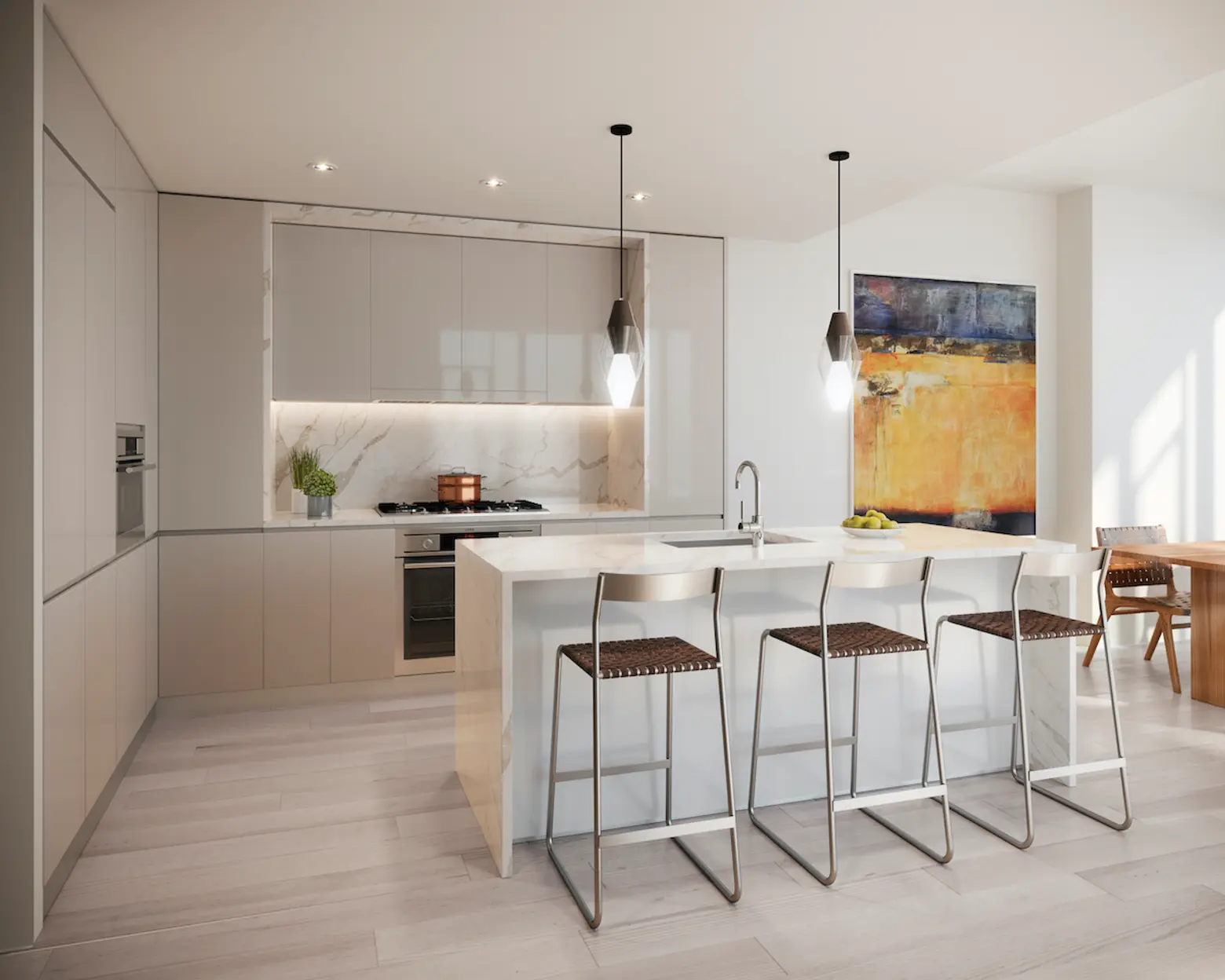
Image courtesy of CetraRuddy
It’s complicated and changes nearly every day, but when it comes to finding a new home during the COVID-19 pandemic, how do you think the current situation affects the way people feel about living in a community like Manhattan? What ways to the interior and exterior design address what home means to people and how might that be changing?
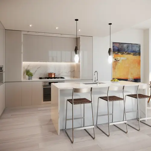
I mentioned a couple of things–especially how the flexibility of the floor plan is really important because people are using their spaces more. Let’s say kitchen design: There are so many restaurants in New York, you didn’t really need to have too big a kitchen. So that’s something that we’ve been thinking about; with COVID-19, the kitchen has become a much more important thing… A counter should work for a number of different purposes; it could be a place where a kid could do some homework or you might want to use it to set up your laptop. Or you might just want to cook.
A lot of the things that we’ve been doing are helping to create that sense of home, and I think with home comes security–you want to feel like when you go home it’s a safe place. So we can do things within the apartment, and within the building, to increase air circulation. We’re looking at touchless controls on doors; we’ve had some of that already but now it’s become more important. There’s a lot of talk about ultraviolet light and how it helps to destroy bacteria and how that can be incorporated into the ductwork.
At the same time, we’ve been trying to make our buildings more efficient, and greater efficiency means a tighter wall system–which kind of goes against the idea of fresh air in the building. So how do you get that fresh air in the building? If you’re going to do it through mechanical means, you have to pump more air in through the system, and that air should be filtered and cleaned as much as possible. A lot of buildings now are designed where fresh air is brought into the building and not necessarily through an open window because you need to provide a certain amount of mechanical ventilation. If you’re exhausting some air because buildings are tighter, you have to replace it. And you can’t necessarily rely on somebody leaving the window open. So you want to do that mechanically. That means the system has to be better engineered to sanitize and clean the air.
FIND OUT MORE INFORMATION ABOUT LIVING AT DAHLIA HERE
RELATED:
- See inside the enviable amenity spaces of Dahlia, a new condo on the Upper West Side
- INTERVIEW: Architect Nancy Ruddy on 30 years in NYC, adding to the skyline, and restaurant design
- Rockefeller Center developer reveals first NYC residential tower in Nomad
This interview has been edited and condensed for clarity.
