L/AND/A transforms a dark Bed-Stuy row house into a spacious, sun-drenched dream
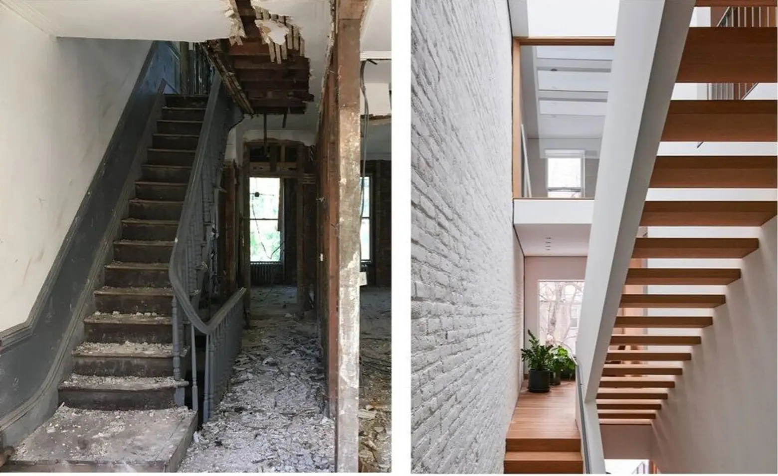
Photo by Kevin Kunstadt
LIGHT AND AIR, better known as L/AND/A, is a New York-based architecture and design studio led by architect and artist Shane Neufeld. Established in 2017, L/AND/A takes a “primal approach” to architecture by reducing design to its essential components to find clarity in a hectic world. Neufeld believes, “architecture is most powerful when elemental, and that spatial clarity and specificity have the potential to shape distinct experiences that ultimately enrich our lives- reconnecting people to their environments in meaningful and surprising ways.” This is just what Neufeld has done in his most recent project.
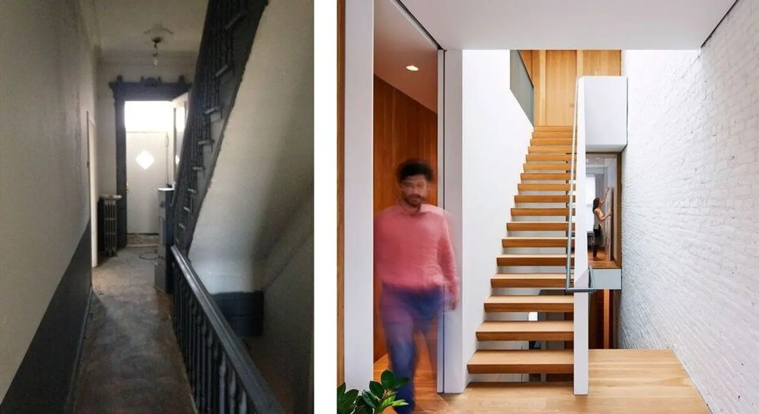
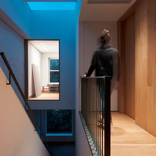
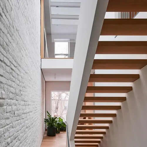
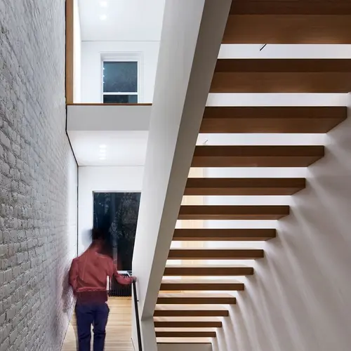
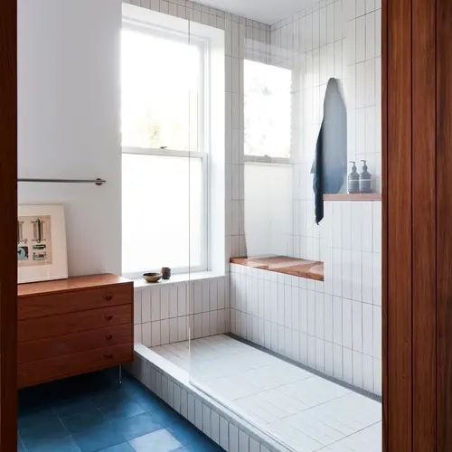
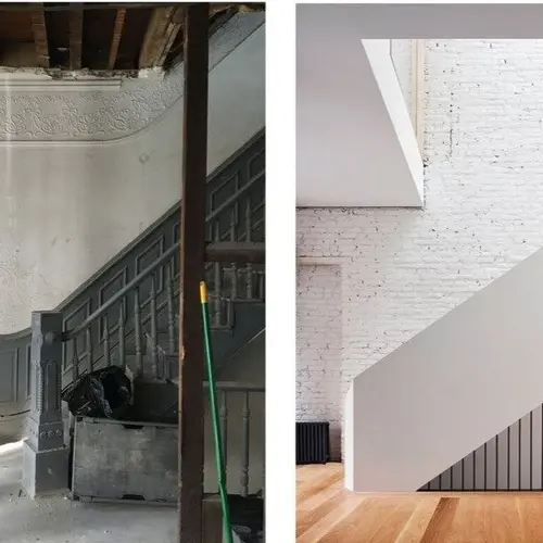
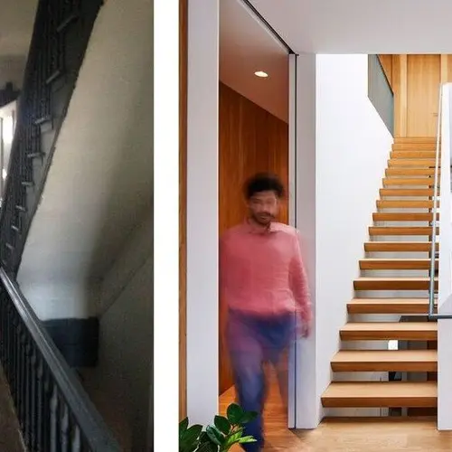
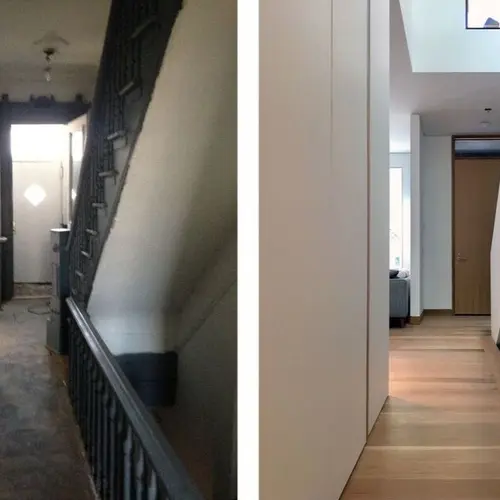
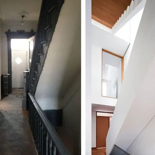
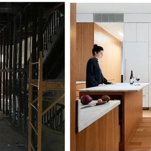
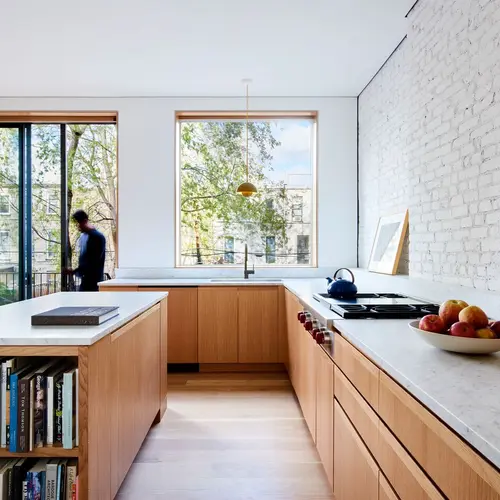
“Light” and “open” are not two words typically used for historic row homes but L/AND/A’s newest project, the Switchback House, a gut renovation of a 1880s row house in Bedford-Stuyvesant, Brooklyn, completely turns that idea on its head. By replacing the original stacked staircase with a switchback stair and adding skylights, Neufeld explains how the previously closed and dark row home became a modern, useful space bathed in natural light.
 Neufeld grew up in Brooklyn. When he was 10 years old, his parents bought and renovated a townhouse. “Just growing up in New York and seeing the obsession of value as square footage instead of valuing space and design, showed me that maximizing square footage comes at a cost,” Neufeld told 6sqft.
He explains this experience informed his current philosophy, that value cannot be quantified through square footage, particularly when it comes to row houses. His work on the Switchback House is a prime example of this. He justified removing “usable” square footage by cutting into the floor plate because “the experience it gives back is worth so much more.”
Additionally, Neufeld believes there is a current obsession with historic details to the point that people will often not remove walls or features of a home because they feel beholden to the original design.
“I value historical details only if they are in alignment with a spatial program that makes sense to the house,” he said. “Townhouses were designed for wealthy families with strong separations between the performance of each level. The stairways were narrow and dark and not places to socialize or spend time, just ways get you to point A to point B.”
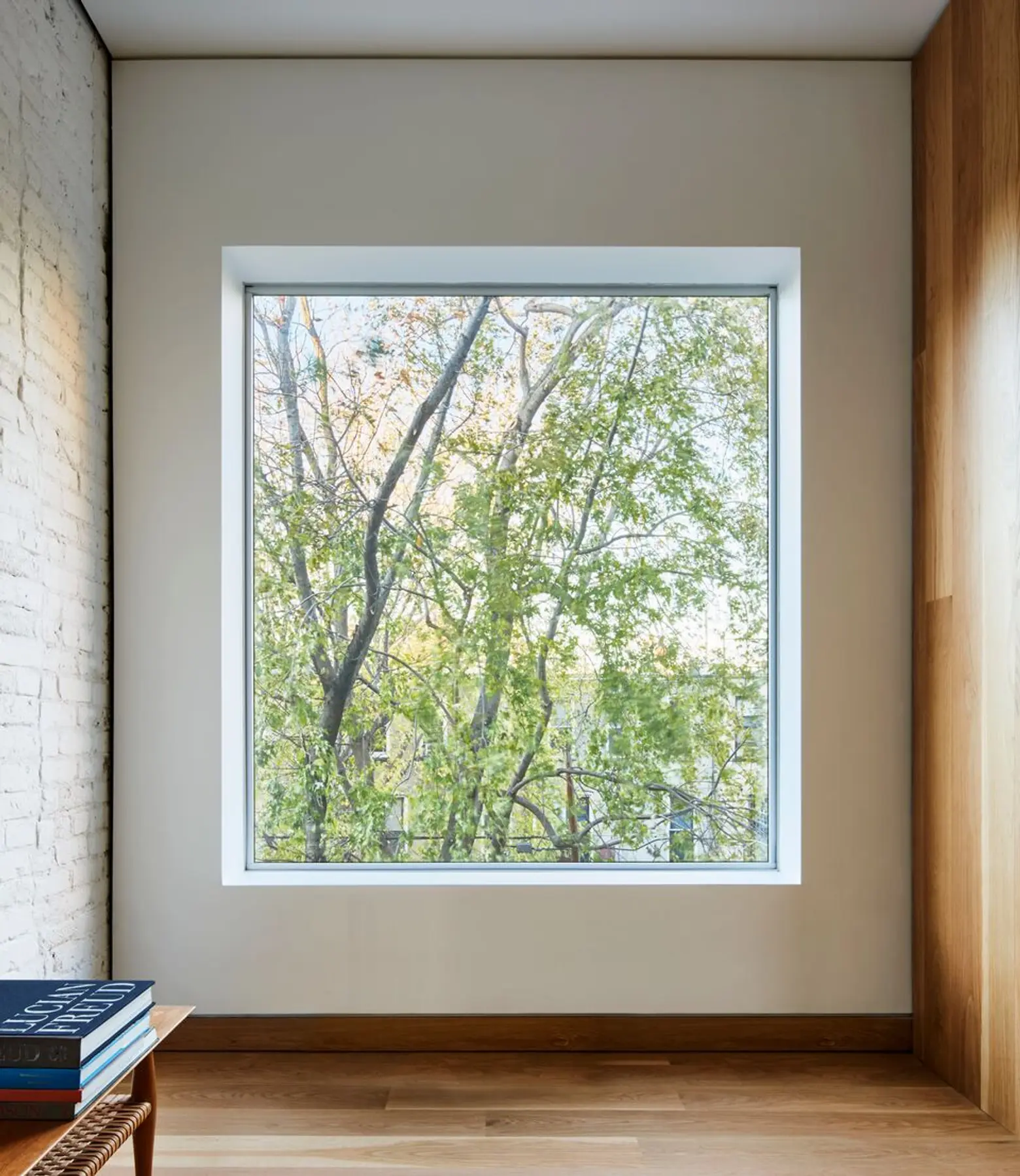
Neufeld recommends that people not be slavishly devoted to historic details, ( i.e. don’t keep a doorway a doorway simply because it has historic value) but rather if and only if they make sense for the way the new space will be used and appreciated.
One way Neufeld found the balance to respect the history of the building was to leave the exterior relatively untouched. “The outside remained exactly the same with the original historical facade which really played up the incredible surprise by not expressing the revamp on the outside. It is quite dramatic as you work your way in and find things you would never expect.”
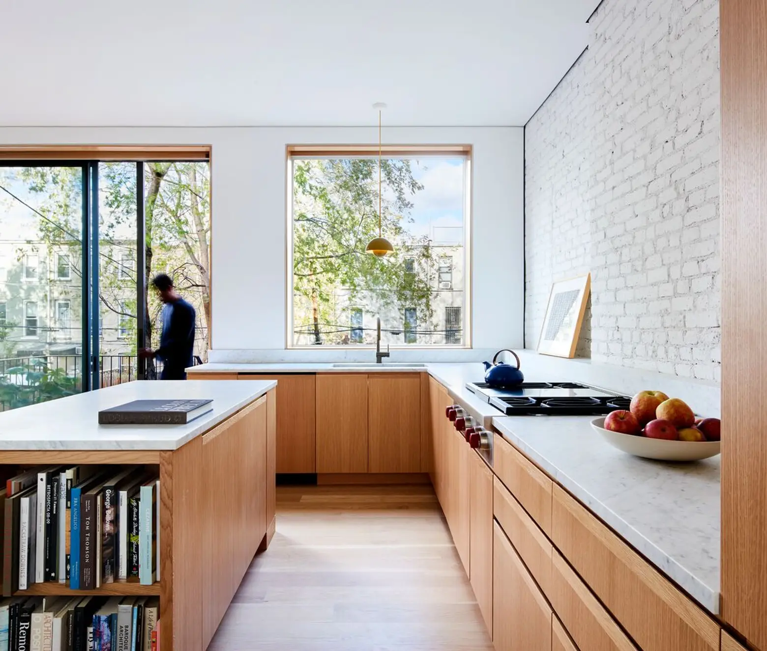
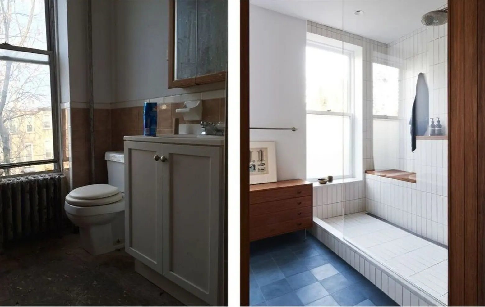
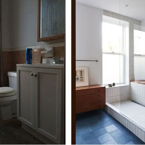
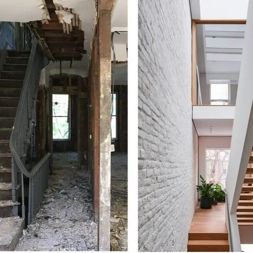
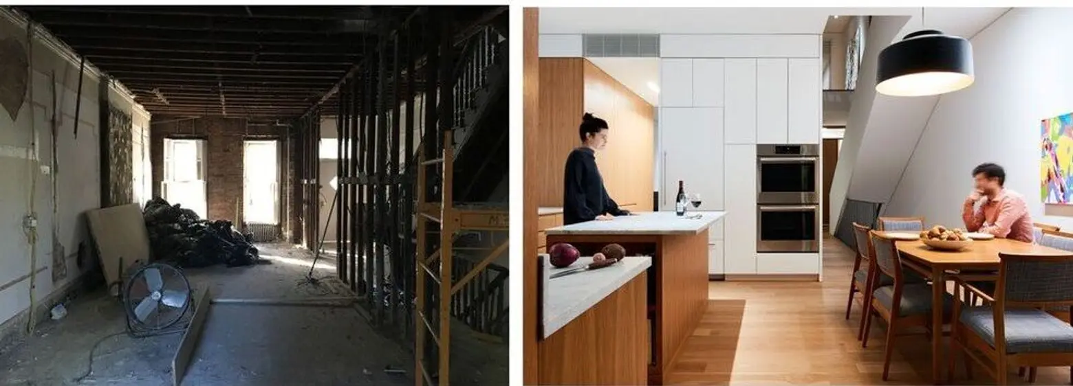
The 2,700-square-foot home was quite dilapidated when work started; this is at least the third evolution of the house. It was originally a townhouse, then a rooming house and now it has been restored back to a single-family home, restoring the grandeur of the original space and making it usable to a modern family.
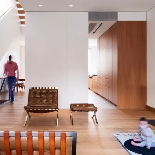
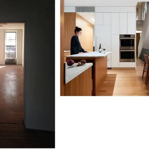
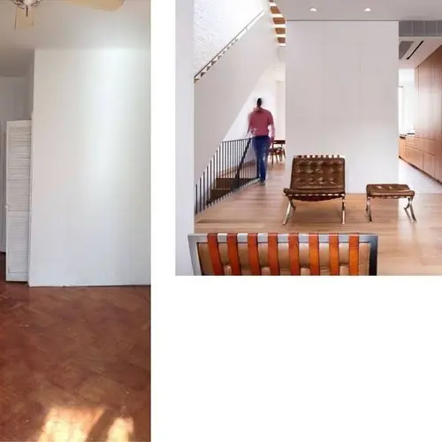
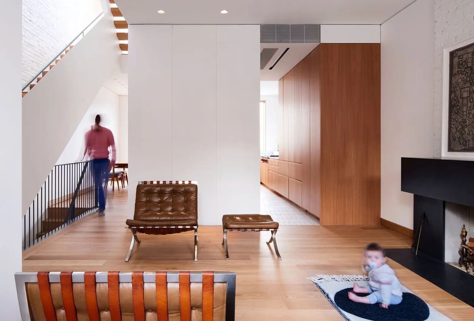
Eliminating part of the upper floors allowed for new skylights to bathe the house in natural sunlight that it had not seen before. Removing the hallway that typically links stacked stairs created a 32-foot-high space that links the three floors of the home. Other interior walls were ripped out to form open-plan living spaces.
In the end, Neufeld recreated a historic space in a way that works perfectly for a modern family.
All photos by Kevin Kunstadt via L/AND/A
