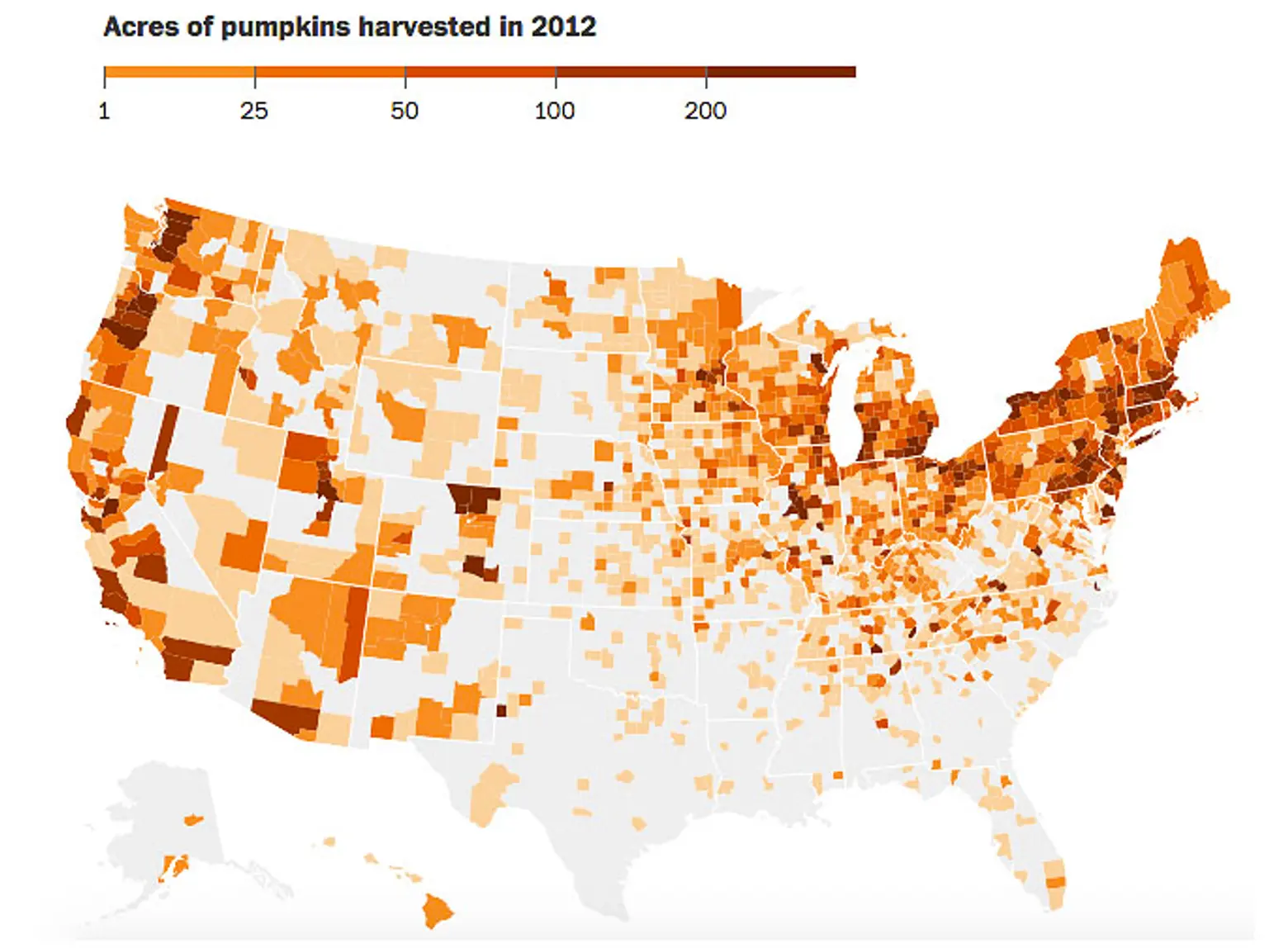
Map Shows Where Our Pumpkins Really Come From

Unfortunately, the pumpkins at Whole Foods don’t come with labels like “local” or “wild caught,” but the good news is that your Halloween purchase likely comes from nearby. This interactive map from the Washington Post highlights the total acres of pumpkins harvested, by county, in 2012. It was created using data from USDA Agricultural Census and shows that “pumpkins are grown commercially in just about every county in the Northeastern states.”
What’s most surprising about the map is that the middle of the country, beginning in eastern Montana and looping southeast to Florida, is a pumpkin desert. Illinois appears to be the nation’s pumpkin capital, with five of its counties accounting for the top six producers. Here’s the full top ten list:
- Tazewell County, IL: 4,669 acres of pumpkins
- San Joaquin County, CA: 3,441
- Mason County, IL: 2,627
- Wayne County, IL: 1,547
- Peoria County, IL: 1,323
- Stark County, IL: 1,068
- Yoakum County, TX: 1,014
- Lancaster County, PA: 1,004
- Carroll County, VA: 703
- Suffolk County, NY: 641
To put this in perspective, one acre of a pumpkin field yields about 3,000 pumpkins, and since the U.S. grew 90,165 acres of pumpkins in 2012, that’s 270 million pumpkins a year!
Explore the interactive map at the Washington Post >>
RELATED:


