Minimalist Subway Map Posters Are More About Beautiful Design Than Finding Your Way
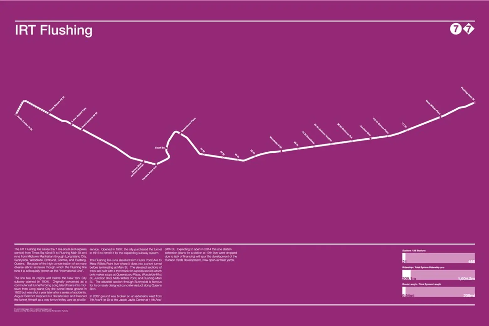
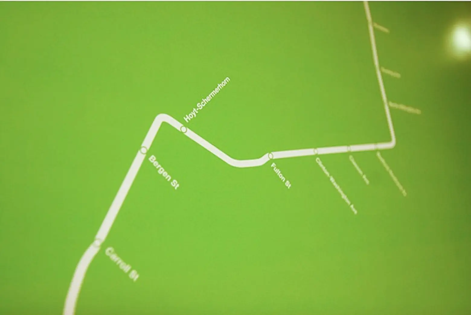
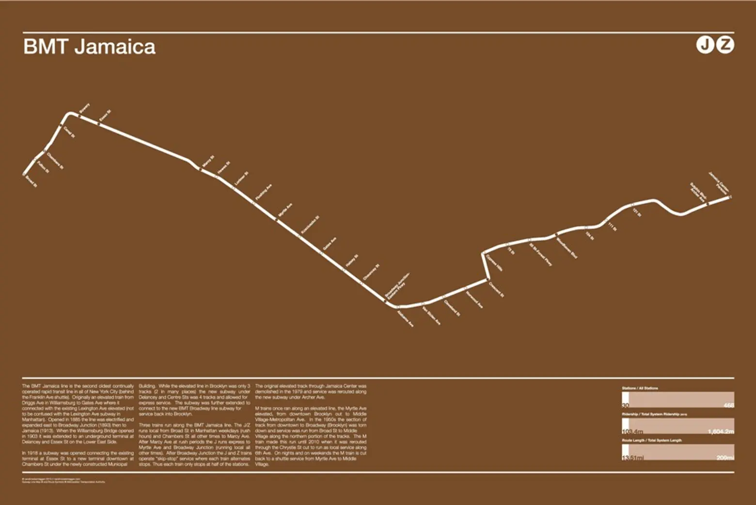
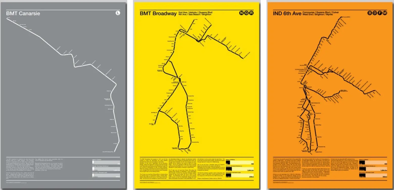
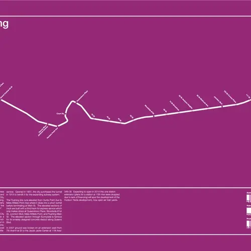
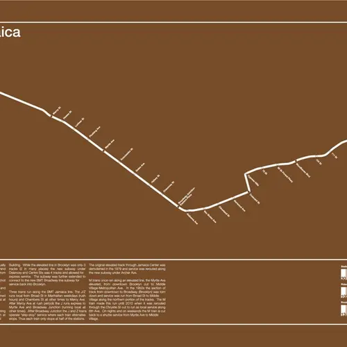
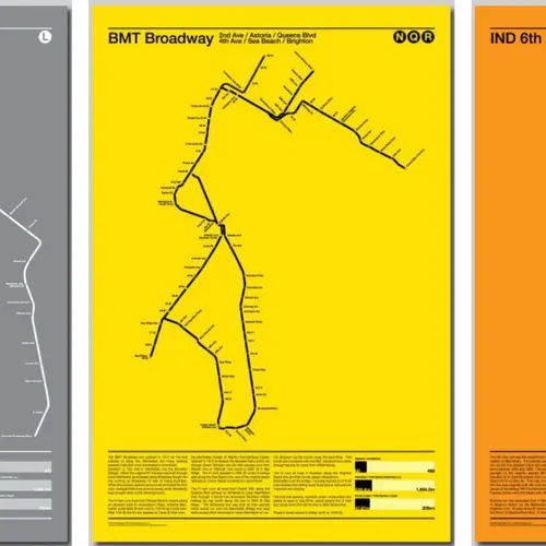
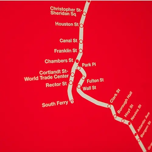
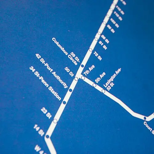
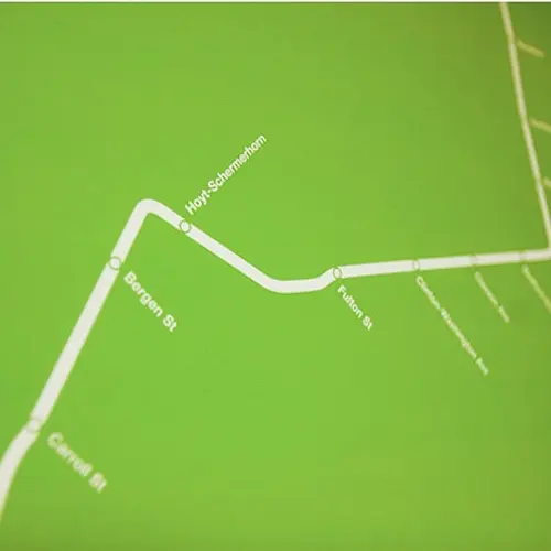
Cartographer Andrew Lynch has spent a lot of time looking at the NYC subway system. The CUNY Hunter alum recently perfected the entire system in a series of hypothetical but geographically accurate “Future NYC Subway” maps. But while studying the paths of the city’s most important people mover, Lynch noticed they looked rather lovely, but just too, well, cluttered. From this thought came a series of colorful minimalist subway line posters (h/t CityLab) that Lynch calls “totally accurate, totally useless,” but nice to look at nonetheless.
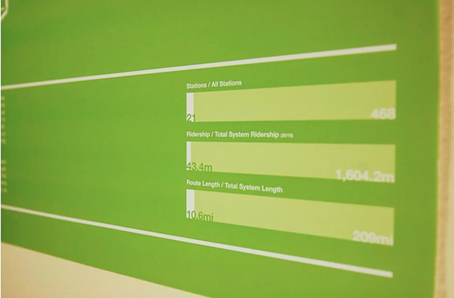
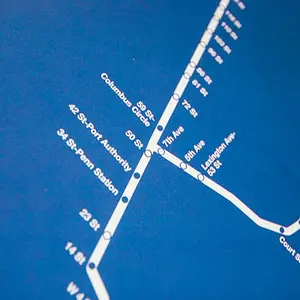
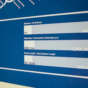
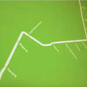
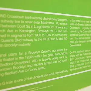
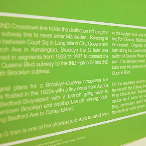
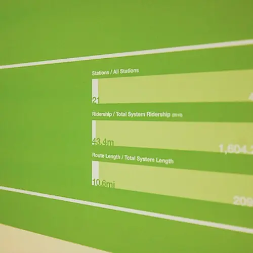
Lynch’s “Subway Infographics Posters” show individual subway lines, on a bright background of MTA-correct colors, with (actually useful) information on each line displayed at the bottom.
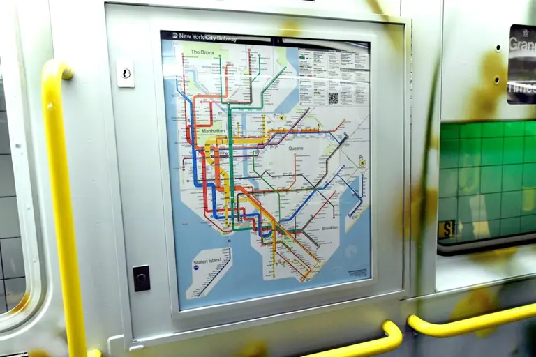
About the isolated subway line maps, Lynch explains, “The traditional subway map shows a distorted geography to make way-finding easier. This map shows the actual route of the subway, however, it places it in a vacuum for a minimalist effect.” He’s planning to delve into the subway systems of other cities in the near future.
You can purchase the colorful posters for about $25 each, here.
[Via CityLab]
RELATED:
- This Poster Displays All 468 Subway Station Signs
- Dream Subway Map Includes a 10th Avenue Subway and a PATH to Staten Island
- Tommi Moilanen’s New Subway Map Design Makes It Easier to Navigate the City
All images via Andrew Lynch
