My 480sqft: Real estate publicist Kelly Kreth lives in a red, black, and white wonderland in Yorkville
6sqft’s series “My sqft” checks out the homes of New Yorkers across all the boroughs. Our latest interior adventure brings us to real estate publicist Kelly Kreth’s Yorkville apartment. Want to see your home featured here? Get in touch!
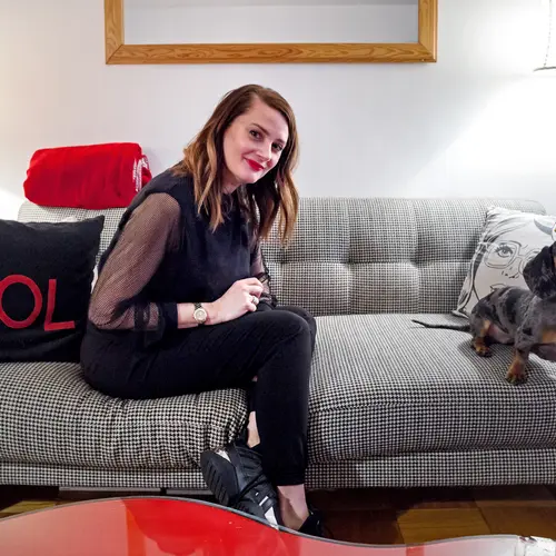
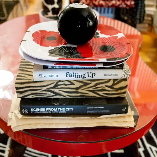
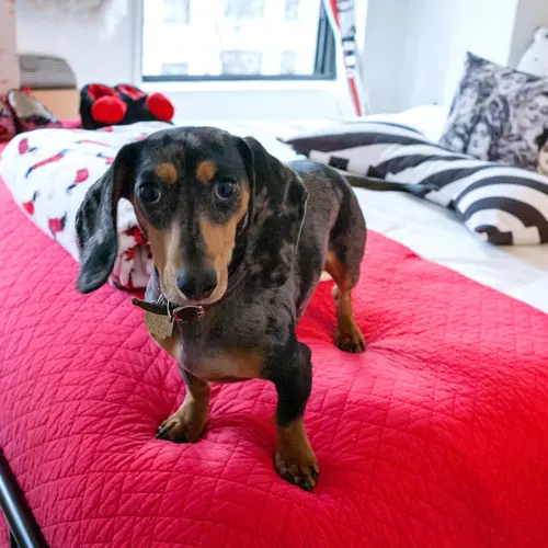
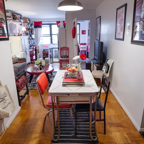
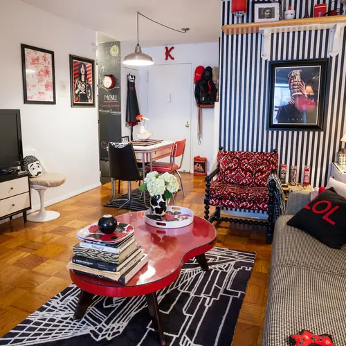
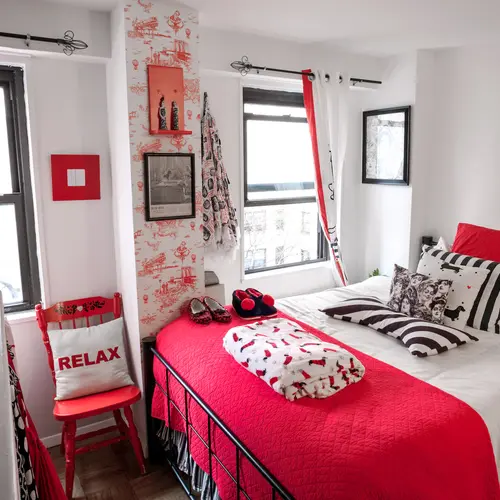
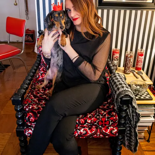
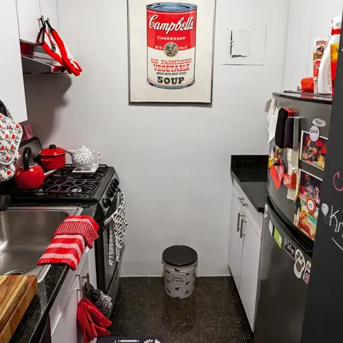
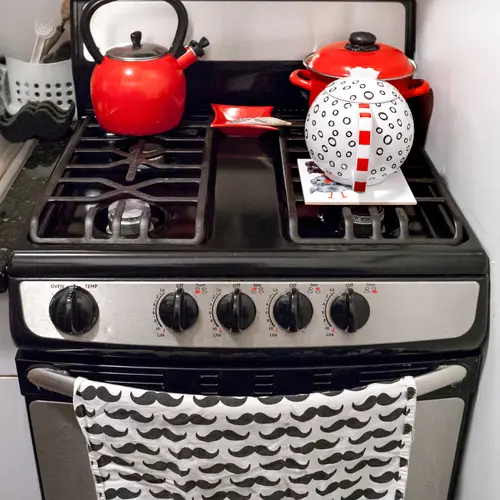
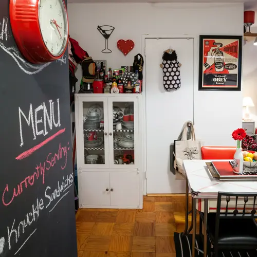
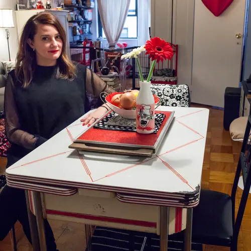
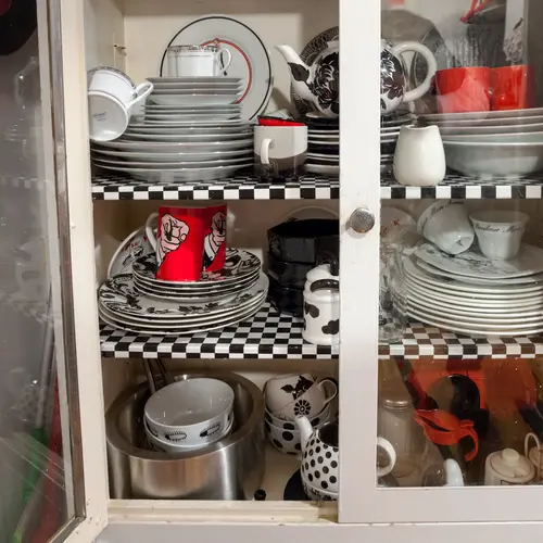
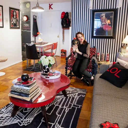
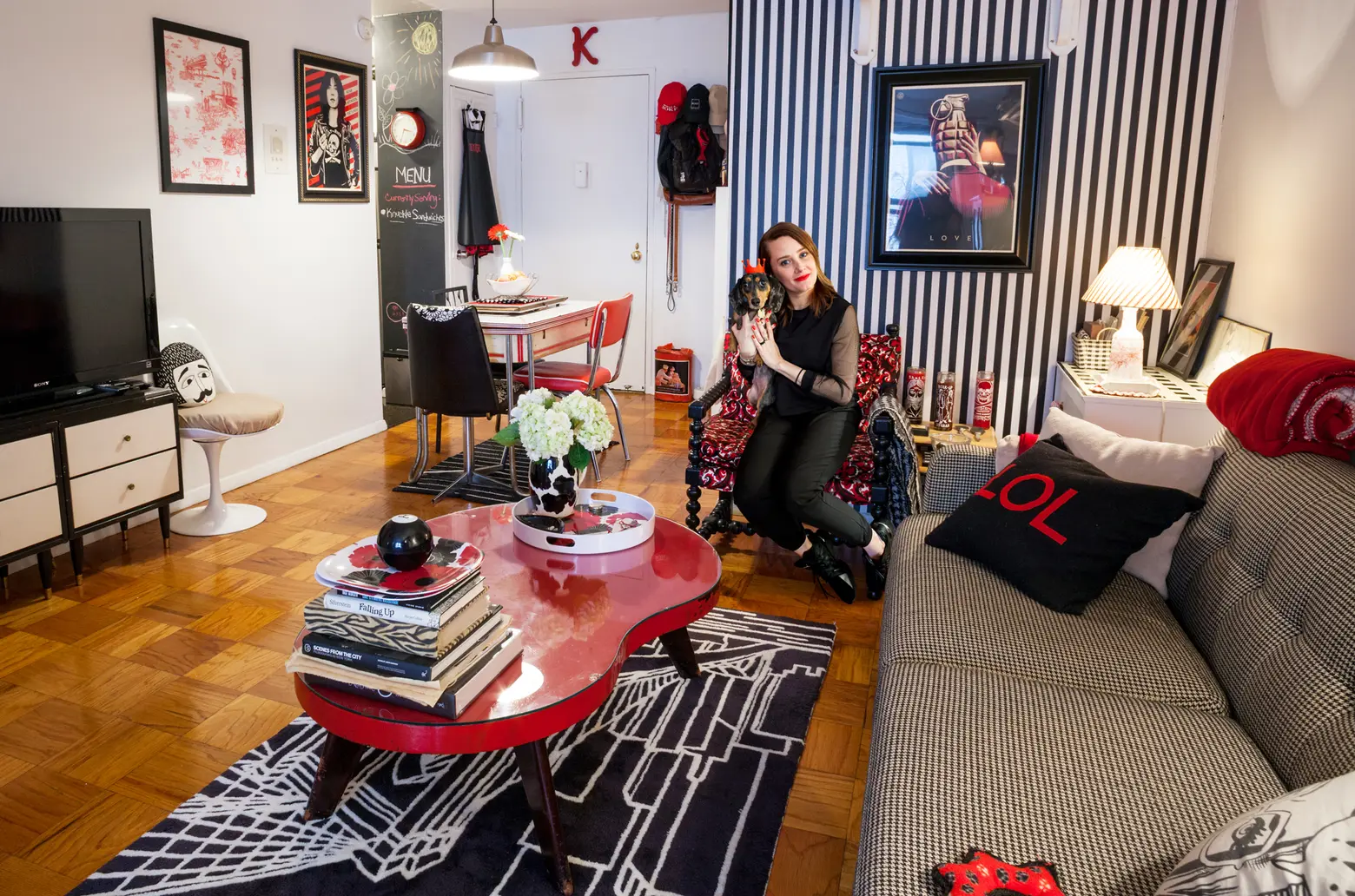
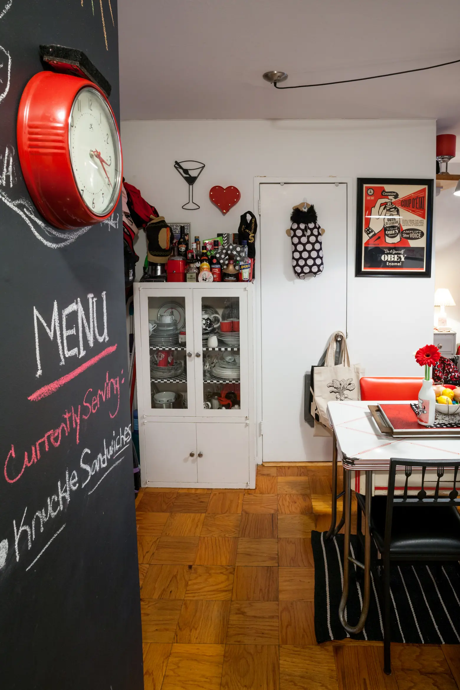
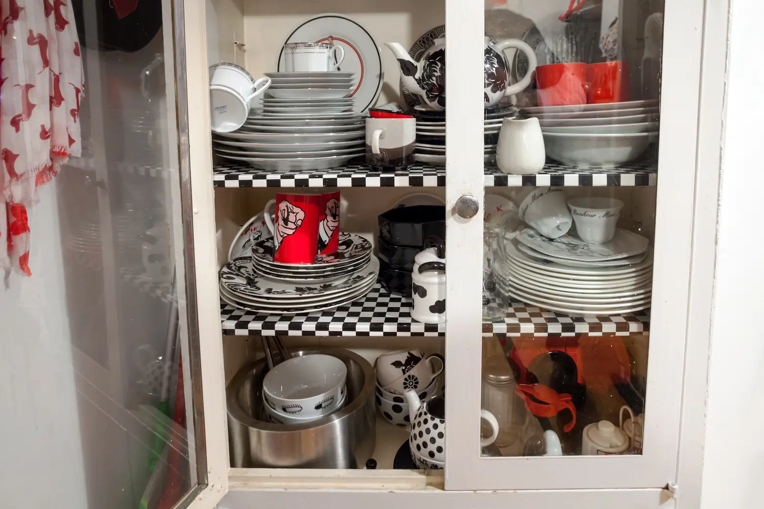
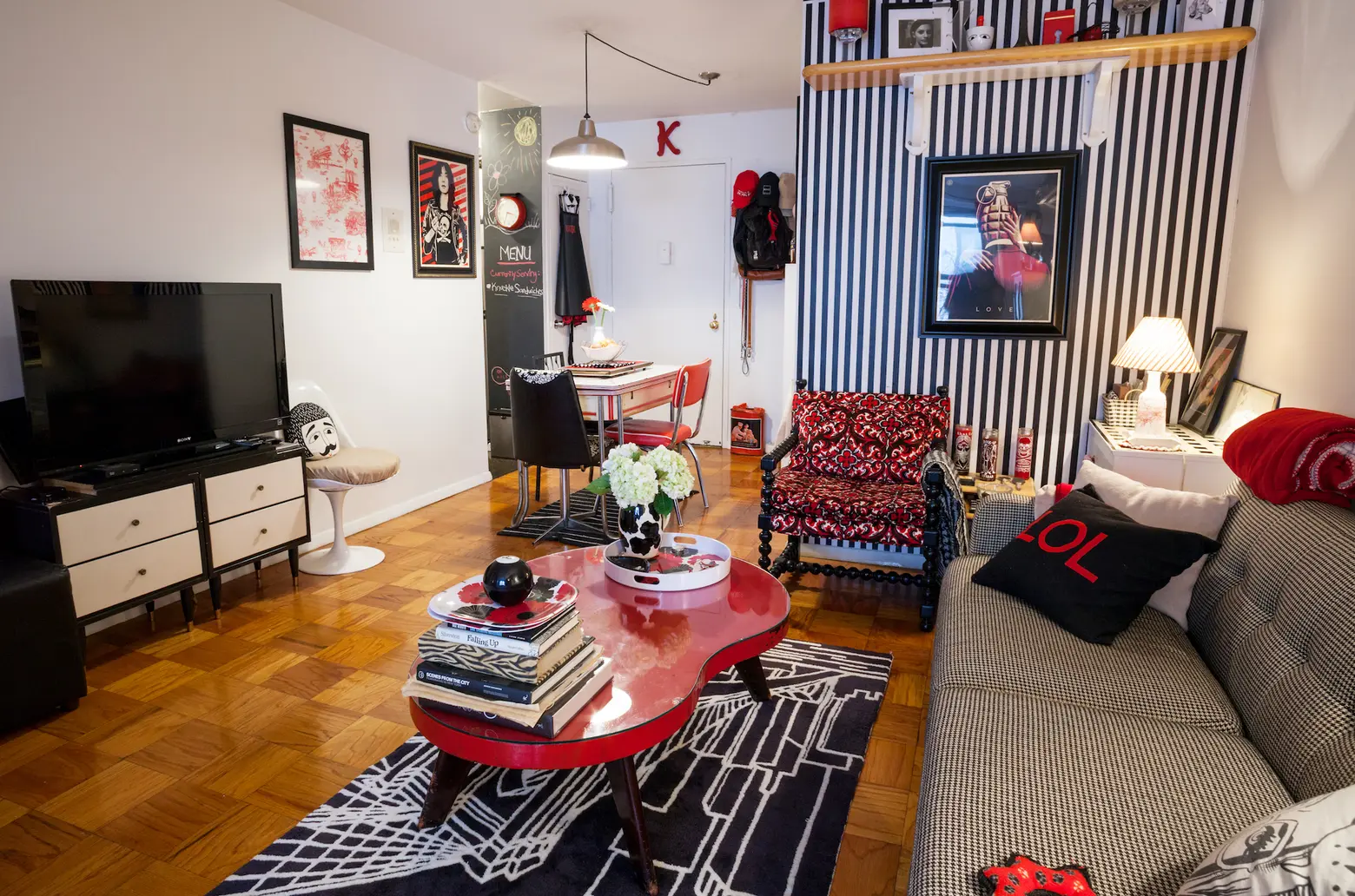
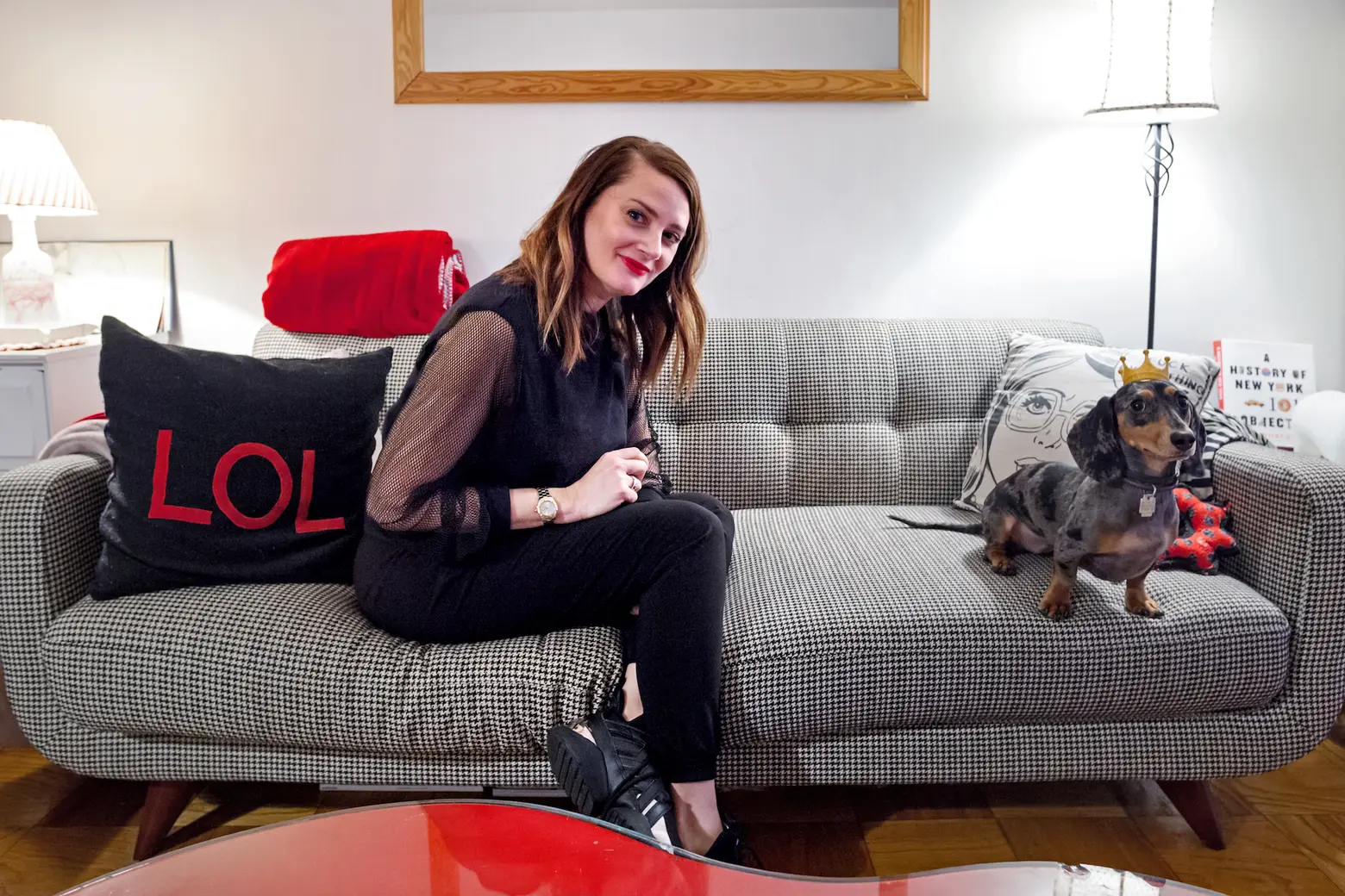
What’s black and white and red all over? Kelly Kreth’s Yorkville apartment. The real estate publicist pegs her OCD diagnosis for the strict color palette–“it makes me feel safe,” she explains–but also the fact that her love for retro pieces, graphic art, and fashion-forward decor lends itself quite well to this tri-hued approach. We recently spent the afternoon getting to know Kelly and her dachshund puppy Biggie Smalls and learned more about what it’s like to live in just three colors, why she chose this Upper East Side ‘hood, and where she’s been able to find some of her fun and funky finds.
 Kelly’s been in this apartment for four years. Previously, she was in another rent-stabilized apartment in Yorkville for seven years.
How did you find your apartment?
I was living in a two-bedroom in Hell’s Kitchen but had started to get very sick after being diagnosed with Lyme Disease. I had to move because I could no longer handle walking up stairs. A real estate agent friend knew of my struggle and knew I was looking for a unicorn: a super affordable unit big enough to house all of my stuff with both elevator and laundry. All things aligned and the timing was perfect; he just happened to have an alcove studio in one of his exclusive buildings for rent at just $1,812 a month! Of course, there were already like 10 applications on it but I threw mine into the mix. I knew I was more than qualified for the price, have a perfect credit score, and great references from previous landlords so was hoping a miracle would happen. It did.
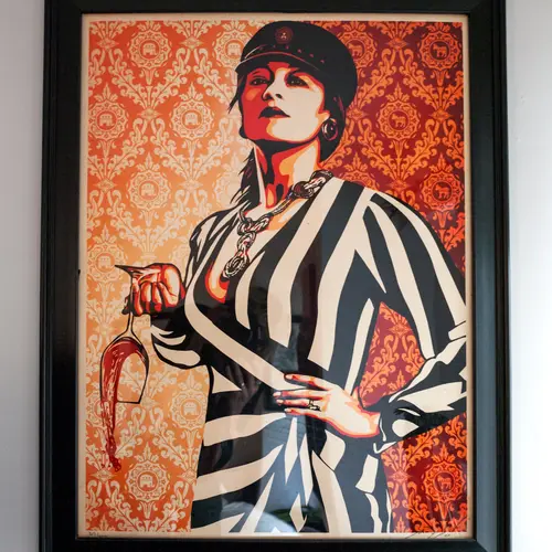
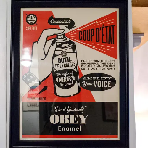
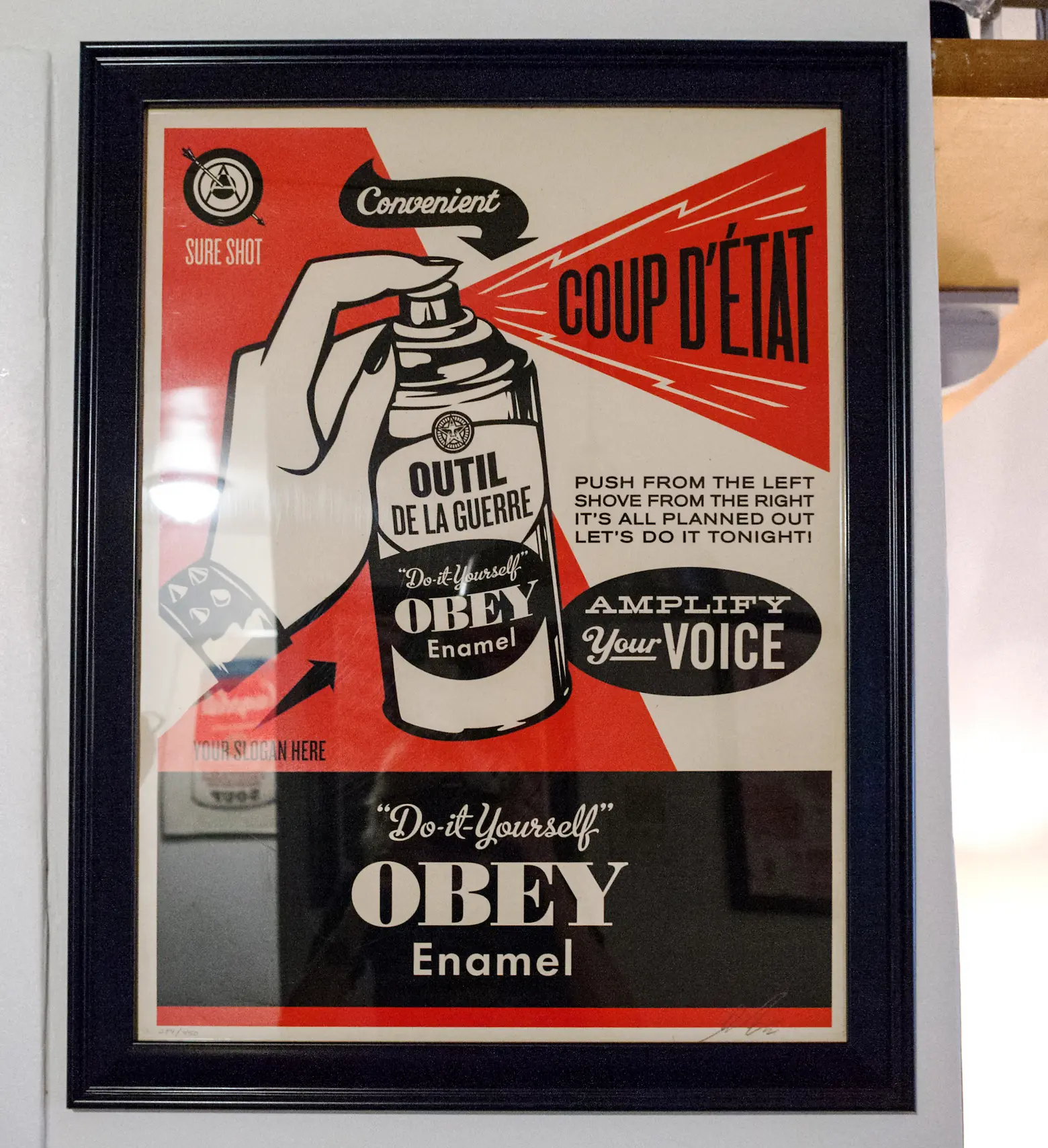 A print of “Coup d’etat” by Shepard Fairey (Obey)
What made you want this apartment so badly?
I was drawn to its price, first and foremost, and that it was rent stabilized. For someone struggling with astronomical medical bills — most treatments for chronic Lyme are not covered at all by health insurance even though I had the best insurance and was paying hefty monthly premiums — a rent-stabilized unit is a godsend. I loved that it had a laundry room and elevator and an amazing staff. When feeling so sick it was nice to have a friendly face to see daily (doorman) and know that packages could easily be delivered straight to my door. Our building even has its own USPS slot so on days/weeks I couldn’t get outside I could still easily pay bills and send mail.

Does working as a real estate publicist make it more or less challenging when house hunting?
Probably easier. I have been running my own RE PR firm for nearly 16 years so I am pretty much an expert on the industry. I know what is required to snag a rental, how to suss out a good deal, and it certainly doesn’t hurt that most of my friends are in the biz.
You’ve been in Yorkville for a total of 11 years. How have you seen the neighborhood change during that time?
The biggest and best change is the recent addition of the Q train. Prior to that, the only subway near my apartment was the green line. I’d end up taking costly cabs just about everywhere. However, now that the Q is just a few blocks away it makes the West side easily accessible without switching lines and also takes me to most major subway hubs throughout NYC.
Favorite spots in the neighborhood?
I don’t drink but do enjoy meeting friends at Auction House — a moody bar ensconced in red velvet. I love ordering from Mansion Restaurant — the best diner I’ve come across in the city. I’m an avid reader so I order books from the Yorkville library weekly. I love that Costco is just a short First Avenue bus ride away for me (in East Harlem.) Flip Sigi is an amazingly decadent and very cool Filipino restaurant.
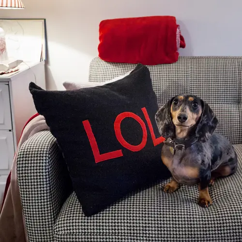
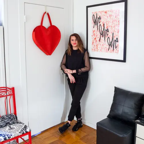
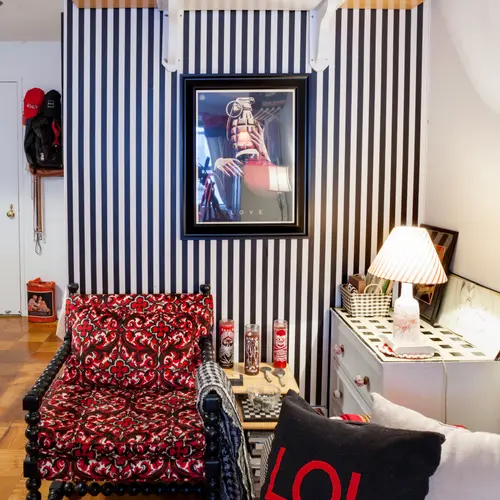
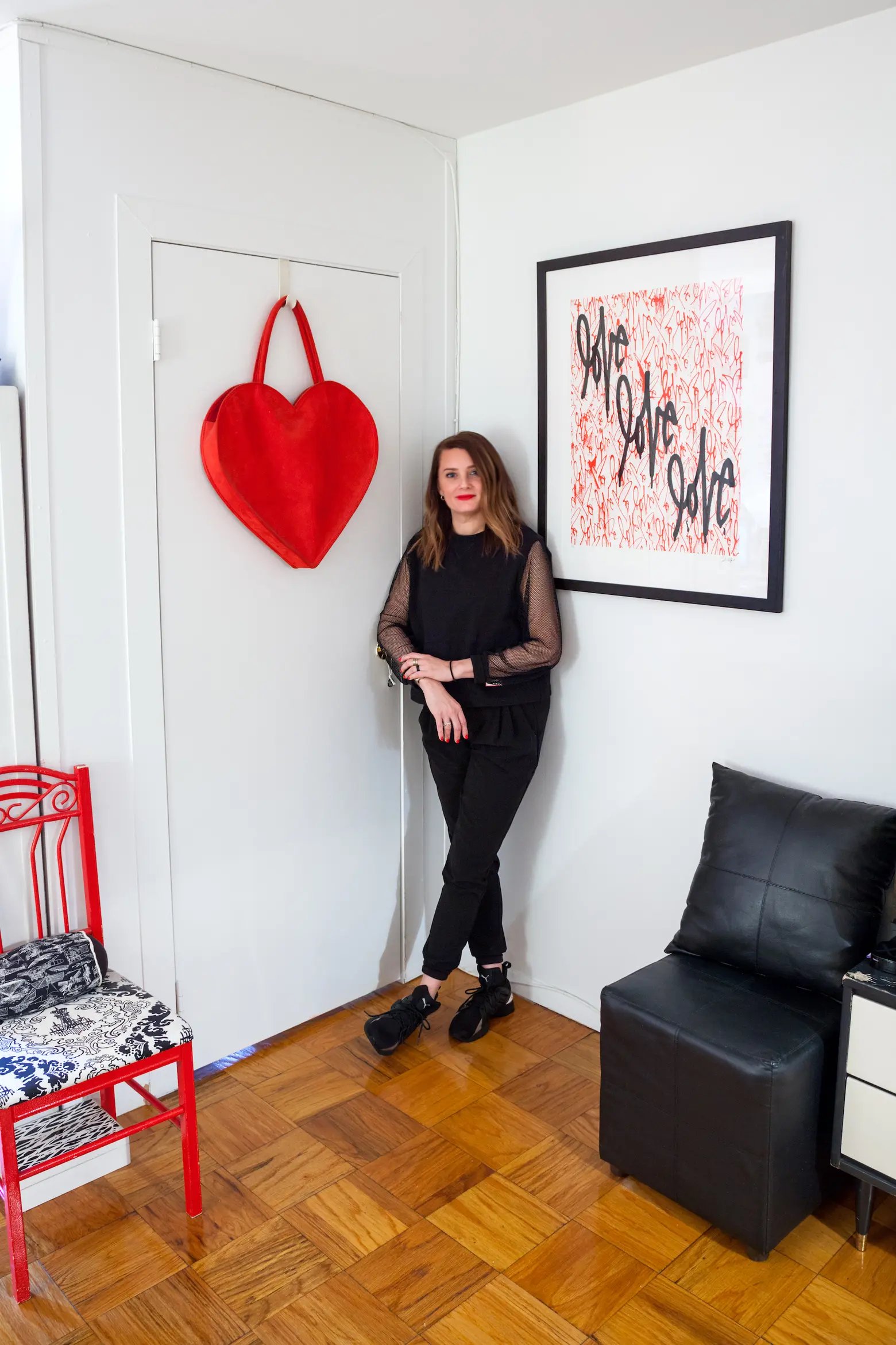 The “Love” graphic is by Curtis Kulig
Okay, let’s get to this red-black-and-white theme. When and why did you start this motif?
Years ago, when I had my second apartment as someone in her young 20s, I had a huge kitchen with a vintage 1950s white and red sink. I decorated around it — put in black and white checkered flooring, hung vintage albums on the wall, and got a diner table and chairs. I figured if I couldn’t make the place look updated, I’d make everything vintage.
I’ve had actual OCD since I was a kid and quickly became obsessed with only having those colors in my apartment, in addition to the already existing triggers like numbers, symmetry, etc. I started not to feel safe if any other colors were introduced. (Wacky for sure, but in NYC I’m certainly not the most bizarre person you will meet. Another reason to love living here!)
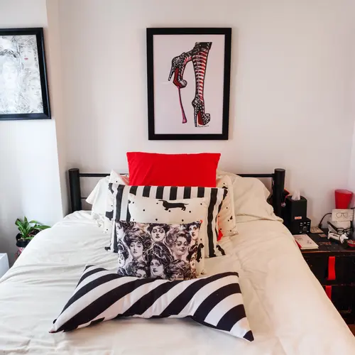
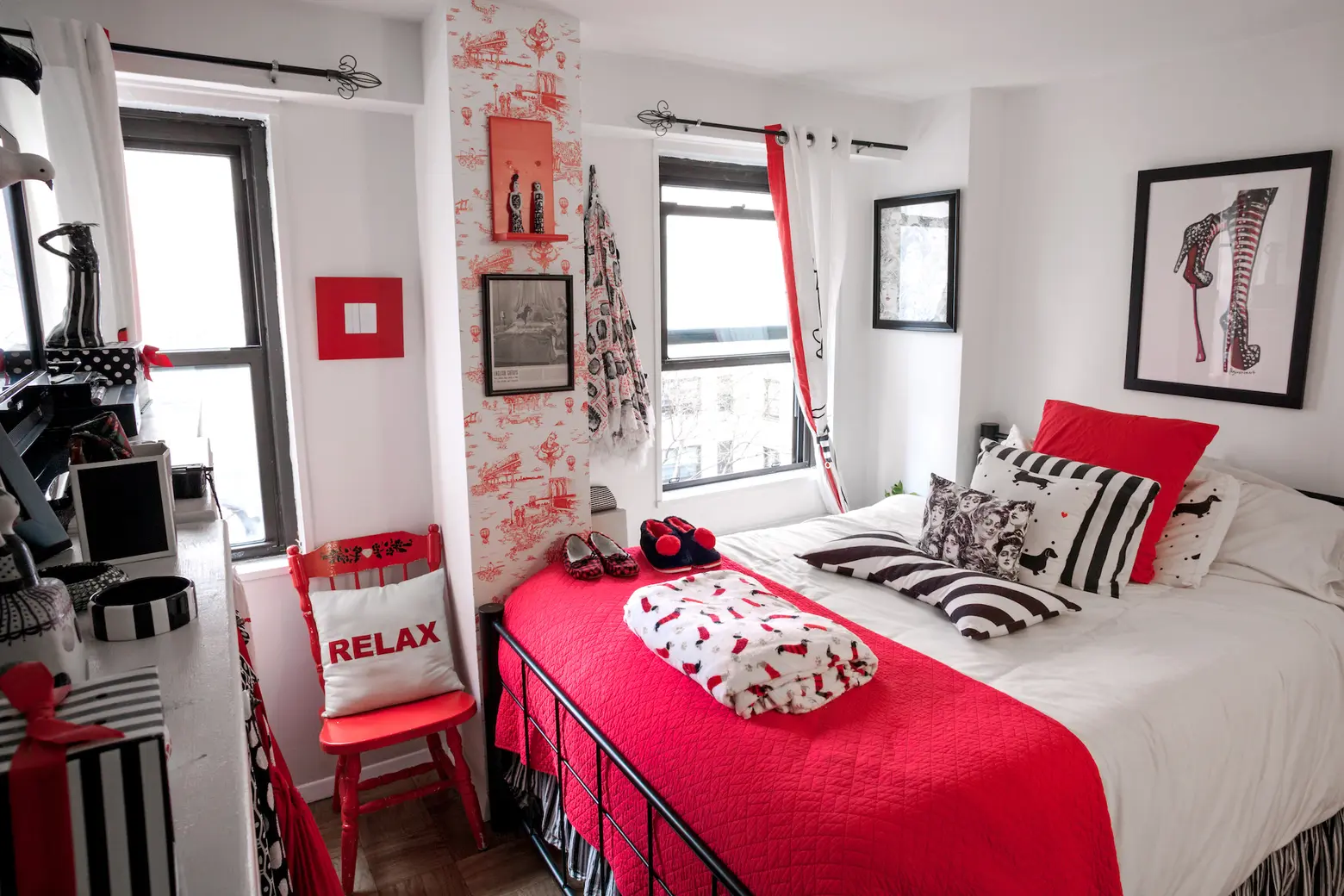
Next, when I moved to my first NYC place in the late ’90s I had a sixth-floor walk-up in Hell’s Kitchen that came complete with a handmade loft bed built into the wall. I had always dreamed of having a red bed so I painted it, and all my other black, white, and red stuff fit in the unit nicely. Over the years and many moves, most of my original pieces (vintage) stayed with me. Because of the unique color theme, people end of bringing me art and knick knacks they find in those colors as well.
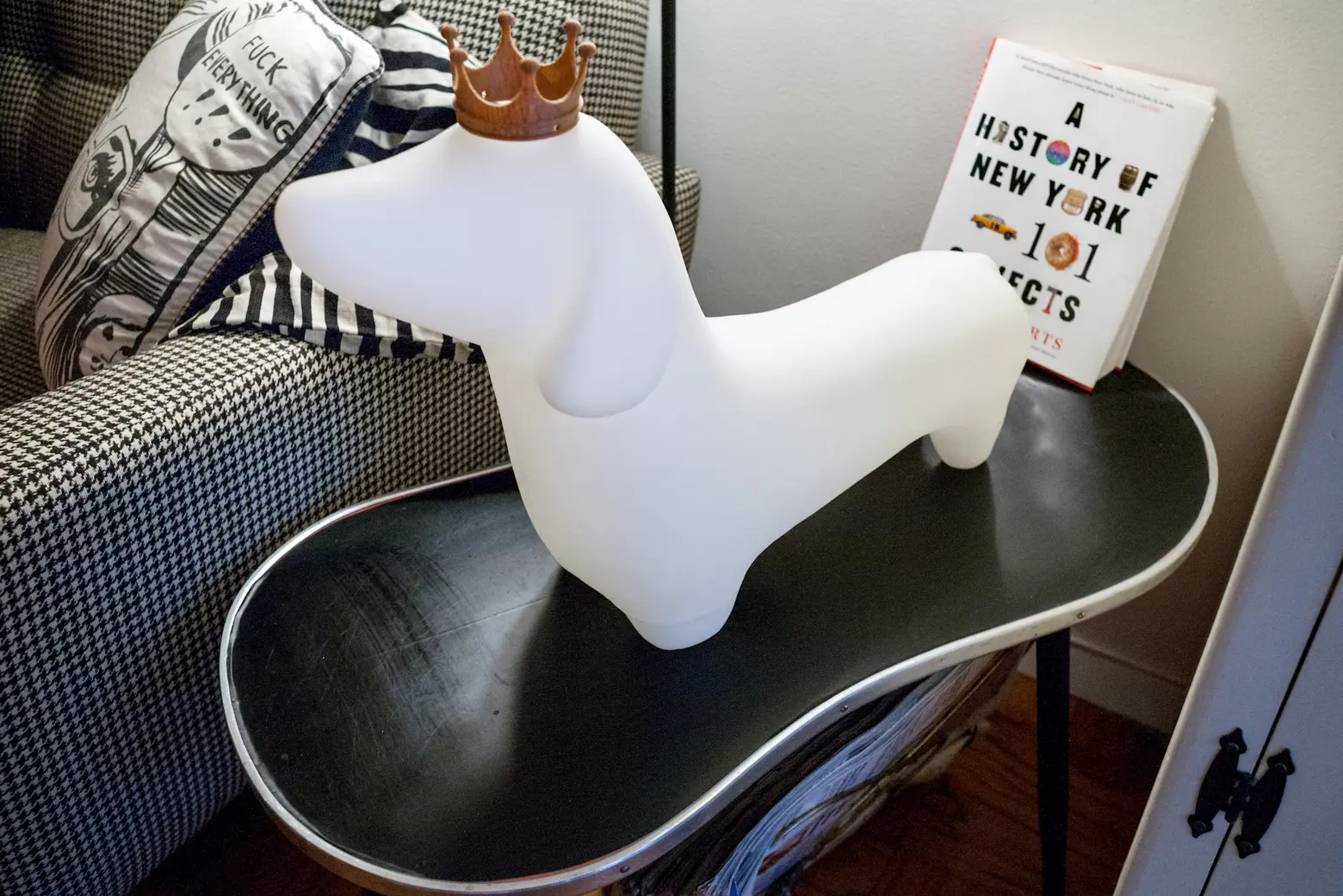
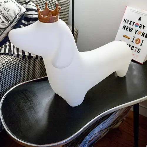
 A friend of Kelly’s 3D-printed two crowns for Biggie Smalls. The red version is for her birthday outfit.
How do people usually react when they walk in?
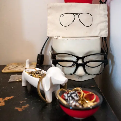
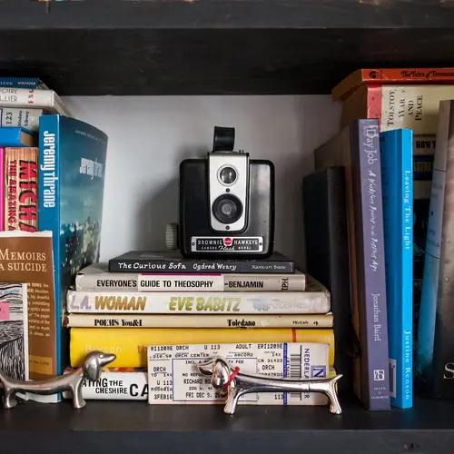
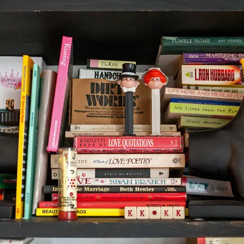
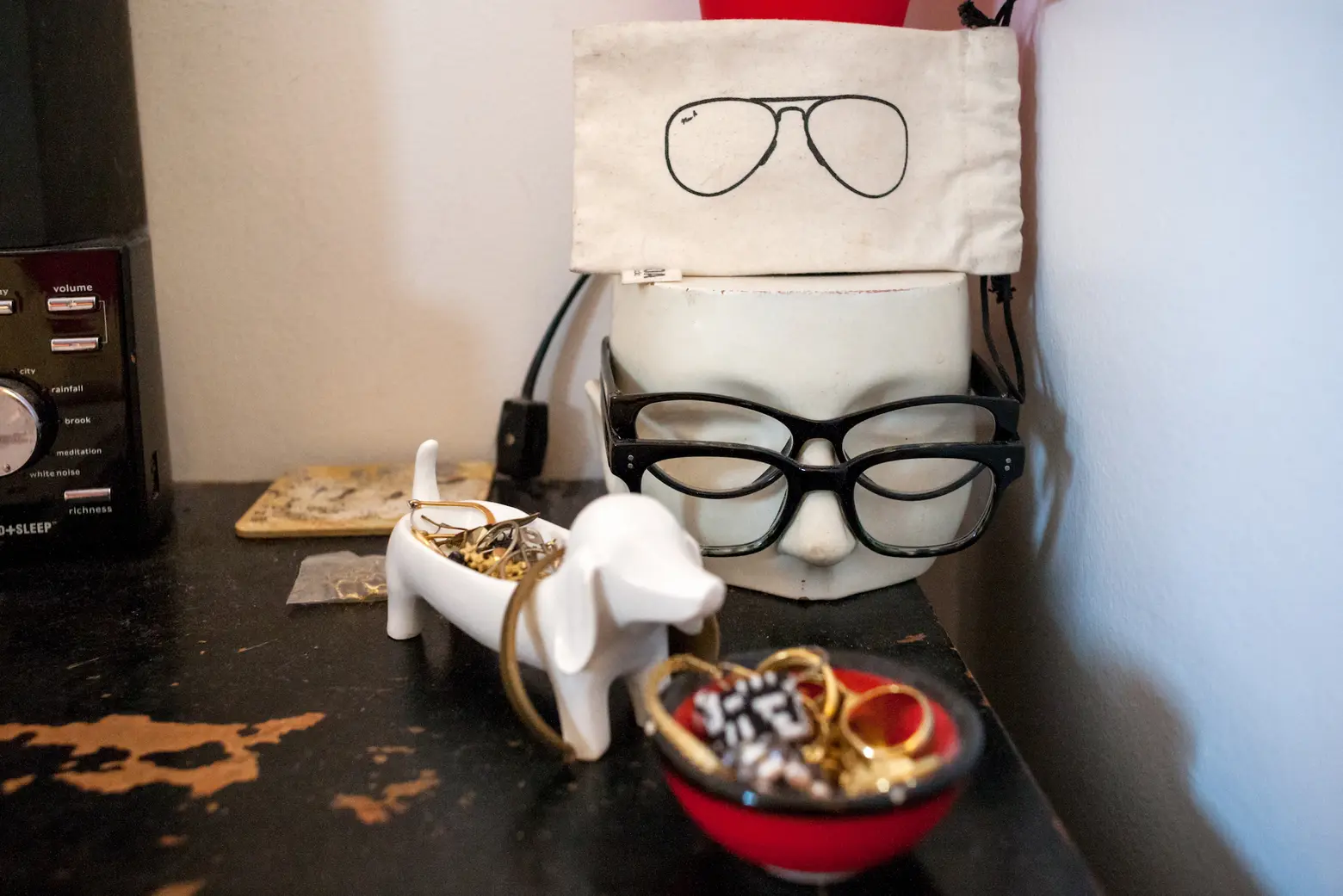
I think my apartment is very polarizing, as am I. I have a strong personality and I think the apartment highlights that. Either you really love it and are totally tickled by it or you are freaked out and want to run. For those who like it, they find amusement in poking around all the unusual stuff hiding in all corners. For those who find it garish, they get overwhelmed and find the clashing patterns and strong color scheme off-putting. And if you love dachshunds, you will never want to leave. Biggie Smalls (my actual silver dapple dachshund puppy) along with tons of dachshund-themed art and design objects will thrill a wiener dog lover.
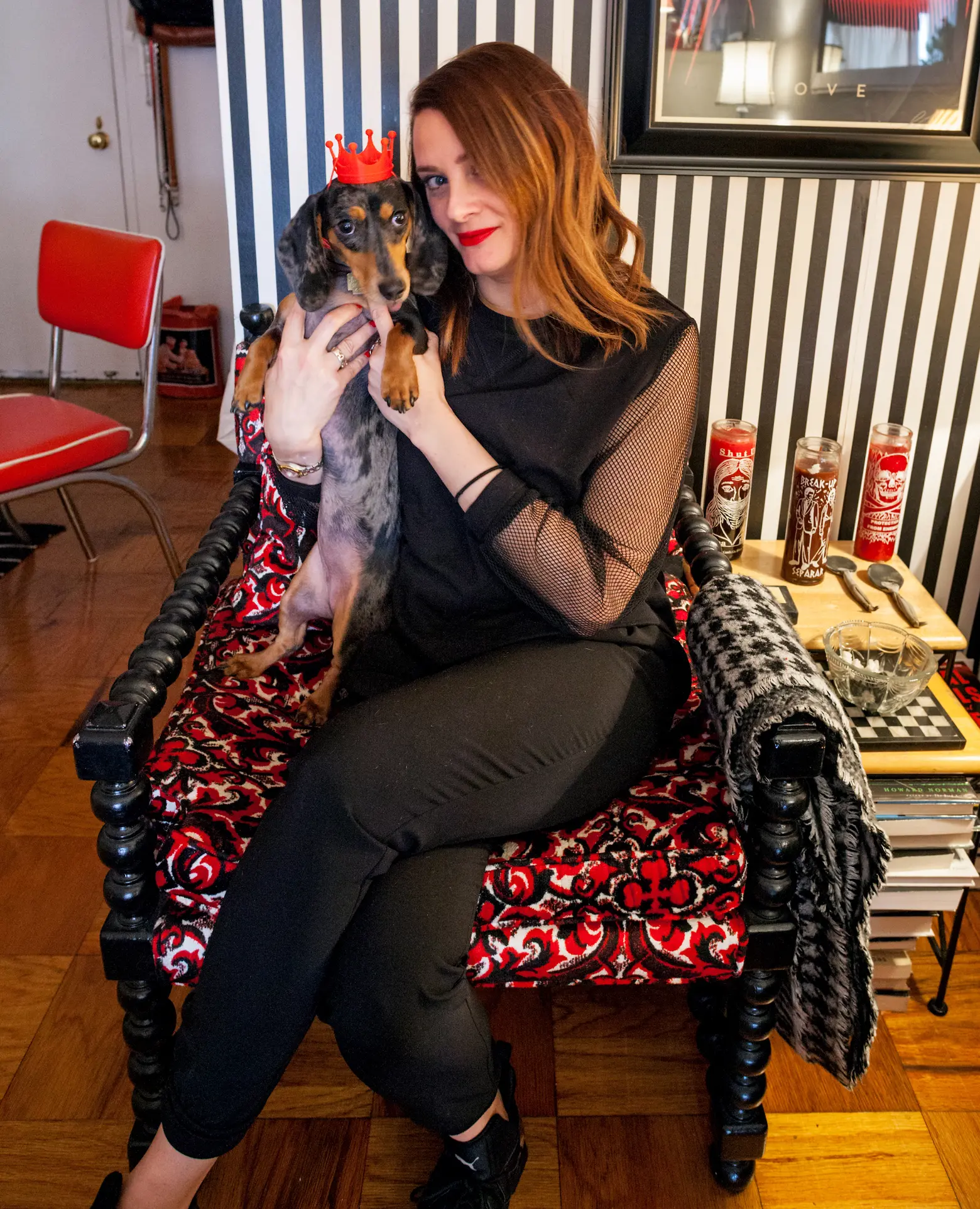 Kelly’s beloved chair was just $25 when she bought it! It’s originally from H. & S. Pogue department store in Chicago.
Do you think you’ll ever move to another color combination?
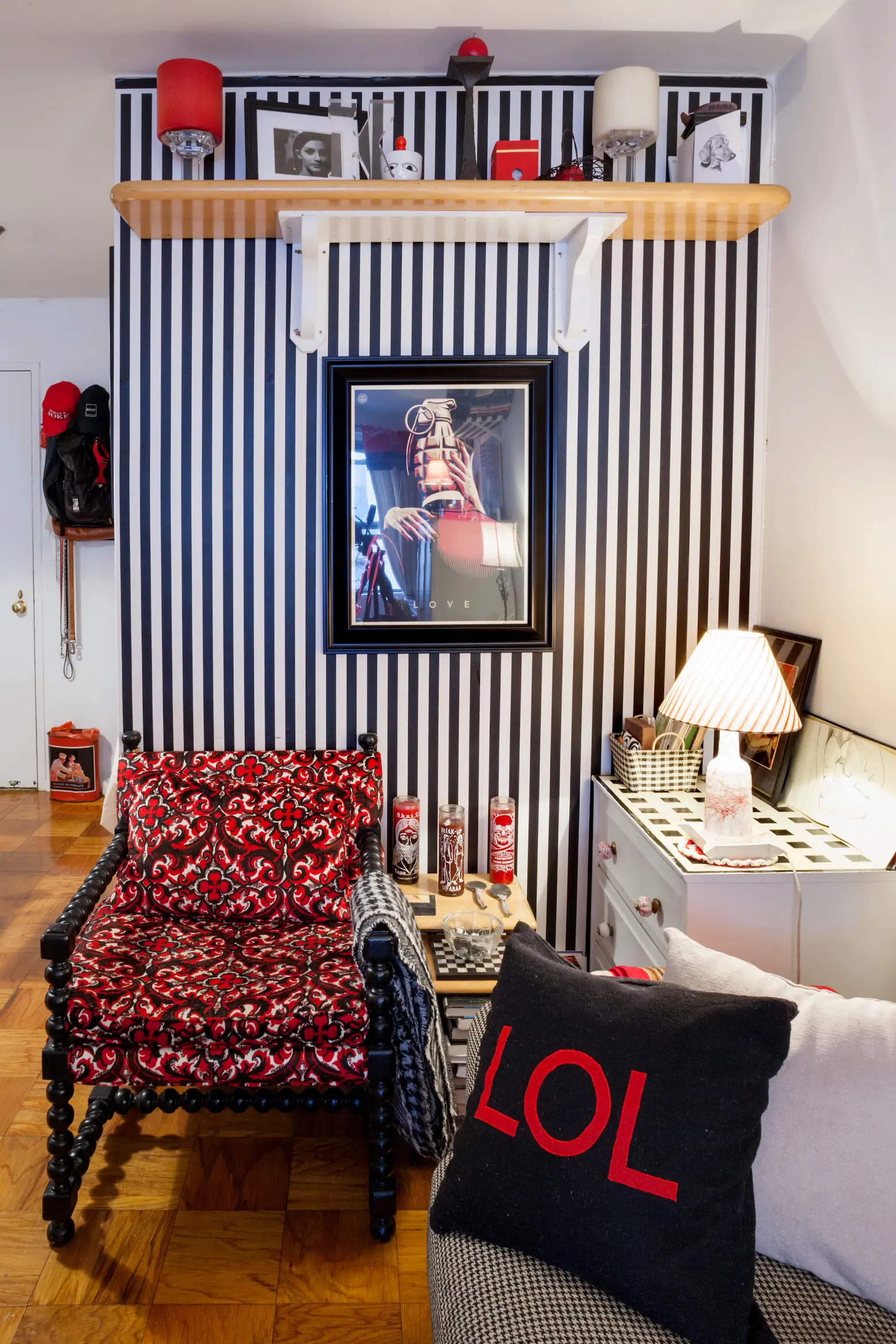
No. I’m very set in my ways. There are pieces I’ve had for over 25 years and I plan on having them the whole of my life — much like a 1963 vintage chair I found at a Salvation Army when living in my first apartment in 1993. I recently had it reupholstered and painstakingly hunted for similar fabric from that same year. Again things aligned and I found the perfect amount of new old stock yardage of a black, white and red velour fabric also made in 1963!
 The gumshoe print is by Angela China. It was a gift from a client.
You have a lot of retro 1950s pieces, along with vintage pop art, contemporary art, and fashion-themed decor. Overall, how would you describe your aesthetic?
Carefully curated mental patient chic. In all seriousness, I’d say my aesthetic is quirky, bold, and carefully curated.
When did you get into thrifting?
I grew up poor so I was sort of forced into the #thriftlife at a very young age and hated it. Handymedowns, used clothing and furniture… But it sort of stuck with me and through college, so when grunge became popular I leaned in. As I grew older — like most people as they age — I found nostalgia comforting and looked for things that reminded me of the past. I started with clothes and still have a fairly admirable vintage clothing collection. Later I started to turn to thrifting to find apartment treasures as well.
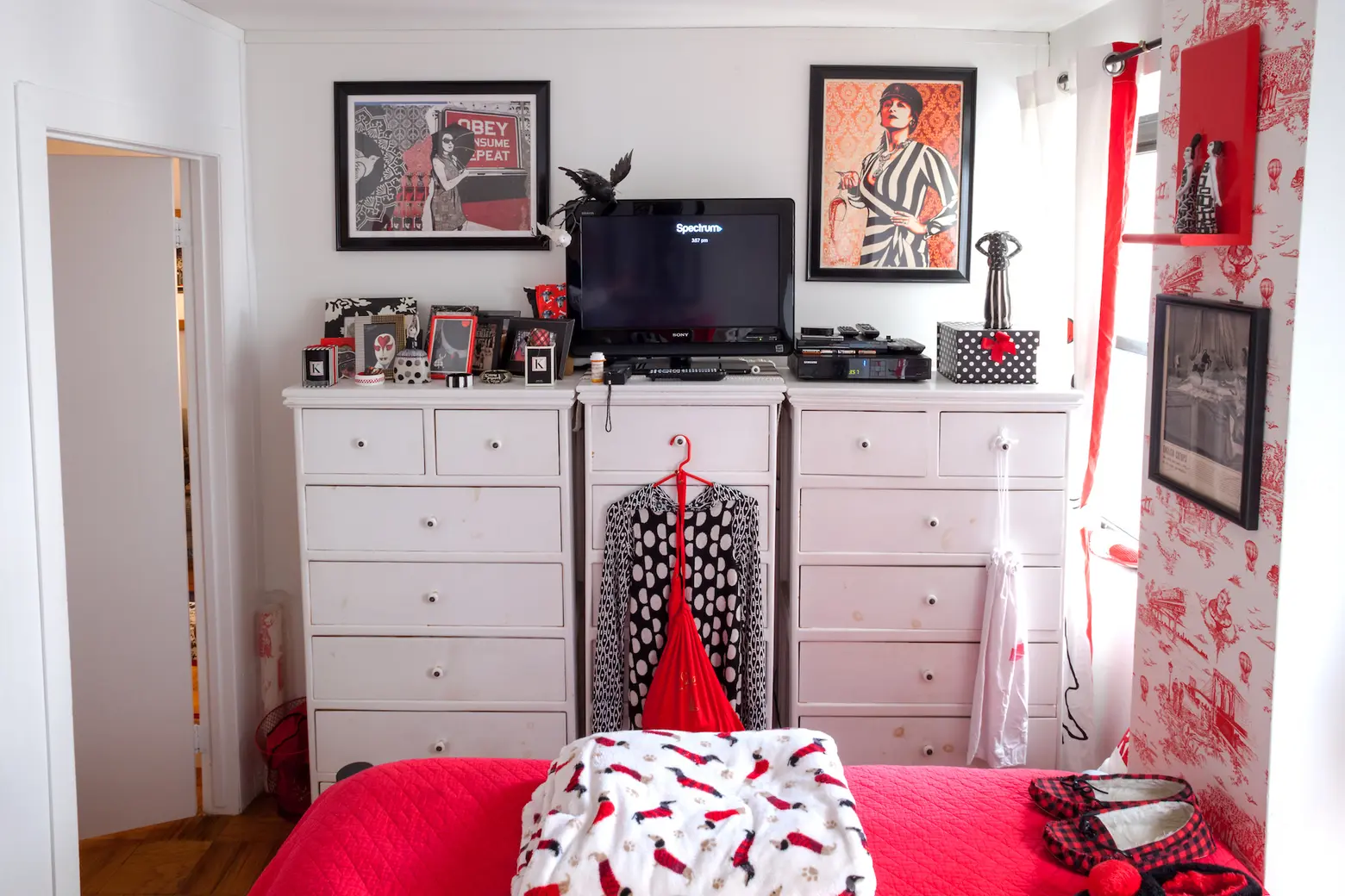
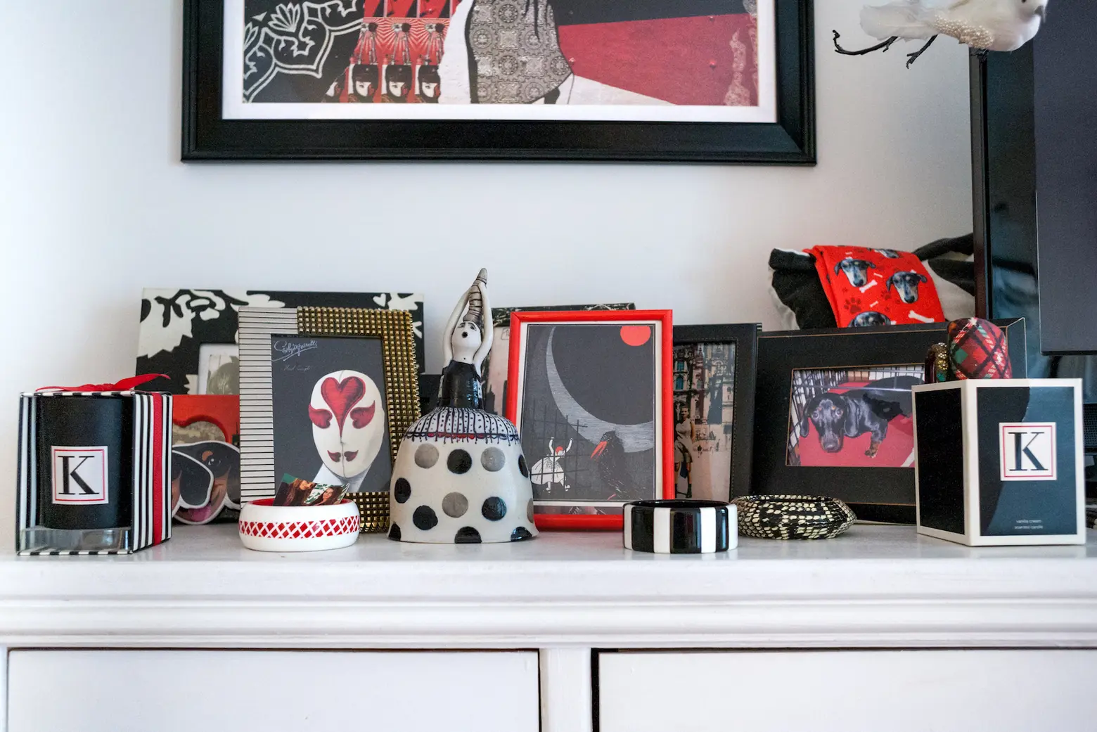
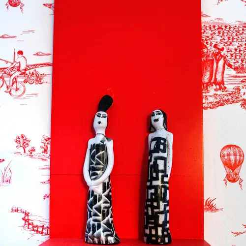
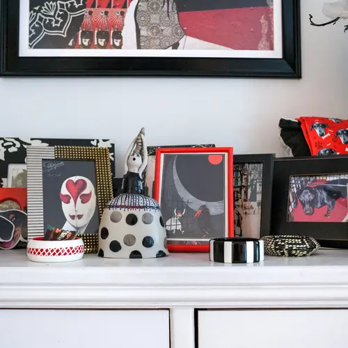
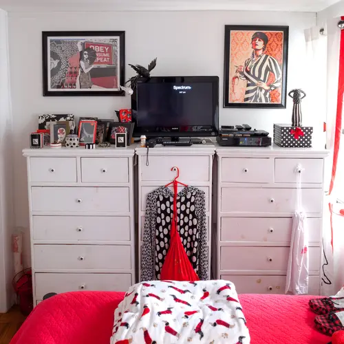
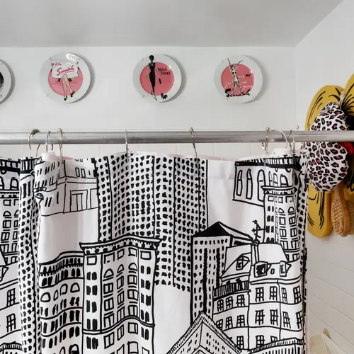
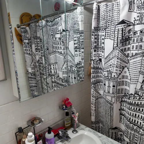
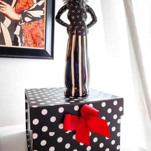
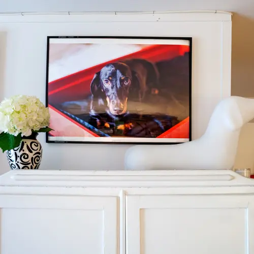
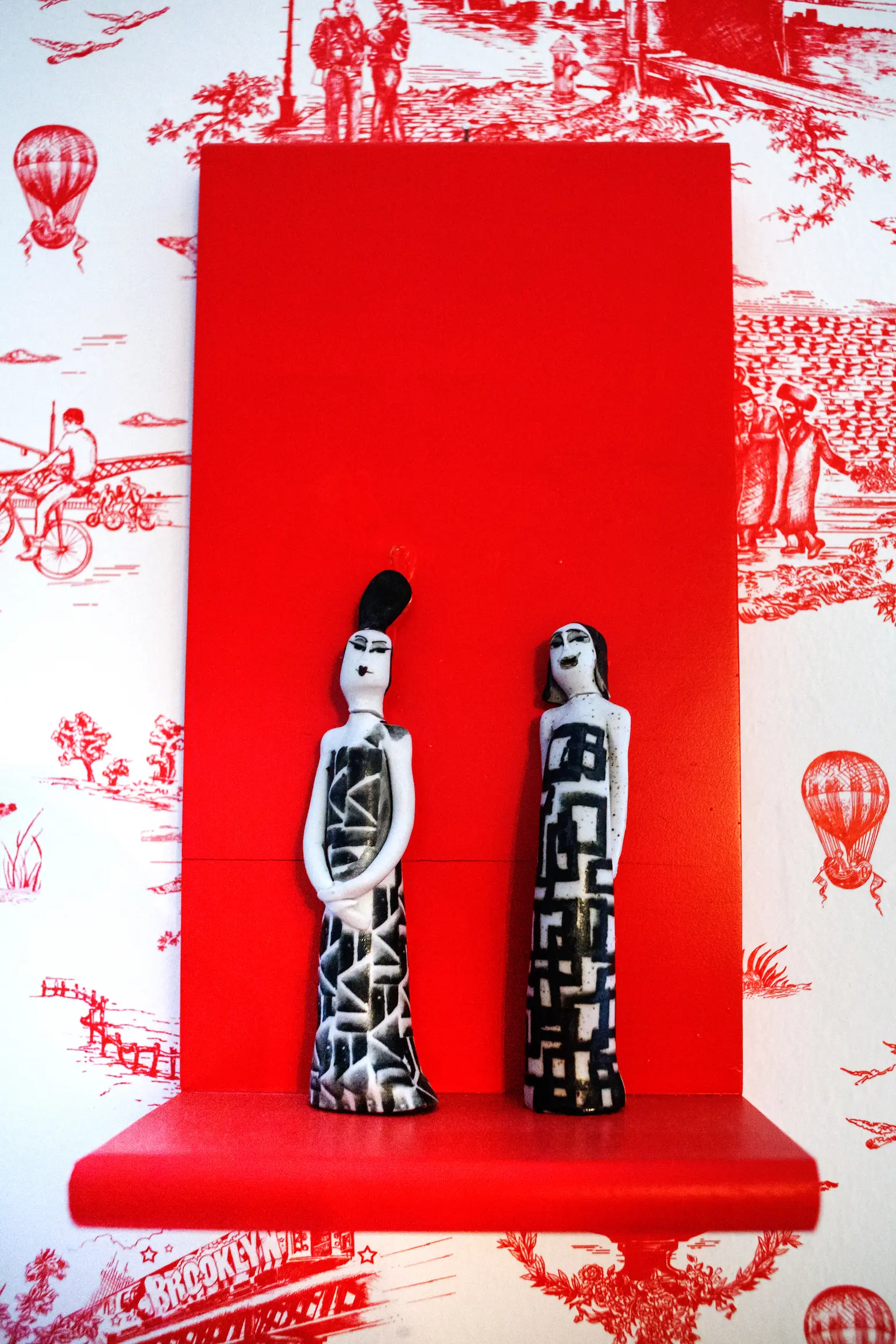 Two more Shepard Fairey prints hang above the dresser. The “Brooklyn Toile” wallpaper is by Flavor Paper and the two figurines are by a Venezuelan artist named Aida Gruebler, one of Kelly’s favorites.
Where have found some of your treasures?
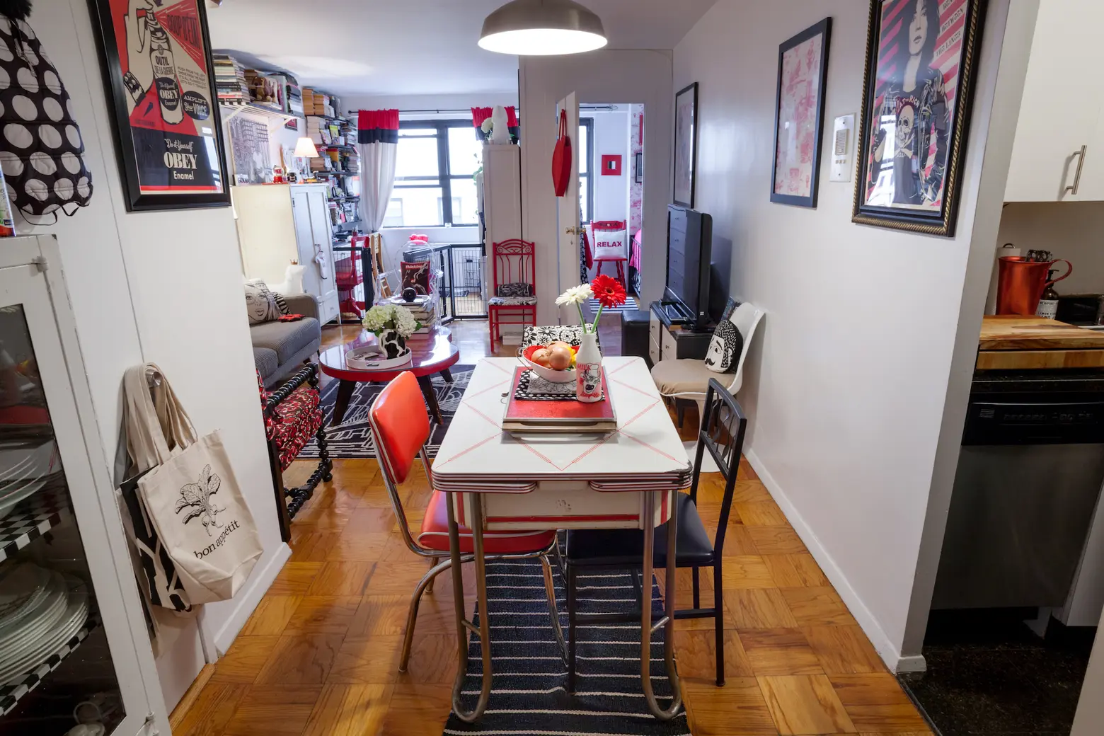
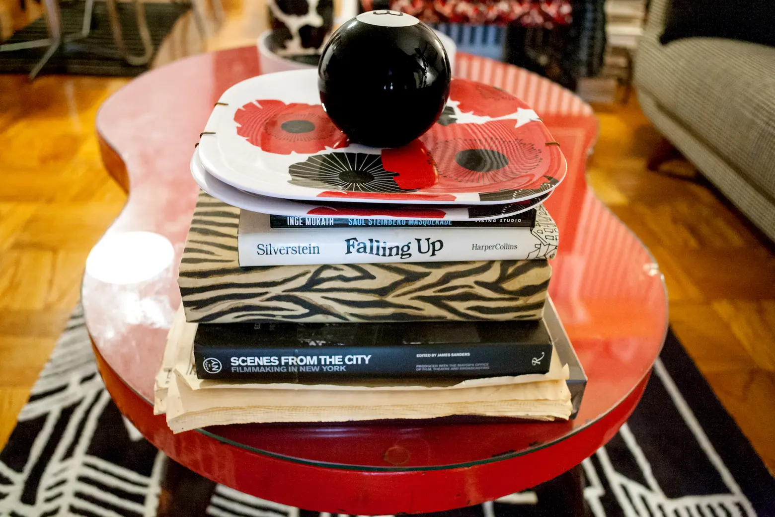
My sofa is from Room and Board and I am very happy with it. It’s probably my most expensive home purchase – I got it custom covered in a black and white houndstooth print. I have several vintage items like my red, vintage, figure-8 coffee table that my ex-husband bought me on Craigslist, as well as a vintage desk and armoire from there as well. My dinette table (1956) was a Ebay purchase. My vintage, mismatched dining chairs from from Ebay (the black and white flower print), Salvation Army (the black chair with the fork, spoon and knife metal pattern) and the classic red diner chair (gifted by my ex-boyfriend Amir. So yes, “shop” at boyfriends’ houses always.) I have even found two different bright red chairs on my block tossed out on garbage night. I restored each — one I reupholstered myself and the other I hand painted a design on.
 A portrait of Mini
You can only take three things from your apartment–what would they be?
Biggie Smalls, purse with wallet/phone/passport, and my dog Mini’s ashes.
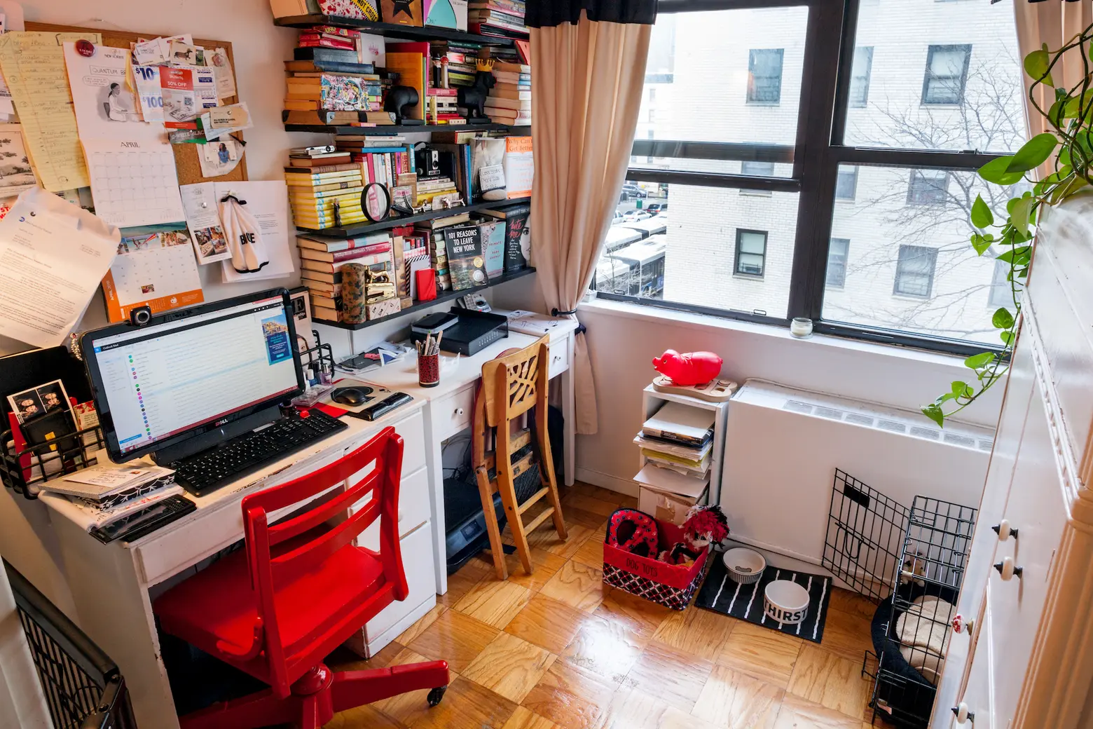
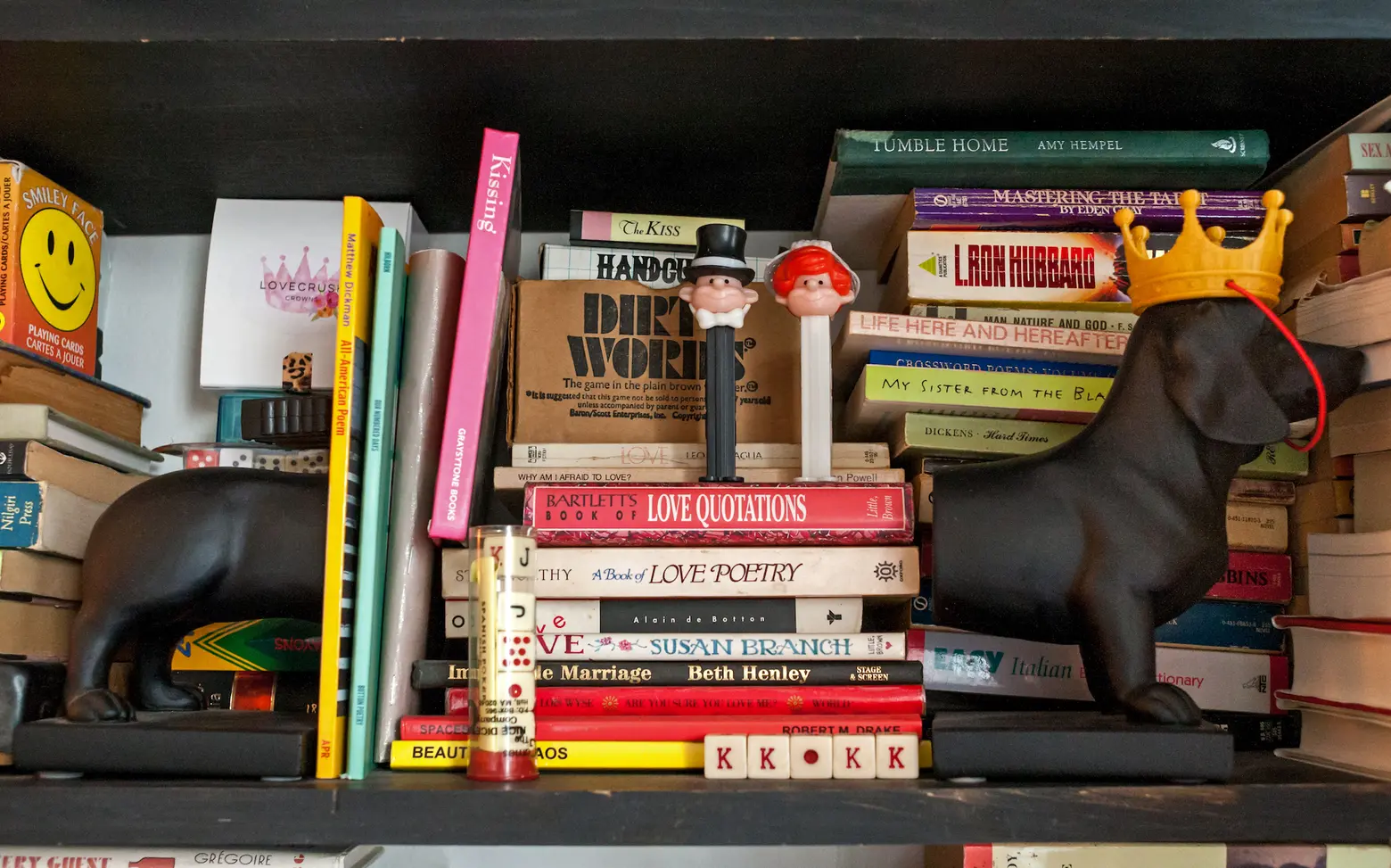
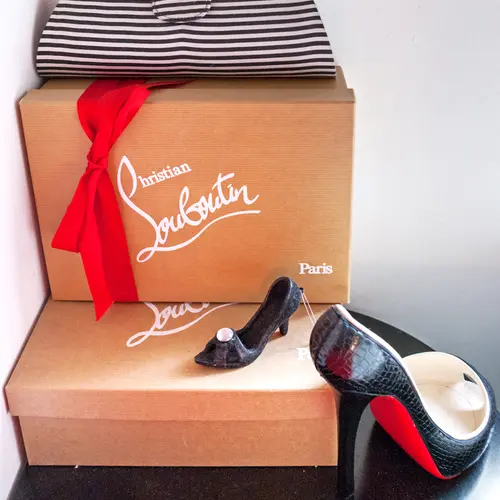
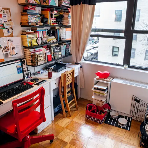
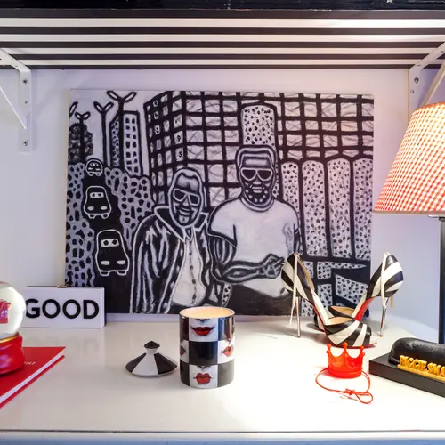
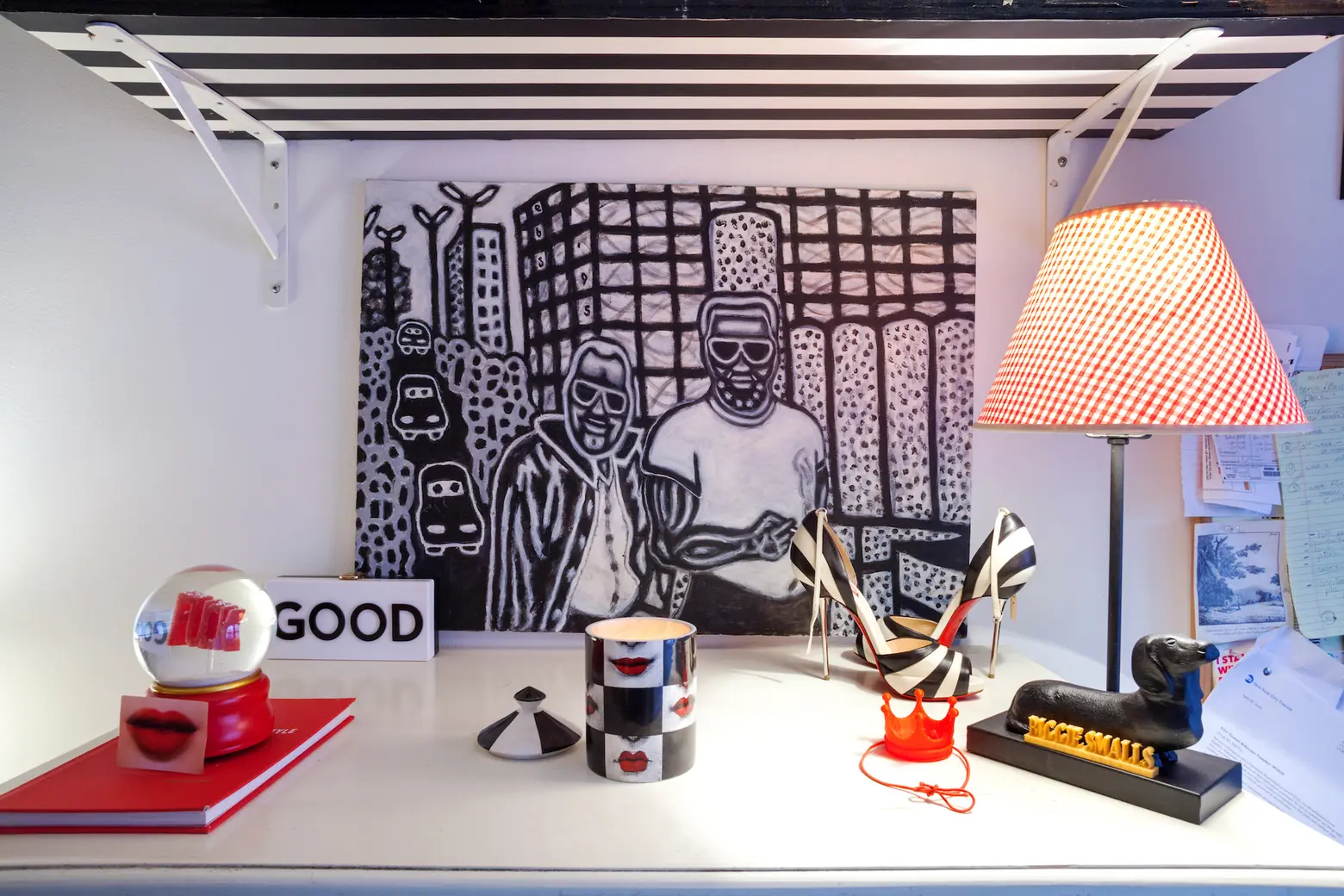 The office/Biggie Smalls’ room. The drawing is of the area where the Javits Center is now; Kelly found it in a Hell’s Kitchen thrift shop. The heels are her prized anniversary Louboutins.
Speaking of Biggie Smalls, she’s definitely had some say in the apartment layout 🙂 Did you have to move things around to make the place more pet-friendly?
Yes. Because Biggie Smalls is as gangsta as her name implies, I needed to get a gate to give her a secure area in which to play. That was a bit tricky because the space I needed to enclose was nearly 10 feet wide. I found a high, tall, sturdy gate with a door on it that allowed me to add several two-foot portions to in order to create a room divider for her. It’s in essence her own little bedroom complete with bed, toy box, and dresser for all her clothes. My recently deceased dachshund Mini didn’t need any special delineated space so getting a new puppy was sort of jarring and required much space rearrangement.
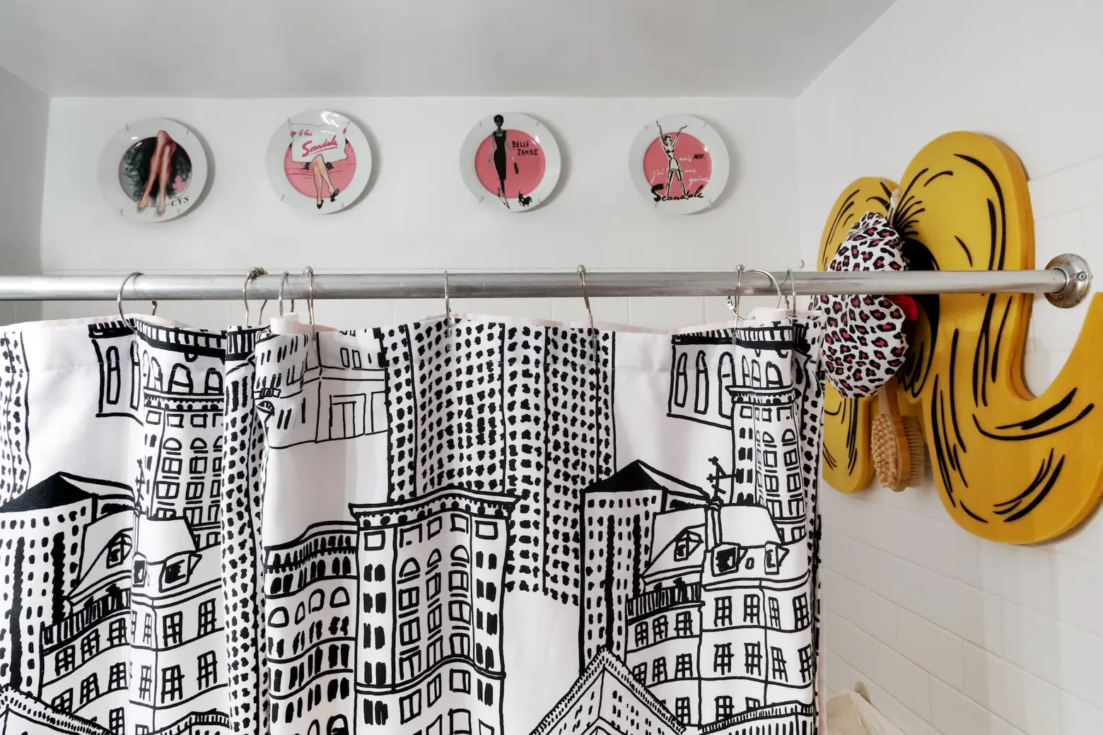
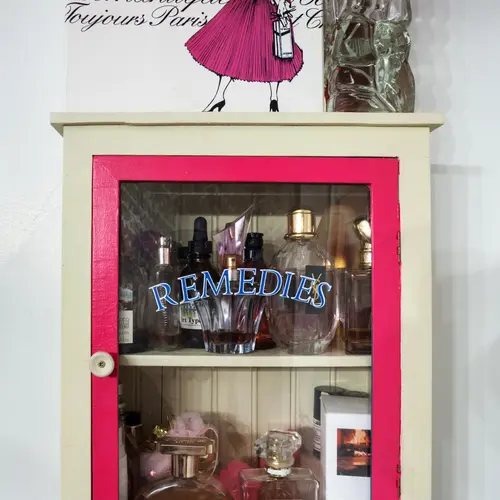
 When people gift items to Kelly that aren’t red, white, or black, she finds a spot for them in her bathroom
Was it important for you to delineate separate spaces even though the apartment is technically a studio?
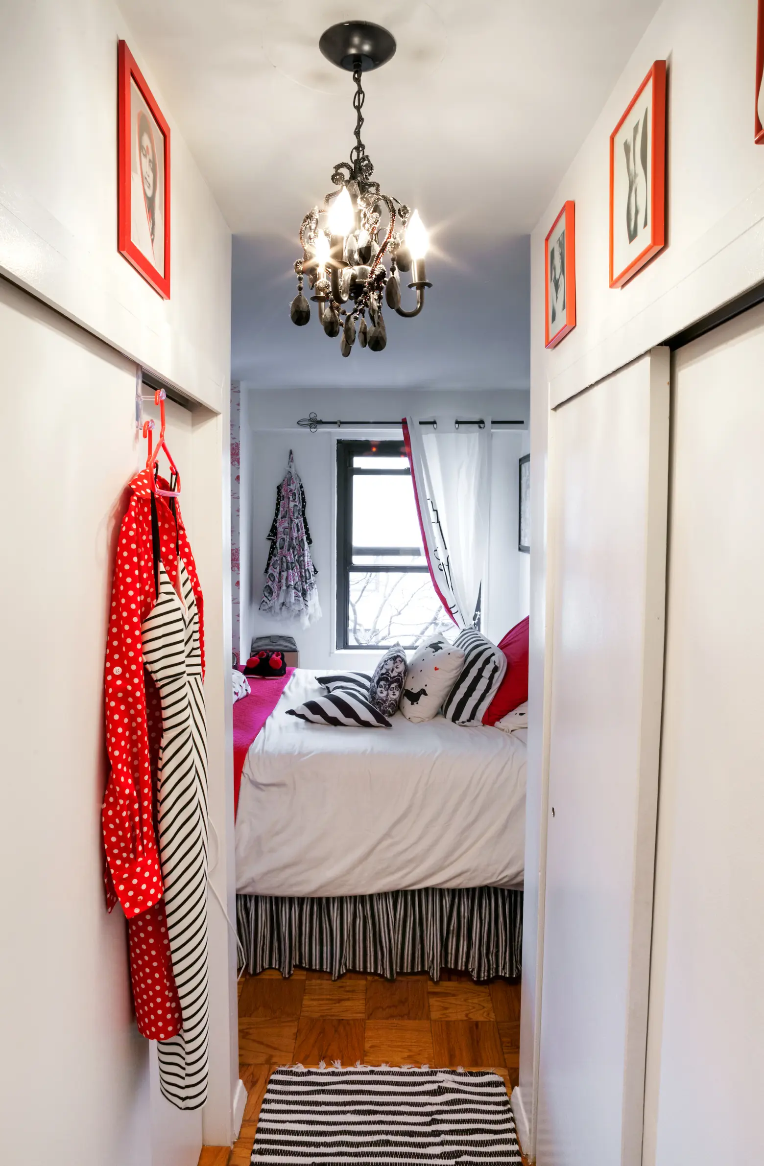
Absolutely. A square studio would have never worked for me. I moved from a two bedroom to a smaller space so I had to construct distinct rooms. I had walls built to create an actual bedroom. I also created a separate office, living room, and dining area. People always comment that the space looks much larger than the actual 480 square feet, and I think the trick is that you can put furniture against both sides of a wall — without those extra walls, there would be a lot of unused space.
+++
All photos taken by James and Karla Murray exclusively for 6sqft. Photos are not to be reproduced without written permission from 6sqft.
