Our 1,100sqft: A move to the Bay Ridge waterfront gave this couple serenity and space
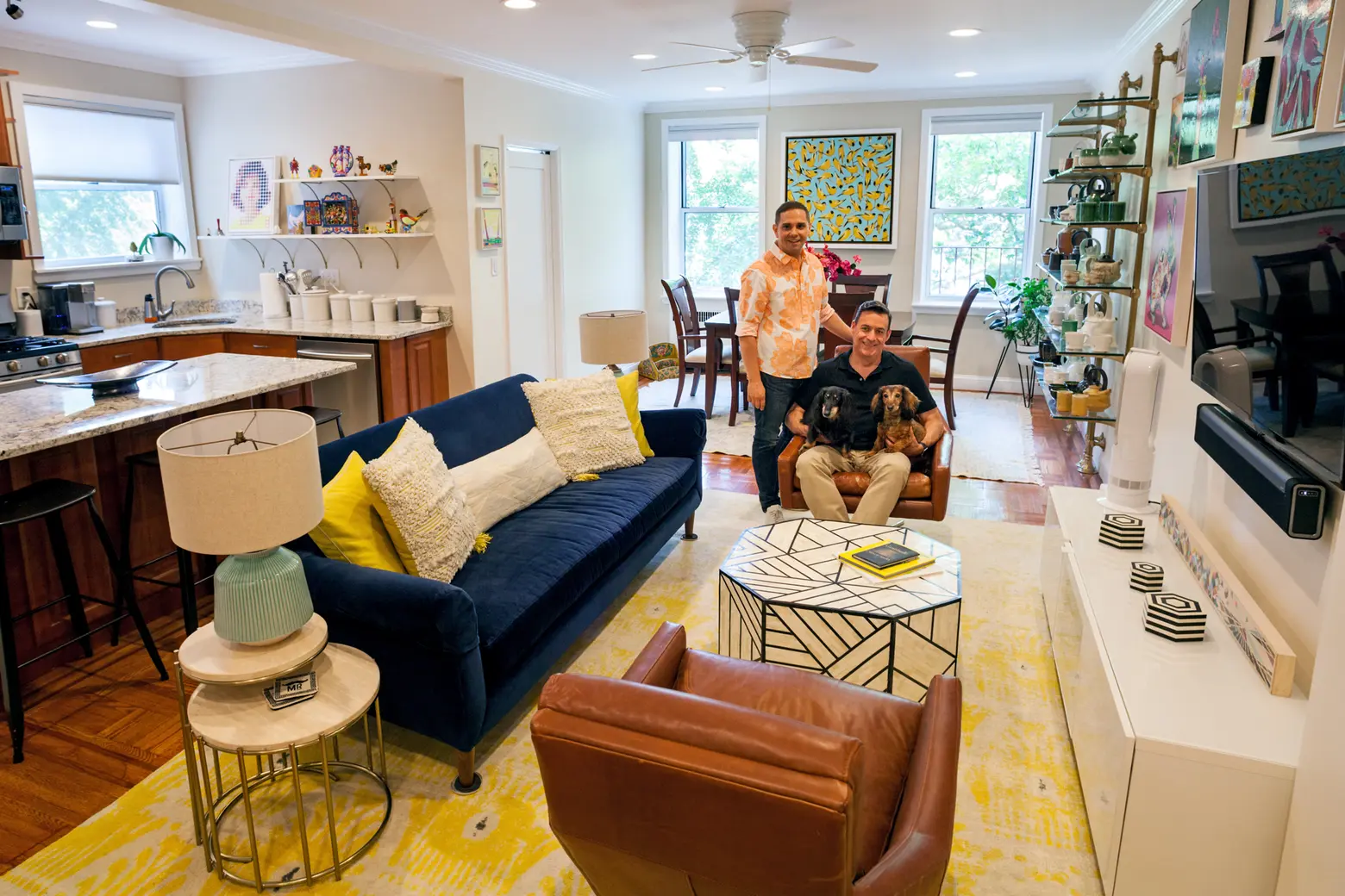
6sqft’s series “My sqft” checks out the homes of New Yorkers across all the boroughs. Our latest interior adventure brings us to Daniel and Kyle’s Bay Ridge co-op. Want to see your home featured here? Get in touch!
Bay Ridge may not be on your list of top Brooklyn ‘nabes, and that’s exactly why it’s such a peaceful enclave for those in the know. After living in a cramped West Village apartment, Daniel Saponaro and Kyle Hutchison set four must-haves in a new place to live–a bright and spacious home, green streets, proximity to transit, and great nearby restaurants. They found all of this and more in a beautiful pre-war apartment building on Bay Ridge’s waterfront Shore Road.
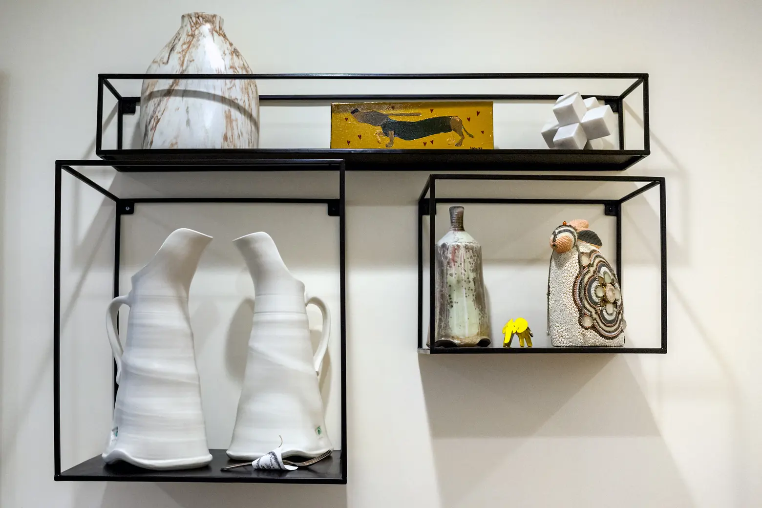
When they rented their 1,000-square-foot home in 2008, the couple always had a renovation in their back of their minds, and two years ago, when they were given the opportunity to purchase, these makeover dreams became a reality. Daniel, a fashion designer and women’s clothing company owner, knew that it would take some work to sell his husband, a VP at a higher education consulting firm, on some of his remodeling ideas, from knocking down walls to coming up with creative ways to display their contemporary art and pottery collections. With the help of online decorating service Modsy, Daniel and Kyle created their perfect slice of serenity and learned a bit about their styles on the way. Ahead, hear more about the process and take a tour of this fun and functional home.
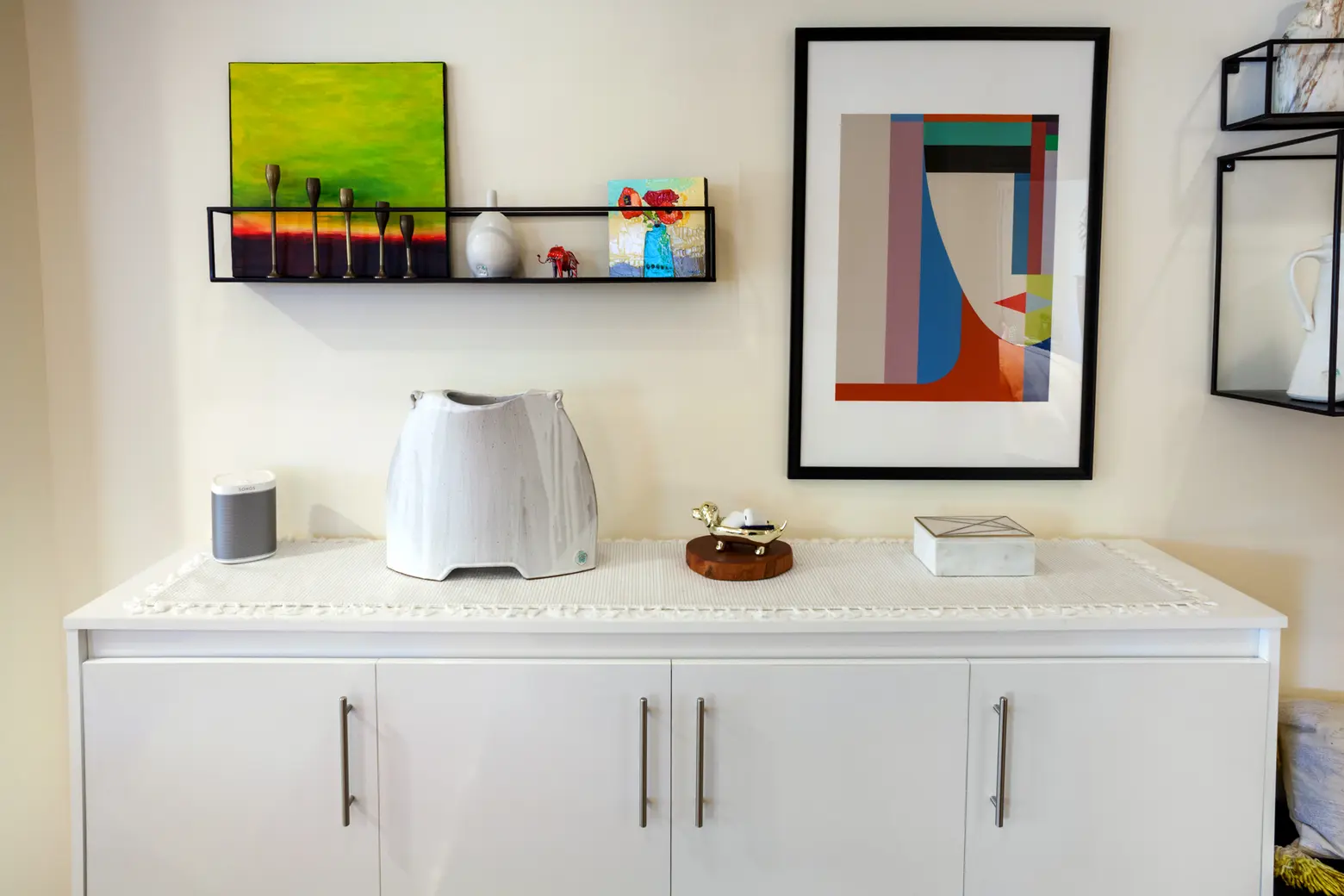

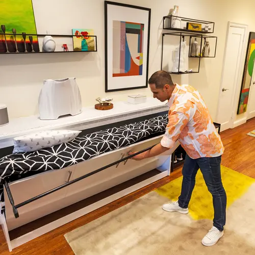
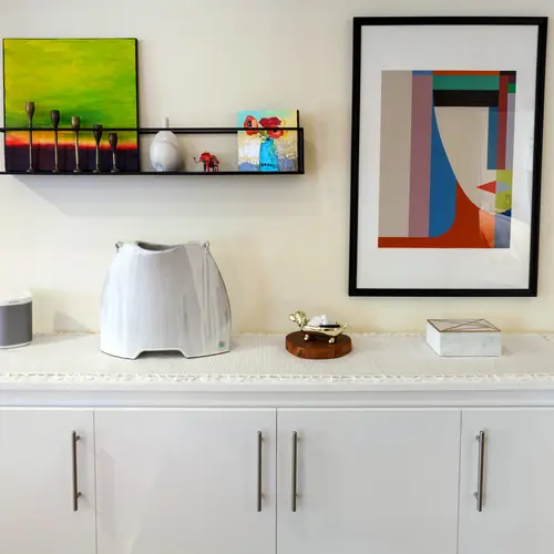
A “console table” does double duty in the entryway as a hidden, pull-out bed! Daniel and Kyle had it custom-built by a Murphy Bed speciality shop in Chelsea to match the television stand.
How did you two meet?
Daniel: Kyle and I met through an online dating site back in 2004, before online dating was so popular, and before smartphones and dating apps were the norm like they are today.
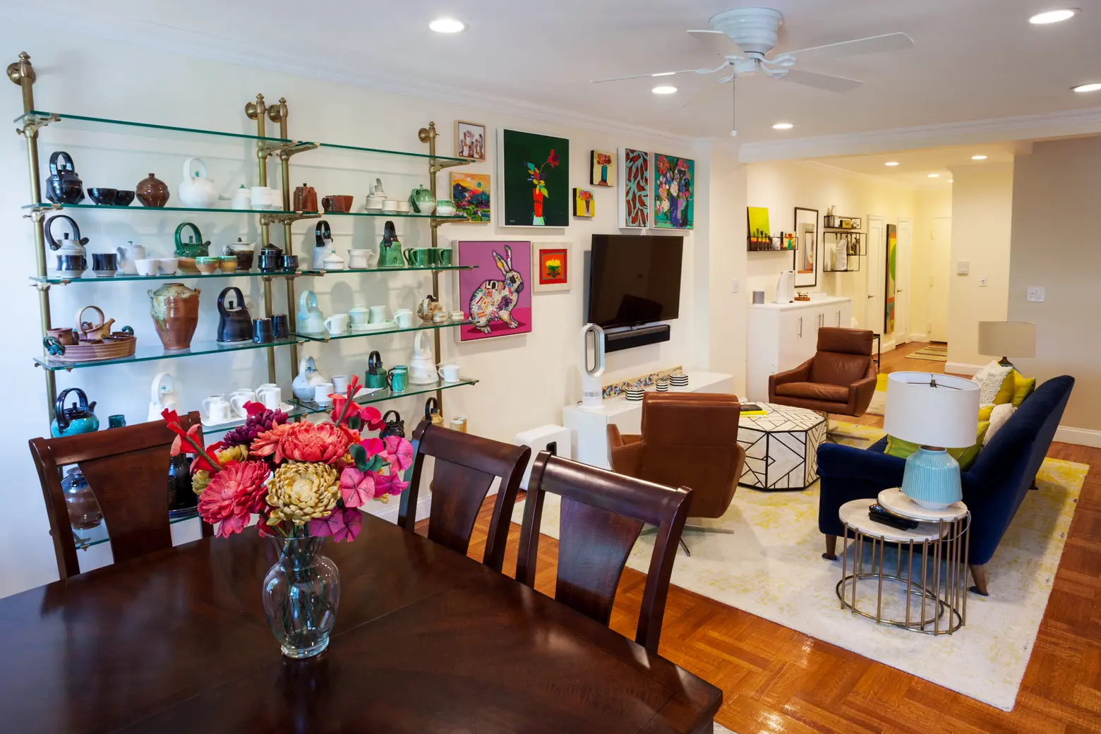
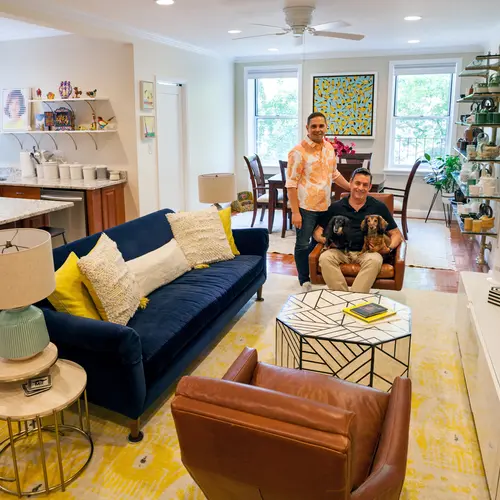
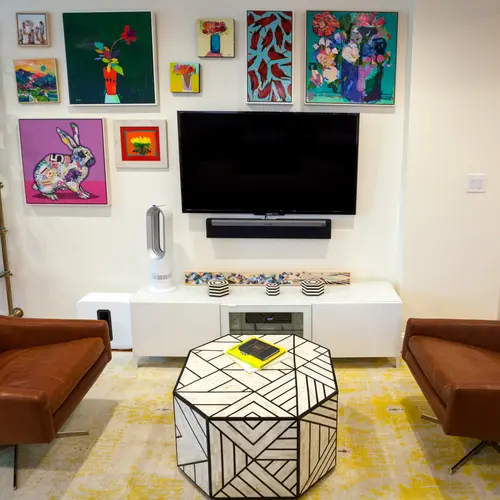
The yellow living room rug was one of the first pieces Modsy suggested to Daniel; he then built the rest of the room around it.
What made you decide to move from the Village to Bay Ridge?
Daniel: We were living on Jane Street near Greenwich Avenue in the West Village, in a garden-level, rent-stabilized apartment. We loved the location but not the apartment. It was small, approximately 300 square feet, one bedroom, and even though it was a garden apartment with a “garden patio” out the back, it was dark and always filled with soot from the neighboring high-rises.
In the Spring of 2007, we were notified that our apartment was at the point that the next rent increase would push us out of rent-stabilized and up to market value, meaning a large rent spike. With that in mind, we decided to start seeing what our options were in the rest of the city. We looked in Midtown West and Upper Manhattan but were not happy with what we were finding. One weekend afternoon we were on our way to visit my family in the Dyker Heights section of Brooklyn. As we were driving along the Belt Parkway that passes under the Bay Ridge bluff, Kyle noticed all of the mansions and buildings up on the Ridge surrounded by trees and casually asked what area that was. I replied that it was Bay Ridge and he said, “Well, that looks pretty nice, maybe we should live there,” and I immediately started looking for apartments in that neighborhood the next day!!
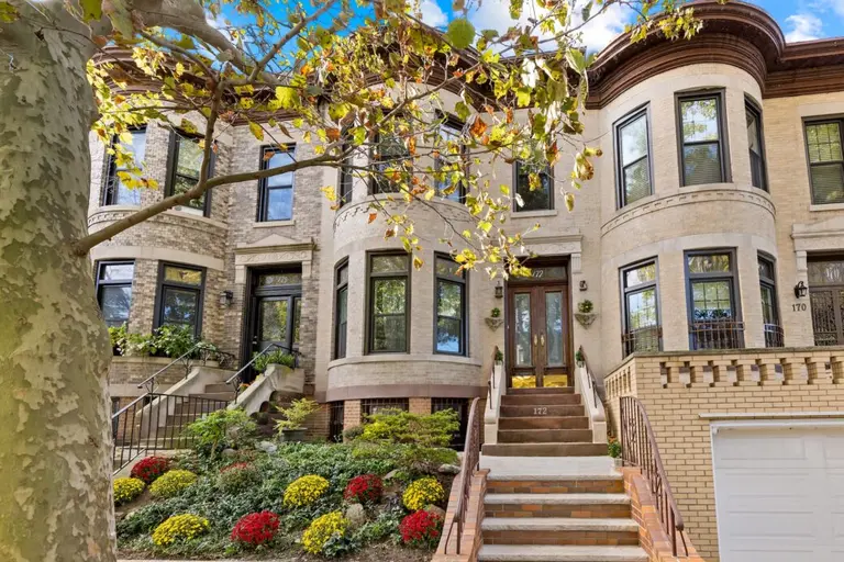
Neither of us was really familiar with the neighborhood, except to know that it was very residential, quiet, and safe. We decided that for us to leave Manhattan for a borough we needed an apartment with a few necessities: it needed to be large, it needed to be bright, and it needed to be tree-lined. It took about three to four months but once we saw this apartment we knew it was the one. The building is one of the oldest in the area, and the realtor told us that people in the industry refer to it as “The Jewel of Shore Road.” The building is pretty spectacular – it’s very well maintained and has such a rich history. When it was constructed in the early 1930s, the builders used re-purposed bricks from the original Waldorf Astoria Hotel. This area actually used to be along the water’s edge, so they say the building was designed as a sort of vacation home for NYC’s elite, and some of the apartments were originally designed with maid’s quarters, so I guess the Waldorf connection may have been a selling point.

Do you miss anything about living in Manhattan?
Daniel: The convenience of having an all-night diner right across the street. Now, we’re in an all-residential neighborhood, about three avenues removed from the commercial-residential mix that is most of NYC. That can be a good thing, too!
We initially thought we’d be more affected by the commute, but there’s a commuter Express Bus that stops outside the building that gets you into Manhattan in about 25 minutes. The bus is super comfortable, and there’s an unspoken rule that passengers remain quiet and free from cell phone use, which can be very comfortable and relaxing at the start and end of a long day.
Kyle: I loved living in the West Village–it was my home since moving to NYC in 1998! I miss being close to home after seeing a show in the Theater District or after going two-stepping at the Big Apple Ranch. And, I miss having Benny’s Burritos on Greenwich Avenue right across the street!
Has the neighborhood changed since you moved in?
Daniel: It hasn’t really changed much at all since we moved here 11 years ago, which is wonderful. And if you speak to locals who have been here even longer, they also say that the residential, quiet neighborhood feeling is something that is pretty constant. However, there are plans for the neighborhood to change in the future. The city has just green-lit a renovation project for the Shore Road Park that they are dubbing “The Shore Line,” which they anticipate will bring visitors as well as new transplants to the area and could be very exciting.
Kyle: Having Car2Go smart cars come to Brooklyn has definitely been a nice addition to the neighborhood. I haven’t owned a car since I moved to NYC, and thanks to Car2go and Zipcar, I don’t really need one.
Favorite spots in the area?
Daniel: Food, food, food! There are several restaurants that are great go-to’s with great food. Family-owed and operated, Pegasus is by far our favorite neighborhood spot for breakfast/brunch and lunch. The food and the service both great! Positano and Campagnia are the best for Italian specialties, and we love Elia for traditional Greek dishes. The restaurant HöM is an interesting and good place for brunch.
Kyle: One of our neighbors owns a great pet supply store, Paws Truly, down on 3rd Avenue, so we visit there often for treats for the boys. It’s nice having Century 21 so close, also, especially their shoe and men’s suit departments.
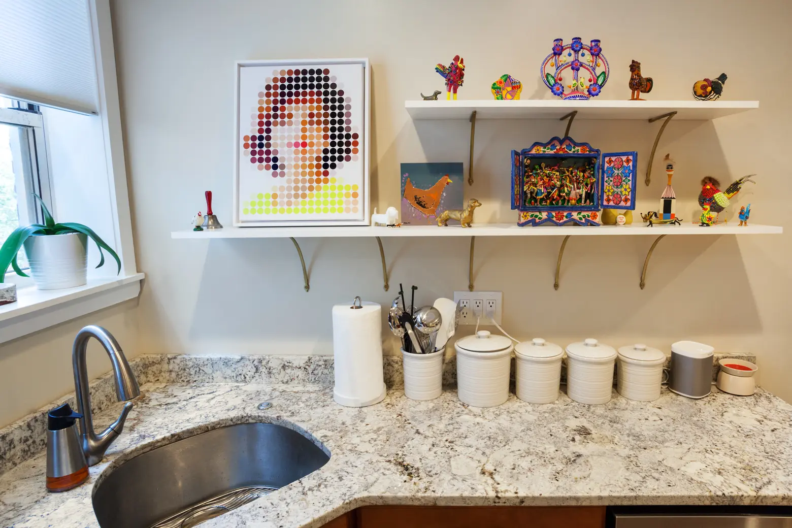


You rented this apartment for nine years, before buying. Did you always know you’d like to renovate?
Daniel: Absolutely! Since we knew this was a co-op building, when we originally leased the apartment we asked the broker if we could include a clause that asked the sellers to give us the first right of refusal if and when they ever decided to sell, assuming that we’d still be there renting from them. Because I always knew it was a possibility, I had always been kind of going over in my head the little changes I would make to improve upon an already stellar apartment.
What were they?
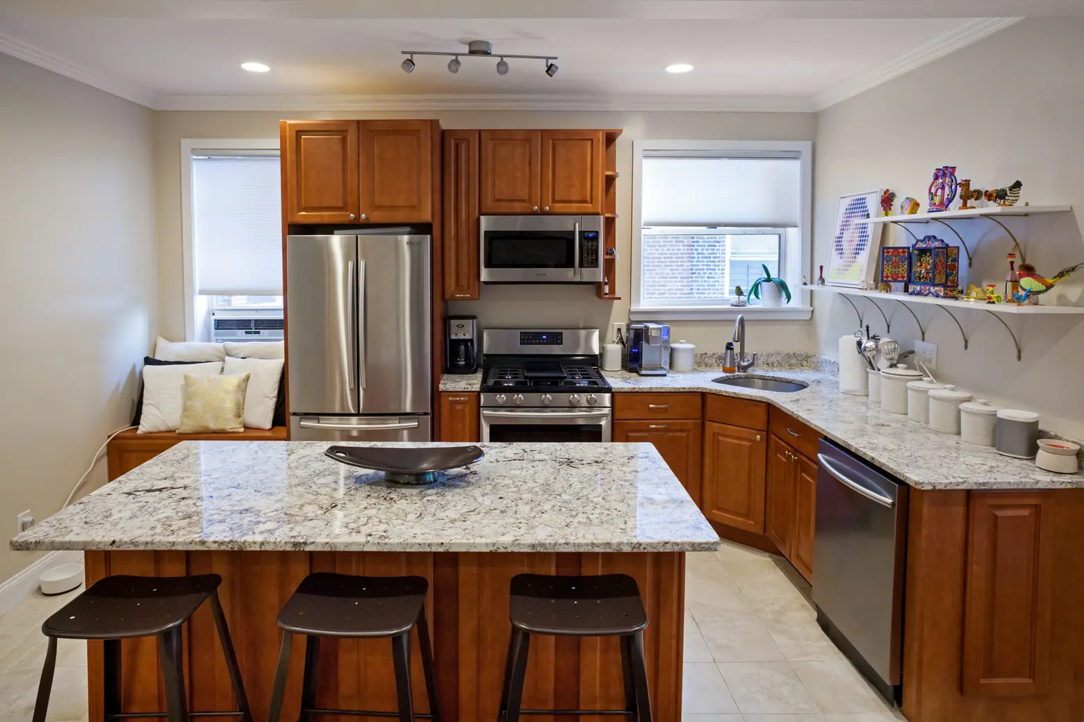
Daniel: The goal was to open the space up so we could really feel the size and bring in additional light and to modernize the feel. We’ve always loved the footprint of the apartment but after living in the space for nine years we did come to see some drawbacks. All these pre-war buildings in the neighborhood, though solid and practically sound-proof, weren’t built with any overhead lighting. We knew we wanted to completely redo the electrical wiring, so we opted to have LED recessed lights installed throughout the space because it meant only dropping the ceiling about four to six inches. Additionally, we had multiple light switches and outlets added throughout the apartment for better functionality than before. We added a dedicated 220volt line for an air conditioner and had CAT6 internet cabling added to the walls and some outlets.
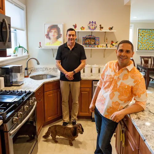
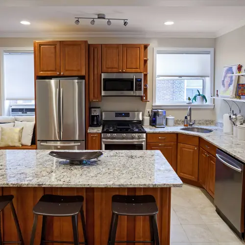
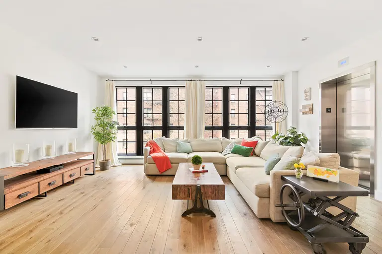
The apartment originally was sectioned off into multiple large rooms, including an oversized foyer and a spare room that had two entrances into the kitchen and living room. All of the original walls had chair rail molding and the entryways into each room were all arched. We decided that we wanted an open concept kitchen, so I worked with an architect to make sure the walls were not load-bearing and could come down. Bringing down some of the walls helped maximize the length of the apartment and create a big impact when first walking in, really showcasing the scope of the space. Additionally, it helped make the foyer become actual usable space and enabled the windows in the kitchen to help give the living space extra direct sunlight.
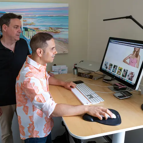
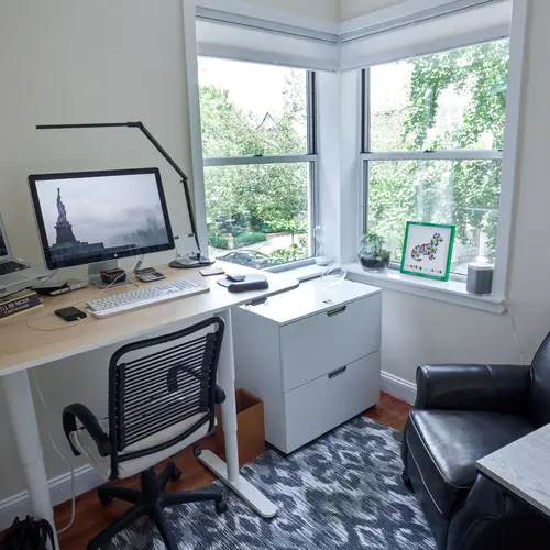
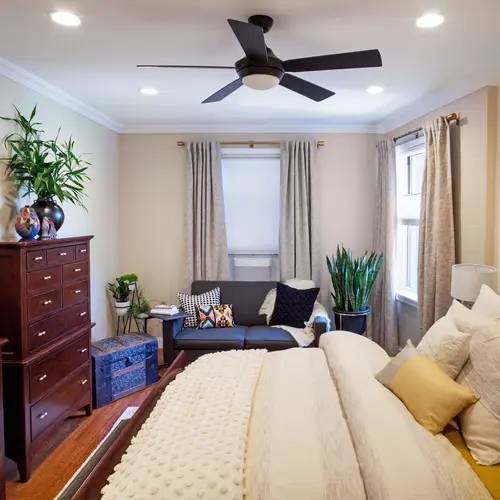
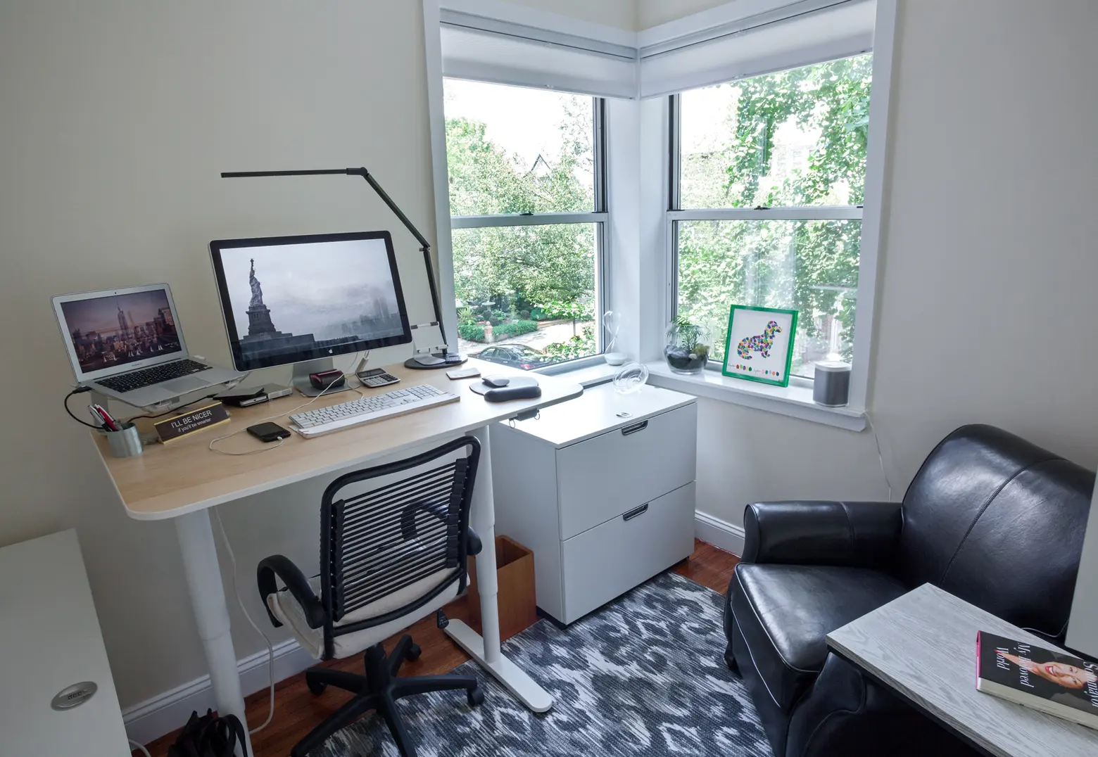
Now that the kitchen was being transitioned from a galley to an L-shape with an island, it enabled us to close off the kitchen-entrance to the spare room. The closed-off spare room has two wrap-around corner windows that have a view of the tree-lined street and the water, and now it can be formally used as a second bedroom, but currently it doubles as Kyle’s office – and we added a pocket door as the entrance so that we didn’t obstruct any of the living room’s usable space.
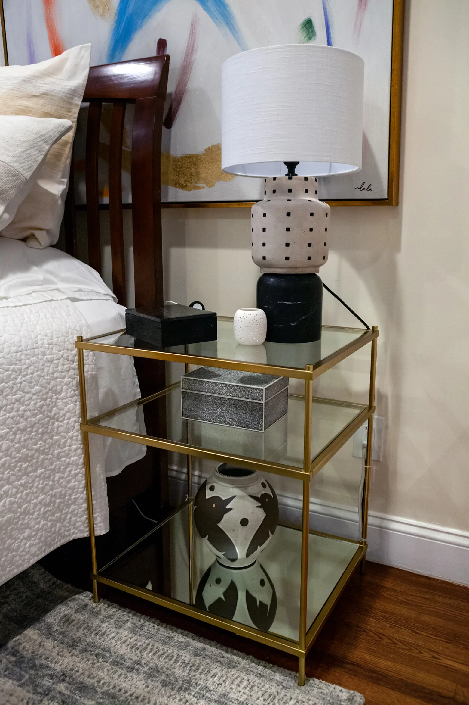
Tell us about working with Modsy.
Daniel: The process was incredibly simple. We started out by taking pictures of the empty space, which for us was then down to the studs. Modsy then took those photos and created a CAD design mock-up of the space with just the walls and floor. I paid a bit extra and sent them the specs and plans for the new kitchen, so they included that into the space as well. From the initial sign up process, I answered a short, easy questionnaire that was pretty image-based (think Pinterest) and that enabled me to relay the kind of aesthetic I was after. At that time, I also advised what items we already owned that I wanted to be included, so I sent front, back, and side pictures, along with dimensions, and the team was able to incorporate those into my space.
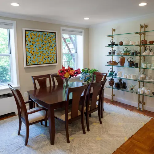
From there, Modsy sent me two initial designs using the items we owned and adding in some recommendations based on my original feedback. Those first two designs were pretty eye-opening because they differed considerably from the layout I had envisioned. I always thought I wanted my dining room adjacent to the new open-concept kitchen, but Modsy flipped that and settled the dining room closer to the windows, which we ended up loving. From there, I settled on some of their suggested items, our living room rug, and the brass shelving unit, and then started to design around it on my own. So as I found an item, a sofa or a side table, etc., I would reach out to the team and ask them to input it into the design until we made a firm decision and subsequent purchase.
As the rooms became more set in place with the furniture, I decided to have Modsy take a swing at helping me with the placement of our art collection. I knew the basics of how I wanted things displayed – a gallery wall, cubing to display sculpture and pottery, etc. – so Modsy helped with the actual layout. I took pictures of all my art and sent them dimensions, paid a small fee, and then they sent me back the first draft of the layout, which I then tweaked and tweaked until it was perfectly placed. All in all, I did 20+ redesigns, but once it was right, it looked exactly like what I wanted and Kyle was able to watch along the way, give feedback, and feel at ease with all my decisions.
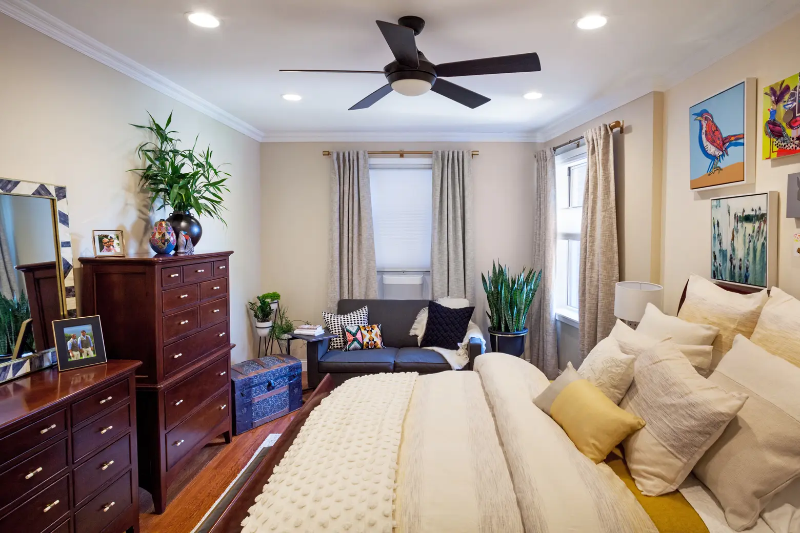
Daniel, you mentioned that part of the appeal with Modsy was being able to show Kyle a visual of how the space would look. Was your plan successful?
Kyle: We’re still married! (LOL) I think it was great to have a 3D or virtual way to see the space as we went through the process. And I think the 360° capability really enabled us to get a sense of how it would look and feel in a real-world way.
Daniel: Yes, having those constant visual updates really helped me get my vision across to Kyle. I found it really helpful when we had narrowed a chair or side table down to one item or another – I would reach out to my rep and have them update the design with one and the other, and then we would make the decision. Because everything is to scale you can really understand what you’re getting and make an informed decision — a definite marriage saver, ha!
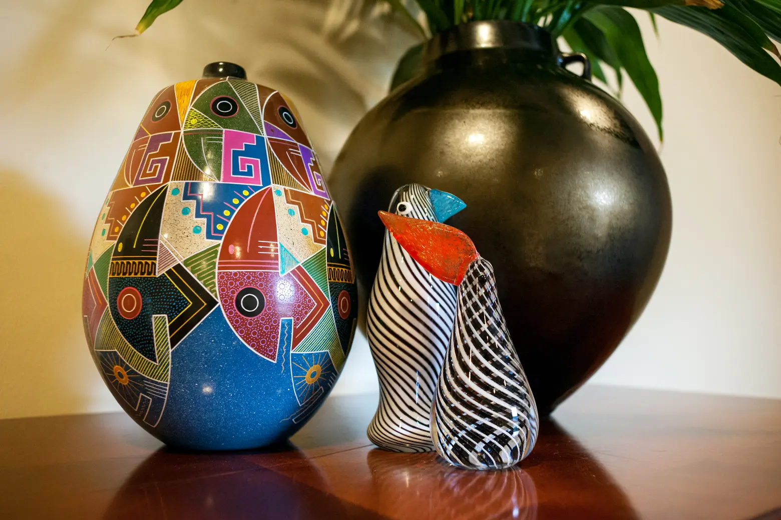
How did you two mix your styles and compromise on the renovation?
Daniel: Kyle had a couple of key items he wanted to keep around, but otherwise gave me free reign of the renovation and design process. I kept him informed and always gave him this or that options, it was collaborative, but I’m glad I can envision outcomes.
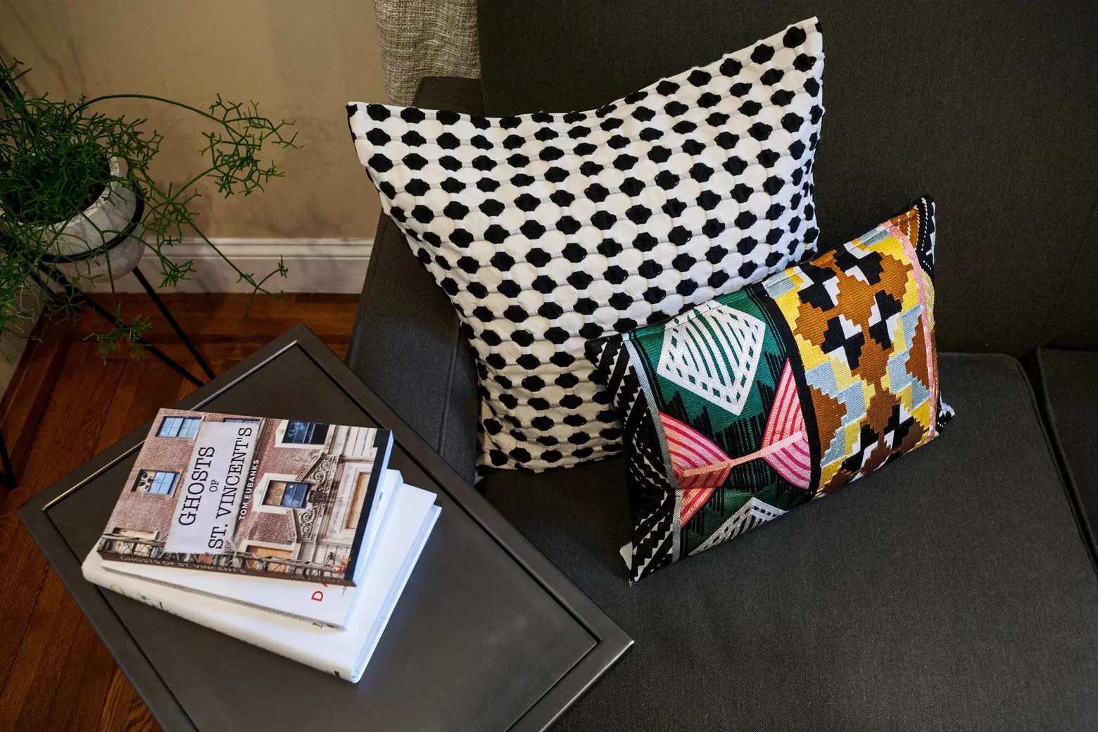
Daniel, being in fashion, you obviously have a creative eye. Would you say your designs share an aesthetic with the apartment?
Daniel: Absolutely!! The company I own and design for, Hutch, is a contemporary womenswear brand recognized for dresses that are both easy and luxe. We work pretty diligently to emphasize timeless sophistication over trend, and the brand’s aesthetic really showcases my love of vibrant colors, conceptual prints, and clean, feminine tailoring. We’re sold in over 200 specialty stores around the country and have major distribution in Anthropologie and Rent the Runway. Within the past two years, the brand has become completely size-inclusive, ranging from 0/XS through 26/5X and are sold to Gwynnie Bee and ModCloth.
The process of decorating our home really is an off-shoot of what I do all day with my design and sales teams. Building a collection each season means adopting lots of fabrics with different textures and feelings to build a cohesive story. So, while I’m mixing plush velvets, sleek jacquard, and bold prints at the office, Kyle and I are buying a velvet sofa, and pairing it with leather chairs and a bright pop-print rug. I’ve always been a fan to color and then more color, but as my line has started to incorporate more black and neutrals, I’ve found myself accenting our home with the same black and neutral pops–it works hand-in-hand, I guess.
How did you arrive at this color scheme?
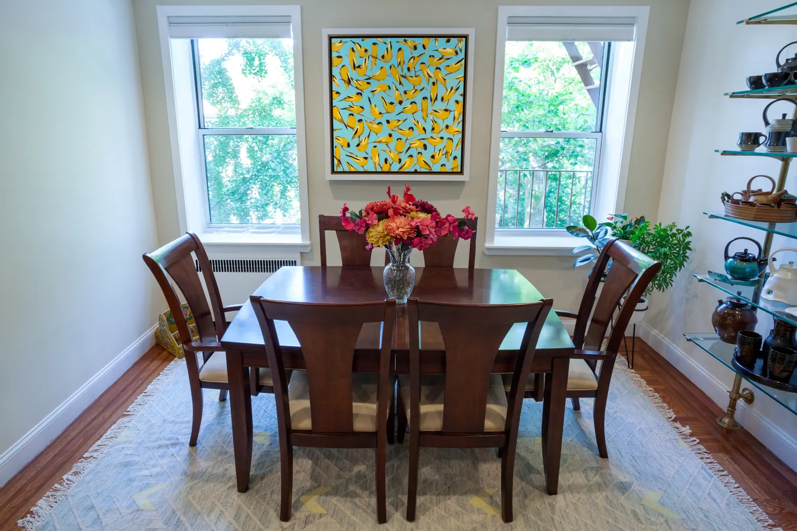
Daniel: We knew that our art was pretty color-driven, so I opted to have the walls and trim be neutral. We went with two shades of ivory for the walls but chose a very bright white for the trim, window boxes, and ceiling so that the white really popped when mixed with all the colors of the furniture and paintings. Additionally, we chose a light-mahogany wood for the kitchen to echo the dining furniture and the refinished hardwood floors.

Tell us about your art collection.
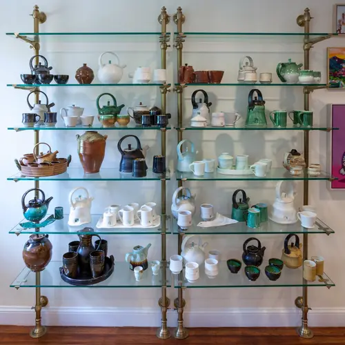
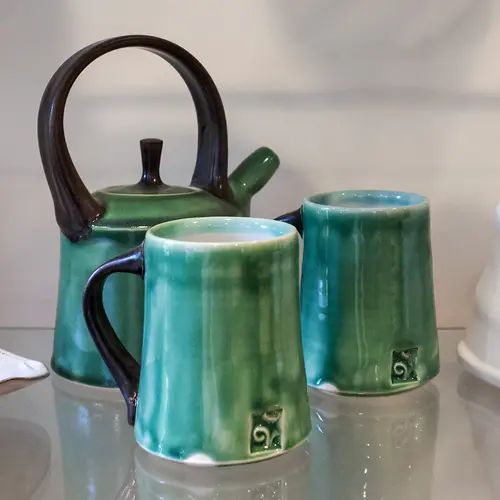
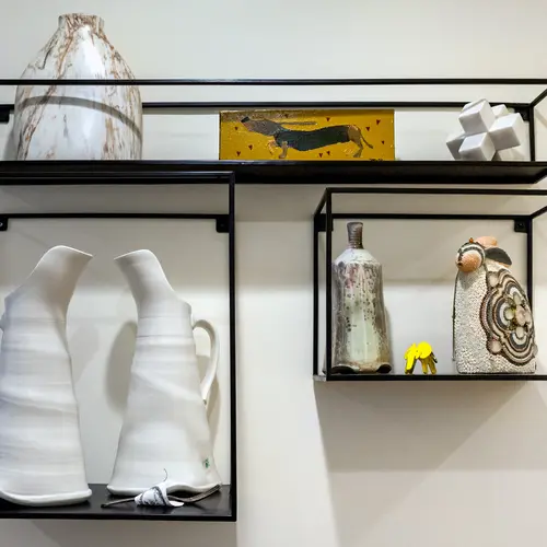
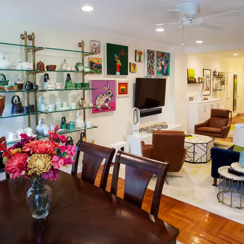
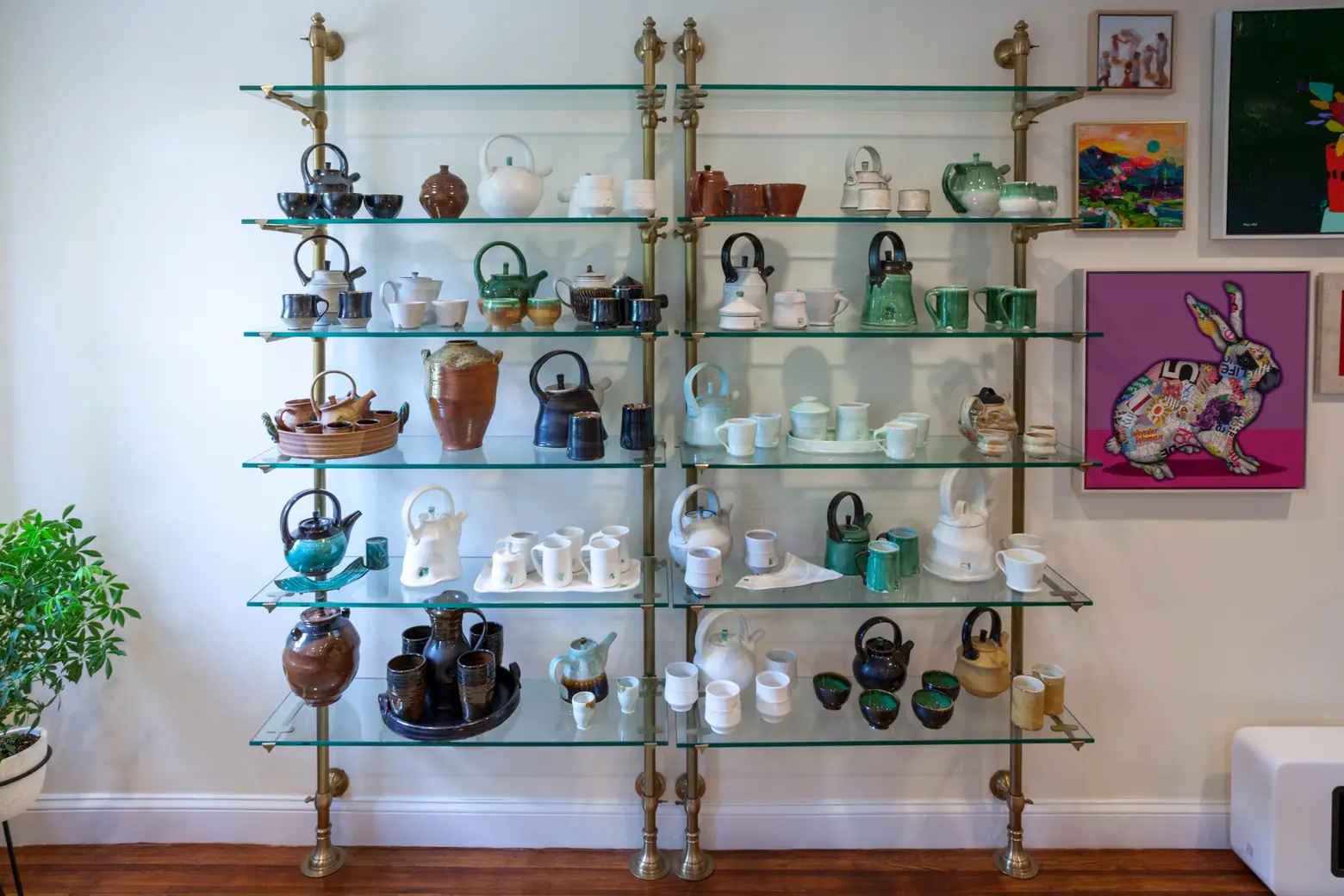
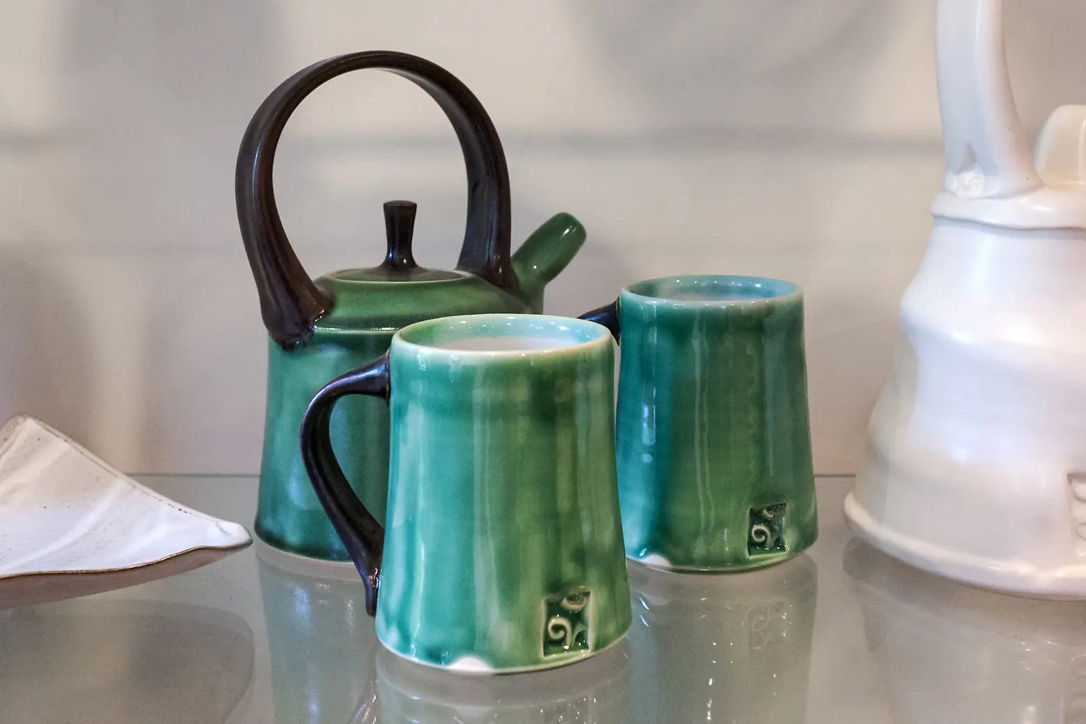
Daniel: We really started our collection with the pottery. I bought my first teapot set from an amazing potter, Darin R. Gehrke, back in 2008 when Kyle was working with Darin’s wife, Cherington. To date, I believe I have 26 full teapot sets, all individually designed and handmade by Darin. One of my main goals when designing the space was to make sure there was a dedicated, central area for me to display these beautiful pieces. With Modsy’s help, we found an area and display option that does the remarkable feat of standing out, while also blending in. My teapot display wall is almost everyone’s favorite topic to discuss when visiting.
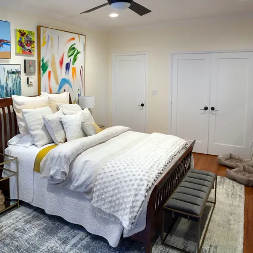
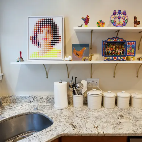
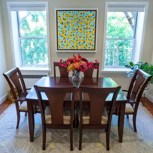
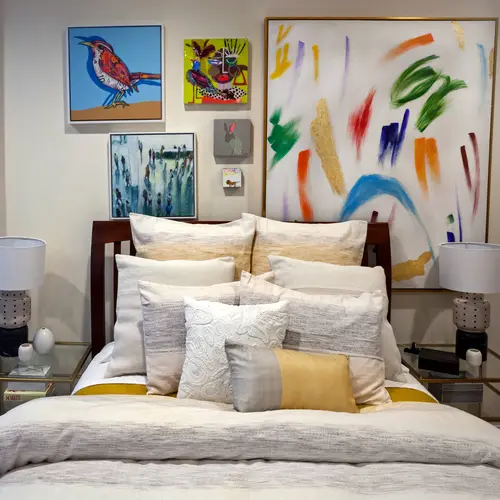
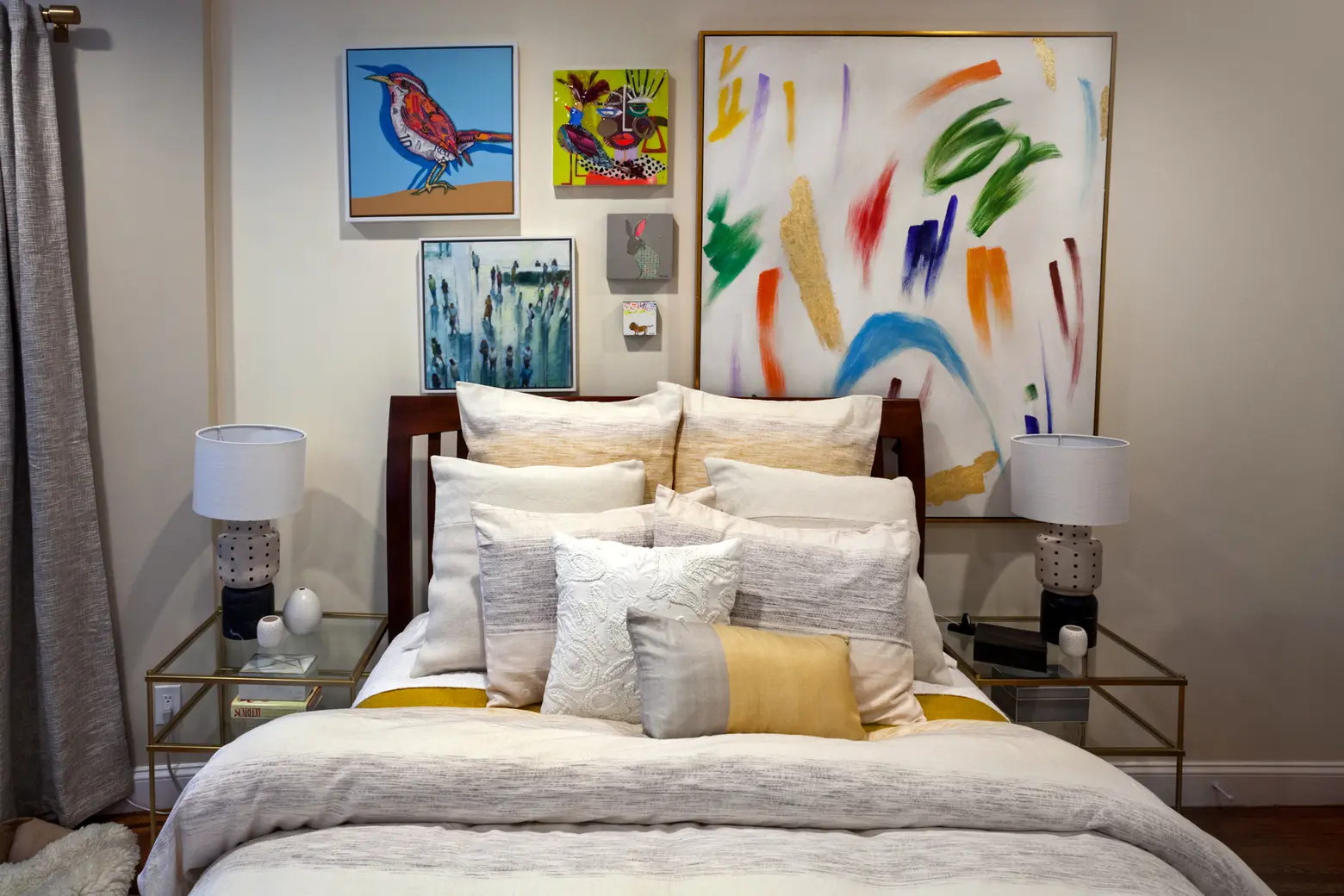
It turns out that one of Hutch’s best specialty store accounts, Monkee’s of the West End, is located in Greenville, SC where Darin and Cherington moved after leaving NYC. I visit that account twice a year, and during my trips there, Cherington, who is now the Executive Director of the Greenville Center for Creative Arts introduced me to the bustling Greenville Art scene. It’s there that we met a handful of the artists who we’ve incorporated into our home. One of the focal points when you walk in the apartment is this fantastic 36×36 Joseph Bradley painting of goldfinches. They are a signature piece of his body of work and so incredibly vibrant and beautiful. Kyle’s office and the bedroom feature paintings by Janina Tukarski Ellis. Her style is so intriguing because I feel like all the figures each have a story, which can be somber yet vibrant at the same. Keith Grace is the artist behind the rabbit in our living room and the bird in the bedroom. Both paintings use the same mixed media technique of collaging together magazine or newspaper clippings, sanding them down so they are completely smooth and then adding painted texture and form. The rabbit, which was our first purchase, is titled “Wonder” and consists of various clippings of Wonder Woman – its fantastic! Kyle and I vacation in Provincetown, MA whenever we can, and two artists we began following during our outings there are Trevor Mikula and Kyle Ringquist. Trevor’s work is just so full of joy and we have managed to collect both small and large pieces – I gravitate toward his florals, but he has a very loyal following for his pop culture pieces. Kyle Ringquist’s work is full of color, and the technique and skill that go into each piece are astounding–they are all painted on glass in reverse, so when the painting is flipped you are able to see all of his layers and detail. His process is just so incredibly fascinating.

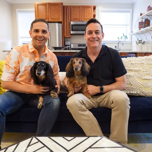
Rusty (left) and Moxley (right). Daniel and Kyle have been together for 15 years.
You can only take three items from the apartment–what are they?
Kyle: the dogs and Daniel!
Daniel: Ok, ok, Kyle and the boys!
All photos taken by James and Karla Murray exclusively for 6sqft. Photos are not to be reproduced without written permission from 6sqft.
