POLL: Would You Like to See the MTA Use This Modern Subway Map?
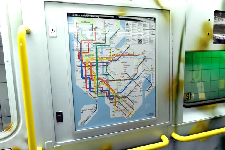
Yesterday, 6sqft brought you this modern subway map redesign by Tommi Moilanen. His version keeps the current map’s basic structure, but infuses it with a bit of Massimo Vignelli‘s famous graphic style. Geographically and systemically accurate, Moilanen’s map also uses thick and thin lines to represent express and local service; tints skipped stops a lighter shade; more clearly locates major transfer points and station names; and includes an easy-to-use legend. Though this all sounds great, some New Yorkers will not want to part with the subway map they’ve gotten so accustomed to — what about you?
The existing subway map (left) compared with Moilanean’s map (right)


