The new Nordic: Scandinavian design goes from Ikea to luxury NYC real estate
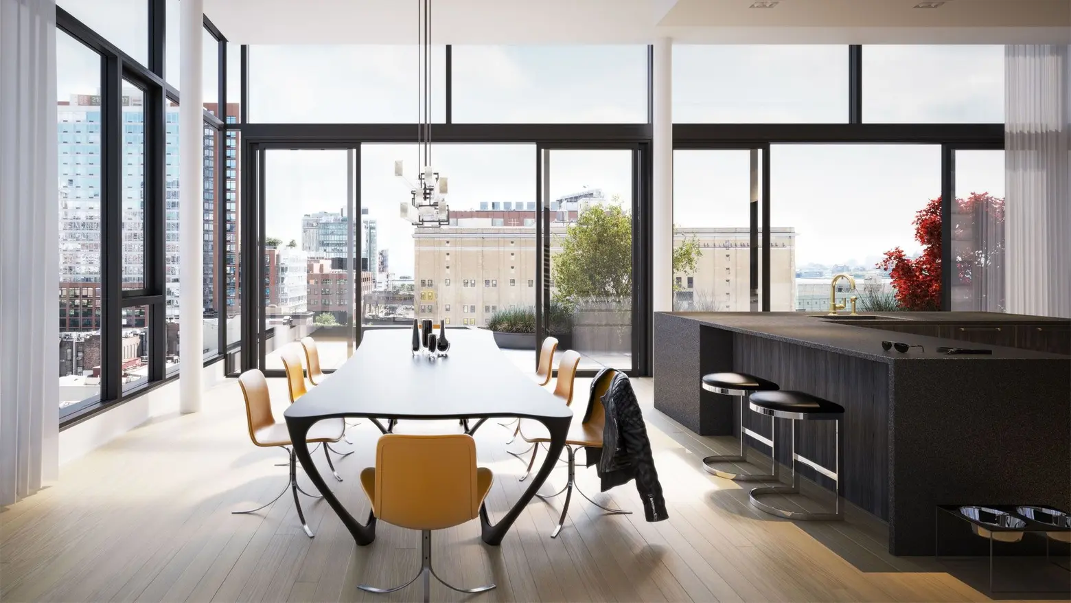
505 West 19th Street via Thomas Juul Hansen
Scandinavian design is on the rise in luxury residences. At first, that might seem like an oxymoron since Scandinavian design was founded on the principles of utility, affordability, and simplicity – and high-end residents are not. But luxe and Scandinavian design have found much common ground.
From its early 20th century roots, based on Germany’s Bauhaus school and developed in the Nordic region, to the mass-produced appeal of Ikea, the trend has certainly remained at the forefront of the design world. And perhaps now it’s seeing its biggest moment, serving as a major selling point for hot new NYC condo projects such as Carroll Gardens’ 145 President and being reimagined by of-the-moment firms like Morris Adjmi and Denmark’s own Thomas Juul-Hansen.
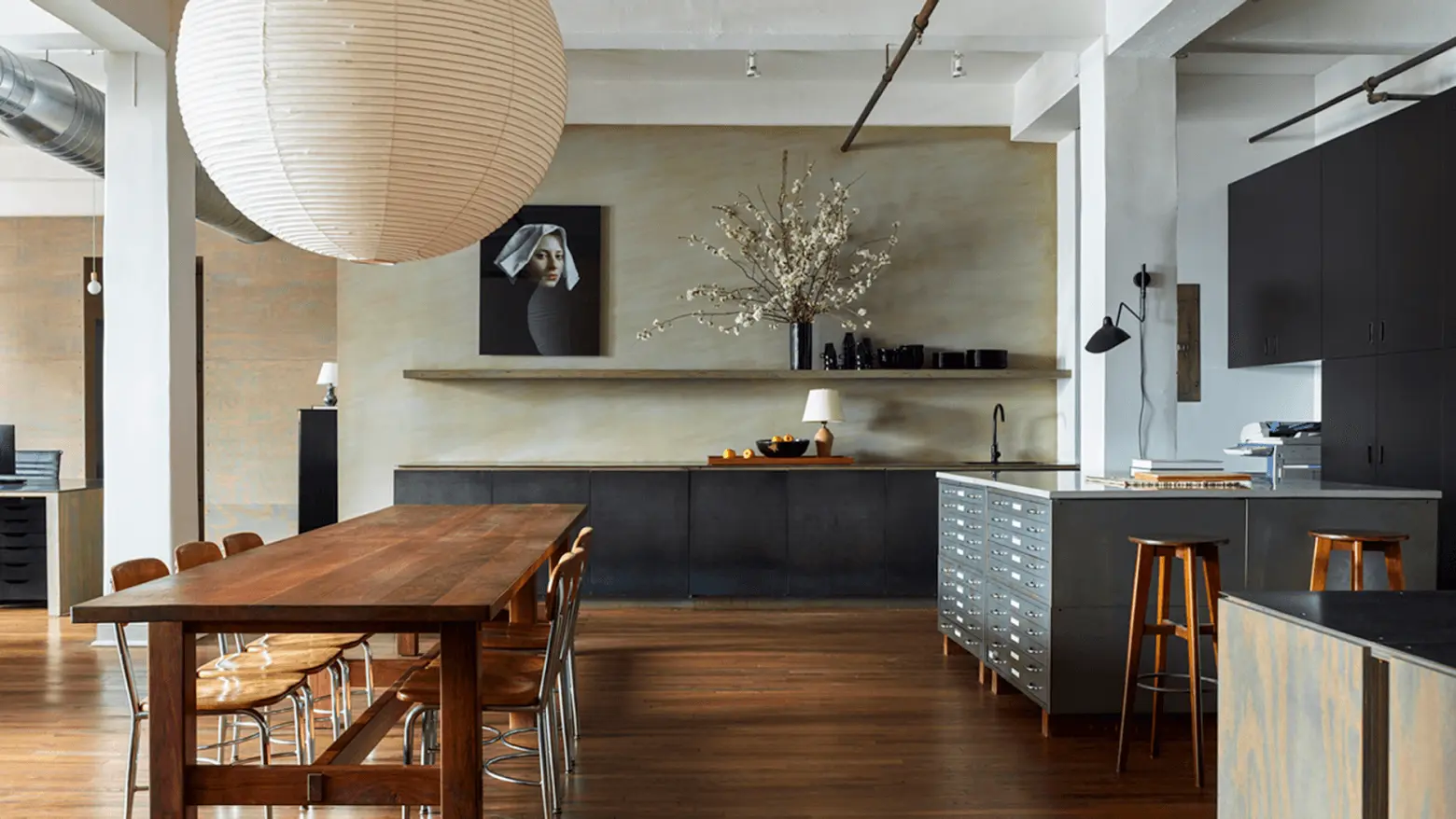 Photo courtesy of Neal Beckstedt Studio
Interior designer Neal Beckstedt’s admiration of Scandinavian design stems from his philosophy of “modest luxury.” “The underlying principles of Scandinavian design are that it’s very refined and subtle in its character and it’s not overpowering. It’s more understated. It’s straightforward luxury with an element of warmth. It’s not about being so ostentatious about everything. It fits the way the way people are today, the world is a different place.”
Scandinavian design is founded on the concepts of purity, simplicity, clean lines, elegance with natural wood and neutral color palettes in addition to fine craftsmanship. Scandinavian design also conjures images of functionality, utility, a bit of frugality and, often, the infuriating instruction manuals from IKEA (personal note: never buy anything with drawers. I have yet to assemble a drawer successfully!).
At the heart of Scandinavian design is the combination of aesthetics and utility. As Tali Roth, interior designer, explains, “Frankly, I think that in the high-end market people often feel that ‘more is more’ and that they need to show a level of ‘luxe’ through all the different elements, materials and ‘stuff.’ Since Scandinavian design has become so trendy and so many people have executed it so well, more people are following suit. High-end Scandinavian design is about simplicity and the sum of the parts.
Vogue argues that the Danish concept of “hygge” (think all things comforting: fireplace, hot cocoa, warm wool socks, etc.) is on it’s way out as the Swedish concept of “lagom,” meaning “not too much, not too little” is on its way in. Either way, hygge or lagom, Scandinavian design is at the forefront of the high-end design world’s mind.
The History of Scandinavian Design
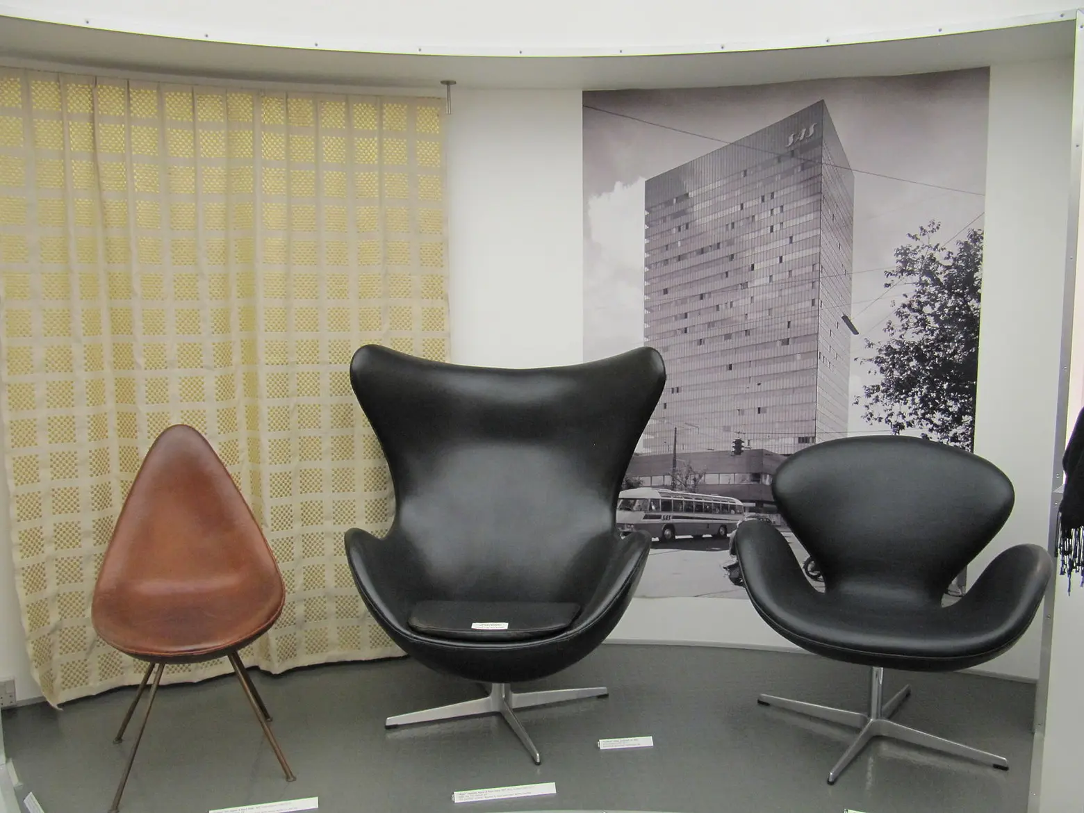 Arne Jacobsen chairs at display in Design Museum Denmark. Via Wiki Commons.
The Scandinavian design movement, based on design principles from the five Nordic countries (Denmark, Finland, Iceland, Norway and Sweden) emerged in the early 20th century out of the Bauhaus school in Weimar, Germany.
Founded by Walter Gropius, the Bauhaus school based its teachings on the concept of creating “a total work of art,” not separate pieces. The literal translation of Bauhaus is “construction house” where all aspects of architecture would come together, interior and exterior as a holistic product.
The Finnish architect, Alvar Aalto, built his practice on the idea of the total work of art. Together, with his wife, Aino, Aalto would design aspects of a building as small as lamps and glassware. The concept gained popularity and traction in the United States in the 1950s.
Scandinavian Design versus Mid-Century Modern versus Minimalism
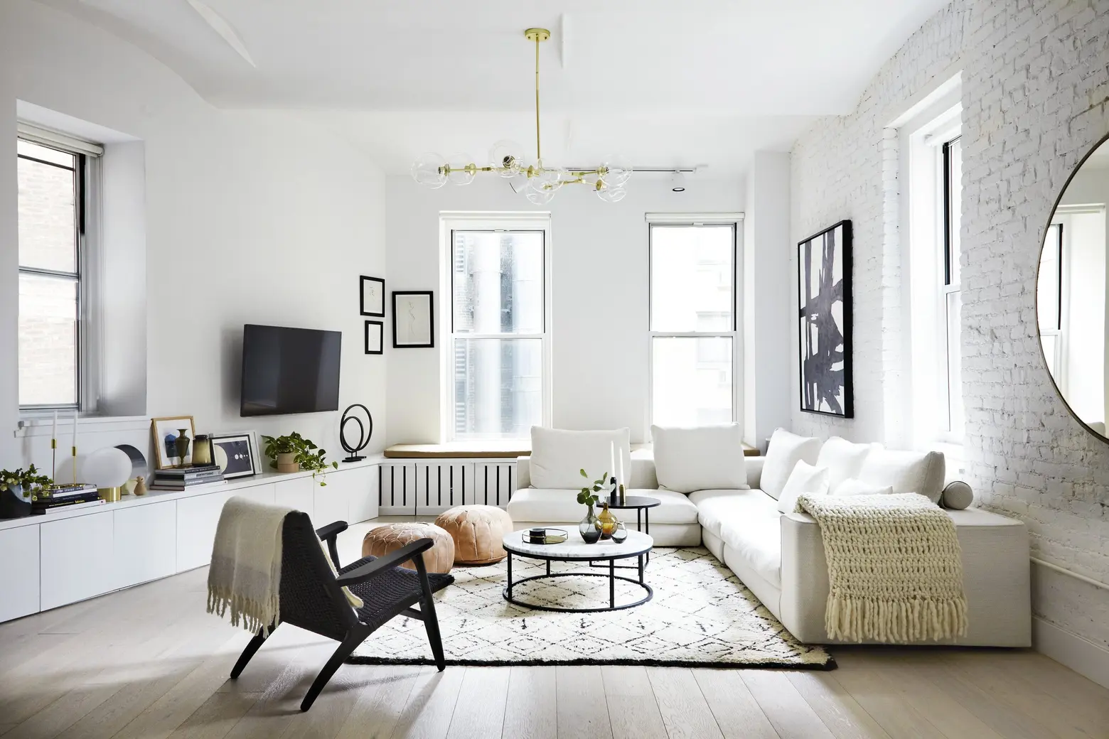 Design by Tali Roth
Although there is a lot of overlap between Scandinavian design, mid-century modern and minimalism, there are many differences.
Mid-century modern interiors tend to use darker hues and not place as much importance on light. Scandinavian design uses the muted color palette and places a high priority on lightness and brightness (due to the long and dark Nordic winters).
Minimalist design often uses stainless steel, chrome, and lacquered plastics; black and white color palettes and relies heavily on geometric forms. Scandinavian design focuses on the use of organic materials, has subdued colors and softer aesthetics.
Beckstedt sums up Scandinavian design as being about “form and function with warmth.”
Scandinavian Inspired
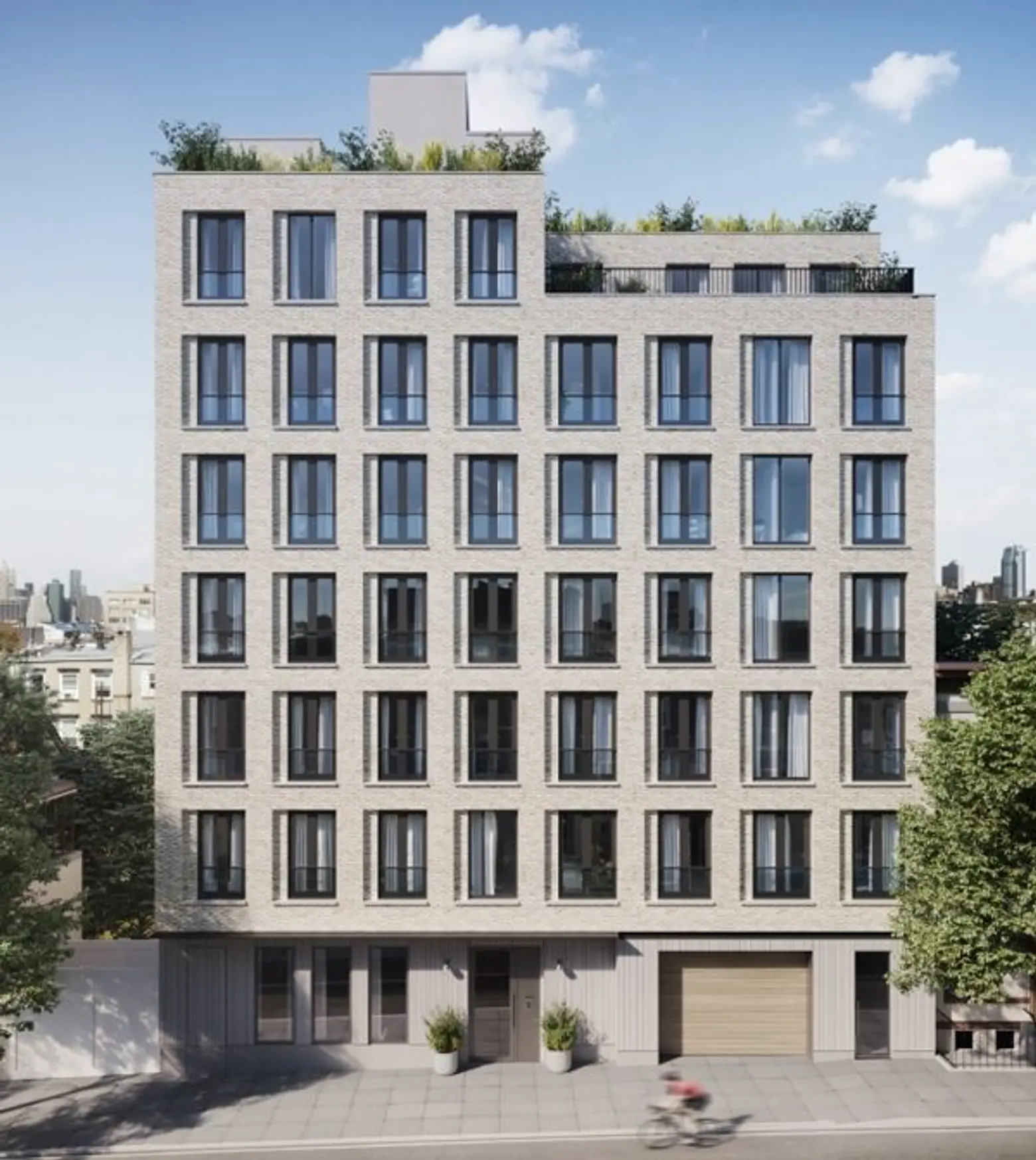 145 President via Arc Media
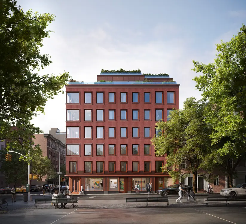
145 President, a new condominium building in Carroll Gardens, Brooklyn touts the tagline, “Scandinavian inspired. Brooklyn based.” Scandinavian design has become so cool it’s on par with “Brooklyn” (as a concept and a place).
As Jesse Wark, Head of Development and Principal at Avery Hall Investments explains, “As more and more families stay in New York, everyone is looking for something that is a home. I think this design has appealed to many people on that level.”
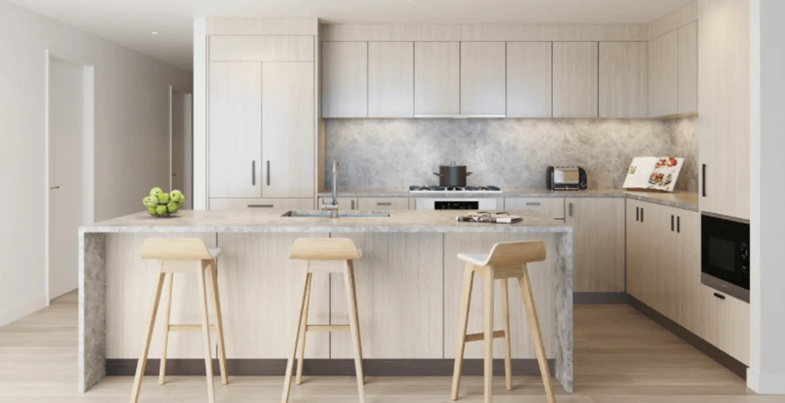 145 President via Arc Media
145 President’s Scandinavian design begins on the exterior of the building and works its way inward. Wark says, “initially we just started looking at the light and how to bring it in. Once we started to refine the concept, we looked for materials that would receive that light best. We used warm wood floors and cabinets incorporating customization and craftsmanship design elements.”
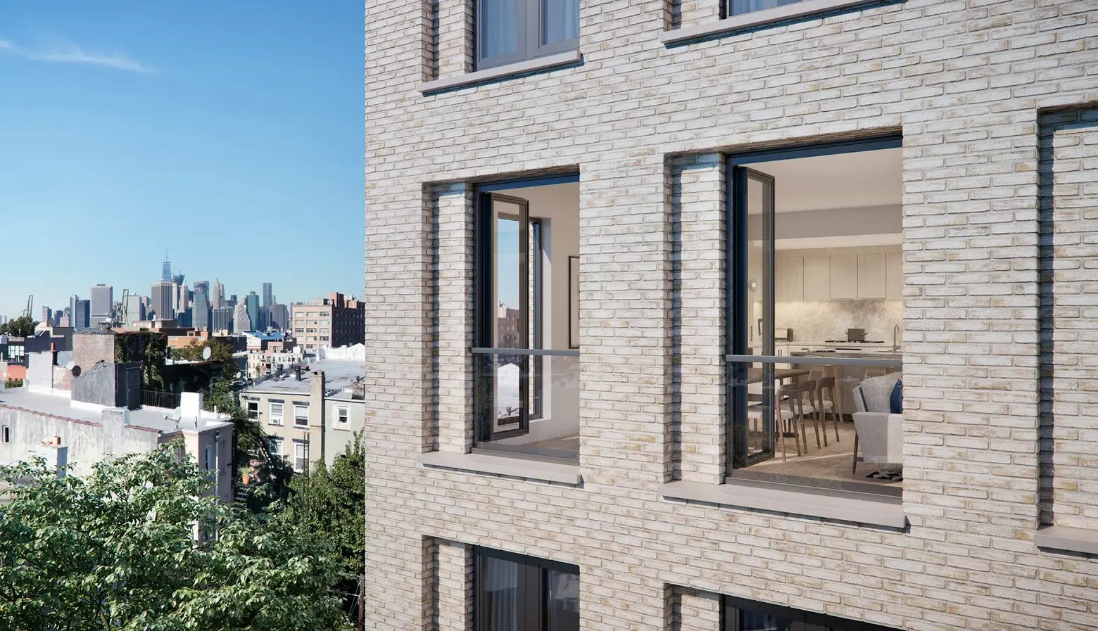 145 President via Arc Media
The exterior of the building will be clad in “Danish brick” that was individually handmade in Denmark, “It’s raw, it’s not from a production line, every piece is handmade. If you look, the variation is phenomenal and has a very warm, custom feel.”
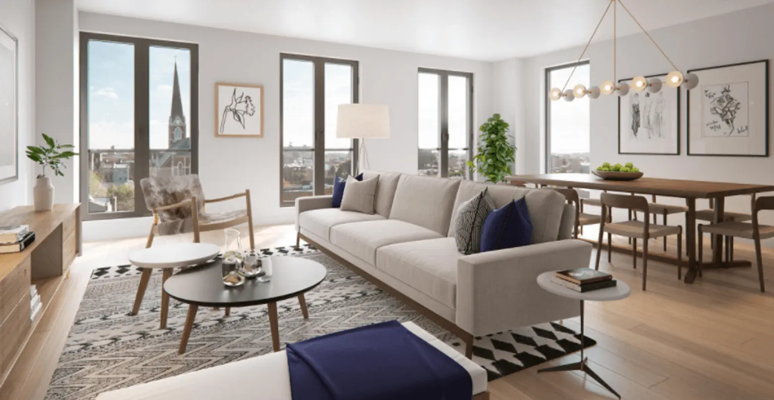 145 President via Arc Media
The interior design prioritized, “Scandinavian-influenced materials and color palette” to blend “natural warmth with sophisticated modern design.” The high ceilings and abundance of natural light complete the Scandinavian feel.

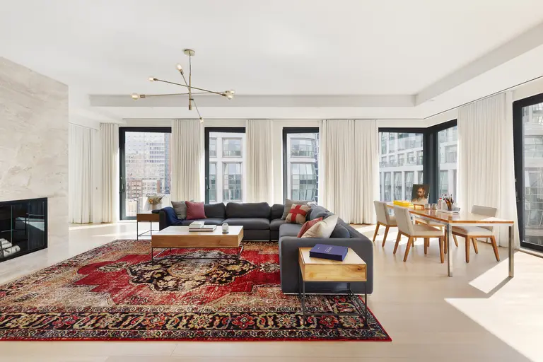
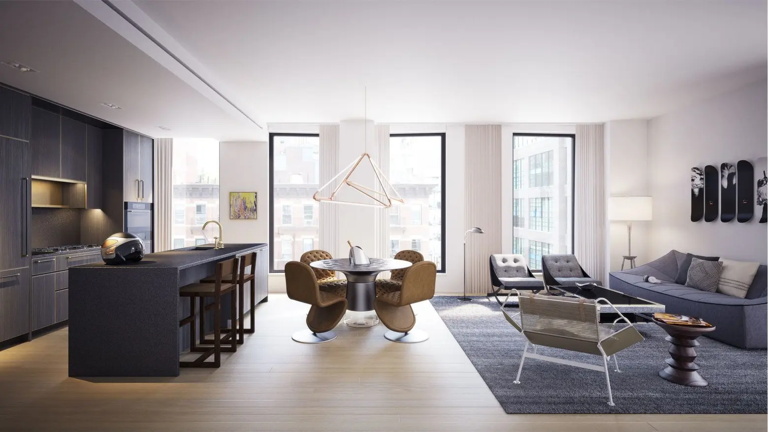 505 West 19th Street via Thomas Juul Hansen
The West Chelsea condominium 505 West 19th Street is infused with hallmarks of Danish architect and designer Thomas Juul-Hansen’s Scandinavian background. Juul-Hansen used natural materials, craftsmanship, and sophisticated interiors to balance restraint and warmth. The priority for the designer was to create calm and comfort in the large homes (each residence in the West Tower is an entire floor or a duplex) and create cocoon-like “privacy wings” that separate entertaining areas from private areas.
Simplicity and Functionality Translated into Curated and Edited
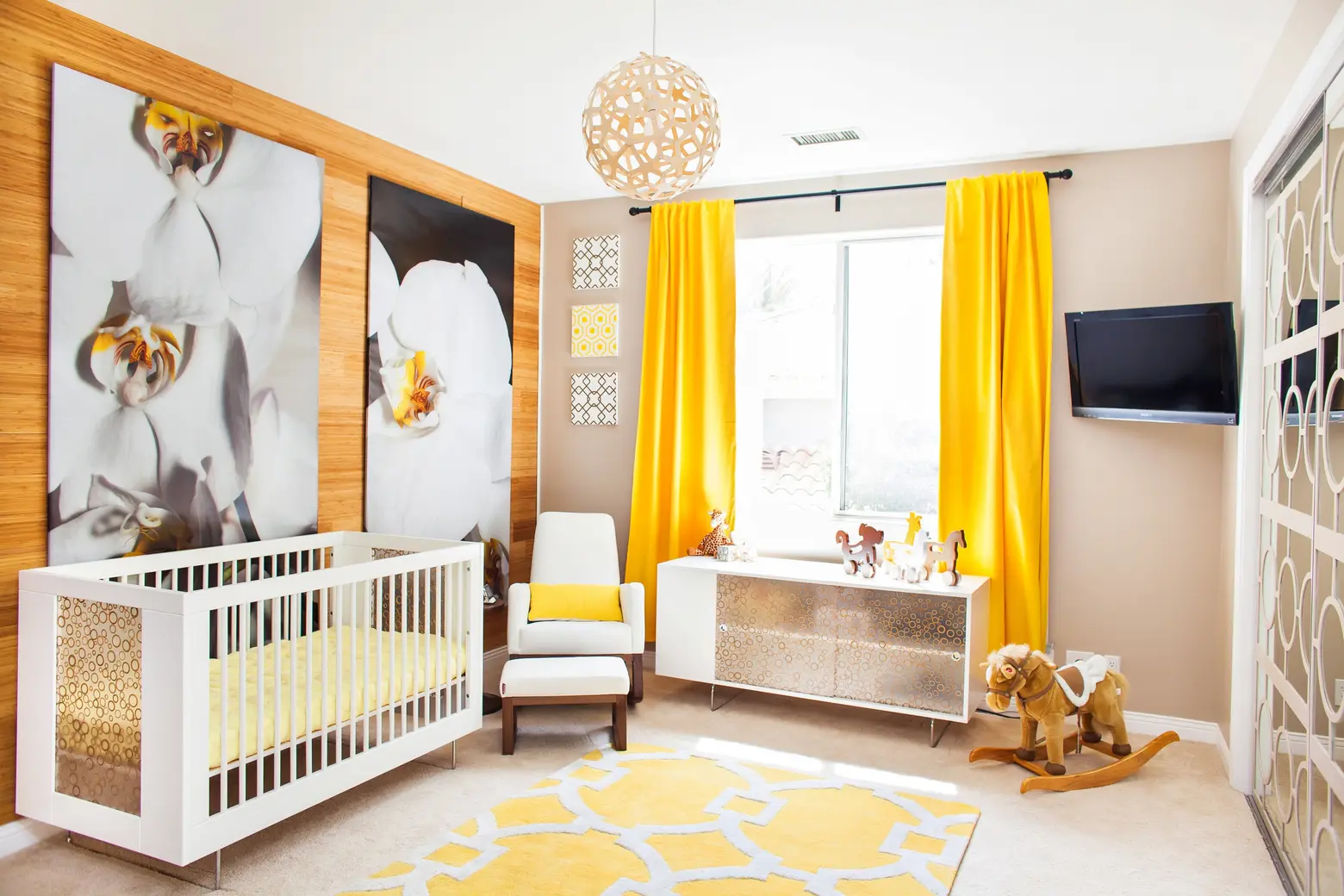 A room designed by Vanessa Antonelli
Scandinavian design prioritizes simplicity and functionality. Tali Roth commented, “I like things but they need to be curated and not everywhere.”
Beckstedt reinforced this by stating that Scandinavian design is about being more edited in your selection process. “It’s not about having tons, it’s about having just the right amount of pieces. For everyone that means something different. If you’re a minimalist, it may be only three things and for others, being very curated may be too much.”
Vanessa Antonelli, an interior designer who specializes in nurseries and kids’ spaces, says, “Many of my clients tell me at our initial meeting that they are looking for a clutter-free, bright space with natural elements. As soon as I hear any of those descriptions, I know Scandinavian design will be for them…I love using storage like clothing racks and bookshelves as décor, which is a definitively Scandinavian style and if everything has its own space, it checks off the request for clutter free.”
Color and Craftsmanship
 211 Schermerhorn via Morris Adjmi Architects
Chris Taylor, Creative Director of Interiors at Morris Adjmi Architects, says that although they do not specifically intend to replicate Scandinavian design, the design principles the firm is based on share many parallels: simplicity, functionality, utility, clean lines, light, natural materials, and craftsmanship.
“For 211 Schermerhorn, the units are bright and light with pale woods, large format plank floors , and clean, integrated cabinetry in the kitchen. Even though we weren’t thinking this is going to feel ‘Danish’ or ‘Swedish,’ there are those parallels.”
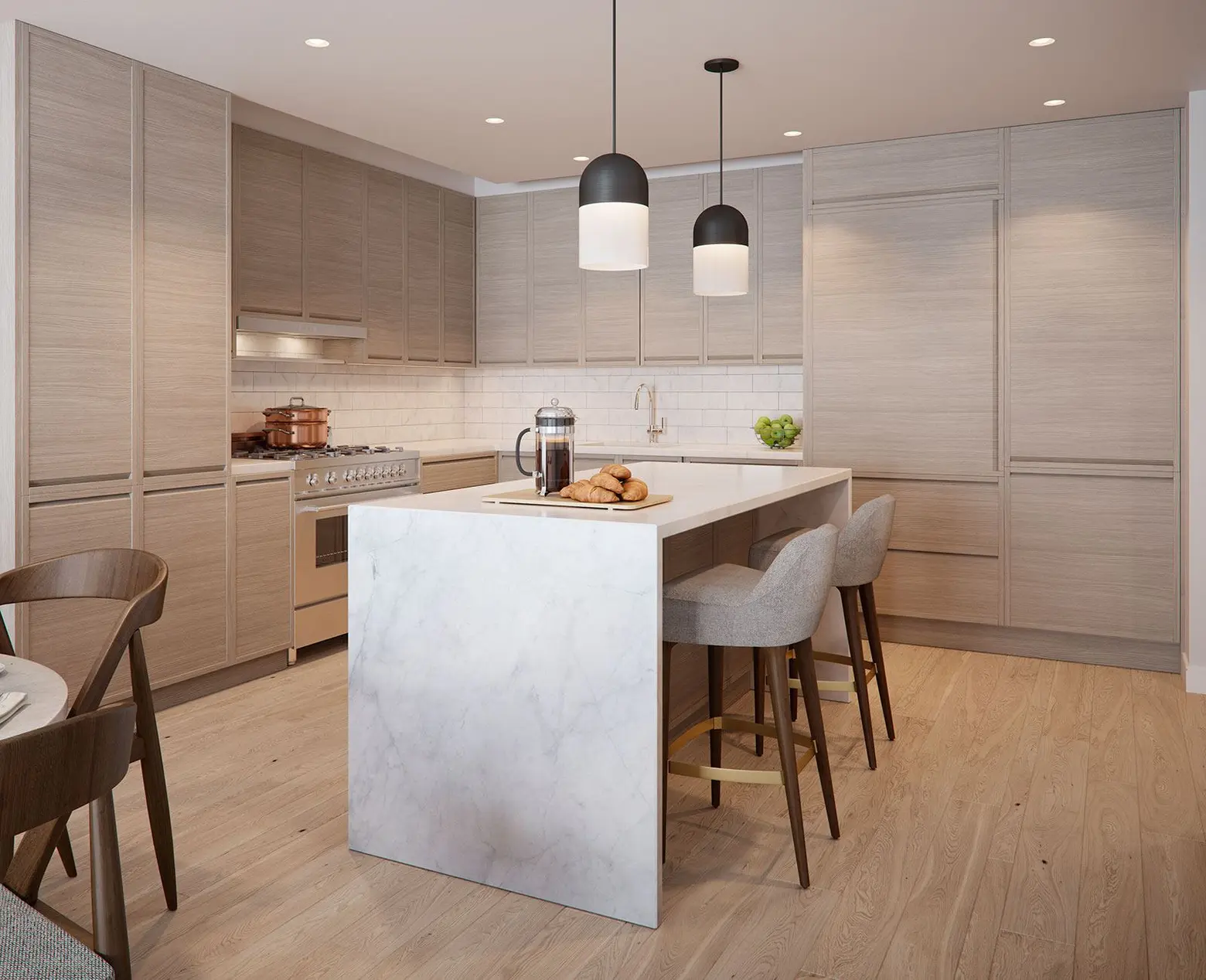 211 Schermerhorn via Morris Adjmi Architects
The kitchens are good examples of the Scandinavian feels, with the use of natural materials that all look very handcrafted. “Everything feels like it’s been made by an old, artisanal woodworker. The cabinets were not made in a factory in China. I think you read that in that space, in the kitchen it feels really special,” says Taylor.
The floors in 211 Schermerhorn also feel very Scandinavian. Taylor explains the floors are custom-stained white oak with multi-widths (3, 5, and 7 inches) and some knotting. “In the olden days, they would cut a tree up, get the planks and use every part of the tree. That was the thinking, it’s romantic and a point of difference for our building.”
Designing Scandinavian
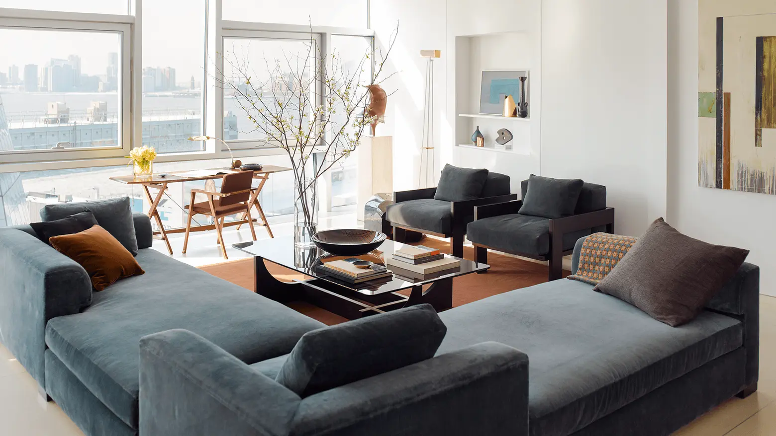 Photo courtesy of Neal Beckstedt Studio
Antonelli recommends, “In order to implement the Scandinavian style into nurseries I suggest choosing modern furniture with clean lines in natural wood…Some other fun ways I tie the rest of the room together is with other natural elements throughout like florals, plants, and wood. I mix those items with hard metals and fur or woven textiles to soften the space.”
Beckstedt concludes that the modest luxury design should drive everything from your floor plan to the entire layout. Making every space, “super functional to how you live is the way Scandinavian design translates the big picture into our lives.”
RELATED:
Get Insider Updates with Our Newsletter!
Leave a reply
Your email address will not be published.









ugh so many of these dwellings have no curtain or even “shears” at the windows. looks so cold and unlived in. (I know, to each his own.)